Organized business’s knee-jerk opposition to paid sick days legislation
The Senate Committee on Health, Education, Labor, and Pensions is holding its Mother’s Day hearing today, and the main subject is paid sick leave, something every working mother needs. Sen. Tom Harkin (D-Iowa) and Rep. Rosa DeLauro (D-Conn.) have introduced a bill, the Healthy Families Act (S. 984/H.R. 1876), to mandate that every employee receive at least seven days of paid time off for illness each year. Everywhere in the civilized world, employees have the right to at least some minimum amount of paid leave when they or their children are sick or when they have to see a doctor—everywhere except in the United States.
The organized U.S. business community—represented by the Washington lobbyists and dozens of giant trade associations—fiercely opposes giving American workers this right.
Why? Because business owners don’t want to be told what to do by anybody, least of all by the government. They consider themselves entitled to force employees to choose between working while sick, taking leave without pay (if the employees are lucky enough to have the right to take unpaid leave), or being fired.
At this morning’s hearing, the business community was represented by the Society for Human Resources Management, which reflexively takes the position that workers should not have legal rights; they should not, for example, have the legal right not to be fired without just cause, they should not have the right to a minimum wage, they should not have the right to unpaid leave to care for family members, they should not have the legal right to advance notice that their office, store or factory will be shut down, etc. The SHRM position is that wages, benefits, and protections should be left to the whim of the employer, or in fancier terms, to market forces.
As usual, the SHRM witness is testifying this morning that her business treats its employees well, giving its employees with three years or more of service 20 days of paid leave. The implication is that left alone, businesses will treat employees as well as they can afford to, and everything will be for the best.
But this benign view is not true. Absent legislation, businesses will treat employees only as well as they want to, even if they can afford to do much more. Even businesses whose CEOs are paid millions of dollars a year can deny all or most of their workers any paid sick leave at all. This problem is so widespread that about 40 percent of the private-sector workforce has no right to even a single day of paid sick leave. That’s 40 million people—mostly low-wage workers who are barely scraping by—who go unpaid if they get sick or if they have to take time off to care for a sick family member.
The SHRM witness argues that a mandate is “inflexible,” and that’s true. It should be inflexible; the whole point is to guarantee a basic, minimum right to workers—most of whom are women—that they need very badly. Nothing would prevent a business from doing more, as the SHRM witness’ business already does.
SHRM’s alternative arguments against the paid sick leave legislation are altogether astonishing. SHRM’s witness argues that providing generous benefits is a competitive advantage to her company that would be lost if every business were compelled by law to provide them, ignoring that the bill’s mandate is for only seven days of paid leave, rather than the 20 days her business provides, leaving plenty of competitive advantage.
“We provide generous paid leave so that we can continue to be an employer of choice for employees and applicants in our area. What we do not want is a government-imposed paid leave mandate to take away our competitive edge over other employers.”
And finally, she argues that it is somehow degrading to be told what to do by the government:
“Organizations such as ours that are already extremely successful with flexible workplace outcomes should not be brought down to the mediocre level that regulatory approaches would be trying to get not-so-well-run companies up to achieving.”
The silliness of these arguments is pretty good evidence that the business community has no good reason (no economic reason) to oppose the Healthy Families Act. Their opposition is ideological: They own the businesses, and no one has the right to tell them (the 1 percent) how to treat their workers—not even a government of the people, by the people, and for the people.
Grasping at Chinese straws
The Commerce Department released another depressing report on the U.S. trade deficit this morning, our monthly reminder of the huge gap between globalization’s economic reality and American economic policymaking.
In March, we bought about $52 billion (28 percent) more from the rest of the world than we sold. From first quarter 2011 to first quarter 2012, the deficit on goods and services rose almost 8 percent, with China representing almost two-thirds of our non-oil deficit with the rest of the world.
Yet, over the past year or so, a drumbeat of analysis in the establishment business press has been telling us to stop worrying; our chronic trade imbalance with China will soon disappear. New York Times columnist Eduardo Porter last week summed up the happy scenario: Chinese wages and transpacific transportation costs are rising and the Chinese are allowing their currency to appreciate. The implication is that rather than exerting unpleasant political pressure on China, we should trust in the natural workings of the market and the good common sense of the Chinese leaders who “appear to understand the need for change.”
Don’t hold your breath.
Porter is correct that wages are rising in China faster than they are in the United States. But to get a perspective, check out the Bureau of Labor Statistics’ numbers on international labor costs in manufacturing, where the latest data—for 2008—is that Chinese manufacturing costs are a little over 4 percent of U.S. levels. Yes, they probably have risen since then, but the gap is still immense and will clearly not be closed anytime soon.
Moreover, the narrowing of the gap may have as much to do with U.S. workers getting less as Chinese workers getting more. The corporate poster boy for looking at the bright side is General Electric, which has moved some production of a few heavy appliances back to the U.S. from China. What the poster leaves out is that GE workers who used to make $22 an hour are now making $13.
It is also true that rising fuel costs are making it more expensive to import large, heavy products from across the Pacific. But that hardly means that production will move back to the U.S. Thanks to the North American Free Trade Agreement, multinational producers of big appliances and autos and parts who find importing from China too expensive, are moving to Mexico where labor costs are 18 percent of what they’d pay in the U.S.
Finally, Porter writes that the Chinese strategy of manipulating their currency to keep their exports cheap and imports expensive “may be turning the corner.” He notes that the Chinese, while they don’t want to appear caving to American pressure, have quietly allowed the renminbi to appreciate 40 percent against the dollar since 2005.
Just so. And over that time our trade deficit with China has grown by over 45 percent, suggesting how large China’s comparative advantage in trade has become. Moreover, despite the endless parade of American officials to Beijing pleading for more currency appreciation, the Chinese apparently think they’ve already done enough. Porter himself quotes China’s premier Wen Jiabao to the effect that the dollar-renminbi now may “have reached equilibrium level.”
Thus, there is little evidence that either the market or the Chinese leadership intend to rescue the U.S. from its trade quagmire.
Unfortunately, neither is there evidence that American leaders—from either party—intend to take responsibility for doing it themselves. Not only do they have no strategy to deal with the trade deficit, but President Obama and congressional Republicans are busily preparing for yet another of the so-called free trade agreements—this one to a group of countries around the Pacific rim—that have allowed our multinationals to off-shore production for the American consumer for over three-and-a-half decades.
But the market will not be denied; eventually we will balance our trading account. So, in the absence of a proactive policy, GE will be the model—the relentless lowering of American wages and living standards until the gap with workers in China and Mexico is closed.
Andrew Biggs is at it again
Comic Demetri Martin has this advice: “Only people in glass houses should throw stones, provided they are trapped in the house with a stone.”
Feeling trapped might explain the American Enterprise Institute’s Andrew Biggs’ penchant for stone throwing, such as accusing public pensions of projecting rosy rates of return (in Biggs’ view, anything higher than Treasury bond yields) despite the fact that he once hyped Social Security private accounts with promises of riches galore.
His latest: charging the National Institute of Retirement Security with advocating stone throwing—or at least window breaking—in order to stimulate the economy (apologies for the colliding metaphors).
Specifically, Biggs says NIRS ignores the cost to taxpayers in its research on the economic impact of public pensions, likening this to advocating window breaking as a way to create jobs for glaziers. Aside from the fact that the report in question repeatedly cites taxpayer costs, author Ilana Boivie is straightforward about the fact that her study measures the gross (not net) economic impact, as even Biggs eventually acknowledges. Thus, the economic stimulus from pensions can be compared to other forms of saving or spending without being limited to a specific counter-factual.
Biggs seems to think the relevant comparison should be with cutting public pension benefits and refunding the cost to taxpayers, as if they could be cut without damaging employee recruitment or retention—and, by extension, public services. He also cites another potential counter-factual: What would happen to the economy if state and local governments switched from traditional defined benefit pensions to 401(k)-style defined contribution plans? In theory, contributions to retirement plans should increase to make up for these plans’ inefficiency due to high fees and a lack of risk pooling. In practice, 401(k) contributions tend to be grossly inadequate, since anxiety, it appears, is not a good motivator. So such a switch would more likely lead to a decline in saving, an increase in consumption spending, and a short-run boost to our economy, albeit for all the wrong reasons (in other words, it would be rather like breaking windows to boost the economy). In the long run, you’d have to factor in an upward redistribution of wealth to high-income households who benefit the most from these accounts and whose higher saving rate would be a drag on our demand-constrained economy.

Perhaps Edward Hicks' "Peaceable Kingdom" is the kind of earthly paradise Andrew Biggs envisions.
You can see how it gets complicated. Not for Biggs, though. For him, increasing savings in private accounts would lead to an earthly paradise, making Americans “not only richer, but also happier, healthier, more familial, smarter, and more active citizens.”
He said this back in the day when he was promoting President George W. Bush’s plan to partially privatize Social Security. Of course, Biggs took into account the cost in the form of reduced guaranteed benefits…
Actually, he didn’t. Which gets back to Biggs’ habit of accusing others of sins he’s committed. Maybe he feels trapped by Dean Baker in a crystal palace of Social Security privatization, and this is the only way he can think of getting out?
Price of a diploma: Class of 2012 faces tough job market, rising costs, and increasing debt
There was a great article in Monday’s Wall Street Journal that discussed the tough job market the Class of 2012 is facing. Many of these new graduates will be competing with the graduating classes of 2011 and 2010 just to get on the bottom rungs of the career ladder. While it’s well-documented that graduating into a depressed labor market lowers lifetime earnings potential on average, today’s young graduates have additional hurdles to worry about: rising higher education costs and crippling student debt.
At EPI, we, with economist Heidi Shierholz, recently released an analysis of the labor market for recent high school and college graduates. The results are predictably grim, with unemployment rates for both sets of graduates spiking at the beginning of the Great Recession and falling very slowly in the recovery.
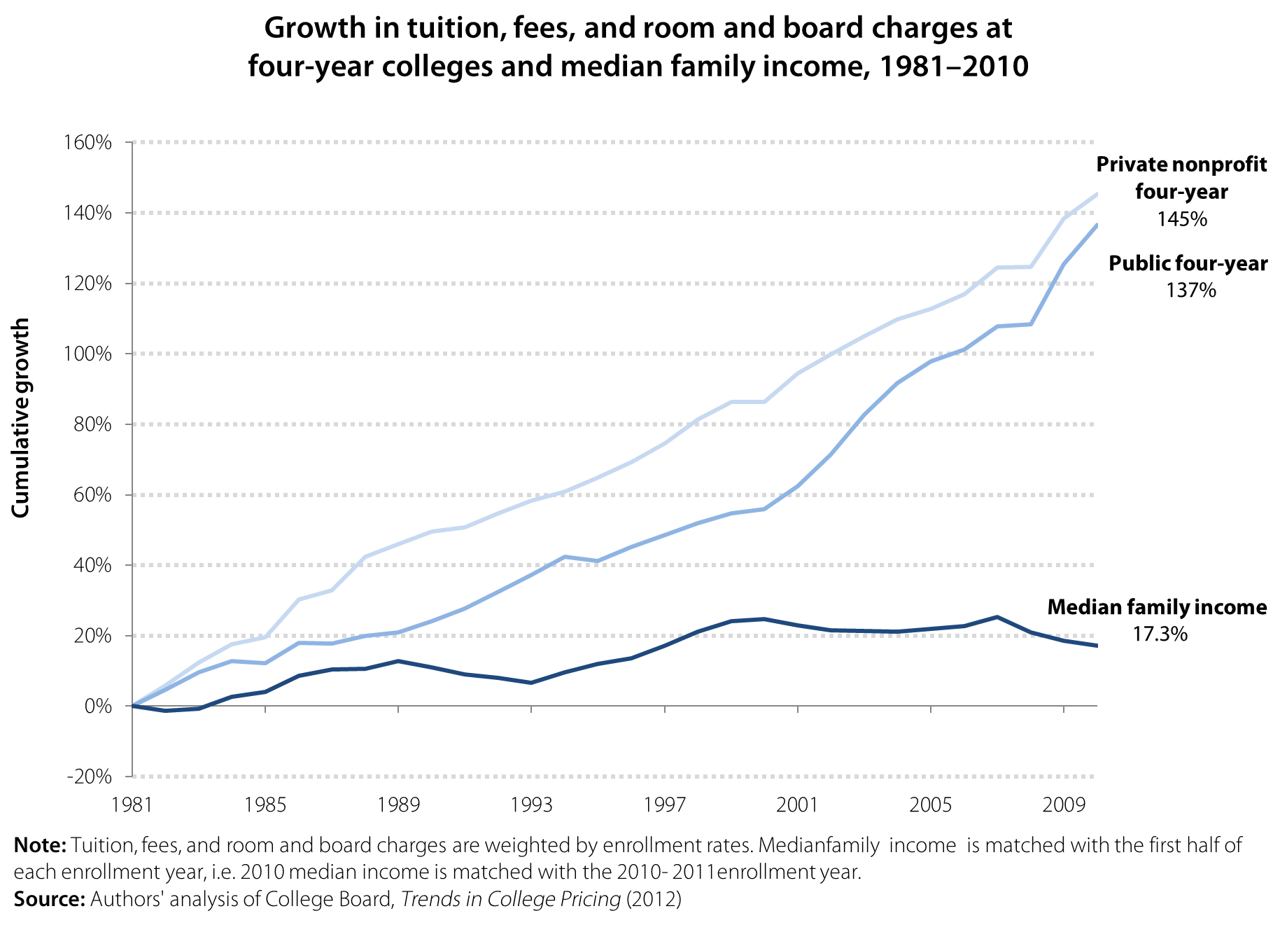
The report also highlighted the rising cost of obtaining a college degree. The figure below shows that the cost of higher education has been rising faster than family incomes for decades, making it harder for families to pay for college. From the 1981–82 enrollment year to the 2010–11 enrollment year, the cost of a four-year education increased 145 percent for private school and 137 percent for public school. Median family income only increased 17.3 percent from 1981–2010, far below the increases in the cost of education, leaving families and students unable to pay for most colleges and universities in full.
Unsurprisingly, a large majority of students and recent graduates take on debt to pay for college. Two-thirds of recent college graduates have student loans, and trends indicate that the number of student loans is increasing. Between 1993 and 2008, average student debt for graduating seniors increased 68 percent, from $14,410 to $24,238. Average debt for graduating seniors at public universities was $21,105 in 2008, and average debt for graduating seniors at private non-profit universities was $28,888 (authors’ analysis of Project on Student Debt 2010). In taking on these loans, students are taking a risk and hoping that they will be able to quickly secure work to begin paying them off after graduation. In recent years, and through no fault of their own, a growing number of graduates have been on the wrong side of this risk, with harsh consequences. Although most student loans have a grace period of six months before repayment begins, recent graduates who do not find a stable source of income may be forced to postpone payment though deferment or forbearance, miss a payment, or worst of all, default altogether on their loans. Deferment and forbearance are short-term fixes, however, and ultimately increase the amount borrowers owe once each period ends. Missed payments and default can ruin young workers’ credit scores and set them back years when it comes to saving for a house or a car.
Even worse, these young workers do not have a strong safety net on which to rely during the volatile job-seeking process.
Young workers are often ineligible for unemployment insurance, for example, because they must first meet state wage and work minimums during an established reference period—a reference period during which they are often in school and not working. Many new graduates are likely turn to their families for assistance. In 2011, 54.6 percent of 18- to 24-year-olds were living with their parents, an increase of 3.4 percentage points since 2007. This option is not, obviously, available to all young graduates. In short, young workers are being squeezed from multiple angles and their plight constitutes yet another instance of how damaging our tolerance of an underperforming economy truly is.
Additional findings and more analysis on the labor market facing young high school and college graduates can be found in our report, The Class of 2012: Labor market for young graduates remains grim.
Depressing graph of the day: The long-term unemployed
The Pew Fiscal Analysis Initiative has released an addendum to its 2010 report A Year or More: The High Cost of Long-Term Unemployment, and the update isn’t pretty. Using data from the Bureau of Labor Statistics’ Current Population Survey, Pew’s addendum finds that 29.5 percent of unemployed Americans in the first quarter of 2012 have been jobless for a year or more. That means 3.9 million working-age Americans haven’t been able to find a job in 12-plus months.
In 2008, during the first quarter of the Great Recession, 9.5 percent of the unemployed had been jobless for at least a year. While this percentage of the long-term unemployed peaked at 31.8 percent in the third quarter of 2011, it’s still very high and remains more than three times greater than at this point four years ago. Note also that BLS defines long-term unemployment as someone who has been unemployed for more than half a year (27 weeks or more). By this measure, 41.3 percent of the jobless still qualify as long-term unemployed.
Some other findings from the Pew analysis:
- Age: Older workers are less likely to lose their jobs, but much more likely to be jobless for a year or more once they do (see Figure 3 in the addendum).
- Education: Workers with higher levels of education are less likely to lose their jobs, but they’re no better off once they do as long-term joblessness is fairly even across all education levels (see Figure 5).
- Industry: No industry or occupation has gone unscathed due to long-term unemployment (see Table 3).
Continued high levels of long-term unemployment have a damaging impact on the economic situations of both individuals and families, and more broadly, on the economy as a whole. As EPI has documented before, the outcome of such long-term joblessness is “scarring,” which carries severe and long-lasting consequences for our economy and society.

What we should talk about when we talk about Social Security
Love?
That’s the original word in the Raymond Carver short story collection paraphrased in this blog title, and in a perfect world, that’s all we’d need to say: Americans love Social Security because it takes care of the people they love.
But this is Washington, so that won’t cut it. Fortunately, our friends at Social Security Works have hired some smart people to think about why we’re losing the messaging war on Social Security, despite the program’s popularity and the fact that transparently partisan attacks (“Ponzi scheme”) haven’t found much traction.
What has gotten traction: a decades-long and lavishly-funded campaign to convince younger workers that Social Security won’t be there when they retire, which opens the door to all sorts of shenanigans. Many Washington insiders, from across the political spectrum, have bought into the idea that Social Security is on an unsustainable course, and a willingness to slash benefits has become a “badge of fiscal seriousness” inside the Beltway, as Paul Krugman has noted.
Once the myth that Social Security is in trouble has taken root, attempts to dispel it with facts can inadvertently reinforce it, because the issue becomes technical and confusing, and people tend to assume that if you’re arguing about a problem, then it must exist. (If-there’s-smoke-there-must-be-fire logic isn’t always wrong, by the way: The Federal Reserve’s repeated attempts to pooh-pooh the existence of housing and stock bubbles should have put people on alert long before the bubbles burst in 2007.)
The good news, as John Neffinger of KNP Communications explained at a recent meeting of Social Security advocates, is that positive messages about Social Security can stick if presented the right way and in the right order.
Here are some DOs and DON’Ts, according to Neffinger:
- DON’T fight on their terrain (“Social Security isn’t going broke”).
- DO focus on the fact that Social Security is the only secure pillar of our retirement system (“If the middle class can’t count on Social Security in their retirement years, what can it count on? Not home equity, or 401(k)s or IRAs…”). In this vein, push for strengthening the program, as Michael Hiltzik does in this recent Los Angeles Times article.
- DO explain attacks on Social Security as attempts to dismantle the system for private gain (“Wall Street stands to make billions from managing more private accounts”) or political ideology (“They take their marching orders from someone who wants to shrink government to the size that they can drown it in a bathtub”).
- DO address the solvency issue by showing that simple adjustments can maintain the system (“Scrap the cap, so everyone pays the same percentage of their income in payroll tax”).
- But DON’T lead with the last two points, or you risk sounding partisan and reinforcing the myth that Social Security is in crisis.
The beauty of this framework, at least in theory, is that it avoids talking points that can backfire, like accusing Congress of raiding Social Security. It also sidesteps confusing topics like the trust fund that are hard to explain in a sound bite. Read more
Addressing price parity concerns
The Atlantic‘s Derek Thompson had a nice write-up on the Future of Work paper that EPI released April 27. In his article, Thompson included a bar chart illustrating “where poverty lives,” showing the 10 states with the highest share of workers making less than poverty-level wages, as defined in the paper. Thompson’s chart also included the share of workers in these states making between 100-200 percent of poverty wages. His bar chart clearly demonstrated that in these states, between 70-80 percent of workers earned less than twice the official poverty threshold for a family of four in 2010, or around $46,000 annually. (As a side note on poverty measures, my colleague David Cooper did a nice blog post explaining how a more dynamic method of assessing poverty—the Census Bureau’s Research Supplemental Poverty Measure—both defines millions more Americans as being impoverished and shows a far greater proportion of people living at very modest means, when compared with the official measure.)
A few commenters on Thompson’s piece brought up a good point in regards to comparing wages by geographic location (in this case by state). Some were quick to point out that the 10 states with the highest shares of workers earning at or below poverty level wages were “red states,” while others pointed out that the analysis did not take into account purchasing power parity—that is, the fact that the purchasing power of a dollar may be different in Manhattan than it is in rural Kansas. Their point was simply that a worker earning $10 per hour in Kansas may actually fare better than someone earning far more who has to pay rent and buy goods and services in a traditionally pricey market such as New York City, San Francisco, or Washington, D.C.
The table below adjusts for this by inflating the poverty wage used in the paper—$10.73 per hour in 2010—by a regional price parity index calculated by the Bureau of Economic Analysis (I actually averaged their measures for 2005 and 2006 that come from a BEA Research Spotlight titled Regional Price Parities: Comparing Price Level Differences Across Geographic Areas). The table shows the adjusted poverty wage level by state and the share of people in each state earning at or below that level. While Hawaii is somewhat of an anomaly due to its geographical separation from the lower 48 states by 2,500 miles of ocean, the next three states with the highest shares of workers earning less than the adjusted poverty wage are New York, California, and New Jersey; all states that contain very large metropolitan areas (as well as more rural areas). An even more accurate breakdown of regional purchase parity would show differences between rural and urban areas, as well as safety net services available for low-wage workers by region, but that is beyond the scope of this blog post.
Adjusted share of workers earning poverty wages by state, 2010
| State | 0-100% poverty wages | Adjusted poverty wage |
|---|---|---|
| Hawaii | 40.6% | $14.04 |
| New York | 38.4% | $14.10 |
| California | 37.8% | $13.75 |
| New Jersey | 31.8% | $13.42 |
| Rhode Island | 31.6% | $12.24 |
| Nevada | 27.7% | $10.74 |
| Connecticut | 27.5% | $13.20 |
| Illinois | 26.3% | $10.81 |
| Michigan | 26.3% | $10.04 |
| Massachusetts | 26.2% | $12.99 |
| New Hampshire | 26.2% | $12.21 |
| Florida | 25.2% | $10.59 |
| Oregon | 25.0% | $10.29 |
| Arizona | 24.5% | $10.22 |
| Texas | 24.5% | $9.81 |
| Virginia | 23.8% | $10.96 |
| Delaware | 22.5% | $11.44 |
| Vermont | 22.2% | $10.80 |
| Maryland | 21.7% | $11.38 |
| Pennsylvania | 21.4% | $10.06 |
| Washington | 21.2% | $11.08 |
| Tennessee | 20.6% | $9.00 |
| Colorado | 20.6% | $10.46 |
| Alaska | 19.8% | $11.24 |
| Ohio | 19.5% | $9.42 |
| Indiana | 19.0% | $9.16 |
| Minnesota | 18.8% | $10.20 |
| Georgia | 18.3% | $9.48 |
| North Carolina | 18.2% | $9.41 |
| Louisiana | 18.2% | $8.76 |
| Maine | 18.0% | $9.92 |
| Utah | 17.6% | $9.37 |
| Mississippi | 17.5% | $8.42 |
| Wisconsin | 17.4% | $9.82 |
| Kentucky | 17.4% | $8.69 |
| Alabama | 17.0% | $8.50 |
| Oklahoma | 16.5% | $8.67 |
| Idaho | 16.5% | $8.87 |
| New Mexico | 16.4% | $8.91 |
| Nebraska | 15.6% | $9.39 |
| Missouri | 15.5% | $8.79 |
| South Carolina | 15.3% | $8.92 |
| Kansas | 14.8% | $8.97 |
| Wyoming | 14.6% | $9.31 |
| Montana | 14.4% | $8.87 |
| Arkansas | 14.2% | $8.34 |
| Iowa | 14.0% | $8.95 |
| District of Columbia | 13.1% | $10.61 |
| South Dakota | 12.4% | $8.67 |
| North Dakota | 10.7% | $8.28 |
| West Virginia | 6.9% | $7.33 |

Source: Author's analysis of Current Population Survey Outgoing Rotation Group microdata, Bureau of Economic Analysis data
Note: Data were calculated using poverty data for a four-person household
The bottom line in this state-by-state comparison is not whether the states that show a high share of low-wage workers are red or blue; it’s rather to illustrate the often-enormous shares of people earning very low wages. As this National Low Income Housing Coalition report points out, for full-time individuals earning what they call the “renter wage,” a two-bedroom unit is unaffordable in nearly every state. The report also has some really interesting data, broken down by state, metropolitan area, and county, that shows how many full-time minimum wage jobs a household would need to hold to afford at two-bedroom fair market rent (FMR) unit. The data shows that whether or not low-wage workers are living and working in New York County (3.8 full-time minimum wage jobs to afford a FMR two-bedroom) or Wichita, Kan. (1.7 full-time minimum wage jobs to afford a FMR two-bedroom), their wages are likely not sufficiently covering their expenses.
How Romney can show support for working women
From 2007 to 2011, 70 percent of the jobs lost in the state and local public sector were jobs held by women. This amounts to roughly 765,000 jobs. Since 2011, we have continued to see public-sector job losses, and, unfortunately, it is a good bet that the declines will continue.
The Obama administration has provided aid to state and local government in a variety of ways. For example, the American Recovery and Reinvestment Act (ARRA) injected more than $180 billion into state and local government. This aid has helped preserve significant numbers of jobs held by women. Women can be found in all types of public-sector jobs, but they are overrepresented in the public sector, in part, because they are more likely to be teachers. So far, $90 billion from ARRA has gone to education.
Out of a desire to appeal to women voters, Mitt Romney’s campaign has been making misleading statements about President Obama’s record. One way for Romney to show legitimate support for working women is to promise that, if elected, he will provide ample federal aid to state and local government. Unfortunately, Romney’s current commitment to shrink government means that he will put even more women out of work.
Underemployment isn’t a ‘myth’ for recent college grads
As readers of this blog are well aware, the labor market remains in terrible shape in the aftermath of the worst downturn since the Great Depression; this is evident in a wide array of economic data and is not disputed in the economics profession. Graduating into said labor market (in which the level of voluntary quits remains weak) with little to no work experience or wage history isn’t an enviable position, as my colleagues Heidi Shierholz, Natalie Sabadish, and Hilary Wething detail in their new paper The Class of 2012: Labor market for young graduates remains grim. Which is why I was flabbergasted by Abigail Johnson’s and Tammy NiCastro’s recent Forbes.com blog post Get Over It: The Truth About College Grad ‘Underemployment.’ Their title is plenty revealing, but here’s the gist of their argument:
“In recent weeks, there have been a slew of articles that reported how difficult things will be for this year’s college graduates because they can expect to be unemployed or “underemployed” … It’s not clear where the concept of being “underemployed” came from. But it’s damaging and counterproductive.”
The Bureau of Labor Statistics’ (BLS) U-6 Alternative Measure of Labor Underutilization—often referred to as the underemployment rate—is not a myth. It’s defined as such: “Unemployed, plus all persons marginally attached to the labor force, plus total employed part time for economic reasons, as a percent of the civilian labor force plus all persons marginally attached to the labor force.” EPI’s State of Working America website even tracks it on a monthly basis across educational attainment, gender, and race and ethnicity. Here’s what it looks like by educational attainment:

Not a pretty picture. Since the onset of the recession more than four years ago, underemployment has roughly doubled across all educational attainment levels (a clear indicator that the economy suffers from a sheer lack of aggregate demand—the economy is running $853 billion below potential output—rather than “structural” employment problems). With so much excess slack in the labor market, employers have all the bargaining power, hence anemic wage growth and the “employed part time for economic reasons” (i.e., involuntarily) part of the underemployment rate. Horatio Alger can’t set his hours worked—there simply aren’t enough hours of work being demanded in the depressed economy.
And as Shierholz, Sabadish, and Wething detail, it looks much, much worse for recent high school and college graduates entering the labor market. Over the last year, the unemployment rate averaged 31.1 percent for recent high school graduates and 9.4 percent for recent college graduates. The underemployment rates averaged 54 percent and 19.1 percent, respectively. High unemployment and underemployment, and accompanying depressed earnings early in career, will result in long-term economic scarring, particularly diminishing lifetime earnings. Beyond underemployment as measured by the BLS, skills/education-based underemployment (so called “cyclical-downgrading”) will contribute to lifetime earnings scarring; as my colleagues note, “entering the labor market in a severe downturn can lead to reduced earnings, greater earnings instability, and more spells of unemployment over the next 10 to 15 years.”
In suggesting that college grads should be grateful to take a job at Starbucks because they aren’t “entitled” to anything more, the authors blithely overlook that recent college graduates working at Starbucks part-time for economic reasons are likely displacing hours from someone with lower educational attainment. This is in no way an indictment of any such recent graduates. This is to say what’s truly damaging and counterproductive is economically illiterate “thought pieces” breeding complacency about the state of the labor market and the policy response to the Great Recession. Neither a college degree nor government can guarantee recent grads “good jobs” or full-time employment, but between the Great Depression and the Great Recession, government prioritized stabilizing the economy and targeting full employment—to the benefit of workers of all educational attainment levels. Underemployment of recent graduates is not a myth being cooked up to breed entitlement as the authors imply; it’s a reality and tragic failure of policymakers to address the jobs crisis.
Video: Paul Krugman discusses his new book
Yesterday, Nobel-winning economist and New York Times columnist Paul Krugman spoke at EPI about his new book, End this Depression Now! A key point of the book and his speech is that there’s a common and very wrong belief that the economy is like a morality play: Lots of people made irresponsible decisions in the run-up to the economic collapse, and, like a hangover, they must now suffer the consequences of their actions.
As Krugman points out, the majority of the people who have been hurt by this crisis do not deserve the blame. Over eight million people lost their jobs and, with an unemployment rate of more than 8 percent for more than three years now, many of those same workers, along with new entrants to the labor market, have been unable to find jobs. Their jobs disappeared through no fault of their own, and the pace of their return is nowhere near sufficient to get everyone back to work anytime soon.
More importantly, Krugman points out that, unlike a hangover that needs to be waited out, we could easily fix the economy now and put these millions of people back to work. First, we should halt the fiscal austerity efforts that recently doomed the British economy. Second, we should embark on aggressive fiscal expansion to boost consumer and business spending, stimulating demand for goods and services and creating jobs. As Krugman notes, this is basic Econ 101. All we need is the political will.