What to Watch on Jobs Day: Nominal Wages, Teacher Gap, and Upward Revisions
Tomorrow, the Bureau of Labor Statistics will release the September numbers on employment, unemployment, and nominal wages. While the report contains a host of data, there are three particular numbers I’m going to be watching closely.
First, the overall employment numbers from the payroll survey were lower than expected last month. Consensus estimates had projected job growth of about 230,000, but they came in at only 142,000. The consensus so far for September is again in the low 200,000s. So, two key things to watch: whether there are any upward revisions to the August employment numbers and whether the September numbers come in below consensus two months in a row. Last month, I suggested that slow job growth should make those arguing that policymakers need to worry about an overheating economy and inflationary pressures reconsider. Tomorrow, we will get some more information that can inform the question of whether we are at a new lower trend, which I hope not, or whether last month was a blip in a jobs picture that has otherwise been consistent for much of this year.
Second, with kids heading back to the classroom, it’s worth re-examining the teacher gap—the gap between actual local public education employment and what is needed to keep up with growth in the student population. During the recession, thousands of local public education jobs were lost, and those losses continued deep into the official economic recovery (as did public sector jobs in general). The costs of a significant teacher gap are measurable: larger class sizes, fewer teacher aides, fewer extracurricular activities, and changes to the curriculum. And, in sheer numbers, the teacher gap can explain a non-trivial part of the overall jobs gap. On Friday, I will compare where jobs in public education should be, using the precession ratio, student population growth, and the most recent jobs numbers.
Third, I’ll continue to track nominal wages. Last month, Josh Bivens and I explained how very far we are from the kind of wage growth that would suggest that the Federal Reserve can put the brakes on the economy. On Friday, we will put the latest nominal wage trends in perspective, both historically and against target level wage growth. These numbers on nominal wage growth are likely to be the single most important indicator in coming months driving Federal Reserve decisions.
What’s Up (or Down) With the Boomers’ Retirement Savings?!
The recent release of the Federal Reserve’s triennial Survey of Consumer Finances has many retirement researchers scratching their heads. As expected, GenXers’ savings (shaded blue lines in Figure 1) benefited from the rebound in stock prices and the economic recovery. Meanwhile, Silent Generation retirees (dashed red and yellow lines) saw a surprisingly large bounce in retirement savings. But Baby Boomers (solid purple, black and green lines) who were approaching retirement when the housing bubble burst saw weak gains or even losses between 2010 and 2013. Those who were born between 1949 and 1954, for example, saw a decline in mean retirement account savings from $176,000 in 2010 to $167,000 in 2013 (values are in 2013 dollars rounded to the nearest $1,000). This is far below the $199,000 their predecessors—older Boomers born between 1943 and 1948—had accumulated at the same age in 2007.
It’s not news that the Boomers’ retirement savings took a hit during the downturn. What’s more surprising is that they have fared so poorly in the recovery compared to younger workers and retirees. One explanation is simply that the Boomers, unlike older retirees, were hit by both the stock and labor market downturns and didn’t benefit as much from the subsequent rebound in stock prices as younger workers who were heavily invested in stocks through target date funds.
Mean retirement account balances by birth cohort , 1989–2013
| 1931–1936 | 1937–1942 | 1943–1948 | 1949–1954 | 1955–1960 | 1961–1966 | 1967–1972 | 1973–1978 | |
|---|---|---|---|---|---|---|---|---|
| 1989 | $56,383 | $44,937 | $30,369 | $27,428 | $7,419 | |||
| 1992 | $68,060 | $75,678 | $44,749 | $22,920 | $12,552 | $7,176 | ||
| 1995 | $64,254 | $90,781 | $75,262 | $50,090 | $22,642 | $16,480 | ||
| 1998 | $113,886 | $114,908 | $91,373 | $64,166 | $48,084 | $29,458 | $11,059 | |
| 2001 | $124,634 | $162,156 | $155,809 | $91,203 | $75,722 | $40,706 | $18,841 | |
| 2004 | $111,834 | $149,322 | $158,827 | $128,848 | $81,818 | $54,205 | $27,100 | $11,640 |
| 2007 | $109,709 | $164,654 | $199,218 | $161,187 | $114,482 | $69,036 | $41,928 | $18,436 |
| 2010 | $80,091 | $138,102 | $209,317 | $175,697 | $138,713 | $85,454 | $48,472 | $25,864 |
| 2013 | $88,944 | $168,828 | $214,277 | $166,597 | $154,630 | $103,838 | $75,433 | $46,593 |

Source: EPI's analysis of the Federal Reserve's Survey of Consumer Finance
TIP: For apples-to-apples comparisons, look at how successive 6-year birth cohorts fared at 6-year intervals (2013, 2007, and 2001), ignoring intervening surveys.
LA Hotel Workers Win $15.37 Minimum Wage: a New Day for Labor in the United States?
The Los Angeles City Council’s vote to raise the minimum wage for hotel workers is another herald of big changes coming in the way the United States deals with low wages and inequality. The Council voted 12 to 3 to raise the minimum wage for workers at large hotels to $15.37 an hour by 2017, which is more than the national median wage for women ($15.10 in 2013). Mayor Eric Garcetti will sign the bill after it receives a confirming second vote next week.
The LA County AFL-CIO, UNITE HERE Local 11 (the LA area union of hospitality workers), and the Los Angeles Alliance for a New Economy, which led the campaign, don’t intend to rest on their laurels and will push for an across-the-board minimum wage increase to $13.25 an hour, far above the national minimum wage of $7.25 an hour. Mayor Garcetti strongly supports that bill, too.
As in Seattle, where a union-led coalition won a $15 minimum wage, the people of Los Angeles realize that many businesses will not share revenues fairly with their workers unless they are required to do so. Even businesses that want to pay their employees a living wage feel constrained by their competitors: How can they compete with a competitor paying its workers $5.00 an hour less? The only way to break through these constraints is to reset labor standards to a level that provides a decent living. As Franklin Roosevelt said when he first sent minimum wage legislation to Congress in 1933: “No business which depends for existence on paying less than living wages to its workers has any right to continue in this country… By living wages, I mean more than a bare subsistence level. I mean the wages of decent living.”
Now It’s Explicit: Fighting Inflation Is a War to Ensure That Real Wages for the Vast Majority Never Grow
Remember that episode of The West Wing when Josh Lyman announced a secret plan to fight inflation? That was great. Turns out that Dallas Federal Reserve Bank President Richard Fisher has a secret paper telling us how to fight inflation: stop progress in reducing unemployment so that nominal wages never grow fast enough to actually boost living standards (or, never grow fast enough to boost real wages).
Last week, Fisher argued that a so-far unpublished (i.e. secret) paper by his staff showed that “declines in the unemployment rate below 6.1 percent exert significantly higher wage pressures than if the rate is above 6.1 percent.”
In the interview, Fisher mostly characterized this as a Phillips curve that is flat at unemployment rates higher than 6.1 percent, but which starts to have a negative slope below this rate, meaning that future declines in unemployment should be associated with higher rates of wage-growth. However, if you’re really thinking in terms of a stable Phillips Curve, this means that we can simply choose what unemployment/wage-inflation combination we’d like without worrying about accelerating inflation. Currently, nominal wage-growth is running around 2-2.5 percent. But as we’ve shown before, even the Fed’s too-conservative 2 percent inflation target is consistent with nominal wage growth of closer to 4 percent. So we have plenty of room to move “up” Fisher’s Phillips Curve before hitting even conservative inflation targets.
2013 ACS Shows Depth of Native American Poverty and Different Degrees of Economic Well-Being for Asian Ethnic Groups
Thursday’s release of 2013 American Community Survey (ACS) data allows us to fill in the blanks for minority populations that were not covered in Tuesday’s Census Bureau report on income, poverty, and health insurance coverage in 2013. ACS is an annual nationwide survey that provides detailed demographic, social, and economic data for smaller populations like Native Americans and the thirteen distinct ethnic groups that make up the Asian population.
Together with the 2013 Income, Poverty, and Health Insurance Coverage report, the 2013 ACS data provide a more complete picture of the economic status of America’s various racial and ethnic groups. This information helps to address the sense of “invisibility” felt by many of these groups, provides critical information for the states and local communities where these populations are concentrated and expands the scope for evaluating the impact of national policies.
Between 2012 and 2013, the real median household income for Native Americans increased 2.3 percent to $36,641. This was 70 percent of the national average in 2013 and $3,066 (-7.7 percent) lower than the group’s 2007 pre-recession level.
ACS Data Show Almost No Improvement in State Poverty Rates
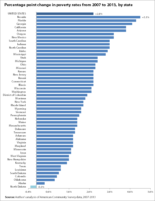
The American Community Survey (ACS) poverty data that were released by the Census Bureau earlier today showed that poverty rates were essentially unchanged from 2012 to 2013 in virtually every state.1 Only six states had significant changes in their poverty rates: Colorado (-0.7 percentage points), New Hampshire (-1.3 percentage points), New Jersey (+0.6 percentage points), New Mexico (+1.1 percentage points), Texas (-0.4 percentage points), and Wyoming (-1.7 percentage points). All other states had no significant change from their 2012 poverty rates.
The increases in poverty in New Jersey and New Mexico are the most troubling, although the lack of any significant decrease in most other states is also deeply frustrating. As shown in the figure below, North Dakota is the only state where the poverty rate has fallen back down to pre-recession levels. In every other state nationwide, poverty rates remain significantly above their 2007 levels.
The failure to see any significant reduction in poverty over the last several years is a direct consequence of the continued weakness in the labor market. (It’s not surprising that poverty has fallen in North Dakota given that the state’s unemployment rate has averaged 3.3 percent from the start of the recession to today.) At the same time, however, policymakers have directly stymied poverty reduction by cutting back on unemployment insurance. If we want to start bringing poverty rates down, we need to restore the labor market back to full health, lift wages, and start sharing economic growth more broadly.
1. The ACS data also showed no significant change in the national poverty rate. This differs from the official national poverty rate generated from the Current Population Survey (CPS) that was released earlier this week, which did show a significant decrease in the share of families in poverty. This discrepancy is due to differences in the way the two surveys treat household members not related to the head of household, and the fact that the ACS data reflect a slightly different timeframe than the CPS. See here for further explanation.
Across the States, Some Modest Improvements, But Incomes are Still Below Where They Were at the Start of the Millenium
This morning the Census Bureau released its annual report on income and poverty within states, with data from the American Community Survey (ACS). This report follows the release earlier this week of national income and poverty statistics. Not surprisingly, the state report tells much the same story as the national data: for the typical U.S. family, incomes in most states were largely unchanged from where they were the year before—and still well below their levels from over a decade ago.
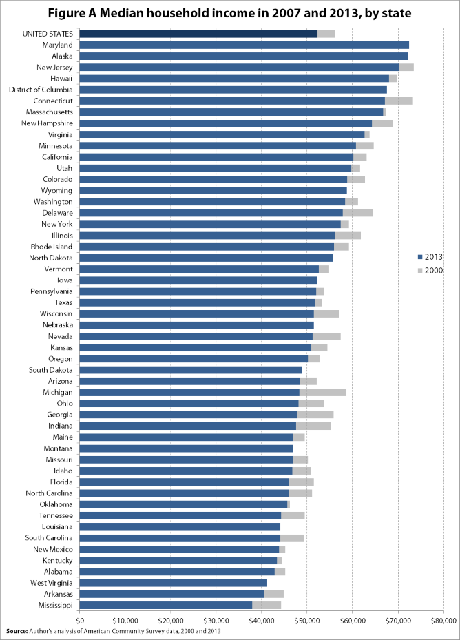
Between 2012 and 2013, median household income rose significantly in 14 states, while the remaining 36 states, plus the District of Columbia, had no significant change. The table below shows the states that had statistically significant year-over-year increases in median household income. The ACS data, which reflect a slightly different time period than the national income data gathered from the Current Population Survey, also showed a small, but significant increase in median income for the nation as a whole.
States with significant year-over-year changes in median household income, 2013 to 2012
| State | 2012 | 2013 | Change |
|---|---|---|---|
| United States | $51,915 | $52,250 | 0.6% |
| Alaska | $68,577 | $72,237 | 5.3% |
| California | $59,184 | $60,190 | 1.7% |
| Colorado | $57,430 | $58,823 | 2.4% |
| Florida | $45,578 | $46,036 | 1.0% |
| Kentucky | $42,230 | $43,399 | 2.8% |
| Michigan | $47,447 | $48,273 | 1.7% |
| Minnesota | $59,747 | $60,702 | 1.6% |
| Missouri | $45,919 | $46,931 | 2.2% |
| Ohio | $47,454 | $48,081 | 1.3% |
| Oklahoma | $44,903 | $45,690 | 1.8% |
| Tennessee | $43,504 | $44,297 | 1.8% |
| Texas | $51,198 | $51,704 | 1.0% |
| Utah | $57,841 | $59,770 | 3.3% |
| Wyoming | $55,569 | $58,752 | 5.7% |
Source: Adapted from Noss, Amanda. 2014. Household Income: 2013. U.S. Census Bureau. http://census.gov/content/dam/Census/library/publications/2014/acs/acsbr13-02.pdf
While these modest improvements are welcome, the reality is that household incomes have yet to recover from the recession virtually anywhere. Only four states (Alaska, Wyoming, North Dakota, and South Dakota), plus the District of Columbia have regained their levels from 2007, and most states has not seen income growth in over a decade. The figure below shows median household incomes, by state, in 2000 and 2013. The overlapping bars show that in the vast majority of states, median incomes are still well below where at the start of the millennium. Only Maryland, Alaska, Wyoming, North Dakota, Iowa, South Dakota, Montana, Louisiana, West Virginia, and the District of Columbia have managed to regain or surpass their median income levels from 2000.
As my colleagues Larry Mishel and Josh Bivens explain, “to get household incomes rising, we need to get real wages of the typical worker to rise, something we haven’t seen for more than a decade.” The policies that can help do this are not solely the province of federal lawmakers. A case in point: the only states that saw any wage growth over the past year where those that raised their state minimum wages.
The Fed’s Interest Rate Decisions, Census Data on Income and Poverty… and Occupy Wall Street
It’s been a busy week already for people who think about the economy. On Tuesday, the Census Bureau released its estimates of household income, poverty, and health insurance coverage for 2013. And on Wednesday, the Federal Reserve released its statement on monetary policy, projections of economic growth, and activity for the next year, and Federal Reserve Chair Janet Yellen held a press conference. Wednesday also marked the informal three-year anniversary of Occupy Wall Street (OWS). To incorrectly paraphrase Neil DeGrasse Tyson: it’s all connected, man.
First, the Fed. The debate swirling around the Fed these days is how soon they should start raising short-term interest rates to slow economic growth and forestall excessively high wage and price inflation. The answer to this should be simple: not soon at all. Wage and price inflation remain extraordinarily low, with no evidence that they’re accelerating. In fact, wage growth could effectively double from its current pace before really becoming inconsistent with even the Fed’s too-conservative 2 percent overall price inflation target.
So if this is what the evidence says, why is there a growing chorus arguing for the Fed to tighten?
Here’s where Occupy Wall Street comes in. Tightening now would keep unemployment higher than it would be under genuinely full employment, and stopping job growth short of full employment is a powerful tool to shift bargaining power away from low- and middle-wage workers and keep them from realizing inflation-adjusted wage increases. This tolerance of sub-full employment is a big reason why inflation-adjusted wages for the vast majority have failed to rise at all for most of the time since 1979, and have certainly not risen anywhere near the pace of overall productivity growth. This wasn’t always the case, but starting in the late 1970s a number of policy decisions made on behalf of corporate managers and owners of capital helped tilt the playing field away from low- and middle-wage workers, and this has been a prime source of the rise in income inequality since. A key part of this inequality by design was having macroeconomic policymakers—particularly the Fed—slow the economy down before full employment could spur across-the-board wage growth. The one time the Fed did not slow the economy “in time”—the late 1990s—led to the first across-the-board wage growth in a generation. If OWS had a grand organizing theme, it was certainly along the lines of the idea that economic policy has helped generate the rising inequality we’ve seen over the past generation. They’re right, and macroeconomic policy that has privileged very low rates of inflation over very low rates of unemployment is part of how policy did it.
Poverty Reduction Stalled by Policy, Once Again: Unemployment Insurance Edition
As EPI’s Elise Gould pointed out back in January, a key barrier to translating overall economic growth in recent decades into rapid poverty reduction has been the rise in income inequality. Were economic growth more broadly shared, the poverty rate would be much lower. Here we make the case that this rise in inequality has large policy fingerprints all over it. Today’s data on income and poverty from the Census Bureau shows how a recent policy choice—specifically cutting back on unemployment insurance (UI) in recent years—has stalled poverty reduction.
Unemployment insurance is a key plank of the American social insurance system. During the ferocious period of job loss and historically high unemployment during and immediately after the Great Recession, policymakers responded by significantly expanding the duration of benefits, and the American Recovery and Reinvestment Act (ARRA) included boosts to the generosity of benefits as well. The result was that in 2009, UI benefits kept 3.3 million people out of poverty.
However, since 2010, this poverty-fighting impact has eroded, and the share of unemployed workers receiving UI benefits has fallen: Both of these trends are shown in the figure below. This is due to both the extended duration of unemployment for some workers outstripping the UI eligibility period as well as intentional policy changes that reduced UI recipiency. The federal government reduced total weeks available in 2012 and then all long-term benefits (those lasting longer than 27 weeks) were cut off at the end of 2013. (The impact of the long-term benefits cut won’t be seen until next year’s poverty figures are released.) Further, several states have also restricted eligibility. The result is that by 2013 only 1.2 million Americans were kept out of poverty by UI benefits.
Unemployment insurance (UI) recipiency rate* and the number of persons UI lifted out of poverty, 1987–2014
| UI recipiency rate* (right axis) | Persons lifted above poverty (left axis) | |
|---|---|---|
| 1987 | 31.2% | 0.684 |
| 1988 | 31.8% | 0.518 |
| 1989 | 34.0% | 0.481 |
| 1990 | 36.5% | 0.668 |
| 1991 | 41.2% | 1.006 |
| 1992 | 51.3% | 1.468 |
| 1993 | 47.7% | 1.208 |
| 1994 | 37.2% | 0.905 |
| 1995 | 36.3% | 0.716 |
| 1996 | 36.8% | 0.633 |
| 1997 | 35.4% | 0.601 |
| 1998 | 36.7% | 0.572 |
| 1999 | 38.1% | 0.602 |
| 2000 | 38.0% | 0.563 |
| 2001 | 44.3% | 0.726 |
| 2002 | 53.1% | 1.177 |
| 2003 | 50.3% | 1.257 |
| 2004 | 38.1% | 0.7 |
| 2005 | 35.9% | 0.656 |
| 2006 | 36.0% | 0.573 |
| 2007 | 36.7% | 0.488 |
| 2008 | 43.7% | 0.905 |
| 2009 | 64.3% | 3.322 |
| 2010 | 66.5% | 3.21 |
| 2011 | 56.4% | 2.306 |
| 2012 | 48.5% | 1.7 |
| 2013 | 40.8% | 1.2 |
| 2014** | 28.9% |
* Recipiency rate is defined as the number of people receiving any form of unemployment insurance (regular program and extended benefits) as a share of the total number of unemployed.
** 2014 UI recipiency rate value is based off of January–August data.
Source: EPI analysis of Current Population Survey basic monthly microdata; U.S. Department of Labor, "Persons Claiming UI Benefits in State and Federal UI Programs [Excel spreadsheet],” updated August 2014; Thomas Gabe and Julie M. Whittaker, Antipoverty Effects of Unemployment Insurance, Congressional Research Service, October 16, 2012; and Carmen DeNavas-Walt and Bernadette D. Proctor, "Income and Poverty in the United States: 2013," U.S. Census Bureau Current Population Reports, September 2014.
Real Median Household Incomes for all Racial Groups Remain Well Below Their 2007 Levels
Today’s Census Bureau report on income, poverty and health insurance coverage in 2013 shows that real median household income increased more among Latino (+$1,391) and African American (+$793) households than white households (+$433), but declined for Asian households (-$2,568). Between 2012 and 2013, the black-white income gap has narrowed from 58.4 cents for every dollar of white median household income to 59.4 cents for every dollar of white median household income. The Hispanic-white income gap has also narrowed from 68.4 to 70.3 cents on the dollar. This is fairly consistent with the modest labor market gains made by African Americans and Latinos in 2013. According to the Bureau of Labor Statistics, between 2012 and 2013, the share of employed adults increased for each of these populations while the share for whites remained unchanged. Despite these relative improvements, real median household incomes for all groups remain well below their 2007 levels. Between 2007 and 2013, median household incomes declined by 9.2 percent (-$3,506) for African Americans, 5.7 percent (-$2,492) for Latinos, 5.6 percent (-$3,432) for whites and 9.7 percent (-$7,201) for Asians. Asian households continue to have the highest median income in spite of large income losses in the wake of the recession.
Real median household income, by race and ethnicity, 1972–2013
| Year | White | Black | Hispanic | Asian |
|---|---|---|---|---|
| Jan-1972 | $51,380 | $29,569 | $38,229 | |
| Jan-1973 | $52,084 | $30,391 | $38,165 | |
| Jan-1974 | $50,314 | $29,669 | $37,942 | |
| Jan-1975 | $48,945 | $29,163 | $34,899 | |
| Jan-1976 | $50,477 | $29,415 | $35,621 | |
| Jan-1977 | $50,965 | $29,490 | $37,281 | |
| Jan-1978 | $52,282 | $30,838 | $38,676 | |
| Jan-1979 | $52,338 | $30,302 | $39,001 | |
| Jan-1980 | $51,180 | $28,972 | $36,743 | |
| Jan-1981 | $50,243 | $27,793 | $37,602 | |
| Jan-1982 | $49,764 | $27,739 | $35,179 | |
| Jan-1983 | (NA) | $27,628 | $35,357 | |
| Jan-1984 | $51,546 | $28,767 | $36,286 | |
| Jan-1985 | $52,581 | $30,595 | $36,058 | |
| Jan-1986 | $54,286 | $30,580 | $37,215 | |
| Jan-1987 | $55,342 | $30,742 | $37,929 | |
| Jan-1988 | $55,958 | $31,044 | $38,522 | |
| Jan-1989 | $56,339 | $32,801 | $39,762 | |
| Jan-1990 | $55,194 | $32,268 | $38,581 | |
| Jan-1991 | $53,914 | $31,369 | $37,848 | |
| Jan-1992 | $54,154 | $30,509 | $36,759 | |
| Jan-1993 | $54,249 | $31,008 | $36,331 | |
| Jan-1994 | $54,596 | $32,682 | $36,403 | |
| Jan-1995 | $56,427 | $33,987 | $34,696 | |
| Jan-1996 | $57,342 | $34,716 | $36,821 | |
| Jan-1997 | $58,720 | $36,250 | $38,534 | |
| Jan-1998 | $60,569 | $36,181 | $40,433 | |
| Jan-1999 | $61,733 | $39,019 | $42,984 | |
| Jan-2000 | $61,715 | $40,131 | $44,867 | |
| Jan-2001 | $60,927 | $38,776 | $44,164 | |
| Jan-2002 | $60,729 | $37,584 | $42,863 | $68,143 |
| Jan-2003 | $60,513 | $37,547 | $41,793 | $70,547 |
| Jan-2004 | $60,318 | $37,114 | $42,264 | $70,916 |
| Jan-2005 | $60,597 | $36,821 | $42,917 | $72,899 |
| Jan-2006 | $60,567 | $36,936 | $43,650 | $74,218 |
| Jan-2007 | $61,702 | $38,104 | $43,455 | $74,266 |
| Jan-2008 | $60,079 | $37,021 | $41,018 | $71,013 |
| Jan-2009 | $59,146 | $35,387 | $41,312 | $71,101 |
| Jan-2010 | $58,185 | $34,321 | $40,205 | $68,654 |
| Jan-2011 | $57,392 | $33,380 | $40,004 | $67,456 |
| Jan-2012 | $57,837 | $33,805 | $39,572 | $69,633 |
| Jan-2013 | $58,270 | $34,598 | $40,963 | $67,065 |
Note: White refers to non-Hispanic whites, black refers to blacks alone, Asian refers to Asians alone, and Hispanic refers to Hispanics of any race. Comparable data are not available prior to 2002 for Asians. Data for non-Hispanic whites are unavailable for the year 1983. Shaded areas denote recessions.
Source: EPI analysis of Current Population Survey Annual Social and Economic Supplement Historical Poverty Tables (Table H-5 and H-9)