Unpaid internships: A scourge on the labor market
I was happy to see the New York Times‘ online debate about unpaid internships, sparked by the latest lawsuit against a major corporation for exploiting an unpaid workforce. A recent graduate of Ohio State University, Ms. Xuedan Wang, is suing the Hearst Corporation for its failure to pay her during four months of work at Harper’s Bazaar, work that allegedly included directing the work of other interns, in addition to record-keeping and overseeing the pick-up and delivery of fashion samples.
As Steven Greenhouse reported in April 2010, it has become common for profit-making businesses to ignore the minimum wage and overtime laws and employ young workers without compensating them and, as Ms. Wang’s lawyers point out, without paying Social Security taxes, unemployment taxes, or worker’s compensation premiums. This not only deprives the so-called interns of coverage under these important programs, it deprives the trust funds of needed revenue. Four months of minimum wage work would cost a New York employer more than $400 in payroll taxes and several hundred dollars in worker’s compensation premiums.
Despite the magnitude of the tax losses nationwide, few state governments have tackled these illegal unpaid internships, and the federal government has failed to litigate a single enforcement case, although it might have settled enforcement actions without litigation or publicity. Given the hostile budgetary and oversight environment in Congress, I suspect the Labor Department has decided to avoid taking on the corporate interests that profit from this tax avoidance and unpaid labor. The chronically underfunded Wage and Hour Division still does not have a Senate-confirmed administrator, and the Republican members of the House Education and the Workforce Committee have made it clear that they frown on zealous enforcement of the law.
An earlier lawsuit against Fox Searchlight, another profit-making enterprise that exploited unpaid interns while making the movie Black Swan, reveals just how pernicious this practice really is. One plaintiff was a 2009 Wesleyan University graduate, but another was a 42-year old accountant with an MBA. The lesson? Once businesses get away with exploiting young people, it isn’t long before they treat older workers just as badly.
I first saw signs that the unpaid internship had slid far down the greasy slope when the Times and Wall Street Journal reported several years ago that adult dislocated workers, 30-somethings who had held jobs for many years, were reduced to doing significant, skilled work for free as “interns” in for-profit businesses while surviving on unemployment insurance. Everything was wrong with this: there was no educational component, the “interns” worked for several months without pay, and the employers escaped all of their normal obligations to pay wages and taxes.
Back in 2006, Anya Kamenetz nicely summarized the key ways that unpaid internships damage the labor market and the ability of the 99 percent to earn a decent living. They undermine the meritocracy that allocates jobs and rewards people for their skills and gumption rather than for the wealth of their parents; they depress wages by creating an oversupply of people willing to work not just for low wages, but literally for nothing; they depress expectations and create an over-identification with employers; and – as compared with paid internships — they damage the career prospects of the young people who take them. More recently, Kamenetz argued that the responsible institutions need to drag the unpaid internship mess out of the shadows and clean it up: “It’s time for employers, in cooperation with the government and colleges, to step up and create higher-quality apprenticeships, paid jobs, and co-op programs to replace the ill-defined, unpaid internship.” Given that many colleges and universities reportedly require students to take an internship before graduation, they do bear some moral responsibility for the educational content and legality of the experience. Apparently, however, they will be reluctant partners in this effort. When the Labor Department issued guidance on the six principles for a legal unpaid internship, a group of university presidents fired off a protest letter to Secretary Hilda Solis. The universities have a cozy deal collecting tuition for semesters in which their students get farmed out as free labor to employers, and they don’t want the government to interfere, no matter what the law requires.
Romer argues against ‘special treatment’ for U.S. manufacturing (gasp, somebody smart is wrong on the Internet!)
Oh no, the economy’s “paging Dr. Romer” feature seems to have developed a glitch. For those who don’t know, Mike Konczal suggested the “PDR” feature a while back, noting that, “Anytime someone associated with the Obama Administration, past or present, says something that is probably wrong about the economy in 2011, we break out Christina Romer saying the correct thing in early 2009.”
And it’s true that on the most important questions of the past couple of years, Romer has been admirably correct and as loud as policymakers with real influence are generally allowed to be. This makes her recent column in the New York Times that much more disappointing. The problem starts and ends with the title – which normally isn’t the author’s fault but in this case actually encapsulates her argument pretty well: “Do Manufacturers Need Special Treatment?”
She argues that recent debates about the importance of helping the manufacturing sector (started in large part by President Obama’s calls to do so in the State of the Union address) are essentially about the costs and benefits of providing this “special treatment” to manufacturing.
This is a very odd read of the current situation. The main problem facing U.S. manufacturing today is a value of the dollar that leads to mammoth trade deficits in the sector. This problem in turn stems largely from the policy of many of our important trading partners to peg the value of their currency at levels that insure very large deficits; as well as from our own policy of not doing anything about this unbalanced trade. Correcting this currency misalignment would provide large benefits to U.S. manufacturers, would reduce the foreign debt of the U.S., and would boost living standards in our trading partners. It’s not clear why calling to undertake this extremely obvious policy intervention is akin to arguing for “special treatment for manufacturers.”
And yes, it’s getting old saying this again and again. But, not as old as people debating issues of trade and manufacturing without wrestling with what is by far the most important policy angle of it.
Lastly, just as a data note, Romer repeats what is a very common canard about manufacturing employment: “Unemployment today is high, but not because of a decline in manufacturing. That decline has been going on for 30 years…”
Depends on what you mean by “decline.” Manufacturing as a share of total employment has been shrinking for decades – and this is not necessarily a terrible thing, so long as it simply reflects faster productivity growth in this sector. But, for 35 years, between 1965 and as recently as 2000, manufacturing employment never dipped below 16 million (and never got above 19.5 million), meaning that it was actually quite stable and not in obvious decline. Then, the sector lost 3 million jobs in the 2000 recession and never recovered them, largely because of subsequent very large increases in manufacturing trade deficits. The sector today employs less than 12 million workers:

Is it unreasonable to expect manufacturing to reach the share of overall employment it last attained in 1965 (27 percent – which would be 36 million jobs)? Yes. But, given a real recovery and intelligent exchange-rate policy, is it unreasonable to expect that it could reach its overall employment level of 1965 (around 16.5 million)? Not at all.
And it wouldn’t even require “special treatment.”
And look, Romer knows all of this. See? But given that no administration in recent decades has done anything about chronic dollar overvaluation – a clear policy failure – is it a shock that many have decided to try to advocate for help for manufacturing through other means? Of course not – but surely the right move here is not arguing against help for manufacturing based on a hypothetical that assumes status quo policy is mostly neutral towards the sector. Instead it’s providing those rightly concerned that current policy is damaging the the sector with the strongest arguments to end this damage.
Another win for the 1%: ‘Right to work’ signed into law in Indiana
When Indiana Gov. Mitch Daniels signed a “right-to-work” bill into law on Wednesday, working people and unions lost another battle in the relentless war the 1 percent have been waging against the 99 percent. Right to work (RTW) does not guarantee anyone a job. Rather, it makes it illegal for unions to require that each employee who benefits from a union contract pays his fair share of the costs of administering it. By making it harder for workers’ organizations to sustain themselves financially, RTW aims to undermine unions’ bargaining strength and eventually eliminate them.
MORE: See EPI’s recent research on RTW
Twenty-two states—predominantly in the South —already had right-to-work laws, mostly dating from the McCarthy era. But since the Republican sweep of state legislatures in 2010, a coalition of corporate lobbies, right-wing ideologues and conservative operatives have seized the moment to push RTW into traditionally union-friendly parts of the country. They’ve targeted Minnesota, Ohio, Michigan and New Hampshire for their next campaigns.
RTW is sold as a job creation strategy, but as Gordon Lafer and Sylvia Allegretto have shown, it’s a big lie. In fact, it’s all about cutting wages, which is what happens when unions are weakened or eliminated. The Chamber of Commerce is almost honest about this wage-cutting goal: They explain that “unionization increases labor costs,” and therefore “makes a given location a less attractive place to invest new capital.” Unfortunately, workers do get lower wages from RTW, but the jobs never come. As EPI has shown, the impact of RTW laws is to lower average income by about $1,500 a year and to decrease the odds of getting health insurance or a pension—for both union and non-union workers. Yet when Oklahoma (the last state before Indiana to pass RTW) passed RTW in 2001, the jobs never materialized. The number of companies coming into the state—supposed to increase by “eight to ten times”—instead decreased by 30 percent.
Gov. Daniels and his right-wing allies want workers to believe that RTW will be a big draw for companies making relocation decisions, but surveys show it’s irrelevant, ranking 16th on a list of factors small manufacturers consider. And for higher-tech, higher-wage employers, nine of the 10 most favored states are non-RTW, led by liberal, pro-union Massachusetts.
Fifty years ago, Martin Luther King Jr. warned against “false slogans such as ‘right to work’… . [Whose] purpose is to destroy labor unions and the freedom of collective bargaining by which unions have improved wages and working conditions of everyone.”
The U.S. economy has been squeezing the middle class for decades, with wages stagnating and median household income actually falling over the last decade. RTW is a factor in this decline. It’s time to stand up for decent wages and benefits, to stand up for unions, and to stop the RTW virus from spreading any further.
The ‘end of the segregated century?’
In a study released this week, two Manhattan Institute researchers heralded the “end of the segregated century.” But their report used a measure of segregation that masks important demographic and economic trends. A measure of segregation that is more relevant for policy and more intuitively reasonable reveals that the neighborhood exposure of African Americans to whites is no greater today than it was 60 years ago, and is considerably less than it was in 1940.
In some respects, racial residential segregation continues to get worse, not better. Low-income African Americans are more segregated from upper-income African Americans, leaving more poor black households in “truly disadvantaged” neighborhoods where educational success of children is nearly impossible. And we can also expect segregation to increase, even by the Manhattan Institute’s overly optimistic measure, as the foreclosure crisis forces more black families into more racially homogeneous and poorer neighborhoods.
For more, read this detailed critique of the Manhattan Institute study that EPI published today.
On Brooks’ muddled defense of the top 1%
Yesterday, we critiqued an essay by James Q. Wilson on income inequality. Today, it’s New York Times columnist David Brooks’ turn. Brooks presents another defense of the top 1 percent, one that is just plain wrong about income trends and the income divide in America. And if he got his facts from Charles Murray, then Murray is wrong too. I just can’t let this one slide:
“Democrats claim America is threatened by the financial elite, who hog society’s resources. But that’s a distraction. The real social gap is between the top 20 percent and the lower 30 percent. The liberal members of the upper tribe latch onto this top 1 percent narrative because it excuses them from the central role they themselves are playing in driving inequality and unfairness.”
Brooks would have us believe that there’s commonality among the top fifth and the only losers are those in the bottom 30 percent. So, let’s examine how the various slices of the population have fared to see whether: the 1 percent sticks out, whether trends for the rest of the top 20 percent are more closely aligned to the top 1 percent or to the bottom 80 percent, and whether the bottom 30 percent fares differently from the rest, especially the middle. The simple answer is that the top 1 percent enjoyed far superior wage and income growth than every other segment of the population and that the lowest 30 percent does not stick out as faring worse than the broad middle class. The mantra of the top 1 percent and the other 99 percent corresponds to the actual facts, as we have pointed out before. So has the Congressional Budget Office. In this post, I will present data from the end of the 1980s recovery, 1989, until the end of the last recovery in 2007.
Here’s a look at inflation-adjusted hourly wage trends for each decile from 1989 to 2007, using computations of the Current Population Survey, which unfortunately does not allow us to examine the 1 percent—I do so below with other data. For the uninitiated, the 20th percentile is those who earn more than 20 percent of the workforce but less than the other 80 percent.
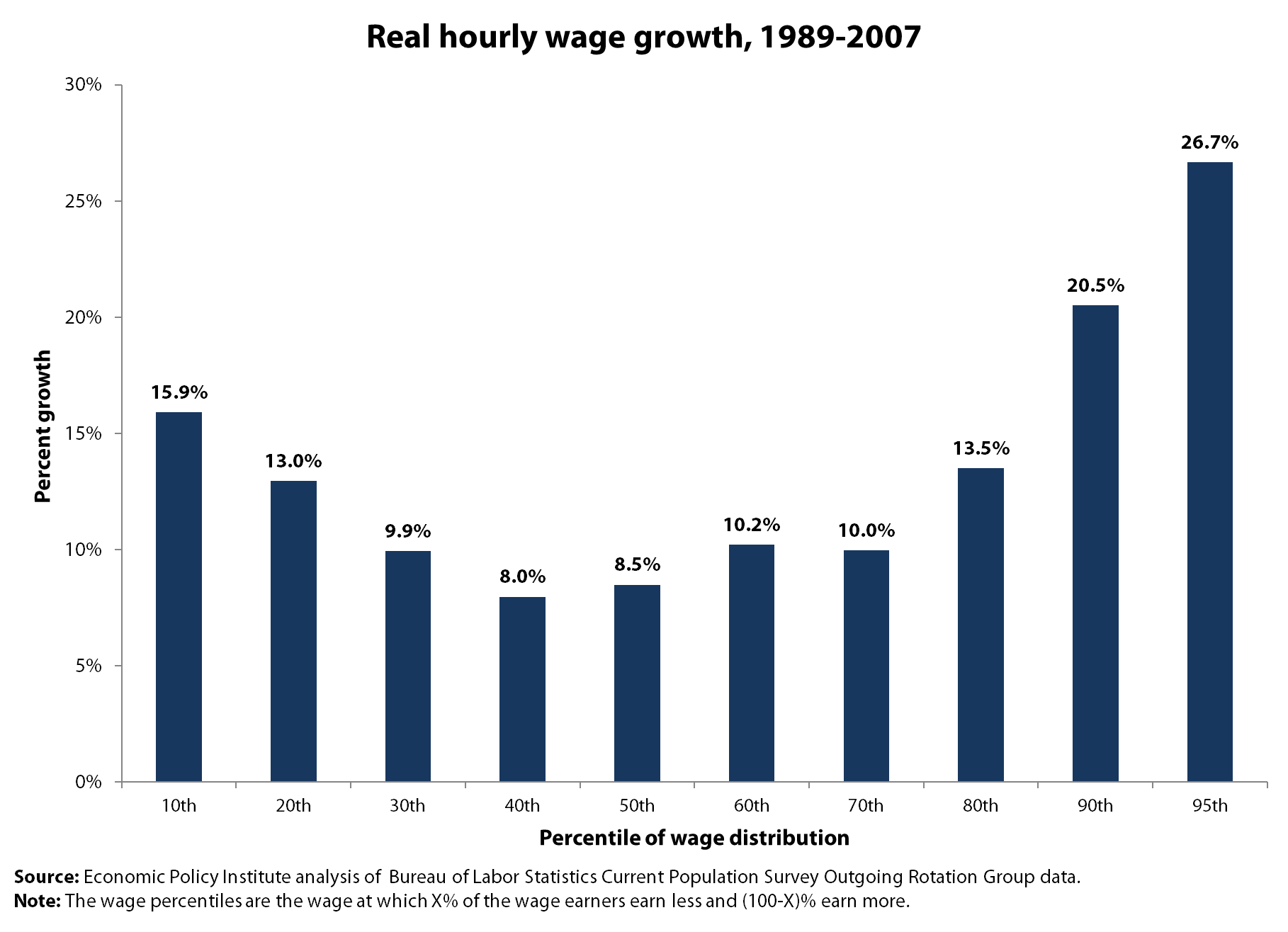
In terms of wage growth, the bottom 20 percent saw faster growth than the middle, the entire middle from the 30th to the 70th percentiles saw comparable wage growth of about 10 percent, and the best wage growth starts at the 90th percentile and is even better at the 95th percentile (growing 26.7 percent). So, if there’s a divide here, it starts at the upper 10 percent and there’s a great commonality among the bottom 90 percent. By the way, almost all of the wage growth for the bottom 90 percent occurred in the late 1990s boom from 1995 to 2000. Last, there was a period when the fortunes of the bottom 20 percent (not 30 percent) fared far worse than the broad middle, but that was in the 1980s.
But what about the top 1 percent? For that we need to look at Social Security wage data which allows us great detail at the top but not much within the bottom 90 percent. These are inflation-adjusted annual wage trends from 1989 to 2007:
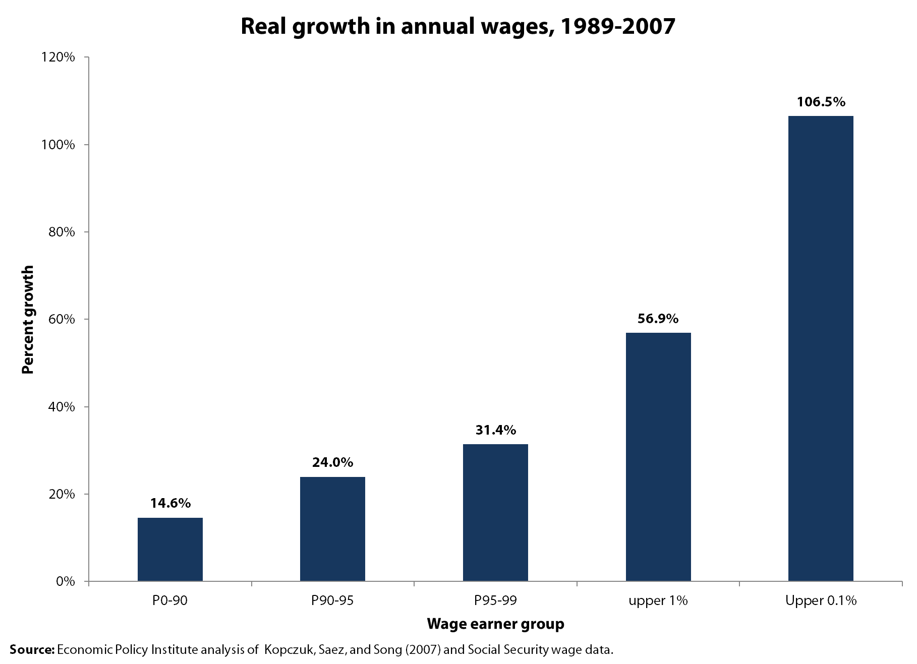
Looks to me like the top 1 percent fared remarkably better than everybody else and that the top 0.1 percent, with 106.5 percent wage growth really distinguished themselves. These wage trends put the top 1 percent with wages 20 times that of those in the bottom 90 percent, up from ratios of 15-to-1 in 1989 and 9.4-to-1 in 1979.
Perhaps Brooks was referring to household incomes and not to individual workers’ wages, so let’s turn to CBO data on income growth (pre-tax) between 1989 and 2007. (CBO provides income levels for each fifth and the top 10 percent, top 5 percent and top 1 percent, and I have deduced the trends for other categories to flesh out the picture).
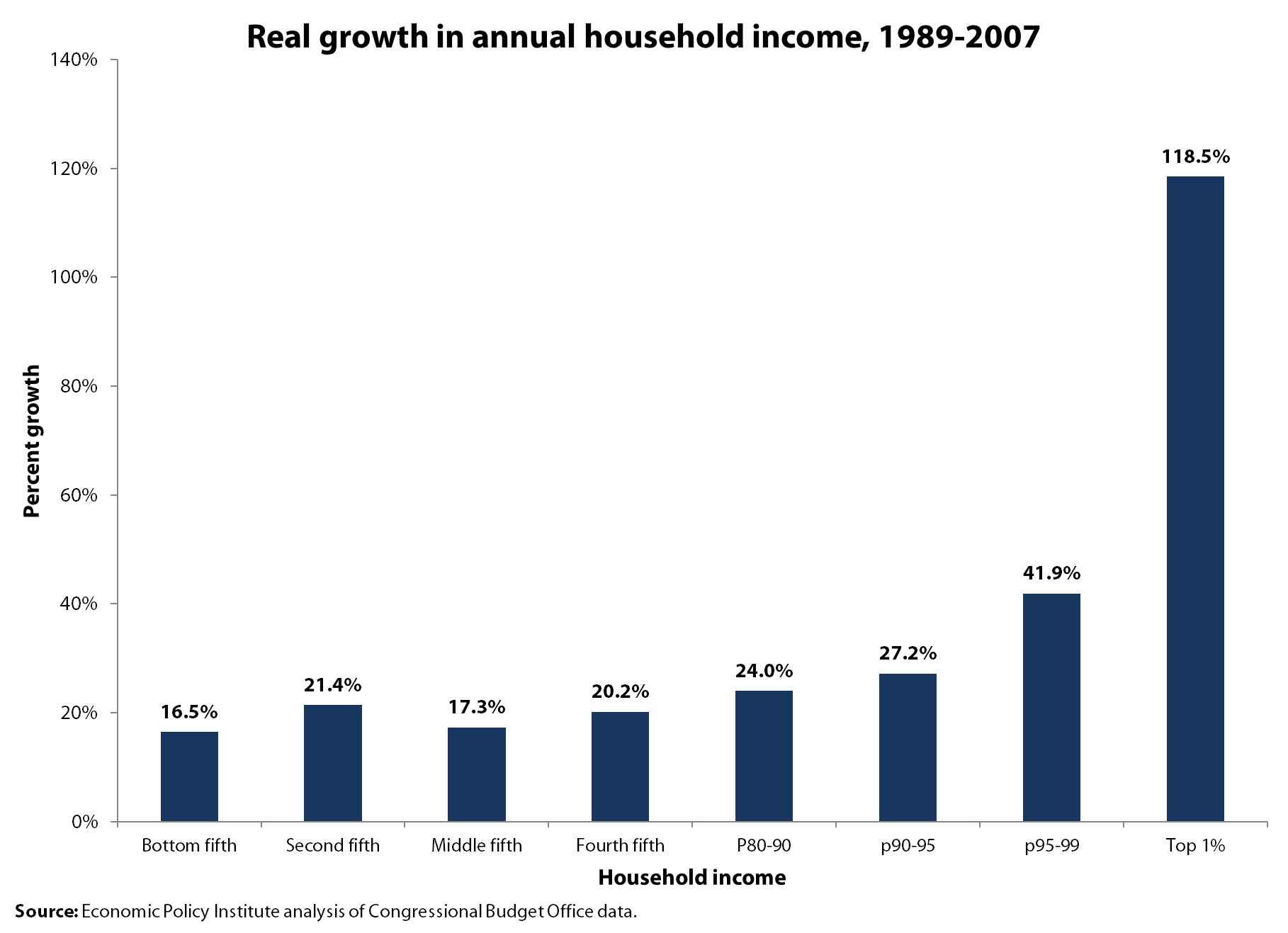
The income trends for the bottom 95 percent vary but look pretty similar across the bottom 80 percent (from 16.5 in the lowest fifth to 20.2 percent in the fourth fifth, with the middle fifth faring essentially the same as the bottom). If anything sticks out, it’s the 118.5 percent income growth of the top 1 percent, whose incomes grew four times as fast as those in the bottom three-fourths of the group Brooks wants to label privileged—the top fifth. The income divide that Brooks sees does not appear in our world, at least from what we can learn from wage or income data.
‘Increase and Index the Minimum Wage Week’
It’s not easy to have a week named in honor of a worthy cause, but this week has turned into “Increase and Index the Minimum Wage Week.” In Connecticut, House Speaker Chris Donovan has announced his support for a two-step increase in the state’s minimum wage to $9.75, with indexing after that. In New York, Speaker Sheldon Silver introduced a bill to raise the minimum wage there to $8.50 with indexing after that. And here at EPI, my colleague Mary Gable and I released a paper documenting the positive economic impact of a proposed increase in the Illinois minimum wage. A 2011 proposal to increase the Illinois minimum wage over a four-year period to $10.65 would have put nearly $4 billion in the hands of minimum-wage earners in Illinois, in turn creating approximately 20,000 new jobs (similar forthcoming 2012 legislation would do the same). As if all that wasn’t enough, yesterday we had GOP presidential candidate, Mitt Romney, speaking in favor of indexing the minimum wage.
Of course, this is not a new suggestion. EPI Economist Heidi Shierholz wrote in 2009 that we should “Fix it and Forget it.” And the concept is pretty simple: Rather than having earnings of minimum-wage earners eroded by inflation, let’s put a mechanism in place to ensure that our lowest-paid workers keep up with the increased costs of meeting basic needs. (As seen in the figure, the minimum wage doesn’t have a very good track record of even meeting the federal poverty level, which we know to be a very inadequate measure of what it takes to make ends meet.)

Ten states already have some sort of indexing, including eight states that had automatic increases Jan. 1. Given the disconnect between wages (generally stagnant at the lower end) and both corporate profits and productivity (both doing very well, thank you), it seems that increasing the minimum wage and indexing it to inflation is a very modest proposal. It’s also a small step that can be taken to address the growing income disparity that has drawn so much attention in recent months.
Tracking GDP and jobs: When repeating the same thing over and over actually provides useful information
Following the release of last week’s report on GDP growth, I wrote the following for a press advisory:
“Gross domestic product grew in the fourth quarter of 2011 at the fastest rate since the first half of 2010 – but any celebration should be muted. The 2.8% growth rate for the quarter was well below expectations and the year-round growth rate for 2011 was only 1.7%, a rate that would not generate reliable declines in unemployment should it continue…”
And the GDP report before that one I wrote*:
“The Bureau of Economic Analysis reported today that the economy grew by 2.5% in the most recent quarter – meaning that it has grown by only 1.6% over the last full year – this sluggish growth is the root cause of the stubbornly high unemployment rate we’ve seen over that time. While a double-dip recession does not seem to be in the cards, this does not by a longshot mean that the economy is healthy.”
And the one before that one I wrote:
“Gross domestic product grew at a 1.3% rate in the second quarter of 2011 and has averaged just 1.6% growth for the entire first half of 2011. This anemic growth is why the unemployment rate stopped falling and actually began rising during these same six months. Worse, the rush to fiscal austerity will make the problems of slow growth and joblessness even worse.”
In short, I’ve been pretty boring over this time in my reactions to subsequent data releases. Take a look at the jobs day releases from my colleague Heidi Shierholz and you’ll see a similar blizzard of same-old-same-old calls that job growth is positive but not fast enough blah blah blah.
But, this week’s update by the Congressional Budget Office of their potential GDP series lets me show why this unvarying string of negativity is actually informative; we just aren’t recovering. The figure below plots the ratio of actual GDP to potential GDP – with potential GDP being the amount of economic output we’d be producing if all workers and factories were fully employed. The gap between these two series (creatively named “the output gap”) is a measure of how far away we are from full recovery. And for the past year or more we have made essentially no progress on this front. Another way to put this is “zero is not the magic number” – GDP (or employment) growth can come in positive forever without actually moving the economy any closer to full recovery. And each month/quarter/year that we do not close the gap between actual and potential GDP is another month/quarter/year that we’re simply leaving hundreds of billions of dollars on the table (cumulatively around $3 trillion and counting since the start of the recession).

So, given this, would writing more unpredictable reactions to each new data release over the past year actually have been informative? Or misleading?
*Note that these “quick takes” were reactions to “advance” estimates of GDP – the growth rates for these quarters have since been revised by BEA.
SNAP for the economy
Today, Congresswoman Rosa DeLauro held a press conference to discuss food stamps and the critical role they play in our economy. She asked several experts, including myself, to discuss the role of food stamps in helping people and helping the economy. I’ve summarized my comments below:
First, food stamps help people. About 46 million people participate in the Supplemental Nutrition Assistance Program (SNAP), which translates into over 1 in 7 Americans who use food stamps. Nearly 75 percent of SNAP participants are in families with children, and more than one-quarter of participants are in households with seniors or people with disabilities. Food stamps primarily help children – roughly 50 percent of those on food stamps are under the age of 18. Over 40 percent of all recipients live in households where family members are employed.
Food stamps go to people truly in need. To be eligible, households have to make a gross income below 130 percent the poverty line and a net income (once all deductions are applied) of less than 100 percent of the poverty line. The average monthly allowance is about $130 per person. In 2010, these modest payments kept over 5 million people out of poverty.
Second, food stamps provide extremely effective support for the overall economy. Food stamps go to people that are cash strapped, by definition, which means they spend the money right away, putting the cash received directly back into local businesses and grocery stores. Nearly all macroeconomic forecasters agree that food stamps are among the most effective forms of fiscal support to create economic activity and jobs.
Third, SNAP is a very efficient program, with 92 percent of SNAP benefits going directly to people to spend on food (the remainder is low administrative costs of running the program, determining eligibility, and the like, and other food assistance). When the money goes to people, they spend it and stimulate the economy on the order of $1.5 to 1.7 for every dollar spent. This means that the $78 billion spent on food stamps in 2011 led to $115 billion in overall economic activity.
Finally, SNAP swelled because the economy entered the worst recession since the Great Depression and remains severely depressed even 18 months after the official recovery began. And this expansion of SNAP was a good thing – benefits keep 5 million people out of poverty and are universally considered some of the most effective fiscal support available to help an economy that is projected to see unemployment rates above 8 percent until 2015. Cutting these benefits would simply be a mistake for families and a mistake for the economy.
Jobs are a top priority in this country at this time. If our main goal is to create jobs, we need to stimulate demand. To stimulate demand, we need to put money in the hands of people who will spend it. One of the more efficient and effective ways to put money in the hands of people who will spend it is food stamps.
Obama’s SOTU claim is right: Regulations can improve the free market
Rules to prevent financial fraud or toxic dumping or faulty medical devices — these don’t destroy the free market. They make the free market work better. — President Obama, State of the Union Address, 1/24/12
Over the past year, discussion over regulations has frequently been distortedly one-sided, as if their only possible effect on the economy and markets is to cause damage. The Obama administration itself has often failed to add balance to this conversation, so it was heartening to see the president lay out a more comprehensive assessment in his State of the Union address.
In the address, President Obama focused most on the financial crisis and regulations. He, appropriately, stated that the roots of the economic collapse and ongoing economic troubles included regulatory inadequacy: “In 2008, the house of cards collapsed. We learned that mortgages had been sold to people who couldn’t afford or understand them. Banks had made huge bets and bonuses with other people’s money. Regulators had looked the other way, or didn’t have the authority to stop the bad behavior.”
So the effective implementation of strong financial regulations can not only provide needed protections to individual borrowers and savers, they can also abet financial stability, in all these ways making the free market “work better.”
A fuller version of the President’s claim would also include the following reasons why regulations can help the free market work better and help the economy.
- Even outside of the financial sector, weak or absent regulations can be a direct threat to the economy and employment. Inadequate regulation contributed to the BP oil spill and its substantial economic costs. Inadequate regulation can also undercut the faith of consumers in an industry’s products because when dangerous products are being produced the public is naturally less likely to buy them. This story recently applied to the food industry. In the wake of too many product horror stories and weak regulation, the food industry supported stronger regulations in the form of the Food Safety Modernization Act of 2010.
- Regulations can have broad economic benefits that may not be apparent at first blush. Clean air regulations, for instance, significantly improve the health of workers and children, resulting in lower health care costs and more productive workers.
- Regulations often spur technological innovations that boost productivity. Michael Porter of Harvard Business School—a self-described Republican and an eminent specialist on how companies and nations compete—has hypothesized that properly designed environmental regulations can lead to so much innovation that they completely offset the costs of compliance.
- Regulations ensure that firms do not act in ways that place unacceptable costs on those outside the firm, or on the society as a whole; these “externalities” are themselves a form of “market failure.” For example, economists would say that much of the externality (or external costs) of air pollution has been overcome with regulations designed to correct this market failure (a term which refers to any market result that does not result in optimal results for society). Once, manufacturers could pollute the air at will. With regulations, laws now require manufacturers to reduce pollutants and to incorporate into their production processes the costs of disposing of waste. This has benefited both the public at large as well as the private sector (companies benefit, for instance, when their workers are not breathing polluted air caused by other firms).
- The direct cost of complying with regulations translates into increased employment. For example, an environmental regulation will mean more jobs for those engaged in pollution abatement. Further, it is possible that regulations may produce more labor-intensive production processes. Compliance can particularly benefit job creation when labor markets are slack, and companies generally have substantial surplus cash, as is now the case; companies do not have to divert such spending from other investments, and plenty of workers are available to meet any increases in demand.
This isn’t to suggest that the only potential effect of any regulation is to improve free markets, but it is to suggest that the relationship between regulations and the market is a complicated one, and frequently positive. For those interested in more detail, please see this report from a year ago on the role of regulations and the economy.
Bush-era tax cuts remain the obstacle to fiscal sustainability
Earlier this week, the Congressional Budget Office released its Jan. 2012 Budget and Economic Outlook, which showed a sustainable fiscal outlook over the next decade provided Congress leaves the budget on autopilot. The current law baseline—the legislated status quo—depicts the budget deficit averaging only 1.5 percent of GDP over the next decade (fiscal years 2013-22), public debt peaking at 75.1 percent of GDP in FY2013, and the public debt-to-GDP ratio gradually falling to a more-than-sustainable 62.0 percent of GDP by FY2022. This picture is not perfect—the fiscal drag from the debt ceiling deal and expiring tax provisions is projected to slow growth to an anemic 1.1 percent of GDP in 2013 (and unemployment projections were raised half a percentage point across the decade)—but it is certainly fiscally sustainable in the out years, after the economy has recovered.
And the single biggest policy threat to this sustainable fiscal outlook? Congress might extend all the George W. Bush-era tax cuts over the next decade, to the tune of $4.4 trillion over a decade. That’s $3.8 trillion (-9.1 percent) in revenue loss and $657 billion (+15.5 percent) in additional debt service. Yes, deficit-financed tax cuts increase spending. CBO’s current law baseline projects cumulative budget deficits of $3.1 trillion, so continuing the Bush-era tax cuts would more than double the scope of fiscal stress. (These calculations assume that Congress will continue patching the alternative minimum tax and attribute a $1.1 trillion interaction between the policies to the Bush tax cuts, which pushed more households into the AMT, significantly increasing the cost of the AMT patch.) Measured differently, the hefty opportunity cost of the Bush-era tax cuts averages 1.9 percent of GDP in revenue loss and another 0.3 percent of GDP in increased interest spending over 10 years.

Under current law, the budget will begin running sustained primary surpluses (where revenue exceeds non-interest spending) starting in FY2015. If Congress patches the AMT, primary surpluses begin in 2017. If the Bush tax cuts are extended, the budget never reaches primary balance. (Primary balance is a common metric for sustainability: while it does not necessarily stabilize debt as a share of GDP—which depends on interest rates, outstanding debt levels, and GDP growth—it’s a decent approximation.)
The Bush tax cuts remain expensive, ineffective, and unfair, and permanently extending even a portion of them—which President Obama proposes to do for 98 percent of households—makes it difficult to adequately fund public investments, economic security programs, and national security spending. Congress and the public have to accept that the federal government must either collect significantly more revenue (above that projected under current law) or renege on commitments insuring that seniors, the poor, and the disabled are provided with health care and a degree of retirement security. Like it or not, we can’t afford the New Deal, the Great Society, and the Bush tax cuts.