Disability and Employment Revisited
Alarming statistics that show large declines in the employment and labor force participation of Americans with disabilities are often cited to support the claim that workers in poor health but able to work are increasingly opting out of the workforce to claim disability benefits. However, these statistics don’t account for a weak labor market, an aging population, the rise in women’s labor force participation, or problems with self-reported disability measures. If one takes these factors into account, there’s no evidence that more workers with comparatively mild impairments are exiting the workforce to claim disability benefits.
The American Institutes of Research (AIR) has a new report by Michelle Yin and Dahlia Shaewitz showing that the labor force participation of Americans with disabilities fell from 25 percent in 2001 to 16 percent in 2014, based on data from the Current Population Survey Annual Social and Economic Supplement conducted by the U.S. Census Bureau (CPS-ASEC—henceforth CPS). Tying this to a broader decline in the labor force participation of working-age adults, the authors warn that “this situation leaves the United States with an even smaller pool of workers to support the recovering economy. “
In the same vein, a recent op-ed in the Wall Street Journal by Andrew Biggs of the American Enterprise Institute cites a “nearly 50 percent decline in the employment rate of Americans with disabilities since 1981.” Echoing critiques of the Social Security Disability Insurance (SSDI) program I’ve discussed in earlier blog posts, Biggs attributes the problem to “looser eligibility standards and stagnating wages that made disability benefits, averaging $1,222 a month for new beneficiaries last year, more attractive relative to work for the less-skilled.” Though Yin and Shaewitz appear more concerned with the plight of people with disabilities than with criticizing SSDI, they also suggest that the “growing number of discouraged workers with disabilities may be a result of policies that unintentionally make it easier to leave the workforce or stay out altogether.”
Pope Francis reminds us that our economic systems should reflect our moral values
During his first visit to the United States, Pope Francis is expected to address economic issues like inequality and poverty, continuing his criticism of trickle-down economic policy. These are issues that affect the lives of everyday Americans: wages for the vast majority of workers in the United States have been stagnant for 35 years despite growing productivity, lawmakers continue to chip away at workers’ right to unionize, and the gulf between top earners and the rest of the nation continues to grow.
While many have lauded Pope Francis for consistently discussing economic inequality and poverty, some on the right have been less enthusiastic. In response to the pope’s encyclical on poverty and the environment, Jeb Bush, for example, remarked, “I don’t get economic policy from my bishops or my cardinal or my pope. I think religion ought to be about making us better as people and less about things that end up getting in the political realm.”
Bush’s dismissal of the pope’s positions on economic issues not only contradicts his earlier claims about the relationship between religion and politics, but also ignores the history of his own church. Far from emerging from a vacuum, Pope Francis is continuing a tradition of Catholic social teaching that stretches back to Pope Leo XIII’s 1891 encyclical on the conditions facing working people. And this attempt to respond to economic and labor issues from a Christian framework is also not solely Catholic. At the same time Pope Leo XIII’s encyclical entered the intellectual sphere, American Protestants like Washington Gladden (a pastor and prominent early thinker of what would become the Social Gospel) were also working to address the conditions of working people through Christianity.
In Virtually Every State, the Poverty Rate is Still Higher than Before the Recession
Between 2013 and 2014, the poverty rate in most states was largely unchanged, according to yesterday’s release of state poverty statistics from the American Community Survey (ACS). While the poverty rate fell slightly for the country as a whole, most of the changes at the state level were too small to signify a meaningful difference. As of 2014, only two states—North Dakota and Colorado—have poverty rates at or below their 2007 values, before the Great Recession.
From 2013 to 2014, the national poverty rate, as measured by the ACS, fell from 15.8 percent to 15.5 percent. Poverty rates declined in 34 states plus the District of Columbia, but only five of these changes were large enough to signify a measurable difference: Mississippi (-2.5 percentage points), Colorado (-1.0 percentage points), Washington, (-0.9 percentage points), Michigan (-0.8 percentage points), and North Carolina (-0.7 percentage points). (A number of other states had similar reductions in their poverty rates, but the sample sizes for these states are too small to tell whether these changes were statistically significant.) Alaska was the only state where the poverty rate increased significantly, rising from 9.3 percent to 11.2 percent.
The lack of improvement in state poverty rates echoes the trends we’ve seen in household income. However, the data suggest that the lack of real income growth over the past decade and a half has been even more pronounced for households at the bottom of the income scale. As of 2014, 38 states had lower median household income than in 2000, yet 47 states—nearly the entire country—had higher poverty rates in 2014 than in 2000.
State-Level Data Show Incomes Continue to Stagnate in Households Across the Map
Thursday’s release of state income data from the American Community Survey (ACS) showed that the gradual improvement in state economies from 2013 to 2014 brought little change in overall economic conditions for households in most states. The ACS data showed a slight increase in median household income for the United States overall and similar modest increases in household incomes in a majority of states—although only a handful of these increases were statistically significant.
By and large, what little improvement in household incomes occurred tended to be in states where incomes were already relatively high or where the oil and gas boom has fueled growth. Higher income states in New England and the mid-Atlantic, as well as Washington state, experienced modest gains, while incomes elsewhere were essentially flat. Kentucky (-2.6 percent) was the only state where household incomes significantly fell.
After adjusting for inflation, the largest year-over-year percentage gains occurred in Maine (+3.6 percent), Washington (+3.4 percent), Connecticut (+2.7 percent), and Colorado (+2.5 percent). The District of Columbia (+4.3 percent), North Dakota (+4.2 percent), and Mississippi (+2.8 percent) also had relatively large increases, although these changes were not statistically significant.
Workers 65 and Older Are 3 Times as Likely to Die From an On-the-Job Injury as the Average Worker
As the Boomers age and retirement insecurity forces workers to delay retirement, workers 55 and older are a growing part of the workforce. In 2014, older workers were 21 percent of the adult workforce based on hours worked—8 percentage points higher than their 13 percent share in 2000.
One unfortunate effect of this increased labor force participation is an increased exposure to workplace hazards, and with hazards come injuries and even death. Older workers are much more likely to be the victims of fatal occupational injuries than are younger workers. In 2014, nearly 35 percent of all fatal on-the-job injuries (1,621 of 4,679) occurred among the 21 percent of the workforce age 55 or older. The fatality rate for workers 65 and older is especially high—three times that of the overall workforce.
In the last year there was an alarming 9 percent increase in fatal workplace injuries among workers 55 and older, and a 17.7 percent increase among workers 65 and older. Nationwide, among all age groups, fatal workplace injuries rose from 4,585 in 2013 to 4,679 in 2014, an increase of 94 deaths. The increase in deaths among workers age 65 and older more than accounted for the entire increase in fatal on-the-job injuries.
Poverty Day Numbers Show the Need for Higher Wages
This post originally appeared on Spotlight on Poverty and Opportunity.
This morning, the US Census Bureau released annual income and poverty data showing essentially no change in the economic status of low- and middle-income households from 2013 to 2014. Despite an improving economy, the same proportion of Americans is still struggling to make ends meet. This lack of improvement in the poverty rate illustrates one of the chief catalysts behind America’s persistent poverty: stagnant wage growth that has left too many people without the means to support themselves and their families.
The official US poverty rate for 2014 was 14.8 percent. This is slightly higher than the official poverty rate reported for 2013 last year; however, last year the Census Bureau redesigned the survey that determines the poverty rate. For last year’s release, Census used both the new and old surveys in parallel, but only reported the results from the old survey. This year, they released the 2013 values from the new survey, which showed a poverty rate in 2013 of 14.8 percent—the same rate reported for 2014 in this year’s release. In 2014, the share of the population in deep poverty – with incomes less than half the poverty line – was 6.6 percent, and the share of families with income less than twice the poverty line was 33.4 percent.
This is the second year in a row that the Census Bureau’s statistics have shown that 1 in 7 American families – roughly 47 million people – have incomes too low to meet the government’s official threshold for basic subsistence, a measure long recognized as inadequate for assessing true economic need. For 2014, the poverty line for a family of four was $24,418; alternative measures show that families require far higher levels of income to achieve modest economic security, even in the country’s least expensive areas.
Wrong Question Answered Badly: Industry Data Can’t Be Used To Infer Individuals’ Productivity
In the debate over the relationship between economy-wide productivity and typical workers’ pay the numbers are clear: typical workers’ pay hasn’t come close to keeping up with productivity, and a wide gap between the two has developed. There has been no credible challenge to this basic finding.
Some have moved past the debate over the numbers to argue that this divergence is not a sign that the economy, and economic policy, is failing these workers. Instead, they argue that the underlying productivity of most workers must have stagnated, and that it is their productivity stagnation that has driven their wage stagnation. This essentially argues that relatively stagnant pay for typical workers is because most Americans are no more productive now than decades ago, and hence did not deserve to see gains in hourly pay in recent decades. A corollary to this argument is the notion that the pay and productivity divergence therefore requires no policy response other than attempting to raise workers’ productivity.
We noted in our recent paper the glaring lack of any actual evidence for the claim that most workers have not become more productive in the past three decades. In fact, most evidence (which we’ll highlight a bit later) indicates that most American workers have become substantially more productive over time. However, in a recent blog post, Evan Soltas claims to have marshalled evidence indicating that most American workers have not seen productivity gains in recent years. Soltas’ conclusion that most American workers must not have become more productive in recent decades is predicated upon looking at industry-level measures of productivity and average pay. He claims to have found a strong correlation between the growth of industry productivity and industry pay, and then claims this (somehow) implies that we know the divergence between economy-wide productivity and typical workers’ pay must, therefore, have been driven by the failure of typical workers to become more productive in recent decades.
We explain in this post why his suggested empirical test for assessing this question is actually meaningless, and will also show how the execution of his test is flawed, and his empirical conclusions (which would be irrelevant in any case) are false. Estimated correctly, there is no correlation between industry productivity and average industry pay. More importantly, even if there was such a correlation, this would be entirely uninformative about the underlying productivity of individuals. In short, Soltas asked the wrong question and then answered it incorrectly.
The Real Stakes for This Week’s Fed Decision on Interest Rates
This piece originally appeared in the Wall Street Journal’s Think Tank blog.
The case against the Federal Reserve raising short-term interest rates at the end of the Federal Open Market Committee meetings Thursday is so clearly strong that is should carry the day. The point of raising rates is to rein in an overheating economy that is threatening to push inflation outside the Fed’s comfort zone. But inflation has been running below the Fed’s target for years—and its recent moves have been down, not up.
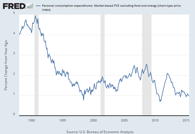
This subdued price inflation is not a puzzle; it’s the outcome of a labor market that remains so slack that nominal wage growth is running about half as fast as a healthy recovery would be churning out. And this slack is pretty easy to see so long as one is willing to look past the (welcome) progress in reducing the headline unemployment rate. The employment-to-population ratio of prime-age adults (25 to 54 years old) has recovered less than half of its decline during the Great Recession. Worse, progress in boosting this measure has stalled for all of 2015.
Nominal wage growth has been far below target in the recovery: Year-over-year change in private-sector nominal average hourly earnings, 2007-2016
| All nonfarm employees | Production/nonsupervisory workers | |
|---|---|---|
| Mar-2007 | 3.59% | 4.11% |
| Apr-2007 | 3.27% | 3.85% |
| May-2007 | 3.73% | 4.14% |
| Jun-2007 | 3.81% | 4.13% |
| Jul-2007 | 3.45% | 4.05% |
| Aug-2007 | 3.49% | 4.04% |
| Sep-2007 | 3.28% | 4.15% |
| Oct-2007 | 3.28% | 3.78% |
| Nov-2007 | 3.27% | 3.89% |
| Dec-2007 | 3.16% | 3.81% |
| Jan-2008 | 3.11% | 3.86% |
| Feb-2008 | 3.09% | 3.73% |
| Mar-2008 | 3.08% | 3.77% |
| Apr-2008 | 2.88% | 3.70% |
| May-2008 | 3.02% | 3.69% |
| Jun-2008 | 2.67% | 3.62% |
| Jul-2008 | 3.00% | 3.72% |
| Aug-2008 | 3.33% | 3.83% |
| Sep-2008 | 3.23% | 3.64% |
| Oct-2008 | 3.32% | 3.92% |
| Nov-2008 | 3.64% | 3.85% |
| Dec-2008 | 3.58% | 3.84% |
| Jan-2009 | 3.58% | 3.72% |
| Feb-2009 | 3.24% | 3.65% |
| Mar-2009 | 3.13% | 3.53% |
| Apr-2009 | 3.22% | 3.29% |
| May-2009 | 2.84% | 3.06% |
| Jun-2009 | 2.78% | 2.94% |
| Jul-2009 | 2.59% | 2.71% |
| Aug-2009 | 2.39% | 2.64% |
| Sep-2009 | 2.34% | 2.75% |
| Oct-2009 | 2.34% | 2.63% |
| Nov-2009 | 2.05% | 2.67% |
| Dec-2009 | 1.82% | 2.50% |
| Jan-2010 | 1.95% | 2.61% |
| Feb-2010 | 2.00% | 2.49% |
| Mar-2010 | 1.77% | 2.27% |
| Apr-2010 | 1.81% | 2.43% |
| May-2010 | 1.94% | 2.59% |
| Jun-2010 | 1.71% | 2.53% |
| Jul-2010 | 1.85% | 2.47% |
| Aug-2010 | 1.75% | 2.41% |
| Sep-2010 | 1.84% | 2.30% |
| Oct-2010 | 1.88% | 2.51% |
| Nov-2010 | 1.65% | 2.23% |
| Dec-2010 | 1.74% | 2.07% |
| Jan-2011 | 1.92% | 2.17% |
| Feb-2011 | 1.87% | 2.12% |
| Mar-2011 | 1.87% | 2.06% |
| Apr-2011 | 1.91% | 2.11% |
| May-2011 | 2.00% | 2.16% |
| Jun-2011 | 2.13% | 2.00% |
| Jul-2011 | 2.26% | 2.31% |
| Aug-2011 | 1.90% | 1.99% |
| Sep-2011 | 1.94% | 1.93% |
| Oct-2011 | 2.11% | 1.77% |
| Nov-2011 | 2.02% | 1.77% |
| Dec-2011 | 1.98% | 1.77% |
| Jan-2012 | 1.75% | 1.40% |
| Feb-2012 | 1.88% | 1.45% |
| Mar-2012 | 2.10% | 1.76% |
| Apr-2012 | 2.01% | 1.76% |
| May-2012 | 1.83% | 1.39% |
| Jun-2012 | 1.95% | 1.54% |
| Jul-2012 | 1.77% | 1.33% |
| Aug-2012 | 1.82% | 1.33% |
| Sep-2012 | 1.99% | 1.44% |
| Oct-2012 | 1.51% | 1.28% |
| Nov-2012 | 1.90% | 1.43% |
| Dec-2012 | 2.20% | 1.74% |
| Jan-2013 | 2.15% | 1.89% |
| Feb-2013 | 2.10% | 2.04% |
| Mar-2013 | 1.93% | 1.88% |
| Apr-2013 | 2.01% | 1.73% |
| May-2013 | 2.01% | 1.88% |
| Jun-2013 | 2.13% | 2.03% |
| Jul-2013 | 1.91% | 1.92% |
| Aug-2013 | 2.26% | 2.18% |
| Sep-2013 | 2.04% | 2.17% |
| Oct-2013 | 2.25% | 2.27% |
| Nov-2013 | 2.24% | 2.32% |
| Dec-2013 | 1.90% | 2.16% |
| Jan-2014 | 1.94% | 2.31% |
| Feb-2014 | 2.14% | 2.45% |
| Mar-2014 | 2.18% | 2.40% |
| Apr-2014 | 1.97% | 2.40% |
| May-2014 | 2.13% | 2.44% |
| Jun-2014 | 2.04% | 2.34% |
| Jul-2014 | 2.09% | 2.43% |
| Aug-2014 | 2.21% | 2.48% |
| Sep-2014 | 2.04% | 2.27% |
| Oct-2014 | 2.03% | 2.27% |
| Nov-2014 | 2.11% | 2.26% |
| Dec-2014 | 1.82% | 1.87% |
| Jan-2015 | 2.23% | 2.01% |
| Feb-2015 | 2.06% | 1.71% |
| Mar-2015 | 2.18% | 1.90% |
| Apr-2015 | 2.34% | 2.00% |
| May-2015 | 2.34% | 2.14% |
| Jun-2015 | 2.04% | 1.99% |
| Jul-2015 | 2.29% | 2.04% |
| Aug-2015 | 2.32% | 2.08% |
| Sep-2015 | 2.40% | 2.13% |
| Oct-2015 | 2.52% | 2.36% |
| Nov-2015 | 2.39% | 2.21% |
| Dec-2015 | 2.60% | 2.61% |
| Jan-2016 | 2.50% | 2.50% |
| Feb-2016 | 2.38% | 2.50% |
| Mar-2016 | 2.33% | 2.44% |
| Apr-2016 | 2.49% | 2.53% |
| May-2016 | 2.48% | 2.33% |
| Jun-2016 | 2.64% | 2.48% |
| Jul-2016 | 2.72% | 2.57% |
| Aug-2016 | 2.43% | 2.46% |
| Sep-2016 | 2.59% | 2.65% |

*Nominal wage growth consistent with the Federal Reserve Board's 2 percent inflation target, 1.5 percent productivity growth, and a stable labor share of income.
Source: EPI analysis of Bureau of Labor Statistics Current Employment Statistics public data series
Many have asked: Would a 0.25 percent increase really do all that much harm? This is the wrong question. The literal, narrow-minded answer is: No, it wouldn’t do much harm. But the data above show that the Fed should not be tightening at all. A 0.25 percent increase is a small move in the wrong direction—but it’s still the wrong way to go.
New Census Data Show No Progress in Closing Stubborn Racial Income Gaps
Today’s Census Bureau report on income, poverty and health insurance coverage in 2014 shows that with the exception of non-Hispanic white households, median household incomes were not statistically different from 2013. Measured incomes increased among Latino (+$2,162, 5.4 percent) and Asian (+$744, 1.0 percent) households, but declined for African-American (-$497, 1.4 percent) and non-Hispanic white households (-$1,048, 1.7 percent). As a result, no progress was made in closing the black-white income gap between 2013 and 2014—the median black household has just 59 cents for every dollar of white median household income. The Hispanic-white income gap narrowed from 66 to 71 cents on the dollar. Weak income growth between 2013 and 2014 also leaves real median household incomes for all groups well below their 2007 levels. Between 2007 and 2014, median household incomes declined by 10.5 percent (-$4,137) for African Americans, 0.7 percent (-$294) for Latinos, 7.2 percent (-$4,662) for whites, and 8.8 percent (-$7,158) for Asians. Asian households continue to have the highest median income in spite of large income losses in the wake of the recession.
Note: CPS ASEC changed its methodology for data years 2013 and 2014, hence the break in the series in 2013. Solid lines are actual CPS ASEC data; dashed lines denote historical values imputed by applying the new methodology to past income trends. White refers to non-Hispanic whites, black refers to blacks alone, Asian refers to Asians alone, and Hispanic refers to Hispanics of any race. Comparable data are not available prior to 2002 for Asians. Shaded areas denote recessions. To account for the redesign of the CPS ASEC survey, when the difference between the original data for 2013 and the redesigned data for 2013 is small in magnitude (less than a 1 percent difference) and statistically insignificantly different, data for 2013 is an average of the original and redesigned data. When the difference between them is relatively large in magnitude (1 percent or greater) or statistically significantly different, we display a break in the series and impute the ratio between them to historical data. Source: EPI analysis of Current Population Survey Annual Social and Economic Supplement Historical Poverty Tables (Table H-5 and H-9)Real median household income, by race and ethnicity, 2000–2014
Year
White
Black
Hispanic
Asian
White-imputed
Black-imputed
Hispanic-imputed
Asian
White
Black
Hispanic
Asian
2000
$62,716
$40,782
$45,594
$64,932
$41,638
$44,174
2001
$61,914
$39,404
$44,879
$64,101
$40,231
$43,481
2002
$61,724
$38,201
$43,566
$69,260
$63,905
$39,002
$42,209
$74,752
2003
$61,484
$38,150
$42,464
$71,679
$63,657
$38,951
$41,141
$77,363
2004
$61,294
$37,715
$42,949
$72,064
$63,460
$38,507
$41,611
$77,779
2005
$61,570
$37,412
$43,606
$74,070
$63,746
$38,197
$42,248
$79,943
2006
$61,560
$37,541
$44,366
$75,434
$63,735
$38,329
$42,984
$81,415
2007
$62,703
$38,722
$44,160
$75,471
$64,918
$39,535
$42,785
$81,455
2008
$61,056
$37,623
$41,686
$72,169
$63,213
$38,413
$40,387
$77,891
2009
$60,093
$35,953
$41,972
$72,239
$62,216
$36,708
$40,665
$77,967
2010
$59,125
$34,876
$40,855
$69,764
$61,215
$35,608
$39,582
$75,296
2011
$58,319
$33,920
$40,650
$68,545
$60,379
$34,631
$39,384
$73,981
2012
$58,781
$34,357
$40,217
$70,769
$60,858
$35,078
$38,965
$76,381
2013
$59,212
$35,157
$41,625
$68,149
$61,304
$35,895
$40,329
$73,553
$61,304
$35,895
$40,329
$73,553
2014
$60,256
$35,398
$42,491
$74,297
The primary driving force behind the slow recovery of pre-recession income levels has been stagnant wage growth. Wages have remained essentially flat since 2000, and despite relatively strong job growth in 2014, wages were remarkably unchanged. From the start of the recovery in 2009 through 2014, real earnings of men working full-time, full-year were down for white (-1.5 percent) and Hispanic (-1.5 percent) men, but up for black men (+1.2 percent). As a result, the black-white and Hispanic-white male earnings gaps are unchanged. Black men earned 70 cents for every dollar earned by white men in 2014 (compared to 69 cents/dollar in 2009) and Hispanic men earned 60 cents on the dollar.
Note: Earnings are wage and salary income. White refers to non-Hispanic whites, black refers to blacks alone, and Hispanic refers to Hispanics of any race. Asians are excluded from this figure due to the volatility of the series. Shaded areas denote recessions. To account for the redesign of the CPS ASEC survey, when the difference between the original data for 2013 and the redesigned data for 2013 is small in magnitude (less than a 1 percent difference) and statistically insignificantly different, data for 2013 is an average of the original and redesigned data. When the difference between them is relatively large in magnitude (1 percent or greater) or statistically significantly different, we display a break in the series and impute the ratio between them to historical data. Source: EPI analysis of Annual Social and Economic Supplement Historical Income Tables (Table PINC-07)Real earnings of full-time, full-year male workers, by race and ethnicity, 2000–2014
Year
Hispanic
White
Black
2000
$43,297
$75,622
$50,021
2001
$43,233
$75,262
$50,056
2002
$44,993
$75,748
$51,204
2003
$42,687
$75,236
$50,700
2004
$43,455
$74,844
$48,483
2005
$42,785
$75,413
$50,360
2006
$43,159
$74,870
$50,088
2007
$43,194
$73,918
$48,115
2008
$44,018
$74,947
$50,067
2009
$45,072
$75,246
$51,616
2010
$44,822
$75,107
$49,494
2011
$43,511
$75,460
$52,665
2012
$44,386
$75,099
$50,186
2013
$44,438
$73,613
$52,300
2014
$44,383
$74,108
$52,236
By the Numbers: Income and Poverty, 2014
Key numbers from today’s new Census reports, Income and Poverty in the United States: 2014 and Health Insurance in the United States: 2014. All dollar values are adjusted for inflation (2014 dollars).
Earnings
Median earnings for men working full time fell 0.7 percent from 2000 to 2013. In 2014 men’s earnings fell 0.9 percent, to $50,383.
Median earnings for women working full time rose 5.4 percent from 2000 to 2013. In 2014 women’s earnings rose 0.5 percent, to $39,621.
Median earnings for men working full-time
- 2014: $50,383
- 2000–2013: -0.7%
- 2013–2014: -0.9%
Median earnings for women working full-time
- 2014: $39,621
- 2000–2013: 5.4%
- 2013–2014: 0.5%