Apple’s shine is fading
Apple is rapidly becoming the symbol of what’s wrong with our economy: a highly profitable enterprise where all the gains go to those at the top and the vast majority, including those with college degrees, struggle to get by. Saturday’s New York Times article by David Segal deepens the story beyond Apple’s complicity in exploiting Chinese manufacturing workers. According to Segal, “About 30,000 of the 43,000 Apple employees in this country work in Apple Stores, as members of the service economy, and many of them earn about $25,000 a year.”
That $25,000 annual salary works out to $12.02 an hour for someone working full-time for one year (2,080 hours paid, either for work hours or paid leave). That’s pretty low; about $1 above the “poverty-level wage” (the poverty line for a family of four in 2011 was about $23,000, equivalent to an hourly wage of $11.07). Segal’s article starts off talking about a former Apple employee, Jordan Golson, who earned just $11.25 an hour. Many of these Apple store workers are young, so one wonders how Apple wages compare with those of other young college graduates. The short answer is “not so good,” or even “terrible.” The hourly wages of young college graduates (those ages 23-29) in 2011 was $21.68 for men and $18.80 for women. To be fair, Segal notes that, “The company also offers very good benefits for a retailer, including health care, 401(k) contributions and the chance to buy company stock, as well as Apple products, at a discount,” so including benefits may offset some of the discrepancy between pay by Apple and pay by other companies. The information necessary to calculate this offset is unavailable, but it is not believable that these benefits fully or even significantly make up such a large shortfall in wages.
How do Apple store wages compare to those of all college graduates? As the table below shows, $12.02 is far below the 20th percentile wage of college graduates, the wage that 80 percent of college graduates earn more than and 20 percent make less than. That’s right, Apple’s store employees’ wages are in the bottom 20 percent of all college graduates. In fact, $12.02 is $2.24, or 16 percent, less than the 20th percentile college wage in 2011. For college-educated men, $12.02 hourly is on par with the wage earned at the 10th decile, $11.87, meaning 90 percent of college graduates earned more than that in 2011.
Hourly wage for college graduates, selected percentiles, 2011
| Percentile* | All | Men | Women |
| 10 | $ 10.80 | $ 11.87 | $ 10.12 |
| 20 | 14.26 | 15.49 | 13.09 |
| Median (50) | 23.07 | 25.96 | 20.25 |
| *The Xth percentile wage is the wage at which X percent of the wage earners earn less and (100-X) percent earn more | |||

Source: Author's analysis of Current Population Survey Outgoing Rotation Group files
It is already well-known that Apple benefits from the extremely low wages and harsh working conditions of the Chinese workers who manufacture its products. As EPI’s Ross Eisenbrey and Isaac Shapiro recently wrote, “Apple workers in China endure extraordinarily long hours (in violation of Chinese law and Apple’s code of conduct), meager pay, and coercive discipline.” Together with the mediocre pay for Apple employees, even compared with other retailers, it is clear that Apple’s success does not translate to high or rising living standards for the workers who one would hope would benefit from its success. Apple could readily afford to pay the Chinese Foxconn workers building iPhones because their costs are a miniscule part of the phone’s costs. Raising pay is not that heavy a lift for Apple: In 2011, Apple’s nine-person executive leadership team received total compensation of $441 million, equivalent to the estimated compensation of 95,000 Foxconn factory workers assembling Apple products.
The discrepancy between Apple’s profits/executive pay and its compensation to its workers is a particularly glaring example of what is occurring in the wider economy. The gap between CEO compensation and that of a typical worker is now 231-to-one, where it used to be just 58.5-to-one in 1989. Corporate profits are now higher as a share of corporate-sector income than in any year since the early 1940s when we had a War Labor Board consciously suppressing wage growth. And, this all contributes to the phenomenon that productivity—the ability to produce more goods and service per hour—has been rising rapidly but the hourly compensation of both high school and college-educated workers is totally flat. It does not look like much will change soon unless there’s a broad change of thinking among policymakers and a mobilized workforce. After all, current outcomes have been dictated by persistent high unemployment, low and weakly enforced labor standards (witness the failure of Apple to abide by California’s wage and hours law mandate of two 10-minute breaks a day, reported in the Times story), the inability of unions to set high labor standards, and the dominant political/policy influence of the wealthy and the business community. Apple’s labor practices and the overall failings of the economy have not been dictated by any economic laws. Rather, they are the result of eminently changeable public-sector policies and private-sector practices.
Supreme Court contorts itself to deny overtime protection to 90,000 pharmaceutical employees
In a 5-4 decision issued this week in Christopher v. SmithKline Beecham Corp., the Supreme Court, in its eagerness to reach a result favoring the pharmaceutical industry over its employees, abandoned the legal straight and narrow for some very sketchy shortcuts. The case concerned the application of overtime protection to medical detailers, also known as pharmaceutical representatives, employees who visit physicians and promote prescription drugs. If the detailers are “outside salesmen,” they are exempt employees and are not entitled to overtime pay.
Ignoring the plain meaning of key words, the “ordinary usage” which Justice Antonin Scalia elsewhere has claimed to favor, the court declared medical detailers to be outside salesmen because—even though they never make a sale of pharmaceuticals to anyone—they come as close to selling as the law governing their industry allows. The best the court could do in terms of identifying sales that these supposed salesmen make is to find that the detailers induce “non-binding commitments” from physicians to prescribe the drugs their pharmaceutical companies are promoting or marketing. The court found that the fact the detailers almost get commitments from these physician “gatekeepers”—without whom no one could sell the prescription drugs being promoted—is enough to treat the “transaction” as a sale. Whew, talk about bootstrapping and judicial activism! A justice could get a hernia with that kind of lifting!
But who in reality buys prescription drugs? Certainly, in any normal economic sense, it’s not the prescribing physician. There are, in fact, two parties that purchase them, and the detailers don’t sell (or even make binding commitments) to either: the retail drug stores like CVS and Walgreens, and the patients who are the end users. The court deals with sales to the drug stores in a most unsatisfactory way: It says that the people who actually make those sales are so few (2000 sales agents vs. 90,000 detailers), and their function is so rote, that we should ignore them.
The persons who make sales (exchanging money for a product) to patients are pharmacists, but the court argues that there would be no sales without the prescribing physicians, who deal with the medical detailers and have a completed transaction when they make a non-binding commitment—not to buy—but only to prescribe the drugs for appropriate patients. According to the court, this is” tantamount” to a sale.
An unfortunate lesson this case teaches is that no one knows what the law means until the Supreme Court decides the result it wants and then stretches the meaning of the statutory or regulatory language to (more or less) fit the result.
The other lesson from this decision is for the Labor Department, which had never in 60 years brought an enforcement action against a pharmaceutical company in a way that gave the industry notice that its widespread practice of denying overtime pay to detailers was unlawful. The medical detailers are relatively well paid and loosely supervised employees whose employers do not closely monitor their work time—not the classic employees we think of when we talk about overtime pay. Although there is no excuse for the tortured logic of the majority opinion, if the Labor Department had given fair notice that it disapproved the exemption of detailers, either by bringing enforcement actions over the years or even issuing consistent guidance that made its interpretation of the statute and its regulations clear, the court might have found that the exemption did not apply.
In other words, if we don’t enforce our rights, we can lose them.
Wealth losses by race and ethnicity
The Federal Reserve’s report on family wealth released last Monday illustrates how severely the Great Recession has hurt middle-class families. Median family net worth (assets minus debt) fell to levels not experienced since 1992. While all groups but the richest 10 percent of families saw declines in wealth, there was variation in the percentage decline by race.
In the Federal Reserve’s report, it is difficult to identify the specific trends for African Americans and Hispanics. While the net worth of white, non-Hispanic families are presented, all nonwhites and Hispanics are lumped together in the family net worth table. However, the report has a sentence detailing the net worth changes specifically for African American families (p. 21). By using the past few reports, we can see the recent trends for wealth in black America.
First, it is important to note the median black family only has a small fraction of the wealth of the median white family (Figure A). (The family data discussed here differs from our reported household data because families are a subset of households and the data are inflated to different years.) In 2010, the median black family only had 12 cents for every dollar of wealth the median white family had.

When one examines the percent decline in wealth from 2007 to 2010, it appears that whites have seen a greater percentage decline in wealth than blacks. White family net worth declined 27 percent over this period while black family net worth declined 13 percent (Figure B). But in the data, while white wealth peaked in 2007, black wealth peaked in 2004. As white wealth continued to grow from 2004 to 2007, black wealth had already declined significantly.

If we compare the white and black wealth declines from their most recent high points, we see white net worth down 27 percent (from 2007) and black net worth down 40 percent (from 2004). A 40 percent decline is a large drop for a population with very little wealth even at their peak.
The trend for black net worth is probably following the trend for black homeownership. For most middle-class families, their home is their primary source of wealth. African Americans have had a strong decline in homeownership since their rate peaked in 2004 (Figure C). Homeownership rates for black families are projected to drop to between 40 and 42 percent—which would erase 15 years of gains in homeownership. If this occurs, it could also mean a continued decline in black wealth.

It is not possible to determine the trends in Hispanic net worth precisely from the published Federal Reserve data. We can deduce, however, that from 2007 to 2010, Hispanic net worth probably declined about 45 percent. This decline is significantly larger than the 27 percent for whites over the same period. Even at their recent peak net worth, Hispanics, like blacks, only had a tiny fraction of the wealth that whites had. (In 2010, the median family for nonwhite and Hispanic families combined only had 16 cents for every dollar of wealth the median white family had.)
In terms of wealth, only the richest American families have come out of the Great Recession relatively unscathed. Significant declines in wealth have been broadly felt. But the losses to black and Hispanic families are particularly damaging because they are quite large, and they were experienced by groups that had very low levels of wealth even before the recession hit.
— Research assistance provided by Johnny Huynh
NLRB uses new tool to help us understand our rights
Not long ago, I blogged about the fact that our key labor law, the National Labor Relations Act, protects workers even if they don’t have a union or seek to have one represent them. When workers join together to protest working conditions, to petition management for raises or plead against pay cuts, or to report unsafe conditions to government agencies, the National Labor Relations Board backs them up. The NLRB can protect workers against retaliation by the employer, can order reinstatement for fired workers, and can obtain back pay.
It isn’t widely known, but since its inception, the National Labor Relations Act has given employees the right “to engage in … concerted activities for the purpose of collective bargaining or other mutual aid or protection.”
Now, for the first time, the NLRB has a nice-looking, somewhat interactive webpage devoted to this issue of “other mutual aid or protection.” Visitors to the site can read some heartening stories about how employers overreacted—almost always by firing someone—, to employees organizing to protest or to make a problem known to management and how the NLRB intervened to restore the job or lost wages of the workers.
It’s great to see the government helping people understand their rights and how to enforce them.
Failure to stimulate recovery is costing trillions in lost national income
In a recent blog post on the (negligible, if not nonexistent) long-run economic cost of deficit-financed fiscal stimulus at present, I noted in passing that the Congressional Budget Office (CBO) has downwardly revised potential economic output for 2017 by 6.6 percent since the start of the recession. This may seem trivial, but for a $15 trillion economy, this dip reflects roughly $1.3 trillion in lost future income in a single year, on top of years of cumulative forgone income (already at roughly $3 trillion and counting). The level of potential output projected for 2017 before the recession is now expected to be reached between 2019 and 2020—representing roughly two-and-a-half years of forgone potential income. This represents a failure of economic policy and merits considerably more attention than received, especially when weighing the benefit of near-term fiscal stimulus versus deficit reduction.
Potential output is the estimated level of economic activity that would occur if the economy’s productive resources were fully utilized—in the case of labor, this means something like a 5 percent unemployment rate rather than today’s 8.2 percent. Potential output is not a pure ceiling for economic activity, but the level of economic activity above which resource scarcity is believed to build inflationary pressures. As of the first quarter of 2012, the U.S. economy was running $861 billion (or 5.3 percent) below potential output—the shortfall known as the “output gap.” This has a number of implications for federal fiscal policy:
- Deficit-financed fiscal stimulus will have a very high bang-per-buck while large output gaps persist. The government spending multiplier is much larger in recessions than expansions (see Figure 3 of Auerbach and Gorodnichenko 2011) and the U.S. remains mired in recessionary conditions, where economic growth is insufficient to restore full employment.
- Deficit-financed fiscal stimulus is largely self-financing because every dollar of increased output relative to potential output is associated with a cyclical $0.37 reduction in budget deficits, and this feedback effect is greatly amplified by the large government spending multiplier.
- There is so much slack in the U.S. economy—i.e., supply of resources in excess of demand—that government borrowing will not “crowd-out” productive private investment; this can be seen in the near record-low 1.6 percent yield on 10-year U.S. Treasuries.
So deficit-financed fiscal stimulus is highly cost-effective, largely self-financing, has a very low opportunity cost, and poses no risk to inflation. But there is another potential benefit: closing today’s output gap can increase potential future output (thereby also increasing the ability to repay debt incurred). The reason is simple—if long bouts of inactivity leave permanent “scars” on the potentially productive resources (and they do), then the longer the economy operates below potential, the more future potential is damaged. Concretely, factories aren’t built because firms can’t even sell what existing factories are producing. Children’s educational outcomes are damaged as economic distress forces their families to move and as they lose access to decent nutrition and health. Desirable early-career jobs for recent graduates that could impart valuable skills throughout their working lives aren’t available to them, so lifetime earnings suffer. And so on.
The CBO certainly is worried about this scarring—look at the annual revisions to real potential GDP made by them since the onset of the recession: Estimates have consistently been revised downwards except between Jan. 2009 and Jan. 2010, when the deficit-financed $831 billion Recovery Act arrested economic contraction and began shrinking the output gap.

The Recovery Act, however, was nowhere near large enough to restore full employment and close the output gap—the 10-year cost of the stimulus, after all, was smaller than the annual output gaps that have persisted since 2009. As the economy has slowed as fiscal support waned, CBO’s potential output forecasts have withered as well. So why did Congress pivot from job creation (i.e., stimulus) to deficit reduction at the start of the 112th Congress?
The whole point of long-term deficit reduction, after all, is to raise future income. But failure to restore full employment decreases potential future income. Worse, while the economy remains depressed below potential output, near-term deficit reduction—particularly spending cuts—greatly exacerbate the output gap because the government spending multiplier is so high. (We’ve seen this play out across much of Europe, where government “austerity” programs have cut spending, pushed economies back into recession, pushed up unemployment, and cyclical deterioration in the budget deficit has rendered spending cuts entirely counterproductive.)
The downward revisions to potential output in CBO’s forecast reflect a failure of Congress to resuscitate the economy and restore full employment, but it’s a policy failure that can still be reversed. Fiscal stimulus can increase employment and industrial capacity utilization today and actually “crowd-in” private investment, thereby increasing today’s capital stock and future potential output. With respect to fiscal tradeoffs, cost effective deficit-financed fiscal stimulus will actually decrease the near-term debt-to-GDP ratio (the relevant metric for fiscal sustainability), whereas deficit reduction cannot raise future income until the output gap is closed and the private sector is competing with government for savings instead of plowing cash into Treasuries. The full cost of Congress’ misguided pivot from job creation to austerity is larger than even just today’s mass underemployment—trillions of dollars of potential future income will also be lost unless we pivot back to addressing the real crisis at hand.
New Fed data shows families falling even farther behind in retirement saving
The Federal Reserve just published findings from the 2010 Survey of Consumer Finances, a triennial survey of household finances. Though it’s no surprise that these took a dive with the collapse of the housing and stock bubbles, the extent of the plunge is still shocking as the median family saw their net worth fall by 39 percent between 2007 and 2010.1
By 2010, the economy had begun its slow recovery. Housing prices had leveled off and stocks rebounded, recouping about half their losses by the end of the year. But this wasn’t just a temporary setback. Households—especially younger households—were in serious trouble long before the twin asset bubbles burst.
Families headed by someone age 35 to 44—the age when workers typically start getting serious about saving for retirement—had seen declines in net worth in the wake of two previous recessions (1990-91 and 2001) without fully regaining the lost ground in the intervening years (see chart below). So the financial meltdowns that precipitated the Great Recession only exacerbated an existing problem. As a result, GenXers had only accumulated $42,100 in 2010, less than half what the Baby Boomers had accumulated at the same age adjusted for inflation (in the chart, Depression and War Babies are indicated by squares, Early Boomers by triangles, Late Boomers by circles, and GenXers by an X).2
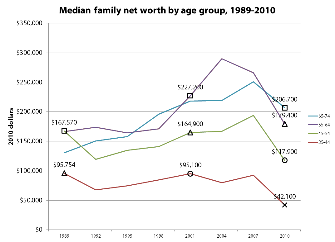
The fact that net worth declined for younger age groups even before the Great Recession is remarkable when you consider that the economy grew by a third on a per capita inflation-adjusted basis between 1989 and 2010, though this growth was not widely shared. Furthermore, families should have been saving more to make up for declines in pension coverage and Social Security benefits. As a result, the Center for Retirement Research has estimated that the average family in the broad 35-64 age range had a Retirement Income Deficit of $90,000 in 2010, a measure of how far behind they were in saving and accumulating benefits for retirement.
Even a generation that fared relatively well—the cohort born during the last years of the Great Depression and World War II—had only accumulated $227,000 as it approached retirement in 2001. This is roughly four times the median income for that age group in 2001, or enough to purchase a 20-year annuity worth $3,750 a year at a 3 percent real interest rate.3 As these Depression and War Babies began tapping their retirement savings during the boom and bust years of the new millennium, their net worth fell to $206,700 in 2010, whereas the preceding generation had seen increases in net worth during their early retirement years.
Baby Boomers fared much worse than the Depression and War Babies, lulled into complacency by asset bubbles that inflated during their prime earning years and popped as the leading edge of the Boomer generation approached retirement. Early Boomers born in the late 1940s and early 1950s saw their net worth increase by around $69,000 between 1989 and 2001 (a 4.6 percent annual rate), but only by a meager $14,500 between 2001 and 2010 (a 0.9 percent annual rate). Late Boomers fared no better, and, like GenXers, are now far behind where earlier generations had been at the same age.
Though it may be tempting to chastise families for not saving enough for retirement, most of the blame lies with former Federal Reserve Chairman Alan Greenspan and others in positions of responsibility who watched asset bubbles inflate without warning that these paper gains weren’t real, and promoted homeownership and 401(k)s as the path to a secure retirement without acknowledging the extent of the risks involved.
1. A special 2009 survey that re-interviewed families who had participated in the 2007 survey found a much smaller 19 percent drop in median net worth between 2007 and 2009.
2. The published survey results don’t allow precise tracking of generational cohorts because demographic breakdowns are by 10-year age group and the survey is conducted every three years. However, the 45-54 “Depression and War Baby” cohort in 1989 approximately corresponds to the 55-64 age group in 2001 and with the 65-74 age group in 2010, etc.
3. In practice, the typical household holds most of their wealth in the form of home equity and doesn’t annuitize liquid assets.
Another suicide at Apple’s key supplier in China
The latest suicide of a worker at Apple Computer’s Foxconn supplier plant in Chengdu, China may be another indication that Apple has not appreciably improved conditions for its manufacturing workers. Apple and Foxconn, working with the Fair Labor Association, announced that they would make changes in grueling overtime work schedules and in working conditions, including a promise to gradually come into compliance with China’s overtime laws. Yet this suicide, in conjunction with recent worker protests and new reports, suggests that needed reforms have not been made.
There are mixed reports from SACOM and China Labor Watch about whether work schedules have been reduced in any systematic way at Foxconn. Problematically, it appears that when the schedules are reduced, the reductions are not adequately balanced with hourly pay increases. So the already-inadequate monthly pay drops, leaving workers—72 percent of whom at the Chengdu plant told the FLA they could not meet their basic needs—in a desperate situation.
Ultimately, Apple has the power and moral responsibility to improve wages and conditions for Foxconn workers in Chengdu and elsewhere. Certainly, Apple and its executives can afford to do the right thing.
Congress should fix Postal Service pension problem it created
The Heritage Foundation’s latest attack on the Postal Service is a convoluted collection of half-truths and untruths. The author, David John, doesn’t want the Postal Service to benefit from $11.6 billion in overpayments it made for its pension obligations even though he grudgingly admits “this surplus appears to exist.” The overpayment should be refunded to the Postal Service to help it met its operating costs, but Heritage wants those funds locked up in the pension plan, which it claims would “follow the private-sector practice of using the current surplus—whatever it is—to defray future retirement payments.” This is baloney. When a private corporation overfunds its pension plan, it can transfer excess funds to pay retiree health obligations. In the case of USPS, it could use the funds to pay both current obligations ($2.4 billion a year) and the congressionally mandated pre-funding for future obligations ($5.6 billion a year).
When it’s inconvenient, Heritage abandons its suggestion that the Postal Service should be treated like the rest of the private sector. Private sector employers are not required to pre-fund their retiree health benefits, and most of them fund retiree health benefits on a pay-as-you-go basis. If USPS “followed the private-sector practice,” it wouldn’t contribute a nickel to the future retiree health obligations; it would pay them as they came due, yet Heritage supports a requirement that USPS “fully prefund this benefit.”
Heritage also glosses over the findings of two independent agencies that the Postal Service was treated unfairly by Congress and the Office of Personnel Management in the allocation of its pension obligations. EPI published a report in 2010 that took the same position as the Postal Service’s Office of Inspector General and the Postal Rate Commission: USPS and its ratepayers were overcharged approximately $75 billion for past service obligations, and taxpayers were undercharged the same amount. But for Congress’ misallocation of costs, the Postal Service’s short-term finances would be manageable despite the Great Recession and the growth of electronic communication and payments.
Heritage shades the truth in its claim that the Government Accountability Office “bluntly rejected” the agencies’ claims that the Postal Service had been treated unfairly. In fact, GAO admitted that the cost allocation methodology is “a policy choice” whose fairness is debatable:
“Although the USPS OIG [Office of Inspector General] and PRC [Postal Rate Commission] reports present alternative methodologies for determining the allocation of pension costs, this determination is ultimately a policy choice rather than a question of accounting or actuarial standards. Some have referred to “overpayments” that USPS has made to the CSRS fund, which can imply an error of some type—mathematical, actuarial, or accounting. We have not found evidence of error of these types. While the USPS OIG and PRC reports make judgments about fairness, the 1974 law also implicitly reflected fairness.”
GAO does not dispute that the PRC and USPS OIG methodologies for allocating the pension costs are sound, it simply prefers a different policy choice, which burdens the Postal Service:
“All three methodologies (current, PRC, and USPS OIG) fall within the range of reasonable actuarial methods for allocating cost to time periods. However, the allocation of costs between two entities is ultimately a business or policy decision.”
In its ideological zeal to see the Postal Service destroyed or dismembered, Heritage has been careless with its facts and inconsistent in its arguments.
Job chart in Romney’s economic plan seems wrong still funky
UPDATE, June 15, 11:37 a.m.: Ah, mystery of the funky-seeming Mitt Romney jobs numbers revealed (see below for my puzzlement)—it’s a measure of full-time jobs reported in the household survey. I guess half of this is my fault—they do reference the “full-time” aspect when talking about data from the 1970s—but the rest of the chart and paragraph just talk about “job growth.”
But I will note that this is the first time I’ve ever seen full-time jobs from the household survey used to measure job market performance over business cycles. And I’m not convinced it’s a useful innovation; in fact, I think it’s pretty obvious cherry-picking.
Say five people get brand-new jobs that provide 30 hours of work per week while five more see their hours cut from 40 to 34 hours. I’d say this is 120 hours of net new additional work being demanded in the economy; but using the full-time jobs from the household survey would simply say that it’s five “jobs” lost. This just doesn’t seem useful to me.
Also, since the Romney chart ends in June 2011, it might be useful to know what happened to their preferred number in the 11 months since then: 2.25 million jobs added. The industry-standard of economists measuring recessions and recoveries—the payroll survey—has 1.7 million jobs added over those same 11 months, so I do wonder which the campaign would cite if asked.
Lastly, I’d note that there is an obvious sector, full of full-time jobs, that has seen a particularly hard time since the June 2009 beginning of recovery: the public sector. Since June 2009, 600,000 state and local jobs have been lost, and in 2009, about three-fourths of these jobs were full-time.
I was asked to comment on the speech Mitt Romney made in front of the Business Roundtable, so I decided to do some light background reading: Believe in America: Mitt Romney’s Plan for Jobs and Economic Growth.
I noticed something odd in the jobs section of the plan—this chart (ripped directly from the Romney PDF):

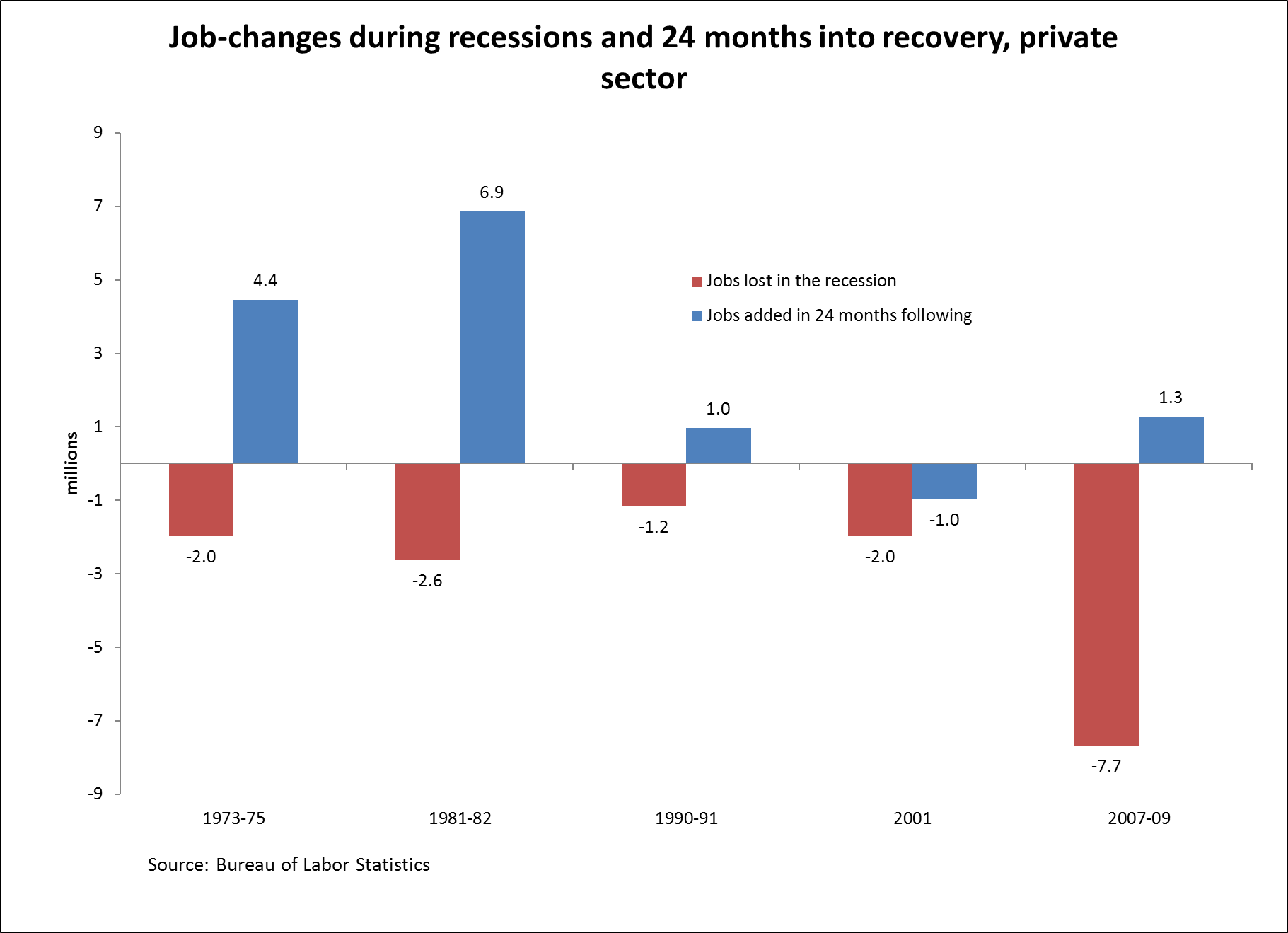
I know jobs numbers and recoveries, and these looked wrong to me. For one, the absolute peak-to-trough employment loss following 2007’s Great Recession was 8.8 million jobs (between Jan. 2008 and Feb. 2010) not the 8.9 million that the chart claims.
And given that this is the peak job loss, this means, by definition, that anything measured after this trough couldn’t be negative, as the chart implies. I also know that the U.S. economy didn’t begin adding jobs after the 2001 recession until the second half of 2003, so the 2001 numbers looked off, too.
So I decided to do the chart correctly—actually show job losses during the official recessions (i.e., not just employment peak to trough) and the 24 months following and sure enough:

Romney’s numbers are all slightly off, which is odd.
Odder is that the respective performance of the recoveries following the 2001 and 2007-2009 recession are reversed. Look closely at the the last two sets of bars in the respective figures.
The Romney chart has jobs growing in the first 24 months of recovery following the 2001 recession, but shrinking in the first 24 months following the 2007-2009 recession. That’s the opposite pattern of what actually occurred—jobs shrank for the first two years after the 2001 recession and grew modestly in the first two years after the 2007-2009 recession.
I’ll note that we also tried to match the Romney numbers with quarterly data, with household-survey employment counts, with household-adjusted-for-payroll concepts survey data … nothing worked.
A little curious as to what’s going on here.
And since there’s been lots of discussion about the relative health of the private and public sectors, here’s the correct graph for private-sector jobs only.
Update to yesterday’s blog post “Fiscal hawks’ double standard for Social Security cuts vs. tax cuts”
This is an update to yesterday’s blog post “Fiscal hawks’ double standard for Social Security cuts vs. tax cuts.”
The Committee for a Responsible Federal Budget (CRFB) subsequently updated the table in their blog post, adding a column with average scheduled (i.e., promised) initial Social Security benefits for 2050. This is certainly an improvement, but their revised table still only depicts the relative comparison between initial benefits under the Bowles-Simpson plan and payable benefits. Here’s what their table would show with the additional relative comparison between initial benefits under the Bowles-Simpson plan and scheduled benefits (the lightly shaded column).

Under the Bowles-Simpson plan, medium earners reaching the normal retirement age in 2050 would see an initial benefit cut of 6 percent relative to scheduled benefits. And as CRFB duly notes in their blog post, the Bowles-Simpson proposal to use a “chained” consumer price index for cost-of-living adjustments would further reduce all beneficiaries’ benefits in subsequent years relative to scheduled benefits—a benefit cut that compounds annually, as explained in this EPI Briefing Paper.