Job chart in Romney’s economic plan seems wrong still funky
UPDATE, June 15, 11:37 a.m.: Ah, mystery of the funky-seeming Mitt Romney jobs numbers revealed (see below for my puzzlement)—it’s a measure of full-time jobs reported in the household survey. I guess half of this is my fault—they do reference the “full-time” aspect when talking about data from the 1970s—but the rest of the chart and paragraph just talk about “job growth.”
But I will note that this is the first time I’ve ever seen full-time jobs from the household survey used to measure job market performance over business cycles. And I’m not convinced it’s a useful innovation; in fact, I think it’s pretty obvious cherry-picking.
Say five people get brand-new jobs that provide 30 hours of work per week while five more see their hours cut from 40 to 34 hours. I’d say this is 120 hours of net new additional work being demanded in the economy; but using the full-time jobs from the household survey would simply say that it’s five “jobs” lost. This just doesn’t seem useful to me.
Also, since the Romney chart ends in June 2011, it might be useful to know what happened to their preferred number in the 11 months since then: 2.25 million jobs added. The industry-standard of economists measuring recessions and recoveries—the payroll survey—has 1.7 million jobs added over those same 11 months, so I do wonder which the campaign would cite if asked.
Lastly, I’d note that there is an obvious sector, full of full-time jobs, that has seen a particularly hard time since the June 2009 beginning of recovery: the public sector. Since June 2009, 600,000 state and local jobs have been lost, and in 2009, about three-fourths of these jobs were full-time.
I was asked to comment on the speech Mitt Romney made in front of the Business Roundtable, so I decided to do some light background reading: Believe in America: Mitt Romney’s Plan for Jobs and Economic Growth.
I noticed something odd in the jobs section of the plan—this chart (ripped directly from the Romney PDF):

I know jobs numbers and recoveries, and these looked wrong to me. For one, the absolute peak-to-trough employment loss following 2007’s Great Recession was 8.8 million jobs (between Jan. 2008 and Feb. 2010) not the 8.9 million that the chart claims.
And given that this is the peak job loss, this means, by definition, that anything measured after this trough couldn’t be negative, as the chart implies. I also know that the U.S. economy didn’t begin adding jobs after the 2001 recession until the second half of 2003, so the 2001 numbers looked off, too.
So I decided to do the chart correctly—actually show job losses during the official recessions (i.e., not just employment peak to trough) and the 24 months following and sure enough:

Romney’s numbers are all slightly off, which is odd.
Odder is that the respective performance of the recoveries following the 2001 and 2007-2009 recession are reversed. Look closely at the the last two sets of bars in the respective figures.
The Romney chart has jobs growing in the first 24 months of recovery following the 2001 recession, but shrinking in the first 24 months following the 2007-2009 recession. That’s the opposite pattern of what actually occurred—jobs shrank for the first two years after the 2001 recession and grew modestly in the first two years after the 2007-2009 recession.
I’ll note that we also tried to match the Romney numbers with quarterly data, with household-survey employment counts, with household-adjusted-for-payroll concepts survey data … nothing worked.
A little curious as to what’s going on here.
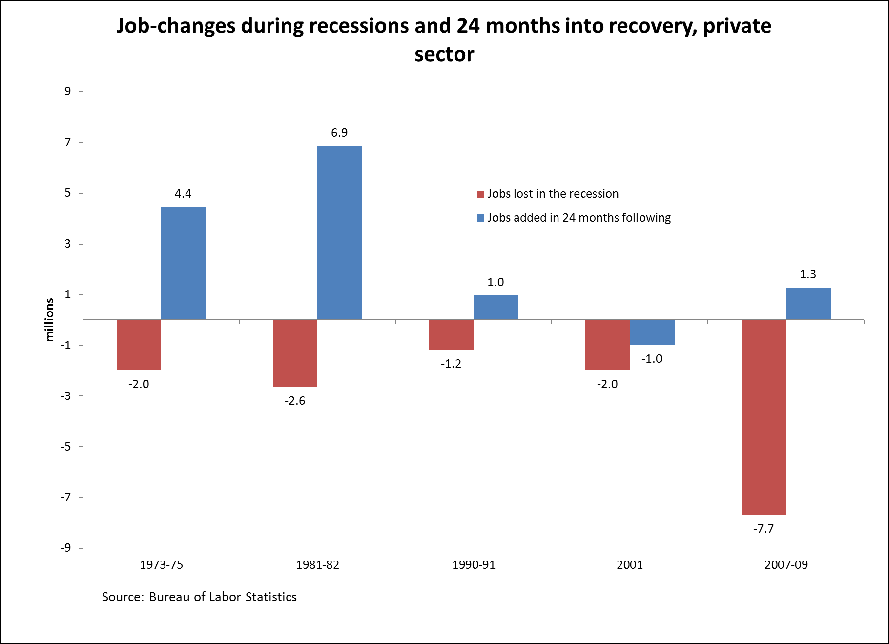
And since there’s been lots of discussion about the relative health of the private and public sectors, here’s the correct graph for private-sector jobs only.
Enjoyed this post?
Sign up for EPI's newsletter so you never miss our research and insights on ways to make the economy work better for everyone.