To illustrate exactly how near to high heaven the Obama recovery stinks, Mitt Romney put this graph in his official Plan for Jobs and Economic Growth. It shows the Obama recovery losing nearly 1 million jobs in the 24 months after the end of the recession, clearly the worst in modern history.

But here is the same graph, via Josh Biven at the left-leaning Economic Policy Institute, adjusted for private sector jobs only. Note the subtle change in the three blue bars to the right. Obama’s recovery is suddenly the best in 20+ years. The key distinction between Romney’s graph and EPI’s graph is the public sector, which withered under Obama despite the stimulus.
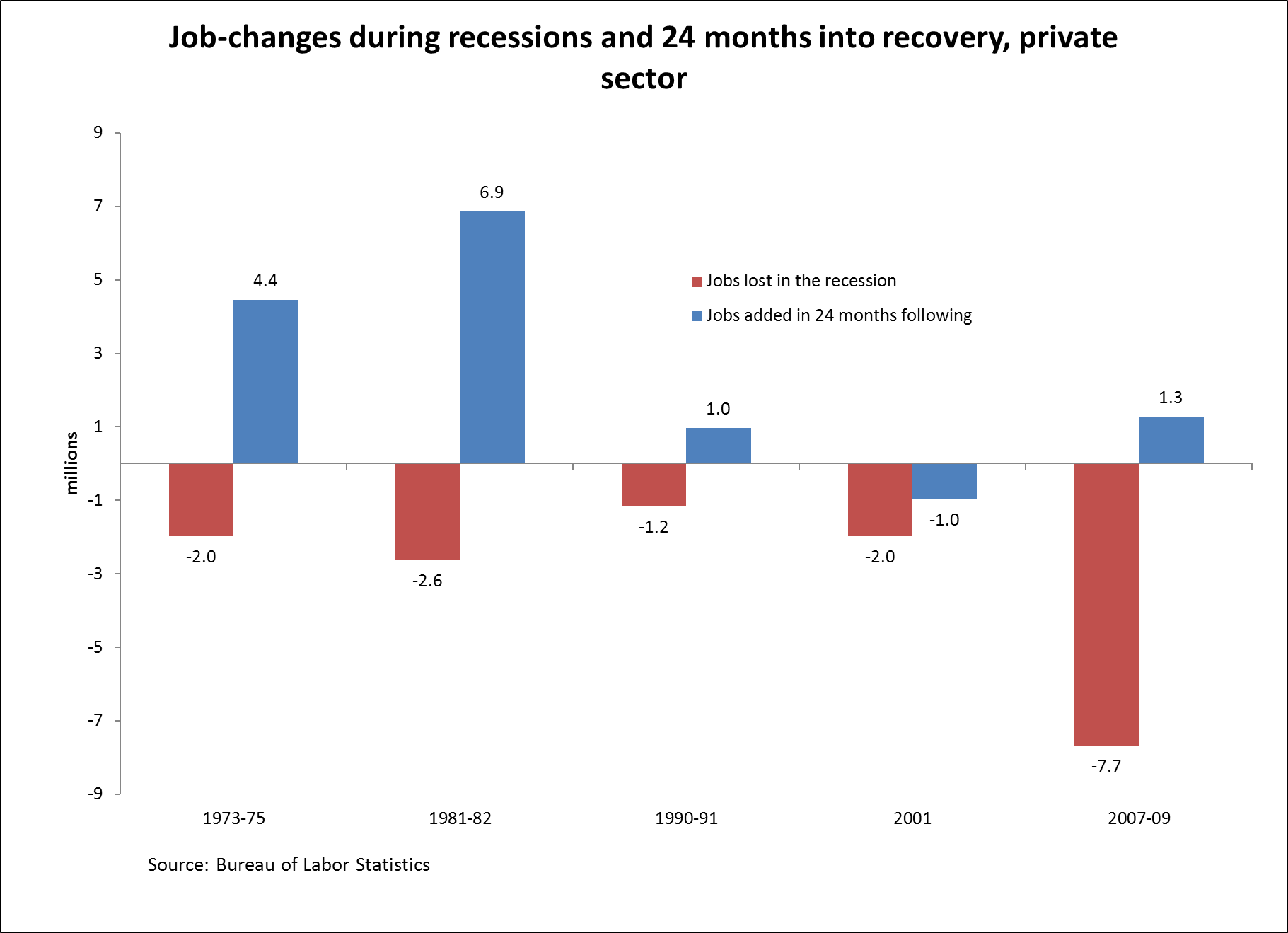
This recovery stinks, okay? No debate there. But if Romney’s contention is that its stinking is qualitatively different from the stinking of the last two recoveries, this particular statistic doesn’t make his case.