Briefing Paper #209
It is widely recognized that the means through which most working-age Americans receive health care coverage—the employer-based system—is undergoing fundamental change (Gould 2007). Though a majority of workers and their families are still covered through employers, a variety of factors, most prominently increased costs, have led to a steady slide in coverage. This decline has occurred in good economic times and bad, implying a structural, as opposed to cyclical, shift. For example, though the current business cycle has been both highly productive and profitable, the share of workers nationwide with employer-provided health insurance (EPHI) from their own job fell each year, from 51.1% in 2000 to 48.8% in 2006—a decline of 2.3 percentage points. In California, this share declined even further, 2.8 percentage points, from 49.0% in 2000 to 46.2% in 2006.
This report examines what role changes in the composition of employment have played in this decline. To what extent, for example, has this negative trend been driven by the loss of jobs with high rates of coverage? Conversely, what has been the role of diminished coverage rates within existing jobs?
To take a simple example, imagine an economy with two industries, one with very high rates of EPHI and the other with low rates. Next, assume that changes in the nature of demand and production in the global economy lead to job losses in the high-coverage industry and job gains in the low-coverage industry. This change in the composition of jobs would lead to lower overall coverage rates, even if rates of coverage remained the same within both industries. This report will refer to this type of decline in coverage rates as the decline from moving “between” industries. Of course, coverage could also decline within these industries, regardless of each industry’s share of total employment. In this paper, we quantify how much of the decline in health insurance coverage can be attributed to “between” losses—those caused by changes in the composition of employment—and “within” losses—those caused by declining coverage within job sectors.
The above example will likely lead some readers to think about the long-term, ongoing shift from manufacturing to services. While we show that the loss of manufacturing jobs has indeed played the predicted role in the loss of coverage, we find that changes in the likelihood of coverage within jobs have been a much more important determinant of the loss of EPHI coverage, both nationally and in California.
In fact, the statistical analysis in this report suggests that over the last decade, the composition of jobs has had a relatively minor effect on changes in EPHI. Industry shifts have had small negative impacts on coverage both nationally and in California, while occupational shifts have had small positive effects nationally and small negative effects in California. But the big story is taking place within sectors: regardless of which industries or occupations have been adding or losing jobs, changes in EPHI are driven by employer decisions as to whether to provide coverage or not. Similarly, when we look at worker characteristics, we find that, while there have been some “between” gains in worker demographics that have led to higher EPHI (namely, educational upgrading along with the workforce getting older), we also find that there have been significant declines in coverage within categories across the entire age and education spectrum.
The conclusion of this report stresses the policy implications of these findings. The fact that within-sector and within-demographic changes (and not changes in the composition of jobs and workers) are largely driving EPHI trends underscores the need for a national approach to health coverage. Even were we to somehow radically change the composition of jobs toward sectors with higher coverage rates, or change the composition of the workforce through dramatic educational upgrading, the decline in coverage within job sectors and worker demographic categories would still lead to further losses.
This report examines changes in EPHI over the years 1995-2006, both nationally and in California. Though the decline in coverage is a long-term trend, the latter 1990s saw a pause in the trend, as slower growth in the costs of health care provision coincided with very low unemployment.1 In fact, the share of workers covered by EPHI increased nationally from 1995 to 2000, from 49.6% to 51.1%, before resuming its decline in the 2000s. Note that the loss of coverage in the 2000s more than offset the 1995-2000 gains, such that the coverage rate in 2006 was 48.8%, about a point below the 1995 level. California experienced a very similar overall trend, but with bigger declines in the 2000s, putting its coverage rate in 2006 about a point and a half below the 1995 level.
The data for this report come from the March Current Population Survey, a large, nationally representative data series. The discussion of data and coding issues can be found in the Appendix.
The main findings are:
- The two time periods examined—1995-2000 and 2000-06—differ significantly with regard to trends in health insurance coverage, with the 2000s much less favorable than the latter 1990s. We attribute this difference to both a temporary respite from fast price increases in EPHI in the late 1990s and the uniquely tight job market that prevailed over that period.
- The composition of jobs between industries and occupations has had a relatively minor effect on changes in EPHI. Industry shifts away from manufacturing have had a small negative impact, and occupation shifts toward white-collar work have had a small positive effect.
- The decline in coverage within jobs is the driving force behind the overall declines in coverage. The recent declines in health insurance coverage are even more dramatic when considering only workers who have demonstrated a strong attachment to the labor force (e.g., excluding part-time or part-year workers).
- Changes in the age and education composition of the workforce have led to increased EPHI, but there have been declines in coverage within categories across the entire age and education spectrum.
- In 2006, the rate of EPHI was 2.9 percentage points lower in California than in the rest of the country. The general trends in coverage in California, however, are very similar to the national level, including the dominance of within job sector changes.
- The one exception to this similarity concerns California workers who are more attached to the labor force. Attached California workers are somewhat more negatively impacted by industry and occupational shifts than by declines within jobs, with the driving force being the loss of manufacturing jobs, which was more pronounced in California than at the national level.
lass=”heading3″> The structure of employment and coverage, 1995-2006
We begin by examining employment and coverage shares by industry, occupation, and worker characteristics. Each reveals different aspects of the decline in EPHI. The composition of jobs by industry tends to be influenced by the interaction of product demand and globalization. As consumers and investors demand certain types of goods and services over others, employment shifts to those industries experiencing higher relative demand. Also, if such demands are met by foreign producers (or domestic firms that produce abroad), that too will change the industry composition of employment in the United States.
Occupational employment is more reflective of shifts in how goods and services are produced Thus, changes in employment shares by occupation reflect changes like those in technology and the organization of work. Finally, changes in worker characteristics reflect changing national demographics, along with changes in employer demand for workers at different skill levels.
Industry
Table 1 shows the industry shares of employment and coverage in 1995, 2000, and 2006. The top panel, employment shares, reveals large shares in professional services (which includes health services) and retail trade; in 2006, these two industries account for almost half of employment. Both construction and professional services expanded faster than average over this 11-year period, thus growing as a share of total employment. Manufacturing employment fell most quickly over these years—dropping by almost 4 percentage points, a large shift over this time frame.
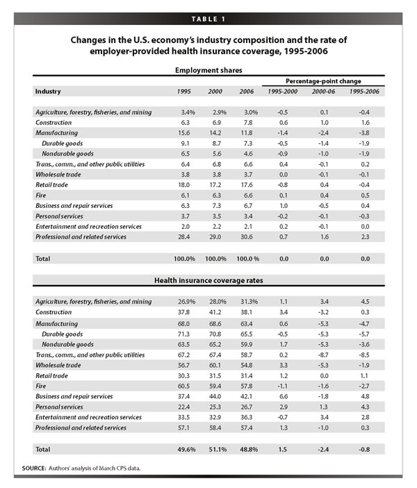
The bottom panel, coverage rates, shows quite different trends in the two time periods. The temporary decline in the pace of the cost of health coverage made a big difference in the 1990s, as most industries posted increased coverage rates in 2000 compared to 1995. The tight job market that prevailed over those years was also a contributing factor, as employers needed to bid up compensation packages to get and keep needed employees. The so-called “office economy”—business and professional services—experienced significant gains in coverage. Even lower wage personal services, jobs that provide services to individuals, like housekeepers and beauticians, saw increased coverage over these years. Among factory workers, coverage results were mixed, with a slight loss to durable goods workers and gains for those manufacturing non-durables.
Coverage trends in the latter period were, however, much more negative. They were almost uniformly negative, with the exception of few small sectors, like agriculture and entertainment. In some industries, the trend reversal was quite sharp: construction reversed almost all of its latter 1990s gains, and transportation et al. went from a stagnant trend in coverage to an alarmingly large loss of over 8 percentage points.
Occupation
Table 2 is structured the same way as the previous table, but through the lens of occupations. In a continuation of a long-term trend, white-collar jobs have generally increased their shares, especially among managers and professionals, while sales workers have remained relatively flat. The share of blue-collar workers in precision production, craft, and repair, which includes carpenters and workers in the construction trade, has not declined, in large part because of the boom in construction over these years. But manufacturing job losses show up in the next line, with a declining share of machine operators and assemblers. Administrative and clerical workers also comprise a smaller share of the economy, presumably displaced by technological changes in computer usage in the workplace.
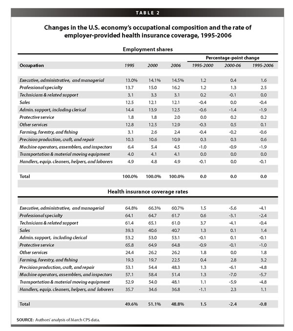
As with the bottom panel of Table 1, in the bottom panel of Table 2 we see the same tale of two very different periods in coverage rate trends. Losses were pervasive in the 2000s. Blue-collar workers saw all the modest coverage gains they made in the late 1990s more than eroded in the 2000s. But notably, white-collar workers, including executives, managers, and technical workers, also saw large declines in coverage in this period. Note, for example, declines of about 3 to 6 percentage points from 2000 to 2006, among the first three occupations listed in the table. These losses in EPHI coverage in high-quality jobs provide an important reminder that occupational upgrading—the shift to jobs higher up the occupational ladder—by itself will not ensure higher rates of EPHI. No one is immune to the slow unraveling of the employer-based system.
Worker characteristics
The first row of the top panel of Table 3 shows that the average age of U.S. workers increased 2.3 years over the 1995 to 2006 period, from 38.5 years in 1995 to 40.7 years in 2006. There was also significant educational upgrading over this period, with a 6 percentage-point drop in the share of workers with a maximum education level of a high school diploma or less, and a 5.1 percentage-point increase in the share of workers with a college degree or higher. The share of women in the workforce increased slightly in the last half of the 1990s, but declined slightly in the 2000s to remain unchanged from 1995 to 2006 at 46.8%. The share of immigrants increased 4.8 percentage points, from 10.4% in 1995 to 15.3% in 2005.
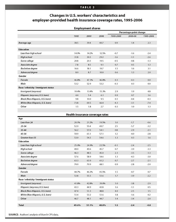
The bottom panel of Table 3 shows health care coverage by demographic groups. We see the familiar pattern, where virtually all groups made gains in the late 1990s but saw those gains more than eroded in the 2000s. Looking over the full 1995-2006 period, the breakdown by age category shows an unsurprising increase in EPHI over the life cycle,2 and a similarly unsurprising increase in EPHI going up the educational ladder.
The more interesting finding is what happens within these age and education categories over time. For the period from 1995 to 2006, the most dramatic declines in EPHI are occurring for prime-age workers—workers age 25-54—who experienced average declines in EPHI of 2.3 percentage points. Furthermore, workers across the entire educational spectrum saw declines in coverage, for example workers with a college degree or more saw a 2.0 percentage-point decline from 1995 to 2006, while workers without a college degree saw a 1.9 percentage-point decline over this period. Men also saw a decline of 2.2 percentage points from 1995 to 2006, while women experienced a slight increase of 0.7 percentage points. Immigrant workers were hit especially hard, experiencing a decline of 2.9 percentage points from 1995 to 2006, while non-immigrant workers held steady over this period.3
In sum, while changes in certain characteristics, like higher mean ages and educational upgrading, should have (and did, as shown below) led to higher levels of EPHI, trends within all groups went the other way.
These descriptive tables reveal two main points, both of which are explored in greater detail in the next section. First, the two time periods differ significantly with regard to health insurance coverage, with the 2000s much less favorable than the latter 1990s, a difference we attribute to both a temporary respite from fast price increases in EPHI and the uniquely tight job market of the 1990s. Second, over these time periods, there was a great deal of movement in health insurance coverage within industries, occupations, and demographic categories (as shown in the bottom panels of Tables 1-3). There was some movement in the distribution of workers over demographic characteristics (as shown in the top panel of Table 3), and t
here was relatively less movement in the distribution of jobs by industries and occupations (as shown in the top panels of Tables 1 and 2). This suggests that the big story in eroding EPHI over this period is not about the changing composition of jobs by industry or occupation Instead, we find that changes in the likelihood of coverage within sectors are much more important in explaining the changes in overall coverage rates.
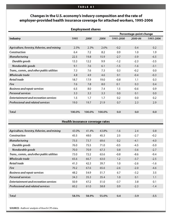
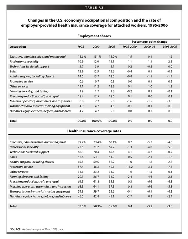
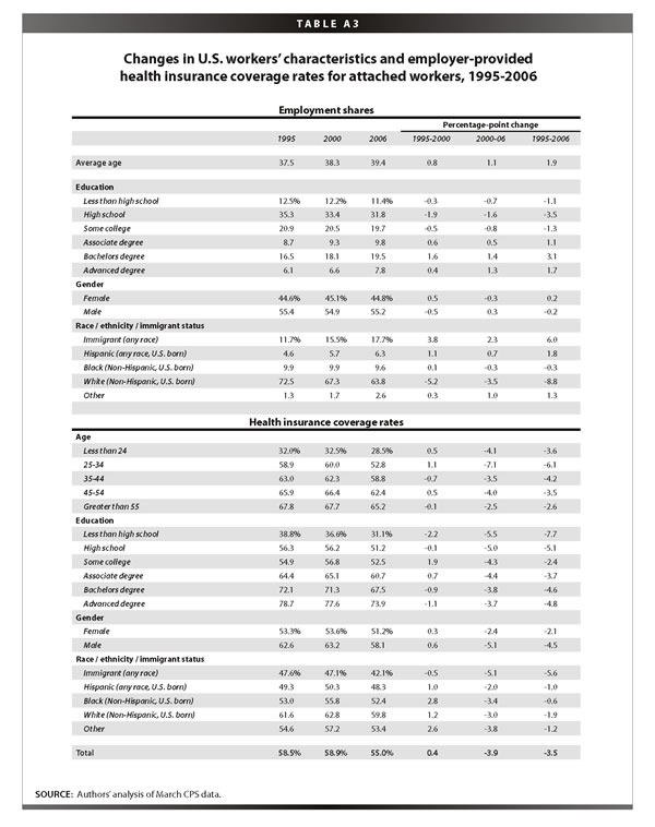
The next section uses a common regression-based decomposition to quantify this reasoning. First, however, we note that Tables A1-A3 in the Appendix provide the same information given in Tables 1-3, but for a subset of workers more closely attached to the labor market, defined by being a private-sector worker between the ages of 18 and 64 who works at least half the year and at least 20 hours per week. These more attached workers comprise about two-thirds of the total workforce over this period and have higher EPHI coverage rates (by about 20 percentage points) than their less-attached colleagues have. The overall trends for the more attached workers are the same as for all workers, both in terms of employment and coverage shares, but the gains in coverage in the 1990s were smaller for the more attached workers and the losses in the 2000s were considerably larger. Overall, EPHI fell 3.5 percentage points for this group of workers (as opposed to 1 percentage point for all workers). This difference implies that the recent decline in EPHI coverage comes not from employers reducing coverage for their most marginally attached workers, but instead it is workers with a demonstrated commitment to the labor force who are feeling the squeeze.
A closer look at the determinants of EPHI coverage rates
This section uses a common decomposition technique to answer the question posed above: which is a more important determinant of changes in EPHI, the shifts occurring in the structure of employment by industry and occupation, or the changes in coverage within jobs? The method is discussed in greater detail in the appendix; here we note that it enables us to control for a wide set of factors, both individual and sectoral, in accounting for the observed changes in coverage.
The first row of Table 4 gives the changes in EPHI, as shown in the bottom rows of Tables 1-3. As discussed above, these overall changes can be decomposed into two parts—the part explained by changes in the likelihood of coverage within worker or job characteristics (row 2) and the part explained by compositional shifts between worker or job characteristics (row 3).4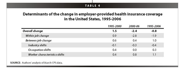
The technique also allows the “between” part to be further decomposed. Here we decompose it into three subparts—the part explained by compositional shifts between industries (row 4), the part explained by compositional shifts between occupations (row 5), and the part explained by compositional shifts between worker characteristics, including age, education, gender, race, ethnicity, and immigrant status (row 6).5
For example, between 1995 and 2000, EPHI coverage increased slightly, by 1.5 percentage points. The decomposition shows us that 0.9 percentage points of the change came from a higher likelihood of coverage, holding worker and job characteristics constant. The rest, 0.6 percentage points, is explained by compositional shifts in worker and job characteristics. Furthermore, of the 0.6 percentage points added by compositional shifts in worker and job characteristics, both worker characteristics (specifically, increases in average age along with educational upgrading) and the shift to higher coverage occupations were driving factors, while industry shifts had a negligible impact.
The 2000s, of course, have been much more negative, with coverage falling 2.4 percentage points. Moreover, this decline is more than explained by diminished likelihood of coverage within jobs; the contribution of compositional shifts between jobs is very small. However, what we do uncover in the further decomposition of the between part is that worker characteristics continued to “improve,” i.e., lead to higher coverage rates, in the 2000s, but that was largely offset by industry shifts that led to reduced coverage.
The final column gives the change over the full 1995-2006 period. The losses in the 2000s more than eroded the gains in the latter 1990s, and coverage ended up falling slightly, by 0.8 percentage points. Here again, the 0.8 percentage-point decline is much more than explained by a diminished likelihood of coverage within jobs, but here the positive contribution of compositional shifts between job and worker characteristics is more than negligible. When we further decompose this “between” part, we find that coverage-inducing changes in personal characteristics, namely the growth in the average age and education level of the workforce over this period, added 1.1 percentage points to coverage (e.g., the share of workers in our overall sample with college or more grew from 25% to 30% over these years). There is also a small positive effect on coverage of occupational shifts, but an offsetting negative effect of industrial shifts. The industrial shifts that played the biggest role in the decline of coverage were the loss of manufacturing jobs, which have relatively high levels of EPHI coverage, and the increase in construction jobs, which have relatively low levels of coverage. To be sure, however, the main story over this period is the fact that the decline in coverage within jobs is the driving force behind the overall changes.
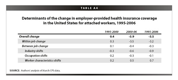
Appendix Table A4 provides the same analysis for those workers more closely attached to the job market (see above selection criteria). As noted, for these workers, improvements over the latter 1990s were less impressive than those of all workers, and their losses in the 2000s were steeper. Over the full period, their coverage rates fell by 3.5 percentage points, partly due to downshifting industries (-0.9 percentage points) but mostly due to reduced coverage within industries, occupations, and worker demographic categories (-3.2 percentage points).
As expected, the findings from the decomposition amplify those from the descriptive Tables 1-3. Once the favorable conditions of the 1990s—slower cost growth and tight job markets—disappeared, coverage rates began to drop within most industries, occupations, and demographic categories. The composition of jobs by industry and occupation has been a relatively minor player in these outcomes. Negative industry shifts (toward jobs with lower coverage shares) played some role, especially for attached workers, but these shifts did not account for much of the changes in coverage. Coverage losses in the 2000s have occurred within industries and occupations and for workers across the education and age scale. The loss of EPHI is a pervasive “within-group” phenomenon, not the function of changing job-sector characteristics.
Analysis of California
Approximately 2.9% fewer Californians were covered by EPHI than non-Californians in 2006. However, we see the same basic trends in California that we see at the national level, with a few notable exceptions. As above, this section begins by examining employment and coverage shares by industry, occupation, and worker characteristics.
Industry
Table 5 shows the industry shares of employment and EPHI coverage in California in 1995, 2000, and 2006. As with the national data, the top panel reveals large employment shares in professional services (which includes health services) and retail trade. As we also saw nationally,
construction and professional services expanded faster than average in California from 1996-2005, and manufacturing employment fell the most dramatically, almost 5 percentage points. This 5-point decline was an entire point larger than the national decline in manufacturing over this period.
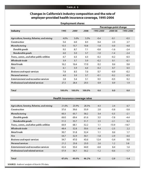
As we saw nationally, the bottom panel of Table 5 reveals quite different trends in EPHI coverage over the two time periods, which bracket periods of very different economic conditions and health care pricing regimes. Most industries saw increased coverage over the latter half of the 1990s. Business and repair services saw a huge increase in coverage, and factory workers—both durable and non-durable goods workers—also experienced a healthy increase.
Coverage trends so far in the 2000s have been much more negative. In California (as nationally), some industries experienced dramatic trend reversals between the two periods. For example, in the 2000s, manufacturing, construction, and transportation reversed all of the gains made in the late 1990s, with transportation experiencing an especially dramatic decline.
Occupation
Table 6 shows the occupational shares of employment and EPHI coverage in California in 1995, 2000, and 2006. As with the national data, the California data show that white-collar jobs have generally increased their shares, especially among managers and professionals, while sales workers have remained relatively flat. The share of workers in precision production, craft, and repair has increased due to the California construction boom. The large decline in machine operators and assemblers reflects the losses in California manufacturing jobs. Finally, as at the national level, administrative and clerical workers also comprise a smaller share of the California economy.
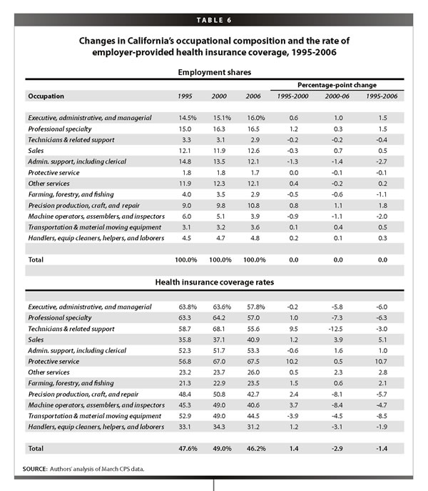
The bottom panel of Table 6 underscores the now-familiar story of two time periods with very different economic conditions and coverage rate trends. As we saw with the national data, losses were pervasive in the 2000s, with major declines for both white-collar workers—particularly executives, managers, and technical workers—and for blue-collar workers, who in California (as at the national level) saw all the modest coverage gains they made in the late 1990s more than erode in the 2000s.
Worker characteristics
The first row of the top panel of Table 7 shows that the average age of California workers increased 1.7 years in the 1995-2006 period, from 38.3 years in 1995 to 40 years in 2006. There was also educational upgrading in California over this period, though somewhat less than what was seen at the national level. California experienced a 1.4 percentage-point drop in the share of workers with a maximum education level of a high school diploma or less, and a 3.9 percentage-point increase in the share of workers with a college degree or higher. The percent of women in the California workforce increased from 43.6% in 1995 to 44.6% in 2006, which was 2.2 percentage points lower than the national level in 2006.
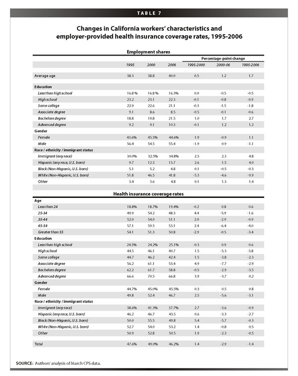
The race/ethnicity/immigration makeup of California is starkly different from the national average. The immigrant share of the workforce in California is more than twice the national average, at 34.8% in California versus 15.3% nationally in 2006. Interestingly, the change in the share of immigrants in the workforce from 1995 to 2006 was the same in California as nationally, an increase of 4.8 percentage points. California has a higher share of non-immigrant Hispanics than the national average (13.7% in California in 2006 versus 6.1% nationally) and it is growing faster (4.0 percentage points from 1995 to 2006 in California versus 1.6 percentage points nationally). Finally, California also has a lower share of non-immigrant, non-Hispanic whites than the national average, and a lower share of non-immigrant, non-Hispanic blacks.
The bottom panel of Table 7 shows health care coverage by demographic groups. Again, there is a familiar pattern, where virtually all groups made gains in the late 1990s but saw those gains more than eroded in the 2000s. As with the discussion of the national level data, the discussion here will focus on the changes from 1995 to 2006. The breakdown by age category shows an unsurprising increase in EPHI over the life cycle,6 and a similarly unsurprising increase in EPHI going up the educational ladder. But as at the national level, there are declines in coverage within almost all age categories; particularly hard hit in California are workers age 45 and above, who experienced a decline of 3.8 percentage points from 1995 to 2006. Furthermore, workers across the educational spectrum saw declines in coverage. The subset of workers with a college degree or more and the subset of workers without a college degree both experienced a 2.3 percentage-point decline from 1995 to 2006. Men saw a decline of 3.1 percentage points from 1995 to 2006, while women experienced a slight increase of 0.8 percentage points. Immigrants and non-immigrants alike experienced declines—immigrant California workers experienced a decline of 0.9 percentage points (much smaller than the national-level decline of 2.9 percentage points), while non-immigrant California workers saw a decline of 0.8 percentage points over this period. Non-immigrant Hispanics were hit especially hard in California, experiencing a decline of 2.7 percentage points from 1995 to 2006 (at the national level, non-immigrant Hispanics actually saw a slight increase in coverage of 0.5 percentage points).
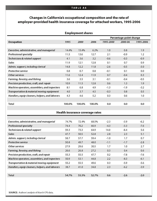
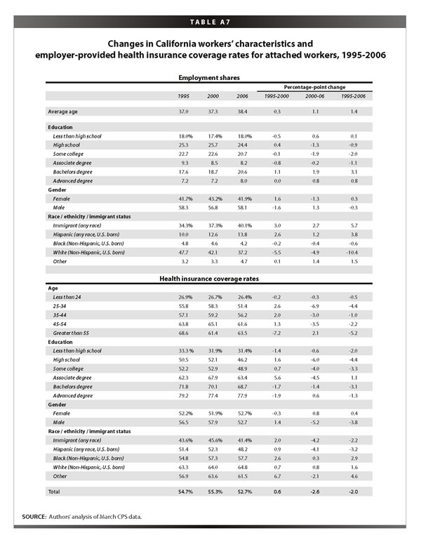
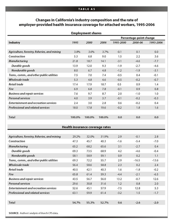
Tables A5-A7 in the Appendix provide the same information given in Tables 5-7, but for the subset of more attached California workers. The overall trends for more attached workers are the same as for all California workers, both in terms of employment and coverage shares, though the gains in coverage in the 1990s and the declines in coverage in the 2000s were somewhat smaller for the more-attached workers. Overall, EPHI fell 2 percentage points for the more-attached workers (as opposed to 1.4 percentage point for all California workers). Thus, in California unlike at the national level, we find more- and less-attached workers facing similar declines in EPHI.
Decomposition
Table 8 presents the decomposition for California in the same form given in Table 4 with national data. Between 1995 and 2000 in California, EPHI coverage increased slightly, by 1.4 percentage points. This was due entirely to increased coverage within worker and job characteristics. In fact, compositional shifts between industries, occupations, and worker characteristics each contributed negatively to the overall trend.
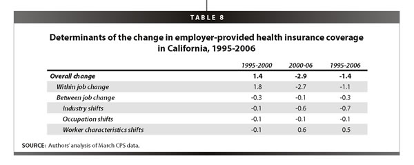
Between 2000 and 2006 in California, coverage fell 2.9 percentage points. Again, this came almost entirely from a lower likelihood of coverage within jobs; the contribution of compositional shifts between jobs is very small. However, what the further decomposition of “between” part reveals is that worker characteristics improved in the 2000s, that is, led to higher coverage rates, but that was largely offset by industry shifts that led to reduced coverage.
The final column gives the change over the full 1995-2006 period. The losses in the 2000s more than eroded the gains in the latter 1990s, and coverage ended up falling by 1.4 percentage points for the period as a whole. Here again, the decline is driven by a diminished likelihood of coverage within jobs, though
the contribution of compositional shifts between jobs is relatively large. When we further decompose the “between” part, we find that the coverage-inducing changes in personal characteristics added 0.5 percentage points to coverage. There were three main contributors to this change: age, educational upgrading, and immigration. Increases in average age led to increased coverage, as did educational upgrading. However, these were somewhat offset by increases in immigration, which lead to decreased coverage because immigrants tend to have lower levels of EPHI. Interestingly, despite California’s much higher share of immigrant workers, the relatively small effect of immigration on changes in EPHI from 1995 to 2006 are very similar in California to the national level, since over this period California experienced the same changes in immigrant worker share as the nation did as a whole. In any case, the generally “improved” personal characteristics were more than offset by the negative effect of industrial shifts, which were larger in California (-0.7 percentage points) than at the national level (-0.4 percentage points).
As at the national level, the industrial shifts that played the biggest role in the decline of coverage were the loss of manufacturing jobs, which have relatively high levels of EPHI coverage, and the increase in construction jobs, which have relatively low levels of coverage. But as above, it is important to keep in mind that it is the decline in coverage within jobs that is the driving force behind the overall changes.
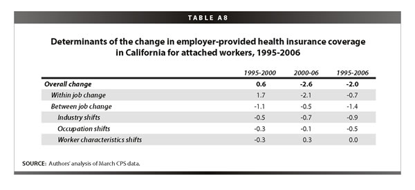
Appendix Table A8 provides the same analysis for those California workers more closely attached to the job market. As noted, for these workers improvements over the latter 1990s were less impressive than those of all workers, but their losses in the 2000s were marginally lower. Over the full period, their coverage rates fell by 2 percentage points, which was much less than the national drop for attached workers of 3.5 percentage points. But the interesting thing here is that the pattern is different from what we have seen thus far—a bigger piece of the decline in coverage experienced by more-attached California workers was due to industry and occupational shifts (-1.4 percentage points) than to declines within jobs (-0.7). Not surprisingly, it is the steep reduction in manufacturing jobs in California that is driving this fact.
Conclusion
It is widely recognized that the employer-based health care system is undergoing fundamental change. The number of workers with employer-provided health insurance from their own job has seen a substantial decrease in recent years, even amidst solid economic growth and strong productivity. This paper demonstrates that, while the loss of manufacturing jobs has played the predicted role in the loss of coverage, especially among attached workers and especially in California, the data repeatedly show that changes in the likelihood of coverage within jobs have been a much more prominent determinant of the loss of EPHI coverage. In other words, regardless of which industries or occupations have been adding or losing jobs, changes in EPHI are being driven by employer decisions as to whether to provide coverage or, as is more likely since 2000, not to do so.
Another important finding is that the decline in coverage within jobs is as likely in white-collar occupations, including executives, managers, and workers in professional specialties, as in blue-collar occupations. While these white-collar occupations have relatively high levels of coverage, they saw large declines over this period, demonstrating that even jobs near the top of the occupational ladder are vulnerable to the erosion of the employer-based system. We also find that it is the more-attached workers—those who have demonstrated a strong commitment to the labor market—who are the most likely to have been affected by the recent decline in coverage. Furthermore, we find that while there have been some shifts in worker demographics (namely age and education) that led to higher EPHI, we also find that there have been significant declines in coverage within categories across the entire age and education spectrum, including prime-age workers and those with college degrees. These findings show that health insecurity is now a broadly shared American experience.
As a consequence, the solution requires a broadly shared approach. The erosion of the employer-based system, with losses accumulating in even high-end sectors, along with the critical need to control health care costs, indicates that the provision of coverage needs to be at least partly “taken out of the market.” Universal programs that a) pool risk across large populations, and b) mandate coverage, with subsidies for those unable to meet the mandate are most likely to reverse the erosion documented in this paper. Some policy ideas in this area, like that of Hacker (2007), accomplish these goals while leaving the employer system largely intact. The findings in this briefing paper should point policy makers toward such plans.
—We thank James Lin and Jin Dai for excellent research assistance. We thank the California Endowment for supporting our work.
Endnotes
1. In fact, lower costs and tighter labor markets were probably connected, as suggested by Blinder and Yellen (2001). The main reason for the downshift in the costs of EPHI was the shift from point-of-service plans to lower-cost forms of coverage, such as health maintenance organizations.
2. The lower level for workers age 55 and above is due to partial retirement in this category. Looking at more attached workers, we find increasing coverage over the entire career (See Appendix Table A3).
3. What is underlying the holding-steady of non-immigrant workers is the fact that less-attached—e.g., part-time or part-year—non-immigrant workers saw a substantial increase of 2.6 percentage points over this period, almost all of it in the late 1990s, while more-attached non-immigrant workers experienced a decline of 2.1 percentage points from 1995 to 2006 (see Appendix Table A3).
4. Note that rows 2 and 3 sum up to row 1 (any discrepancies are due to rounding).
5. Note that rows 4-6 sum up to row 3 (again, any discrepancies are due to rounding).
6. As at the national level, the lower level for California workers age 55 and above is due to partial retirement in this category. Looking at more attached California workers, we find increasing coverage over the entire career (see Appendix Table A7).
References
Blinder, Alan S., and Janet L.Yellen. 2001. The Fabulous Decade: Macroeconomic Lessons From the 1990s. New York: The Century Foundation Press.
Gould, Elise. 2007. The Erosion of Employment-Based Insurance: More Working Families Left Uninsured. Economic Policy Institute Briefing Paper #203. Washington, D.C.: EPI.
Hacker, Jacob S. 2007. Health Care for America: A Proposal for Guaranteed, Affordable Health Care for All Americans Building on Medicare and Employment-Based Insurance. Economic Policy Institute Briefing Paper #180. Washington, D.C.: EPI.
 “600” />