Post-recession Decline in Black Women’s Wages is Consistent with Occupational Downgrading
The Bureau of Labor Statistics reported another month of solid job growth in September, bringing this year’s average to over 225,000 jobs per month—the highest average monthly job growth since 1999. As the jobs recovery consistently grinds on, more attention is shifting toward the absence of wage growth in the recovery. Wage stagnation is part of a longer-term trend that has been well-documented in EPI’s research. Last month’s Census Bureau report on income, poverty and health insurance coverage in 2013 provided more evidence of weak wage growth following the recession. In my previous analysis of data from the Census report, I also identified how uneven that growth has been for different groups of women. Median real (ie, inflation-adjusted) annual earnings for African American women working full-time full-year in 2013 were 3.3 percent below the 2009 level, compared to 0.2 percent and 0.5 percent lower for white and Hispanic women, respectively.
Given the magnitude of that disparity, I sought to confirm it using hourly wage data for full-time full-year workers from the CPS ORG files, the data source for EPI’s signature research on wage trends. Based on that analysis, I identified similar racial disparities in women’s hourly wage growth.
Is Corporate America Going to the Poorhouse?
The Financial Times recently reported that the U.S. Chamber of Commerce has spent $30 million to influence the upcoming elections, backing mostly Republicans candidates. The Chamber, upset with the so-called anti-business attitude of the Obama administration, wants a Congress that will cut corporate taxes. This rhetoric suggests that U.S. corporations have become so unprofitable they need tax relief in order to stay in business. So let’s take a look at corporate profitability.
The first figure below shows corporate profits (left axis) and corporate taxes (right axis) as a percent of national income since 1946. Corporate profits have bounced around over the last 68 years between 8 percent of national income and 14 percent. The high point over this period, however, was just last year. Furthermore, corporate profits as a percent of national income have been steadily rising since President Obama took office, though much of that is due to the recovery in corporate profits after the Great Recession. At least before taxes, corporations appear to be doing rather well in terms of profitability.
The figure also shows total taxes on corporate income as a percent of national income. Since 1946, corporate taxes have steadily decreased in relation to national income. In 2013, corporate taxes were at a level below the high point reached in the last Republican administration. The data suggests that corporate taxes have not been keeping up with corporate profitability.

Why is the Obama Administration on the Wrong Side of a Wage and Hour Case?
Integrity Staffing Solutions, which runs a warehouse operation for Amazon, makes employees go through a “security check” at the end of each working day, where they are searched for stolen goods. Even though employees spend 25 minutes being processed—and would be fired if they tried to skip the screening—Integrity doesn’t pay them a penny for their time. The employees sued and won, and the case has gone to the U.S. Supreme Court. Now, the Justice Department and Labor Department have filed a brief that takes the side of the Amazon subcontractor over its employees. This is a shame.
Over the past year, President Obama and Secretary of Labor Tom Perez have seemingly done everything within their power to lift wages and discourage the exploitation of workers. Obama has issued executive orders raising the minimum wage and requiring decent labor practices from federal contractors, Perez has issued a rule covering home-care workers under the minimum wage and overtime rules, and Obama directed Perez to update overtime rules so more salaried employees would have the right to overtime pay. So why are they fighting the employees in this case?
It doesn’t look like a matter of legal principle to me. Certainly, the application of the Portal to Portal Act, which frees employers from the obligation to pay for certain preliminary and postliminary activities such as traveling to the work site or changing from a uniform into civilian clothes, isn’t obvious in this case. The court of appeals found that the search for stolen property was integral and necessary to the business operation of the warehouse, and that seems right to me. If the screening isn’t “integral and necessary” to the business operation, why would the employer fire employees who skip it? If making employees remove work clothes and shower after work to remove toxins has to be compensated (and the Supreme Court has said that it does), why isn’t making them remove belts and shoes and other clothing to prevent theft? (Cases finding that making employees—and everyone else—go through airport security screenings aren’t analogous because the employees are only being required to do what everyone has to do. It isn’t integral and necessary to the business operation, it’s a general requirement of federal law.)
So if it’s a close legal question, why didn’t the Obama administration side with the workers and ask the Supreme Court to uphold the Court of Appeals decision in their favor? I’m afraid it’s because the federal government is doing the same thing as Integrity, and doesn’t want to be sued. The brief of the United States includes a “Statement of Interest” explaining why it wanted to file a friend of the court brief. Here’s what it says, in part:
“The United States also employs many employees who are covered by the FLSA, 29 U.S.C. 203(e)(2)(A), and requires physical-security checks in many settings. The United States accordingly has a substantial interest in the resolution of the question presented.”
In other words, as an employer, the government wants to be able to get away without paying its own workers for their time. This is wrong.
The Ridiculousness of a “Liberal Endgame” on Fiscal Policy
Last night, the American Enterprise Institute’s Jim Pethokoukis, with whom I occasionally agree on matters of fiscal policy, took to Twitter to “clarify” the fiscal implications of many progressive priorities.
Basically, Pethokoukis is arguing that federal spending levels as high as some (slightly-caricatured version of) progressives have called for would require a broad-based tax hike on all Americans.
There’s plenty to dislike about this claim, but the most important issue is that no progressives I know are arguing for a specific federal spending level for all occasions. Instead, we want federal spending levels that are consistent with our policy priorities. So, for example, in times of weak aggregate demand, spending should temporarily rise to finance safety net programs, aid to state and local governments, and public investments to put people back to work. When the economy gets going again and we are near full employment, federal spending should then pull back. Over the longer run, spending levels should be sufficient to preserve the social insurance programs we have (which are not particularly generous), as well as finance needed public investments, vital safety net programs, and the efficient running of government. (So no phony savings like slashing the budget of the IRS.)
The liberal end game is 30% of GDP spending, financed by a VAT and other taxes.
— James Pethokoukis (@JimPethokoukis) October 6, 2014
Labor Market Weakness Is Still not due to Workers Lacking the Right Skills
The figure below shows the number of unemployed workers and the number of job openings by industry. This figure is useful for diagnosing what’s behind our sustained high unemployment. If our current elevated unemployment were due to skills shortages or mismatches, we would expect to find some sectors where there are more unemployed workers than job openings, and some where there are more job openings than unemployed workers. What we find, however, is that unemployed workers dramatically outnumber job openings across the board. There are between 1.1 and 6.5 times as many unemployed workers as job openings in every industry. In other words, even in the industry with the most favorable ratio of unemployed workers to job openings (health care and social assistance), there are still about 10 percent more unemployed workers than job openings. This demonstrates that the main problem in the labor market is a broad-based lack of demand for workers—not, as is often claimed, available workers lacking the skills needed for the sectors with job openings.
Unemployed and job openings, by industry (in millions)
| Industry | Unemployed | Job openings |
|---|---|---|
| Professional and business services | 1.151667 | 0.792083 |
| Health care and social assistance | 0.719667 | 0.665667 |
| Retail trade | 1.179833 | 0.473667 |
| Accommodation and food services | 0.975167 | 0.544 |
| Government | 0.734333 | 0.421333 |
| Finance and insurance | 0.27225 | 0.216333 |
| Durable goods manufacturing | 0.518667 | 0.174417 |
| Other services | 0.40575 | 0.143417 |
| Wholesale trade | 0.171167 | 0.145917 |
| Transportation, warehousing, and utilities | 0.38375 | 0.157833 |
| Information | 0.163667 | 0.103083 |
| Construction | 0.815333 | 0.126167 |
| Nondurable goods manufacturing | 0.343667 | 0.10575 |
| Educational services | 0.23275 | 0.073333 |
| Real estate and rental and leasing | 0.126 | 0.052 |
| Arts, entertainment, and recreation | 0.226167 | 0.074583 |
| Mining and logging | 0.05425 | 0.026833 |

Note: Because the data are not seasonally adjusted, these are 12-month averages, September 2013–August 2014.
Source: EPI analysis of data from the Job Openings and Labor Turnover Survey and the Current Population Survey
Job Seekers Outnumber Jobs by 2-to-1
In August, the total number of job openings was 4.8 million, up from a revised 4.6 million in July. In August, there were 9.6 million job seekers (unemployment data are from the Current Population Survey), meaning that there were 2.0 times as many job seekers as job openings. Put another way, job seekers so outnumbered job openings that about half of the unemployed were not going to find a job in August no matter what they did. In a labor market with strong job opportunities, there would be roughly as many job openings as job seekers.
The decline of the job seekers to job openings ratio to 2.0 continues the overall downward trend since the high of 6.8 to 1 in July 2009 (see Figure A). The ratio has steadily declined, falling by about 1.0 over the last year.
While this is clearly a move in the right direction, the 9.6 million unemployed workers understate how many job openings will be needed when a robust jobs recovery finally begins, due to the existence of 5.9 million would-be workers (in August) who are currently not in the labor market, but who would be if job opportunities were strong. Many of these “missing workers” will become job seekers when we enter a robust jobs recovery, so job openings will be needed for them, too.
The job-seekers ratio, December 2000–August 2014
| Month | Unemployed job seekers per job opening |
|---|---|
| Dec-2000 | 1.1 |
| Jan-2001 | 1.1 |
| Feb-2001 | 1.3 |
| Mar-2001 | 1.3 |
| Apr-2001 | 1.3 |
| May-2001 | 1.4 |
| Jun-2001 | 1.5 |
| Jul-2001 | 1.5 |
| Aug-2001 | 1.7 |
| Sep-2001 | 1.8 |
| Oct-2001 | 2.1 |
| Nov-2001 | 2.3 |
| Dec-2001 | 2.3 |
| Jan-2002 | 2.3 |
| Feb-2002 | 2.4 |
| Mar-2002 | 2.3 |
| Apr-2002 | 2.6 |
| May-2002 | 2.4 |
| Jun-2002 | 2.5 |
| Jul-2002 | 2.5 |
| Aug-2002 | 2.4 |
| Sep-2002 | 2.5 |
| Oct-2002 | 2.4 |
| Nov-2002 | 2.4 |
| Dec-2002 | 2.8 |
| Jan-2003 | 2.3 |
| Feb-2003 | 2.5 |
| Mar-2003 | 2.8 |
| Apr-2003 | 2.8 |
| May-2003 | 2.8 |
| Jun-2003 | 2.8 |
| Jul-2003 | 2.8 |
| Aug-2003 | 2.7 |
| Sep-2003 | 2.9 |
| Oct-2003 | 2.7 |
| Nov-2003 | 2.6 |
| Dec-2003 | 2.5 |
| Jan-2004 | 2.5 |
| Feb-2004 | 2.4 |
| Mar-2004 | 2.5 |
| Apr-2004 | 2.4 |
| May-2004 | 2.2 |
| Jun-2004 | 2.4 |
| Jul-2004 | 2.1 |
| Aug-2004 | 2.2 |
| Sep-2004 | 2.1 |
| Oct-2004 | 2.1 |
| Nov-2004 | 2.3 |
| Dec-2004 | 2.1 |
| Jan-2005 | 2.2 |
| Feb-2005 | 2.1 |
| Mar-2005 | 2.0 |
| Apr-2005 | 1.9 |
| May-2005 | 2.0 |
| Jun-2005 | 1.9 |
| Jul-2005 | 1.8 |
| Aug-2005 | 1.8 |
| Sep-2005 | 1.8 |
| Oct-2005 | 1.8 |
| Nov-2005 | 1.7 |
| Dec-2005 | 1.7 |
| Jan-2006 | 1.7 |
| Feb-2006 | 1.7 |
| Mar-2006 | 1.6 |
| Apr-2006 | 1.6 |
| May-2006 | 1.6 |
| Jun-2006 | 1.6 |
| Jul-2006 | 1.8 |
| Aug-2006 | 1.6 |
| Sep-2006 | 1.5 |
| Oct-2006 | 1.5 |
| Nov-2006 | 1.5 |
| Dec-2006 | 1.5 |
| Jan-2007 | 1.6 |
| Feb-2007 | 1.5 |
| Mar-2007 | 1.4 |
| Apr-2007 | 1.5 |
| May-2007 | 1.5 |
| Jun-2007 | 1.5 |
| Jul-2007 | 1.6 |
| Aug-2007 | 1.6 |
| Sep-2007 | 1.6 |
| Oct-2007 | 1.7 |
| Nov-2007 | 1.7 |
| Dec-2007 | 1.8 |
| Jan-2008 | 1.8 |
| Feb-2008 | 1.9 |
| Mar-2008 | 1.9 |
| Apr-2008 | 2.0 |
| May-2008 | 2.1 |
| Jun-2008 | 2.3 |
| Jul-2008 | 2.4 |
| Aug-2008 | 2.6 |
| Sep-2008 | 3.0 |
| Oct-2008 | 3.1 |
| Nov-2008 | 3.4 |
| Dec-2008 | 3.7 |
| Jan-2009 | 4.4 |
| Feb-2009 | 4.6 |
| Mar-2009 | 5.4 |
| Apr-2009 | 6.1 |
| May-2009 | 6.0 |
| Jun-2009 | 6.2 |
| Jul-2009 | 6.8 |
| Aug-2009 | 6.5 |
| Sep-2009 | 6.2 |
| Oct-2009 | 6.5 |
| Nov-2009 | 6.3 |
| Dec-2009 | 6.1 |
| Jan-2010 | 5.5 |
| Feb-2010 | 6.0 |
| Mar-2010 | 5.8 |
| Apr-2010 | 5.0 |
| May-2010 | 5.1 |
| Jun-2010 | 5.3 |
| Jul-2010 | 5.0 |
| Aug-2010 | 5.0 |
| Sep-2010 | 5.2 |
| Oct-2010 | 4.8 |
| Nov-2010 | 4.9 |
| Dec-2010 | 5.0 |
| Jan-2011 | 4.8 |
| Feb-2011 | 4.6 |
| Mar-2011 | 4.4 |
| Apr-2011 | 4.5 |
| May-2011 | 4.5 |
| Jun-2011 | 4.3 |
| Jul-2011 | 4.0 |
| Aug-2011 | 4.3 |
| Sep-2011 | 3.9 |
| Oct-2011 | 4.0 |
| Nov-2011 | 4.2 |
| Dec-2011 | 3.7 |
| Jan-2012 | 3.5 |
| Feb-2012 | 3.7 |
| Mar-2012 | 3.3 |
| Apr-2012 | 3.5 |
| May-2012 | 3.4 |
| Jun-2012 | 3.3 |
| Jul-2012 | 3.5 |
| Aug-2012 | 3.4 |
| Sep-2012 | 3.4 |
| Oct-2012 | 3.2 |
| Nov-2012 | 3.2 |
| Dec-2012 | 3.4 |
| Jan-2013 | 3.3 |
| Feb-2013 | 3.0 |
| Mar-2013 | 3.0 |
| Apr-2013 | 3.1 |
| May-2013 | 3.0 |
| Jun-2013 | 3.0 |
| Jul-2013 | 3.0 |
| Aug-2013 | 2.9 |
| Sep-2013 | 2.8 |
| Oct-2013 | 2.8 |
| Nov-2013 | 2.6 |
| Dec-2013 | 2.6 |
| Jan-2014 | 2.6 |
| Feb-2014 | 2.5 |
| Mar-2014 | 2.5 |
| Apr-2014 | 2.2 |
| May-2014 | 2.1 |
| Jun-2014 | 2.0 |
| Jul-2014 | 2.1 |
| Aug-2014 | 2.0 |
Note: Shaded areas denote recessions.
Source: EPI analysis of Bureau of Labor Statistics Job Openings and Labor Turnover Survey and Current Population Survey
Even further, a job opening when the labor market is weak often does not mean the same thing as a job opening when the labor market is strong. There is a wide range of “recruitment intensity” with which a company can deal with a job opening. For example, if a company is trying hard to fill an opening, it may increase the compensation package and/or scale back the required qualifications. Conversely, if it is not trying very hard, it may hike up the required qualifications and/or offer a meager compensation package. Perhaps unsurprisingly, research shows that recruitment intensity is cyclical; it tends to be stronger when the labor market is strong, and weaker when the labor market is weak. This means that when a job opening goes unfilled when the labor market is weak, as it is today, companies may very well be holding out for an overly qualified candidate at a cheap price.
Job Openings Are Up, but the Hires Rate Is Down
The August Job Openings and Labor Turnover Survey (JOLTS) data release this morning from the Bureau of Labor Statistics showed mixed results. While the job openings rose, the hires rate fell. Layoffs continue to trend downwards, while the quits rate remained flat—it’s been flat now since February.
The figure below shows the hires rate, the quits rate, and the layoffs rate. The first thing to note is that layoffs, which shot up during the recession, recovered quickly once the recession officially ended. Layoffs have been at prerecession levels for more than three years. This makes sense—the economy is in a recovery and businesses are no longer shedding workers at an elevated rate. And the continued trend downward in August is a good sign.
But for a full recovery in the labor market to occur, two key things need to happen: Layoffs need to come down, and hiring needs to pick up. Hiring is the side of that equation that, while generally improving, has not yet come close to a full recovery. The hires rate remains well below its prerecession level.
Another piece of the puzzle is voluntary quits (shown by the quits rate in the figure below). A larger number of people voluntarily quitting their job indicates a labor market in which hiring is prevalent and workers are able to leave jobs that are not right for them, and find new ones. The voluntary quits rate, which has been flat for the last seven months, is also nowhere near a full recovery. There are 14 percent percent fewer voluntary quits each month than there were before the recession began, and the quits rate is the same as it was last October. Low voluntary quits indicate that there are a large number of workers who are locked into jobs who would leave if they could.
Hires, quits, and layoff rates, December 2000–August 2014
| Month | Hires rate | Layoffs rate | Quits rate |
|---|---|---|---|
| Dec-2000 | 4.1% | 1.4% | 2.3% |
| Jan-2001 | 4.4% | 1.6% | 2.6% |
| Feb-2001 | 4.1% | 1.4% | 2.5% |
| Mar-2001 | 4.2% | 1.6% | 2.4% |
| Apr-2001 | 4.0% | 1.5% | 2.4% |
| May-2001 | 4.0% | 1.5% | 2.4% |
| Jun-2001 | 3.8% | 1.5% | 2.3% |
| Jul-2001 | 3.9% | 1.5% | 2.2% |
| Aug-2001 | 3.8% | 1.4% | 2.1% |
| Sep-2001 | 3.8% | 1.6% | 2.1% |
| Oct-2001 | 3.8% | 1.7% | 2.2% |
| Nov-2001 | 3.7% | 1.6% | 2.0% |
| Dec-2001 | 3.7% | 1.4% | 2.0% |
| Jan-2002 | 3.7% | 1.4% | 2.2% |
| Feb-2002 | 3.7% | 1.5% | 2.0% |
| Mar-2002 | 3.5% | 1.4% | 1.9% |
| Apr-2002 | 3.8% | 1.5% | 2.1% |
| May-2002 | 3.8% | 1.5% | 2.1% |
| Jun-2002 | 3.7% | 1.4% | 2.0% |
| Jul-2002 | 3.8% | 1.5% | 2.1% |
| Aug-2002 | 3.7% | 1.4% | 2.0% |
| Sep-2002 | 3.7% | 1.4% | 2.0% |
| Oct-2002 | 3.7% | 1.4% | 2.0% |
| Nov-2002 | 3.8% | 1.5% | 1.9% |
| Dec-2002 | 3.8% | 1.5% | 2.0% |
| Jan-2003 | 3.8% | 1.5% | 1.9% |
| Feb-2003 | 3.6% | 1.5% | 1.9% |
| Mar-2003 | 3.4% | 1.4% | 1.9% |
| Apr-2003 | 3.6% | 1.6% | 1.8% |
| May-2003 | 3.5% | 1.5% | 1.8% |
| Jun-2003 | 3.7% | 1.6% | 1.8% |
| Jul-2003 | 3.6% | 1.6% | 1.8% |
| Aug-2003 | 3.6% | 1.5% | 1.8% |
| Sep-2003 | 3.7% | 1.5% | 1.9% |
| Oct-2003 | 3.8% | 1.4% | 1.9% |
| Nov-2003 | 3.6% | 1.4% | 1.9% |
| Dec-2003 | 3.8% | 1.5% | 1.9% |
| Jan-2004 | 3.7% | 1.5% | 1.9% |
| Feb-2004 | 3.6% | 1.4% | 1.9% |
| Mar-2004 | 3.9% | 1.4% | 2.0% |
| Apr-2004 | 3.9% | 1.5% | 2.0% |
| May-2004 | 3.8% | 1.4% | 1.9% |
| Jun-2004 | 3.8% | 1.4% | 2.0% |
| Jul-2004 | 3.7% | 1.4% | 2.0% |
| Aug-2004 | 3.9% | 1.5% | 2.0% |
| Sep-2004 | 3.8% | 1.4% | 2.0% |
| Oct-2004 | 3.9% | 1.4% | 2.0% |
| Nov-2004 | 3.9% | 1.5% | 2.1% |
| Dec-2004 | 4.0% | 1.5% | 2.1% |
| Jan-2005 | 3.9% | 1.4% | 2.1% |
| Feb-2005 | 3.9% | 1.4% | 2.0% |
| Mar-2005 | 3.9% | 1.5% | 2.1% |
| Apr-2005 | 4.0% | 1.4% | 2.1% |
| May-2005 | 3.9% | 1.4% | 2.1% |
| Jun-2005 | 3.9% | 1.5% | 2.1% |
| Jul-2005 | 3.9% | 1.4% | 2.0% |
| Aug-2005 | 4.0% | 1.4% | 2.2% |
| Sep-2005 | 4.0% | 1.4% | 2.3% |
| Oct-2005 | 3.8% | 1.3% | 2.2% |
| Nov-2005 | 3.9% | 1.2% | 2.2% |
| Dec-2005 | 3.7% | 1.3% | 2.1% |
| Jan-2006 | 3.9% | 1.3% | 2.1% |
| Feb-2006 | 3.9% | 1.3% | 2.2% |
| Mar-2006 | 3.9% | 1.2% | 2.2% |
| Apr-2006 | 3.8% | 1.3% | 2.1% |
| May-2006 | 4.0% | 1.4% | 2.2% |
| Jun-2006 | 3.9% | 1.2% | 2.2% |
| Jul-2006 | 3.9% | 1.3% | 2.2% |
| Aug-2006 | 3.8% | 1.2% | 2.2% |
| Sep-2006 | 3.8% | 1.3% | 2.1% |
| Oct-2006 | 3.8% | 1.3% | 2.1% |
| Nov-2006 | 4.0% | 1.3% | 2.3% |
| Dec-2006 | 3.8% | 1.3% | 2.2% |
| Jan-2007 | 3.8% | 1.2% | 2.2% |
| Feb-2007 | 3.8% | 1.3% | 2.2% |
| Mar-2007 | 3.8% | 1.3% | 2.2% |
| Apr-2007 | 3.7% | 1.3% | 2.1% |
| May-2007 | 3.8% | 1.3% | 2.2% |
| Jun-2007 | 3.8% | 1.3% | 2.0% |
| Jul-2007 | 3.7% | 1.3% | 2.1% |
| Aug-2007 | 3.7% | 1.3% | 2.1% |
| Sep-2007 | 3.7% | 1.5% | 1.9% |
| Oct-2007 | 3.8% | 1.4% | 2.1% |
| Nov-2007 | 3.7% | 1.4% | 2.0% |
| Dec-2007 | 3.6% | 1.3% | 2.0% |
| Jan-2008 | 3.5% | 1.3% | 2.0% |
| Feb-2008 | 3.5% | 1.4% | 2.0% |
| Mar-2008 | 3.4% | 1.3% | 1.9% |
| Apr-2008 | 3.5% | 1.3% | 2.1% |
| May-2008 | 3.3% | 1.3% | 1.9% |
| Jun-2008 | 3.5% | 1.5% | 1.9% |
| Jul-2008 | 3.3% | 1.4% | 1.8% |
| Aug-2008 | 3.3% | 1.6% | 1.7% |
| Sep-2008 | 3.1% | 1.4% | 1.8% |
| Oct-2008 | 3.3% | 1.6% | 1.8% |
| Nov-2008 | 2.9% | 1.6% | 1.5% |
| Dec-2008 | 3.2% | 1.8% | 1.6% |
| Jan-2009 | 3.1% | 1.9% | 1.5% |
| Feb-2009 | 3.0% | 1.9% | 1.5% |
| Mar-2009 | 2.8% | 1.8% | 1.4% |
| Apr-2009 | 2.9% | 2.0% | 1.3% |
| May-2009 | 2.8% | 1.6% | 1.3% |
| Jun-2009 | 2.8% | 1.6% | 1.3% |
| Jul-2009 | 2.9% | 1.7% | 1.3% |
| Aug-2009 | 2.9% | 1.6% | 1.3% |
| Sep-2009 | 3.0% | 1.6% | 1.3% |
| Oct-2009 | 2.9% | 1.5% | 1.3% |
| Nov-2009 | 3.1% | 1.4% | 1.4% |
| Dec-2009 | 2.9% | 1.5% | 1.3% |
| Jan-2010 | 3.0% | 1.4% | 1.3% |
| Feb-2010 | 2.9% | 1.4% | 1.3% |
| Mar-2010 | 3.2% | 1.4% | 1.4% |
| Apr-2010 | 3.1% | 1.3% | 1.5% |
| May-2010 | 3.4% | 1.3% | 1.4% |
| Jun-2010 | 3.1% | 1.5% | 1.5% |
| Jul-2010 | 3.2% | 1.6% | 1.4% |
| Aug-2010 | 3.0% | 1.4% | 1.4% |
| Sep-2010 | 3.1% | 1.4% | 1.4% |
| Oct-2010 | 3.1% | 1.3% | 1.4% |
| Nov-2010 | 3.2% | 1.4% | 1.4% |
| Dec-2010 | 3.2% | 1.4% | 1.5% |
| Jan-2011 | 3.0% | 1.3% | 1.4% |
| Feb-2011 | 3.1% | 1.3% | 1.4% |
| Mar-2011 | 3.2% | 1.3% | 1.5% |
| Apr-2011 | 3.2% | 1.3% | 1.5% |
| May-2011 | 3.1% | 1.3% | 1.5% |
| Jun-2011 | 3.3% | 1.4% | 1.5% |
| Jul-2011 | 3.1% | 1.3% | 1.5% |
| Aug-2011 | 3.2% | 1.3% | 1.5% |
| Sep-2011 | 3.3% | 1.3% | 1.5% |
| Oct-2011 | 3.2% | 1.3% | 1.5% |
| Nov-2011 | 3.2% | 1.3% | 1.5% |
| Dec-2011 | 3.2% | 1.3% | 1.5% |
| Jan-2012 | 3.2% | 1.2% | 1.5% |
| Feb-2012 | 3.3% | 1.3% | 1.6% |
| Mar-2012 | 3.3% | 1.2% | 1.6% |
| Apr-2012 | 3.2% | 1.4% | 1.6% |
| May-2012 | 3.3% | 1.4% | 1.6% |
| Jun-2012 | 3.2% | 1.3% | 1.6% |
| Jul-2012 | 3.2% | 1.2% | 1.6% |
| Aug-2012 | 3.3% | 1.4% | 1.6% |
| Sep-2012 | 3.1% | 1.3% | 1.4% |
| Oct-2012 | 3.2% | 1.3% | 1.5% |
| Nov-2012 | 3.3% | 1.3% | 1.6% |
| Dec-2012 | 3.2% | 1.2% | 1.6% |
| Jan-2013 | 3.2% | 1.2% | 1.7% |
| Feb-2013 | 3.4% | 1.2% | 1.7% |
| Mar-2013 | 3.2% | 1.3% | 1.6% |
| Apr-2013 | 3.3% | 1.3% | 1.6% |
| May-2013 | 3.3% | 1.3% | 1.6% |
| Jun-2013 | 3.2% | 1.2% | 1.6% |
| Jul-2013 | 3.3% | 1.2% | 1.7% |
| Aug-2013 | 3.4% | 1.2% | 1.7% |
| Sep-2013 | 3.4% | 1.3% | 1.7% |
| Oct-2013 | 3.3% | 1.1% | 1.8% |
| Nov-2013 | 3.3% | 1.1% | 1.8% |
| Dec-2013 | 3.3% | 1.2% | 1.8% |
| Jan-2014 | 3.3% | 1.2% | 1.7% |
| Feb-2014 | 3.4% | 1.2% | 1.8% |
| Mar-2014 | 3.4% | 1.2% | 1.8% |
| Apr-2014 | 3.5% | 1.2% | 1.8% |
| May-2014 | 3.4% | 1.2% | 1.8% |
| Jun-2014 | 3.5% | 1.2% | 1.8% |
| Jul-2014 | 3.6% | 1.2% | 1.8% |
| Aug-2014 | 3.3% | 1.1% | 1.8% |
Note: Shaded areas denote recessions. The hires rate is the number of hires during the entire month as a percent of total employment. The layoff rate is the number of layoffs and discharges during the entire month as a percent of total employment. The quits rate is the number of quits during the entire month as a percent of total employment.
Source: EPI analysis of Bureau of Labor Statistics Job Openings and Labor Turnover Survey
How Do U.S. Retirees Compare with Those in Other Countries?
In Monday’s Wall Street Journal, Andrew Biggs and Sylvester Schieber cited these statistics from the Organisation for Economic Co-operation and Development (OECD):
“Despite a supposedly stingy Social Security program and ineffective retirement-savings vehicles, the average U.S. retiree has an income equal to 92% of the average American income, handily outpacing the Scandinavian countries (81%), Germany (85%), Belgium (77%) and many others.”
Meanwhile, in its Global AgeWatch Index released Tuesday, HelpAge International ranked the United States #8 among the best countries to grow old in, ahead of France (#18) but trailing Norway, Sweden, Switzerland, Canada, Germany, Netherlands, and Iceland (#1-7). Afghanistan (#96) was in last place.
It’s not hard to imagine how wealthy countries like Norway and the United States outrank poor and war-torn countries like Afghanistan. But the relative ranking of the wealthy countries comes as a surprise. How did the United States and other English-speaking countries like the United Kingdom and Australia, not known for their generous social insurance programs or employee benefits, come close to the Nordic cradle-to-grave welfare states and handily beat out France, with its famously generous pensions and high-quality affordable healthcare? Are older Americans really living in a retiree paradise?
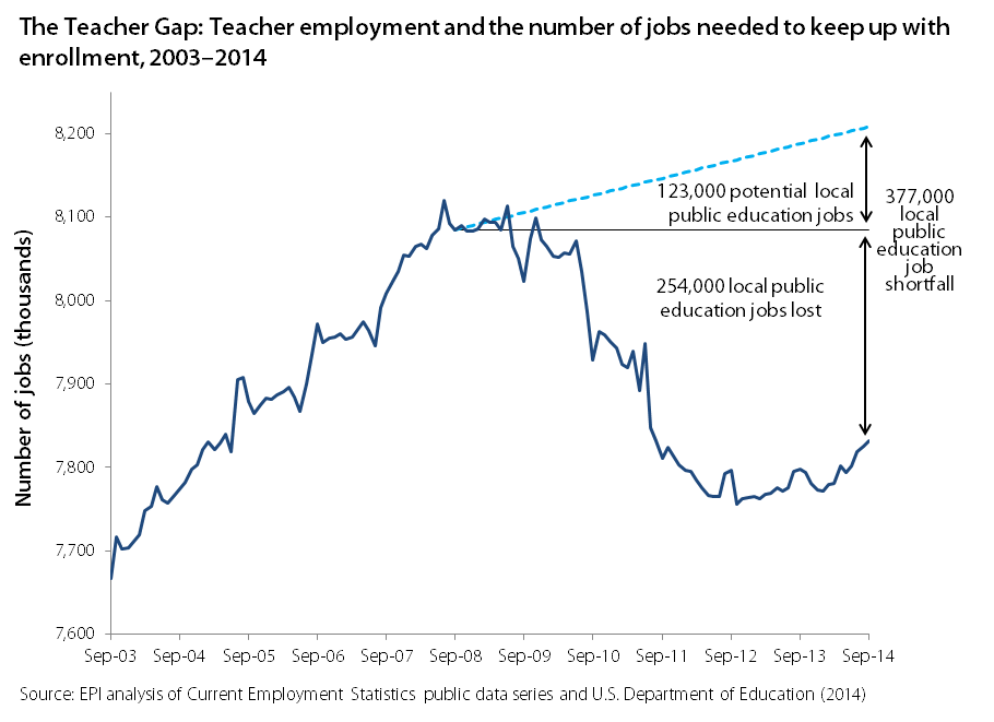
Strong Jobs Numbers for Teachers in September, but Large Jobs Gap Remains
In September, public-sector employment increased by 12,000, with the majority of that growth coming from local government education—an increase of 6,700 jobs. Local government education is largely jobs in public K-12 education (the majority of which are teachers, but also teacher aides, librarians, guidance counselors, administrators, support staff, etc.).
While this is clearly a positive sign, unfortunately, the number of teachers and related education staffers fell dramatically in the recession and has failed to get anywhere near its pre-recession level, let alone the level that would be required to keep up with the expanding student population. The figure below breaks down the teacher gap. The dark blue line illustrates the level of teacher employment. While the most recent positive trend is obvious, the longer term losses are also readily apparently.
Along with dismal trends in public sector employment in general, about a quarter million public education jobs were lost in the great recession and its aftermath. If we add to that the number of public education jobs that should have been added simply to keep up with growing enrollment, then we are currently experiencing a 377,000 job shortfall in local public education. The costs of a significant teacher gap are measurable: larger class sizes, fewer teacher aides, fewer extracurricular activities, and changes to the curriculum.
The Unemployment Rate Fails to Take into Account Missing Workers
Let’s put the pieces of the puzzle together. The unemployment rate fell in September by 0.2 percent points, from 6.1 to 5.9 percent. There was also a decrease in the sheer number of unemployed people—down 329,000 from August. On its face, this sounds like good news.
At the same time, the employment-to-population ratio has remained 59.0 percent for four months running. If the unemployment rate dropped and the employment-to-population ratio remained the same, the missing part of the puzzle is the labor force participation rate. In September, the labor force participation rate dropped to 62.7 percent. The last time the labor force participation rate was this low was February 1978. And, the biggest drop in labor force participation was among prime-age workers, 25-54 years old.
Over the last year, the labor force participation rate fell 0.5 percentage points. Therefore, it’s not surprising that missing workers—potential workers who are neither working nor actively seeking work due to the weak labor market—are at an all-time-high of 6.3 million. The vast majority of them (3.4 million) are 25 to 54 years old.
To put the official unemployment rate in perspective, the figure below shows the actual unemployment rate and the unemployment rate if the missing workers were in the labor force looking for work and thus counted as unemployed. The unemployment rate including the missing workers sits at 9.6 percent, the same rate for the last four months. Perhaps, this is a better indication of the slack in the labor market and the reason why wage growth has remained so sluggish even with a falling unemployment rate.
The unemployment rate is vastly understating weakness in today's labor market: Unemployment rate, actual and if missing workers* were looking for work, January 2006–November 2014
| Date | Actual | If missing workers were looking for work |
|---|---|---|
| 2006-01-01 | 4.7% | 5.0% |
| 2006-02-01 | 4.8% | 4.8% |
| 2006-03-01 | 4.7% | 4.8% |
| 2006-04-01 | 4.7% | 4.9% |
| 2006-05-01 | 4.6% | 4.8% |
| 2006-06-01 | 4.6% | 4.7% |
| 2006-07-01 | 4.7% | 4.8% |
| 2006-08-01 | 4.7% | 4.6% |
| 2006-09-01 | 4.5% | 4.6% |
| 2006-10-01 | 4.4% | 4.4% |
| 2006-11-01 | 4.5% | 4.4% |
| 2006-12-01 | 4.4% | 4.1% |
| 2007-01-01 | 4.6% | 4.4% |
| 2007-02-01 | 4.5% | 4.4% |
| 2007-03-01 | 4.4% | 4.3% |
| 2007-04-01 | 4.5% | 4.9% |
| 2007-05-01 | 4.4% | 4.8% |
| 2007-06-01 | 4.6% | 4.8% |
| 2007-07-01 | 4.7% | 4.9% |
| 2007-08-01 | 4.6% | 5.1% |
| 2007-09-01 | 4.7% | 4.9% |
| 2007-10-01 | 4.7% | 5.2% |
| 2007-11-01 | 4.7% | 4.9% |
| 2007-12-01 | 5.0% | 5.1% |
| 2008-01-01 | 5.0% | 4.8% |
| 2008-02-01 | 4.9% | 5.0% |
| 2008-03-01 | 5.1% | 5.1% |
| 2008-04-01 | 5.0% | 5.2% |
| 2008-05-01 | 5.4% | 5.4% |
| 2008-06-01 | 5.6% | 5.6% |
| 2008-07-01 | 5.8% | 5.7% |
| 2008-08-01 | 6.1% | 6.0% |
| 2008-09-01 | 6.1% | 6.3% |
| 2008-10-01 | 6.5% | 6.5% |
| 2008-11-01 | 6.8% | 7.1% |
| 2008-12-01 | 7.3% | 7.5% |
| 2009-01-01 | 7.8% | 8.2% |
| 2009-02-01 | 8.3% | 8.7% |
| 2009-03-01 | 8.7% | 9.3% |
| 2009-04-01 | 9.0% | 9.4% |
| 2009-05-01 | 9.4% | 9.7% |
| 2009-06-01 | 9.5% | 9.9% |
| 2009-07-01 | 9.5% | 10.1% |
| 2009-08-01 | 9.6% | 10.4% |
| 2009-09-01 | 9.8% | 10.9% |
| 2009-10-01 | 10.0% | 11.3% |
| 2009-11-01 | 9.9% | 11.2% |
| 2009-12-01 | 9.9% | 11.7% |
| 2010-01-01 | 9.7% | 11.3% |
| 2010-02-01 | 9.8% | 11.4% |
| 2010-03-01 | 9.9% | 11.3% |
| 2010-04-01 | 9.9% | 11.0% |
| 2010-05-01 | 9.6% | 11.1% |
| 2010-06-01 | 9.4% | 11.1% |
| 2010-07-01 | 9.5% | 11.3% |
| 2010-08-01 | 9.5% | 11.1% |
| 2010-09-01 | 9.5% | 11.3% |
| 2010-10-01 | 9.5% | 11.5% |
| 2010-11-01 | 9.8% | 11.7% |
| 2010-12-01 | 9.4% | 11.6% |
| 2011-01-01 | 9.1% | 11.4% |
| 2011-02-01 | 9.0% | 11.4% |
| 2011-03-01 | 9.0% | 11.3% |
| 2011-04-01 | 9.1% | 11.4% |
| 2011-05-01 | 9.0% | 11.4% |
| 2011-06-01 | 9.1% | 11.5% |
| 2011-07-11 | 9.0% | 11.7% |
| 2011-08-20 | 9.0% | 11.4% |
| 2011-09-01 | 9.0% | 11.3% |
| 2011-10-11 | 8.8% | 11.2% |
| 2011-11-20 | 8.6% | 11.0% |
| 2011-12-30 | 8.5% | 11.0% |
| 2012-01-12 | 8.2% | 10.8% |
| 2012-02-12 | 8.3% | 10.7% |
| 2012-03-12 | 8.2% | 10.7% |
| 2012-04-12 | 8.2% | 10.9% |
| 2012-05-12 | 8.2% | 10.6% |
| 2012-06-12 | 8.2% | 10.5% |
| 2012-07-12 | 8.2% | 10.8% |
| 2012-08-12 | 8.1% | 10.8% |
| 2012-09-12 | 7.8% | 10.4% |
| 2012-10-12 | 7.8% | 10.0% |
| 2012-11-12 | 7.8% | 10.3% |
| 2012-12-12 | 7.9% | 10.3% |
| 2013-01-12 | 7.9% | 10.4% |
| 2013-02-12 | 7.7% | 10.5% |
| 2013-03-12 | 7.5% | 10.6% |
| 2013-04-12 | 7.5% | 10.5% |
| 2013-05-12 | 7.5% | 10.3% |
| 2013-06-12 | 7.5% | 10.3% |
| 2013-07-12 | 7.3% | 10.2% |
| 2013-08-12 | 7.2% | 10.3% |
| 2013-09-12 | 7.2% | 10.3% |
| 2013-10-12 | 7.2% | 10.7% |
| 2013-11-12 | 7.0% | 10.3% |
| 2013-12-12 | 6.7% | 10.2% |
| 2014-01-12 | 6.6% | 10.0% |
| 2014-02-12 | 6.7% | 10.0 |
| 2014-03-12 | 6.7% | 9.8% |
| 2014-04-12 | 6.3% | 9.9% |
| 2014-05-12 | 6.3% | 9.7% |
| 2014-06-12 | 6.1% | 9.6% |
| 2014-07-12 | 6.2% | 9.6% |
| 2014-08-12 | 6.1% | 9.6% |
| 2014-09-12 | 5.9% | 9.6% |
| 2014-10-12 | 5.8% | 9.1% |
| 2014-11-12 | 5.8% | 9.2% |
* Potential workers who, due to weak job opportunities, are neither employed nor actively seeking work
Source: EPI analysis of Mitra Toossi, “Labor Force Projections to 2016: More Workers in Their Golden Years,” Bureau of Labor Statistics Monthly Labor Review, November 2007; and Current Population Survey public data series