The top charts of 2016: 13 charts that show the difference between the economy we have now and the economy we could have
The election of Donald Trump alerted many to what should have been obvious long ago: the U.S. economy has failed to deliver the goods to the vast majority of American families for decades. In the context of Trump’s election, this economic failure was often characterized as being unique to white working-class voters in the upper Midwest. But this is wrong. Income growth has been sluggish, and hourly wage growth near zero, for low- and middle-income families across the board. The fact is, our economy has generated enough income in recent decades to deliver very substantial wage gains for all workers—men and women, people of color and whites. Our economy has the capacity to provide not just decent wages but labor protections that support strong families and policies that provide security in retirement. These charts show the gap between what is and what could be. (For policies to close the gaps, see EPI’s Real agenda for working people.)
The minimum wage would be much higher if it had kept up with a growing economy: The inflation-adjusted minimum wage, and hypothetical minimum wage values if it had grown with average wages and productivity since 1968
| Actual minimum wage (2016$) | Minimum wage if it had grown with average wages | Minimum wage if it had grown with productivity | |
|---|---|---|---|
| 1938 | $ 3.67 | ||
| 1939 | $ 4.46 | ||
| 1940 | $ 4.43 | ||
| 1941 | $ 4.22 | ||
| 1942 | $ 3.81 | ||
| 1943 | $ 3.59 | ||
| 1944 | $ 3.53 | ||
| 1945 | $ 4.60 | ||
| 1946 | $ 4.24 | ||
| 1947 | $ 3.71 | ||
| 1948 | $ 3.46 | $5.43 | |
| 1949 | $ 3.51 | $5.52 | |
| 1950 | $ 6.49 | $5.94 | |
| 1951 | $ 6.02 | $6.11 | |
| 1952 | $ 5.91 | $6.28 | |
| 1953 | $ 5.86 | $6.50 | |
| 1954 | $ 5.82 | $6.61 | |
| 1955 | $ 5.84 | $6.87 | |
| 1956 | $ 7.67 | $6.88 | |
| 1957 | $ 7.43 | $7.07 | |
| 1958 | $ 7.22 | $7.22 | |
| 1959 | $ 7.17 | $7.48 | |
| 1960 | $ 7.05 | $7.61 | |
| 1961 | $ 8.03 | $7.84 | |
| 1962 | $ 7.95 | $8.14 | |
| 1963 | $ 8.52 | $8.42 | |
| 1964 | $ 8.41 | $8.69 | |
| 1965 | $ 8.28 | $8.96 | |
| 1966 | $ 8.05 | $9.24 | |
| 1967 | $ 8.75 | $9.35 | |
| 1968 | $ 9.63 | $ 9.63 | $9.63 |
| 1969 | $ 9.21 | $ 9.80 | $9.67 |
| 1970 | $ 8.79 | $ 9.90 | $9.80 |
| 1971 | $ 8.42 | $ 10.10 | $10.17 |
| 1972 | $ 8.17 | $ 10.55 | $10.44 |
| 1973 | $ 7.69 | $ 10.53 | $10.69 |
| 1974 | $ 8.74 | $ 10.27 | $10.52 |
| 1975 | $ 8.48 | $ 10.12 | $10.76 |
| 1976 | $ 8.78 | $ 10.25 | $11.06 |
| 1977 | $ 8.26 | $ 10.35 | $11.18 |
| 1978 | $ 8.91 | $ 10.47 | $11.29 |
| 1979 | $ 8.90 | $ 10.31 | $11.31 |
| 1980 | $ 8.56 | $ 10.01 | $11.23 |
| 1981 | $ 8.45 | $ 9.93 | $11.47 |
| 1982 | $ 7.96 | $ 9.91 | $11.30 |
| 1983 | $ 7.64 | $ 9.91 | $11.64 |
| 1984 | $ 7.34 | $ 9.85 | $11.94 |
| 1985 | $ 7.09 | $ 9.80 | $12.14 |
| 1986 | $ 6.97 | $ 9.83 | $12.39 |
| 1987 | $ 6.74 | $ 9.74 | $12.45 |
| 1988 | $ 6.50 | $ 9.70 | $12.60 |
| 1989 | $ 6.23 | $ 9.66 | $12.70 |
| 1990 | $ 6.73 | $ 9.58 | $12.88 |
| 1991 | $ 7.27 | $ 9.53 | $12.98 |
| 1992 | $ 7.09 | $ 9.52 | $13.45 |
| 1993 | $ 6.92 | $ 9.53 | $13.50 |
| 1994 | $ 6.78 | $ 9.58 | $13.63 |
| 1995 | $ 6.62 | $ 9.61 | $13.63 |
| 1996 | $ 7.20 | $ 9.67 | $13.96 |
| 1997 | $ 7.64 | $ 9.83 | $14.16 |
| 1998 | $ 7.54 | $ 10.09 | $14.44 |
| 1999 | $ 7.38 | $ 10.24 | $14.79 |
| 2000 | $ 7.14 | $ 10.29 | $15.13 |
| 2001 | $ 6.95 | $ 10.39 | $15.37 |
| 2002 | $ 6.84 | $ 10.52 | $15.80 |
| 2003 | $ 6.69 | $ 10.57 | $16.31 |
| 2004 | $ 6.51 | $ 10.51 | $16.75 |
| 2005 | $ 6.30 | $ 10.44 | $17.04 |
| 2006 | $ 6.10 | $ 10.51 | $17.14 |
| 2007 | $ 6.74 | $ 10.62 | $17.27 |
| 2008 | $ 7.26 | $ 10.62 | $17.29 |
| 2009 | $8.07 | $ 10.97 | $17.65 |
| 2010 | $ 7.94 | $ 11.05 | $18.17 |
| 2011 | $ 7.70 | $ 10.93 | $18.19 |
| 2012 | $ 7.54 | $ 10.87 | $18.29 |
| 2013 | $ 7.43 | $ 10.94 | $18.31 |
| 2014 | $ 7.31 | $ 11.01 | $18.42 |
| 2015 | $ 7.30 | $ 11.23 | $18.48 |
| 2016 | $7.25 | $11.35 | $18.85 |

Note: Growth in average wages measures average wages of production/nonsupervisory workers in the private sector.
Source: Adapted from David Cooper, The federal minimum wage has been eroded by decades of inaction, Economic Policy Institute Snapshot, July 25, 2016
The federal minimum wage is meant to ensure a fair wage for the nation’s lowest-paid workers. But it hasn’t done that since 1968. Since the inception of the federal minimum wage in 1938, Congress has periodically raised it, ostensibly so that its real (inflation-adjusted) value would reflect changing economic circumstances. Before 1968, the real value of the federal minimum wage grew at roughly the same pace as the growth in labor productivity—i.e., the rate at which the average worker can produce income from each hour of work. This makes sense: if the economy as a whole can produce more income per hour of work, it means there is capacity for wages across the distribution to grow at a similar rate. But after 1968, when the real value of the minimum wage in today’s dollars was $9.63, the minimum wage stopped rising at the same pace as productivity. As the top line in the graph shows, had the minimum wage kept pace with rising productivity, it would be nearly $19 per hour today. Not $7.25.
This is only one way in which policymakers have failed to ensure that the lowest-paid Americans get their fair share of economic growth and improving labor productivity. As the middle line in the figure shows, if, since 1968, the minimum wage had even just been raised at the same growth rate as average hourly wages of typical U.S. workers, the minimum wage would be $11.35 today. To sum up, minimum wage workers are falling behind not only productivity growth but typical worker pay growth and pay growth of their 1968 counterparts! And as the next chart shows, typical workers (measured here as the nonsupervisory production workers who constitute roughly 80 percent of all private-sector U.S. workers) themselves are lagging behind highly paid supervisors and executives when it comes to claiming a share of economic growth.
CEOs make 276 times more than typical workers: CEO-to-worker compensation ratio, 1965–2015
| Year | CEO-to-worker compensation ratio |
|---|---|
| 1965/01/01 | 20.0 |
| 1966/01/01 | 21.2 |
| 1967/01/01 | 22.4 |
| 1968/01/01 | 23.7 |
| 1969/01/01 | 23.4 |
| 1970/01/01 | 23.2 |
| 1971/01/01 | 22.9 |
| 1972/01/01 | 22.6 |
| 1973/01/01 | 22.3 |
| 1974/01/01 | 23.7 |
| 1975/01/01 | 25.1 |
| 1976/01/01 | 26.6 |
| 1977/01/01 | 28.2 |
| 1978/01/01 | 29.9 |
| 1979/01/01 | 31.8 |
| 1980/01/01 | 33.8 |
| 1981/01/01 | 35.9 |
| 1982/01/01 | 38.2 |
| 1983/01/01 | 40.6 |
| 1984/01/01 | 43.2 |
| 1985/01/01 | 45.9 |
| 1986/01/01 | 48.9 |
| 1987/01/01 | 51.9 |
| 1988/01/01 | 55.2 |
| 1989/01/01 | 58.7 |
| 1990/01/01 | 71.2 |
| 1991/01/01 | 86.2 |
| 1992/01/01 | 104.4 |
| 1993/01/01 | 111.8 |
| 1994/01/01 | 87.3 |
| 1995/01/01 | 122.6 |
| 1996/01/01 | 153.8 |
| 1997/01/01 | 233.0 |
| 1998/01/01 | 321.8 |
| 1999/01/01 | 286.7 |
| 2000/01/01 | 376.1 |
| 2001/01/01 | 214.2 |
| 2002/01/01 | 188.5 |
| 2003/01/01 | 227.5 |
| 2004/01/01 | 256.6 |
| 2005/01/01 | 308.0 |
| 2006/01/01 | 341.4 |
| 2007/01/01 | 345.3 |
| 2008/01/01 | 239.3 |
| 2009/01/01 | 195.8 |
| 2010/01/01 | 229.7 |
| 2011/01/01 | 235.5 |
| 2012/01/01 | 285.3 |
| 2013/01/01 | 303.1 |
| 2014/01/01 | 301.9 |
| 2015/01/01 | 275.6 |
Note: CEO annual compensation is computed using the “options realized” compensation series, which includes salary, bonus, restricted stock grants, options exercised, and long-term incentive payouts for CEOs at the top 350 U.S. firms ranked by sales. Typical worker compensation refers to annual compensation of the workers in the key industries of the firms in the sample.
Source: Adapted from Figure C in Lawrence Mishel and Jessica Schieder, Stock market headwinds meant less generous year for some CEOs, Economic Policy Institute Report, July 12, 2016
The compensation of the CEOs of the largest firms has grown much faster than stock prices, corporate profits, and the wages of the top 0.1 percent. But the most dramatic difference is between the compensation of CEOs and the compensation of typical workers. From 1978 to 2015, CEO compensation grew 941 percent compared with just 10 percent for the compensation of a typical worker (annual compensation of the workers in the key industries represented by the sample).
The figure illustrates the gap in pay between CEOs and employees by tracking the ratio of CEO compensation to that of the typical worker. CEOs of major U.S. companies earned 20 times more than a typical worker in 1965; this ratio grew to 59-to-1 by 1989, and then it surged in the 1990s, hitting 376-to-1 by the end of the 1990s recovery, in 2000. The two stock market crashes after 2000 reduced CEO stock-related pay and caused CEO compensation to tumble. But by 2014, the stock market had recouped all of the value it lost following the 2008 financial crisis and the CEO-to-worker compensation ratio was back to 302-to-1. A dip in the stock market and the value of associated stock options led to a decline in CEO compensation in 2015 and, correspondingly, the CEO-to-worker pay ratio fell to 276-to-1, similar to what happened in other stock market declines at the start of the new millennium and during the Great Recession. Though the CEO-to-worker compensation ratio remains below the peak values achieved earlier in the 2000s, it is far higher than it was in the previous four decades.
Boosting productivity is necessary but not sufficient for wage growth: Disconnect between productivity and a typical worker's compensation, 1948–2015
| Year | Hourly compensation | Net productivity |
|---|---|---|
| 1948 | 0.00% | 0.00% |
| 1949 | 6.25% | 1.55% |
| 1950 | 10.48% | 9.33% |
| 1951 | 11.75% | 12.35% |
| 1952 | 15.04% | 15.63% |
| 1953 | 20.84% | 19.55% |
| 1954 | 23.52% | 21.56% |
| 1955 | 28.74% | 26.46% |
| 1956 | 33.94% | 26.66% |
| 1957 | 37.14% | 30.09% |
| 1958 | 38.16% | 32.78% |
| 1959 | 42.55% | 37.64% |
| 1960 | 45.49% | 40.05% |
| 1961 | 47.99% | 44.36% |
| 1962 | 52.47% | 49.79% |
| 1963 | 55.02% | 55.01% |
| 1964 | 58.50% | 59.99% |
| 1965 | 62.46% | 64.94% |
| 1966 | 64.89% | 70.00% |
| 1967 | 66.89% | 72.05% |
| 1968 | 70.73% | 77.16% |
| 1969 | 74.66% | 77.88% |
| 1970 | 76.59% | 80.37% |
| 1971 | 82.01% | 87.10% |
| 1972 | 91.24% | 92.05% |
| 1973 | 91.29% | 96.75% |
| 1974 | 86.96% | 93.66% |
| 1975 | 86.84% | 97.92% |
| 1976 | 89.66% | 103.44% |
| 1977 | 93.13% | 105.79% |
| 1978 | 95.96% | 107.79% |
| 1979 | 93.43% | 108.14% |
| 1980 | 88.56% | 106.57% |
| 1981 | 87.59% | 111.02% |
| 1982 | 87.76% | 107.88% |
| 1983 | 88.35% | 114.13% |
| 1984 | 86.94% | 119.73% |
| 1985 | 86.31% | 123.43% |
| 1986 | 87.32% | 127.99% |
| 1987 | 84.59% | 129.12% |
| 1988 | 83.85% | 131.78% |
| 1989 | 83.70% | 133.65% |
| 1990 | 82.22% | 136.98% |
| 1991 | 81.87% | 138.89% |
| 1992 | 83.04% | 147.56% |
| 1993 | 83.38% | 148.37% |
| 1994 | 83.82% | 150.75% |
| 1995 | 82.70% | 150.86% |
| 1996 | 82.79% | 156.92% |
| 1997 | 84.80% | 160.50% |
| 1998 | 89.17% | 165.71% |
| 1999 | 91.92% | 172.08% |
| 2000 | 92.90% | 178.50% |
| 2001 | 95.56% | 182.84% |
| 2002 | 99.38% | 190.72% |
| 2003 | 101.63% | 200.17% |
| 2004 | 100.84% | 208.21% |
| 2005 | 100.05% | 213.58% |
| 2006 | 100.21% | 215.48% |
| 2007 | 101.70% | 217.70% |
| 2008 | 101.71% | 218.24% |
| 2009 | 109.69% | 224.75% |
| 2010 | 111.53% | 234.28% |
| 2011 | 109.06% | 234.67% |
| 2012 | 107.27% | 236.51% |
| 2013 | 108.32% | 237.57% |
| 2014 | 109.13% | 239.30% |
| 2015 | 112.53% | 241.08% |
Note: Data are for average hourly compensation of production/nonsupervisory workers in the private sector and net productivity of the total economy. “Net productivity” is the growth of output of goods and services minus depreciation per hour worked.
Source: Adapted from Figure K in Josh Bivens and Hunter Blair, Financing recovery and fairness by going where the money is, Economic Policy Institute Report, November 15, 2016
Source: Economic Policy Institute analysis of data from the Bureau of Economic Analysis’ National Income and Produce Accounts and the Bureau of Labor Statistics’ Consumer Price Indexes and Labor Productivity and Costs programs (see technical appendix of Understanding the Historic Divergence Between Productivity and a Typical Worker's Pay for more detailed information)
The root cause of the extraordinary rise in inequality and the near-stagnant growth of wages for typical workers over most of the past generation is the pay-productivity gap. Before the late 1970s, wages of the vast majority of workers grew in line with productivity. In the late 1970s, typical worker pay growth split from economy-wide productivity growth. Productivity is a measure of how much income is generated in an average hour of work in the economy. While productivity after 1979 grew more slowly relative to previous decades, it did grow steadily, offering the potential for broad-based wage gains. But income gains were not broad-based. In fact, average pay (wages plus benefits) for the 80 percent of the private-sector workers who are not supervisors barely budged in that time. The growing wedge between productivity and pay is the income generated by workers in the economy that has been claimed by corporate owners and managers and others at the very top of the pay scale.
Eliminating the gender and inequality wage gaps would raise women’s wages by 69%: Median hourly wages for men and women, compared with wages for all workers had they increased in tandem with productivity, 1979–2015
| Year | Wages for all workers | Men’s wages | Women’s wages | Wages for all workers had they grown in tandem with productivity |
|---|---|---|---|---|
| 1979 | $16.15 | $20.30 | $12.66 | $16.15 |
| 1980 | $16.07 | $19.98 | $12.60 | $16.03 |
| 1981 | $15.66 | $19.52 | $12.53 | $16.38 |
| 1982 | $15.75 | $19.30 | $12.61 | $16.13 |
| 1983 | $15.71 | $19.18 | $12.76 | $16.62 |
| 1984 | $15.71 | $19.15 | $12.93 | $17.05 |
| 1985 | $15.80 | $19.10 | $12.98 | $17.34 |
| 1986 | $16.27 | $19.70 | $13.26 | $17.70 |
| 1987 | $16.12 | $19.75 | $13.64 | $17.78 |
| 1988 | $16.10 | $19.23 | $13.64 | $17.99 |
| 1989 | $16.06 | $18.57 | $13.71 | $18.13 |
| 1990 | $15.85 | $18.12 | $13.62 | $18.39 |
| 1991 | $15.94 | $18.06 | $13.68 | $18.54 |
| 1992 | $15.98 | $18.10 | $13.82 | $19.21 |
| 1993 | $16.06 | $17.87 | $14.02 | $19.28 |
| 1994 | $15.80 | $17.67 | $13.98 | $19.46 |
| 1995 | $15.58 | $17.91 | $13.85 | $19.47 |
| 1996 | $15.65 | $17.93 | $13.87 | $19.94 |
| 1997 | $16.04 | $17.85 | $14.14 | $20.22 |
| 1998 | $16.49 | $18.65 | $14.54 | $20.62 |
| 1999 | $16.97 | $19.10 | $14.73 | $21.12 |
| 2000 | $16.83 | $19.20 | $15.03 | $21.61 |
| 2001 | $17.27 | $19.44 | $15.31 | $21.95 |
| 2002 | $17.27 | $19.64 | $15.72 | $22.56 |
| 2003 | $17.56 | $19.35 | $15.61 | $23.30 |
| 2004 | $17.55 | $19.17 | $15.69 | $23.92 |
| 2005 | $17.40 | $18.95 | $15.63 | $24.34 |
| 2006 | $17.51 | $18.91 | $15.58 | $24.49 |
| 2007 | $17.21 | $19.21 | $15.70 | $24.66 |
| 2008 | $17.30 | $19.06 | $15.85 | $24.70 |
| 2009 | $17.65 | $19.75 | $16.06 | $25.20 |
| 2010 | $17.40 | $19.09 | $15.92 | $25.94 |
| 2011 | $16.92 | $18.60 | $15.74 | $25.97 |
| 2012 | $16.83 | $18.59 | $15.44 | $26.12 |
| 2013 | $16.95 | $18.38 | $15.32 | $26.20 |
| 2014 | $16.90 | $18.41 | $15.14 | $26.33 |
| 2015 | 17.11 | 18.94 | 15.67 | 26.47 |
Source: Adapted from Figure B in Elise Gould, “A women’s economic agenda for the 45th U.S. president: Investing in the infrastructure to support a 21st century economy,” Working Economics (Economic Policy Institute blog), October 26, 2016. See also What is the gender pay gap and is it real?, Economic Policy Institute report, October 20, 2016
Closing the pay-productivity gap must be a part of an agenda to improve women’s economic security. Although the gap between what median men and median women are paid has narrowed (albeit too slowly) since 1979, the gap between typical workers’ compensation and economy-wide productivity growth has widened. Tackling both gaps would also raise the economic security of men. One example of why the pay-productivity gap needs to inform our thinking about progress in closing gender pay gaps is the fact that roughly a third of the progress made in closing the median gender wage gap since 1979 was due to the decline in men’s wages in an era of increasing inequality. Remedying unfairness of pay for women is necessary, but wage parity gained simply because male wages dropped is no cause for celebration.
The figure shows how high median wages for women could be if gender wage disparities had been closed between 1979 and today and if the economy had generated wage growth for all workers that matched economy-wide productivity growth. If the gender wage gap were closed and the economy’s gains broadly shared, women’s median hourly wages would be 69 percent higher today ($26.47 instead of $15.67). Notably, men’s median hourly wages would also be 40 percent higher. (To see how these differences compare for age and education cohorts, check out EPI’s new gender wage calculator.) These figures show that getting to gender pay equity is not a zero-sum game—if we also tackle inequality, typical men and women have much to gain.
Though all workers’ wages have failed to rise in tandem with productivity, black men have suffered most: Hourly median wage growth by gender, race, and ethnicity, compared with economy-wide productivity growth, 1979–2014
| Year | White men | White women | Black men | Black women | Productivity |
|---|---|---|---|---|---|
| 1979 | 0.0% | 0.0% | 0.0% | 0.0% | 0.0% |
| 1980 | -2.1% | -0.2% | -2.0% | -1.9% | -0.8% |
| 1981 | -3.8% | -1.6% | -3.3% | 0.0% | 1.4% |
| 1982 | -3.9% | -0.6% | -7.1% | -0.8% | -0.1% |
| 1983 | -5.1% | 0.5% | -6.6% | -1.2% | 2.9% |
| 1984 | -5.5% | 1.0% | -5.9% | -1.2% | 5.6% |
| 1985 | -2.6% | 1.5% | -8.2% | 1.4% | 7.3% |
| 1986 | -2.4% | 5.4% | -4.5% | 3.0% | 9.5% |
| 1987 | -4.1% | 7.8% | -5.6% | 3.0% | 10.1% |
| 1988 | -4.5% | 8.8% | -5.0% | 4.0% | 11.4% |
| 1989 | -5.3% | 9.0% | -8.9% | 6.0% | 12.3% |
| 1990 | -7.0% | 8.9% | -9.9% | 4.8% | 13.9% |
| 1991 | -6.6% | 9.4% | -11.2% | 5.3% | 14.8% |
| 1992 | -7.2% | 10.7% | -11.8% | 5.8% | 18.9% |
| 1993 | -8.0% | 12.1% | -11.6% | 7.0% | 19.3% |
| 1994 | -9.0% | 12.0% | -11.6% | 5.2% | 20.5% |
| 1995 | -8.8% | 11.7% | -11.3% | 4.5% | 20.5% |
| 1996 | -8.5% | 13.9% | -12.4% | 4.5% | 23.4% |
| 1997 | -6.3% | 14.7% | -9.8% | 5.6% | 25.2% |
| 1998 | -3.2% | 17.7% | -6.9% | 11.2% | 27.7% |
| 1999 | -0.8% | 21.2% | -3.0% | 11.4% | 30.7% |
| 2000 | -1.1% | 21.9% | -3.4% | 16.1% | 33.8% |
| 2001 | 0.7% | 25.6% | -0.5% | 15.1% | 35.9% |
| 2002 | 0.9% | 28.4% | -0.3% | 18.0% | 39.7% |
| 2003 | 2.6% | 29.6% | -0.9% | 21.4% | 44.2% |
| 2004 | 1.8% | 29.3% | 1.0% | 22.9% | 48.1% |
| 2005 | 0.0% | 30.0% | -4.7% | 15.4% | 50.7% |
| 2006 | 0.0% | 30.0% | -1.9% | 19.6% | 51.6% |
| 2007 | 1.3% | 30.5% | -3.0% | 18.2% | 52.7% |
| 2008 | 0.0% | 29.6% | -3.1% | 16.0% | 53.0% |
| 2009 | 3.6% | 31.5% | 0.0% | 20.8% | 56.1% |
| 2010 | 1.8% | 31.6% | -1.9% | 20.2% | 60.7% |
| 2011 | -1.4% | 30.3% | -5.5% | 16.9% | 60.9% |
| 2012 | -2.2% | 29.2% | -5.9% | 14.0% | 61.7% |
| 2013 | -3.1% | 30.6% | -4.9% | 15.9% | 61.9% |
| 2014 | -3.1% | 30.2% | -7.2% | 12.8% | 62.7% |
Note: Race/ethnicity categories are mutually exclusive (i.e., white non-Hispanic, black non-Hispanic, and Hispanic any race).
Source: Adapted from Figure A in Valerie Wilson, Black workers’ wages have been harmed by both widening racial wage gaps and the widening productivity-pay gap, Economic Policy Institute Report, October 25, 2016
In the wake of Trump’s election, some commentators have focused on the economic failures afflicting white working-class men. White working-class men are suffering, but they are not the only group suffering from the chasm between what the economy can provide and what it is providing, and their loss has not translated into gains made by typical workers of other races. In fact, wage gaps between workers of different races have widened at the same time that economy-wide productivity and wages for typical workers overall have diverged. In short, what has caused sluggish wage growth for the vast majority of all workers is the rise of inequality that has redistributed income toward the very top of the income distribution.
The figure shows that between 1979 and 2015, median hourly real wage growth fell far short of productivity growth—a measure of the potential for pay increases—for men as well as for women and for both black and white workers. And white workers are not losing income to their black counterparts. Median hourly wages of black men fell 5.7 percent, compared with a 1.0 percent decline for white men. Median hourly wages of white women grew 31.6 percent, compared with 15.2 percent for black women.
What this figure does not show is that black workers already start out with a big pay disparity. In 2015, black workers overall were paid 26.2 percent less than their white peers. What has this double penalty of overall wage stagnation and regress on racial pay disparities cost black workers? Quite a lot, according to a 2016 report by Valerie Wilson. If the 1979 racial wage gap at the median had closed by 2015 and the overall median had grown with productivity (63.9 percent) between 1979 and 2015, the median black worker would be earning an hourly wage of $26.47 instead of $14.14—an increase of $12.33. That means the hourly wage of the median black worker would be an astounding 87.2 percent higher! And under this scenario, the median white worker would also receive an hourly pay increase of $7.30—the difference between $26.47 and $19.17—boosting their wages by 38.1 percent. The vast majority of workers of all races would be better off if we addressed both class and racial inequalities, with larger gains for African Americans because of the dual penalties imposed by class and race.
Drop in union membership has taken $14 to $52 out of nonunion workers’ weekly wages: Additional weekly wages that nonunion private-sector workers would earn, had the share of workers in a union (union density) remained the same as in 1979, 1979–2013 (2013 dollars)
| Year | Men | Women |
|---|---|---|
| 1979 | 0.00 | 0.00 |
| 1980 | 4.55 | 1.81 |
| 1981 | 7.34 | 2.50 |
| 1983 | 16.93 | 4.77 |
| 1984 | 22.11 | 6.18 |
| 1985 | 25.90 | 7.39 |
| 1986 | 28.29 | 8.14 |
| 1987 | 29.63 | 8.60 |
| 1988 | 31.24 | 9.19 |
| 1989 | 32.36 | 9.76 |
| 1990 | 33.57 | 10.07 |
| 1991 | 33.57 | 10.27 |
| 1992 | 33.58 | 10.57 |
| 1993 | 34.83 | 10.89 |
| 1995 | 38.96 | 11.74 |
| 1996 | 38.38 | 11.62 |
| 1997 | 40.31 | 12.33 |
| 1998 | 42.69 | 12.74 |
| 1999 | 43.50 | 12.84 |
| 2000 | 45.00 | 13.41 |
| 2001 | 46.29 | 13.48 |
| 2002 | 48.02 | 13.76 |
| 2003 | 49.62 | 13.91 |
| 2004 | 49.55 | 13.63 |
| 2005 | 50.49 | 13.89 |
| 2006 | 51.14 | 13.86 |
| 2007 | 51.98 | 14.09 |
| 2008 | 50.01 | 13.48 |
| 2009 | 50.07 | 12.87 |
| 2010 | 49.09 | 12.63 |
| 2011 | 50.08 | 13.48 |
| 2012 | 52.48 | 13.80 |
| 2013 | $52.39 | $13.80 |
Notes: Sample restricted to nonunion full-time workers in the private sector ages 16 to 64.
Source: Adapted from Figure C in Jake Rosenfeld, Patrick Denice, and Jennifer Laird, Union decline lowers wages of nonunion workers, Economic Policy Institute Report, August 30, 2016
All workers would be better off in terms of wage levels had the right of workers to associate and bargain collectively not been severely eroded in recent decades. Between 1979 and 2013, the share of private-sector workers in a union fell from about 34 percent to 10 percent among men, and from 16 percent to 6 percent among women. This decline in union density has eroded wages for nonunion workers at every level of education and experience, costing billions in lost wages. For the 32.9 million full-time nonunion women working in the private sector and the 40.2 million full-time men working in the private sector, there is a $133 billion loss in annual wages because of weakened unions. This translates to real weekly wage losses for workers. Women would be making $13.80 more a week and men would be making $52.39 more a week, had union density (the share of workers in similar industries and regions who are union members) remained the same as in 1979.
Unions keep wages high for nonunion workers for several reasons. Union agreements set wage standards that nonunion employers follow. And a strong union presence prompts managers to keep wages high to prevent workers from organizing or leaving. Unions also set industry-wide norms, influencing what is seen as a “moral economy.”
Though not shown in the graph, working-class men have felt the decline in unionization the hardest. Specifically, nonunion men lacking a college degree would have earned 8 percent, or $3,016, more in 2013 if unions had remained as strong as they were in 1979.
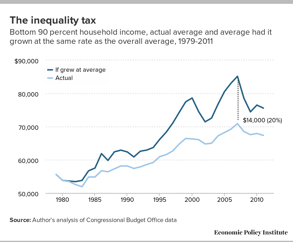
Source: Data are from a new data set compiled by Thomas Piketty, Emmanuel Saez, and Gabriel Zucman. A new data set confirms what we know about the enormous increase in income inequality after 1979. This data set allows us to take another cut at this issue, with all of total national income and its distribution accounted for—market-based incomes like wages and dividends, transfer incomes like Social Security and Medicare, and even the income stemming from direct government purchases. The figure charts incomes (indexed to be 100 in 1979) for the bottom 50 percent of households, bottom 90 percent of households, households between the 50th and 90th percentiles, households in subgroups of the top 10 percent, and the top 0.1 percent of households. The results are clear: households nearer the top of the income distribution have seen far more rapid growth in recent decades. And counting income in the form of government benefits does not close the gap between income growth at the top and the income growth of everybody else.Yet another data source documents the enormous surge in American inequality: Post-tax-and-transfer household income growth from the distributional national accounts data, by income percentile
Bottom 90
Bottom 50
Next 40
91-95th
96-99th
99-99.9th
Top 0.1
1913
23.7327
33.65331
29.93943
43.27823
75.47623
1914
21.28975
30.44152
27.42943
38.72785
70.84473
1915
22.01303
31.29446
27.63197
33.98987
76.78276
1916
24.03428
35.05713
32.63794
45.75293
95.50515
1917
23.36389
37.55653
35.58478
48.98219
70.30063
1918
25.99977
37.45943
39.75538
51.13678
45.59054
1919
23.7557
29.73864
37.5025
55.97586
66.42215
1920
23.91308
30.49568
36.39877
52.00038
52.00913
1921
20.40423
33.57089
35.97857
46.24904
43.86804
1922
22.56271
35.35251
38.48873
48.60645
46.79869
1923
26.62762
36.18494
40.41201
51.57063
52.83884
1924
25.3325
37.78878
41.67534
53.30806
55.98231
1925
25.04011
35.89191
43.1564
60.36712
66.94126
1926
26.0494
35.2388
44.31057
65.07314
80.33322
1927
25.88253
35.26906
43.68758
62.20689
72.31164
1928
25.59061
36.8098
44.30285
63.26883
81.19631
1929
27.59766
36.22686
45.13929
63.97269
84.32806
1930
25.69753
36.78869
41.43329
53.91076
50.41799
1931
23.58497
37.6386
38.18021
42.38411
23.40733
1932
19.5378
33.37675
36.22934
33.874
12.42559
1933
18.8133
29.89834
35.59108
34.83715
16.7181
1934
20.12877
31.87053
41.05316
44.31979
30.83398
1935
22.40259
36.77853
41.38343
48.20434
35.22401
1936
24.67013
40.19861
42.85473
57.50882
45.48423
1937
26.43228
41.65951
44.5373
62.14962
50.66807
1938
24.79725
42.58223
43.10907
53.47296
34.3556
1939
25.55145
44.95177
46.81794
61.79799
46.51512
1940
27.62901
47.54603
48.92943
67.68232
61.10282
1941
33.88191
54.39828
53.65169
79.19836
73.09964
1942
43.29914
63.3563
55.50446
81.06559
73.31078
1943
52.80965
69.71679
58.40494
83.07906
70.12778
1944
54.60111
83.20119
61.25023
73.92529
58.40418
1945
54.2032
73.59434
58.5029
67.72197
42.88401
1946
47.1023
54.98784
55.75051
65.37271
42.55941
1947
45.61777
51.27523
52.65075
64.54918
52.81662
1948
46.27771
55.32878
56.69584
73.94818
67.30207
1949
44.85111
55.47728
53.61912
68.53701
64.51888
1950
48.95762
59.82028
58.26081
76.67206
69.6535
1951
53.13092
63.30267
61.1851
79.11648
66.05985
1952
55.543
63.20365
60.6588
75.66076
67.4788
1953
58.13027
66.00397
60.82156
74.12246
62.29707
1954
56.74598
64.72895
59.72348
73.76929
61.18403
1955
60.45715
66.59386
64.45841
81.47777
74.45941
1956
62.6146
66.07277
65.53554
78.24851
69.06196
1957
63.07287
64.54181
65.75526
77.86183
67.29979
1958
61.44245
65.657
65.02915
72.07397
56.18065
1959
65.02998
68.06952
68.14701
78.90449
69.33398
1960
66.89607
68.68847
68.1266
76.77248
69.91774
1961
67.78351
69.65426
70.63115
75.09075
67.87351
1962
70.4927
63.64325
74.46108
73.76656
75.63827
80.53871
77.82573
1963
72.34403
64.45871
76.91257
77.00796
79.27725
84.17178
83.4488
1964
74.78534
65.27417
80.29585
80.97379
83.68492
88.60585
90.01243
1965
78.97684
70.13567
84.09917
84.71663
87.38434
91.63466
93.81867
1966
83.00219
74.99717
87.64008
88.19319
90.8142
94.28764
97.31097
1967
85.64931
80.78541
88.46732
87.65472
88.85984
92.36706
88.88887
1968
89.01593
85.16668
91.24607
89.55186
89.20251
91.6852
88.51358
1969
91.25928
88.4355
92.8953
90.5163
88.4021
88.0171
83.84223
1970
89.31669
87.15028
90.57185
88.66994
86.42245
85.17894
75.69672
1971
89.55088
87.09922
90.9713
89.31088
87.57022
86.35819
76.34119
1972
92.38655
90.03742
93.74757
92.96691
92.13266
90.75359
79.82626
1973
96.11671
94.64942
96.96682
96.91853
96.75554
95.51017
81.34194
1974
94.02037
93.52424
94.30781
93.87008
92.52697
90.70497
76.23273
1975
91.01398
90.52585
91.29679
90.96083
89.50955
87.40869
74.26816
1976
94.35718
94.2051
94.44529
94.31208
92.73313
90.32411
76.67994
1977
96.81916
96.52656
96.98868
97.28635
96.48129
94.6759
82.49974
1978
99.88037
99.34863
100.1884
100.8638
100.2407
98.91114
90.22779
1979
100
100
100
100
100
100
100
1980
98.26488
97.61414
98.64191
97.76216
94.80523
93.1143
86.91483
1981
97.68509
96.23014
98.52805
98.91017
97.19851
98.64778
100.612
1982
94.07145
90.60212
96.08148
96.72842
94.56753
95.22981
101.7506
1983
94.64854
88.9539
97.94785
100.3394
97.77981
101.0831
103.9856
1984
98.68139
91.5108
102.8358
107.8385
107.5276
116.219
131.004
1985
100.8055
93.33651
105.1329
109.655
108.4626
118.0252
130.057
1986
102.7875
94.35348
107.6739
111.2332
109.3253
116.9127
110.9831
1987
104.7421
96.2283
109.6748
111.9271
112.8364
128.7529
134.6872
1988
106.8402
97.96563
111.982
115.4286
118.3864
143.0172
175.9767
1989
108.8137
100.2283
113.7879
116.895
119.2596
144.3395
165.6537
1990
108.8275
100.2639
113.789
116.7634
118.5356
144.6014
165.7722
1991
106.9756
98.14099
112.0942
115.7375
118.7417
137.8344
148.6849
1992
107.6168
97.72335
113.3488
117.3251
122.0337
147.7052
168.7361
1993
109.3271
99.80908
114.8416
119.6654
123.0398
142.693
159.3989
1994
112.7897
102.5032
118.7495
124.494
127.9362
146.7308
162.0879
1995
114.2954
103.2037
120.7217
127.2814
132.2493
154.3844
173.5347
1996
116.8251
105.3766
123.458
131.5369
138.125
162.6432
189.7594
1997
120.0619
107.7359
127.2032
136.0553
143.8332
171.3382
212.6514
1998
124.279
111.47
131.7001
140.7231
150.4667
182.4624
217.8013
1999
127.0094
113.8701
134.6219
144.6325
154.4141
192.1739
242.2452
2000
130.2871
116.1185
138.496
149.5242
160.0374
201.6449
262.2195
2001
130.563
116.4413
138.7448
149.1107
157.6435
196.2731
255.3759
2002
129.6873
115.0149
138.188
148.5807
158.6449
198.1229
258.2305
2003
130.7376
114.3935
140.2069
151.4572
159.7162
200.1824
268.4298
2004
133.1071
116.6533
142.6401
154.2173
164.2175
211.3237
298.3971
2005
135.1675
118.907
144.5884
157.2676
168.406
216.9945
327.02
2006
137.0963
120.5917
146.6586
160.8505
174.6956
230.622
345.1448
2007
136.5364
121.2232
145.4084
159.4222
171.626
221.0781
328.095
2008
134.4407
120.4954
142.5202
153.4786
163.4876
212.8995
330.0312
2009
128.613
111.9696
138.2557
148.2443
155.5828
195.6494
318.9889
2010
129.7716
114.2373
138.7717
150.9138
159.7115
205.1275
356.6267
2011
131.4316
114.5713
141.2
154.8323
165.0593
213.0578
348.0072
2012
132.2085
113.8685
142.8342
159.1319
171.7283
226.6272
380.3506
2013
134.7136
116.3695
145.3417
161.0668
174.0647
219.045
330.5724
2014
136.7039
118.4258
147.2938
164.6328
178.6594
227.4947
346.8308
The gap between the retirement ‘haves’ and ‘have-nots’ has grown since the recession: Retirement account savings of families age 32–61 by savings percentile, 1989–2013 (2013 dollars)
| 50th (median) | 60th | 70th | 80th | 90th | |
|---|---|---|---|---|---|
| 1989 | $0 | $5,423 | $14,461 | $32,536 | $90,379 |
| 1992 | $0 | $4,874 | $16,248 | $39,384 | $90,987 |
| 1995 | $2,277 | $9,866 | $24,286 | $47,054 | $113,841 |
| 1998 | $6,004 | $17,440 | $38,597 | $73,763 | $160,106 |
| 2001 | $7,879 | $23,638 | $48,326 | $92,818 | $223,247 |
| 2004 | $6,166 | $19,730 | $49,326 | $102,351 | $246,628 |
| 2007 | $11,228 | $30,315 | $61,754 | $123,508 | $258,243 |
| 2010 | $5,358 | $19,291 | $42,868 | $96,453 | $246,490 |
| 2013 | $5,000 | $20,100 | $50,000 | $116,000 | $274,000 |
Note: Retirement account savings include 401(k)s, IRAs, and Keogh plans. Scale changed to accommodate larger values.
Source: Adapted from Figure 9 in Monique Morrissey, The State of American Retirement:
How 401(k)s have failed most American workers, Economic Policy Institute Report, March 3, 2016
Over the past generation of economic life, the U.S. economy undertook a grand experiment in making defined-contribution (DC) pension plans such as 401(k)s, often financed directly by workers’ savings themselves, the primary vehicle of private retirement security. This experiment has decisively failed. Overall pension coverage has not increased, and fewer Americans are in defined-benefit (DB) plans (think company pensions). The DB plans crowded out by DC plans were more secure, providing a guaranteed income for life that was not subject to the vagaries of the stock market. They were also much more equal than DC plans because they were employer-funded and participation was automatic (rather than workers bearing most of the costs and all of the risks).
Nearly half of working-age families have nothing saved in retirement accounts, and the median working-age family had only $5,000 saved in 2013. Meanwhile, families in the 90th percentile of retirement savings had $274,000 in retirement, and the top 1 percent of families had $1,080,000 or more (not shown on chart). These huge disparities reflect a growing gap between the haves and the have-nots since the Great Recession, as accounts with smaller balances have stagnated while larger ones have rebounded.
Fiscal austerity explains why recovery has been so long in coming: Change in per capita government spending during recoveries of the last four recessions
| 1982Q4 | 1991Q1 | 2001Q4 | 2009Q2 | |
|---|---|---|---|---|
| -6 | 90.83817 | |||
| -5 | 96.46779 | 91.33168 | ||
| -4 | 96.72548 | 97.80345 | ||
| -3 | 96.51523 | 96.35624 | 94.05089 | |
| -2 | 97.21731 | 98.09825 | 98.14218 | 94.4813 |
| -1 | 98.26435 | 98.92533 | 97.98324 | 96.68474 |
| 0 | 100 | 100 | 100 | 100 |
| 1 | 100.3829 | 100.7468 | 101.5275 | 99.84022 |
| 2 | 100.9558 | 100.4456 | 102.3723 | 99.50632 |
| 3 | 101.005 | 100.9653 | 102.8023 | 100.7222 |
| 4 | 99.79553 | 102.3054 | 103.3013 | 101.0192 |
| 5 | 100.4771 | 102.4831 | 103.1351 | 101.1242 |
| 6 | 101.715 | 102.7714 | 104.3665 | 100.3432 |
| 7 | 102.037 | 102.2554 | 104.5556 | 98.88213 |
| 8 | 103.485 | 101.9195 | 104.6451 | 98.15822 |
| 9 | 104.602 | 101.724 | 105.4192 | 97.23836 |
| 10 | 106.0107 | 102.011 | 105.8382 | 96.86414 |
| 11 | 107.6073 | 101.868 | 105.804 | 95.9267 |
| 12 | 107.6288 | 101.2959 | 105.4445 | 95.78736 |
| 13 | 108.7749 | 101.4328 | 106.1767 | 95.40735 |
| 14 | 110.4932 | 102.1325 | 106.3521 | 94.83589 |
| 15 | 112.3029 | 101.9209 | 106.5289 | 94.21625 |
| 16 | 111.6476 | 102.6275 | 106.0185 | 93.90439 |
| 17 | 112.0741 | 102.8173 | 107.5423 | 93.62299 |
| 18 | 112.6221 | 102.3836 | 107.6773 | 93.04895 |
| 19 | 112.3952 | 101.1486 | 107.8776 | 93.22292 |
| 20 | 113.0807 | 101.9359 | 108.2144 | 93.60604 |
| 21 | 113.3476 | 103.2437 | 109.1187 | 94.245 |
| 22 | 113.3408 | 102.7047 | 109.0787 | 94.14226 |
| 23 | 113.108 | 102.7598 | 109.5846 | 95.09063 |
| 24 | 114.405 | 103.1194 | 109.8789 | 95.43504 |
| 25 | 114.9973 | 103.4402 | 95.722 | |
| 26 | 116.1049 | 103.3562 | 95.86387 | |
| 27 | 116.8758 | 103.2392 | 96.35498 |
Note: For total government spending, government consumption and investment expenditures are deflated with the NIPA price deflator. Government transfer payments are deflated with the price deflator for personal consumption expenditures. This figure includes state and local government spending.
Source: Adapted from Figure B in Josh Bivens, Why is recovery taking so long—and who’s to blame?, Economic Policy Institute Report, August 11, 2016
The agonizingly slow pace of recovery from the Great Recession is easy to explain: it is the result of austerity policies championed by Republican policymakers at the federal and state levels. Like every other postwar recession before it, the Great Recession was caused by a shortfall in aggregate demand, meaning that the spending of households, businesses, and governments was not sufficient to keep the economy’s resources fully employed.
Despite the Great Recession being the sharpest and longest on record since World War II, and despite monetary policy reaching its conventional limits to boost spending early in the recession, policymakers made damaging decisions to limit public spending following the recession’s trough in 2009. This growth has been historically slow relative to other business cycles even as the economy needed substantially faster-than-average growth to mount a full and timely recovery.
The figure shows the growth in per capita spending by federal, state, and local governments following the troughs of the four recessions. Astoundingly, per capita government spending in the first quarter of 2016—27 quarters into the recovery—was nearly 3.5 percent lower than it was at the trough of the Great Recession. By contrast, 27 quarters into the early 1990s recovery, per capita government spending was 3 percent higher than at the trough; 23 quarters following the early 2000s recession (a shorter recovery), it was 10 percent higher; and 27 quarters into the early 1980s recovery, it was 17 percent higher.
Nominal wage growth shows economy is not overheating: Year-over-year change in private-sector nominal average hourly earnings, 2007–2016
| All nonfarm employees | Production/nonsupervisory workers | |
|---|---|---|
| Mar-2007 | 3.59% | 4.11% |
| Apr-2007 | 3.27% | 3.85% |
| May-2007 | 3.73% | 4.14% |
| Jun-2007 | 3.81% | 4.13% |
| Jul-2007 | 3.45% | 4.05% |
| Aug-2007 | 3.49% | 4.04% |
| Sep-2007 | 3.28% | 4.15% |
| Oct-2007 | 3.28% | 3.78% |
| Nov-2007 | 3.27% | 3.89% |
| Dec-2007 | 3.16% | 3.81% |
| Jan-2008 | 3.11% | 3.86% |
| Feb-2008 | 3.09% | 3.73% |
| Mar-2008 | 3.08% | 3.77% |
| Apr-2008 | 2.88% | 3.70% |
| May-2008 | 3.02% | 3.69% |
| Jun-2008 | 2.67% | 3.62% |
| Jul-2008 | 3.00% | 3.72% |
| Aug-2008 | 3.33% | 3.83% |
| Sep-2008 | 3.23% | 3.64% |
| Oct-2008 | 3.32% | 3.92% |
| Nov-2008 | 3.64% | 3.85% |
| Dec-2008 | 3.58% | 3.84% |
| Jan-2009 | 3.58% | 3.72% |
| Feb-2009 | 3.24% | 3.65% |
| Mar-2009 | 3.13% | 3.53% |
| Apr-2009 | 3.22% | 3.29% |
| May-2009 | 2.84% | 3.06% |
| Jun-2009 | 2.78% | 2.94% |
| Jul-2009 | 2.59% | 2.71% |
| Aug-2009 | 2.39% | 2.64% |
| Sep-2009 | 2.34% | 2.75% |
| Oct-2009 | 2.34% | 2.63% |
| Nov-2009 | 2.05% | 2.67% |
| Dec-2009 | 1.82% | 2.50% |
| Jan-2010 | 1.95% | 2.61% |
| Feb-2010 | 2.00% | 2.49% |
| Mar-2010 | 1.77% | 2.27% |
| Apr-2010 | 1.81% | 2.43% |
| May-2010 | 1.94% | 2.59% |
| Jun-2010 | 1.71% | 2.53% |
| Jul-2010 | 1.85% | 2.47% |
| Aug-2010 | 1.75% | 2.41% |
| Sep-2010 | 1.84% | 2.30% |
| Oct-2010 | 1.88% | 2.51% |
| Nov-2010 | 1.65% | 2.23% |
| Dec-2010 | 1.74% | 2.07% |
| Jan-2011 | 1.92% | 2.17% |
| Feb-2011 | 1.87% | 2.12% |
| Mar-2011 | 1.87% | 2.06% |
| Apr-2011 | 1.91% | 2.11% |
| May-2011 | 2.00% | 2.16% |
| Jun-2011 | 2.13% | 2.00% |
| Jul-2011 | 2.26% | 2.31% |
| Aug-2011 | 1.90% | 1.99% |
| Sep-2011 | 1.94% | 1.93% |
| Oct-2011 | 2.11% | 1.77% |
| Nov-2011 | 2.02% | 1.77% |
| Dec-2011 | 1.98% | 1.77% |
| Jan-2012 | 1.75% | 1.40% |
| Feb-2012 | 1.88% | 1.45% |
| Mar-2012 | 2.10% | 1.76% |
| Apr-2012 | 2.01% | 1.76% |
| May-2012 | 1.83% | 1.39% |
| Jun-2012 | 1.95% | 1.54% |
| Jul-2012 | 1.77% | 1.33% |
| Aug-2012 | 1.82% | 1.33% |
| Sep-2012 | 1.99% | 1.44% |
| Oct-2012 | 1.51% | 1.28% |
| Nov-2012 | 1.90% | 1.43% |
| Dec-2012 | 2.20% | 1.74% |
| Jan-2013 | 2.15% | 1.89% |
| Feb-2013 | 2.10% | 2.04% |
| Mar-2013 | 1.93% | 1.88% |
| Apr-2013 | 2.01% | 1.73% |
| May-2013 | 2.01% | 1.88% |
| Jun-2013 | 2.13% | 2.03% |
| Jul-2013 | 1.91% | 1.92% |
| Aug-2013 | 2.26% | 2.18% |
| Sep-2013 | 2.04% | 2.17% |
| Oct-2013 | 2.25% | 2.27% |
| Nov-2013 | 2.24% | 2.32% |
| Dec-2013 | 1.90% | 2.16% |
| Jan-2014 | 1.94% | 2.31% |
| Feb-2014 | 2.14% | 2.45% |
| Mar-2014 | 2.18% | 2.40% |
| Apr-2014 | 1.97% | 2.40% |
| May-2014 | 2.13% | 2.44% |
| Jun-2014 | 2.04% | 2.34% |
| Jul-2014 | 2.09% | 2.43% |
| Aug-2014 | 2.21% | 2.48% |
| Sep-2014 | 2.04% | 2.27% |
| Oct-2014 | 2.03% | 2.27% |
| Nov-2014 | 2.11% | 2.26% |
| Dec-2014 | 1.82% | 1.87% |
| Jan-2015 | 2.23% | 2.01% |
| Feb-2015 | 2.06% | 1.71% |
| Mar-2015 | 2.18% | 1.90% |
| Apr-2015 | 2.34% | 2.00% |
| May-2015 | 2.34% | 2.14% |
| Jun-2015 | 2.04% | 1.99% |
| Jul-2015 | 2.29% | 2.04% |
| Aug-2015 | 2.32% | 2.08% |
| Sep-2015 | 2.40% | 2.13% |
| Oct-2015 | 2.52% | 2.36% |
| Nov-2015 | 2.39% | 2.21% |
| Dec-2015 | 2.60% | 2.61% |
| Jan-2016 | 2.50% | 2.50% |
| Feb-2016 | 2.38% | 2.50% |
| Mar-2016 | 2.33% | 2.44% |
| Apr-2016 | 2.49% | 2.53% |
| May-2016 | 2.48% | 2.33% |
| Jun-2016 | 2.64% | 2.48% |
| Jul-2016 | 2.72% | 2.57% |
| Aug-2016 | 2.47% | 2.42% |
| Sep-2016 | 2.67% | 2.60% |
| Oct-2016 | 2.82% | 2.36% |
| Nov-2016 | 2.45% | 2.36% |
*Nominal wage growth consistent with the Federal Reserve Board’s 2 percent inflation target, 1.5 percent productivity growth, and a stable labor share of income.
Source: Adapted from EPI’s “Nominal Wage Tracker”
The year 2017 looks to be the year that the Fed begins raising short-term interest rates in earnest. The Fed should raise rates only when it fears the economy is growing too fast and pushing unemployment low enough that workers are empowered to demand (and get) raises above what their productivity justifies. Data on nominal wage growth show that the economy is not getting overheated and thus a rate increase is not justified.
The pace of economic growth should be considered unsustainable only when increases in labor costs force firms to raise prices enough to accelerate inflation above the Federal Reserve’s stated goal of 2 percent inflation. An absolutely crucial link in this chain is wage growth. If nominal (i.e., not inflation-adjusted) wages simply grow at the rate of economy-wide productivity, then wages are putting no upward pressure on prices. To see why, think of a 2 percent raise in hourly pay of a worker whose productivity (how much they produce in an hour) also rises 2 percent. The worker is getting 2 percent more, but is also producing 2 percent more. So the labor cost per unit of output is unchanged, and there is zero upward pressure on firms’ costs, or overall inflation. And the goal of Federal Reserve policy is not zero upward pressure on prices (or 0 percent inflation). Their stated target is 2 percent inflation. This means that nominal wages can grow at the rate of economy-wide productivity growth plus 2 percent before they are putting enough upward pressure on prices to make the Fed rein them in. EPI’s nominal wage tracker looks are how wages have grown over this recovery relative to a target of 1.5 percent (a common estimate of long-run, trend productivity growth) plus 2 percent. Nominal wage growth has been consistently below this target, meaning there is very little reason to worry about overheating in the economy.
The U.S. has a lower share of prime-age women with a job than do peer countries: Employment-to-population ratio of women workers age 25–54, select countries, 1995–2014
| Canada | Germany | Japan | United States | |
|---|---|---|---|---|
| 1995 | 69.434551% | 66.360158% | 63.233624% | 72.189196% |
| 1996 | 69.577146% | 67.220440% | 63.701741% | 72.770073% |
| 1997 | 70.971110% | 67.399584% | 64.566038% | 73.541046% |
| 1998 | 72.183646% | 68.944387% | 64.036077% | 73.642970% |
| 1999 | 73.245982% | 70.253128% | 63.551051% | 74.147991% |
| 2000 | 73.944309% | 71.210539% | 63.582090% | 74.213847% |
| 2001 | 74.297867% | 71.607431% | 64.124398% | 73.421299% |
| 2002 | 75.348504% | 71.845950% | 63.863976% | 72.259684% |
| 2003 | 76.000458% | 71.981067% | 64.407421% | 72.006189% |
| 2004 | 76.720415% | 72.129055% | 65.028791% | 71.848458% |
| 2005 | 76.488663% | 70.969949% | 65.733178% | 71.963537% |
| 2006 | 76.984912% | 72.647765% | 66.614235% | 72.504467% |
| 2007 | 78.190906% | 74.045933% | 67.370518% | 72.501768% |
| 2008 | 78.008148% | 74.744854% | 67.495987% | 72.301570% |
| 2009 | 77.114622% | 75.420875% | 67.595960% | 70.208609% |
| 2010 | 77.075022% | 76.320711% | 68.157788% | 69.343654% |
| 2011 | 77.207691% | 77.892216% | 68.459240% | 68.967922% |
| 2012 | 77.710148% | 78.235789% | 69.161920% | 69.196894% |
| 2013 | 78.090883% | 78.625264% | 70.773639% | 69.253713% |
| 2014 | 77.444969% | 78.839200% | 71.835052% | 69.997790% |
Source: Adapted from Figure F in Josh Bivens et al., It’s time for an ambitious national investment in America’s children, Economic Policy Institute Report, April 6, 2016
Reducing gender and inequality wage gaps and lowering unemployment enough to spur sustainable wage growth are absolutely essential steps if we are serious about restoring economic security to millions of working families. But a working labor market requires more than just jobs and wages. It requires a policy infrastructure that enables workers to enter the labor market and be productive in their roles as employees because they don’t have to make difficult choices between their careers and their caregiving responsibilities.
Paid family leave and subsidized child care provide family security, which benefits employers and the economy. But there are currently no national standards regarding paid family leave or subsidized child care. Each worker is left to the whims of individual company policies, which often means no allowance or support for family leave or child care. Therefore, workers have to make difficult choices between their careers and their caregiving responsibilities precisely when they need their paychecks the most, such as following the birth of a child or when they or a loved one falls ill. The lack of these policies particularly affects women, as they currently take on the lion’s share of unpaid care work. In contrast, many of our peer nations have such policies. Not surprisingly, the United States has fallen far behind some of our international peers in the share of women who are working. The graph shows the share of women age 25–54 with a job between 1995 and 2014. While the share of prime-age women with a job rose in Germany, Canada, and Japan, in the United States it actually fell. Policies that help workers, particularly women, balance work and family could meaningfully increase women’s employment, which would also mean more earnings for families and more economic activity for the country. (See EPI’s latest investigation into child care for how progressive child care policy, in particular, can benefit families, reduce inequality, and increase economic growth.)
The number of salaried workers guaranteed overtime pay has plummeted since 1979: Number of salaried workers* covered by overtime salary threshold, 1979–2014 (in millions)
| Year | Number of salaried workers* covered |
|---|---|
| 1979 | 12.6 |
| 1980 | 10.8 |
| 1981 | 8.9 |
| 1982 | 7.4 |
| 1983 | 6.5 |
| 1984 | 5.8 |
| 1985 | 5.1 |
| 1986 | 4.5 |
| 1987 | 3.8 |
| 1988 | 3.5 |
| 1989 | 3.4 |
| 1990 | 3.0 |
| 1991 | 2.4 |
| 1992 | 2.2 |
| 1993 | 2.1 |
| 1994 | 2.5 |
| 1995 | 2.3 |
| 1996 | 2.2 |
| 1997 | 2.0 |
| 1998 | 1.9 |
| 1999 | 1.6 |
| 2000 | 1.5 |
| 2001 | 1.3 |
| 2002 | 1.2 |
| 2003 | 1.1 |
| 2004 | 5.5 |
| 2005 | 5.5 |
| 2006 | 4.9 |
| 2007 | 4.8 |
| 2008 | 4.4 |
| 2009 | 3.9 |
| 2010 | 3.8 |
| 2011 | 3.8 |
| 2012 | 3.7 |
| 2013 | 3.6 |
| 2014 | 3.5 |
* The sample included salaried (nonhourly), full-time workers who are 18 years or older. It excluded teachers (pre-K through college) and religious workers, who are automatically exempt from overtime protections.
Note: The nominal threshold was set at $250 per week from 1975 until 2004 when it was increased to $455 per week. Under the Fair Labor Standards Act, all salaried workers under the threshold must receive overtime pay for hours worked beyond 40 per week.
Source: Adapted from Figure A in Ross Eisenbrey, Raising the overtime salary threshold is an important improvement in working families’ labor standards, Economic Policy Institute Testimony, October 5, 2015
Work-life balance is a fundamental goal of the Fair Labor Standards Act (FLSA). Its requirement that employers pay hourly and lower-earning salaried employees a premium for time worked beyond 40 hours a week makes the FLSA the most family-friendly law ever passed in the United States. Excessive work is detrimental to family life, health, well-being, and productivity, and the law aims to protect workers who are junior enough that they can be forced to work extra hours. If not for the law’s overtime rules, tens of millions more workers would be working 50, 60, or 70 hours a week for no additional pay, just as millions of Americans did before the FLSA was enacted in 1938.
But millions more are still dealing with this overwork and stress on families, in part because the salary threshold that determines whether workers are automatically eligible for overtime pay is set for a 1970s economy, not a 2010s economy. As shown in the graph, in 1979 more than 12 million salaried workers earned less than the salary threshold and were therefore automatically guaranteed the right to overtime pay, regardless of their duties. Today, with a 50 percent bigger workforce, only 3.5 million salaried employees are automatically protected.
A new rule that guaranteed overtime protection to salaried workers making between $23,660 and $47,476 was instituted by the Department of Labor and was supposed to go into effect on December 1, 2016. But an egregiously bad legal decision has delayed enforcement of this common-sense rule.
Note: Data on manufacturing employment are from Current Employment Statistics (CES) program of the Bureau of Labor Statistics (BLS). Data on Chinese trade balance are from the Census Bureau. As a share of GDP, the US/China trade balance was 0.00% in 1985 (first year of data availability). We assume this value holds for pre-1985 years as well. The presidential campaign often highlighted the decline of American manufacturing jobs. An incorrect conventional wisdom among economic commentators holds that the decline of manufacturing employment has been driven by automation. This explanation does not fit the facts. Manufacturing employment was actually quite stable (aside from business cycle fluctuations) for 35 years between 1965 and 2000. But certainly there was plenty of automation between 1965 and 2000. Indeed productivity growth (a proxy for automation) was just as rapid in those years as thereafter. But 3 million jobs were lost in the 2001–2003 recession and jobless recovery from that recession. Then rapidly growing trade deficits—particularly with China—kept the subsequent recovery from aiding manufacturing jobs. This meant that manufacturing entered the Great Recession without having regained the jobs lost in the previous recession, and in fact having lost a small number more as the rest of the economy recovered. As a result of two recessions and the “China shock,” the manufacturing sector today has nearly 5 million fewer jobs than it did in 2000.It’s not technology killing manufacturing—employment was steady for 35 years between 1965 and 2000: Manufacturing employment and trade deficit with China, 1965–2015
Trade balance
Manufacturing employment
1965
0.00%
17051
1966
0.00%
17998
1967
0.00%
18025
1968
0.00%
18410
1969
0.00%
18485
1970
0.00%
17309
1971
0.00%
17202
1972
0.00%
18158
1973
0.00%
18820
1974
0.00%
17693
1975
0.00%
17140
1976
0.00%
17719
1977
0.00%
18531
1978
0.00%
19334
1979
0.00%
19301
1980
0.00%
18640
1981
0.00%
18223
1982
0.00%
16690
1983
0.00%
17551
1984
0.00%
18023
1985
0.00%
17693
1986
0.04%
17478
1987
0.06%
17809
1988
0.07%
18025
1989
0.11%
17881
1990
0.17%
17395
1991
0.21%
16916
1992
0.28%
16769
1993
0.33%
16815
1994
0.40%
17217
1995
0.44%
17231
1996
0.49%
17284
1997
0.58%
17588
1998
0.63%
17449
1999
0.71%
17280
2000
0.82%
17181
2001
0.78%
15711
2002
0.94%
14912
2003
1.08%
14300
2004
1.32%
14287
2005
1.54%
14193
2006
1.69%
14015
2007
1.79%
13746
2008
1.82%
12850
2009
1.57%
11475
2010
1.82%
11595
2011
1.90%
11802
2012
1.95%
11960
2013
1.91%
12086
2014
1.98%
12294
2015
2.04%
12320