Digging deeper into the BLS data: It was the ‘job creators’ and those in ‘real America’ that led to the job growth
I decided to dig a bit deeper into Bureau of Labor Statistics (BLS) data to gauge the divergence of employment growth in the household survey and the establishment survey in September and recent times. It is, after all, the divergence between these two series in September’s jobs report that generated outrageous charges of BLS economists manipulating the data (the household survey showed employment growth of 873,000 in September, which pushed the unemployment rate down to 7.8 percent from 8.1 percent in spite of a surge of new workers into the labor force).
The BLS, being the highly professional agency that it is, provides documentation on how the two series differ and compares the trends obtained in each series on an apples-to-apples basis (or, as close as they can get it); this information is available when the numbers are released each month. That is impressive, by the way. BLS will also share, on request, a spreadsheet providing the actual adjustments made to reconcile the two series over the last 12-month period (using “not seasonally adjusted” data, which is why they show it for the same month a year apart).
The bottom line is that the household survey has shown comparable employment growth as the payroll survey over the last year and less employment growth than in the payroll survey since the trough in June 2009. That’s pretty strong evidence that the trends in the household survey are not spectacular or implausible even though September’s employment growth was quite large. If Jack Welch thinks the September numbers were cooked then he’d also need to explain why the household employment growth was so low, relative to the payroll survey, before September’s data.
The following table from BLS’ document provides comparisons of employment growth in the payroll and household surveys and in a series which adjusts the household survey to be “more similar in concept and definition” to the payroll survey. The key adjustments to the household survey (noted in the table’s footnote) are to remove the trends in self-employment and agricultural employment (neither one in the scope of the payroll survey) and correct for multiple job holders (who show up twice in payroll but just once in the household survey, assuming “multiple” means “two”).
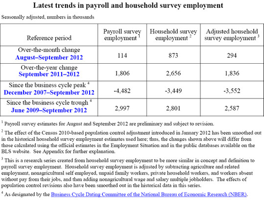
In September, the household series showed far more job growth than the payroll survey (873,000 versus 114,000) but the divergence was far less with the adjusted series (294,000 versus 114,000). This latter gap can readily be explained by the changing seasonality of college attendance that Catherine Rampell of the New York Times wrote about (students leaving summer jobs to return to school in August—earlier than expected in the seasonal adjustments—pushing down employment in August and accelerating growth in September).
The largest factors in the divergence last month, however, are primarily in the items that are part of the adjustment (the gap between the actual 873,000 employment growth and the “adjusted household” employment growth of 294,000). Digging deeper (with not seasonally adjusted data), I can tell you that self-employment grew in September (by 90,000) this year but fell by 284,000 last September. Similarly, employment in agriculture (not seasonally adjusted) fell 53,000 this September but fell a lot more last September (250,000). The actual changes in the reported data are seasonally adjusted so we cannot pinpoint the actual employment impact of the changed behavior of self-employment and agricultural employment, but these factors are clearly very big drivers of household employment in September and the divergence from the payroll series. It seems to me that one could argue, tongue in cheek, that the household employment growth in September captured a surge in “job creators” (self-employment) and agricultural employment in the “real America” that the payroll survey missed because those employment sectors are not in the scope of the payroll survey. There was also a smaller growth in multiple job holding (by 61,000) this September than last September, which contributes to a larger divergence between payroll and household employment changes (since multiple job holders show up twice in payroll but once in household employment). The bigger point is that BLS readily provides the data (in Table A-8 of the various “The Employment Situation” reports) needed to make this assessment to anyone interested. We should also be mindful that these data are volatile on a month-to-month basis, especially the household survey results. As BLS points out:
‘The payroll survey’s active sample covers approximately 486,000 business establishments of all sizes representing about one-third of total nonfarm employment. The household survey is much smaller at 60,000 households, covering a very small fraction of total employed persons. Over-the-month changes in household survey employment are therefore subject to larger sampling error, about four times that of the payroll survey on a monthly basis.”
The table also provides comparisons of the payroll and “adjusted household” employment trends over the last year and since the “trough” (June 2009) of the current recession, meaning since the beginning of the recovery. Over the last 12 months, the payroll and “adjusted” household survey employment trends have been nearly identical (up 1,806,000 in one and 1,836,000 in the other). Since the recovery began in June 2009, employment growth was 410,000 jobs greater in the payroll survey (up 2,997,000) than in the “adjusted household” series (up 2,587,000). So, even with the greater household employment growth in September, the household survey, on an apples-to-apples basis, has been showing slower employment growth. It is also curious that those who claim a BLS conspiracy did not notice that the household survey showed employment losses in July and August while the payroll survey showed gains; did they forget to thank BLS for sabotaging President Obama in July and August?
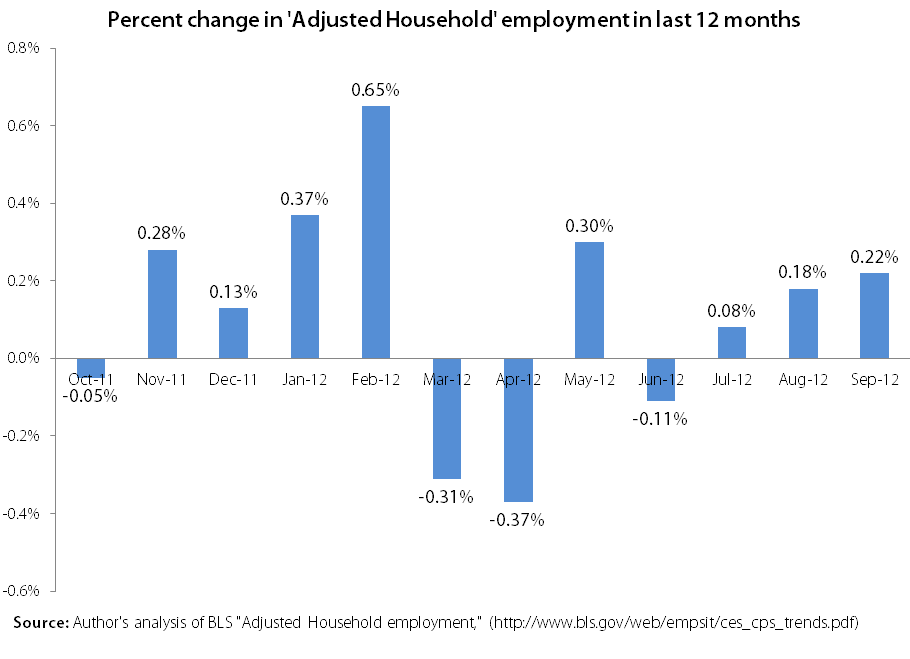
It is also clear that September’s change in the household employment growth in the “adjusted” series (that is, other than factors such as growth in agriculture and self-employment) was not extreme at all. In fact, as the graph shows, the percent change in employment in September was smaller than that in six of the last 11 months.
This controversy is not funny at all. BLS career staff has been inundated with calls from people attacking them, the predictable consequence of these conspiracy charges. BLS staff should not be facing this type of harassment. This whole episode makes me angry—at the disrespect for facts and the professionals at BLS—and it also makes me sad about the state of discourse in our nation.
Enjoyed this post?
Sign up for EPI's newsletter so you never miss our research and insights on ways to make the economy work better for everyone.