The State of Poverty in New England and the U.S. (and how we got here)
David Cooper
Senior Economic Analyst
January 16, 2020
Economic Policy Institute
Key terms and concepts:
- Income – the money a household, family, or person takes in over some period of time (usually annually) from all sources (earnings, investments, government transfers)
- “Market income” – pre-tax income excluding all government transfers
- Annual wages or “earnings”– the money a person receives from their employer as pay for their work over the course of a year
- Hourly wages – the money a person receives from their employer as pay for each hour they work
- Wealth – the stock of money or assets a household, family, or person has accumulated (such as the value of their home minus any debt)
State poverty rates, 2018
| State | ACS Poverty | CPS Poverty | SPM Poverty |
|---|---|---|---|
| USA | 13.1% | 11.8% | 13.1% |
| Alabama | 16.8% | 15.9% | 13.8% |
| Alaska | 10.9% | 13.1% | 12.8% |
| Arizona | 14.0% | 12.8% | 14.0% |
| Arkansas | 17.2% | 15.9% | 12.9% |
| California | 12.8% | 11.9% | 18.1% |
| Colorado | 9.6% | 9.1% | 10.8% |
| Connecticut | 10.4% | 10.2% | 11.6% |
| Delaware | 12.5% | 7.4% | 11.9% |
| District of Columbia | 16.2% | 14.7% | 18.2% |
| Florida | 13.6% | 13.6% | 16.2% |
| Georgia | 14.3% | 14.9% | 14.3% |
| Hawaii | 8.8% | 9.2% | 13.7% |
| Idaho | 11.8% | 11.4% | 9.0% |
| Illinois | 12.1% | 10.3% | 12.3% |
| Indiana | 13.1% | 11.6% | 11.1% |
| Iowa | 11.2% | 8.9% | 6.7% |
| Kansas | 12.0% | 7.5% | 7.8% |
| Kentucky | 16.9% | 15.7% | 12.5% |
| Louisiana | 18.6% | 19.0% | 16.5% |
| Maine | 11.6% | 11.6% | 10.1% |
| Maryland | 9.0% | 8.0% | 12.4% |
| Massachusetts | 10.0% | 8.7% | 11.4% |
| Michigan | 14.1% | 10.5% | 10.1% |
| Minnesota | 9.6% | 7.9% | 7.0% |
| Mississippi | 19.7% | 19.5% | 15.8% |
| Missouri | 13.2% | 12.4% | 10.5% |
| Montana | 13.0% | 10.3% | 9.4% |
| Nebraska | 11.0% | 10.5% | 9.1% |
| Nevada | 12.9% | 13.0% | 13.5% |
| New Hampshire | 7.6% | 6.1% | 8.2% |
| New Jersey | 9.5% | 8.3% | 14.0% |
| New Mexico | 19.5% | 16.6% | 14.4% |
| New York | 13.6% | 11.1% | 14.0% |
| North Carolina | 14.0% | 13.1% | 13.4% |
| North Dakota | 10.7% | 9.7% | 10.0% |
| Ohio | 13.9% | 11.9% | 10.4% |
| Oklahoma | 15.6% | 13.4% | 11.1% |
| Oregon | 12.6% | 9.7% | 11.5% |
| Pennsylvania | 12.2% | 11.8% | 10.8% |
| Rhode Island | 12.9% | 8.9% | 8.0% |
| South Carolina | 15.3% | 12.8% | 12.6% |
| South Dakota | 13.1% | 10.6% | 9.8% |
| Tennessee | 15.3% | 12.0% | 11.5% |
| Texas | 14.9% | 13.7% | 14.2% |
| Utah | 9.0% | 6.9% | 8.3% |
| Vermont | 11.0% | 9.7% | 9.4% |
| Virginia | 10.7% | 9.8% | 12.8% |
| Washington | 10.3% | 8.5% | 10.5% |
| West Virginia | 17.8% | 15.8% | 14.5% |
| Wisconsin | 11.0% | 8.6% | 7.8% |
| Wyoming | 11.1% | 9.5% | 10.1% |
Source: U.S. Census Bureau and EPI analysis of Current Population Survey (CPS) data from the Bureau of Labor Statistics
ACS, CPS, and SPM poverty rates in New England states and the U.S., averages 2016-2018
| ACS | CPS | SPM | |
|---|---|---|---|
| UNITED STATES | 13.5% | 12.3% | 13.1% |
| Maine | 11.7% | 12.1% | 10.1% |
| New Hampshire | 7.5% | 6.4% | 8.2% |
| Vermont | 11.4% | 9.9% | 9.4% |
| Massachusetts | 10.3% | 9.7% | 11.4% |
| Rhode Island | 12.4% | 10.8% | 8.0% |
| Connecticut | 9.9% | 10.3% | 11.6% |
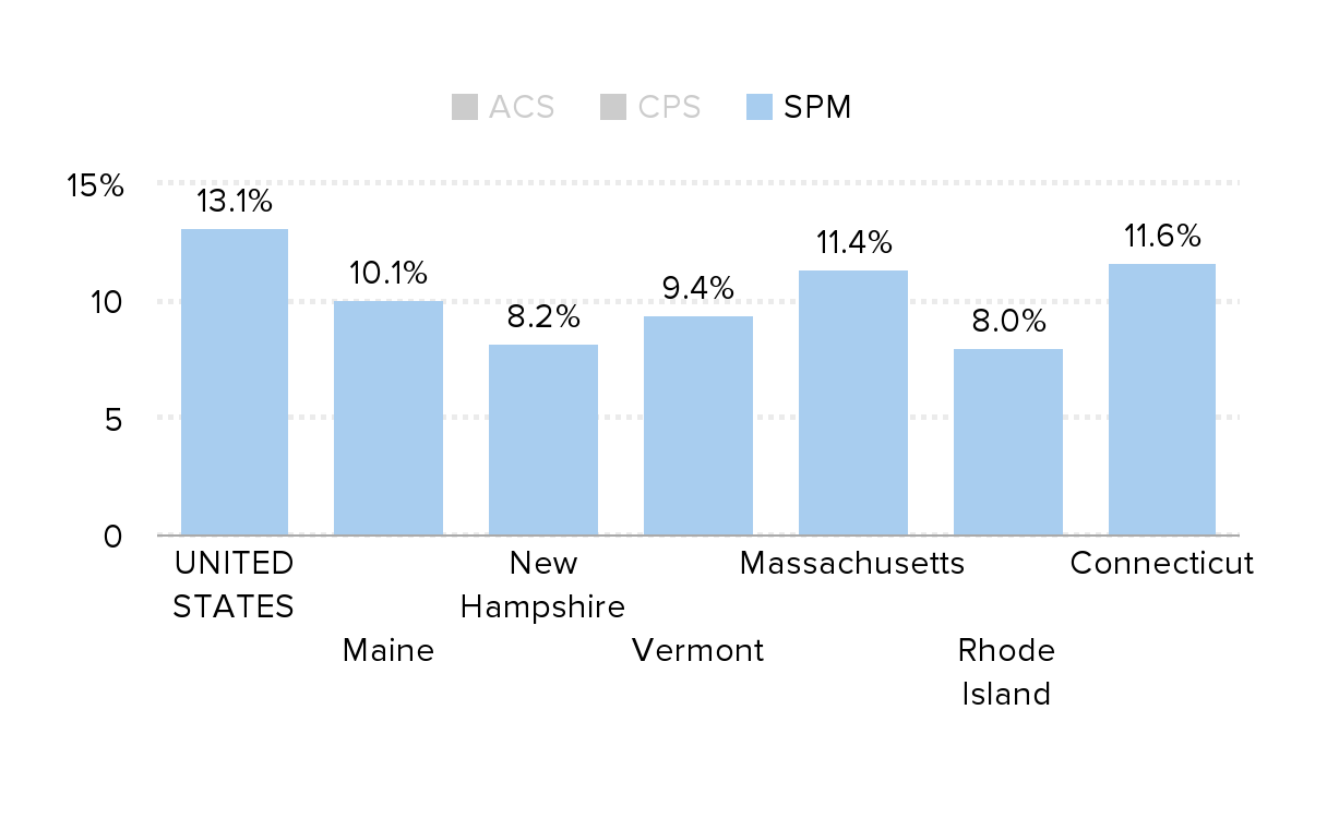
Source: U.S. Census Bureau data from the Current Population Survey, American Community Survey, and the Supplemental Poverty Measure, 2016-2018
Poverty and child poverty rates of New England and the United States, 1980-2018
| U.S. Poverty | U.S. Child poverty | N.E. Poverty | N.E. Child poverty | |
|---|---|---|---|---|
| 1980 | 13.0% | 18.4% | 9.6% | 14.5% |
| 1981 | 14.0% | 20.0% | 9.6% | 15.1% |
| 1982 | 15.0% | 21.9% | 10.4% | 15.7% |
| 1983 | 15.3% | 22.4% | 9.4% | 14.7% |
| 1984 | 14.4% | 21.5% | 9.1% | 14.4% |
| 1985 | 14.0% | 20.7% | 8.8% | 13.9% |
| 1986 | 13.6% | 20.5% | 8.1% | 12.6% |
| 1987 | 13.4% | 20.3% | 7.9% | 12.2% |
| 1988 | 13.0% | 19.5% | 7.8% | 11.0% |
| 1989 | 12.8% | 19.6% | 7.2% | 10.8% |
| 1990 | 13.5% | 20.6% | 9.2% | 15.1% |
| 1991 | 14.2% | 21.8% | 10.4% | 17.3% |
| 1992 | 14.5% | 21.9% | 10.2% | 17.7% |
| 1993 | 15.2% | 22.8% | 10.6% | 17.5% |
| 1994 | 14.5% | 21.8% | 9.7% | 15.1% |
| 1995 | 13.8% | 20.8% | 10.1% | 15.9% |
| 1996 | 13.7% | 20.5% | 10.5% | 16.7% |
| 1997 | 13.3% | 19.9% | 10.7% | 16.3% |
| 1998 | 12.7% | 18.9% | 9.4% | 13.9% |
| 1999 | 11.8% | 16.9% | 9.9% | 14.7% |
| 2000 | 11.3% | 16.2% | 8.9% | 12.6% |
| 2001 | 11.7% | 16.3% | 8.5% | 10.8% |
| 2002 | 12.1% | 16.7% | 9.6% | 12.5% |
| 2003 | 12.5% | 17.7% | 9.5% | 11.7% |
| 2004 | 12.7% | 17.8% | 9.5% | 11.5% |
| 2005 | 12.6% | 17.6% | 9.8% | 11.9% |
| 2006 | 12.3% | 17.4% | 9.9% | 11.9% |
| 2007 | 12.5% | 18.0% | 9.9% | 14.7% |
| 2008 | 13.2% | 19.0% | 10.2% | 14.4% |
| 2009 | 14.3% | 20.7% | 10.1% | 14.7% |
| 2010 | 15.1% | 22.0% | 10.1% | 13.7% |
| 2011 | 15.0% | 21.9% | 11.1% | 14.4% |
| 2012 | 15.0% | 21.8% | 10.7% | 15.6% |
| 2013 | 14.5% | 19.9% | 11.5% | 16.0% |
| 2014 | 14.8% | 21.1% | 11.5% | 15.7% |
| 2015 | 13.5% | 19.7% | 10.6% | 14.7% |
| 2016 | 12.7% | 18.0% | 9.8% | 13.1% |
| 2017 | 12.3% | 17.5% | 10.6% | 15.2% |
| 2018 | 11.8% | 16.2% | 9.1% | 12.4% |
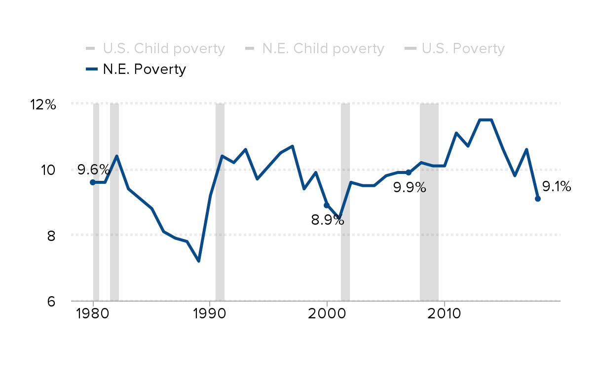
Source: EPI analysis of Current Population Survey microdata, 1980-2018
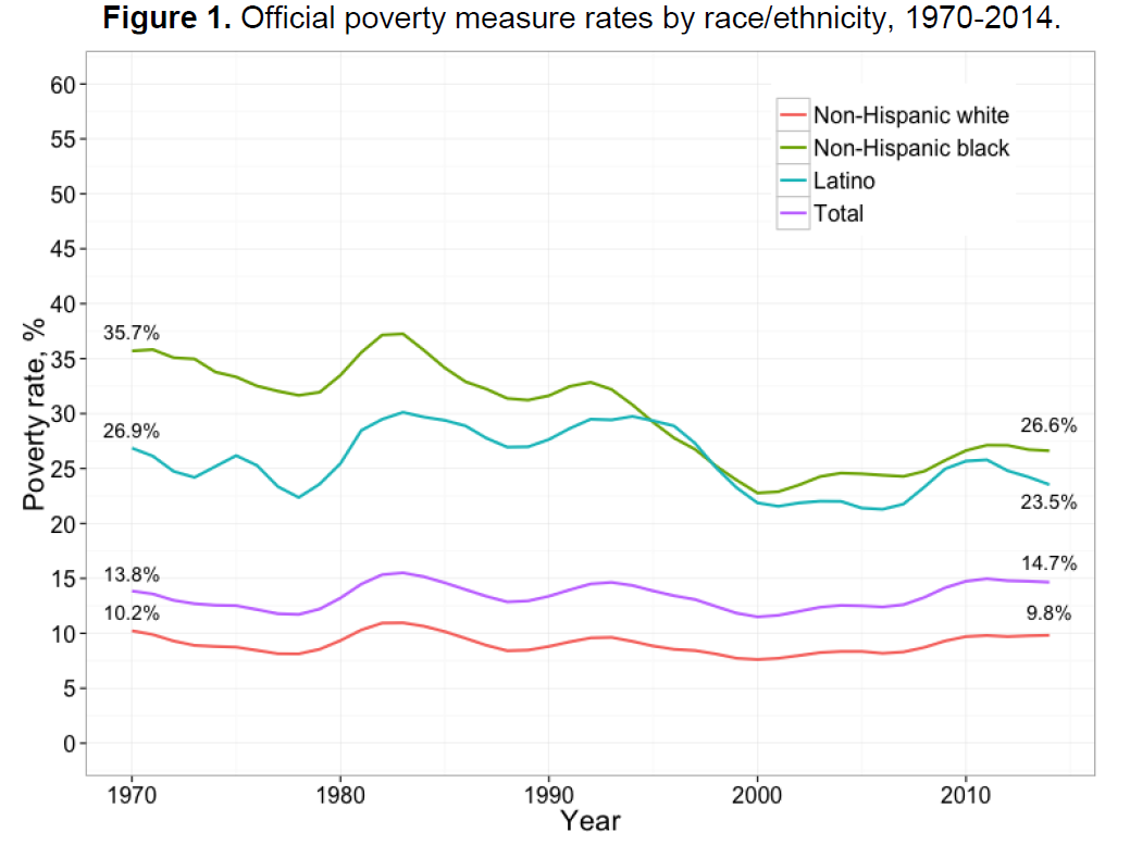
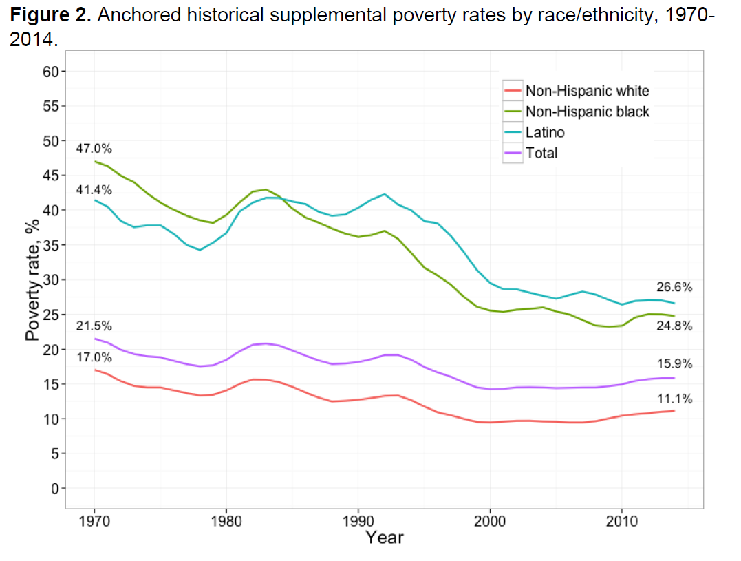
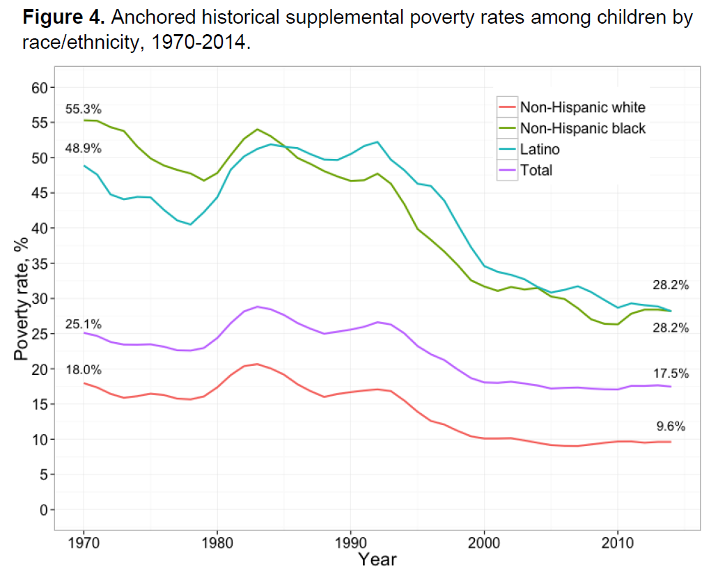
Source: Nolan, Laura; Garfinkel, Irwin; Kaushal, Neeraj; Nam, JaeHyun; Waldfogel, Jane; and Wimer, Christopher , “Trends in Child Poverty by Race/Ethnicity: New Evidence Using an Anchored Historical Supplemental Poverty Measure,” Journal of Applied Research on Children: Informing Policy for Children at Risk: Vol. 7: Iss. 1, Article 3.
Available at: http://digitalcommons.library.tmc.edu/childrenatrisk/vol7/iss1/3
Black and Hispanic children now represent almost two-thirds of children in poverty: Share of poor children, by race/ethnicity, 1976 and 2016
| Race/ethnicity | White, non-Hispanic | Black | Hispanic |
|---|---|---|---|
| 1976 | 46.7% | 36.9 | 14.0 |
| 2016 | 30.6 | 25.8 | 36.9 |
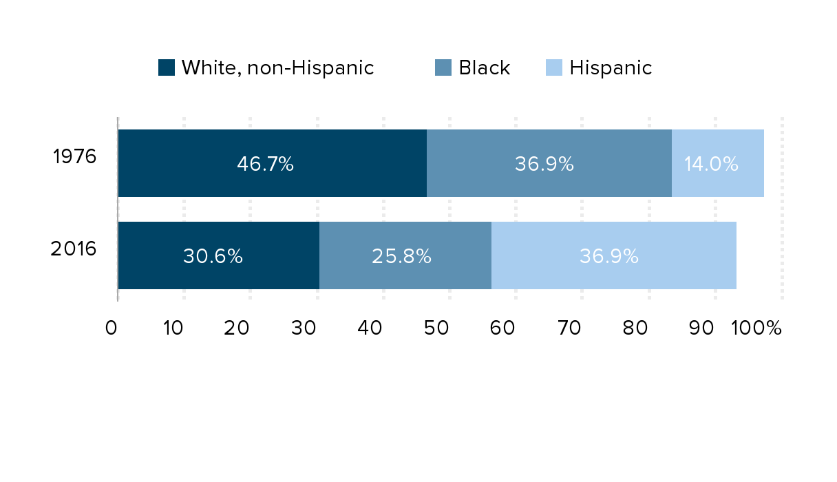
Notes: Values do not sum to 100%, because the data series for other races are not available in earlier years and Hispanic children can be of any race.
Source: EPI analysis of the Current Population Survey Annual Social and Economic Supplement, 2016
Without government programs, millions more would be in poverty: Number of people in poverty, as measured by the Supplemental Poverty Measure, and additional number that would be in poverty without specified government program, by age group, 2018
| Under 18 years old | 18 to 64 years old | 65 years old and older | ||
|---|---|---|---|---|
| Number of people in poverty | 10,674,000 | 24,637,000 | 7,189,000 | 0 |
| 0 | 0 | |||
| Social Security | 1,507,000 | 7,860,000 | 17,892,000 | 0 |
| Refundable tax credits | 4,157,000 | 3,612,000 | 101,000 | 0 |
| SSI | 515,000 | 1,908,000 | 525,000 | 0 |
| SNAP | 1,334,000 | 1,501,000 | 309,000 | 0 |
| Housing subsidies | 926,000 | 1,404,000 | 665,000 | 0 |
| School lunch | 702,000 | 564,000 | 21,000 | 0 |
| TANF/general assistance | 209,000 | 207,000 | 22,000 | 0 |
| Unemployment insurance | 97,000 | 280,000 | 38,000 | 0 |
| Workers’ compensation | 24,000 | 74,000 | 18,000 | 0 |
| WIC | 160,000 | 114,000 | 1,000 | 0 |
| LIHEAP | 57,000 | 140,000 | 28,000 | 0 |
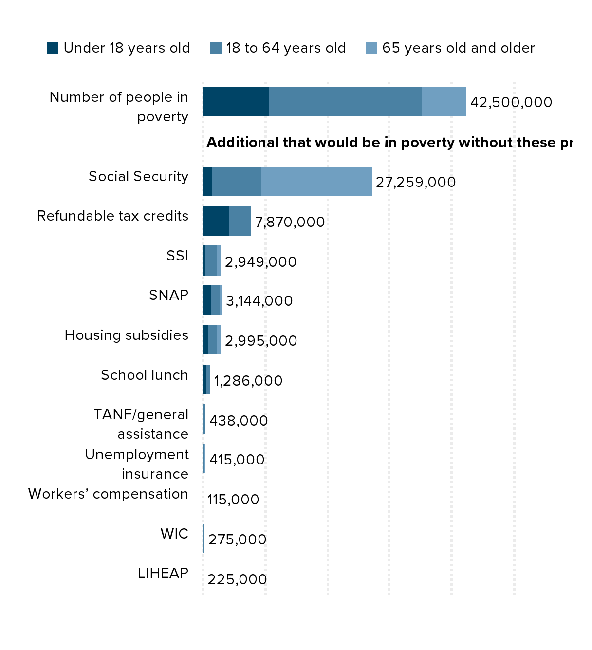
Notes: SSI refers to Supplemental Security Income, SNAP refers to Supplemental Nutrition Assistance Program, TANF refers to Temporary Assistance for Needy Families, WIC refers to the Special Supplemental Nutrition Program for Women, Infants, and Children, and LIHEAP refers to the Low Income Home Energy Assistance Program.
Source: EPI analysis of Liana Fox, The Supplemental Poverty Measure: 2018, U.S. Census Bureau report #P60-268, September 2019.
Economic expansions are no longer lowering poverty: Poverty rates of New England states and the U.S. since 2000 (percent in poverty)
| 2000 | 2007 | 2018 | |
|---|---|---|---|
| UNITED STATES | 12.2% | 13.0% | 13.1% |
| Maine | 10.1 | 12.0 | 11.6 |
| New Hampshire | 5.3 | 7.1 | 7.6 |
| Vermont | 10.7 | 10.1 | 11.0 |
| Massachusetts | 9.6 | 9.9 | 10.0 |
| Rhode Island | 10.7 | 12.0 | 12.9 |
| Connecticut | 7.7 | 7.9 | 10.4 |
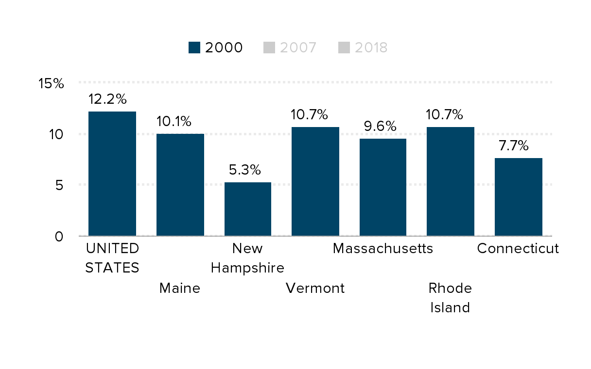
Source: U.S. Census Bureau and EPI analysis of Current Population Survey microdata, 2000-2018
Income growth has been vastly unequal: Change in real annual household income, by income group, 1979–2015
| Top 1% | Bottom 90% | Lowest quitile | Lowest quintile (market income only) | Bottom 90% (Market income only) | |
|---|---|---|---|---|---|
| 1979 | 0% | 0% | 0% | 0% | 0% |
| 1980 | -4% | -3% | -1% | -4% | -3% |
| 1981 | -5% | -3% | -2% | -5% | -3% |
| 1982 | 1% | -4% | -3% | -8% | -4% |
| 1983 | 10% | -5% | -6% | -12% | -5% |
| 1984 | 21% | 0% | -4% | -6% | 0% |
| 1985 | 31% | 0% | -3% | -6% | 0% |
| 1986 | 70% | 3% | -2% | -7% | 3% |
| 1987 | 37% | 3% | -3% | -11% | 2% |
| 1988 | 73% | 4% | 0% | -8% | 3% |
| 1989 | 60% | 6% | 5% | -3% | 4% |
| 1990 | 54% | 6% | 9% | 0% | 5% |
| 1991 | 38% | 5% | 13% | 0% | 4% |
| 1992 | 56% | 7% | 17% | 1% | 4% |
| 1993 | 49% | 8% | 20% | 1% | 4% |
| 1994 | 53% | 9% | 21% | 0% | 5% |
| 1995 | 71% | 13% | 26% | 8% | 9% |
| 1996 | 90% | 14% | 26% | 8% | 11% |
| 1997 | 118% | 17% | 27% | 14% | 14% |
| 1998 | 147% | 22% | 34% | 22% | 18% |
| 1999 | 170% | 26% | 36% | 26% | 22% |
| 2000 | 198% | 27% | 36% | 25% | 23% |
| 2001 | 137% | 26% | 38% | 23% | 22% |
| 2002 | 110% | 25% | 40% | 21% | 19% |
| 2003 | 125% | 26% | 42% | 20% | 19% |
| 2004 | 169% | 30% | 44% | 21% | 23% |
| 2005 | 226% | 32% | 47% | 25% | 25% |
| 2006 | 252% | 35% | 51% | 31% | 27% |
| 2007 | 271% | 39% | 57% | 40% | 31% |
| 2008 | 201% | 36% | 62% | 37% | 27% |
| 2009 | 135% | 34% | 67% | 31% | 24% |
| 2010 | 172% | 35% | 68% | 32% | 24% |
| 2011 | 171% | 34% | 65% | 30% | 23% |
| 2012 | 235% | 34% | 62% | 24% | 23% |
| 2013 | 180% | 37% | 65% | 29% | 25% |
| 2014 | 217% | 40% | 70% | 26% | 27% |
| 2015 | 229% | 46% | 79% | 32% | 32% |
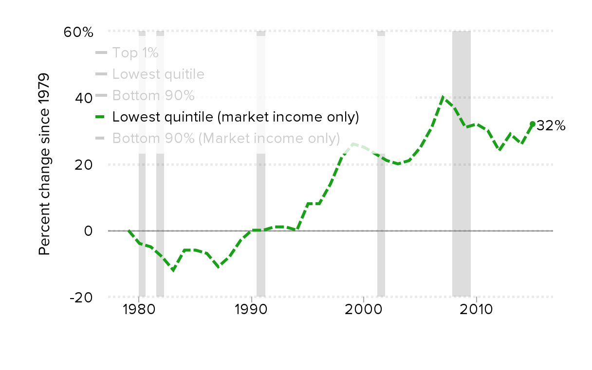
Note: Data are for comprehensive income, except where indicated. Shaded areas denote recessions.
Source: Authors' analysis of data from the Congressional Budget Office (2017)
Families are working more hours than decades ago: Change in average family annual work hours in New England and the U.S., by family type, 1978–2018
| New England | United States | |
|---|---|---|
| All families | 6.6% | 7.5% |
| No children | 7.4% | 8.2% |
| One-parent families | 1.2% | 3.4% |
| Two-parent families | 14.3% | 12.6% |
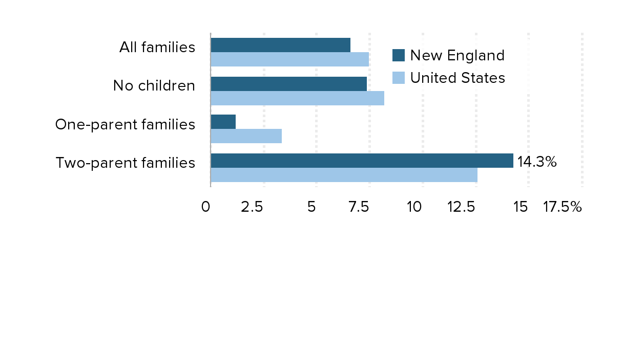
Source: EPI analysis of Current Population Survey March supplement
The gap between productivity and a typical worker's compensation has increased dramatically since 1979: Productivity growth and hourly compensation growth, 1948–2019
| Year | Hourly compensation | Net productivity |
|---|---|---|
| 1948 | 0.0% | 0.0% |
| 1949 | 5.8% | 1.6% |
| 1950 | 9.9% | 9.3% |
| 1951 | 10.9% | 12.2% |
| 1952 | 14.4% | 15.5% |
| 1953 | 20.2% | 19.4% |
| 1954 | 22.5% | 21.5% |
| 1955 | 27.4% | 26.4% |
| 1956 | 32.3% | 26.6% |
| 1957 | 35.0% | 30.0% |
| 1958 | 35.8% | 32.7% |
| 1959 | 39.6% | 37.6% |
| 1960 | 42.0% | 40.1% |
| 1961 | 44.2% | 44.4% |
| 1962 | 48.2% | 49.8% |
| 1963 | 50.3% | 55.0% |
| 1964 | 65.0% | 60.0% |
| 1965 | 69.2% | 64.9% |
| 1966 | 71.1% | 70.0% |
| 1967 | 73.4% | 72.0% |
| 1968 | 77.7% | 77.1% |
| 1969 | 80.9% | 77.9% |
| 1970 | 83.3% | 80.4% |
| 1971 | 87.9% | 87.1% |
| 1972 | 97.2% | 92.2% |
| 1973 | 95.4% | 97.0% |
| 1974 | 90.8% | 93.8% |
| 1975 | 90.4% | 98.1% |
| 1976 | 92.2% | 103.6% |
| 1977 | 95.4% | 106.1% |
| 1978 | 97.7% | 108.3% |
| 1979 | 95.0% | 108.1% |
| 1980 | 89.8% | 106.8% |
| 1981 | 88.6% | 110.5% |
| 1982 | 89.1% | 108.4% |
| 1983 | 90.0% | 114.5% |
| 1984 | 88.5% | 120.2% |
| 1985 | 88.0% | 123.7% |
| 1986 | 89.6% | 128.3% |
| 1987 | 87.6% | 128.8% |
| 1988 | 86.9% | 132.0% |
| 1989 | 87.4% | 134.1% |
| 1990 | 86.2% | 137.0% |
| 1991 | 86.1% | 138.5% |
| 1992 | 87.8% | 147.5% |
| 1993 | 88.2% | 148.5% |
| 1994 | 88.8% | 150.6% |
| 1995 | 88.0% | 151.6% |
| 1996 | 88.4% | 156.3% |
| 1997 | 90.7% | 160.8% |
| 1998 | 95.5% | 166.3% |
| 1999 | 98.4% | 173.5% |
| 2000 | 99.6% | 179.5% |
| 2001 | 102.5% | 183.8% |
| 2002 | 106.6% | 191.6% |
| 2003 | 108.7% | 201.3% |
| 2004 | 107.8% | 209.4% |
| 2005 | 107.0% | 215.4% |
| 2006 | 107.3% | 217.7% |
| 2007 | 109.4% | 219.8% |
| 2008 | 109.4% | 221.5% |
| 2009 | 117.8% | 228.8% |
| 2010 | 119.7% | 238.3% |
| 2011 | 116.8% | 238.3% |
| 2012 | 114.7% | 239.6% |
| 2013 | 116.9% | 241.0% |
| 2014 | 117.5% | 243.0% |
| 2015 | 121.2% | 246.5% |
| 2016 | 123.3% | 247.3% |
| 2017 | 123.6% | 250.6% |
| 2018 | 125.2% | 254.5% |
| 2019 | 128.5% | 258.4% |
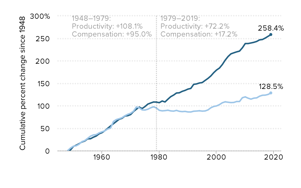
Notes: Data are for compensation (wages and benefits) of production/nonsupervisory workers in the private sector and net productivity of the total economy. “Net productivity” is the growth of output of goods and services less depreciation per hour worked.
Source: EPI analysis of unpublished Total Economy Productivity data from Bureau of Labor Statistics (BLS) Labor Productivity and Costs program, wage data from the BLS Current Employment Statistics, BLS Employment Cost Trends, BLS Consumer Price Index, and Bureau of Economic Analysis National Income and Product Accounts
Updated from Figure A in Raising America’s Pay: Why It’s Our Central Economic Policy Challenge (Bivens et al. 2014)
Top 0.1 percent earnings grew fifteen times faster than bottom 90 percent earnings: Cumulative percent change in real annual earnings, by earnings group, 1979–2017
| Year | Bottom 90% | Top 1% | Top 0.1% |
|---|---|---|---|
| 1979 | 0.0% | 0.0% | 0.0% |
| 1980 | -2.2% | 3.4% | 5.8% |
| 1981 | -2.6% | 3.1% | 7.3% |
| 1982 | -3.9% | 9.5% | 17.4% |
| 1983 | -3.7% | 13.6% | 28.7% |
| 1984 | -1.8% | 20.7% | 44.0% |
| 1985 | -1.0% | 23.0% | 45.8% |
| 1986 | 1.1% | 32.6% | 60.9% |
| 1987 | 2.1% | 53.5% | 106.6% |
| 1988 | 2.2% | 68.7% | 140.2% |
| 1989 | 1.8% | 63.3% | 123.9% |
| 1990 | 1.1% | 64.8% | 129.8% |
| 1991 | 0.0% | 53.6% | 104.6% |
| 1992 | 1.5% | 74.3% | 156.0% |
| 1993 | 0.9% | 67.9% | 140.2% |
| 1994 | 2.0% | 63.4% | 126.9% |
| 1995 | 2.8% | 70.2% | 137.0% |
| 1996 | 4.1% | 79.0% | 157.3% |
| 1997 | 7.0% | 100.6% | 225.6% |
| 1998 | 11.0% | 113.1% | 254.9% |
| 1999 | 13.2% | 129.7% | 300.5% |
| 2000 | 15.3% | 144.8% | 337.6% |
| 2001 | 15.7% | 130.4% | 300.5% |
| 2002 | 15.6% | 109.3% | 239.5% |
| 2003 | 15.7% | 113.9% | 250.1% |
| 2004 | 15.6% | 127.2% | 287.6% |
| 2005 | 15.0% | 135.3% | 306.9% |
| 2006 | 15.7% | 143.4% | 324.9% |
| 2007 | 16.7% | 156.2% | 362.5% |
| 2008 | 16.0% | 137.5% | 309.0% |
| 2009 | 16.0% | 116.2% | 241.6% |
| 2010 | 15.2% | 130.8% | 278.0% |
| 2011 | 14.5% | 134.0% | 279.0% |
| 2012 | 14.6% | 148.3% | 327.9% |
| 2013 | 15.1% | 137.5% | 289.3% |
| 2014 | 16.6% | 149.0% | 323.7% |
| 2015 | 20.5% | 156.2% | 337.9% |
| 2016 | 21.0% | 148.1% | 310.3% |
| 2017 | 22.2% | 157.3% | 343.2% |
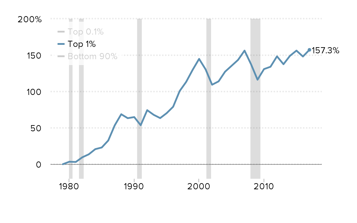
Source: EPI analysis of Kopczuk, Saez, and Song (2010, Table A3) and Social Security Administration wage statistics
Top earners' wages grew four times faster than wages at the median: Cumulative change in real hourly wages of all workers, by wage percentile, 1979–2018
| 10th percentile | 50th percentile | 95th percentile | |
|---|---|---|---|
| 1979 | 0.0% | 0.0% | 0.0% |
| 1980 | -6.7% | -0.6% | -1.8% |
| 1981 | -8.1% | -1.7% | -1.5% |
| 1982 | -11.8% | -2.1% | 0.5% |
| 1983 | -14.7% | -1.9% | 3.5% |
| 1984 | -16.4% | -1.4% | 3.9% |
| 1985 | -17.5% | 0.1% | 6.1% |
| 1986 | -17.2% | 0.8% | 8.6% |
| 1987 | -17.3% | 1.9% | 11.6% |
| 1988 | -16.5% | 0.5% | 14.3% |
| 1989 | -17.1% | 0.3% | 7.7% |
| 1990 | -16.5% | 0.2% | 9.1% |
| 1991 | -15.1% | -0.6% | 10.6% |
| 1992 | -14.4% | 0.4% | 8.8% |
| 1993 | -13.1% | 1.9% | 6.6% |
| 1994 | -13.8% | 0.8% | 12.4% |
| 1995 | -14.7% | -0.6% | 12.7% |
| 1996 | -15.7% | -2.3% | 13.4% |
| 1997 | -13.2% | -0.3% | 14.8% |
| 1998 | -7.8% | 3.3% | 18.3% |
| 1999 | -6.1% | 5.9% | 21.5% |
| 2000 | -6.7% | 6.5% | 24.9% |
| 2001 | -3.8% | 8.2% | 27.0% |
| 2002 | -0.8% | 9.8% | 31.6% |
| 2003 | -1.2% | 9.9% | 30.5% |
| 2004 | -3.0% | 11.1% | 31.7% |
| 2005 | -5.3% | 9.5% | 32.0% |
| 2006 | -5.9% | 9.9% | 33.2% |
| 2007 | -4.3% | 10.1% | 35.5% |
| 2008 | -3.2% | 9.3% | 36.3% |
| 2009 | -2.4% | 11.7% | 39.4% |
| 2010 | -3.2% | 11.0% | 38.6% |
| 2011 | -5.7% | 8.2% | 37.3% |
| 2012 | -7.3% | 6.9% | 39.0% |
| 2013 | -6.7% | 7.4% | 41.4% |
| 2014 | -5.9% | 7.5% | 39.4% |
| 2015 | -1.4% | 9.3% | 48.3% |
| 2016 | -0.6% | 11.2% | 49.8% |
| 2017 | 3.5% | 12.2% | 52.0% |
| 2018 | 4.1% | 14.0% | 56.1% |
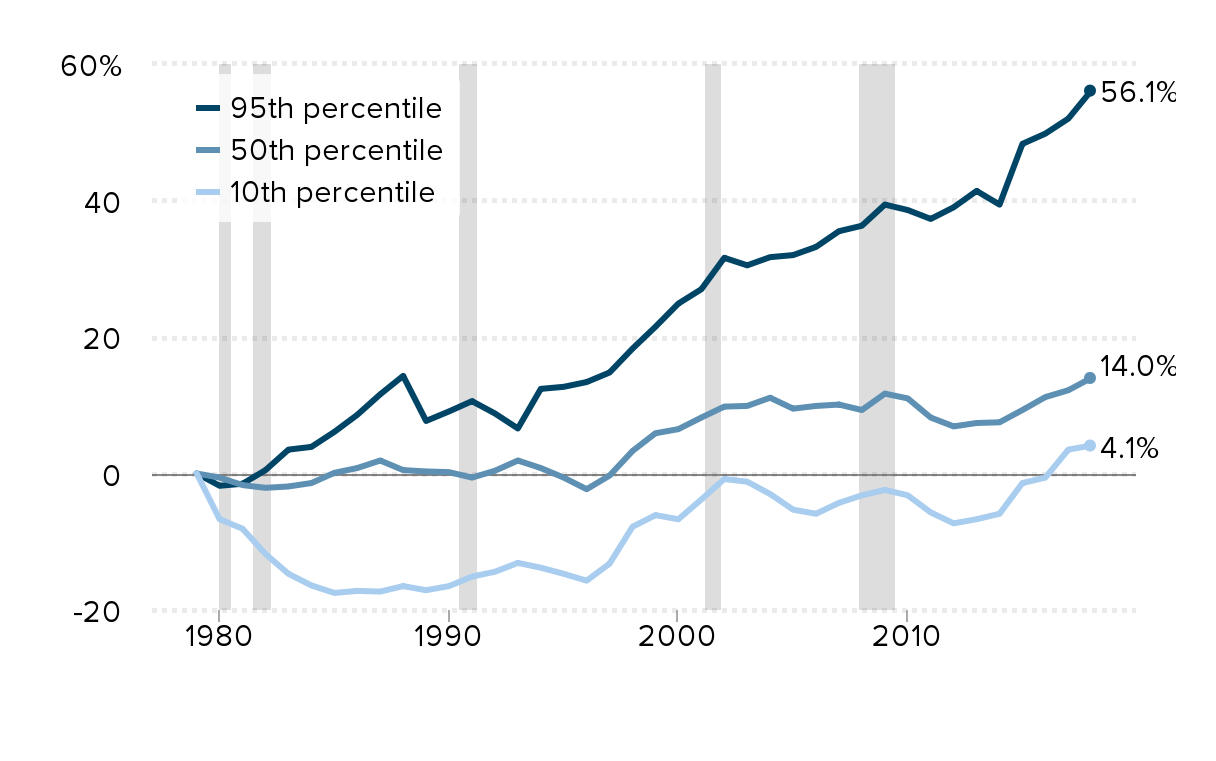
Notes: Shaded areas denote recessions. The xth-percentile wage is the wage at which x% of wage earners earn less and (100−x)% earn more.
Source: EPI analysis of Current Population Survey Outgoing Rotation Group microdata
Wage growth has been stronger in New England than the country as a whole: Cumulative change in real hourly wages of all workers, by wage percentile, 1979–2018
| US – 10th | NE – 10th | US – Median | NE – Median | US – 90th | NE – 90th | |
|---|---|---|---|---|---|---|
| 1979 | 0.00% | 0.00% | 0.00% | 0.00% | 0.00% | 0.00% |
| 1980 | -6.70% | -3.70% | -0.60% | -0.40% | -1.20% | -1.70% |
| 1981 | -8.10% | -4.60% | -1.70% | -1.40% | -0.90% | -0.90% |
| 1982 | -11.80% | -8.10% | -2.10% | 1.00% | -0.10% | -0.10% |
| 1983 | -14.70% | -8.50% | -1.90% | 2.40% | 1.00% | 4.20% |
| 1984 | -16.40% | -7.90% | -1.40% | 4.00% | 3.10% | 6.70% |
| 1985 | -17.50% | -7.30% | 0.10% | 4.40% | 1.80% | 8.00% |
| 1986 | -17.20% | -3.30% | 0.80% | 9.00% | 5.40% | 12.90% |
| 1987 | -17.30% | 4.80% | 1.90% | 15.00% | 7.10% | 15.20% |
| 1988 | -16.50% | 4.00% | 0.50% | 17.80% | 7.50% | 18.70% |
| 1989 | -17.10% | 3.90% | 0.30% | 18.40% | 6.10% | 20.40% |
| 1990 | -16.50% | 4.60% | 0.20% | 14.60% | 7.00% | 19.30% |
| 1991 | -15.10% | 1.90% | -0.60% | 16.80% | 7.60% | 22.40% |
| 1992 | -14.40% | -0.30% | 0.40% | 15.80% | 5.60% | 19.20% |
| 1993 | -13.10% | -0.30% | 1.90% | 14.60% | 7.50% | 19.10% |
| 1994 | -13.80% | -3.40% | 0.80% | 14.90% | 9.90% | 24.50% |
| 1995 | -14.70% | -1.70% | -0.60% | 16.00% | 9.70% | 25.50% |
| 1996 | -15.70% | -3.40% | -2.30% | 15.80% | 10.00% | 23.70% |
| 1997 | -13.20% | -3.30% | -0.30% | 14.40% | 11.90% | 25.80% |
| 1998 | -7.80% | 1.30% | 3.30% | 17.50% | 15.20% | 29.00% |
| 1999 | -6.10% | 4.30% | 5.90% | 20.40% | 17.50% | 34.30% |
| 2000 | -6.70% | 4.20% | 6.50% | 22.80% | 19.00% | 35.60% |
| 2001 | -3.80% | 7.20% | 8.20% | 24.60% | 22.20% | 40.00% |
| 2002 | -0.80% | 9.70% | 9.80% | 27.20% | 25.00% | 43.80% |
| 2003 | -1.20% | 10.00% | 9.90% | 28.60% | 25.10% | 47.00% |
| 2004 | -3.00% | 7.60% | 11.10% | 27.20% | 24.90% | 44.90% |
| 2005 | -5.30% | 5.70% | 9.50% | 24.80% | 24.90% | 44.00% |
| 2006 | -5.90% | 2.70% | 9.90% | 26.30% | 26.40% | 46.60% |
| 2007 | -4.30% | 2.20% | 10.10% | 26.00% | 27.20% | 48.80% |
| 2008 | -3.20% | 6.10% | 9.30% | 28.00% | 27.70% | 51.70% |
| 2009 | -2.40% | 6.70% | 11.70% | 35.50% | 31.40% | 56.50% |
| 2010 | -3.20% | 4.60% | 11.00% | 32.50% | 31.70% | 54.50% |
| 2011 | -5.70% | 1.80% | 8.20% | 27.70% | 28.80% | 55.10% |
| 2012 | -7.30% | -0.50% | 6.90% | 25.10% | 29.60% | 51.10% |
| 2013 | -6.70% | -0.70% | 7.40% | 26.00% | 30.50% | 56.10% |
| 2014 | -5.90% | -2.30% | 7.50% | 24.60% | 29.20% | 53.60% |
| 2015 | -1.40% | 2.30% | 9.30% | 28.00% | 34.20% | 56.80% |
| 2016 | -0.60% | 6.30% | 11.20% | 27.10% | 37.20% | 55.50% |
| 2017 | 3.50% | 7.30% | 12.20% | 29.50% | 39.90% | 58.40% |
| 2018 | 4.10% | 11.70% | 14.00% | 31.50% | 40.90% | 61.90% |
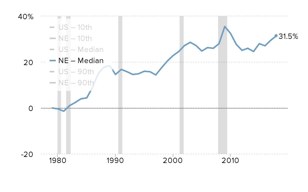
Notes: Shaded areas denote recessions. The xth-percentile wage is the wage at which x% of wage earners earn less and (100−x)% earn more.
Source: EPI analysis of Current Population Survey Outgoing Rotation Group microdata
Changes in real hourly wages in New England states and the U.S., 2000–2018
| 10th percentile | Median | 90th percentile | |
|---|---|---|---|
| UNITED STATES | 7.3% | 6.4% | 18.5% |
| Maine | 9.5% | 17.1% | 21.0% |
| New Hampshire | -0.7% | 9.3% | 16.8% |
| Vermont | 7.3% | 15.2% | 22.4% |
| Massachusetts | 8.0% | 11.5% | 27.4% |
| Rhode Island | 2.9% | 3.8% | 16.8% |
| Connecticut | 5.2% | -0.2% | 8.7% |
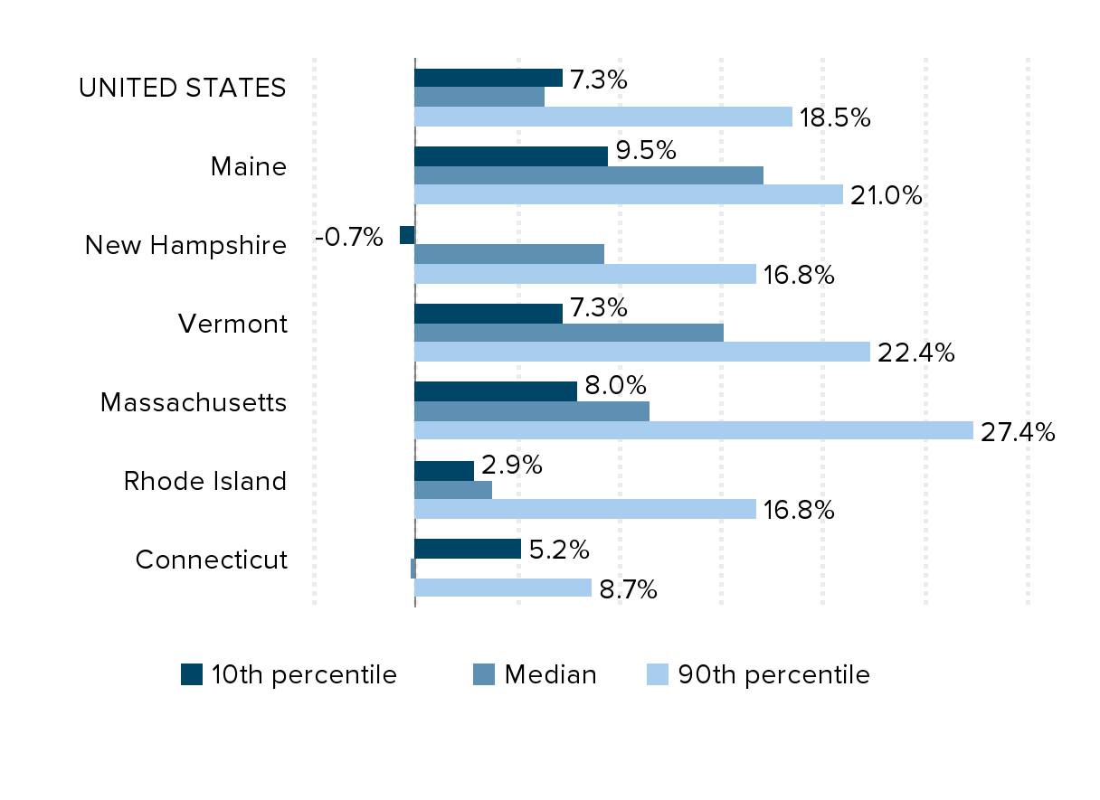
Note: Wages adjusted for inflation using the CPI-U.
Source: EPI analysis of Current Population Survey microdata
Wages are of critical (and growing) importance to low-income households: Sources of income for the non-elderly bottom fifth, 1979–2013
| Cash transfers (e.g., Social Security, UI) | In-kind benefits (e.g., SNAP, Medicaid) | Wage-related income (wages, benefits, and tax credits) | |
|---|---|---|---|
| 1979 | 18.8% | 13.1% | 58.1% |
| 1980 | 19.2% | 13.4% | 57.3% |
| 1981 | 19.4% | 13.6% | 57.2% |
| 1982 | 20.4% | 14.3% | 56.2% |
| 1983 | 19.9% | 15.2% | 55.7% |
| 1984 | 17.2% | 13.3% | 57.9% |
| 1985 | 17.9% | 14.6% | 57.0% |
| 1986 | 17.1% | 14.9% | 56.9% |
| 1987 | 17.6% | 16.9% | 55.0% |
| 1988 | 17.1% | 16.6% | 55.4% |
| 1989 | 15.2% | 16.1% | 57.9% |
| 1990 | 14.5% | 17.4% | 58.3% |
| 1991 | 14.6% | 17.8% | 58.5% |
| 1992 | 14.3% | 18.0% | 60.0% |
| 1993 | 14.1% | 18.6% | 58.5% |
| 1994 | 13.7% | 18.7% | 60.1% |
| 1995 | 12.0% | 16.8% | 63.9% |
| 1996 | 11.6% | 16.0% | 65.7% |
| 1997 | 10.7% | 14.0% | 68.0% |
| 1998 | 9.6% | 13.1% | 70.5% |
| 1999 | 9.3% | 12.5% | 69.8% |
| 2000 | 9.1% | 12.7% | 69.6% |
| 2001 | 8.6% | 15.6% | 70.6% |
| 2002 | 9.4% | 15.2% | 70.0% |
| 2003 | 9.0% | 15.5% | 70.6% |
| 2004 | 8.6% | 15.9% | 70.8% |
| 2005 | 7.5% | 15.7% | 72.6% |
| 2006 | 6.8% | 15.8% | 72.8% |
| 2007 | 6.6% | 16.0% | 72.1% |
| 2008 | 7.8% | 16.7% | 74.7% |
| 2009 | 10.2% | 18.6% | 70.7% |
| 2010 | 10.6% | 18.3% | 70.3% |
| 2011 | 9.3% | 19.4% | 68.4% |
| 2012 | 8.5% | 20.3% | 67.8% |
| 2013 | 7.8% | 20.4% | 68.1% |
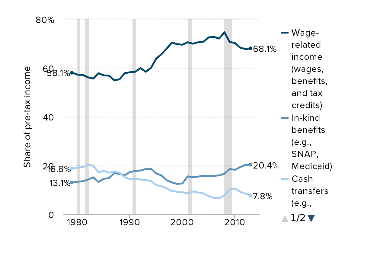
Note: Data are derived from weighted average of non-elderly childless households and households with children. Wages and benefits, cash transfers, and in-kind income comprise 96.3% of all pre-tax income for the bottom fifth non-elderly population in 2013. The other 3.7% is made up of capital gains, proprietors' income, other business income, interest and dividends, and other income.
Source: EPI analysis of data from the Congressional Budget Office (2016)
Real median household income by race and ethnicity, 2000–2018
| Year | White | Black | Hispanic | Asian | White-imputed | Black-imputed | Hispanic-imputed | Asian-imputed | White | Black | Hispanic | Asian | White | Black | Hispanic | Asian |
|---|---|---|---|---|---|---|---|---|---|---|---|---|---|---|---|---|
| 2000 | $66,712 | $43,380 | $48,500 | $69,069 | $44,614 | $46,989 | ||||||||||
| 2001 | $65,835 | $41,899 | $47,721 | $68,161 | $43,091 | $46,234 | ||||||||||
| 2002 | $65,646 | $40,839 | $46,334 | $73,660 | $67,965 | $42,001 | $44,890 | $79,501 | ||||||||
| 2003 | $65,388 | $40,633 | $45,160 | $76,231 | $67,698 | $41,789 | $43,753 | $82,276 | ||||||||
| 2004 | $65,178 | $40,292 | $45,670 | $76,631 | $67,481 | $41,438 | $44,247 | $82,708 | ||||||||
| 2005 | $65,458 | $39,898 | $46,360 | $76,873 | $67,771 | $41,033 | $43,846 | $84,991 | ||||||||
| 2006 | $65,449 | $40,116 | $47,169 | $78,291 | $67,762 | $41,257 | $45,699 | $86,560 | ||||||||
| 2007 | $66,676 | $41,388 | $46,958 | $78,343 | $69,032 | $42,565 | $45,495 | $86,616 | ||||||||
| 2008 | $64,923 | $40,154 | $44,326 | $74,913 | $67,217 | $41,296 | $42,945 | $82,824 | ||||||||
| 2009 | $63,895 | $38,423 | $44,628 | $74,982 | $66,153 | $39,516 | $43,238 | $82,901 | ||||||||
| 2010 | $62,857 | $37,114 | $43,433 | $72,402 | $65,078 | $38,170 | $42,080 | $80,048 | ||||||||
| 2011 | $62,001 | $36,215 | $43,217 | $71,139 | $64,192 | $37,245 | $41,870 | $78,653 | ||||||||
| 2012 | $62,465 | $36,945 | $42,738 | $73,415 | $64,672 | $37,996 | $41,406 | $81,169 | ||||||||
| 2013 | $62,915 | $37,547 | $44,228 | $70,687 | $65,138 | $38,615 | $42,850 | $78,153 | $65,138 | $38,615 | $42,850 | $78,153 | ||||
| 2014 | $63,976 | $37,854 | $45,114 | $78,883 | $63,976 | $37,854 | $45,114 | $78,883 | ||||||||
| 2015 | $66,721 | $39,440 | $47,852 | $81,788 | $66,721 | $39,440 | $47,852 | $81,788 | ||||||||
| 2016 | $68,059 | $41,924 | $49,887 | $85,210 | $68,059 | $41,924 | $49,887 | $85,210 | ||||||||
| 2017 | $69,806 | $41,584 | $51,717 | $83,314 | $69,806 | $41,584 | $51,717 | $83,314 | $69,851 | $40,963 | $51,390 | $83,376 | ||||
| 2018 | $70,642 | $41,692 | $51,450 | $87,194 |
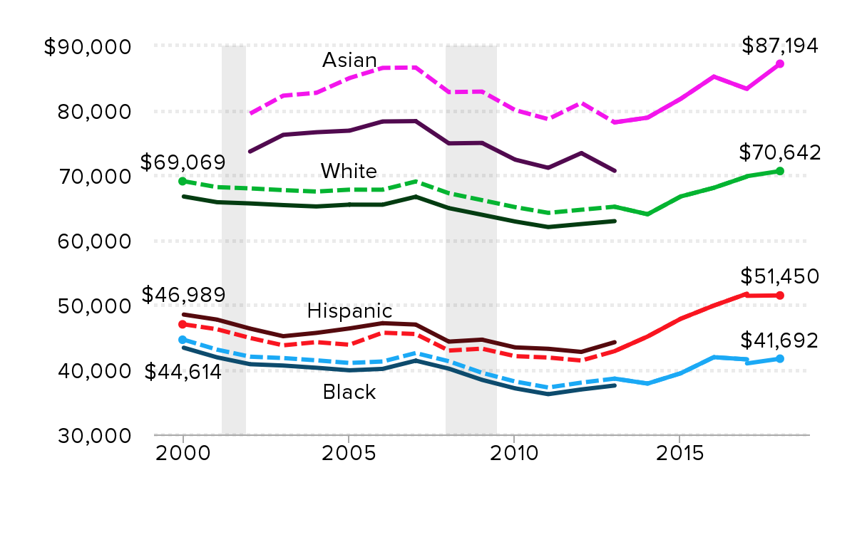
Notes: Because of a redesign in the CPS ASEC income questions in 2013, we imputed the historical series using the ratio of the old and new method in 2013. Solid lines are actual CPS ASEC data; dashed lines denote historical values imputed by applying the new methodology to past income trends. The break in the series in 2017 represents data from both the legacy CPS ASEC processing system and the updated CPS ASEC processing system. White refers to non-Hispanic whites, Black refers to Blacks alone or in combination, Asian refers to Asians alone, and Hispanic refers to Hispanics of any race. Comparable data are not available prior to 2002 for Asians. Shaded areas denote recessions.
Source: EPI analysis of Current Population Survey Annual Social and Economic Supplement Historical Poverty Tables (Tables H-5 and H-9).
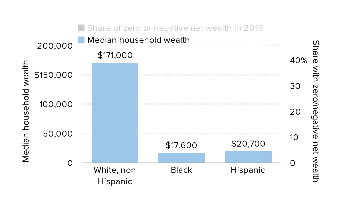
A typical white family has 10x the wealth of a typical black family: Median household wealth (for families with wealth greater than zero) and share of households with zero or negative net wealth , by race and ethnicity, 2016 (2016 dollars)
| Share of zero or negative net wealth in 2016 | Median household wealth | |
|---|---|---|
| White, non Hispanic | 9% | $171,000 |
| Black | 19% | $17,600 |
| Hispanic | 13% | $20,700 |
Source: EPI analysis of Survey of Consumer Finances Combined Extract Data
Receiving an inheritance helps white families more than black families: Median family wealth by race and whether the family received an inheritance
| White | Black | |
|---|---|---|
| Families without an inheritance | $183,050 | $33,969 |
| Families with an inheritance | $287,457 | $38,174 |
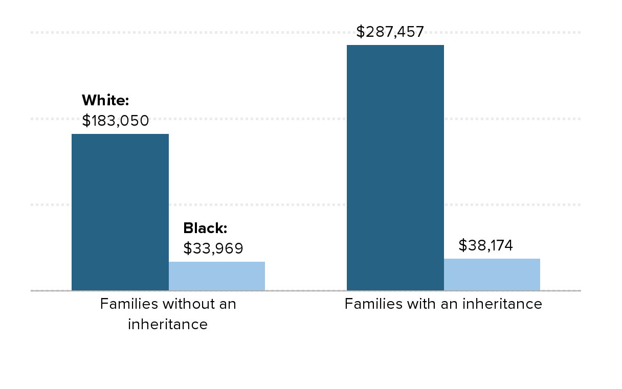
Source: Thompson, Jeffrey P. and Gustavo A. Suarez (2015). “Exploring the Racial Wealth Gap Using the Survey of Consumer Finances,” Finance and Economics Discussion Series 2015-076. Washington: Board of Governors of the Federal Reserve System, http://dx.doi.org/10.17016/FEDS.2015.076.
What do we do about all this?
Failure to raise the federal minimum wage has taken thousands of dollars out of the pockets of minimum wage workers: The real value of the minimum wage (adjusted for inflation) is 17% less than 10 years ago and 31% less than in 1968
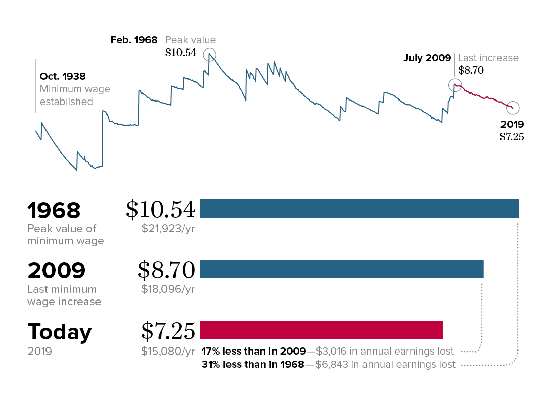
Note: All values are in June 2019 dollars, adjusted using the CPI-U-RS.
Source: Adapted from Figure C in David Cooper, Elise Gould, and Ben Zipperer, Low-Wage Workers Are Suffering from a Decline in the Real Value of the Federal Minimum Wage, Economic Policy Institute, August 2019).
Source: Adapted from Figure C in David Cooper, Elise Gould, and Ben Zipperer, Low-Wage Workers Are Suffering from a Decline in the Real Value of the Federal Minimum Wage, Economic Policy Institute, August 2019). The figure reflects EPI analysis of historical minimum wage data in the Fair Labor Standards Act and amendments.
States enacting meaningful minimum wage increases have raised pay for their low-wage workers overall: Change in the 10th percentile real wage between 2010 and 2018 in states with and without real minimum wage changes, overall and by gender
| States without real increase | States with real increase | |
|---|---|---|
| Overall | 5.7% | 9.9% |
| Men | 6.0% | 8.6% |
| Women | 2.8% | 10.7% |
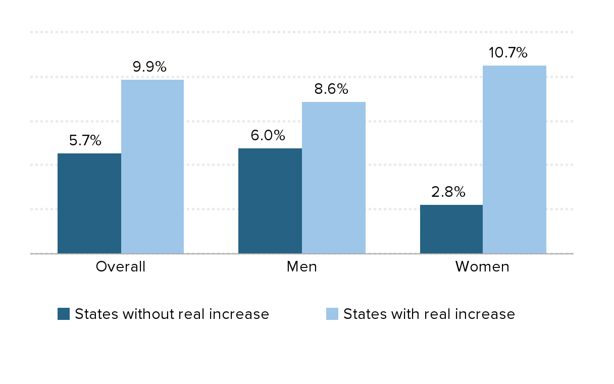
Note: The real minimum wage increased between 2010 and 2018 in Alaska, Arizona, Arkansas, California, Colorado, Connecticut, District of Columbia, Hawaii, Maine, Maryland, Massachusetts, Michigan, Minnesota, Nebraska, New Jersey, New York, Oregon, Rhode Island, South Dakota, Vermont, Washington, and West Virginia.
Source: Adapted from Figure C in David Cooper, Elise Gould, and Ben Zipperer, Low-Wage Workers Are Suffering from a Decline in the Real Value of the Federal Minimum Wage, Economic Policy Institute, August 2019.
Source: Adapted from Figure C in David Cooper, Elise Gould, and Ben Zipperer, Low-Wage Workers Are Suffering from a Decline in the Real Value of the Federal Minimum Wage, Economic Policy Institute, August 2019. Data are from the authors’ analysis of Current Population Survey basic monthly microdata from the U.S. Census Bureau.
As union membership declines, income inequality increases: Union membership and share of income going to the top 10%, 1917–2017
| Year | Union membership | Share of income going to the top 10% |
|---|---|---|
| 1917 | 11.0% | 40.3% |
| 1918 | 12.1% | 39.9% |
| 1919 | 14.3% | 39.5% |
| 1920 | 17.5% | 38.1% |
| 1921 | 17.6% | 42.9% |
| 1922 | 14.0% | 42.9% |
| 1923 | 11.7% | 40.6% |
| 1924 | 11.3% | 43.3% |
| 1925 | 11.0% | 44.2% |
| 1926 | 10.7% | 44.1% |
| 1927 | 10.6% | 44.7% |
| 1928 | 10.4% | 46.1% |
| 1929 | 10.1% | 43.8% |
| 1930 | 10.7% | 43.1% |
| 1931 | 11.2% | 44.4% |
| 1932 | 11.3% | 46.3% |
| 1933 | 9.5% | 45.0% |
| 1934 | 9.8% | 45.2% |
| 1935 | 10.8% | 43.4% |
| 1936 | 11.1% | 44.8% |
| 1937 | 18.6% | 43.3% |
| 1938 | 23.9% | 43.0% |
| 1939 | 24.8% | 44.6% |
| 1940 | 23.5% | 44.4% |
| 1941 | 25.4% | 41.0% |
| 1942 | 24.2% | 35.5% |
| 1943 | 30.1% | 32.7% |
| 1944 | 32.5% | 31.5% |
| 1945 | 33.4% | 32.6% |
| 1946 | 31.9% | 34.6% |
| 1947 | 31.1% | 33.0% |
| 1948 | 30.5% | 33.7% |
| 1949 | 29.6% | 33.8% |
| 1950 | 30.0% | 33.9% |
| 1951 | 32.4% | 32.8% |
| 1952 | 31.5% | 32.1% |
| 1953 | 33.2% | 31.4% |
| 1954 | 32.7% | 32.1% |
| 1955 | 32.9% | 31.8% |
| 1956 | 33.2% | 31.8% |
| 1957 | 32.0% | 31.7% |
| 1958 | 31.1% | 32.1% |
| 1959 | 31.6% | 32.0% |
| 1960 | 30.7% | 31.7% |
| 1961 | 28.7% | 31.9% |
| 1962 | 29.1% | 32.0% |
| 1963 | 28.5% | 32.0% |
| 1964 | 28.5% | 31.6% |
| 1965 | 28.6% | 31.5% |
| 1966 | 28.7% | 32.0% |
| 1967 | 28.6% | 32.0% |
| 1968 | 28.7% | 32.0% |
| 1969 | 28.3% | 31.8% |
| 1970 | 27.9% | 31.5% |
| 1971 | 27.4% | 31.8% |
| 1972 | 27.5% | 31.6% |
| 1973 | 27.1% | 31.9% |
| 1974 | 26.5% | 32.4% |
| 1975 | 25.7% | 32.6% |
| 1976 | 25.7% | 32.4% |
| 1977 | 25.2% | 32.4% |
| 1978 | 24.7% | 32.4% |
| 1979 | 25.4% | 32.3% |
| 1980 | 23.6% | 32.9% |
| 1981 | 22.3% | 32.7% |
| 1982 | 21.6% | 33.2% |
| 1983 | 21.4% | 33.7% |
| 1984 | 20.5% | 33.9% |
| 1985 | 19.0% | 34.3% |
| 1986 | 18.5% | 34.6% |
| 1987 | 17.9% | 36.5% |
| 1988 | 17.6% | 38.6% |
| 1989 | 17.2% | 38.5% |
| 1990 | 16.7% | 38.8% |
| 1991 | 16.2% | 38.4% |
| 1992 | 16.2% | 39.8% |
| 1993 | 16.2% | 39.5% |
| 1994 | 16.1% | 39.6% |
| 1995 | 15.3% | 40.5% |
| 1996 | 14.9% | 41.2% |
| 1997 | 14.7% | 41.7% |
| 1998 | 14.2% | 42.1% |
| 1999 | 13.9% | 42.7% |
| 2000 | 13.5% | 43.1% |
| 2001 | 13.5% | 42.2% |
| 2002 | 13.3% | 42.4% |
| 2003 | 12.9% | 42.8% |
| 2004 | 12.5% | 43.6% |
| 2005 | 12.5% | 44.9% |
| 2006 | 12.0% | 45.5% |
| 2007 | 12.1% | 45.7% |
| 2008 | 12.4% | 46.0% |
| 2009 | 12.3% | 45.5% |
| 2010 | 11.9% | 46.4% |
| 2011 | 11.8% | 46.6% |
| 2012 | 11.2% | 47.8% |
| 2013 | 11.2% | 46.7% |
| 2014 | 11.1% | 46.9% |
| 2015 | 11.1% | 47.2% |
| 2016 | 10.7% | 47.4% |
| 2017 | 10.7% | 47.9% |
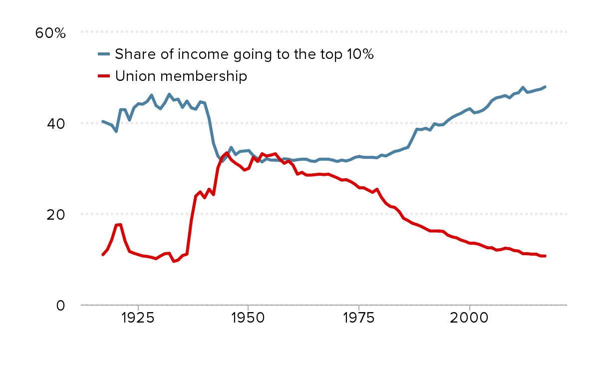
Source: Reproduced from Figure A in Heidi Shierholz, Working People Have Been Thwarted in Their Efforts to Bargain for Better Wages by Attacks on Unions, Economic Policy Institute, August 2019.
Source: Reproduced from Figure A in Heidi Shierholz, Working People Have Been Thwarted in Their Efforts to Bargain for Better Wages by Attacks on Unions, Economic Policy Institute, August 2019. Data on union density follows the composite series found in Historical Statistics of the United States; updated to 2017 from unionstats.com. Income inequality (share of income to top 10%) data are from Thomas Piketty and Emmanuel Saez, “Income Inequality in the United States, 1913–1998,” Quarterly Journal of Economics 118, no. 1 (2003) and updated data from the Top Income Database, updated March 2019.
A large share of workers do not have the union representation they want and need: Share of workers who are either covered by a union contract or would vote for a union in their workplace, and share of workers who are covered by a union contract, 1977 and 2017
| Year | Share of workers either covered by a union contract or who would vote for a union | Share of workers covered by a union contract |
|---|---|---|
| 1977 | 50.8% | 26.5% |
| 2017 | 54.2% | 11.9% |
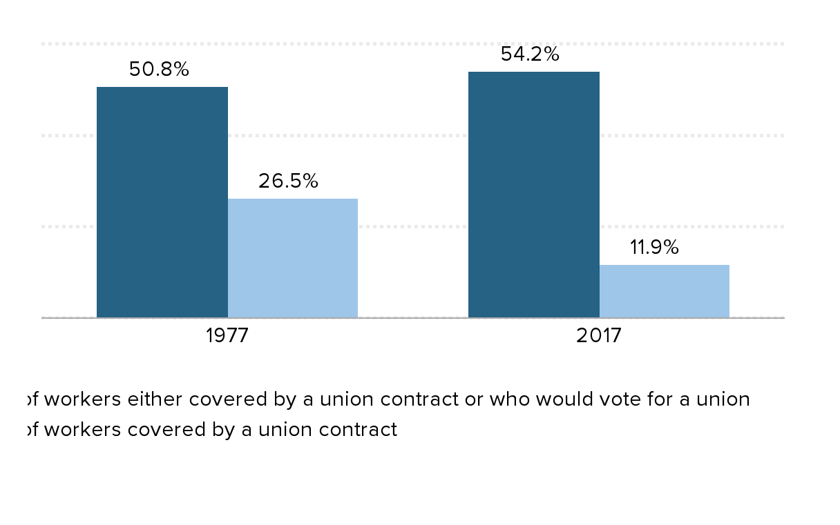
Source: Reproduced from Figure A in Heidi Shierholz, Working People Have Been Thwarted in Their Efforts to Bargain for Better Wages by Attacks on Unions, Economic Policy Institute, August 2019.
Source: Reproduced from Figure A in Heidi Shierholz, Working People Have Been Thwarted in Their Efforts to Bargain for Better Wages, Economic Policy Institute, August 2019. Data are from the author’s analysis of Thomas A. Kochan et al., “Worker Voice in America: Is There a Gap Between What Workers Expect and What They Experience?” ILR Review 72, no. 1 (2019), and Bureau of Labor Statistics’ Current Population Survey public data series.
Average annual family income growth, by income group, 1947–2017
| 1947-1979 | 1979-2007 | 2007-2017 | |
|---|---|---|---|
| Lowest fifth | 2.52% | 0.02% | 0.12% |
| Second fifth | 2.22% | 0.37% | 0.06% |
| Third fifth | 2.39% | 0.59% | 0.13% |
| Fourth fifth | 2.43% | 0.89% | 0.31% |
| 80th-95th percentile | 2.36% | 1.17% | 0.46% |
| Top 5 percent | 1.87% | 1.99% | 0.71% |
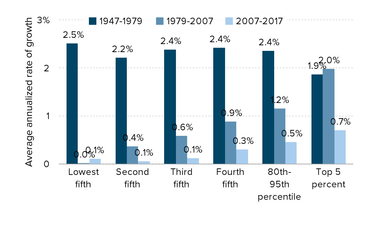
Note: Data are for money income. Because of a redesign in the CPS ASEC income questions in 2013, we imputed the historical series using the ratio of the old and new method in 2013.
Source: EPI analysis of Current Population Survey Annual Social and Economic Supplement Historical Income Tables (Table F-3)
Updated from: Figure 2C in The State of Working America, 12th Edition (Mishel et al. 2012), an Economic Policy Institute book published by Cornell University Press in 2012
