Summary: The large increase in inflation in 2021 and 2022 in the United States exposed just how little deep thinking had been done about the issue of inflation-control by macroeconomists and policy makers in preceding decades. The inflation of that time has often been attributed entirely to an excess of aggregate demand over potential output. But these years saw historically large shocks to the real economy stemming from COVID-19 and the Russian invasion of Ukraine. These shocks imposed extreme distortions on sectoral demand and supply, distortions which seem to have generated inflation globally, not just in the U.S. Further, temporary policies and circumstances (particularly pandemic fiscal relief and the whipsaw of massive layoffs and rapid rehiring efforts in labor-intensive service sectors) gave U.S. workers a pronounced but temporary boost in wage-bargaining with employers. Accordingly, a “shocks and ripples” analysis of inflation explains the data better than analyses based on movements in aggregate demand and supply.1
Starting in mid-2021, inflation in the United States rose to levels not seen since the early 1980s. This inflation followed on the heels of the economic shock imposed by the global COVID-19 pandemic and the significant fiscal policy interventions meant to smooth the fallout of this shock. As of October 2022, inflation—both headline and core measures—remained at historically high levels, though there are significant signs of softening in the near future (evidenced in part by the bending down of the quarterly data series shown in Figure A).
Inflation’s 2021 rise and potential 2023 fall: Overall and core (excluding food and energy) inflation, year-over-year and quarterly at an annualized rate, 2017–2022
| Overall, year-over-year | Core, year-over-year | Overall, quarterly (annualized) | Core, quarterly (annualized) | |
|---|---|---|---|---|
| 2017Q1 | 2.1% | 1.9% | 2.4% | 1.9% |
| 2017Q2 | 1.7% | 1.7% | 1.0% | 1.5% |
| 2017Q3 | 1.7% | 1.5% | 1.5% | 1.3% |
| 2017Q4 | 1.9% | 1.7% | 2.6% | 2.0% |
| 2018Q1 | 2.0% | 1.9% | 2.9% | 2.6% |
| 2018Q2 | 2.3% | 2.0% | 2.2% | 2.2% |
| 2018Q3 | 2.3% | 2.1% | 1.4% | 1.4% |
| 2018Q4 | 2.0% | 2.0% | 1.5% | 1.9% |
| 2019Q1 | 1.5% | 1.7% | 0.8% | 1.5% |
| 2019Q2 | 1.6% | 1.7% | 2.5% | 2.1% |
| 2019Q3 | 1.5% | 1.8% | 1.0% | 1.6% |
| 2019Q4 | 1.5% | 1.6% | 1.5% | 1.2% |
| 2020Q1 | 1.6% | 1.7% | 1.5% | 1.9% |
| 2020Q2 | 0.5% | 0.9% | -1.8% | -1.0% |
| 2020Q3 | 1.1% | 1.3% | 3.4% | 3.2% |
| 2020Q4 | 1.2% | 1.4% | 1.6% | 1.5% |
| 2021Q1 | 1.9% | 1.7% | 4.5% | 3.2% |
| 2021Q2 | 4.0% | 3.5% | 6.4% | 6.0% |
| 2021Q3 | 4.5% | 3.9% | 5.6% | 4.8% |
| 2021Q4 | 5.7% | 4.7% | 6.2% | 4.8% |
| 2022Q1 | 6.4% | 5.3% | 7.5% | 5.6% |
| 2022Q2 | 6.6% | 5.0% | 7.3% | 4.7% |
| 2022Q3 | 6.3% | 4.9% | 4.2% | 4.5% |

Source: Price deflator for personal consumption expenditures (PCEPI) taken from the Bureau of Economic Analysis (BEA) National Income and Product Accounts (NIPA).
This episode has sparked furious debate over the proper policy response, and it has exposed how little innovative thinking has been done on inflation by either macroeconomists or policy analysts since the 1980s price acceleration was ended by the Volcker shock. This report identifies a number of key questions raised by the inflationary outbreak of the past 18 months and offers some answers. A brief summary of these questions and answers is provided below. The remainder of the report then expands on these points.
Why did inflation surge in 2021 and remain high throughout 2022?
The evidence that the simplest stories of macroeconomic “overheating” adequately explain the inflation of the past 18 months is extremely mixed. The evidence is more consistent with a story of extreme shocks causing sectoral demand and supply imbalances, and these sectoral shocks in turn causing unexpectedly large ripple effects in the wider economy through distributional conflict over which groups would absorb the economic losses from higher prices.
What was the role of the COVID pandemic and the Russian invasion of Ukraine in driving this inflationary surge?
The pandemic led to a historically sharp reallocation of consumer spending away from face-to-face services and toward goods consumption and residential investment. Simultaneously, the pandemic introduced huge snarls in global supply chains that need to function smoothly to meet demand for goods and materials used in residential investment. These extreme shocks to both sectoral demand and supply were the spark to inflation in 2021. In 2022, the Russian invasion of Ukraine added another, more familiar shock, to energy and food prices. Both the direct effects of the invasion and the international response of sanctions reduced the supply of energy and food, sending inflation in these sectors historically high. Many of these shocks were far more persistent than is commonly recognized.
Would a looser labor market and higher unemployment have allowed us to see a more subdued path of inflation over the past 18 months?
These largely sectoral shocks bled over into wider macroeconomic effects in part due to labor markets. Nominal wage growth accelerated noticeably in late 2021 and early 2022, even when the odd compositional effects of the pandemic on the labor market are accounted for. However, this effect of labor market tightness is often overstated as a primary driver of inflation. Most of the initial rise in prices did not come from wage-push factors, and the amount of reduced inflation that could have been “bought” by keeping unemployment higher and nominal wage growth more tame would have been relatively small. The price of this slightly slower inflation would have been even larger declines in real wages for working families.
What was the role of mark-ups in the rise of inflation?
The growth of profit margins contributed a historically large amount to inflationary pressures over the past 18 months. In normal times, profit margins constitute roughly 11% of overall output costs. But growth in these margins contributed well over half of the rise in prices in the nonfinancial corporate sector through the end of 2021. The fact of this large spike in profit margins and the distribution of the rise in these margins across sectors more strongly supports a view that recent inflation has been caused by a “shocks and ripples” effect rather than a simple imbalance between aggregate demand and potential output (i.e., macroeconomic overheating).
With the virtue of hindsight, what policy decisions could have been made differently?
Quite heterodox inflation-fighting tools would have been needed to match up tightly with the inflation we saw in 2021 and 2022. For example, policies that deferred consumer demand on goods could have greatly lessened inflationary pressures. Or an explicitly temporary excess profits tax—implemented quickly and early in 2021—might have restrained margin growth.
Some might argue that the Federal Reserve should have started raising interest rates sooner. We would argue that that is not true. The most compelling case that the Federal Reserve should have started raising rates sooner comes from the effect of rate increases on housing. However, the evidence supporting this housing-based case is mixed.
What was the role of housing in the inflation of 2021–2022 and how should it affect policymaking going forward?
Housing is by far the largest single component of consumption spending and accounts for nearly 40% of core spending in the consumer price index (CPI). It is also the component whose price measurement is most backward-looking. Actual increases in rental inflation, for example, only start to reliably push up housing costs as measured in the CPI over the next 6–12 months.
COVID-19 and the rise of remote work led to a large positive shock to housing demand in 2021. Failure to appreciate the backward-looking dynamics of housing price changes led many to be behind the curve on both the rise and fall of prices in 2021–2022.
Further, housing prices (including rents) have more complicated responses to interest rate increases than other components of price indices. For these and other reasons, policymakers should think hard about housing markets, specifically in the context of debates about inflation control and macroeconomic slack.
What insights from previous historical debates about inflation have been missed in this episode, and why?
In the debate over the inflationary periods of the 1960s and 1970s, much greater attention was paid to issues like the inertia of inflation and how distributional conflict over resources could lead to inflation propagation. Further, the role of sectoral, not macroeconomic, imbalances of supply and demand were taken seriously in previous inflation debates.
In the current debate, it has been striking how confidently many have proclaimed that the mere existence of inflation provides ipso facto evidence that the economy has run into a macroeconomic imbalance of aggregate demand exceeding potential output. This conflation of any inflation with macroeconomic imbalances has been a real loss of knowledge that should be reclaimed.
Macroeconomic overheating is not necessarily the culprit for the inflationary surge of 2021 and 2022
In early 2021, debate raged about the potential economic effects of the American Rescue Plan (ARP). ARP, passed in early 2021, was explicitly designed as fiscal stimulus, with large and front-loaded transfers to households as its centerpiece, along with substantial aid to state and local governments.
Some critics of ARP worried about its potential effect on inflation. The most famous of these worriers was Larry Summers. Summers explicitly framed his concerns as centered around estimates of potential output. He posited that excess fiscal stimulus would push gross domestic product (GDP) well over the economy’s long-run potential to deliver, hence causing inflation. As he put it:
I agree with the general consensus of progressive economists that it would have been much better if the Obama administration had been able to legislate a much larger fiscal stimulus in early 2009, in response to the Great Recession. Yet a comparison of the 2009 stimulus and what is now being proposed is instructive. In 2009, the gap between actual and estimated potential output was about $80 billion a month and increasing. The 2009 stimulus measures provided an incremental $30 billion to $40 billion a month during 2009—an amount equal to about half the output shortfall.
In contrast, recent Congressional Budget Office estimates suggest that with the already enacted $900 billion package—but without any new stimulus—the gap between actual and potential output will decline from about $50 billion a month at the beginning of the year to $20 billion a month at its end. The proposed stimulus will total in the neighborhood of $150 billion a month, even before consideration of any follow-on measures. That is at least three times the size of the output shortfall. (Summers 2021)
This argument might benefit from an illustrative figure. The green line in Figure B shows the estimates of potential output referenced by Summers (“GDP in overheating scenario”). The blue line shows the Congressional Budget Office’s (CBO’s) predictions of what GDP growth would have been without ARP through the end of 2020, and actual GDP growth since that date. We then add in a line showing the path GDP would have taken had ARP pushed up actual GDP 1-for-1 with spending, leading real GDP to exceed potential in the manner described by Summers. In this figure, one can see the still considerable negative output gap (shortfall of actual GDP relative to potential) that persisted at the end of 2020, as well as the very large positive output gap that was projected by reasoning like Summers’s after ARP’s passage by the end of 2022.
What overheating pursuant to American Rescue Plan spending would have looked like: Measures and projections of real and potential GDP ($billions)
| CBO est. of potential output in January 2021 | GDP in overheating scenario | Actual GDP | |
|---|---|---|---|
| 2019Q4 | 19157.1 | 19215.7 | 19215.7 |
| 2020Q1 | 19250.2 | 18989.9 | 18989.9 |
| 2020Q2 | 19340.2 | 17378.7 | 17378.7 |
| 2020Q3 | 19424.2 | 18743.7 | 18743.7 |
| 2020Q4 | 19512 | 18924.3 | 18924.3 |
| 2021Q1 | 19602.5 | 19666.2 | 19216.2 |
| 2021Q2 | 19697.4 | 20116.2 | 19544.2 |
| 2021Q3 | 19795.8 | 20566.2 | 19672.6 |
| 2021Q4 | 19898.3 | 21016.2 | 20006.2 |
| 2022Q1 | 20003.7 | 21466.2 | 19924.1 |
| 2022Q2 | 20109.9 | 21916.2 | 19895.3 |
| 2022Q3 | 20216.1 | 22366.2 | 20021.7 |
Note: The green line takes the Congressional Budget Office (2021) forecast of actual GDP and assumes American Rescue Plan fiscal impulse translated 1:1 into higher GDP, per the concerns of some at the time.
Source: Data taken from Congressional Budget Office (2021) and Bureau of Economic Analysis (BEA) National Income and Product Accounts (NIPA).
The emergence of higher levels of inflation by mid-2021 led many to assume this output gap-based reasoning had turned out to be true. They thought that the inflation was clearly the result of macroeconomic overheating (with the level of actual GDP far exceeding the level of potential GDP). But it is far from obvious that this is the correct interpretation. For one (as we show later), even with the American Rescue Plan, real GDP growth (the red line) has barely beaten pre-pandemic projections of what it would be by mid-2022.
Below we highlight evidence that further complicates the narrative that inflation is the result of simple macroeconomic imbalances driven by a too generous ARP.
International evidence complicates the domestic overheating story
The most straightforward reason to doubt this narrative comes from a look at the international experience of inflation.
A look across member countries of the Organisation for Economic Co-operation and Development (OECD) shows that rising inflation was not unique to the U.S. and was in fact a global phenomenon throughout 2021 and 2022. Figure C shows the acceleration in core inflation from May 2021 through September 2022, compared with two years of pre-pandemic “normal” inflation (2018–2019), for 35 OECD countries. We use core inflation, which strips out food and energy prices, to better represent broad inflationary pressures in each economy. Using core inflation also allows for a better comparison between the U.S. and Europe given the volatility in food and energy prices affecting Europe due to the war in Ukraine.
The rise of inflation was global in 2021 and 2022: Acceleration of core inflation from May 2021 through September 2022, compared with two years of pre-pandemic “normal” inflation (2018–2019)
| Country | Acceleration of core inflation |
|---|---|
| JPN | 0.7% |
| CHE | 1.7% |
| FRA | 2.4% |
| ESP | 2.8% |
| NOR | 3.1% |
| KOR | 3.7% |
| ITA | 3.8% |
| LUX | 3.8% |
| NLD | 4.2% |
| DNK | 4.4% |
| DEU | 4.5% |
| MEX | 4.6% |
| BEL | 4.6% |
| CAN | 4.7% |
| FIN | 4.8% |
| ISR | 5.1% |
| Non-US median | 5.2% |
| GRC | 5.2% |
| COL | 5.3% |
| IRL | 5.3% |
| AUT | 5.5% |
| GBR | 5.6% |
| SVN | 5.9% |
| USA | 6.0% |
| Non-US average | 6.1% |
| SWE | 6.4% |
| PRT | 6.8% |
| LVA | 7.2% |
| ISL | 7.5% |
| CHL | 9.9% |
| POL | 10.2% |
| LTU | 10.9% |
| SVK | 11.3% |
| HUN | 11.5% |
| EST | 12.2% |
| CZE | 14.4% |
Note: The acceleration of core inflation is measured as the annualized rate of inflation from May 2021 to September 2022 minus the average rate of inflation that prevailed in 2018–2019.
Source: Data from the Organisation for Economic Co-operation and Development (OECD 2022).
As Figure C shows, all 35 OECD nations we examined experienced an acceleration in core inflation throughout 2021 and 2022 compared with the pre-pandemic period. While above the median, and on the higher side of inflation experiences worldwide, the U.S. is by no means an outlier and is just below the average for all other OECD countries. This global phenomenon of rising inflation casts doubt on the claim that U.S. inflation was caused purely by domestic policy decisions leading to macroeconomic overheating.
One might argue that the global acceleration in inflation simply meant that many countries overheated their economies and generated excess demand through too much fiscal spending. However, the data do not support this argument. For one, Figure C shows OECD nations with a wide range of fiscal responses, from aggressive relief spending to little intervention. Despite the varying responses, all countries experienced some level of inflation acceleration.
Figure D examines more closely the argument that global inflation is simply a reflection of global excess demand. To do this, we examine core inflation acceleration on the vertical axis (the same numbers shown in Figure C). On the horizontal axis, we show change in unemployment between September 2022 and the pre-pandemic 2018–2019 unemployment. This measure indicates how much unemployment has improved recently compared with the pre-pandemic period (for example, a fall in the unemployment rate of 2 percentage points would be shown on the graph as a positive 2%). If inflation was caused by excess demand growth (proxied by lower unemployment rates today), one would expect to see a positive relationship between unemployment improvement and acceleration of inflation. The data do not show this.
Very hard to see global overheating: Unemployment improvement and inflation acceleration across countries
| Unemployment improvement | Inflation acceleration | |
|---|---|---|
| AUT | 0.36 | 5.5% |
| BEL | 0.02 | 4.6% |
| CAN | 0.69 | 4.7% |
| CHL | -0.33 | 9.9% |
| COL | -1.06 | 5.3% |
| CZE | -0.23 | 14.4% |
| DEU | 0.10 | 4.5% |
| DNK | 0.80 | 4.4% |
| ESP | 1.92 | 2.8% |
| EST | -0.75 | 12.2% |
| FIN | 0.31 | 4.8% |
| FRA | 1.30 | 2.4% |
| GBR | 0.25 | 5.6% |
| HUN | 0.02 | 11.5% |
| IRL | 0.96 | 5.3% |
| ISL | -0.47 | 7.5% |
| ISR | 0.32 | 5.1% |
| ITA | 2.20 | 3.8% |
| JPN | -0.18 | 0.7% |
| KOR | 1.07 | 3.7% |
| LTU | 0.85 | 10.9% |
| LUX | 1.21 | 3.8% |
| LVA | 0.30 | 7.2% |
| MEX | 0.12 | 4.6% |
| NLD | 1.16 | 4.2% |
| NOR | 0.76 | 3.1% |
| POL | 0.97 | 10.2% |
| PRT | 0.95 | 6.8% |
| SVK | 0.03 | 11.3% |
| SVN | 0.52 | 5.9% |
| SWE | -0.61 | 6.4% |
| USA | 0.20 | 6.0% |
Notes: The acceleration of core inflation is measured as the annualized rate of inflation from May 2021 to September 2022 minus the average rate of inflation that prevailed in 2018–2019. The improvement in unemployment is average unemployment in 2019 minus unemployment rate that prevailed as of September 2022.
Source: Data from the Organisation for Economic Co-operation and Development (OECD 2022).
As Figure D depicts, there is no significant positive relationship between unemployment improvement and inflation acceleration. If anything, there appears to be a slightly weak relationship in the opposite direction whereby countries with higher unemployment (or lower improvement) relative to pre-pandemic times experienced higher inflation levels. The fact that countries with larger decreases in unemployment (perhaps brought about by more expansive fiscal policy and economic stimulus) do not show larger spikes in inflation strongly complicates the claim that macroeconomic overheating applies globally.
Overall, the shared 2021–2022 international experience of high core inflation strongly counters the argument that fiscal relief in the U.S.—such as the American Rescue Plan—either drove up inflation or contributed significantly to its unusual persistence.
Domestic evidence is also underwhelming for simple overheating explanations
Turning to the domestic U.S. evidence, the case for recent inflation being sparked by a simple macroeconomic imbalance of aggregate demand and potential output is also weak. Many have presented the steepening trend in nominal spending over the past year and a half as evidence for the overheating view. This is tautological. Faster nominal spending growth could simply be a reflection of faster inflation; it is not evidence of its cause.
Take a totally trivial example: Imagine there was a rapid consolidation of market concentration across the economy. Firms with greater market power would likely raise prices. If the price elasticity of demand was relatively low in the short run (which seems like a safe bet), this would in turn make nominal spending rise more rapidly (even while real spending would actually fall). This could happen with no implication at all for the state of macroeconomic balance.
More realistically, one could imagine a scenario—like what happened following the pandemic shock—wherein the allocation of demand across spending categories rotated sharply into sectors with either impaired supply or a higher elasticity of prices with respect to demand. As this happened, there would be an increase in prices even without the level of aggregate demand being particularly high relative to the economy’s potential output. In the long run, the inflationary effect of very large relative price changes set off by such a process could be muffled by macroeconomic policy, but claims that over a 1–2 year period such relative price changes cannot be major drivers of inflation seem obviously wrong.
Decomposition of inflation into ‘demand’ and ‘supply’ factors
One method some have used to assess the role of ARP and excess stimulus in generating inflation is to decompose the recent acceleration of inflation into “demand” versus “supply” factors. Probably the most well-done and transparent version of this exercise is by Shapiro (2022). The categorization of price changes in a given economic sector as being driven by demand or supply is done by estimating the price and quantity levels of an industry in each month. Then, the “unexpected” components of monthly changes (basically those that exceed or lag a running trend) in both prices and quantities are extracted. If a sector sees both price and quantity growth above trend, price increases in that sector are categorized as demand-driven. If price growth is above trend but quantity growth is below trend, then price increases are characterized as supply-driven. If either price or quantity growth is near trend, then the industry’s price growth is labeled ambiguous.
The Shapiro (2022) decomposition is certainly clever. Based on these results, the rise of core inflation over the past year can essentially be attributed equally to demand- and supply-side measures. This decomposition for recent years is reproduced in Figure E. However, this technique and how its results are interpreted have a couple of potential shortcomings.
Inflation is both a demand and supply phenomenon: Decomposition of core inflation into demand-and supply-driven contributions, by month, 2017–2022
| Demand-driven inflation | Ambiguous | Supply-driven inflation | |
|---|---|---|---|
| Jan 2017 | 0.409999996% | 0.569999993% | 0.930000007% |
| Feb 2017 | 0.340000004 | 0.560000002 | 1 |
| Mar 2017 | 0.340000004 | 0.5 | 0.870000005 |
| Apr 2017 | 0.360000014 | 0.479999989 | 0.879999995 |
| May 2017 | 0.389999986 | 0.400000006 | 0.879999995 |
| Jun 2017 | 0.400000006 | 0.400000006 | 0.920000017 |
| Jul 2017 | 0.400000006 | 0.340000004 | 0.870000005 |
| Aug 2017 | 0.439999998 | 0.310000002 | 0.779999971 |
| Sep 2017 | 0.479999989 | 0.430000007 | 0.649999976 |
| Oct 2017 | 0.469999999 | 0.400000006 | 0.810000002 |
| Nov 2017 | 0.550000012 | 0.419999987 | 0.74000001 |
| Dec 2017 | 0.649999976 | 0.330000013 | 0.74000001 |
| Jan 2018 | 0.629999995 | 0.319999993 | 0.819999993 |
| Feb 2018 | 0.689999998 | 0.319999993 | 0.779999971 |
| Mar 2018 | 0.670000017 | 0.360000014 | 1.039999962 |
| Apr 2018 | 0.699999988 | 0.349999994 | 0.939999998 |
| May 2018 | 0.779999971 | 0.360000014 | 0.949999988 |
| Jun 2018 | 0.75999999 | 0.370000005 | 0.910000026 |
| Jul 2018 | 0.819999993 | 0.379999995 | 0.910000026 |
| Aug 2018 | 0.75999999 | 0.389999986 | 0.870000005 |
| Sep 2018 | 0.74000001 | 0.349999994 | 1 |
| Oct 2018 | 0.75999999 | 0.349999994 | 0.850000024 |
| Nov 2018 | 0.790000021 | 0.289999992 | 0.99000001 |
| Dec 2018 | 0.560000002 | 0.289999992 | 1.230000019 |
| Jan 2019 | 0.540000021 | 0.300000012 | 1.049999952 |
| Feb 2019 | 0.49000001 | 0.270000011 | 0.970000029 |
| Mar 2019 | 0.610000014 | 0.270000011 | 0.75999999 |
| Apr 2019 | 0.639999986 | 0.310000002 | 0.790000021 |
| May 2019 | 0.540000021 | 0.270000011 | 0.839999974 |
| Jun 2019 | 0.519999981 | 0.280000001 | 0.959999979 |
| Jul 2019 | 0.560000002 | 0.270000011 | 0.939999998 |
| Aug 2019 | 0.629999995 | 0.200000003 | 1.019999981 |
| Sep 2019 | 0.629999995 | 0.200000003 | 0.870000005 |
| Oct 2019 | 0.589999974 | 0.159999996 | 0.959999979 |
| Nov 2019 | 0.589999974 | 0.180000007 | 0.790000021 |
| Dec 2019 | 0.75999999 | 0.189999998 | 0.660000026 |
| Jan 2020 | 0.769999981 | 0.180000007 | 0.769999981 |
| Feb 2020 | 0.720000029 | 0.200000003 | 0.910000026 |
| Mar 2020 | 0.379999995 | 0.200000003 | 1.00999999 |
| Apr 2020 | -0.01 | 0.159999996 | 0.699999988 |
| May 2020 | -0.01 | 0.189999998 | 0.680000007 |
| Jun 2020 | -0.050000001 | 0.270000011 | 0.639999986 |
| Jul 2020 | 0.02 | 0.319999993 | 0.720000029 |
| Aug 2020 | 0.039999999 | 0.469999999 | 0.779999971 |
| Sep 2020 | 0.170000002 | 0.5 | 0.74000001 |
| Oct 2020 | 0.109999999 | 0.600000024 | 0.600000024 |
| Nov 2020 | 0.07 | 0.600000024 | 0.649999976 |
| Dec 2020 | 0.090000004 | 0.769999981 | 0.569999993 |
| Jan 2021 | 0.219999999 | 0.769999981 | 0.560000002 |
| Feb 2021 | 0.209999993 | 0.939999998 | 0.409999996 |
| Mar 2021 | 0.709999979 | 1.029999971 | 0.370000005 |
| Apr 2021 | 1.200000048 | 1.110000014 | 0.910000026 |
| May 2021 | 1.49000001 | 1.159999967 | 1 |
| Jun 2021 | 1.5 | 1.120000005 | 1.330000043 |
| Jul 2021 | 1.49000001 | 1.070000052 | 1.440000057 |
| Aug 2021 | 1.49000001 | 0.930000007 | 1.580000043 |
| Sep 2021 | 1.340000033 | 0.949999988 | 1.74000001 |
| Oct 2021 | 1.600000024 | 0.970000029 | 1.830000043 |
| Nov 2021 | 1.629999995 | 1.179999948 | 2.069999933 |
| Dec 2021 | 1.620000005 | 1.120000005 | 2.339999914 |
| Jan 2022 | 1.5 | 1.190000057 | 2.529999971 |
| Feb 2022 | 1.700000048 | 1.100000024 | 2.599999905 |
| Mar 2022 | 1.659999967 | 0.99000001 | 2.690000057 |
| Apr 2022 | 1.570000052 | 0.949999988 | 2.470000029 |
| May 2022 | 1.450000048 | 0.939999998 | 2.450000048 |
| Jun 2022 | 1.639999986 | 1.070000052 | 2.25999999 |
| Jul 2022 | 1.629999995 | 1.090000033 | 1.909999967 |
| Aug 2022 | 1.75 | 1.200000048 | 1.899999976 |
| Sep 2022 | 1.970000029 | 1.210000038 | 1.919999957 |
| Oct 2022 | 1.879999995 | 1.299999952 | 1.730000019 |
Note: Decomposition based on work of Shapiro (2022).
Source: “Supply and Demand Driven PCE Inflation” page from the San Francisco Federal Reserve Bank (2022).
Shapiro’s technique for decomposing demand versus supply drivers of inflation might stumble on one potentially important issue—changes in the elasticity of price changes with respect to demand shocks. Take the example of an industry that has seen a very large price increase relative to trend but has seen steady growth in output. Under the Shapiro (2022) decomposition, this would qualify as the source of inflation in the sector being “ambiguous.” But this could easily be a supply issue. If during normal times a mild uptick in demand (a percentage point or two above trend) led to tame price growth, but since the pandemic this mild uptick was associated with very large price increases, this could well actually be a signal that it is supply-side factors that are binding. Further, even for sectors that are characterized as demand- or supply- driven, if the price change associated with any demand or supply mismatch (regardless of which side initially caused it) is greater than it was in the past, this could signal that sectoral frictions—not just macroeconomic factors—are causing the rise of inflation.
On the issue of the interpretation of the results, identifying a given inflationary episode as being driven by “demand” or “supply” can sometimes be akin to asking which blade of the scissors cuts the paper. As Larry Summers put it (fairly enough):
I think it restates what I think is a bit of a popular confusion in the following sense—supply is what it is. Monetary policy can’t change it. Fiscal policy can’t change it, except in the long-run. And so given what supply is, it’s the task of demand to balance supply. And if demand is greater than supply, then you’re going to have excess inflation and you’re going to have the problems of financial excess.
So the job of the demand managers, principally the Fed, is to judge what supply is and calibrate appropriately. It’s not an excuse for inflation to blame it on supply. It’s a reality in the environment that you have to deal with. And so the job is to look for measures of overheating, and when you see measures of overheating, to apply restraint. (Klein 2022)
Real-time estimates of actual and potential GDP don’t look particularly inflationary
Summers’s point that attributing the recent rise in inflation to “demand” or “supply” does not end the debate about the role of excess macroeconomic stimulus in driving today’s inflation is well taken. However, his claim that “supply is what it is” simplifies far too much. The most obvious disruption to potential output (or aggregate supply) in the wake of the COVID-19 shock was the 2.5% decline in labor force participation between February 2020 and the end of 2020. But should policymakers really have looked at this decline and just thought “it is what it is” and pulled back demand growth to match this? Or, instead, was the decline in labor force participation (which fell 3.5% in a single month in April 2020) better seen as a mostly temporary economic casualty of the pandemic that would eventually heal?
So, in some sense it is true that categorizing some inflationary shocks as “supply-driven” does not map perfectly onto a recommendation to keep demand policy stable. But the larger claim that inflation is ipso facto evidence of aggregate demand overshooting supply and hence requires contractionary macroeconomic policy does not follow.
We can get some sense of how much the aggregate levels of demand and supply have shifted relative to pre-pandemic trends using data on GDP and potential output. At the end of 2019, the Congressional Budget Office made projections of both of these variables for the coming years while forecasting little to no change in inflation (or interest rates). The Summers argument above is that either GDP began rising faster than forecast in 2019 (due to excessively expansionary fiscal policy) or that potential output shrank, with either influence (or both influences) leading to a positive “output gap” that drove up inflationary pressures.
Figure F shows real GDP and potential output, both as ratios to what CBO projected they would be before the pandemic. For the measure of potential output, we allow developments since the pandemic to affect the CBO projection. Specifically, we reduce the labor input into potential output by assuming that the decline in the labor force participation rate is driven solely by supply-side factors.2
We also account for changing capital services input and total factor productivity growth relative to CBO projections. For capital services, we construct a measure of growth of the aggregate capital stock that accounts for the nonresidential fixed investment (NRFI) that has occurred since the pandemic and we compare this against CBO projections of capital services input growth. For total factor productivity, we employ the utilization-adjusted measure of total factor productivity growth compiled by John Fernald (2023) and compare that with the CBO forecast.
As can be seen in Figure F, potential output fell sharply (not as sharply as GDP, but still noticeably) in the immediate post-pandemic shock period. As of the third quarter of 2022, it still remained a bit under 2% below what CBO forecast it would be in that quarter. GDP fell very sharply in the pandemic recession, but by the third quarter of 2022 sat roughly 1% beneath what CBO forecast it would be before the pandemic struck.
Output has likely not surged above its potential level post pandemic shock: Adjusted measures of potential GDP and actual GDP, both relative to pre-pandemic CBO forecasts
| Adjusted CBO est. of potential GDP, January 2020 | Actual GDP | |
|---|---|---|
| 2019Q4 | 100.0% | 99.9% |
| 2020Q1 | 100.8% | 98.3% |
| 2020Q2 | 97.7% | 89.4% |
| 2020Q3 | 98.2% | 95.9% |
| 2020Q4 | 96.7% | 96.3% |
| 2021Q1 | 98.0% | 97.3% |
| 2021Q2 | 97.7% | 98.5% |
| 2021Q3 | 98.1% | 98.8% |
| 2021Q4 | 98.4% | 100.0% |
| 2022Q1 | 100.2% | 99.2% |
| 2022Q2 | 98.6% | 98.7% |
| 2022Q3 | 98.2% | 98.9% |
Note: Adjustments to potential GDP as described in text.
Sources: The potential GDP baseline and GDP forecasts are taken from Congressional Budget Office (2021). Actual GDP is taken from Bureau of Economic Analysis (BEA) National Income and Product Accounts (NIPA).
There was a period of time during 2021 when GDP rose above our adjusted measures of potential output for a stretch. Over the five quarters from the end of 2020 to the end of 2021, the cumulative positive output gap (GDP exceeding potential output) was 5.8%, with an average gap of around 1.2% in each quarter.
That GDP exceeded potential output as inflation rose gives some plausibility to claims that macroeconomic overheating contributed to the recent inflationary spike, but the magnitude of the spike makes it highly unlikely that this overheating played a starring role. There is a well-established literature on how much each 1 percentage point positive output gap should be expected to drive up the inflation rate. These estimates do not exceed 0.5% and cluster more tightly around 0.3% or even lower. This implies that the 1.2% average output gap in that five-quarter stretch should be expected to raise subsequent inflation by roughly 0.4–0.6%, or by about a tenth of its actual acceleration over this period.
A historical example might help make this clearer. According to CBO estimates, the U.S. economy ran a cumulative positive output gap of over 17% of potential output, with an average gap of 1.2%, over the period from 1997 to 2000. This was the same average gap as that seen in 2021, but sustained for four times as long. Yet there was no inflationary increase at all during this period. In short, running the economy this “hot” for a year is not supposed to yield anywhere near the degree of inflation that we have witnessed since the middle of 2021.
Figure G shows the history of output gaps since 1995. For the last two years, we show the gap with an unadjusted measure of potential output from CBO’s last pre-pandemic projection, plus the gap with our adjusted measure of potential output. Even with our adjusted measure, which accounts for pandemic damage to the economy’s aggregate potential output, the positive output gaps of the past 18 months are utterly unremarkable relative to recent U.S. economic history—a history that saw no similar inflationary spike.
Positive 2021 output gap is unremarkable in recent history: Output gaps (% of GDP) since 1995, including adjusted output gap for 2021–2022
| Output gap, adjusted | Output gap, unadjusted | |
|---|---|---|
| 1995Q1 | -1.037442674 | |
| 1995Q2 | -1.417944987 | |
| 1995Q3 | -1.253764142 | |
| 1995Q4 | -1.267621768 | |
| 1996Q1 | -1.218840757 | |
| 1996Q2 | -0.30597483 | |
| 1996Q3 | -0.193508223 | |
| 1996Q4 | 0.015040705 | |
| 1997Q1 | -0.207254381 | |
| 1997Q2 | 0.541406779 | |
| 1997Q3 | 0.848909855 | |
| 1997Q4 | 0.740745752 | |
| 1998Q1 | 0.753957453 | |
| 1998Q2 | 0.671584645 | |
| 1998Q3 | 0.907080142 | |
| 1998Q4 | 1.498258603 | |
| 1999Q1 | 1.407574806 | |
| 1999Q2 | 1.205981182 | |
| 1999Q3 | 1.490939149 | |
| 1999Q4 | 2.09073296 | |
| 2000Q1 | 1.403664348 | |
| 2000Q2 | 2.213327853 | |
| 2000Q3 | 1.336220186 | |
| 2000Q4 | 1.013814946 | |
| 2001Q1 | -0.17651419 | |
| 2001Q2 | -0.367073431 | |
| 2001Q3 | -1.519140107 | |
| 2001Q4 | -1.953546467 | |
| 2002Q1 | -1.811436526 | |
| 2002Q2 | -1.851007007 | |
| 2002Q3 | -2.081713335 | |
| 2002Q4 | -2.564721809 | |
| 2003Q1 | -2.66607767 | |
| 2003Q2 | -2.404946463 | |
| 2003Q3 | -1.389227218 | |
| 2003Q4 | -0.86926817 | |
| 2004Q1 | -0.928038684 | |
| 2004Q2 | -0.789297985 | |
| 2004Q3 | -0.501182803 | |
| 2004Q4 | -0.136371387 | |
| 2005Q1 | 0.332489649 | |
| 2005Q2 | 0.200815071 | |
| 2005Q3 | 0.379377318 | |
| 2005Q4 | 0.356940212 | |
| 2006Q1 | 1.130602179 | |
| 2006Q2 | 0.814758487 | |
| 2006Q3 | 0.429248749 | |
| 2006Q4 | 0.762090719 | |
| 2007Q1 | 0.54801544 | |
| 2007Q2 | 0.678655708 | |
| 2007Q3 | 0.771103249 | |
| 2007Q4 | 0.876392638 | |
| 2008Q1 | -0.031770238 | |
| 2008Q2 | 0.062268994 | |
| 2008Q3 | -0.914045502 | |
| 2008Q4 | -3.486071828 | |
| 2009Q1 | -4.979094406 | |
| 2009Q2 | -5.479377457 | |
| 2009Q3 | -5.455786055 | |
| 2009Q4 | -4.755715265 | |
| 2010Q1 | -4.590521875 | |
| 2010Q2 | -3.987322966 | |
| 2010Q3 | -3.581543154 | |
| 2010Q4 | -3.429040795 | |
| 2011Q1 | -4.020298733 | |
| 2011Q2 | -3.742455073 | |
| 2011Q3 | -4.163170099 | |
| 2011Q4 | -3.483241686 | |
| 2012Q1 | -3.098823814 | |
| 2012Q2 | -3.072610555 | |
| 2012Q3 | -3.325044436 | |
| 2012Q4 | -3.645040485 | |
| 2013Q1 | -3.243102357 | |
| 2013Q2 | -3.545280881 | |
| 2013Q3 | -3.221571848 | |
| 2013Q4 | -2.978336665 | |
| 2014Q1 | -3.762823871 | |
| 2014Q2 | -2.977166383 | |
| 2014Q3 | -2.306752966 | |
| 2014Q4 | -2.329227621 | |
| 2015Q1 | -1.996928446 | |
| 2015Q2 | -1.889443822 | |
| 2015Q3 | -2.027380247 | |
| 2015Q4 | -2.329516612 | |
| 2016Q1 | -2.194154532 | |
| 2016Q2 | -2.33092847 | |
| 2016Q3 | -2.170039754 | |
| 2016Q4 | -2.106614267 | |
| 2017Q1 | -2.10915828 | |
| 2017Q2 | -2.03636394 | |
| 2017Q3 | -1.657360043 | |
| 2017Q4 | -1.111337256 | |
| 2018Q1 | -0.878552423 | |
| 2018Q2 | -0.650842836 | |
| 2018Q3 | -0.406639899 | |
| 2018Q4 | -0.697743417 | |
| 2019Q1 | -0.629675979 | |
| 2019Q2 | -0.434271331 | |
| 2019Q3 | -0.023450459 | |
| 2019Q4 | -0.051535901 | |
| 2020Q1 | -1.679857519 | -1.860602484 |
| 2020Q2 | -10.41743765 | -7.776585183 |
| 2020Q3 | -3.765909602 | -1.546344629 |
| 2020Q4 | -3.246589566 | 0.393500667 |
| 2021Q1 | -2.180082048 | 0.151483956 |
| 2021Q2 | -0.956479479 | 1.59083981 |
| 2021Q3 | -0.757843738 | 1.382575058 |
| 2021Q4 | 0.461432469 | 2.281207018 |
| 2022Q1 | -0.406699174 | -0.513727689 |
| 2022Q2 | -1.024362749 | 0.543082553 |
| 2022Q3 | -0.872460261 | 1.11867539 |
Sources: Data taken from Congressional Budget Office (2021) and Bureau of Economic Analysis (BEA) National Income and Product Accounts (NIPA).
Tight labor markets usually boost—not reduce—labor’s relative bargaining power
Finally, we highlight some evidence from the labor market to assess the claim that a straightforward story of macroeconomic overheating is at the core of recent inflation. Generally, claims that inflation accelerations are driven by an excess of aggregate demand over potential output rest on theories of labor market overheating. As aggregate demand exceeds potential output, unemployment falls. In turn, this boosts workers’ bargaining position with employers and accelerates wage growth. If nominal wage growth begins exceeding price inflation, this leads to a rise in labor’s share of income.
The general logic that lower rates of unemployment boost nominal wage growth more than price inflation is sound and supported by empirical evidence. As the recent inflationary episode began in 2021, it was often accompanied by stories of labor shortages in many sectors. This led far too many to assume that wage pressures were pushing up price growth, and the simple story of the labor market overheating due to a macroeconomic excess of aggregate demand over potential output gained credence.
The first bit of evidence against the claim that rolling labor shortages across sectors led to prices rising can be seen in Figure H. This graph shows the acceleration in price inflation and the acceleration in nominal wage growth across 61 industries. It measures acceleration of prices and wages as their annualized growth rate between the second quarter of 2020 and the third quarter of 2022 relative to the annualized growth rate that prevailed on average between 2018 and 2019. There is no discernible correlation at all between these measures.
Industry price inflation not driven by rolling labor shortages: One-year acceleration of inflation and nominal wage growth by industry in September 2022
| date | 1-year change in wages | 1-year change in prices |
|---|---|---|
| 2022q2 | 0.1268338% | 0.0230537% |
| 2022q2 | 0.1245117 | 0.0651971 |
| 2022q2 | 0.1096804 | 0.1264156 |
| 2022q2 | 0.1003991 | 0.0259661 |
| 2022q2 | 0.0991156 | 0.1033432 |
| 2022q2 | 0.0969601 | 0.0559718 |
| 2022q2 | 0.0916344 | 0.1778477 |
| 2022q2 | 0.0900257 | 0.0089109 |
| 2022q2 | 0.0845733 | 0.1346681 |
| 2022q2 | 0.0788986 | 0.0216826 |
| 2022q2 | 0.0783661 | 0.1933899 |
| 2022q2 | 0.0744892 | -0.1681365 |
| 2022q2 | 0.0741051 | 0.0422949 |
| 2022q2 | 0.0726174 | -0.0779248 |
| 2022q2 | 0.0720981 | 0.1865076 |
| 2022q2 | 0.0679267 | 0.037667 |
| 2022q2 | 0.067722 | 0.0288282 |
| 2022q2 | 0.0670871 | 0.0790173 |
| 2022q2 | 0.0643922 | 0.0205015 |
| 2022q2 | 0.0603795 | 0.0738291 |
| 2022q2 | 0.0581729 | 0.2302468 |
| 2022q2 | 0.0581624 | 1.571569 |
| 2022q2 | 0.0579678 | 0.0183528 |
| 2022q2 | 0.0577908 | 0.2409101 |
| 2022q2 | 0.0562284 | 0.1927279 |
| 2022q2 | 0.056197 | 0.1326708 |
| 2022q2 | 0.0560012 | 0.0655703 |
| 2022q2 | 0.0548044 | 0.0956108 |
| 2022q2 | 0.0543616 | 0.0422047 |
| 2022q2 | 0.0538076 | 0.1594304 |
| 2022q2 | 0.0535776 | 0.1869677 |
| 2022q2 | 0.0514923 | 0.138399 |
| 2022q2 | 0.0472634 | 0.2707055 |
| 2022q2 | 0.0450574 | -0.0537838 |
| 2022q2 | 0.0444742 | 0.1343548 |
| 2022q2 | 0.04378 | 0.042727 |
| 2022q2 | 0.0420794 | 0.1839621 |
| 2022q2 | 0.0412392 | 0.0947621 |
| 2022q2 | 0.0410261 | 0.1483489 |
| 2022q2 | 0.0409108 | 0.1354458 |
| 2022q2 | 0.0406292 | -0.0298556 |
| 2022q2 | 0.0395538 | 0.0240901 |
| 2022q2 | 0.0394657 | 0.266773 |
| 2022q2 | 0.0363253 | 0.1499694 |
| 2022q2 | 0.0355256 | -0.076805 |
| 2022q2 | 0.0332553 | 0.0607655 |
| 2022q2 | 0.0243052 | 1.300836 |
| 2022q2 | 0.0135722 | 0.0266431 |
| 2022q2 | 0.0106534 | 0.2336368 |
| 2022q2 | 0.0081077 | 0.0399025 |
| 2022q2 | -0.0013241 | 0.0166427 |
| 2022q2 | -0.0103535 | -0.0151664 |
| 2022q2 | -0.0124126 | -0.0112901 |
| 2022q2 | -0.0160883 | 0.0316972 |
| 2022q2 | -0.0231058 | 0.1023001 |
| 2022q2 | -0.031784 | 0.213711 |
| 2022q2 | -0.0602599 | 0.1961474 |
Note: Both inflation and wage acceleration defined as year-over-year change in September 2022, minus average rates in 2018–2019.
Sources: Bureau of Economic Analysis (BEA) GDP-by-Industry series and Bureau of Labor Statistics (BLS) Current Employment Statistics (CES).
Moreover, while nominal wage growth did accelerate in 2021, it never exceeded price inflation. This means that real (inflation-adjusted) wages have been falling since early 2021. This also led to a pronounced fall in the labor share of income in the corporate sector, which has largely not recovered from its post-pandemic low. It seems odd that a labor shortage could somehow be the source of inflation given this data—it is rare for services in short supply to command less and less income growth on a per-unit basis.
This fall in real wages and the labor share of income is absolutely not the norm for the U.S. economy as it “heats up” in recoveries. This fact has been missed by far too many commenters. Many have made implicit claims that a sharp fall in the labor share of income and real wages is the norm for an economy with positive output gaps. Rampell (2022), for example, writes:
The greedflationists argue that something fishy is afoot because companies are not merely “passing along” their higher costs; their profit margins are expanding, too. But this is exactly what you’d expect when flush customers are buying more stuff and willing to pay whatever’s necessary to get what they want. Prices and profits rise.
Read “flush customers willing to pay whatever’s necessary to get what they want” as “high levels of aggregate demand relative to potential output.” Is it really true that historical experience would lead one to expect that high levels of aggregate demand lead to prices and profits rising?
Not really. Figure I shows the labor share of income in the corporate sector since 1949. The cyclical dynamics of the labor share are slightly complicated: The labor share is not “countercyclical” as it is sometimes described. It does rise sharply during outright recessions, as more volatile profits decline sharply during economic downturns. But in early recoveries with unemployment still high, the labor share universally falls sharply. Then, in mid-recovery as unemployment starts to approach (or fall beneath) pre-recession lows, the labor share begins to rise as unemployment falls—or, as the economy “heats up.”
Figure I also shows variability and potential decade-specific trends in labor’s share. This explains why a simple scatterplot of the relationship between the change in labor’s share of income and the unemployment gap is very noisy, with only a mild (if statistically significant) downward correlation, which indicates that low unemployment gaps (signifying tight labor markets) are weakly associated with an increased labor share.
After we control for decade-specific dummy variables and decade-specific trends, this relationship dramatically strengthens, as shown in Figure J. The figure shows the coefficient on the unemployment gap from a regression of the change in the labor share on the unemployment gap, plus decade-specific dummy variables, decade-specific trends, and productivity growth. It shows this regression for all periods in our data (quarterly data from 1949 to 2018), as well as periods when the unemployment gap is greater than 1, less than or equal to 1, greater than 0, and less than or equal to 0. An unemployment gap of 0 or below indicates a tight labor market with actual unemployment either equal to or less than estimates of the natural rate. An unemployment gap of 1 or below indicates an economy operating below full employment but within shouting distance of it. An unemployment gap of above 1 indicates an unhealthy labor market.
What does this tell us? That it is extremely unusual for labor’s share of income to fall (or even stagnate) even as unemployment falls beneath 5%: Higher profits are not the expected signature of an overheating economy. In this sense, the recent low levels of labor’s share and the poor performance of real wages are signs that the current economy does not look anything like a typically overheating economy.
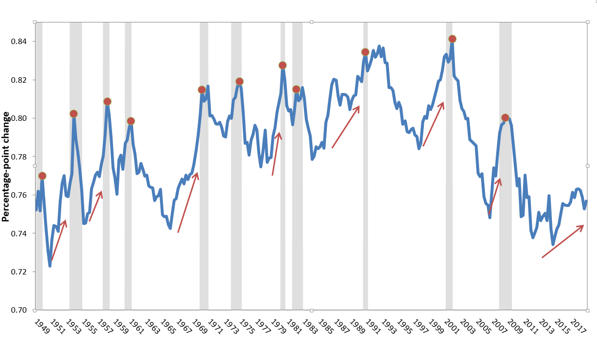
In tight labor markets, the labor share of income rises: Change in labor’s share of income per 1 percentage point decline in the unemployment gap, overall and by unemployment gap values
| Samples | |
|---|---|
| Overall | 0.16% |
| >1 | 0.08% |
| ≤1 | 0.312% |
| >0 | 0.137% |
| ≤0 | 0.47% |
Notes: The unemployment gap is the actual unemployment rate minus the estimate of the natural rate of unemployment. Bars represent the regression coefficient on the unemployment gap from a regression, with the change in the labor share of income as the dependent variable. Controls include productivity growth and the four-quarter change in the unemployment rate; dummy variables for the business cycles of the 1950s, 1960s, 1970s, 1980s, and 1990s, and for the 2001–2007 business cycle; and business cycle–specific trends for each of those time periods. An asterisk indicates the coefficient is not statistically significant at conventional levels.
Sources: Author’s analysis of data from the Bureau of Economic Analysis (BEA) National Income and Product Accounts (NIPA), unemployment rates from the Bureau of Labor Statistics (BLS), and estimates of the natural rate of unemployment from the Congressional Budget Office (2019).
If not macroeconomic imbalances, then what? Sectoral shocks and their ripples
If the driver of recent inflation was not large macroeconomic imbalances, then what was it? Put simply, extraordinarily sharp sectoral shocks and the large ripples these shocks generated drove recent inflation. Tobin (1972) provides probably the best description of how large sectoral shocks can cause persistent inflation. Key to his reasoning is the empirical finding that nominal wages are extremely rigid downward. Given this downward nominal wage rigidity, adjusting to sectoral shocks to demand and supply will always require inflation (rising nominal wages in expanding sectors) rather than deflation or neutral aggregate wage and price growth (i.e., rising or flat nominal wages in expanding sectors matched by falling nominal wages in contracting sectors). These insights are profound enough to quote at length:
The overlap of vacancies and unemployment—say, the sum of the two for any given difference between them—is a measure of the heterogeneity or dispersion of individual markets. The amount of dispersion depends directly on the size of those shocks of demand and technology that keep markets in perpetual disequilibrium, and inversely on the responsive mobility of labor. The one increases, the other diminishes the frictional component of unemployment, that is, the number of unfilled vacancies coexisting with any given unemployment rate. A central assumption of the theory is that the functions relating wage change to excess demand or supply are non-linear, specifically that unemployment retards money wages less than vacancies accelerate them. Non-linearity in the response of wages to excess demand has several important implications.
First, it helps to explain the characteristic observed curvature of the Phillips curve. Each successive increment of unemployment has less effect in reducing the rate of inflation. Linear wage response, on the other hand, would mean a linear Phillips relation. Second, given the overall state of aggregate demand, economy-wide vacancies less unemployment, wage inflation will be greater the larger the variance among markets in excess demand and supply. As a number of recent empirical studies have confirmed (see George Perry and Charles Schultze), dispersion is inflationary. Of course, the rate of wage inflation will depend not only on the overall dispersion of excess demands and supplies across markets but also on the particular markets where the excess supplies and demands happen to fall. An unlucky random drawing might put the excess demands in highly responsive markets and the excess supplies in especially unresponsive ones. Third, the nonlinearity is an explanation of inflationary bias, in the following sense. Even when aggregate vacancies are at most equal to unemployment, the average disequilibrium component will be positive. Full employment in the sense of equality of vacancies and unemployment is not compatible with price stability. Zero inflation requires unemployment in excess of vacancies. (p. 10)
If Tobin is right that “dispersion [of sectoral shocks] is inflationary,” then the mammoth response of inflation to the COVID-19 shock becomes very easy to understand—this pandemic effect was the mother of all shocks to sectoral dispersion. Further, specific features of the 2021 economy meant that any shock to sectoral imbalances would have led to large ripple effects, mostly through shocks’ effects on the labor market, which saw nominal wages respond to nonlabor cost shocks and support inflation to an unexpected degree.
These “ripple” effects stem in part from the distributional conflict resulting from inflationary shocks as various economic groups try to protect their real incomes. As Ros (1989) puts it: “A common form of [conflict inflation] arises when the real wage reflecting the balance of power in the labour market, and expressing the expectations created in wage bargains, is not validated by the real wage implied by price formation in other markets” (p. 8). So, if a shock to the cost of nonlabor inputs (say lumber used in home building and chips used in automobile production) pushes up prices, workers might respond by bargaining for higher nominal wages to protect their living standards. In turn, firms may accommodate their own workers’ nominal wage demands (or at least some of them) yet maintain or even expand profit margins to protect their own incomes.
This conflicting-claims view of U.S. inflation is not well known or often wrestled with in most macroeconomic commentary. There’s one pretty good reason for this—for decades, it has largely not been an issue, as a number of policy changes have so disempowered U.S. workers that their efforts to protect real incomes from any shocks have been limited enough to leave almost no mark on inflationary dynamics. Ratner and Sim (2022) provide compelling evidence that the extremely low inflation that characterized the 30 years before COVID-19 is likely largely explained by a pronounced shift in bargaining power from workers to firms. Yet in 2021, these conflicting claims on real output following large exogenous shocks led to the large and persistent ripple effects in inflation.
What are the analytical and policy stakes in distinguishing between inflation driven by macroeconomic overheating (imbalances in the level of aggregate demand and potential output) versus a “shocks and ripples” theory? Even if they are large, as long as the ripple effects following inflationary shocks dampen rather than amplify the initial inflationary shock, then macroeconomic policymakers should not have to pursue aggressively contractionary policies to rein inflation back in. This is not simply tautological—sometimes shocks really do set off ripple effects that amplify the initial impulse and need some external force (looser labor markets in the current context) to provide dampening. But so long as wage growth lags behind price inflation, the ripple effects—large as they might be—will steadily dampen the initial shocks and return inflation to more normal levels over time, even absent any effort to engineer looser labor markets.
Below we more sharply distinguish just what the economic shocks caused by COVID-19 and the Russian invasion of Ukraine were. We also outline how the ripple effects kept inflation more persistent than what many forecast going into this episode, though the effects still look set to fade as long as the shocks stop coming.
What were the shocks?
The main shocks to the U.S. economy from the pandemic and war were the economic distortions that they created in both demand and supply patterns. On demand, the composition of GDP shifted with a historically rapid reallocation in spending and demand away from services and government and into durable goods consumption and residential investment. On the supply side, the pandemic and war contributed to massive supply chain snarls, further heightened by port shutdowns and the global spike in raw material, energy, and commodities prices.
Demand shocks: consumption patterns and the underappreciated role of housing
The shift in demand patterns away from face-to-face, high-contact services (such as gyms, movie theaters, travel) and toward durable goods and residences (cars and houses) was clearly a consequence of the pandemic, and it has shown remarkable persistence. Figure K displays the shock to the composition of demand in historical context from 1980 through the present. We examine the share of GDP made up of durables and residential investment and demonstrate how it has changed relative to the average of the previous two years. Clearly, the onset of the pandemic led to a historically unprecedented jump in the share of durable goods consumption and residential investment (the last rise, though at a much slower rate, can be seen in the early 2000s). In recent years, the share of durables consumption and residential investment has moved a bit closer to normal, but it remains at a high level relative to historical averages. (In Figure K, one can see that the level of demand as of 2022 Q3 was roughly in line with what it has been for the past two years—i.e., the line hovers near zero—and these past two years have been dominated by the COVID-19 patterns of spending.) This historically sharp swing in demand across sectors is certainly a large enough shock to explain the beginning of the recent inflationary episode.
The swing toward durable goods consumption and away from face-to-face services is intuitive to understand (the classic example being the substitution of Peloton purchases for gym memberships). However, the boost to housing demand driven by the pandemic is even better documented by the data. Apparently, the prevalence of remote work led to a large positive shock in housing demand as more people worked from home, first out of necessity of social distancing for public health, but then (for many) out of choice. Working from home in turn inspired demand for more space and smaller households, leading to a large surge in new purchases and household formation that ran far ahead of population growth for 2021.
Pandemic led to sharp sectoral swings in demand: Change in share of GDP accounted for by durable goods and residential investment, 1980–2022
| Change in share of GDP | |
|---|---|
| 1980Q1 | -0.55 |
| 1980Q2 | -1 |
| 1980Q3 | -0.725 |
| 1980Q4 | -1 |
| 1981Q1 | -1 |
| 1981Q2 | -1.175 |
| 1981Q3 | -1.225 |
| 1981Q4 | -1.475 |
| 1982Q1 | -0.95 |
| 1982Q2 | -1.325 |
| 1982Q3 | -1.3 |
| 1982Q4 | -1.1 |
| 1983Q1 | -1.575 |
| 1983Q2 | -1.225 |
| 1983Q3 | -1.1 |
| 1983Q4 | -1 |
| 1984Q1 | -1.075 |
| 1984Q2 | -0.9 |
| 1984Q3 | -1.025 |
| 1984Q4 | -0.775 |
| 1985Q1 | -0.625 |
| 1985Q2 | -0.575 |
| 1985Q3 | -0.6 |
| 1985Q4 | -0.8 |
| 1986Q1 | -0.85 |
| 1986Q2 | -0.975 |
| 1986Q3 | -0.4 |
| 1986Q4 | -0.6 |
| 1987Q1 | -0.9 |
| 1987Q2 | -0.5 |
| 1987Q3 | -0.15 |
| 1987Q4 | -0.75 |
| 1988Q1 | -0.375 |
| 1988Q2 | -0.725 |
| 1988Q3 | -0.775 |
| 1988Q4 | -0.725 |
| 1989Q1 | -0.85 |
| 1989Q2 | -0.775 |
| 1989Q3 | -0.825 |
| 1989Q4 | -0.875 |
| 1990Q1 | -0.7 |
| 1990Q2 | -1.15 |
| 1990Q3 | -0.975 |
| 1990Q4 | -0.875 |
| 1991Q1 | -1.15 |
| 1991Q2 | -1.05 |
| 1991Q3 | -1.225 |
| 1991Q4 | -1.475 |
| 1992Q1 | -1.225 |
| 1992Q2 | -1.4 |
| 1992Q3 | -1.25 |
| 1992Q4 | -1.4 |
| 1993Q1 | -1.4 |
| 1993Q2 | -1.1 |
| 1993Q3 | -1.05 |
| 1993Q4 | -0.85 |
| 1994Q1 | -0.75 |
| 1994Q2 | -0.7 |
| 1994Q3 | -0.325 |
| 1994Q4 | -0.1 |
| 1995Q1 | -0.25 |
| 1995Q2 | -0.175 |
| 1995Q3 | -0.175 |
| 1995Q4 | -0.2 |
| 1996Q1 | -0.125 |
| 1996Q2 | -0.125 |
| 1996Q3 | -0.25 |
| 1996Q4 | -0.3 |
| 1997Q1 | -0.275 |
| 1997Q2 | -0.775 |
| 1997Q3 | -0.7 |
| 1997Q4 | -0.65 |
| 1998Q1 | -0.925 |
| 1998Q2 | -0.575 |
| 1998Q3 | -0.575 |
| 1998Q4 | -0.275 |
| 1999Q1 | -0.375 |
| 1999Q2 | 0.15 |
| 1999Q3 | 0.15 |
| 1999Q4 | 0.175 |
| 2000Q1 | 0.525 |
| 2000Q2 | 0.325 |
| 2000Q3 | 0.525 |
| 2000Q4 | 0.7 |
| 2001Q1 | 0.675 |
| 2001Q2 | 0.5 |
| 2001Q3 | 0.45 |
| 2001Q4 | 0.75 |
| 2002Q1 | 0.3 |
| 2002Q2 | 0.125 |
| 2002Q3 | 0.025 |
| 2002Q4 | -0.25 |
| 2003Q1 | -0.125 |
| 2003Q2 | -0.225 |
| 2003Q3 | -0.025 |
| 2003Q4 | -0.175 |
| 2004Q1 | -0.05 |
| 2004Q2 | -0.1 |
| 2004Q3 | -0.25 |
| 2004Q4 | -0.025 |
| 2005Q1 | -0.35 |
| 2005Q2 | -0.175 |
| 2005Q3 | 0.125 |
| 2005Q4 | -0.175 |
| 2006Q1 | -0.25 |
| 2006Q2 | -0.275 |
| 2006Q3 | -0.175 |
| 2006Q4 | -0.575 |
| 2007Q1 | -0.475 |
| 2007Q2 | -0.5 |
| 2007Q3 | -0.525 |
| 2007Q4 | -0.35 |
| 2008Q1 | -0.55 |
| 2008Q2 | -0.525 |
| 2008Q3 | -0.575 |
| 2008Q4 | -1.975 |
| 2009Q1 | -1.925 |
| 2009Q2 | -1.75 |
| 2009Q3 | -1.05 |
| 2009Q4 | -1.3 |
| 2010Q1 | -1.225 |
| 2010Q2 | -1.225 |
| 2010Q3 | -1.35 |
| 2010Q4 | -1 |
| 2011Q1 | -0.6 |
| 2011Q2 | -0.575 |
| 2011Q3 | -0.175 |
| 2011Q4 | 0.075 |
| 2012Q1 | 0.525 |
| 2012Q2 | 0.4 |
| 2012Q3 | 0.3 |
| 2012Q4 | 0.3 |
| 2013Q1 | 0.25 |
| 2013Q2 | 0.175 |
| 2013Q3 | -0.05 |
| 2013Q4 | -0.175 |
| 2014Q1 | -0.225 |
| 2014Q2 | -0.4 |
| 2014Q3 | -0.575 |
| 2014Q4 | -0.775 |
| 2015Q1 | -1 |
| 2015Q2 | -0.825 |
| 2015Q3 | -0.8 |
| 2015Q4 | -0.85 |
| 2016Q1 | -1.025 |
| 2016Q2 | -0.85 |
| 2016Q3 | -0.85 |
| 2016Q4 | -0.775 |
| 2017Q1 | -0.65 |
| 2017Q2 | -0.75 |
| 2017Q3 | -0.7 |
| 2017Q4 | -0.35 |
| 2018Q1 | -0.425 |
| 2018Q2 | -0.325 |
| 2018Q3 | -0.45 |
| 2018Q4 | -0.4 |
| 2019Q1 | -0.55 |
| 2019Q2 | -0.475 |
| 2019Q3 | -0.425 |
| 2019Q4 | -0.45 |
| 2020Q1 | -0.325 |
| 2020Q2 | 0.875 |
| 2020Q3 | 1.525 |
| 2020Q4 | 1.25 |
| 2021Q1 | 2.25 |
| 2021Q2 | 2.7 |
| 2021Q3 | 2.2 |
| 2021Q4 | 2.2 |
| 2022Q1 | 2.6 |
| 2022Q2 | 2.55 |
| 2022Q3 | 2.4 |
Note: The average annual share of GDP accounted for by durable goods consumption and residential investment lagged 30 months is subtracted from the current quarter.
Source: Bureau of Economic Analysis (BEA) National Income and Product Accounts (NIPA).
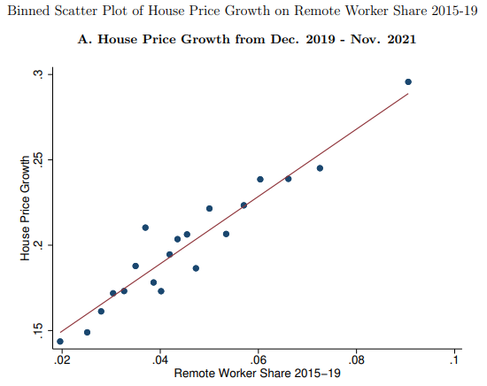
This pandemic shock to housing demand had profound implications for subsequent inflation. Housing is a key component of inflation, making up 40% of core consumption spending in the CPI. Housing prices (including rents) have also increased dramatically since 2019. Figure L shows the tight relationship between remote work and the growth in home prices, as shown in Mondragon and Wieland (2022).
Figure L (taken directly from Mondragon and Wieland 2022) shows a strong positive relationship between home price growth and exposure to remote work, meaning that the areas most exposed to remote work had home price growth twice as high as the areas least exposed. Their model further estimates that remote work raised aggregate home prices by 15.1%, accounting for well over half of the rise in housing prices over that time. Clearly, the pandemic shock to housing demand and subsequent price growth is a crucial component of the 2021 inflation story.
Though housing prices have been high through the pandemic, they seem to have been assigned less blame in the recent inflation episode compared with the overheating or fiscal over-stimulus arguments. Why has housing been such an underrated contributor to high inflation in economic policymaking discussions? Mostly because official measures of housing costs were one of the last components of inflation to noticeably accelerate. The measurement of housing prices is one of the most backward-looking price indicators, with increases in new rents and home prices in many industry data sources only visibly pushing up costs in the CPI 6–12 months later.
Given this lag and the backward-looking nature of housing measurement, a shock to housing demand generally does not manifest in an increase in housing prices and rents until the following year. This means that many policymakers and economic commentators were unable to track the extent of price changes as they occurred. Figure M shows the correlation between annual growth in the Case-Shiller home price index, lagged one year, and annual growth in the shelter component of the CPI since 1989.
This lag between home price changes and when they are reflected in falling shelter in the CPI meant that the 2021 positive shock to housing demand stemming from the pandemic only pushed up official measures of inflation later in 2022. However, it is also important to note that the reverse dynamic is likely to characterize rental prices going forward—substantial weakness in early-warning measures of rental prices will show up only in a slower rate of CPI growth with a significant lag.
Housing disinflation follows industry measures with a long—but reliable—lag: Case-Shiller index of home prices and the shelter component of the consumer price index, lagged one year
| date | Case-Shller index | Consumer Price Index |
|---|---|---|
| 1980-01-01 | 12.8% | 13.7% |
| 1980-02-01 | 12.1% | 12.4% |
| 1980-03-01 | 11.6% | 11.0% |
| 1980-04-01 | 11.1% | 10.1% |
| 1980-05-01 | 10.5% | 10.1% |
| 1980-06-01 | 9.8% | 9.2% |
| 1980-07-01 | 9.3% | 12.5% |
| 1980-08-01 | 8.9% | 13.6% |
| 1980-09-01 | 8.5% | 14.5% |
| 1980-10-01 | 7.9% | 12.5% |
| 1980-11-01 | 7.6% | 11.0% |
| 1980-12-01 | 7.4% | 9.9% |
| 1981-01-01 | 7.2% | 9.4% |
| 1981-02-01 | 7.0% | 9.7% |
| 1981-03-01 | 6.7% | 8.7% |
| 1981-04-01 | 6.7% | 9.2% |
| 1981-05-01 | 6.7% | 9.3% |
| 1981-06-01 | 6.7% | 9.0% |
| 1981-07-01 | 6.5% | 7.7% |
| 1981-08-01 | 6.4% | 6.9% |
| 1981-09-01 | 6.1% | 4.8% |
| 1981-10-01 | 5.8% | 4.9% |
| 1981-11-01 | 5.4% | 4.1% |
| 1981-12-01 | 5.1% | 2.3% |
| 1982-01-01 | 4.8% | 3.0% |
| 1982-02-01 | 4.6% | 3.0% |
| 1982-03-01 | 3.9% | 3.6% |
| 1982-04-01 | 3.1% | 3.3% |
| 1982-05-01 | 2.5% | 2.0% |
| 1982-06-01 | 1.9% | 1.0% |
| 1982-07-01 | 1.3% | 0.9% |
| 1982-08-01 | 0.8% | 0.7% |
| 1982-09-01 | 0.6% | 1.7% |
| 1982-10-01 | 0.5% | 1.9% |
| 1982-11-01 | 0.5% | 2.9% |
| 1982-12-01 | 0.6% | 4.8% |
| 1983-01-01 | 0.8% | 4.3% |
| 1983-02-01 | 1.2% | 4.4% |
| 1983-03-01 | 1.7% | 4.8% |
| 1983-04-01 | 2.1% | 4.7% |
| 1983-05-01 | 2.4% | 4.6% |
| 1983-06-01 | 3.0% | 4.6% |
| 1983-07-01 | 3.6% | 4.9% |
| 1983-08-01 | 4.1% | 5.1% |
| 1983-09-01 | 4.3% | 5.0% |
| 1983-10-01 | 4.5% | 5.2% |
| 1983-11-01 | 4.6% | 5.1% |
| 1983-12-01 | 4.7% | 5.2% |
| 1984-01-01 | 4.7% | 5.2% |
| 1984-02-01 | 4.5% | 5.5% |
| 1984-03-01 | 4.5% | 5.4% |
| 1984-04-01 | 4.6% | 5.0% |
| 1984-05-01 | 4.7% | 5.8% |
| 1984-06-01 | 4.8% | 5.8% |
| 1984-07-01 | 4.8% | 5.6% |
| 1984-08-01 | 4.8% | 5.8% |
| 1984-09-01 | 4.9% | 5.6% |
| 1984-10-01 | 4.9% | 5.7% |
| 1984-11-01 | 4.7% | 6.1% |
| 1984-12-01 | 4.7% | 5.9% |
| 1985-01-01 | 4.7% | 6.1% |
| 1985-02-01 | 4.9% | 5.7% |
| 1985-03-01 | 5.0% | 6.0% |
| 1985-04-01 | 5.1% | 6.4% |
| 1985-05-01 | 5.3% | 5.5% |
| 1985-06-01 | 5.4% | 5.5% |
| 1985-07-01 | 5.6% | 5.3% |
| 1985-08-01 | 5.8% | 5.0% |
| 1985-09-01 | 6.2% | 5.3% |
| 1985-10-01 | 6.6% | 5.4% |
| 1985-11-01 | 7.1% | 4.9% |
| 1985-12-01 | 7.5% | 4.8% |
| 1986-01-01 | 7.7% | 4.8% |
| 1986-02-01 | 7.9% | 4.9% |
| 1986-03-01 | 8.1% | 4.5% |
| 1986-04-01 | 8.4% | 4.6% |
| 1986-05-01 | 8.6% | 4.8% |
| 1986-06-01 | 8.8% | 4.7% |
| 1986-07-01 | 9.1% | 4.5% |
| 1986-08-01 | 9.3% | 4.8% |
| 1986-09-01 | 9.4% | 4.7% |
| 1986-10-01 | 9.4% | 4.8% |
| 1986-11-01 | 9.4% | 4.8% |
| 1986-12-01 | 9.6% | 5.1% |
| 1987-01-01 | 9.6% | 5.1% |
| 1987-02-01 | 9.6% | 5.0% |
| 1987-03-01 | 9.4% | 5.0% |
| 1987-04-01 | 9.2% | 4.7% |
| 1987-05-01 | 9.2% | 4.6% |
| 1987-06-01 | 9.2% | 4.8% |
| 1987-07-01 | 9.0% | 5.0% |
| 1987-08-01 | 8.9% | 4.8% |
| 1987-09-01 | 8.6% | 4.8% |
| 1987-10-01 | 8.5% | 4.5% |
| 1987-11-01 | 8.3% | 4.7% |
| 1987-12-01 | 7.8% | 4.4% |
| 1988-01-01 | 7.6% | 4.2% |
| 1988-02-01 | 7.5% | 4.2% |
| 1988-03-01 | 7.5% | 4.4% |
| 1988-04-01 | 7.4% | 4.3% |
| 1988-05-01 | 7.4% | 4.5% |
| 1988-06-01 | 7.3% | 4.4% |
| 1988-07-01 | 7.3% | 4.7% |
| 1988-08-01 | 7.3% | 4.6% |
| 1988-09-01 | 7.3% | 4.4% |
| 1988-10-01 | 7.2% | 4.8% |
| 1988-11-01 | 7.3% | 4.8% |
| 1988-12-01 | 7.2% | 4.9% |
| 1989-01-01 | 7.3% | 5.0% |
| 1989-02-01 | 7.3% | 4.8% |
| 1989-03-01 | 7.3% | 5.0% |
| 1989-04-01 | 7.3% | 5.2% |
| 1989-05-01 | 6.9% | 5.0% |
| 1989-06-01 | 6.5% | 5.4% |
| 1989-07-01 | 6.1% | 5.6% |
| 1989-08-01 | 5.7% | 6.1% |
| 1989-09-01 | 5.3% | 6.1% |
| 1989-10-01 | 5.0% | 5.6% |
| 1989-11-01 | 4.7% | 5.3% |
| 1989-12-01 | 4.4% | 5.3% |
| 1990-01-01 | 4.0% | 5.8% |
| 1990-02-01 | 3.5% | 5.8% |
| 1990-03-01 | 3.2% | 5.2% |
| 1990-04-01 | 2.9% | 5.1% |
| 1990-05-01 | 2.7% | 5.1% |
| 1990-06-01 | 2.4% | 4.5% |
| 1990-07-01 | 2.0% | 4.1% |
| 1990-08-01 | 1.6% | 3.5% |
| 1990-09-01 | 1.1% | 3.6% |
| 1990-10-01 | 0.5% | 3.7% |
| 1990-11-01 | -0.2% | 3.9% |
| 1990-12-01 | -0.7% | 4.0% |
| 1991-01-01 | -1.3% | 3.6% |
| 1991-02-01 | -1.7% | 3.5% |
| 1991-03-01 | -2.1% | 3.6% |
| 1991-04-01 | -2.2% | 3.4% |
| 1991-05-01 | -2.0% | 3.4% |
| 1991-06-01 | -1.6% | 3.6% |
| 1991-07-01 | -1.3% | 3.4% |
| 1991-08-01 | -1.1% | 3.4% |
| 1991-09-01 | -0.8% | 3.1% |
| 1991-10-01 | -0.8% | 3.2% |
| 1991-11-01 | -0.5% | 3.2% |
| 1991-12-01 | -0.2% | 2.9% |
| 1992-01-01 | 0.2% | 2.9% |
| 1992-02-01 | 0.5% | 3.0% |
| 1992-03-01 | 0.9% | 2.9% |
| 1992-04-01 | 1.0% | 3.2% |
| 1992-05-01 | 0.8% | 3.1% |
| 1992-06-01 | 0.5% | 3.1% |
| 1992-07-01 | 0.2% | 3.0% |
| 1992-08-01 | 0.2% | 3.0% |
| 1992-09-01 | 0.1% | 3.1% |
| 1992-10-01 | 0.4% | 2.9% |
| 1992-11-01 | 0.7% | 2.9% |
| 1992-12-01 | 0.8% | 3.0% |
| 1993-01-01 | 0.9% | 2.9% |
| 1993-02-01 | 0.9% | 3.0% |
| 1993-03-01 | 0.8% | 3.3% |
| 1993-04-01 | 0.8% | 2.9% |
| 1993-05-01 | 0.8% | 3.0% |
| 1993-06-01 | 1.2% | 2.8% |
| 1993-07-01 | 1.5% | 2.9% |
| 1993-08-01 | 1.8% | 3.2% |
| 1993-09-01 | 2.0% | 3.3% |
| 1993-10-01 | 2.0% | 3.3% |
| 1993-11-01 | 2.1% | 3.4% |
| 1993-12-01 | 2.1% | 3.0% |
| 1994-01-01 | 2.4% | 3.1% |
| 1994-02-01 | 2.5% | 3.0% |
| 1994-03-01 | 2.6% | 2.9% |
| 1994-04-01 | 2.7% | 3.1% |
| 1994-05-01 | 2.8% | 3.3% |
| 1994-06-01 | 2.8% | 3.4% |
| 1994-07-01 | 2.8% | 3.5% |
| 1994-08-01 | 2.8% | 3.2% |
| 1994-09-01 | 2.7% | 3.3% |
| 1994-10-01 | 2.7% | 3.3% |
| 1994-11-01 | 2.6% | 3.3% |
| 1994-12-01 | 2.5% | 3.5% |
| 1995-01-01 | 2.3% | 3.4% |
| 1995-02-01 | 2.3% | 3.4% |
| 1995-03-01 | 2.2% | 3.4% |
| 1995-04-01 | 2.1% | 3.3% |
| 1995-05-01 | 1.9% | 3.2% |
| 1995-06-01 | 1.7% | 3.1% |
| 1995-07-01 | 1.7% | 3.3% |
| 1995-08-01 | 1.7% | 3.3% |
| 1995-09-01 | 1.7% | 3.1% |
| 1995-10-01 | 1.8% | 3.0% |
| 1995-11-01 | 1.8% | 3.0% |
| 1995-12-01 | 1.8% | 2.9% |
| 1996-01-01 | 1.7% | 3.0% |
| 1996-02-01 | 1.8% | 3.1% |
| 1996-03-01 | 2.0% | 2.9% |
| 1996-04-01 | 2.2% | 3.1% |
| 1996-05-01 | 2.4% | 3.1% |
| 1996-06-01 | 2.4% | 3.1% |
| 1996-07-01 | 2.5% | 3.0% |
| 1996-08-01 | 2.4% | 3.0% |
| 1996-09-01 | 2.4% | 3.1% |
| 1996-10-01 | 2.3% | 3.1% |
| 1996-11-01 | 2.4% | 3.1% |
| 1996-12-01 | 2.4% | 3.4% |
| 1997-01-01 | 2.6% | 3.2% |
| 1997-02-01 | 2.7% | 3.2% |
| 1997-03-01 | 2.7% | 3.3% |
| 1997-04-01 | 2.7% | 3.3% |
| 1997-05-01 | 2.7% | 3.3% |
| 1997-06-01 | 2.8% | 3.3% |
| 1997-07-01 | 2.9% | 3.2% |
| 1997-08-01 | 3.0% | 3.3% |
| 1997-09-01 | 3.1% | 3.4% |
| 1997-10-01 | 3.3% | 3.4% |
| 1997-11-01 | 3.7% | 3.4% |
| 1997-12-01 | 4.0% | 3.4% |
| 1998-01-01 | 4.3% | 3.2% |
| 1998-02-01 | 4.5% | 3.1% |
| 1998-03-01 | 4.7% | 3.0% |
| 1998-04-01 | 5.0% | 3.0% |
| 1998-05-01 | 5.3% | 2.9% |
| 1998-06-01 | 5.6% | 2.9% |
| 1998-07-01 | 5.8% | 3.0% |
| 1998-08-01 | 6.1% | 2.7% |
| 1998-09-01 | 6.3% | 2.7% |
| 1998-10-01 | 6.5% | 2.5% |
| 1998-11-01 | 6.4% | 2.5% |
| 1998-12-01 | 6.4% | 2.4% |
| 1999-01-01 | 6.4% | 3.0% |
| 1999-02-01 | 6.4% | 3.0% |
| 1999-03-01 | 6.5% | 3.2% |
| 1999-04-01 | 6.6% | 3.0% |
| 1999-05-01 | 6.7% | 3.1% |
| 1999-06-01 | 6.8% | 3.3% |
| 1999-07-01 | 7.0% | 3.3% |
| 1999-08-01 | 7.1% | 3.4% |
| 1999-09-01 | 7.2% | 3.3% |
| 1999-10-01 | 7.4% | 3.6% |
| 1999-11-01 | 7.5% | 3.5% |
| 1999-12-01 | 7.7% | 3.5% |
| 2000-01-01 | 7.9% | 3.3% |
| 2000-02-01 | 8.2% | 3.5% |
| 2000-03-01 | 8.4% | 3.5% |
| 2000-04-01 | 8.6% | 3.6% |
| 2000-05-01 | 8.7% | 3.7% |
| 2000-06-01 | 8.8% | 3.8% |
| 2000-07-01 | 8.8% | 3.8% |
| 2000-08-01 | 8.8% | 4.0% |
| 2000-09-01 | 8.9% | 3.7% |
| 2000-10-01 | 9.0% | 3.7% |
| 2000-11-01 | 9.2% | 3.9% |
| 2000-12-01 | 9.3% | 4.2% |
| 2001-01-01 | 9.2% | 4.2% |
| 2001-02-01 | 9.0% | 4.3% |
| 2001-03-01 | 8.8% | 4.0% |
| 2001-04-01 | 8.5% | 4.1% |
| 2001-05-01 | 8.2% | 3.9% |
| 2001-06-01 | 8.0% | 3.6% |
| 2001-07-01 | 8.0% | 3.6% |
| 2001-08-01 | 8.0% | 3.5% |
| 2001-09-01 | 7.8% | 3.7% |
| 2001-10-01 | 7.4% | 3.6% |
| 2001-11-01 | 7.0% | 3.4% |
| 2001-12-01 | 6.7% | 3.2% |
| 2002-01-01 | 6.6% | 3.1% |
| 2002-02-01 | 6.6% | 2.7% |
| 2002-03-01 | 6.8% | 2.5% |
| 2002-04-01 | 7.2% | 2.2% |
| 2002-05-01 | 7.7% | 2.5% |
| 2002-06-01 | 8.0% | 2.3% |
| 2002-07-01 | 8.3% | 2.4% |
| 2002-08-01 | 8.5% | 2.2% |
| 2002-09-01 | 8.7% | 2.2% |
| 2002-10-01 | 9.0% | 2.4% |
| 2002-11-01 | 9.3% | 2.2% |
| 2002-12-01 | 9.6% | 2.2% |
| 2003-01-01 | 9.6% | 2.1% |
| 2003-02-01 | 9.8% | 2.0% |
| 2003-03-01 | 9.6% | 2.6% |
| 2003-04-01 | 9.5% | 2.9% |
| 2003-05-01 | 9.1% | 2.8% |
| 2003-06-01 | 8.9% | 3.0% |
| 2003-07-01 | 8.9% | 2.9% |
| 2003-08-01 | 9.0% | 2.8% |
| 2003-09-01 | 9.2% | 3.0% |
| 2003-10-01 | 9.4% | 2.8% |
| 2003-11-01 | 9.6% | 2.7% |
| 2003-12-01 | 9.8% | 2.7% |
| 2004-01-01 | 10.2% | 2.7% |
| 2004-02-01 | 10.7% | 3.1% |
| 2004-03-01 | 11.4% | 3.1% |
| 2004-04-01 | 12.0% | 2.7% |
| 2004-05-01 | 12.5% | 2.4% |
| 2004-06-01 | 13.0% | 2.3% |
| 2004-07-01 | 13.1% | 2.4% |
| 2004-08-01 | 13.1% | 2.4% |
| 2004-09-01 | 13.2% | 1.9% |
| 2004-10-01 | 13.3% | 2.3% |
| 2004-11-01 | 13.5% | 2.5% |
| 2004-12-01 | 13.6% | 2.6% |
| 2005-01-01 | 13.8% | 2.6% |
| 2005-02-01 | 14.0% | 2.6% |
| 2005-03-01 | 14.2% | 2.5% |
| 2005-04-01 | 14.2% | 2.9% |
| 2005-05-01 | 14.3% | 3.2% |
| 2005-06-01 | 14.3% | 3.5% |
| 2005-07-01 | 14.3% | 3.6% |
| 2005-08-01 | 14.4% | 3.8% |
| 2005-09-01 | 14.5% | 4.2% |
| 2005-10-01 | 14.4% | 4.1% |
| 2005-11-01 | 14.1% | 4.1% |
| 2005-12-01 | 13.5% | 4.1% |
| 2006-01-01 | 12.9% | 4.3% |
| 2006-02-01 | 12.1% | 4.3% |
| 2006-03-01 | 11.0% | 4.0% |
| 2006-04-01 | 10.0% | 3.9% |
| 2006-05-01 | 8.8% | 3.7% |
| 2006-06-01 | 7.3% | 3.6% |
| 2006-07-01 | 6.0% | 3.5% |
| 2006-08-01 | 4.8% | 3.4% |
| 2006-09-01 | 3.7% | 3.4% |
| 2006-10-01 | 3.0% | 3.2% |
| 2006-11-01 | 2.2% | 3.2% |
| 2006-12-01 | 1.7% | 3.2% |
| 2007-01-01 | 1.0% | 3.1% |
| 2007-02-01 | 0.5% | 2.9% |
| 2007-03-01 | -0.3% | 3.0% |
| 2007-04-01 | -0.8% | 2.7% |
| 2007-05-01 | -1.4% | 2.6% |
| 2007-06-01 | -1.6% | 2.5% |
| 2007-07-01 | -2.0% | 2.5% |
| 2007-08-01 | -2.3% | 2.4% |
| 2007-09-01 | -2.8% | 2.3% |
| 2007-10-01 | -3.5% | 2.2% |
| 2007-11-01 | -4.6% | 2.1% |
| 2007-12-01 | -5.4% | 1.9% |
| 2008-01-01 | -6.4% | 1.8% |
| 2008-02-01 | -7.3% | 1.7% |
| 2008-03-01 | -7.8% | 1.5% |
| 2008-04-01 | -8.1% | 1.6% |
| 2008-05-01 | -8.2% | 1.5% |
| 2008-06-01 | -8.3% | 1.3% |
| 2008-07-01 | -8.4% | 0.9% |
| 2008-08-01 | -8.9% | 0.9% |
| 2008-09-01 | -9.6% | 0.7% |
| 2008-10-01 | -10.3% | 0.7% |
| 2008-11-01 | -10.9% | 0.3% |
| 2008-12-01 | -12.0% | 0.3% |
| 2009-01-01 | -12.7% | -0.4% |
| 2009-02-01 | -12.7% | -0.4% |
| 2009-03-01 | -12.7% | -0.6% |
| 2009-04-01 | -12.2% | -0.6% |
| 2009-05-01 | -11.3% | -0.6% |
| 2009-06-01 | -10.1% | -0.5% |
| 2009-07-01 | -9.0% | -0.3% |
| 2009-08-01 | -8.3% | -0.4% |
| 2009-09-01 | -7.6% | -0.3% |
| 2009-10-01 | -6.6% | -0.4% |
| 2009-11-01 | -5.2% | -0.1% |
| 2009-12-01 | -3.9% | 0.0% |
| 2010-01-01 | -2.9% | 0.6% |
| 2010-02-01 | -3.1% | 0.8% |
| 2010-03-01 | -2.0% | 0.9% |
| 2010-04-01 | -1.0% | 1.0% |
| 2010-05-01 | -0.8% | 1.0% |
| 2010-06-01 | -1.4% | 1.2% |
| 2010-07-01 | -2.1% | 1.4% |
| 2010-08-01 | -2.8% | 1.6% |
| 2010-09-01 | -3.4% | 1.6% |
| 2010-10-01 | -3.7% | 1.8% |
| 2010-11-01 | -4.1% | 1.9% |
| 2010-12-01 | -4.1% | 2.0% |
| 2011-01-01 | -4.1% | 2.0% |
| 2011-02-01 | -3.7% | 2.0% |
| 2011-03-01 | -4.0% | 2.1% |
| 2011-04-01 | -4.3% | 2.3% |
| 2011-05-01 | -4.3% | 2.3% |
| 2011-06-01 | -3.9% | 2.2% |
| 2011-07-01 | -3.5% | 2.1% |
| 2011-08-01 | -3.2% | 2.1% |
| 2011-09-01 | -3.1% | 2.2% |
| 2011-10-01 | -3.3% | 2.2% |
| 2011-11-01 | -3.6% | 2.2% |
| 2011-12-01 | -3.9% | 2.2% |
| 2012-01-01 | -3.5% | 2.2% |
| 2012-02-01 | -2.7% | 2.3% |
| 2012-03-01 | -1.4% | 2.2% |
| 2012-04-01 | -0.5% | 2.2% |
| 2012-05-01 | 0.3% | 2.3% |
| 2012-06-01 | 0.9% | 2.3% |
| 2012-07-01 | 1.4% | 2.4% |
| 2012-08-01 | 2.1% | 2.4% |
| 2012-09-01 | 3.0% | 2.4% |
| 2012-10-01 | 4.0% | 2.3% |
| 2012-11-01 | 5.3% | 2.4% |
| 2012-12-01 | 6.4% | 2.5% |
| 2013-01-01 | 7.6% | 2.6% |
| 2013-02-01 | 8.3% | 2.6% |
| 2013-03-01 | 8.9% | 2.7% |
| 2013-04-01 | 9.0% | 2.8% |
| 2013-05-01 | 9.1% | 2.8% |
| 2013-06-01 | 9.3% | 2.8% |
| 2013-07-01 | 9.7% | 2.9% |
| 2013-08-01 | 10.2% | 2.9% |
| 2013-09-01 | 10.6% | 2.9% |
| 2013-10-01 | 10.8% | 3.0% |
| 2013-11-01 | 10.7% | 3.0% |
| 2013-12-01 | 10.7% | 2.9% |
| 2014-01-01 | 10.4% | 2.9% |
| 2014-02-01 | 10.1% | 3.0% |
| 2014-03-01 | 8.9% | 3.0% |
| 2014-04-01 | 7.9% | 3.0% |
| 2014-05-01 | 7.0% | 2.9% |
| 2014-06-01 | 6.3% | 3.0% |
| 2014-07-01 | 5.6% | 3.1% |
| 2014-08-01 | 5.1% | 3.1% |
| 2014-09-01 | 4.7% | 3.2% |
| 2014-10-01 | 4.6% | 3.2% |
| 2014-11-01 | 4.6% | 3.2% |
| 2014-12-01 | 4.5% | 3.2% |
| 2015-01-01 | 4.3% | 3.3% |
| 2015-02-01 | 4.2% | 3.3% |
| 2015-03-01 | 4.3% | 3.2% |
| 2015-04-01 | 4.3% | 3.2% |
| 2015-05-01 | 4.4% | 3.4% |
| 2015-06-01 | 4.4% | 3.4% |
| 2015-07-01 | 4.4% | 3.3% |
| 2015-08-01 | 4.5% | 3.4% |
| 2015-09-01 | 4.7% | 3.4% |
| 2015-10-01 | 4.9% | 3.5% |
| 2015-11-01 | 5.1% | 3.6% |
| 2015-12-01 | 5.2% | 3.6% |
| 2016-01-01 | 5.3% | 3.5% |
| 2016-02-01 | 5.2% | 3.5% |
| 2016-03-01 | 5.1% | 3.5% |
| 2016-04-01 | 5.0% | 3.5% |
| 2016-05-01 | 4.9% | 3.3% |
| 2016-06-01 | 4.9% | 3.3% |
| 2016-07-01 | 4.9% | 3.2% |
| 2016-08-01 | 5.0% | 3.3% |
| 2016-09-01 | 5.1% | 3.2% |
| 2016-10-01 | 5.1% | 3.2% |
| 2016-11-01 | 5.2% | 3.1% |
| 2016-12-01 | 5.3% | 3.2% |
| 2017-01-01 | 5.5% | 3.2% |
| 2017-02-01 | 5.6% | 3.1% |
| 2017-03-01 | 5.6% | 3.3% |
| 2017-04-01 | 5.6% | 3.4% |
| 2017-05-01 | 5.7% | 3.5% |
| 2017-06-01 | 5.7% | 3.4% |
| 2017-07-01 | 5.7% | 3.5% |
| 2017-08-01 | 5.8% | 3.4% |
| 2017-09-01 | 5.9% | 3.3% |
| 2017-10-01 | 6.0% | 3.2% |
| 2017-11-01 | 6.1% | 3.3% |
| 2017-12-01 | 6.2% | 3.2% |
| 2018-01-01 | 6.2% | 3.2% |
| 2018-02-01 | 6.4% | 3.4% |
| 2018-03-01 | 6.5% | 3.4% |
| 2018-04-01 | 6.4% | 3.4% |
| 2018-05-01 | 6.3% | 3.3% |
| 2018-06-01 | 6.1% | 3.5% |
| 2018-07-01 | 5.9% | 3.5% |
| 2018-08-01 | 5.7% | 3.4% |
| 2018-09-01 | 5.4% | 3.5% |
| 2018-10-01 | 5.3% | 3.4% |
| 2018-11-01 | 4.9% | 3.3% |
| 2018-12-01 | 4.5% | 3.2% |
| 2019-01-01 | 4.1% | 3.3% |
| 2019-02-01 | 3.8% | 3.3% |
| 2019-03-01 | 3.6% | 3.0% |
| 2019-04-01 | 3.5% | 2.6% |
| 2019-05-01 | 3.4% | 2.6% |
| 2019-06-01 | 3.2% | 2.4% |
| 2019-07-01 | 3.1% | 2.3% |
| 2019-08-01 | 3.1% | 2.3% |
| 2019-09-01 | 3.2% | 2.1% |
| 2019-10-01 | 3.2% | 2.0% |
| 2019-11-01 | 3.4% | 1.9% |
| 2019-12-01 | 3.7% | 1.8% |
| 2020-01-01 | 4.0% | 1.6% |
| 2020-02-01 | 4.3% | 1.4% |
| 2020-03-01 | 4.6% | 1.7% |
| 2020-04-01 | 4.6% | 2.1% |
| 2020-05-01 | 4.4% | 2.2% |
| 2020-06-01 | 4.4% | 2.6% |
| 2020-07-01 | 4.8% | 2.8% |
| 2020-08-01 | 5.8% | 2.8% |
| 2020-09-01 | 7.0% | 3.2% |
| 2020-10-01 | 8.4% | 3.5% |
| 2020-11-01 | 9.5% | 3.9% |
| 2020-12-01 | 10.4% | 4.2% |
| 2021-01-01 | 11.3% | 4.4% |
| 2021-02-01 | 12.2% | 4.8% |
| 2021-03-01 | 13.5% | 5.0% |
| 2021-04-01 | 15.0% | 5.1% |
| 2021-05-01 | 16.9% | 5.4% |
| 2021-06-01 | 18.8% | 5.6% |
| 2021-07-01 | 19.8% | 5.7% |
| 2021-08-01 | 20.0% | |
| 2021-09-01 | 19.7% | |
| 2021-10-01 | 19.1% | |
| 2021-11-01 | 18.8% | |
| 2021-12-01 | 18.9% | |
| 2022-01-01 | 19.3% | |
| 2022-02-01 | 20.1% | |
| 2022-03-01 | 20.8% | |
| 2022-04-01 | 20.7% | |
| 2022-05-01 | 20.0% | |
| 2022-06-01 | 18.1% | |
| 2022-07-01 | 15.8% |
Notes: The year-over-year change in the Case-Shiller index of home prices is lagged by one year and compared to the year-over-year change in the shelter component of the consumer price index.
Source: Robert Shiller’s online data page (Shiller 2022) and the Bureau of Labor Statistics (BLS) consumer price index program.
Supply shocks: Supply chains and much spikier effects on labor supply than appreciated
While the pandemic shocks to the demand side are evident, the pandemic created important supply shocks as well.
The most well-known shocks were pandemic-driven snarls in global supply chains of durable goods and materials for construction. These supply-chain snarls were largely due to rolling port shutdowns throughout East Asia in key manufacturing hubs. The Federal Reserve Bank of New York maintains an index of global supply chain pressure. Figure N shows that this index hit its highest points on record in 2021, and only by late 2022 had the index begun showing real signs of normalizing. The pandemic supply-chain shock was quite persistent.
Pandemic led to historic stress on global supply chains: Global supply chain pressure index, 1997–2022
| Global supply chain pressure index | |
|---|---|
| Jan 1998 | -0.92 |
| Feb 1998 | -0.46 |
| Mar 1998 | -0.11 |
| Apr 1998 | -0.15 |
| May 1998 | -0.50 |
| Jun 1998 | -0.80 |
| Jul 1998 | -0.94 |
| Aug 1998 | -0.95 |
| Sep 1998 | -0.96 |
| Oct 1998 | -0.82 |
| Nov 1998 | -0.89 |
| Dec 1998 | -0.67 |
| Jan 1999 | -0.33 |
| Feb 1999 | -0.10 |
| Mar 1999 | -0.35 |
| Apr 1999 | -0.36 |
| May 1999 | -0.39 |
| Jun 1999 | -0.42 |
| Jul 1999 | -0.61 |
| Aug 1999 | -0.49 |
| Sep 1999 | -0.33 |
| Oct 1999 | -0.11 |
| Nov 1999 | -0.09 |
| Dec 1999 | -0.04 |
| Jan 2000 | -0.48 |
| Feb 2000 | -0.31 |
| Mar 2000 | -0.25 |
| Apr 2000 | 0.10 |
| May 2000 | 0.19 |
| Jun 2000 | -0.09 |
| Jul 2000 | -0.11 |
| Aug 2000 | -0.08 |
| Sep 2000 | -0.20 |
| Oct 2000 | -0.65 |
| Nov 2000 | -0.91 |
| Dec 2000 | -1.10 |
| Jan 2001 | -1.12 |
| Feb 2001 | -0.95 |
| Mar 2001 | -0.95 |
| Apr 2001 | -1.19 |
| May 2001 | -1.28 |
| Jun 2001 | -0.84 |
| Jul 2001 | -0.86 |
| Aug 2001 | -0.75 |
| Sep 2001 | -0.68 |
| Oct 2001 | -1.15 |
| Nov 2001 | -1.23 |
| Dec 2001 | -1.03 |
| Jan 2002 | -0.87 |
| Feb 2002 | -0.40 |
| Mar 2002 | -0.43 |
| Apr 2002 | -0.48 |
| May 2002 | -0.27 |
| Jun 2002 | -0.49 |
| Jul 2002 | -0.87 |
| Aug 2002 | -0.96 |
| Sep 2002 | -0.95 |
| Oct 2002 | -1.12 |
| Nov 2002 | -0.79 |
| Dec 2002 | -0.59 |
| Jan 2003 | -0.51 |
| Feb 2003 | -0.40 |
| Mar 2003 | -0.27 |
| Apr 2003 | -0.52 |
| May 2003 | -0.25 |
| Jun 2003 | -0.23 |
| Jul 2003 | -0.14 |
| Aug 2003 | -0.18 |
| Sep 2003 | -0.09 |
| Oct 2003 | -0.34 |
| Nov 2003 | -0.33 |
| Dec 2003 | -0.27 |
| Jan 2004 | -0.38 |
| Feb 2004 | -0.27 |
| Mar 2004 | 0.08 |
| Apr 2004 | 0.48 |
| May 2004 | 0.49 |
| Jun 2004 | 0.42 |
| Jul 2004 | -0.37 |
| Aug 2004 | 0.18 |
| Sep 2004 | -0.06 |
| Oct 2004 | -0.61 |
| Nov 2004 | -0.06 |
| Dec 2004 | 0.12 |
| Jan 2005 | -0.16 |
| Feb 2005 | -0.28 |
| Mar 2005 | -0.36 |
| Apr 2005 | -1.40 |
| May 2005 | -1.12 |
| Jun 2005 | -0.95 |
| Jul 2005 | -0.98 |
| Aug 2005 | -0.73 |
| Sep 2005 | -0.03 |
| Oct 2005 | -0.05 |
| Nov 2005 | -0.62 |
| Dec 2005 | -0.66 |
| Jan 2006 | -0.38 |
| Feb 2006 | -0.64 |
| Mar 2006 | -0.41 |
| Apr 2006 | 0.05 |
| May 2006 | 0.07 |
| Jun 2006 | 0.11 |
| Jul 2006 | -0.13 |
| Aug 2006 | 0.09 |
| Sep 2006 | -0.53 |
| Oct 2006 | -0.39 |
| Nov 2006 | -0.19 |
| Dec 2006 | -0.43 |
| Jan 2007 | -0.80 |
| Feb 2007 | -0.70 |
| Mar 2007 | -0.50 |
| Apr 2007 | -0.75 |
| May 2007 | -0.29 |
| Jun 2007 | -0.36 |
| Jul 2007 | -0.40 |
| Aug 2007 | -0.06 |
| Sep 2007 | -0.10 |
| Oct 2007 | -0.67 |
| Nov 2007 | -0.49 |
| Dec 2007 | -0.18 |
| Jan 2008 | -0.38 |
| Feb 2008 | 0.35 |
| Mar 2008 | 0.12 |
| Apr 2008 | 0.09 |
| May 2008 | -0.12 |
| Jun 2008 | 0.19 |
| Jul 2008 | 0.91 |
| Aug 2008 | 0.22 |
| Sep 2008 | -0.59 |
| Oct 2008 | -1.03 |
| Nov 2008 | -1.60 |
| Dec 2008 | -0.79 |
| Jan 2009 | -0.56 |
| Feb 2009 | -0.62 |
| Mar 2009 | -0.04 |
| Apr 2009 | 0.59 |
| May 2009 | 0.13 |
| Jun 2009 | -0.66 |
| Jul 2009 | -0.87 |
| Aug 2009 | -1.19 |
| Sep 2009 | -0.54 |
| Oct 2009 | -0.49 |
| Nov 2009 | -0.78 |
| Dec 2009 | -0.63 |
| Jan 2010 | -0.27 |
| Feb 2010 | -0.11 |
| Mar 2010 | 0.40 |
| Apr 2010 | 0.28 |
| May 2010 | 0.43 |
| Jun 2010 | -0.01 |
| Jul 2010 | 0.01 |
| Aug 2010 | 0.33 |
| Sep 2010 | 0.35 |
| Oct 2010 | 0.66 |
| Nov 2010 | 0.42 |
| Dec 2010 | 0.71 |
| Jan 2011 | 0.80 |
| Feb 2011 | 0.38 |
| Mar 2011 | 0.71 |
| Apr 2011 | 1.51 |
| May 2011 | 0.92 |
| Jun 2011 | 0.19 |
| Jul 2011 | 0.22 |
| Aug 2011 | -0.11 |
| Sep 2011 | -0.57 |
| Oct 2011 | -0.40 |
| Nov 2011 | 0.09 |
| Dec 2011 | -0.08 |
| Jan 2012 | 0.32 |
| Feb 2012 | -0.05 |
| Mar 2012 | -0.38 |
| Apr 2012 | -0.32 |
| May 2012 | -0.72 |
| Jun 2012 | -0.69 |
| Jul 2012 | -0.73 |
| Aug 2012 | -0.17 |
| Sep 2012 | -0.28 |
| Oct 2012 | -0.04 |
| Nov 2012 | -0.39 |
| Dec 2012 | -0.18 |
| Jan 2013 | -0.05 |
| Feb 2013 | -0.39 |
| Mar 2013 | -0.54 |
| Apr 2013 | -0.73 |
| May 2013 | -0.83 |
| Jun 2013 | -0.63 |
| Jul 2013 | -0.66 |
| Aug 2013 | -0.55 |
| Sep 2013 | -0.30 |
| Oct 2013 | -0.18 |
| Nov 2013 | -0.65 |
| Dec 2013 | -0.46 |
| Jan 2014 | -0.59 |
| Feb 2014 | -0.25 |
| Mar 2014 | -0.57 |
| Apr 2014 | -0.82 |
| May 2014 | -0.80 |
| Jun 2014 | -0.64 |
| Jul 2014 | -0.79 |
| Aug 2014 | -0.62 |
| Sep 2014 | -0.78 |
| Oct 2014 | -0.56 |
| Nov 2014 | -0.91 |
| Dec 2014 | -0.37 |
| Jan 2015 | -0.53 |
| Feb 2015 | -0.29 |
| Mar 2015 | -0.38 |
| Apr 2015 | -0.31 |
| May 2015 | -0.52 |
| Jun 2015 | -0.82 |
| Jul 2015 | -0.38 |
| Aug 2015 | -0.65 |
| Sep 2015 | -0.42 |
| Oct 2015 | -0.25 |
| Nov 2015 | -0.62 |
| Dec 2015 | -0.58 |
| Jan 2016 | -0.73 |
| Feb 2016 | -0.71 |
| Mar 2016 | -0.64 |
| Apr 2016 | -0.26 |
| May 2016 | -0.70 |
| Jun 2016 | -0.28 |
| Jul 2016 | -0.19 |
| Aug 2016 | 0.08 |
| Sep 2016 | -0.28 |
| Oct 2016 | -0.02 |
| Nov 2016 | -0.27 |
| Dec 2016 | -0.20 |
| Jan 2017 | 0.19 |
| Feb 2017 | 0.20 |
| Mar 2017 | 0.11 |
| Apr 2017 | 0.05 |
| May 2017 | -0.08 |
| Jun 2017 | 0.15 |
| Jul 2017 | 0.15 |
| Aug 2017 | 0.43 |
| Sep 2017 | 0.55 |
| Oct 2017 | 0.81 |
| Nov 2017 | 0.85 |
| Dec 2017 | 0.70 |
| Jan 2018 | 0.60 |
| Feb 2018 | 0.13 |
| Mar 2018 | 0.47 |
| Apr 2018 | 0.56 |
| May 2018 | 0.38 |
| Jun 2018 | 0.42 |
| Jul 2018 | 0.45 |
| Aug 2018 | 0.53 |
| Sep 2018 | 0.47 |
| Oct 2018 | 0.53 |
| Nov 2018 | 0.44 |
| Dec 2018 | 0.44 |
| Jan 2019 | 0.51 |
| Feb 2019 | 0.12 |
| Mar 2019 | 0.20 |
| Apr 2019 | 0.02 |
| May 2019 | -0.64 |
| Jun 2019 | -0.51 |
| Jul 2019 | -0.46 |
| Aug 2019 | -0.33 |
| Sep 2019 | 0.10 |
| Oct 2019 | 0.02 |
| Nov 2019 | 0.09 |
| Dec 2019 | 0.01 |
| Jan 2020 | 0.03 |
| Feb 2020 | 1.10 |
| Mar 2020 | 2.45 |
| Apr 2020 | 3.03 |
| May 2020 | 2.52 |
| Jun 2020 | 2.25 |
| Jul 2020 | 2.76 |
| Aug 2020 | 1.30 |
| Sep 2020 | 0.57 |
| Oct 2020 | 0.10 |
| Nov 2020 | 0.70 |
| Dec 2020 | 1.65 |
| Jan 2021 | 1.44 |
| Feb 2021 | 1.92 |
| Mar 2021 | 2.21 |
| Apr 2021 | 2.57 |
| May 2021 | 3.00 |
| Jun 2021 | 2.73 |
| Jul 2021 | 2.94 |
| Aug 2021 | 3.26 |
| Sep 2021 | 3.26 |
| Oct 2021 | 3.81 |
| Nov 2021 | 4.23 |
| Dec 2021 | 4.30 |
| Jan 2022 | 3.65 |
| Feb 2022 | 2.76 |
| Mar 2022 | 2.79 |
| Apr 2022 | 3.42 |
| May 2022 | 2.64 |
| Jun 2022 | 2.34 |
| Jul 2022 | 1.76 |
| Aug 2022 | 1.50 |
| Sep 2022 | 0.89 |
| Oct 2022 | 1.00 |
Source: The Federal Reserve Bank of New York.
Another underappreciated part of the pandemic’s effect on the U.S. economy’s supply side was its effect in temporarily sidelining millions of employed workers each month. This effect became historically pronounced during the omicron wave of January 2022. Figure O shows the number of people who were employed with a job but were not at work due to illness or medical problems in the reference week of the Current Population Survey (the survey used to calculate the unemployment rate and other key labor market indicators). While there are spikes in this series in 2020 and when the delta variant was spreading in summer 2021, the number skyrockets to over 3.5 million people in January 2022 during the omicron wave. This rolling shock in labor supply very likely disrupted the labor market and economic system as well but shows some hopeful signs of normalizing in recent months.
Disguised impairment of labor supply was another pandemic shock: Number of employed workers reporting they missed work in past week due to own illness (thousands), 2012–2022
| Share of employed workers reporting | |
|---|---|
| Jan 2012 | 930 |
| Feb 2012 | 986 |
| Mar 2012 | 917 |
| Apr 2012 | 911 |
| May 2012 | 934 |
| Jun 2012 | 900 |
| Jul 2012 | 863 |
| Aug 2012 | 822 |
| Sep 2012 | 882 |
| Oct 2012 | 899 |
| Nov 2012 | 880 |
| Dec 2012 | 944 |
| Jan 2013 | 1202 |
| Feb 2013 | 1079 |
| Mar 2013 | 1027 |
| Apr 2013 | 913 |
| May 2013 | 947 |
| Jun 2013 | 897 |
| Jul 2013 | 862 |
| Aug 2013 | 838 |
| Sep 2013 | 874 |
| Oct 2013 | 891 |
| Nov 2013 | 888 |
| Dec 2013 | 869 |
| Jan 2014 | 1006 |
| Feb 2014 | 974 |
| Mar 2014 | 1034 |
| Apr 2014 | 1046 |
| May 2014 | 873 |
| Jun 2014 | 882 |
| Jul 2014 | 823 |
| Aug 2014 | 864 |
| Sep 2014 | 931 |
| Oct 2014 | 936 |
| Nov 2014 | 1026 |
| Dec 2014 | 1048 |
| Jan 2015 | 989 |
| Feb 2015 | 1000 |
| Mar 2015 | 1032 |
| Apr 2015 | 919 |
| May 2015 | 948 |
| Jun 2015 | 860 |
| Jul 2015 | 864 |
| Aug 2015 | 791 |
| Sep 2015 | 889 |
| Oct 2015 | 795 |
| Nov 2015 | 874 |
| Dec 2015 | 924 |
| Jan 2016 | 1003 |
| Feb 2016 | 1033 |
| Mar 2016 | 1020 |
| Apr 2016 | 1045 |
| May 2016 | 1062 |
| Jun 2016 | 972 |
| Jul 2016 | 986 |
| Aug 2016 | 1005 |
| Sep 2016 | 996 |
| Oct 2016 | 986 |
| Nov 2016 | 1009 |
| Dec 2016 | 891 |
| Jan 2017 | 1075 |
| Feb 2017 | 1078 |
| Mar 2017 | 1065 |
| Apr 2017 | 1065 |
| May 2017 | 903 |
| Jun 2017 | 892 |
| Jul 2017 | 908 |
| Aug 2017 | 851 |
| Sep 2017 | 805 |
| Oct 2017 | 859 |
| Nov 2017 | 897 |
| Dec 2017 | 1020 |
| Jan 2018 | 1283 |
| Feb 2018 | 1184 |
| Mar 2018 | 1098 |
| Apr 2018 | 981 |
| May 2018 | 861 |
| Jun 2018 | 970 |
| Jul 2018 | 801 |
| Aug 2018 | 845 |
| Sep 2018 | 884 |
| Oct 2018 | 892 |
| Nov 2018 | 984 |
| Dec 2018 | 990 |
| Jan 2019 | 1063 |
| Feb 2019 | 1113 |
| Mar 2019 | 978 |
| Apr 2019 | 912 |
| May 2019 | 902 |
| Jun 2019 | 962 |
| Jul 2019 | 862 |
| Aug 2019 | 866 |
| Sep 2019 | 893 |
| Oct 2019 | 973 |
| Nov 2019 | 875 |
| Dec 2019 | 1119 |
| Jan 2020 | 1071 |
| Feb 2020 | 1088 |
| Mar 2020 | 1340 |
| Apr 2020 | 2010 |
| May 2020 | 1534 |
| Jun 2020 | 1228 |
| Jul 2020 | 1695 |
| Aug 2020 | 1331 |
| Sep 2020 | 1258 |
| Oct 2020 | 1315 |
| Nov 2020 | 1778 |
| Dec 2020 | 1902 |
| Jan 2021 | 1955 |
| Feb 2021 | 1414 |
| Mar 2021 | 1203 |
| Apr 2021 | 1507 |
| May 2021 | 1244 |
| Jun 2021 | 1046 |
| Jul 2021 | 1290 |
| Aug 2021 | 1470 |
| Sep 2021 | 1532 |
| Oct 2021 | 1378 |
| Nov 2021 | 1513 |
| Dec 2021 | 1679 |
| Jan 2022 | 3616 |
| Feb 2022 | 1573 |
| Mar 2022 | 1081 |
| Apr 2022 | 1181 |
| May 2022 | 1350 |
| Jun 2022 | 1472 |
| Jul 2022 | 1518 |
| Aug 2022 | 1529 |
| Sep 2022 | 1237 |
| Oct 2022 | 1331 |
Source: Bureau of Labor Statistics (BLS) calculation from the Current Population Survey (CPS).
Large—but settling—labor market ‘ripples’
Perhaps one of the most notable elements of the 2021 labor market was the growth in nominal wages. Nominal wage growth in 2021 was extraordinarily fast relative to recent history and is even turning out to have been fast relative to what has prevailed in 2022—even as other measures of the labor market have seemingly tightened. Many policymakers have claimed that increased nominal wage growth has been a key driver of inflation since early 2021. This claim is not totally implausible—historical episodes of price-wage spirals really have occurred and required some exogenous forcing mechanism to bring down wage growth as part of the anti-inflationary strategy. However, a close look at the evidence indicates that the focus on wage growth as a key driver of inflation in the past 18 months seems misplaced. Further, it seems quite likely that the abnormally fast wage growth of the past 18 months can be normalized without a significant forcing mechanism (like substantially higher unemployment rates engineered by Fed interest rate hikes). Indeed, wage growth already seems to be normalizing pretty quickly.
In short, the rapid nominal wage growth of 2021 should not be understood as a major cause of the inflation of 2021 and should not be expected to continue (even if the unemployment rate remains low) going forward. To support these claims, we highlight a number of features of the 2021 labor market that allowed for this nominal wage growth in the first place and argue that they are largely unique to that year.
Put simply, workers had high degrees of bargaining power in 2021 relative to what the overall unemployment rate might have indicated. Well before the unemployment rate approached its pre-pandemic levels, employers were pushed to raise wages in order to attract and retain workers. Most notably, this wage growth occurred in industries in which workers often have the least bargaining power and face the lowest pay: retail, services, food, and accommodations.
There were likely two major changes to labor markets in 2021 that provided temporary boosts to workers’ bargaining power. First, the massive level of layoffs and business closures that accompanied the pandemic meant that labor market frictions that gave employers a degree of monopsony power over their workforce were dissolved in one fell swoop. These frictions are highly powerful in preventing workers from even obtaining information about jobs with higher wages in their immediate area (Jager et al. 2022). By the end of 2020, tens of millions of employee-employer ties had been severed by the pandemic, but at the beginning of 2021, the extremely large fiscal relief convinced employers to staff up quickly. This rapid staffing-up happened in the context of workers facing far fewer frictions tying to their current employer (and muting upward wage pressure) than is the norm. As more and more new employee-employer matches were cemented as 2021 turned into 2022, the same forces that introduce frictions into workers’ job searches and competitive searching seem highly likely to reassert themselves.
The second major component of workers’ empowerment in 2021 was the role of pandemic aid in providing a wealth buffer (we present evidence on the size of this buffer in Figure V). This buffer bought workers time to find employment that suited them while still covering their costs, rather than being forced back into the first available job regardless of its fit for them. Chetty (2008), for example, has identified the powerful role that having some liquid wealth buffer has in allowing workers to be choosier in their job searches.
Economic impact payments (EIPs, often called stimulus checks), expanded unemployment insurance, and the monthly Child Tax Credit gave workers the ability to build up savings and accumulate a level of financial security that had been largely unavailable for tens of millions of workers any time before the pandemic. This translated into significant bargaining power in the labor market. However, while this support was unprecedented, it was also short lived, and both employers and workers knew with a high degree of certainty when this aid would turn off. The last stimulus check was mailed in January 2021. Enhanced unemployment insurance and the CTC phased out in fall and winter 2021, respectively. This wealth buffer for all made job searches and wage offers in 2021 far different than they were during normal times.
One could imagine how policy efforts to restrain employers’ monopsony power and to give workers a better fallback position in the face of job loss could have permanent effects. If, for example, a major change to labor law allowed workers to unionize even in the face of today’s hostile employer class, then this could easily provide a permanent source of countervailing power to monopsony (see, for example, Benmelech, Bergman, and Kim 2021). Aspects of the pandemic relief (particularly the enhanced child tax credit and an increase in the protectiveness of the UI system) could have also been made permanent. But the simple fact is that none of the underlying boosts to workers’ bargaining power that characterized the 2021 labor market continue to exist today. This fact strongly suggests that any unexpected labor market worker power experienced in 2021 is likely to be temporary rather than permanent.
Why were the large wage ripples such a surprise—and why are we sure they’ll settle?
We noted before that the primary policy-relevant distinction between a view that sees recent inflation as the result of macroeconomic overheating and a view that sees it as a series of shocks and ripples concerns the role of demand management. If inflation is the result of aggregate demand exceeding potential output (and if one imagines potential output is fixed—“it is what it is”), then the only remedy is to slow demand growth, even if that leads to higher unemployment. If, instead, inflation has been driven by shocks and ripples, and if the ripples eventually settle, then inflation can normalize without engineering higher unemployment.
We also noted that wage growth in 2021 and early 2022 was quite rapid in historical terms, and the ability of U.S. workers to shield their real incomes from inflationary shocks was unexpectedly robust. This raises a couple of questions: (1) If the ripple effects of higher wage growth following inflationary shocks were so large, why can we be sure that they will eventually dampen on their own?; and (2) Was the inflation of the past 18 months driven by wage growth or not?
On the first question, the simplest answer is that for decades American workers’ wages have responded only weakly to price shocks in the short run. Figures P1 and P2 highlight two separate time periods—1949–1988 and 1989–2019. In each period, the growth of wages and growth in prices lagged just two quarters is shown. In the earlier period, shown in Figure P1, wage growth was tightly linked to price inflation even in the short run. In the latter period, shown in Figure P2, there is essentially no durable relationship at all. In sum, recent decades seemed to break any quick link between price spikes and immediate changes in wages. It’s certainly possible that the pattern that held between 1989 and 2019 was somehow completely overturned in the post-pandemic period, and we are headed back to an era in which wages will respond quickly to price shocks. But there needs to be a long period of compelling evidence on this before we should assume this tight link has been reestablished. If instead the nonrelationship that has prevailed for the last 30 years is the better predictor of future wage-price dynamics—particularly once the temporary sources of bargaining power we highlighted previously are behind us—then it seems a safe bet that the wage ripples from recent price shocks will settle soon.
Recent decades have seen erosion of wage response to inflation shocks: Wage growth and lagged (2-quarter) inflation in two periods, 1954–1988
| Price | Comp. per hour | |
|---|---|---|
| 1949Q1 | 6.30% | 5.03% |
| 1949Q2 | 3.39% | 3.87% |
| 1949Q3 | 1.45% | 2.01% |
| 1949Q4 | -0.21% | 0.72% |
| 1950Q1 | -2.28% | 2.72% |
| 1950Q2 | -2.04% | 4.73% |
| 1950Q3 | -1.42% | 6.58% |
| 1950Q4 | -0.34% | 9.59% |
| 1951Q1 | 2.34% | 9.39% |
| 1951Q2 | 4.24% | 9.46% |
| 1951Q3 | 7.73% | 8.50% |
| 1951Q4 | 8.07% | 7.85% |
| 1952Q1 | 5.99% | 6.46% |
| 1952Q2 | 5.53% | 4.91% |
| 1952Q3 | 2.71% | 5.06% |
| 1952Q4 | 1.88% | 5.68% |
| 1953Q1 | 2.40% | 5.78% |
| 1953Q2 | 1.23% | 6.23% |
| 1953Q3 | 1.17% | 6.02% |
| 1953Q4 | 1.35% | 4.44% |
| 1954Q1 | 1.23% | 4.11% |
| 1954Q2 | 1.50% | 3.00% |
| 1954Q3 | 1.63% | 2.74% |
| 1954Q4 | 1.34% | 2.75% |
| 1955Q1 | 0.47% | 2.60% |
| 1955Q2 | -0.06% | 3.35% |
| 1955Q3 | -0.24% | 4.37% |
| 1955Q4 | -0.01% | 4.27% |
| 1956Q1 | 0.72% | 5.16% |
| 1956Q2 | 1.09% | 6.30% |
| 1956Q3 | 1.19% | 6.04% |
| 1956Q4 | 1.76% | 6.88% |
| 1957Q1 | 2.35% | 6.74% |
| 1957Q2 | 2.67% | 5.77% |
| 1957Q3 | 3.17% | 5.56% |
| 1957Q4 | 3.13% | 5.19% |
| 1958Q1 | 2.96% | 3.72% |
| 1958Q2 | 2.89% | 3.61% |
| 1958Q3 | 3.24% | 4.63% |
| 1958Q4 | 2.77% | 3.67% |
| 1959Q1 | 2.02% | 4.67% |
| 1959Q2 | 1.46% | 4.63% |
| 1959Q3 | 0.90% | 2.85% |
| 1959Q4 | 1.13% | 3.40% |
| 1960Q1 | 1.67% | 4.60% |
| 1960Q2 | 2.26% | 4.38% |
| 1960Q3 | 1.69% | 4.40% |
| 1960Q4 | 1.82% | 3.84% |
| 1961Q1 | 1.58% | 2.55% |
| 1961Q2 | 1.48% | 3.33% |
| 1961Q3 | 1.54% | 3.49% |
| 1961Q4 | 0.99% | 3.83% |
| 1962Q1 | 0.98% | 4.56% |
| 1962Q2 | 0.64% | 3.80% |
| 1962Q3 | 0.89% | 3.76% |
| 1962Q4 | 1.26% | 3.94% |
| 1963Q1 | 1.17% | 3.32% |
| 1963Q2 | 1.37% | 3.15% |
| 1963Q3 | 1.23% | 3.48% |
| 1963Q4 | 1.02% | 3.70% |
| 1964Q1 | 1.24% | 2.38% |
| 1964Q2 | 1.30% | 2.99% |
| 1964Q3 | 1.49% | 3.28% |
| 1964Q4 | 1.55% | 2.88% |
| 1965Q1 | 1.40% | 3.63% |
| 1965Q2 | 1.36% | 3.17% |
| 1965Q3 | 1.20% | 2.91% |
| 1965Q4 | 1.50% | 3.68% |
| 1966Q1 | 1.54% | 5.04% |
| 1966Q2 | 1.52% | 6.01% |
| 1966Q3 | 1.97% | 6.41% |
| 1966Q4 | 2.29% | 6.26% |
| 1967Q1 | 2.68% | 5.85% |
| 1967Q2 | 3.16% | 5.86% |
| 1967Q3 | 2.67% | 5.77% |
| 1967Q4 | 2.32% | 5.80% |
| 1968Q1 | 2.49% | 7.19% |
| 1968Q2 | 2.58% | 7.21% |
| 1968Q3 | 3.37% | 7.51% |
| 1968Q4 | 3.94% | 8.15% |
| 1969Q1 | 4.05% | 6.77% |
| 1969Q2 | 4.30% | 6.76% |
| 1969Q3 | 4.20% | 6.91% |
| 1969Q4 | 4.46% | 6.85% |
| 1970Q1 | 4.65% | 7.31% |
| 1970Q2 | 4.70% | 7.27% |
| 1970Q3 | 4.90% | 7.10% |
| 1970Q4 | 4.73% | 6.11% |
| 1971Q1 | 4.47% | 6.38% |
| 1971Q2 | 4.61% | 6.26% |
| 1971Q3 | 4.39% | 6.00% |
| 1971Q4 | 4.42% | 5.71% |
| 1972Q1 | 4.44% | 6.44% |
| 1972Q2 | 3.74% | 6.13% |
| 1972Q3 | 3.85% | 6.10% |
| 1972Q4 | 3.27% | 7.36% |
| 1973Q1 | 3.16% | 7.20% |
| 1973Q2 | 3.37% | 7.45% |
| 1973Q3 | 3.52% | 7.86% |
| 1973Q4 | 4.91% | 8.01% |
| 1974Q1 | 5.89% | 7.62% |
| 1974Q2 | 7.18% | 8.89% |
| 1974Q3 | 9.05% | 10.21% |
| 1974Q4 | 10.03% | 10.99% |
| 1975Q1 | 10.97% | 11.76% |
| 1975Q2 | 11.51% | 11.24% |
| 1975Q3 | 10.33% | 9.96% |
| 1975Q4 | 8.61% | 8.78% |
| 1976Q1 | 7.73% | 7.67% |
| 1976Q2 | 6.83% | 7.41% |
| 1976Q3 | 6.01% | 7.75% |
| 1976Q4 | 5.60% | 8.27% |
| 1977Q1 | 5.23% | 8.24% |
| 1977Q2 | 5.13% | 8.42% |
| 1977Q3 | 5.86% | 8.25% |
| 1977Q4 | 6.78% | 7.83% |
| 1978Q1 | 6.76% | 8.63% |
| 1978Q2 | 6.60% | 8.27% |
| 1978Q3 | 6.43% | 8.24% |
| 1978Q4 | 6.78% | 9.05% |
| 1979Q1 | 7.05% | 8.96% |
| 1979Q2 | 7.54% | 9.58% |
| 1979Q3 | 7.80% | 9.91% |
| 1979Q4 | 8.52% | 9.95% |
| 1980Q1 | 9.29% | 10.20% |
| 1980Q2 | 9.86% | 10.64% |
| 1980Q3 | 11.06% | 10.98% |
| 1980Q4 | 10.76% | 11.13% |
| 1981Q1 | 10.61% | 10.82% |
| 1981Q2 | 10.66% | 9.77% |
| 1981Q3 | 10.22% | 9.44% |
| 1981Q4 | 9.40% | 8.35% |
| 1982Q1 | 8.66% | 8.47% |
| 1982Q2 | 7.66% | 7.45% |
| 1982Q3 | 6.27% | 6.75% |
| 1982Q4 | 5.52% | 6.57% |
| 1983Q1 | 5.45% | 4.90% |
| 1983Q2 | 5.01% | 5.10% |
| 1983Q3 | 4.55% | 4.05% |
| 1983Q4 | 4.50% | 3.73% |
| 1984Q1 | 4.22% | 3.86% |
| 1984Q2 | 3.77% | 3.95% |
| 1984Q3 | 4.03% | 4.90% |
| 1984Q4 | 4.08% | 4.54% |
| 1985Q1 | 3.53% | 4.66% |
| 1985Q2 | 3.48% | 4.55% |
| 1985Q3 | 3.58% | 4.57% |
| 1985Q4 | 3.42% | 5.70% |
| 1986Q1 | 3.43% | 5.87% |
| 1986Q2 | 3.52% | 6.08% |
| 1986Q3 | 3.04% | 5.84% |
| 1986Q4 | 2.10% | 5.27% |
| 1987Q1 | 1.84% | 4.25% |
| 1987Q2 | 1.74% | 3.81% |
| 1987Q3 | 1.98% | 3.58% |
| 1987Q4 | 3.07% | 3.42% |
| 1988Q1 | 3.50% | 4.76% |
| 1988Q2 | 3.77% | 5.26% |
| 1988Q3 | 3.61% | 5.48% |
| 1988Q4 | 3.76% | 5.03% |
Sources: Bureau of Labor Statistics (BLS) Current Employment Statistics (CES) and Bureau of Economic Analysis (BEA) National Income and Product Accounts (NIPA).
Recent decades have seen erosion of wage response to inflation shocks: Wage growth and lagged (2-quarter) inflation in two periods, 1989–2019
| Price | Comp. per hour | |
|---|---|---|
| 1989Q1 | 4.05% | 3.52% |
| 1989Q2 | 4.20% | 2.70% |
| 1989Q3 | 4.57% | 2.36% |
| 1989Q4 | 4.82% | 3.05% |
| 1990Q1 | 4.16% | 4.74% |
| 1990Q2 | 3.93% | 6.34% |
| 1990Q3 | 4.24% | 6.79% |
| 1990Q4 | 3.79% | 6.07% |
| 1991Q1 | 4.49% | 4.68% |
| 1991Q2 | 5.04% | 4.65% |
| 1991Q3 | 4.09% | 4.53% |
| 1991Q4 | 3.71% | 5.13% |
| 1992Q1 | 3.11% | 7.24% |
| 1992Q2 | 2.50% | 6.20% |
| 1992Q3 | 2.60% | 6.13% |
| 1992Q4 | 2.72% | 5.30% |
| 1993Q1 | 2.68% | 1.87% |
| 1993Q2 | 2.65% | 1.69% |
| 1993Q3 | 2.62% | 0.58% |
| 1993Q4 | 2.63% | 0.77% |
| 1994Q1 | 2.42% | 0.93% |
| 1994Q2 | 2.30% | 1.02% |
| 1994Q3 | 2.06% | 0.95% |
| 1994Q4 | 1.94% | 1.00% |
| 1995Q1 | 2.23% | 2.19% |
| 1995Q2 | 2.12% | 2.18% |
| 1995Q3 | 2.25% | 2.76% |
| 1995Q4 | 2.28% | 2.80% |
| 1996Q1 | 1.96% | 3.30% |
| 1996Q2 | 1.93% | 3.41% |
| 1996Q3 | 2.00% | 3.64% |
| 1996Q4 | 2.09% | 3.40% |
| 1997Q1 | 2.11% | 3.46% |
| 1997Q2 | 2.35% | 3.44% |
| 1997Q3 | 2.24% | 3.69% |
| 1997Q4 | 1.81% | 4.95% |
| 1998Q1 | 1.65% | 5.52% |
| 1998Q2 | 1.28% | 5.89% |
| 1998Q3 | 0.84% | 6.52% |
| 1998Q4 | 0.77% | 5.22% |
| 1999Q1 | 0.81% | 5.31% |
| 1999Q2 | 0.76% | 4.42% |
| 1999Q3 | 0.95% | 3.66% |
| 1999Q4 | 1.35% | 5.15% |
| 2000Q1 | 1.59% | 6.97% |
| 2000Q2 | 1.94% | 6.79% |
| 2000Q3 | 2.56% | 7.94% |
| 2000Q4 | 2.47% | 6.39% |
| 2001Q1 | 2.56% | 5.07% |
| 2001Q2 | 2.52% | 5.24% |
| 2001Q3 | 2.45% | 3.36% |
| 2001Q4 | 2.44% | 3.74% |
| 2002Q1 | 1.84% | 1.91% |
| 2002Q2 | 1.31% | 2.38% |
| 2002Q3 | 0.76% | 2.76% |
| 2002Q4 | 1.04% | 2.10% |
| 2003Q1 | 1.51% | 2.26% |
| 2003Q2 | 1.94% | 3.15% |
| 2003Q3 | 2.51% | 4.14% |
| 2003Q4 | 1.86% | 5.34% |
| 2004Q1 | 2.00% | 4.50% |
| 2004Q2 | 2.03% | 4.70% |
| 2004Q3 | 2.04% | 5.02% |
| 2004Q4 | 2.62% | 4.00% |
| 2005Q1 | 2.45% | 4.91% |
| 2005Q2 | 2.82% | 3.54% |
| 2005Q3 | 2.63% | 2.99% |
| 2005Q4 | 2.58% | 3.19% |
| 2006Q1 | 3.18% | 4.53% |
| 2006Q2 | 3.12% | 3.99% |
| 2006Q3 | 3.06% | 2.95% |
| 2006Q4 | 3.31% | 3.98% |
| 2007Q1 | 2.94% | 4.30% |
| 2007Q2 | 1.96% | 4.09% |
| 2007Q3 | 2.36% | 4.33% |
| 2007Q4 | 2.33% | 3.88% |
| 2008Q1 | 2.18% | 2.56% |
| 2008Q2 | 3.39% | 2.82% |
| 2008Q3 | 3.28% | 3.36% |
| 2008Q4 | 3.41% | 3.52% |
| 2009Q1 | 3.93% | -0.19% |
| 2009Q2 | 1.24% | 2.27% |
| 2009Q3 | -0.26% | 1.96% |
| 2009Q4 | -0.82% | 1.18% |
| 2010Q1 | -1.20% | 2.93% |
| 2010Q2 | 1.18% | 1.44% |
| 2010Q3 | 2.26% | 1.35% |
| 2010Q4 | 2.02% | 1.15% |
| 2011Q1 | 1.51% | 3.97% |
| 2011Q2 | 1.38% | 1.94% |
| 2011Q3 | 1.84% | 2.14% |
| 2011Q4 | 2.68% | 0.27% |
| 2012Q1 | 2.96% | 0.78% |
| 2012Q2 | 2.64% | 2.22% |
| 2012Q3 | 2.46% | 1.38% |
| 2012Q4 | 1.71% | 5.54% |
| 2013Q1 | 1.53% | 1.60% |
| 2013Q2 | 1.77% | 1.76% |
| 2013Q3 | 1.46% | 1.57% |
| 2013Q4 | 1.29% | -0.24% |
| 2014Q1 | 1.41% | 3.21% |
| 2014Q2 | 1.26% | 1.95% |
| 2014Q3 | 1.38% | 2.77% |
| 2014Q4 | 1.82% | 3.07% |
| 2015Q1 | 1.69% | 2.30% |
| 2015Q2 | 1.15% | 3.74% |
| 2015Q3 | 0.25% | 3.86% |
| 2015Q4 | 0.24% | 2.57% |
| 2016Q1 | 0.19% | 1.41% |
| 2016Q2 | 0.21% | 0.87% |
| 2016Q3 | 0.68% | 0.64% |
| 2016Q4 | 0.83% | 1.95% |
| 2017Q1 | 0.96% | 2.97% |
| 2017Q2 | 1.54% | 3.22% |
| 2017Q3 | 2.08% | 4.07% |
| 2017Q4 | 1.70% | 4.30% |
| 2018Q1 | 1.69% | 3.98% |
| 2018Q2 | 1.85% | 3.77% |
| 2018Q3 | 1.98% | 3.48% |
| 2018Q4 | 2.28% | 2.58% |
| 2019Q1 | 2.27% | 4.17% |
| 2019Q2 | 2.01% | 3.77% |
| 2019Q3 | 1.49% | 2.86% |
| 2019Q4 | 1.56% | 4.09% |
Sources: Bureau of Labor Statistics (BLS) Current Employment Statistics (CES) and Bureau of Economic Analysis (BEA) National Income and Product Accounts (NIPA).
Further, as long as nominal wage growth adjusts only partially to price shocks and lags at all behind inflation, then wages are providing a dampening effect on inflation. This has clearly been the case in the recent period. Since May 2021, for example, CPI inflation has risen at an average annualized rate of 6.8%, while average hourly earnings have risen at a rate of 5.0%.
Even more compelling, the ripple effect of faster wage growth clearly seems to be abating now that large shocks have stopped coming (and temporary labor market supports have ended). This is true even as quantity side measures of the labor market (like the unemployment rate) remain quite strong. Figure Q shows the growth of average hourly earnings and unemployment over the past two years (note that we suppress the very large wage jump accompanying the pandemic-driven layoffs of mostly low-wage workers in mid-2020). Besides showing a pronounced nonrelationship between unemployment and wage growth in recent times (casting some doubt on a simple story of labor market overheating), this graph also shows a pretty clear recent deceleration of wage growth.
Wage growth looks set to normalize even with low unemployment: Quarterly wage growth (at an annualized rate) and unemployment
| Earnings | Unemployment rate | |
|---|---|---|
| Jan 2019 | 1.8% | 4.0% |
| Feb 2019 | 4.4% | 3.8% |
| Mar 2019 | 3.5% | 3.8% |
| Apr 2019 | 2.7% | 3.6% |
| May 2019 | 2.2% | 3.6% |
| Jun 2019 | 2.1% | 3.6% |
| Jul 2019 | 3.6% | 3.7% |
| Aug 2019 | 4.1% | 3.7% |
| Sep 2019 | 3.1% | 3.5% |
| Oct 2019 | 2.9% | 3.6% |
| Nov 2019 | 3.2% | 3.6% |
| Dec 2019 | 3.2% | 3.6% |
| Jan 2020 | 3.5% | |
| Feb 2020 | 3.5% | |
| Mar 2020 | 4.4% | |
| Apr 2020 | 14.7% | |
| May 2020 | 13.2% | |
| Jun 2020 | 11.0% | |
| Jul 2020 | 10.2% | |
| Aug 2020 | 2.9% | 8.4% |
| Sep 2020 | 2.1% | 7.9% |
| Oct 2020 | 1.6% | 6.9% |
| Nov 2020 | 2.3% | 6.7% |
| Dec 2020 | 5.8% | 6.7% |
| Jan 2021 | 5.6% | 6.4% |
| Feb 2021 | 5.5% | 6.2% |
| Mar 2021 | 1.9% | 6.0% |
| Apr 2021 | 3.7% | 6.0% |
| May 2021 | 4.4% | 5.8% |
| Jun 2021 | 6.3% | 5.9% |
| Jul 2021 | 6.4% | 5.4% |
| Aug 2021 | 5.4% | 5.2% |
| Sep 2021 | 5.4% | 4.7% |
| Oct 2021 | 5.9% | 4.6% |
| Nov 2021 | 6.3% | 4.2% |
| Dec 2021 | 6.1% | 3.9% |
| Jan 2022 | 5.9% | 4.0% |
| Feb 2022 | 4.9% | 3.8% |
| Mar 2022 | 4.8% | 3.6% |
| Apr 2022 | 3.9% | 3.6% |
| May 2022 | 4.9% | 3.6% |
| Jun 2022 | 4.6% | 3.6% |
| Jul 2022 | 5.2% | 3.5% |
| Aug 2022 | 4.8% | 3.7% |
| Sep 2022 | 4.4% | 3.5% |
Sources: Bureau of Labor Statistics (BLS) Current Employment Statistics (CES) and Current Population Survey (CPS).
On the second question (“was the inflation of the past 18 months driven by wage growth or not”), the answer is nearly as simple: largely not. It is true that if nominal wage growth had not budged from the 3% pace that persisted pre-pandemic then inflation would have been slower over the past 18 months. But it still would have been a historically large inflationary spike.
Further, given that most of the price pressure started from outside labor markets and would have happened anyway, the ability of nominal wage growth to accelerate over this period really did protect workers’ real incomes. If all policymakers cared about was keeping inflation as close to the Federal Reserve’s 2% inflation target as possible, then the nominal wage growth acceleration of the past 18 months was a problem. If instead one also cared about protecting the living standards of U.S. workers in the context of nonexplosive inflation, this wage growth was clearly beneficial.
Figures R1 and R2 provide some rough simulations showing the inflationary effect of various paces of nominal wage growth. They use real data on wage growth and then infer what portion of overall inflation was driven by other factors over the past 18 months. They then subtract out the influence of the faster wage growth seen over the pandemic recovery while allowing these other factors’ contribution to inflation to persist. Figure R1 compares the resulting evolution of actual inflation against the counterfactual in which nominal wage growth does not accelerate past its pre-pandemic pace. Flat wage growth would have indeed lowered inflation, but a historically notable spike still would have occurred. Finally, Figure R2 highlights how much lower inflation-adjusted wages would be today had nominal wage growth not accelerated but other inflationary forces were felt over the past 18 months. Even with the higher inflation rates prevailing in the model in which nominal wages partially adjust to price shocks, real (inflation-adjusted) wages fall less in the scenario with partial wage adjustment relative to the one in which wage growth remains flat in the face of price shocks.
The large wage ripples were good—not bad—for the U.S. economy: Simulated inflation and real wage paths for flat and partially adjusted nominal wage growth
| Flat wage growth | Partially-adjusting wage growth | |
|---|---|---|
| 2019Q4 | 2.0% | 2.0% |
| 2020Q1 | 2.0% | 2.0% |
| 2020Q2 | 2.0% | 2.0% |
| 2020Q3 | 2.0% | 2.0% |
| 2020Q4 | 5.2% | 6.2% |
| 2021Q1 | 5.3% | 6.2% |
| 2021Q2 | 5.3% | 6.3% |
| 2021Q3 | 5.3% | 6.3% |
| 2021Q4 | 5.4% | 6.4% |
| 2022Q1 | 4.3% | 5.0% |
| 2022Q2 | 3.3% | 3.6% |
| 2022Q3 | 2.2% | 2.3% |
Notes: Nominal wage growth in the “flat wage growth” scenario is set at 3.5% and does not change over the course of the inflationary shock. Under the “partially adjusted” path, wage growth increases 0.5% for every 1% acceleration in overall inflation in the simulation. For the first four periods, wage growth is 3.5%, nonlabor input cost growth is 3.5%, productivity growth is 1.5%, and inflation is 2%. Then we shock nonlabor input cost growth and have it rise to 11.5% for four periods and then fall by 2.5% each quarter thereafter until it normalizes.
The large wage ripples were good—not bad—for the U.S. economy: Simulated inflation and real wage paths for flat and partially adjusted nominal wage growth
| Flat wage growth | Partially-adjusting wage growth | |
|---|---|---|
| 2019Q4 | 100 | 100 |
| 2020Q1 | 100.3656368 | 100.3656368 |
| 2020Q2 | 100.7326105 | 100.7326105 |
| 2020Q3 | 101.100926 | 101.100926 |
| 2020Q4 | 100.6814221 | 100.8425658 |
| 2021Q1 | 100.2551024 | 100.5798636 |
| 2021Q2 | 99.82204242 | 100.3128809 |
| 2021Q3 | 99.38232077 | 100.0416804 |
| 2021Q4 | 98.93601907 | 99.76632658 |
| 2022Q1 | 98.73598405 | 99.6847698 |
| 2022Q2 | 98.78796888 | 99.80279288 |
| 2022Q3 | 99.09726979 | 100.1261375 |
Notes: Nominal wage growth in the “flat wage growth” scenario is set at 3.5% and does not change over the course of the inflationary shock. Under the “partially adjusted” path, wage growth increases 0.5% for every 1% acceleration in overall inflation in the simulation. For the first four periods, wage growth is 3.5%, nonlabor input cost growth is 3.5%, productivity growth is 1.5%, and inflation is 2%. Then we shock nonlabor input cost growth and have it rise to 11.5% for four periods and then fall by 2.5% each quarter thereafter until it normalizes.
The role of mark-ups
The price of just about everything in the U.S. economy can be broken down into the three main components of cost. These are labor costs, nonlabor inputs, and the “mark-up” of profits over the first two components. Good data on these separate cost components exist for the nonfinancial corporate (NFC) sector, which accounts for roughly 60% of the entire private sector (and likely has strong effects on price setting even throughout the noncorporate sector).
Since the trough of the COVID-19 recession in the second quarter of 2020, overall prices in the NFC sector have risen at an annualized rate of 7.3%—a pronounced acceleration over the 1.8% price growth that characterized the pre-pandemic business cycle of 2007–2019. As Figure S shows, 40.8% of the increase in the former period (since the recession’s trough in 2020 Q2) can be attributed to fatter profit margins, with labor costs contributing less than a quarter of this increase. Some have argued that starting this measurement from 2020 Q2 could represent cherry-picking that overstates this effect. Measuring from the previous business cycle peak of 2019 Q4 still sees fatter profit margins accounting for a third of the rise in prices in the current business cycle. This is a very high share. From 1979 to 2019, profits contributed only about 11% to price growth (and—not shown in this figure—labor costs contributed over 60%). Through the end of 2021—the period of greatest price acceleration—profits contributed well over half of the entire increase in prices.
Profits make a large contribution to price-growth: Contribution to price growth in nonfinancial corporate sector (NFC), various time-periods
| Contribution to price growth | |
|---|---|
| 1979Q1-2019Q4 | 11.5% |
| 2019Q4-2022Q2 | 33.1% |
| 2020Q2-2022Q2 | 40.8% |
| 2020Q2-2021Q4 | 53.1% |
Source: Bureau of Economic Analysis (BEA) National Income and Product Accounts (NIPA).
Do fatter profit margins imply more corporate power—or just power channeled differently?
The rise in profit margins that accounts for a disproportionate share of price growth in the current recovery has led to speculation that increased corporate power has been a key driver of recent inflation. Corporate power is clearly playing a role, but an increase in corporate power likely has not happened recently enough to make it a root cause of the inflation of 2021–2022. In fact, the rapid rise in profit margins and the decline in labor’s share of income during the first six quarters of the current recovery is not that different from the rise in the first few years following the Great Recession and financial crisis of 2008. Figure T shows that starting from the trough of the recession (zero on the horizontal axis), the fall in the labor share of income was actually more pronounced during the early recovery from the Great Recession than it has been so far in the recovery from the COVID-19 recession.
Corporate power present—but channeled differently—in last two recoveries: Labor share of income in first six quarters of recoveries, last two business cycles
| 2020 Q2 | 2009 Q2 | |
|---|---|---|
| -6 | 75.5% | 79.1% |
| -5 | 76.8% | 79.5% |
| -4 | 76.6% | 79.6% |
| -3 | 76.6% | 79.9% |
| -2 | 76.5% | 79.9% |
| -1 | 78.2% | 79.9% |
| 0 | 78.2% | 79.6% |
| 1 | 75.2% | 78.6% |
| 2 | 76.1% | 77.6% |
| 3 | 75.1% | 76.5% |
| 4 | 73.2% | 76.9% |
| 5 | 73.9% | 75.0% |
| 6 | 74.3% | 75.1% |
Notes: Labor share for the fourth quarter of 2008 was smoothed to remove a large spike in the data stemming from large write-offs of underperforming assets in the financial sector during the financial crisis of that year. The vertical line at zero on the horizontal axis denotes the recession’s trough.
Source: Bureau of Economic Analysis (BEA) National Income and Product Accounts (NIPA).
In the recovery from the Great Recession, increased corporate power did not manifest in faster price growth that made room for fatter profit margins—price growth was actually quite subdued (Bivens 2015). Instead, corporate power manifested itself in extreme wage suppression (aided by high and persistent levels of unemployment). Unit labor costs actually declined over a three-year stretch from the recession’s trough in the second quarter of 2009 to the middle of 2012. The general pattern of the labor share of income falling during the early phase of recoveries characterized most of the post-World War II recoveries, though it has become more extreme in recent business cycles (see Figures G and H in Bivens and Shierholz 2014).
Given that the rise in profit margins was similar in the 2008 recovery and the current one, it is hard to say that some recent rise in corporate power is the key driver of current inflation. Rather, a chronic excess of corporate power has built up over a long period of time, and it manifested in the current recovery as an inflationary surge in prices rather than successful wage suppression. What was different this time that channeled this power into higher prices rather than slower wage growth? Put simply, the main influence conditioning the recovery from the Great Recession was anemic growth in aggregate demand, whereas the main influences conditioning recovery post-2020 were the pandemic and the Russian invasion of Ukraine.
In previous recoveries—like the one following the Great Recession—domestic demand growth was slow and unemployment was high in the early phases of recovery. This led firms to become desperate for more customers but also gave them the upper hand in negotiations with potential employees, which led to subdued price growth and wage suppression.
This time around, the pandemic drove demand through the roof in durable sectors, and employment has rebounded rapidly, but the bottleneck in meeting this demand on the supply side was largely not labor (Bivens 2022). Instead, it was shipping capacity and other nonlabor shortages. Firms that did happen to have supply on hand as the pandemic-driven demand surge hit had enormous pricing power vis-à-vis their customers.
Policy in hindsight
Inflation has reached higher peaks and been more persistent than many would have predicted in early 2021. Given this, it is natural to ask what (if anything) should have been done differently by policymakers over this time. If one restricts this policy revisionism to, say, things that could have been done differently only since the end of 2020, obvious answers like “invest more in pandemic preparedness or more resilient supply chains” are off the table.
The most pressing policy debate concerns the actions of the Federal Reserve. Many inflation hawks would claim that the Fed has been far “behind the curve” on inflation. It’s not always entirely clear just what this means, however. Almost by definition, if the Fed had raised interest rates far enough and fast enough, inflation could have been significantly reduced. But the collateral damage of simply raising rates until inflation returns to 2% no matter the broader consequences could have been immense and made this approach easily not worth pursuing.
It is crucial to remember that inflation—particularly a short-run inflation that does not persist for years—generally has no aggregate cost. Instead, it is a purely distributional event. One actor’s cost is another actor’s income: As some group (workers, say) must pay more at stores for their consumption goods, the higher nominal prices feed directly into higher nominal incomes for somebody else. We may not like the pattern of redistribution caused by the current inflation (I certainly don’t), but it does not follow from this that it carries large aggregate costs.
Unemployment, conversely, really does carry high aggregate costs. By definition, an increase in unemployment caused by insufficient demand is economic waste—useful resources that could be deployed to produce more goods and services instead sit idle.
Costless rate hikes through expectations management?
A serious case that the Fed had gotten too far “behind the curve” on inflation would wrestle much harder with this potential trade-off. If the claim was that raising interest rates sooner would have squelched inflation while not requiring much increase in unemployment, this would be a compelling argument. This case is theoretically possible. If one believed that inflation expectations were the driver of nominal wage growth and subsequent price increases in 2021, these expectations (or at least expectations of inflation over the next year) really did move up sharply, and efforts—like starting rate increases sooner—that could have kept expectations in check might have helped.
But this assumes that expectations strongly condition subsequent inflation and that interest rate increases—even if they do not materially affect unemployment—have strong effects on these expectations. Neither of these propositions are well supported by the data.
The role of interest rates and housing
Outside of expectations, the one area where arguments about quicker rate hikes taking out some inflationary steam without harming the economic recovery more generally have some potential validity is housing. As we noted earlier, private industry data indicate a very sharp bounce-back of both rent inflation and housing prices by early 2021. Subsequent research by Mondragon and Wieland (2022) shows that the shift to remote work constituted a large positive shock to housing demand in 2020 and 2021.
Housing is by far the largest single component of price indices, and an acceleration of housing costs in mid-2022 was a key reason why core inflation remained substantially above the 2% target for most of this year. All of this provides some support for claims that the Fed should have raised rates more quickly on the heels of the passage of the American Rescue Plan.
In real time, however, it is not a complete certainty that this should have happened based on trends in the housing market. The Mondragon and Wieland (2022) results clearly imply that the housing price increases have a strong transitory element—unless a growing share of the population switches to remote work each and every year for the rest of the decade, there is little reason to think the upward price pressure imposed by this boost to housing demand will be sustained.
Further, if one thought that the shock to housing demand was transitory, then raising interest rates in response has potentially mixed effects. In the longer run, higher interest rates are clearly associated with reduced housing construction, limiting supply and exacerbating any excess demand. But Dias and Duarte (2016) have found evidence that, even in the short run, interest rate increases can actually increase rent inflation. The mechanism is through tenure choice—as interest rate increases boost the user cost of homeownership, prospective buyers switch into the rental market. In time, if the higher user cost pushes down purchase prices of homes enough, homeowners may choose to rent out rather than sell their homes when they wish to move, thus boosting rental supply. If in the short run the effect of interest rate increases on housing prices is ambiguous, and in the longer run it is potentially inflationary, it becomes less clear that the housing channel provides strong evidence that the Fed should have raised rates sooner in the current inflationary episode.
That said, the recent Fed rate hikes do seem to have relatively quickly released much inflationary pressure in housing markets, first in home prices and then (relatively quickly) in rental markets. As of October 2022, a few months of actual rent declines had occurred in many cities, and forecasters were predicting sharp rental price declines in 2023.
Was the American Rescue Plan the original sin of today’s inflation?
Previously, we highlighted evidence casting doubt on the claim that the American Rescue Plan was a primary contributor to the 2021–2022 inflation episode. Among other issues, the decomposition of inflation into “demand” and “supply” factors by Shapiro (2022) indicates that above-trend demand can account for just about 1 percentage point of core inflation acceleration by August 2022. One would have to attribute the entirety of this above-trend demand influence on inflation to ARP to use this evidence to indict ARP as more than a bit player in the inflation acceleration. But ARP’s spending impulse into the economy had largely petered out by the last quarter of 2021. Since the beginning of 2022, the federal fiscal impulse had actually turned historically contractionary. Figure U shows the change in federal net borrowing (-) or lending (+) over the previous year.
What it shows is that net borrowing by the federal government declined by an average of 10% of GDP over the first three quarters of 2022 (see the large upward spikes at the right edge of Figure U). This is roughly three times as much as the largest pre-pandemic reduction of borrowing (3.4%), which occurred in 2013 when fiscal austerity was widely acknowledged to be dragging heavily on growth from the Great Recession. Before 2007, the largest change in year-over-year borrowing was just 2.0%, a fiscal contraction less than a fifth as intense as the one in 2022.
For further perspective, note that the swing in net borrowing by the household sector and financial crisis of 2008 was roughly 9% of GDP, but was spread over more than two years (for this calculation, see Bivens 2011). In that episode, the deflating housing bubble led families to reduce spending to make up for lost wealth driven by falling home prices. This bursting of the housing market bubble is why the Great Recession began and why it was so damaging. Further, this private-sector contraction in borrowing in 2006–2009 was even larger than the one that led to the Great Depression in the 1930s. In short, this evidence should make it hard to blame fiscal policy writ large for inflation that has persisted (and even accelerated) after fiscal policy swung hard from expansionary to historically contractionary.
One possibility for ARP’s effects to spill over well into 2022 is the ability of households to spend down the “excess savings” made possible by the fiscal aid in 2021. This is certainly plausible. The fiscal aid was almost surely largely saved (which is why actual GDP did not spiral rapidly above potential GDP in 2021 and early 2022). Figure V shows the increase in net worth of the bottom 50% of households and the size of pandemic fiscal relief. This relief can easily explain the rise in net worth, and this in turn can explain a potential “long fuse” of ARP as the aid initially boosted personal savings rates and then was spent out over time.
Fiscal policy became historically contractionary in 2022: Change in net borrowing (-) and lending (+) by federal government
| Quarter | Change in lending |
|---|---|
| 1961Q1 | -2.1% |
| 1961Q2 | -1.9% |
| 1961Q3 | -1.6% |
| 1961Q4 | -0.9% |
| 1962Q1 | -0.3% |
| 1962Q2 | 0.0% |
| 1962Q3 | 0.0% |
| 1962Q4 | -0.1% |
| 1963Q1 | 0.1% |
| 1963Q2 | 0.4% |
| 1963Q3 | 0.8% |
| 1963Q4 | 0.8% |
| 1964Q1 | 0.4% |
| 1964Q2 | -0.3% |
| 1964Q3 | -0.7% |
| 1964Q4 | -0.6% |
| 1965Q1 | 0.1% |
| 1965Q2 | 0.8% |
| 1965Q3 | 0.9% |
| 1965Q4 | 0.5% |
| 1966Q1 | -0.2% |
| 1966Q2 | -0.5% |
| 1966Q3 | -0.4% |
| 1966Q4 | -0.3% |
| 1967Q1 | -0.7% |
| 1967Q2 | -1.2% |
| 1967Q3 | -1.5% |
| 1967Q4 | -1.1% |
| 1968Q1 | -0.3% |
| 1968Q2 | 0.2% |
| 1968Q3 | 1.0% |
| 1968Q4 | 1.2% |
| 1969Q1 | 1.7% |
| 1969Q2 | 1.9% |
| 1969Q3 | 1.5% |
| 1969Q4 | 0.9% |
| 1970Q1 | -0.4% |
| 1970Q2 | -1.4% |
| 1970Q3 | -2.3% |
| 1970Q4 | -2.6% |
| 1971Q1 | -2.1% |
| 1971Q2 | -1.7% |
| 1971Q3 | -1.0% |
| 1971Q4 | -0.5% |
| 1972Q1 | -0.1% |
| 1972Q2 | 0.3% |
| 1972Q3 | 0.7% |
| 1972Q4 | 0.7% |
| 1973Q1 | 0.8% |
| 1973Q2 | 0.8% |
| 1973Q3 | 1.0% |
| 1973Q4 | 1.4% |
| 1974Q1 | 1.1% |
| 1974Q2 | 1.2% |
| 1974Q3 | 0.4% |
| 1974Q4 | -0.2% |
| 1975Q1 | -1.4% |
| 1975Q2 | -3.4% |
| 1975Q3 | -4.0% |
| 1975Q4 | -4.0% |
| 1976Q1 | -1.9% |
| 1976Q2 | 0.5% |
| 1976Q3 | 1.7% |
| 1976Q4 | 2.0% |
| 1977Q1 | 1.1% |
| 1977Q2 | 0.9% |
| 1977Q3 | 0.8% |
| 1977Q4 | 0.7% |
| 1978Q1 | 0.4% |
| 1978Q2 | 0.4% |
| 1978Q3 | 0.5% |
| 1978Q4 | 1.0% |
| 1979Q1 | 1.4% |
| 1979Q2 | 1.4% |
| 1979Q3 | 1.1% |
| 1979Q4 | 0.5% |
| 1980Q1 | 0.0% |
| 1980Q2 | -0.8% |
| 1980Q3 | -1.5% |
| 1980Q4 | -1.6% |
| 1981Q1 | -0.9% |
| 1981Q2 | 0.0% |
| 1981Q3 | 0.8% |
| 1981Q4 | 0.6% |
| 1982Q1 | -0.3% |
| 1982Q2 | -1.4% |
| 1982Q3 | -2.2% |
| 1982Q4 | -2.5% |
| 1983Q1 | -2.6% |
| 1983Q2 | -2.0% |
| 1983Q3 | -1.4% |
| 1983Q4 | -0.4% |
| 1984Q1 | 0.4% |
| 1984Q2 | 0.8% |
| 1984Q3 | 1.0% |
| 1984Q4 | 0.5% |
| 1985Q1 | 0.5% |
| 1985Q2 | -0.1% |
| 1985Q3 | -0.1% |
| 1985Q4 | -0.2% |
| 1986Q1 | -0.1% |
| 1986Q2 | 0.0% |
| 1986Q3 | -0.3% |
| 1986Q4 | 0.1% |
| 1987Q1 | 0.1% |
| 1987Q2 | 0.9% |
| 1987Q3 | 1.4% |
| 1987Q4 | 1.5% |
| 1988Q1 | 1.3% |
| 1988Q2 | 0.7% |
| 1988Q3 | 0.7% |
| 1988Q4 | 0.5% |
| 1989Q1 | 0.8% |
| 1989Q2 | 0.7% |
| 1989Q3 | 0.5% |
| 1989Q4 | 0.2% |
| 1990Q1 | -0.2% |
| 1990Q2 | -0.4% |
| 1990Q3 | -0.5% |
| 1990Q4 | -0.6% |
| 1991Q1 | -0.3% |
| 1991Q2 | -0.4% |
| 1991Q3 | -0.4% |
| 1991Q4 | -0.7% |
| 1992Q1 | -1.2% |
| 1992Q2 | -1.1% |
| 1992Q3 | -1.1% |
| 1992Q4 | -0.7% |
| 1993Q1 | -0.3% |
| 1993Q2 | 0.1% |
| 1993Q3 | 0.6% |
| 1993Q4 | 0.9% |
| 1994Q1 | 1.1% |
| 1994Q2 | 1.3% |
| 1994Q3 | 1.4% |
| 1994Q4 | 1.1% |
| 1995Q1 | 0.7% |
| 1995Q2 | 0.4% |
| 1995Q3 | 0.4% |
| 1995Q4 | 0.5% |
| 1996Q1 | 0.6% |
| 1996Q2 | 0.7% |
| 1996Q3 | 0.7% |
| 1996Q4 | 1.0% |
| 1997Q1 | 1.3% |
| 1997Q2 | 1.5% |
| 1997Q3 | 1.5% |
| 1997Q4 | 1.2% |
| 1998Q1 | 1.1% |
| 1998Q2 | 1.0% |
| 1998Q3 | 1.1% |
| 1998Q4 | 1.0% |
| 1999Q1 | 1.0% |
| 1999Q2 | 0.8% |
| 1999Q3 | 0.6% |
| 1999Q4 | 0.5% |
| 2000Q1 | 0.6% |
| 2000Q2 | 0.7% |
| 2000Q3 | 0.9% |
| 2000Q4 | 0.7% |
| 2001Q1 | 0.3% |
| 2001Q2 | -0.1% |
| 2001Q3 | -1.3% |
| 2001Q4 | -1.8% |
| 2002Q1 | -2.8% |
| 2002Q2 | -3.0% |
| 2002Q3 | -2.9% |
| 2002Q4 | -2.6% |
| 2003Q1 | -1.8% |
| 2003Q2 | -1.7% |
| 2003Q3 | -1.4% |
| 2003Q4 | -1.3% |
| 2004Q1 | -1.1% |
| 2004Q2 | -0.4% |
| 2004Q3 | 0.2% |
| 2004Q4 | 0.6% |
| 2005Q1 | 0.8% |
| 2005Q2 | 0.8% |
| 2005Q3 | 0.7% |
| 2005Q4 | 0.7% |
| 2006Q1 | 0.7% |
| 2006Q2 | 0.8% |
| 2006Q3 | 0.9% |
| 2006Q4 | 1.0% |
| 2007Q1 | 0.8% |
| 2007Q2 | 0.4% |
| 2007Q3 | -0.1% |
| 2007Q4 | -0.5% |
| 2008Q1 | -0.9% |
| 2008Q2 | -1.9% |
| 2008Q3 | -2.3% |
| 2008Q4 | -3.3% |
| 2009Q1 | -4.3% |
| 2009Q2 | -5.2% |
| 2009Q3 | -5.6% |
| 2009Q4 | -4.5% |
| 2010Q1 | -3.1% |
| 2010Q2 | -1.1% |
| 2010Q3 | 0.0% |
| 2010Q4 | 0.5% |
| 2011Q1 | 0.9% |
| 2011Q2 | 1.0% |
| 2011Q3 | 1.1% |
| 2011Q4 | 0.9% |
| 2012Q1 | 1.0% |
| 2012Q2 | 1.3% |
| 2012Q3 | 1.6% |
| 2012Q4 | 1.7% |
| 2013Q1 | 2.0% |
| 2013Q2 | 2.8% |
| 2013Q3 | 3.1% |
| 2013Q4 | 3.4% |
| 2014Q1 | 2.6% |
| 2014Q2 | 1.6% |
| 2014Q3 | 0.7% |
| 2014Q4 | 0.1% |
| 2015Q1 | 0.1% |
| 2015Q2 | 0.2% |
| 2015Q3 | 0.5% |
| 2015Q4 | 0.7% |
| 2016Q1 | 0.2% |
| 2016Q2 | -0.3% |
| 2016Q3 | -0.6% |
| 2016Q4 | -0.7% |
| 2017Q1 | -0.5% |
| 2017Q2 | -0.5% |
| 2017Q3 | -0.3% |
| 2017Q4 | 1.2% |
| 2018Q1 | 1.2% |
| 2018Q2 | 1.0% |
| 2018Q3 | -0.6% |
| 2018Q4 | -2.2% |
| 2019Q1 | -2.2% |
| 2019Q2 | -2.2% |
| 2019Q3 | -0.7% |
| 2019Q4 | -0.6% |
| 2020Q1 | -0.5% |
| 2020Q2 | -7.8% |
| 2020Q3 | -11.3% |
| 2020Q4 | -12.6% |
| 2021Q1 | -9.8% |
| 2021Q2 | -1.8% |
| 2021Q3 | 1.6% |
| 2021Q4 | 7.4% |
| 2022Q1 | 8.7% |
| 2022Q2 | 10.0% |
Notes: The data are rolling 3-quarter average of changes in net lending/borrowing as a share of GDP compared to the same quarter a year ago. A positive number means the federal government is borrowing less than in previous years.
Source: Bureau of Economic Analysis (BEA) National Income and Product Accounts (NIPA).
Pandemic aid and excess savings: Net worth of bottom 50% of households and cumulative pandemic fiscal aid for bottom 50%
| Net worth | Pandemic transfers | |
|---|---|---|
| 2019Q1 | 74.325 | 0 |
| 2019Q2 | 84.232325 | 0 |
| 2019Q3 | 222.607325 | 0 |
| 2019Q4 | 334.615325 | 0 |
| 2020Q1 | 263.466325 | 0 |
| 2020Q2 | 360.232325 | 1253.175 |
| 2020Q3 | 446.193325 | 1791.515 |
| 2020Q4 | 643.999325 | 2011.955 |
| 2021Q1 | 830.146325 | 3414.4 |
| 2021Q2 | 1318.923325 | 3947.02 |
| 2021Q3 | 1778.824325 | 4189.515 |
| 2021Q4 | 2069.235325 | 4244.625 |
| 2022Q1 | 2268.879325 | 4275.535 |
| 2022Q2 | 2766.686325 | 4287.03 |
Sources: Net worth data from the Federal Reserve’s distributional financial accounts. Data on pandemic fiscal aid from the Bureau of Economic Analysis (BEA) special release on the effect of pandemic relief on personal income. Distribution of this aid taken from the Tax Policy Center (TPC) analysis of pandemic aid packages.
Some have pointed to the recent rapid falls in personal savings rates as evidence that this built-up excess savings from ARP was being rapidly spent down in 2022 and fueling too-fast demand growth (see Figure W for recent fall in savings rate).
Personal savings surged, then declined quickly post-pandemic: Personal savings rate (savings as % of disposable personal income), 2015–2022
| Personal saving rate | |
|---|---|
| Jan 2016 | 7.7 |
| Feb 2016 | 7.2 |
| Mar 2016 | 7.6 |
| Apr 2016 | 7.2 |
| May 2016 | 6.9 |
| Jun 2016 | 6.6 |
| Jul 2016 | 6.8 |
| Aug 2016 | 6.8 |
| Sep 2016 | 6.8 |
| Oct 2016 | 6.9 |
| Nov 2016 | 7.0 |
| Dec 2016 | 6.5 |
| Jan 2017 | 6.9 |
| Feb 2017 | 7.2 |
| Mar 2017 | 7.2 |
| Apr 2017 | 7.3 |
| May 2017 | 7.8 |
| Jun 2017 | 7.5 |
| Jul 2017 | 7.6 |
| Aug 2017 | 7.6 |
| Sep 2017 | 7.3 |
| Oct 2017 | 7.4 |
| Nov 2017 | 6.9 |
| Dec 2017 | 6.3 |
| Jan 2018 | 7.1 |
| Feb 2018 | 7.2 |
| Mar 2018 | 7.2 |
| Apr 2018 | 7.2 |
| May 2018 | 7.2 |
| Jun 2018 | 7.4 |
| Jul 2018 | 7.5 |
| Aug 2018 | 7.6 |
| Sep 2018 | 7.7 |
| Oct 2018 | 7.6 |
| Nov 2018 | 7.5 |
| Dec 2018 | 9.4 |
| Jan 2019 | 9.3 |
| Feb 2019 | 9.5 |
| Mar 2019 | 9.1 |
| Apr 2019 | 8.9 |
| May 2019 | 8.6 |
| Jun 2019 | 8.5 |
| Jul 2019 | 8.4 |
| Aug 2019 | 8.7 |
| Sep 2019 | 8.9 |
| Oct 2019 | 8.9 |
| Nov 2019 | 8.9 |
| Dec 2019 | 8.3 |
| Jan 2020 | 9.1 |
| Feb 2020 | 9.3 |
| Mar 2020 | 13.8 |
| Apr 2020 | 33.8 |
| May 2020 | 24.9 |
| Jun 2020 | 20.1 |
| Jul 2020 | 19.2 |
| Aug 2020 | 15.5 |
| Sep 2020 | 14.6 |
| Oct 2020 | 14.0 |
| Nov 2020 | 13.3 |
| Dec 2020 | 13.8 |
| Jan 2021 | 20.0 |
| Feb 2021 | 13.4 |
| Mar 2021 | 26.3 |
| Apr 2021 | 12.8 |
| May 2021 | 10.3 |
| Jun 2021 | 9.3 |
| Jul 2021 | 9.9 |
| Aug 2021 | 9.5 |
| Sep 2021 | 7.9 |
| Oct 2021 | 7.3 |
| Nov 2021 | 7.1 |
| Dec 2021 | 7.5 |
| Jan 2022 | 4.7 |
| Feb 2022 | 4.5 |
| Mar 2022 | 3.8 |
| Apr 2022 | 3.6 |
| May 2022 | 3.4 |
| Jun 2022 | 2.7 |
| Jul 2022 | 3.2 |
| Aug 2022 | 2.8 |
| Sep 2022 | 2.4 |
| Oct 2022 | 2.3 |
Source: Bureau of Economic Analysis (BEA) National Income and Product Accounts (NIPA).
However, much of the rapid decline in personal savings might be mostly a statistical quirk unrelated to households spending down their pandemic assistance. This savings rate is measured as one minus the ratio of personal outlays divided by disposable personal income. As disposable personal income falls, the ratio of outlays to income rises and the measured savings rate falls. A very rapid increase in tax collections in 2022 led to a sharp fall in personal disposable income. Further, this increase can be almost fully explained by “nonwithheld” income taxes—which largely consist of capital gains taxes. Crucially, capital gains taxes push down measures of disposable personal income, but capital gains themselves are not included in measures of income. So as these collections rise, the savings rate is pushed down mechanically. Figure X shows the very sharp rise in federal income taxes as a share of personal income in recent quarters and shows that nearly all of this rise is accounted for by nonwithheld personal income taxes.
Could the American Rescue Plan have been structured differently to have caused less inflation?
With the benefit of hindsight, there are some changes to ARP one could have imagined. One reasonable-sounding change that was discussed in real-time—spreading the disbursement of funds over a longer time span—would likely not have made much of a difference. As Figure W shows, the large rise in pandemic aid was associated not with a huge wave of new spending, but instead with a large rise in savings (and net worth). Almost by definition, the large spike in savings kept much of the pandemic aid from translating quickly into new demand. Over time the excess savings have been rundown, but in a sense, households’ decisions smoothed out the spend-out of pandemic aid by themselves. A legislated “longer fuse” on this spending would not have slowed the spending much relative to what actually occurred.
The highest value of this pandemic aid—even when not spent—may have been the potential boost it gave to job seekers’ fallback positions when searching for jobs and the resulting acceleration of nominal wage growth. This wage growth is often seen solely as a contributor to inflation. But as we show in Figure R, most of the inflation seen over the past 18 months would have occurred even if nominal wage growth had not accelerated at all. Given this, the nominal wage acceleration was valuable in protecting workers’ real incomes against the inflationary spike.
The alternative changes to ARP that could have potentially blunted inflation in 2021 and early 2022 would have required simply a significantly lower level of spending or would have been seen as extremely heterodox. Simply reducing ARP’s spending levels would have led to marginally less inflation, but also would have led to significantly higher unemployment and even larger losses to real (inflation-adjusted) wages.
In terms of heterodox changes, one could imagine making some of the fiscal relief come in the form of vouchers that could be spent only on goods with a substantial lag. This would have given supply chains time to heal and provided an incentive to firms to invest heavily in repairing these distribution networks, knowing that customers would be waiting.
Another heterodox policy that could have blunted some of the major drivers of inflation was a temporary excess profits tax. We pointed out before the large role of widening profit margins in driving price increases. Imposing a large windfall tax on profits exceeding pre-pandemic margins could have blunted the incentive for firms to respond opportunistically to pandemic distortions (like impaired supply chains) that had temporarily reduced competitive pressures to keep prices low. There were some sectors in which the pros and cons of such a tax would have needed to be carefully weighed. Oil drilling and refining, for example, has been plagued for years with depressed investment, and this investment has responded sluggishly even to the extraordinary profits of recent years. This investment dearth has made the energy price spike in the U.S. historically large. An excess profits tax could have even further reduced this type of investment and made the energy price spike even worse. Then again, if investment in oil drilling and refining did not respond robustly to the highest profit margins in history for the sector, maybe relying on high after-tax profit margins to relieve price pressure in this sector was never going to work?
Capital gains taxes likely depressing personal savings rate: Tax rate on personal income (including nonwithheld taxes), 1988–2022
| Total federal | Non-withheld | |
|---|---|---|
| 1988Q1 | 9.7% | 1.4% |
| 1988Q2 | 9.5% | 1.3% |
| 1988Q3 | 9.3% | 1.3% |
| 1988Q4 | 9.3% | 1.3% |
| 1989Q1 | 9.7% | 1.7% |
| 1989Q2 | 9.8% | 1.8% |
| 1989Q3 | 9.8% | 1.8% |
| 1989Q4 | 9.9% | 1.8% |
| 1990Q1 | 9.6% | 1.5% |
| 1990Q2 | 9.6% | 1.5% |
| 1990Q3 | 9.6% | 1.5% |
| 1990Q4 | 9.6% | 1.5% |
| 1991Q1 | 9.2% | 1.2% |
| 1991Q2 | 9.1% | 1.2% |
| 1991Q3 | 9.1% | 1.2% |
| 1991Q4 | 9.0% | 1.2% |
| 1992Q1 | 8.7% | 1.2% |
| 1992Q2 | 8.7% | 1.3% |
| 1992Q3 | 8.8% | 1.3% |
| 1992Q4 | 9.0% | 1.3% |
| 1993Q1 | 8.6% | 1.3% |
| 1993Q2 | 9.0% | 1.3% |
| 1993Q3 | 9.1% | 1.3% |
| 1993Q4 | 9.2% | 1.3% |
| 1994Q1 | 9.1% | 1.3% |
| 1994Q2 | 9.4% | 1.6% |
| 1994Q3 | 9.1% | 1.2% |
| 1994Q4 | 9.1% | 1.2% |
| 1995Q1 | 9.2% | 1.3% |
| 1995Q2 | 9.5% | 1.6% |
| 1995Q3 | 9.3% | 1.3% |
| 1995Q4 | 9.5% | 1.4% |
| 1996Q1 | 9.8% | 1.7% |
| 1996Q2 | 10.1% | 2.0% |
| 1996Q3 | 10.0% | 1.8% |
| 1996Q4 | 10.1% | 1.8% |
| 1997Q1 | 10.4% | 2.1% |
| 1997Q2 | 10.5% | 2.1% |
| 1997Q3 | 10.6% | 2.2% |
| 1997Q4 | 10.7% | 2.3% |
| 1998Q1 | 10.8% | 2.4% |
| 1998Q2 | 10.9% | 2.4% |
| 1998Q3 | 11.0% | 2.4% |
| 1998Q4 | 11.1% | 2.4% |
| 1999Q1 | 11.1% | 2.2% |
| 1999Q2 | 11.2% | 2.2% |
| 1999Q3 | 11.2% | 2.2% |
| 1999Q4 | 11.3% | 2.3% |
| 2000Q1 | 11.6% | 2.5% |
| 2000Q2 | 11.5% | 2.5% |
| 2000Q3 | 11.6% | 2.6% |
| 2000Q4 | 11.6% | 2.6% |
| 2001Q1 | 11.7% | 2.6% |
| 2001Q2 | 11.6% | 2.6% |
| 2001Q3 | 9.8% | 1.0% |
| 2001Q4 | 11.1% | 2.4% |
| 2002Q1 | 9.4% | 1.2% |
| 2002Q2 | 9.2% | 1.1% |
| 2002Q3 | 9.0% | 1.0% |
| 2002Q4 | 8.8% | 0.9% |
| 2003Q1 | 8.6% | 0.8% |
| 2003Q2 | 8.6% | 0.7% |
| 2003Q3 | 7.5% | 0.1% |
| 2003Q4 | 8.1% | 0.6% |
| 2004Q1 | 7.9% | 0.5% |
| 2004Q2 | 8.0% | 0.5% |
| 2004Q3 | 8.1% | 0.5% |
| 2004Q4 | 8.0% | 0.6% |
| 2005Q1 | 8.7% | 1.2% |
| 2005Q2 | 8.8% | 1.2% |
| 2005Q3 | 8.9% | 1.3% |
| 2005Q4 | 8.9% | 1.3% |
| 2006Q1 | 9.2% | 1.6% |
| 2006Q2 | 9.2% | 1.6% |
| 2006Q3 | 9.3% | 1.7% |
| 2006Q4 | 9.5% | 1.7% |
| 2007Q1 | 9.7% | 1.8% |
| 2007Q2 | 9.7% | 1.8% |
| 2007Q3 | 9.8% | 1.8% |
| 2007Q4 | 9.8% | 1.9% |
| 2008Q1 | 9.7% | 1.9% |
| 2008Q2 | 9.4% | 1.9% |
| 2008Q3 | 9.4% | 1.8% |
| 2008Q4 | 9.2% | 1.7% |
| 2009Q1 | 7.6% | 0.5% |
| 2009Q2 | 7.1% | 0.3% |
| 2009Q3 | 7.0% | 0.2% |
| 2009Q4 | 7.0% | 0.1% |
| 2010Q1 | 7.3% | 0.4% |
| 2010Q2 | 7.5% | 0.4% |
| 2010Q3 | 7.6% | 0.5% |
| 2010Q4 | 7.6% | 0.5% |
| 2011Q1 | 8.4% | 1.0% |
| 2011Q2 | 8.5% | 1.1% |
| 2011Q3 | 8.5% | 1.1% |
| 2011Q4 | 8.5% | 1.1% |
| 2012Q1 | 8.3% | 0.8% |
| 2012Q2 | 8.3% | 0.8% |
| 2012Q3 | 8.4% | 0.8% |
| 2012Q4 | 8.4% | 0.9% |
| 2013Q1 | 9.1% | 1.4% |
| 2013Q2 | 9.2% | 1.5% |
| 2013Q3 | 9.2% | 1.6% |
| 2013Q4 | 9.3% | 1.6% |
| 2014Q1 | 9.4% | 1.6% |
| 2014Q2 | 9.3% | 1.7% |
| 2014Q3 | 9.4% | 1.7% |
| 2014Q4 | 9.4% | 1.7% |
| 2015Q1 | 9.7% | 2.1% |
| 2015Q2 | 9.8% | 2.1% |
| 2015Q3 | 9.8% | 2.1% |
| 2015Q4 | 9.8% | 2.1% |
| 2016Q1 | 9.6% | 1.9% |
| 2016Q2 | 9.6% | 1.8% |
| 2016Q3 | 9.6% | 1.8% |
| 2016Q4 | 9.7% | 1.7% |
| 2017Q1 | 9.5% | 1.6% |
| 2017Q2 | 9.6% | 1.6% |
| 2017Q3 | 9.6% | 1.6% |
| 2017Q4 | 9.6% | 1.6% |
| 2018Q1 | 9.2% | 2.0% |
| 2018Q2 | 9.2% | 2.0% |
| 2018Q3 | 9.1% | 2.0% |
| 2018Q4 | 9.0% | 2.0% |
| 2019Q1 | 9.2% | 2.1% |
| 2019Q2 | 9.1% | 2.1% |
| 2019Q3 | 9.1% | 2.0% |
| 2019Q4 | 9.2% | 2.0% |
| 2020Q1 | 9.2% | 2.0% |
| 2020Q2 | 7.9% | 1.6% |
| 2020Q3 | 8.6% | 1.8% |
| 2020Q4 | 9.3% | 2.0% |
| 2021Q1 | 8.9% | 2.3% |
| 2021Q2 | 9.9% | 2.6% |
| 2021Q3 | 10.3% | 2.7% |
| 2021Q4 | 10.6% | 2.7% |
| 2022Q1 | 12.0% | 4.1% |
| 2022Q2 | 12.1% | 4.2% |
| 2022Q3 | 12.1% | 4.1% |
Source: Bureau of Economic Analysis (BEA) National Income and Product Accounts (NIPA).
What do macroeconomists and policy analysts need to know about inflation going forward?
There is a lot of truth to claims by macroeconomists that monetary policy can eventually neutralize the effect of relative price changes and restore inflation to a target level. It is also true that looking at the contributions to overall inflation in a given month made by specific sectors and then removing those sectors to find reassurance that what remains is not-that-fast inflation is a bad way to do policy analysis.
But throughout the current inflationary episode, a stronger claim has been often made: Relative price changes (and the sectoral shocks that caused them) are irrelevant to inflation even in the short run. Inflation is, in this view of the world, by definition evidence of a macroeconomic imbalance that needs to be rectified by changing macroeconomic aggregates.
This absolutely does not follow. The initial surge of inflation in 2021 occurred with unemployment still substantially higher than it was in the two years before the pandemic. As unemployment fell and other measures of macroeconomic tightness surged in late 2021 and early 2022, core inflation largely stabilized and key measures like nominal wage growth began falling.
Restoring intellectual respectability in policy debates to explanations that hinge on key sectoral imbalances is a key task for inflation analysis moving forward. It really should not be that hard. Analyses that highlight the crucial importance of particular sectors (and shocks to them) loom large in macroeconomic theories of long-run growth (see Blanchard and Kremer 1997 and Jones 2006). It hardly seems like a huge stretch to go from sectoral shocks causing long-run collapse in aggregate output to sectoral shocks causing an increase in medium-run (say 3–5 years) inflation dynamics.
Another crucial task for making inflation analyses smarter going forward is returning conflicting claims explanations of inflation’s persistence to prominence. Again, Tobin (1981), writing about the last large American inflation, expressed much wisdom that has seemingly been lost:
[I]nflation is the symptom of deep-rooted social and economic contradiction and conflict. There is no real equilibrium path. The major economic groups are claiming pieces of pie that together exceed the whole pie. Inflation is the way that their claims, so far as they are expressed in nominal terms, are temporarily reconciled. But it will continue and indeed accelerate so long as the basic conflicts of real claims and real power continue. (p. 28)
This will become especially important in any happy scenario in which the decades-long effort to shift bargaining power away from workers and toward employers is overturned. Distributional conflict—and nearly every other determinant of inflation’s persistence—has been easy to ignore for decades, simply because this conflict was well and truly settled in capital’s favor and inflation remained entirely quiescent. This settlement on capital’s terms was a disaster for the living standards of the vast majority, and it should be a progressive priority to overturn it and restore some bargaining power back to typical workers. But doing this—as 2021 demonstrated—will require keeping a close eye on inflationary dynamics.
Finally, today’s inflationary episode raises many questions about housing. The most obvious one is whether or not more timely measures of rent inflation can be used in analysis of macroeconomic stabilization policy. The backward-looking nature of housing prices in official indices really did leave many of us behind the curve on both the upslope and downslope of price changes. Adams et al. (2022) have done much of the work in demonstrating that more timely measures of building inflationary pressure in housing can be constructed. These more timely measures should be a bigger part of the monetary policy “dashboard.”
Another obvious issue in regard to housing is how it responds to interest rate hikes. There are potentially cross-cutting effects. Higher interest rates that slow growth of labor income will reduce demand for all types of housing. But if higher interest rates increase monthly costs of homeownership more rapidly than prices decline, there can be a period of time when these rate increases reduce the demand for homeownership, but this in turn increases the demand for rental housing. Because inflation as measured in the CPI or PCEPI is rent inflation, this means that interest rate hikes could actually raise housing inflation. Dias and Duarte (2016) provide evidence that this effect could be relevant empirically. All in all, the evidence of the current episode supports a view that interest rate increases reduce housing and rental prices, but the issues of tenure choice highlighted by analyses like Dias and Duarte (2016) should at least make policymakers think hard over the time horizon in which they are hoping prices will respond to rate increases.
Another issue, however, regards the treatment of housing in macroeconomic models. Rognlie (2015) has demonstrated that much of the rise in wealth documented by Piketty (2014) was driven by the rising price of housing. A number of analyses of the current inflationary period (and not just journalistic accounts) have argued that a very “hot” economy should naturally lead to rising profit shares and margins (i.e., debates over whether or not mark-ups were pro-cyclical). Earlier in this report, we show that this really did not seem to be the case for the corporate sector. But the corporate sector does not include housing. If housing is in quasi-fixed supply over the short run, then it really could be the case that hot economies start directing more and more income to landlords (and homeowners) than either workers or capital owners.
There is real reason to think this dynamic is getting more likely over time. Figure Y shows the share of personal consumption expenditures going to housing (either tenant-occupied rent or owners’-equivalent rent). It shows the actual share, as well as the share that would have prevailed had the price of housing risen at the same rate as nonhousing consumption expenditures. This counterfactual actually shows the share of housing rising more quickly than it actually did in the years leading up to 1979—meaning that housing prices rose consistently more slowly than nonhousing prices. Beginning in the early 1980s, there is a steady upward trend (punctuated by up and down spikes driven by the early 2000s housing bubble and the pandemic) in the actual housing share and a steady downward trend in the counterfactual, meaning that housing prices are rising substantially faster than nonhousing prices.
In short, if there were some wealth class in the economy that threatened to generate “forced savings” away from workers as the economy heats up over the course of a business cycle, it seems like housing might be it. The policy agenda to combat this is a whole new topic, but incorporating the dynamics of housing prices in a wider macroeconomic model could be a fruitful range of research spurred by the current inflationary episode.
Figuring out the impact of a global pandemic and war on inflation dynamics was always going to be challenging. Even worse, smart analyses of inflation, its causes, and proper remedies atrophied over recent decades as inflation seemed nearly permanently tamed. It is highly likely that in a few years, once the pandemic shock has passed, inflation will have returned to near irrelevance. But we should realize now that shocks happen: If smart analysis is not in economists’ mental toolkits, less smart reflexes will dominate policy discussion.
Housing prices steadily rising and crowding out other consumption: Housing’s share of total consumption expenditures, actual and simulated under assumption of no excess housing price growth, 1954–2022
| Actual | House prices rising at “normal” pace | |
|---|---|---|
| 1954 | 12.3% | 12.3% |
| 1955 | 12.2% | 12.0% |
| 1956 | 12.4% | 12.3% |
| 1957 | 12.6% | 12.7% |
| 1958 | 13.1% | 13.2% |
| 1959 | 13.1% | 13.2% |
| 1960 | 13.5% | 13.6% |
| 1961 | 13.9% | 14.0% |
| 1962 | 14.0% | 14.1% |
| 1963 | 14.1% | 14.2% |
| 1964 | 13.9% | 14.1% |
| 1965 | 13.7% | 14.0% |
| 1966 | 13.4% | 13.9% |
| 1967 | 13.6% | 14.1% |
| 1968 | 13.3% | 14.1% |
| 1969 | 13.4% | 14.3% |
| 1970 | 13.5% | 14.6% |
| 1971 | 13.7% | 14.7% |
| 1972 | 13.6% | 14.6% |
| 1973 | 13.5% | 14.7% |
| 1974 | 13.5% | 15.7% |
| 1975 | 13.4% | 15.8% |
| 1976 | 13.2% | 15.4% |
| 1977 | 13.2% | 15.1% |
| 1978 | 13.3% | 15.2% |
| 1979 | 13.4% | 15.5% |
| 1980 | 13.8% | 16.2% |
| 1981 | 14.1% | 16.3% |
| 1982 | 14.4% | 16.2% |
| 1983 | 14.1% | 15.6% |
| 1984 | 14.1% | 15.4% |
| 1985 | 14.3% | 15.2% |
| 1986 | 14.7% | 15.0% |
| 1987 | 14.8% | 14.8% |
| 1988 | 14.8% | 14.7% |
| 1989 | 14.7% | 14.6% |
| 1990 | 14.8% | 14.7% |
| 1991 | 15.1% | 15.0% |
| 1992 | 14.9% | 14.9% |
| 1993 | 14.8% | 14.7% |
| 1994 | 14.8% | 14.6% |
| 1995 | 15.0% | 14.7% |
| 1996 | 15.0% | 14.4% |
| 1997 | 15.0% | 14.3% |
| 1998 | 15.0% | 13.9% |
| 1999 | 14.9% | 13.6% |
| 2000 | 14.7% | 13.3% |
| 2001 | 15.1% | 13.4% |
| 2002 | 15.2% | 13.0% |
| 2003 | 15.0% | 12.8% |
| 2004 | 14.9% | 12.7% |
| 2005 | 14.9% | 12.9% |
| 2006 | 14.9% | 12.7% |
| 2007 | 15.0% | 12.7% |
| 2008 | 15.5% | 13.1% |
| 2009 | 16.1% | 13.3% |
| 2010 | 15.9% | 13.4% |
| 2011 | 15.5% | 13.3% |
| 2012 | 15.4% | 13.1% |
| 2013 | 15.4% | 13.0% |
| 2014 | 15.3% | 12.7% |
| 2015 | 15.2% | 12.2% |
| 2016 | 15.3% | 11.9% |
| 2017 | 15.2% | 11.7% |
| 2018 | 15.1% | 11.4% |
| 2019 | 15.3% | 11.3% |
| 2020 | 16.2% | 11.7% |
| 2021 | 14.9% | 11.0% |
Notes: We back out an implied nonhousing price deflator for the PCE by using expenditure shares. We then only allow housing expenditures to grow at the rate of real growth plus the nonhousing price increases to get a counterfactual housing share.
Source: Bureau of Economic Analysis (BEA) National Income and Product Accounts (NIPA).
Notes
1. This report is a lightly-edited version of a working paper written in December 2022.
2. The decline in labor force participation likely slightly overstates the size of the supply shock hitting the labor market in recent years. Much of the decline in this measure is driven by older workers who did not work full time before the pandemic. Hence, the decline in potential output driven by a given percentage-point decline in labor force participation among this workforce is likely less than if it were driven by reduced participation among full-time and younger workers.
References
Adams, Brian, Lara Loewenstein, Hugh Montag, and Randal Verbrugge. 2022. “Disentangling Rent Index Differences: Data, Methods, and Scope.” Bureau of Labor Statistics (BLS) Working Paper no. 555, October 6, 2022.
Benmelech, Efraim, Nittai Bergman, and Hyunseob Kim. 2020. “Strong Employers and Weak Employees: How Does Employer Concentration Affect Wages?” Journal of Human Resources 58, no. 3.
Bivens, Josh. 2011. “The Stimulus: Two Years Later.” Testimony for a hearing before the Committee for Government Oversight, U.S. House of Representatives, Washington, D.C., February 16, 2011.
Bivens, Josh, and Heidi Shierholz. 2014. Lagging Demand, Not Unemployability, Is Why Long-Term Unemployment Remains So High. Economic Policy Institute, Briefing Paper #381, August 2014.
Bivens, Josh. 2015. A Vital Dashboard Indicator for Monetary Policy: Nominal Wage Targets. Center for Budget and Policy Priorities, June 2015.
Bivens, Josh. 2022. “U.S. Workers Have Already Been Disempowered in the Name of Fighting Inflation: Policymakers Should Not Make It Even Worse by Raising Interest Rates Too Aggressively.” Working Economics Blog (Economic Policy Institute), January 21, 2022.
Blanchard, Olivier, and Michael Kremer. 1997. “Disorganization.” The Quarterly Journal of Economics 112, no. 4: 1091–1126.
Bureau of Economic Analysis (BEA). 2022a. Gross Domestic Product (GDP) by Industry, various tables. Accessed November 2022.
Bureau of Economic Analysis (BEA). 2022b. National Income and Product Accounts (NIPAs), various tables. Accessed November 2022.
Bureau of Economic Analysis (BEA). 2022c. “Table 1.1.5. Gross Domestic Product,” National Income and Product Accounts (NIPAs). Accessed November 2022.
Bureau of Labor Statistics (BLS). 2022. Current Employment Statistics. Accessed November 2022.
Chetty, Raj. 2008. “Moral Hazard Versus Liquidity and Optimal Unemployment Insurance.” Journal of Political Economy 116, no. 2: 173–234.
Congressional Budget Office (CBO). 2021. Budget and Economic Outlook, 2021–2031. February 9, 2021.
Dias, Daniel A., and João Duarte. 2016. The Effect of Monetary Policy on Housing Tenure Choice as an Explanation for the Price Puzzle. International Finance Discussion Papers no. 1171, Federal Reserve Board, June 2016.
Economic Policy Institute (EPI). 2022. Current Population Survey Extracts, Version 1.0.36, https://microdata.epi.org.
Federal Reserve Bank of New York (Fed NY). 2022. Global Supply Chain Pressure Index. Accessed November, 2022.
Fernald, John. 2023. Total Factor Productivity, data page. Accessed November 2022.
Jones, Charles. 2006. “Intermediate Goods and Weak Links in the Theory of Economic Development.” American Economic Journal: Macroeconomics 3, no. 2: 1–28.
Klein, Ezra. 2022. “Transcript: Ezra Klein Interviews Larry Summers.” New York Times, March 29, 2022.
Mondragon, John, and Johannes Wieland. 2022. “Housing Demand and Remote Work.” Federal Reserve Bank of San Francisco Working Paper 2022-11, May 2022.
Organisation for Economic Co-operation and Development (OECD). 2022. OECD.Stat online database. Accessed November 2022.
Piketty, Thomas. 2014. Capital in the Twenty-First Century. Translated by Arthur Goldhammer. London, United Kingdom: Belknap Press of Harvard University Press.
Rampell, Catherine. 2022. “An Inflation Conspiracy Theory Is Infecting the Democratic Party.” Washington Post, May 12, 2022.
Rognlie, Matthew. 2015. “Deciphering the Fall and Rise in the Net Capital Share.” Brookings Papers on Economic Activity, spring 2015: 1–54.
Ros, Jaime. 1989. “On Inertia, Social Conflict, and the Structuralist Analysis of Inflation.” Working Paper no. 128, Kellogg Institute for International Studies, Notre Dame University, August 1989.
Shapiro, Adam. 2022. Supply- and Demand-Driven PCE Inflation. Federal Reserve Bank of San Francisco Economic Research.
Summers, Lawrence. 2021. “The Biden Stimulus Is Admirably Ambitious. But It Brings Some Big Risks, Too.” Washington Post, February 4, 2021.
Tobin, James. 1972. “Inflation and Unemployment.” American Economic Review 62, no. 1/2: 1–18.
Tobin, James. 1981. “Diagnosing Inflation: A Taxonomy.” In Development in an Inflationary World, edited by M. June Flanders and Assaf Razin. Cambridge, Mass.: Academic Press.
Zhou, Xiaoqing, and Jim Dolmas. 2022. “Rent Inflation Expected to Accelerate Then Moderate in Mid-2023.” Federal Reserve Bank of Dallas, August 16, 2022.