Household income growth slowed markedly in 2017 and was stronger for those at the top, while earnings declined slightly
Today’s report from the Census Bureau shows a marked slowdown in median household income growth relative to previous years. Median household incomes rose 1.8 percent, after an impressive 5.1 percent gain in 2015 and a 3.1 percent gain in 2016; median non-elderly household income saw a similar rise of 2.5 percent this year after gaining 4.6 percent and 3.6 percent in the prior two years, respectively. However, inflation-adjusted full-time annual earnings for both men and women fell by 1.1 percent in 2017. Men’s earnings are still below their 2007 level (by 2.5 percent points), while women’s earnings are now 0.9 percent above. This year’s report is hence a bit discouraging; earnings for low and middle-income workers need to make strong and sustained gains if we are to have an economy that works for typical American households and not just for the well-off.
While the gains in household income are markedly slower than in previous years, they nonetheless represent another small step toward reclaiming the lost decade of income growth caused by the Great Recession. Part of this year’s slowdown in income growth relative to 2016 is likely driven by a small increase in the pace of inflation. In 2017, year-over-year inflation was 2.2 percent compared to 1.3 percent in 2016. However, as discussed below, this year’s report reminds us that the vast majority of household incomes (when corrected for a break in the data series in 2013) have still not fully recovered from the deep losses suffered in the Great Recession.
Non-elderly household incomes improve
The Census data show that from 2016–2017, inflation-adjusted median household incomes for non-elderly households (those with a head of household younger than 65 years old) increased 2.5 percent, from $67,917 to $69,628. Median non-elderly household income is an important measure of an improving economy, as those households depend on labor market income for the vast majority of their income. This continued, albeit slower, increase after large gains in the prior two years is a welcome trend. Median household income for non-elderly households, which finally recovered to its pre-recession level in 2017, was 0.8 percent, or $530, above its level in 2007. It’s important to note that the Great Recession and its aftermath came on the heels of a weak labor market from 2000–2007, during which the median income of non-elderly households fell significantly, from $71,577 to $69,098—the first time in the post-war period that incomes failed to grow over a business cycle. Altogether, from 2000–2017, the median income for non-elderly households fell from $71,577 to $69,628, a decline of $1,949, or 2.7 percent. In short, the last three years should not make us forget that incomes for the majority of Americans have experienced a lost 17 years of growth.
Real median household income, all and non-elderly, 1995–2017
| All households | All households- imputed series | All households- new series | Non-elderly households | Non-elderly households- imputed series | Non-elderly households- new series | |
|---|---|---|---|---|---|---|
| 1995 | $54,600 | $56,330 | $62,727 | $64,677 | ||
| 1996 | $55,394 | $57,150 | $63,898 | $65,885 | ||
| 1997 | $56,533 | $58,325 | $64,722 | $66,734 | ||
| 1998 | $58,612 | $60,470 | $67,372 | $69,467 | ||
| 1999 | $60,062 | $61,966 | $69,079 | $71,226 | ||
| 2000 | $59,938 | $61,838 | $69,419 | $71,577 | ||
| 2001 | $58,609 | $60,466 | $68,324 | $70,448 | ||
| 2002 | $57,947 | $59,784 | $67,650 | $69,753 | ||
| 2003 | $57,875 | $59,709 | $67,031 | $69,115 | ||
| 2004 | $57,674 | $59,502 | $66,246 | $68,305 | ||
| 2005 | $58,291 | $60,138 | $65,792 | $67,837 | ||
| 2006 | $58,746 | $60,608 | $66,698 | $68,772 | ||
| 2007 | $59,534 | $61,421 | $67,015 | $69,098 | ||
| 2008 | $57,412 | $59,232 | $64,817 | $66,832 | ||
| 2009 | $57,010 | $58,817 | $63,932 | $65,920 | ||
| 2010 | $55,520 | $57,280 | $62,280 | $64,217 | ||
| 2011 | $54,673 | $56,406 | $60,775 | $62,664 | ||
| 2012 | $54,569 | $56,298 | $61,346 | $63,254 | ||
| 2013 | $54,744 | $56,479 | $56,479 | $61,605 | $63,520 | $63,520 |
| 2014 | $55,613 | $62,667 | ||||
| 2015 | $58,476 | $65,541 | ||||
| 2016 | $60,309 | $67,917 | ||||
| 2017 | $61,372 | $69,628 |
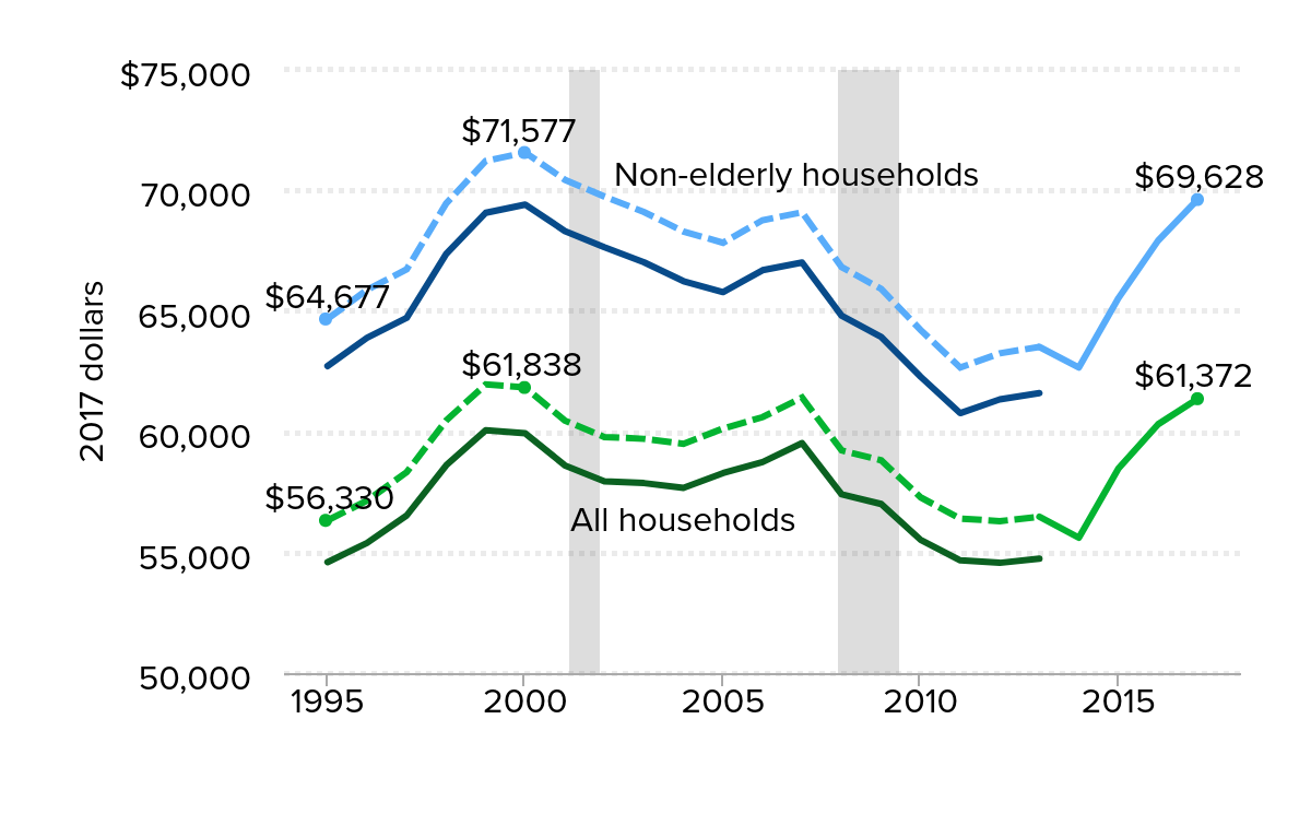
Note: Because of a redesign in the CPS ASEC income questions in 2013, we imputed the historical series using the ratio of the old and new method in 2013. Solid lines are actual CPS ASEC data; dashed lines denote historical values imputed by applying the new methodology to past income trends. Non-elderly households are those in which the head of household is younger than age 65. Shaded areas denote recessions.
Source: EPI analysis of Current Population Survey Annual Social and Economic Supplement Historical Income Tables (Tables H-5 and HINC-02)
Income gains and losses by income group
Low- and middle-income households have fared poorly since 2000 because of faltering wages compounded by the Great Recession and the slow recovery. Figure B allows us to track the extent to which households at various income levels have been able to mount a recovery from the blow to income inflicted by the Great Recession and its long shadow (looking at the cutoffs for household income deciles and the 95th percentile). The data we cite in this graph corrects income growth for a break in the income series stemming from a redesign of the income questions asked in the CPS ASEC in 2013.
Households at the bottom of the income distribution experienced larger income declines as unemployment rose from 2007–2010, and failed to see improvements even by 2014. The lower a household’s income, the greater the income losses were—exacerbating inequality. With the income gains of the last three years we see that those in the top 10 percent are the only part of the income distribution to have significantly passed their pre-Great Recession income levels. Although income growth was relatively widespread in 2015 and 2016, 2017 saw stronger income growth for those at the top than those at the middle. The lowest fifth saw a relatively strong increase of 2.3 percent, however, their incomes have only just reached their 2007 levels. Median incomes in 2017 were just below (0.1 percent) those of 2007. One more year of normal income growth will restore median incomes to their pre-great-recession level. Maintaining real wage gains and further lowering unemployment is the recipe for that reasonable outcome.
Cumulative percent change in annual household income for selected income percentiles, 2007–2017
| Year | 10th percentile | 20th percentile | 40th percentile | 50th (median) | 60th percentile | 80th percentile | 90th percentile | Top 5 percent |
|---|---|---|---|---|---|---|---|---|
| 2007 | 0.0% | 0.0% | 0.0% | 0.0% | 0.0% | 0.0% | 0.0% | 0.0% |
| 2008 | -3.7% | -1.7% | -3.9% | -3.6% | -2.6% | -3.5% | -2.1% | -2.1% |
| 2009 | -3.7% | -2.6% | -4.7% | -4.2% | -3.7% | -3.4% | -2.2% | -1.7% |
| 2010 | -7.3% | -6.3% | -7.6% | -6.7% | -5.7% | -4.9% | -3.0% | -3.1% |
| 2011 | -9.1% | -8.0% | -9.2% | -8.2% | -7.2% | -6.4% | -2.7% | -3.2% |
| 2012 | -9.2% | -8.4% | -8.2% | -8.3% | -6.0% | -6.1% | -3.1% | -2.5% |
| 2013 | -9.3% | -8.4% | -8.6% | -8.0% | -6.0% | -5.8% | -1.9% | -1.5% |
| 2014 | -10.3% | -8.1% | -9.8% | -9.5% | -6.2% | -5.7% | -2.3% | -2.5% |
| 2015 | -3.2% | -2.4% | -4.9% | -4.8% | -1.2% | -1.9% | 0.5% | 1.1% |
| 2016 | -2.0% | 1.5% | -1.6% | -1.8% | 1.4% | 0.2% | 4.3% | 4.8% |
| 2017 | 0.3% | 2.0% | -0.4% | -0.1% | 2.9% | 2.8% | 7.2% | 8.0% |
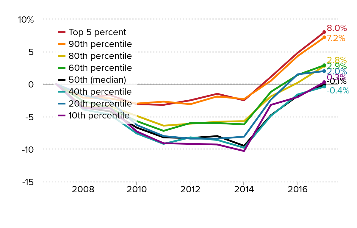
Note: Because of a redesign in the CPS ASEC income questions in 2013, we imputed the historical series using the ratio of the old and new method in 2013.
Source: EPI analysis of Current Population Survey Annual Social and Economic Supplement family income data
Although all groups now have incomes at or near their 2007 levels, households were really just making up for the ground lost during the recession and the subsequent slow recovery. A better benchmark is 2000, a year when the economy was closer to full employment. As shown in Figure C, the bottom half of households are still falling short of their 2000 income levels. Despite increases in recent years, households at the 10th percentile still have incomes 4.3 percent lower than they were in 2000. While median household incomes are closing in on their 2000 levels, they still fell 0.8 percent short in 2017.
Figure C also demonstrates the longer term trend of incomes at the top pulling away from those at the middle and bottom. In 2017, the 95th percentile household income was $237,034, which is 3.9 times the median household income of $61,372. The gap between the top and middle has widened since 2000, when the average income for the top 5 percent of households was 3.5 times the median.
Cumulative percent change in annual household income for selected income percentiles, 2000–2017
| Year | 10th percentile | 20th percentile | 40th percentile | 50th (median) | 60th percentile | 80th percentile | 90th percentile | Top 5 percent |
|---|---|---|---|---|---|---|---|---|
| 2000 | 0.0% | 0.0% | 0.0% | 0.0% | 0.0% | 0.0% | 0.0% | 0.0% |
| 2001 | -1.8% | -2.5% | -1.8% | -2.2% | -1.2% | -0.7% | -1.4% | 0.8% |
| 2002 | -3.9% | -4.3% | -3.2% | -3.3% | -2.5% | -1.6% | -2.5% | -1.1% |
| 2003 | -6.8% | -6.1% | -3.6% | -3.4% | -2.3% | -0.6% | -1.2% | -0.7% |
| 2004 | -6.1% | -6.0% | -4.2% | -3.8% | -3.5% | -1.9% | -1.7% | -1.4% |
| 2005 | -6.0% | -5.7% | -3.8% | -2.7% | -2.6% | -1.1% | -0.8% | 0.8% |
| 2006 | -3.2% | -4.5% | -2.3% | -2.0% | -1.8% | 1.3% | 1.4% | 2.3% |
| 2007 | -4.6% | -6.0% | -1.6% | -0.7% | -1.3% | 1.5% | 0.8% | 1.2% |
| 2008 | -8.1% | -7.6% | -5.5% | -4.2% | -3.9% | -2.0% | -1.3% | -0.9% |
| 2009 | -8.1% | -8.4% | -6.3% | -4.9% | -5.0% | -1.9% | -1.4% | -0.5% |
| 2010 | -11.5% | -11.9% | -9.1% | -7.4% | -7.0% | -3.4% | -2.2% | -1.9% |
| 2011 | -13.2% | -13.5% | -10.7% | -8.8% | -8.4% | -4.9% | -1.9% | -2.0% |
| 2012 | -13.4% | -13.9% | -9.7% | -9.0% | -7.2% | -4.6% | -2.3% | -1.4% |
| 2013 | -13.5% | -13.9% | -10.1% | -8.7% | -7.3% | -4.4% | -1.1% | -0.3% |
| 2014 | -14.4% | -13.6% | -11.2% | -10.1% | -7.5% | -4.2% | -1.5% | -1.3% |
| 2015 | -7.7% | -8.2% | -6.4% | -5.4% | -2.5% | -0.3% | 1.3% | 2.3% |
| 2016 | -6.4% | -4.6% | -3.2% | -2.5% | 0.1% | 1.8% | 5.2% | 6.1% |
| 2017 | -4.3% | -4.1% | -2.1% | -0.8% | 1.5% | 4.4% | 8.1% | 9.3% |
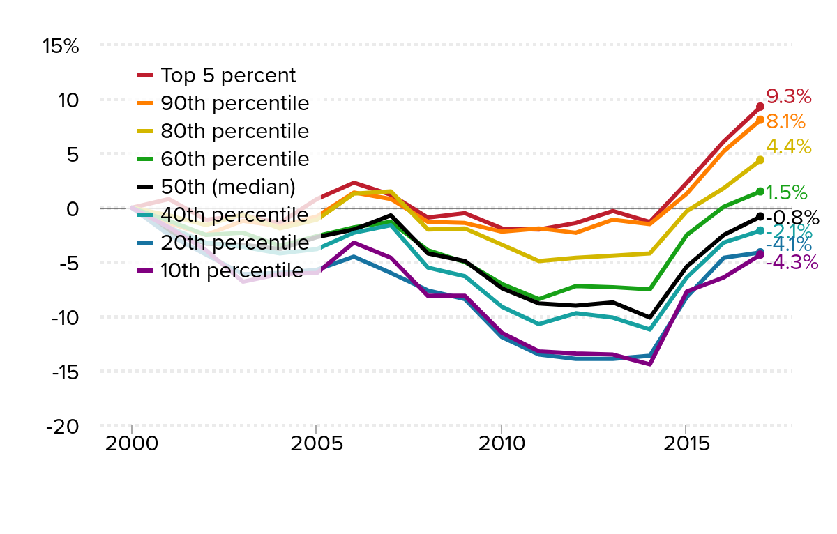
Note: Because of a redesign in the CPS ASEC income questions in 2013, we imputed the historical series using the ratio of the old and new method in 2013.
Source: EPI analysis of Current Population Survey Annual Social and Economic Supplement family income data
Earnings fell slightly in 2017
Besides lower employment and hours in the aftermath of the financial crisis, the key driver of the post-2000 income trends highlighted above has been anemic growth of hourly wages over the last seventeen years. The continued fall in unemployment over the last couple of years would be expected to yield solid wage growth. In 2017, both full-time year round men and women’s earnings fell by 1.1 percent, failing to keep up with inflation. The median man working full-time experienced a decline in real earnings of 1.1 percent, from $52,751 to $52,146, in 2017. The median woman working full time, full year also saw a decline of 1.1 percent, from $42,448 to $41,977. For this group of full-time workers, men’s earnings are still below their 2007 level (by 2.5 percent points), while women’s earnings are now 0.9 percent above. Looking over a longer horizon, however, the trends are starkly disappointing. The median woman working full time, full year saw her earnings grow from $31,328 in 1973 to $41,269 in 2002, and then stagnate in the 2002–2007 recovery, reaching only $41,602 by 2007. Since the recession that began at the end of 2007, women’s earnings have recovered, reaching $41,977 in 2017. Full-time men’s earnings dropped from $55,317 in 1973 to $53,466 in 2007, then fell further in the recession and have recovered only to $52,146 in 2017. Since 1973, the median man working full time, full year has seen no sustained earnings growth.
Real earnings of full-time, full-year workers, by gender, 1995–2017
| Men: Full-time, full-year | Women: Full-time, full-year | |
|---|---|---|
| 1995 | $50,466 | $36,047 |
| 1996 | $50,169 | $37,005 |
| 1997 | $51,444 | $38,152 |
| 1998 | $53,276 | $38,982 |
| 1999 | $53,709 | $38,839 |
| 2000 | $53,175 | $39,200 |
| 2001 | $53,123 | $40,548 |
| 2002 | $53,875 | $41,269 |
| 2003 | $54,334 | $41,049 |
| 2004 | $53,072 | $40,640 |
| 2005 | $52,075 | $40,086 |
| 2006 | $51,506 | $39,628 |
| 2007 | $53,466 | $41,602 |
| 2008 | $52,920 | $40,797 |
| 2009 | $53,975 | $41,549 |
| 2010 | $54,027 | $41,562 |
| 2011 | $52,650 | $40,543 |
| 2012 | $52,838 | $40,422 |
| 2013 | $52,727 | $41,080 |
| 2014 | $52,220 | $41,066 |
| 2015 | $52,988 | $42,155 |
| 2016 | $52,751 | $42,448 |
| 2017 | $52,146 | $41,977 |
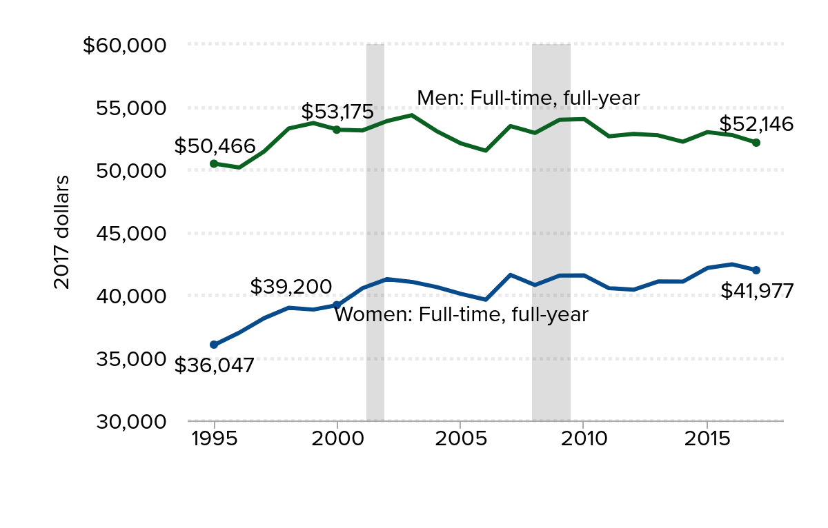
Note: Earnings are wage and salary income. Shaded areas denote recessions. Because the redesign of the CPS ASEC in 2013 did not directly affect earnings, the data for 2013 are an average of the new and old series.
Source: EPI analysis of Current Population Survey Annual Social and Economic Supplement Historical Income Tables (Table P-41)
While the earnings of full-time, full-year women have improved since 1973, progress in closing the gender earnings gap slowed significantly over the last decade. The gap between women’s and men’s earnings shrunk by 17.1 percentage points during the 27 year period from 43.4 percent in 1973 to 26.3 percent 2000 (an average annual change of 0.6 percentage points), but only shrunk 6.8 percent points from 2000–2017 (an average annual chance of 0.4 percentage points). Women’s earnings were 26.3 percent lower than men’s in 2000 and 19.5 percent lower in 2017. Because men and women experienced the same decline in earnings, the gender earnings gap remained unchanged from 2016 to 2017. The economy does have the potential to increase men’s and women’s wages and close the gender wage gap—between 2014 and 2015 both men’s and women’s median wages did rise, while the gender wage gap narrowed.
Stay tuned, we will be reporting on incomes, earnings, and poverty by race and ethnicity as well as a more in-depth look at wage differentials among men and women, black and white workers.
Enjoyed this post?
Sign up for EPI's newsletter so you never miss our research and insights on ways to make the economy work better for everyone.