A retrospective look at inflation: Which predictions were wrong or right, and what remains unclear?
Inflation—both overall and core—has been steadily normalizing from its elevated levels of the past two years. Notably, this has happened without any pronounced slowdown in economic growth or any rise in unemployment. In short, the much-discussed “soft landing” seems to be happening. Many have declared this a highly unexpected development that was unforeseen by any economists. This is obviously not true—there have been plenty of us making the case that inflation would indeed likely normalize even without a rise in unemployment.
That said, it has been a highly unusual few years and no economic analyst has called every zig and zag of the inflation debate exactly. Given that this unusual period seems to be ending, it’s a useful time for a retrospective look at predictions I made. This retrospective can be divided into four categories:
- Unambiguously wrong: I predicted a relatively short and narrow burst of inflation, with very little spillover into faster nominal wage growth. Much of this was wrong due to new shocks occurring after this initial prediction, but not all of it.
- Unambiguously right: Higher unemployment was not needed to pull down inflation or even the pace of nominal wage growth.
- Probably wrong: I thought interest rate increases as fast and high as what was done over the past year would have appreciably slowed the economy far more than they have so far.
- Probably right: The role of generic macroeconomic overheating in driving inflation has been far overemphasized. Instead, the evidence is more consistent with a story of extreme shocks causing unexpectedly large ripple effects in the wider economy.
- Totally mixed: What role, if any, did higher interest rates contribute to normalizing inflation?
Below, I’ll say a bit more about each of these.
Unambiguously wrong: My prediction of a shorter and narrower burst of inflation—with little spillover into fast wage growth—was made before the Omicron wave and the Russian invasion of Ukraine, both of which represented very large new shocks, which substantially exculpates my wrongness on this. But, this prediction was also wrong simply because U.S. workers were able to protect their inflation-adjusted wages from price shocks to a greater degree than I thought possible.
For decades, price increases had not been met by any reliable boost to wages. In essence, when price shocks occurred, workers just immediately had to absorb lower real incomes. It was not always this way in every historical period. In the period of the “Great Compression” (roughly the mid-1930s to the late 1970s) when institutions granting workers leverage and bargaining power in the labor market were strong, price shocks did spur countervailing wage growth. For a brief period in 2021 and early 2022, workers had some real leverage and were able to demand higher wages in response to price shocks. This leverage was the result of short-lived and sui generis features of the 2021–2022 economy, such as pandemic aid boosting wealth buffers for workers and the “severed monopsony power” stemming from mammoth layoffs in low-wage sectors followed quickly by extraordinarily rapid hiring spurred by fiscal relief and recovery measures. In short, atypically fast nominal wage growth was indeed mostly just ripple effects stemming from large pandemic- and war-driven price shocks—but these ripples were larger and longer-lived than I imagined they would be. Once the shocks stopped, the ripples did eventually begin dying out, and the specter of wage-price spirals needing much higher unemployment to tame never emerged.
Unambiguously right: Higher unemployment was not needed to pull down inflation or even the pace of nominal wage growth. From the start of the elevated inflation in mid-2021 through the next year, nominal wages clearly dampened—not amplified—the upward spike of prices. The source of the successive waves of inflationary pressure was huge pandemic and war shocks, not excessively tight labor markets. Nominal wage growth moved higher than its pre-COVID pace (again, a development I didn’t predict), but it always lagged other sources of price growth and hence muffled, not amplified, the inflationary shocks. As such, targeting inflation reduction through wage restraint imposed by higher rates of unemployment was always going to be a poorly calibrated response. Further, from early 2022 onwards, nominal wage growth stopped rising and began moderating even as many quantity-side measures of labor slack (like unemployment or the prime-age employment-to-population ratio) tightened.
Nothing about the 2021–2022 inflationary episode signaled extraordinary excess heat in labor markets except a spike in vacancies. There is not zero information embedded in the vacancy data, but it was the outlier indicator, and there are many questions about how well it is measured and predicts inflation—particularly early in recoveries. As such, this vacancy spike should have been taken with a large grain of salt, not elevated above other labor market indicators. The possibility that a soft landing was in reach and should be targeted was identified early in this debate and it seems to be quite likely now.
Finally, the fact that nominal wage growth has been normalizing even with very low unemployment puts to rest the often-claimed trade-off for real wage growth between tight labor markets and inflation. Inflation hawks frequently post graphs of real (inflation-adjusted) wages over recent years and invite readers to draw the conclusion that inflation was a policy mistake that led to real wages being lower than they would have been had we not pursued as-aggressive a fiscal response to the pandemic recession and early recovery. This is almost surely not true—a counterfactual macroeconomic response that was contractionary enough to noticeably reduce inflation would have pulled down nominal wage growth even faster than price inflation. The choice, in short, is not between the low unemployment and relatively slow real wage growth we have seen in recent years, and a scenario with higher unemployment but faster real wage growth. It’s between our current recovery and one where unemployment was higher but real wage growth was even lower.
Probably wrong: I thought interest rate increases as fast and large as we’ve seen over the past year would have appreciably slowed the economy and labor market by now. I was not strongly opposed to any increase, but I would have gone more slowly and stopped at a lower interest rate, which now looks like it was perhaps too risk-averse in terms of harming the labor market. This caution could still end up being vindicated—the lag between interest rate hikes and slower economic activity can be considerable and quite non-linear. For example, there is still a scenario where acute financial distress emerges in banks due to higher interest rates, particularly in those banks whose main assets are commercial real estate, which is almost surely going to see a large negative price reset in coming years. It is, of course, maddening that banks have such trouble adjusting to higher interest rates when a high level of rates is clearly good for their profitability, but the experience of the past year should tell us they do have this trouble adjusting, and further shoes could drop in the financial sector.
Finally, one key thing that may have absorbed much of the force of recent rate increases is the trio of industrial policy bills passed in 2021 and 2022—the Infrastructure Investment and Jobs Act (IIJA), the CHIPS and Science Act, and the Inflation Reduction Act (IRA). These bills boosted exactly that component of economic activity—fixed investment—that interest rate increases are generally expected to dampen. If the economy does indeed make it into 2024 without a recession even in the face of the steepest interest rate increase in decades, it will likely have these industrial policy bills to thank for it.
Probably right: The role of generic macroeconomic overheating has been far overemphasized relative to a “shocks and ripples” view of what drove recent years’ inflation. The role of relative price shocks in driving the inflationary spike of 2021–2022 was dismissed far too early in this debate. It is true that some of the discussion linking relative price changes to overall inflation was unsound reasoning in the form of “if you remove this and that component then the rest of overall inflation looks tame.” But there is a long and respectable intellectual vein in inflation analysis that highlights the importance of relative price shocks and the economy’s reactions to them as possible sources of relatively durable overall inflation.
One key piece of evidence arguing against a generalized macroeconomic overheating view of recent inflation came from factor shares. I pointed out that large increases in corporate profit margins could disproportionately account for the first year of inflation. This finding largely got slotted into a less useful discussion about the role of corporate greed or concentration in driving inflation. But what too many missed is that in every single U.S. business cycle since World War II, tight labor markets and higher levels of aggregate demand relative to supply had been associated with thinner profit margins and a lower profit share of income. The fact that inflation and factor shares in 2022 instead displayed the opposite pattern of the 11 other business cycles since World War II really should have been seen as a signal that there was something different going on this time. High profit shares being evidence against macroeconomic overheating still remains underrecognized.
What remains very unclear: How big a role have interest rate hikes played in the inflation deceleration? The most common chain of reasoning linking higher interest rates and lower inflation runs through the labor market. Higher rates are assumed to reduce consumption and business spending, and the resulting drop in demand filters through to higher unemployment and reduced upward pressure on wages. Given that many quantity-side indicators of labor market tightness have instead increased during the year of interest rate hikes, the role of these higher rates in pulling down inflation seems far from obvious. There is one oversimplified narrative being told that should be refuted—that rate hikes did indeed slow aggregate demand growth, but because the economy was on a vertical section of the aggregate supply curve (or sometimes the “non-linear” section of this curve), this did not lead to output and employment losses but instead just pulled down inflation.
The intuition is shown below in Figure A. It shows the normal downward sloping aggregate demand (AD) curve and an extremely non-linear aggregate supply curve. In this view, outward shifts in the AD curve (say from AD1 to AD2) lead to no boost in output when the economy is initially on the “elbow” of the L-shaped AS curve, but instead only translate one-for-one into inflation increases. Inward shifts in the AD curve (say when interest rate increases pull it from AD2 to AD1) just walk the economy down the vertical part of the AS curve and lead to lower prices, but with no loss at all to output.
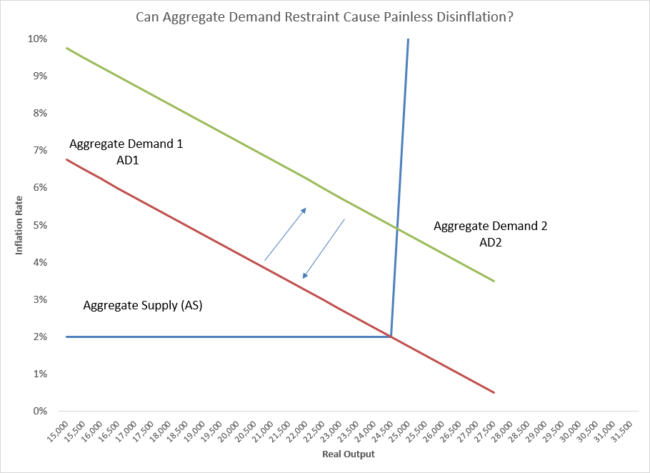
This explanation makes logical sense, and because there are no observable economic data labeled “aggregate demand” or “aggregate supply”, it is impossible to debunk (or confirm) simply by plotting these data. However, we can make inferences about aggregate demand and supply from empirical proxies, and these proxies make clear that this story does not fit the historical data at all. This sort of extreme “plunging” behavior—with increases in aggregate demand translating near-entirely into inflation acceleration with no increase in output and vice-versa—has never happened before in post-war U.S. economic history. Instead, even when the economy is starting from an unemployment rate well below estimates of the long-run natural rate, boosts to aggregate demand have reliably increased output and quantity-side measures of employment.
Some have implicitly argued that it is self-evident that aggregate demand exceeds aggregate supply by far more today than it has at any point in recent economic history and hence this kind of plunging story makes sense. But the only evidence ever presented for this is graphs of nominal spending, which has indeed accelerated sharply in the past two years. But these graphs only prove that inflation happened. When prices rise quickly, then nominal spending also rises by definition. These graphs are not explanations for why inflation has risen, they are simply proof that it did, and that’s not in any dispute.
Further, we do have some empirical measures that can give us some sense of whether aggregate demand is indeed far in excess of aggregate supply in recent years. An oft-used “output gap” measure examines how much actual gross domestic product (GDP) exceeds potential GDP (which is an estimate of how much output the economy can produce without putting upward pressure on inflation). Crucially, potential GDP is not a measure of maximum feasible output—it is only a ceiling on how much output can be produced without upward pressure on inflation.
The gap between actual and potential GDP should be a good proxy for how much aggregate demand is exceeding aggregate supply—this gap is essentially a measure of how hard aggregate demand is pushing the economy to produce in excess of its ability to do so without any upward pressure on inflation. Currently, the economy’s real GDP and estimates of real potential GDP are essentially exactly where pre-pandemic forecasts predicted they would be this year—and those predictions did not include any upward spike in inflation. In Banerjee and Bivens (2023), we make some adjustments to estimates of potential GDP to reflect the reductions in labor force participation, capital investment, and productivity that have occurred post-COVID (and which were most likely caused by the pandemic). But, even with this “scarring” effect accounted for, we have seen significantly larger and more persistent positive output gaps (which signal aggregate demand pushing the economy to produce in excess of aggregate supply) in the past with no outbreak of inflation.
Figure B below shows the recent positive output gap (excess of actual GDP over potential GDP) and how it compares with past episodes. In short, there is nothing in U.S. economic history that suggests the aggregate supply curve becomes vertical at relatively normal levels of production—and today’s levels of production are quite normal.
Even adjusted for pandemic scarring, recent output gaps are entirely unremarkable: Output gap, standard and adjusted for post-pandemic outcomes for labor force participation, capital investment and productivity trends, 1950–present
| Output gap (adjusted) | Output gap (July 2023 vintage) | |
|---|---|---|
| 1950q1 | -1.4% | |
| 1950q2 | 0.2% | |
| 1950q3 | 2.8% | |
| 1950q4 | 3.4% | |
| 1951q1 | 3.5% | |
| 1951q2 | 3.9% | |
| 1951q3 | 4.7% | |
| 1951q4 | 3.5% | |
| 1952q1 | 3.1% | |
| 1952q2 | 1.7% | |
| 1952q3 | 0.9% | |
| 1952q4 | 2.8% | |
| 1953q1 | 3.5% | |
| 1953q2 | 3.3% | |
| 1953q3 | 1.8% | |
| 1953q4 | -0.5% | |
| 1954q1 | -1.6% | |
| 1954q2 | -2.1% | |
| 1954q3 | -1.6% | |
| 1954q4 | -0.2% | |
| 1955q1 | 2.0% | |
| 1955q2 | 3.0% | |
| 1955q3 | 3.7% | |
| 1955q4 | 3.7% | |
| 1956q1 | 2.6% | |
| 1956q2 | 2.8% | |
| 1956q3 | 2.1% | |
| 1956q4 | 3.0% | |
| 1957q1 | 2.9% | |
| 1957q2 | 1.9% | |
| 1957q3 | 2.0% | |
| 1957q4 | 0.0% | |
| 1958q1 | -3.4% | |
| 1958q2 | -3.6% | |
| 1958q3 | -2.3% | |
| 1958q4 | -0.9% | |
| 1959q1 | 0.1% | |
| 1959q2 | 1.3% | |
| 1959q3 | 0.3% | |
| 1959q4 | -0.5% | |
| 1960q1 | 0.7% | |
| 1960q2 | -0.9% | |
| 1960q3 | -1.4% | |
| 1960q4 | -3.6% | |
| 1961q1 | -3.8% | |
| 1961q2 | -3.0% | |
| 1961q3 | -2.0% | |
| 1961q4 | -1.0% | |
| 1962q1 | -0.2% | |
| 1962q2 | -0.4% | |
| 1962q3 | -0.3% | |
| 1962q4 | -1.0% | |
| 1963q1 | -1.0% | |
| 1963q2 | -1.0% | |
| 1963q3 | 0.1% | |
| 1963q4 | -0.3% | |
| 1964q1 | 0.7% | |
| 1964q2 | 0.7% | |
| 1964q3 | 1.2% | |
| 1964q4 | 0.4% | |
| 1965q1 | 1.7% | |
| 1965q2 | 1.9% | |
| 1965q3 | 3.0% | |
| 1965q4 | 4.2% | |
| 1966q1 | 5.6% | |
| 1966q2 | 4.9% | |
| 1966q3 | 4.6% | |
| 1966q4 | 4.4% | |
| 1967q1 | 4.1% | |
| 1967q2 | 3.0% | |
| 1967q3 | 2.9% | |
| 1967q4 | 2.4% | |
| 1968q1 | 3.3% | |
| 1968q2 | 3.9% | |
| 1968q3 | 3.6% | |
| 1968q4 | 2.8% | |
| 1969q1 | 3.3% | |
| 1969q2 | 2.6% | |
| 1969q3 | 2.3% | |
| 1969q4 | 0.9% | |
| 1970q1 | -0.1% | |
| 1970q2 | -0.8% | |
| 1970q3 | -0.6% | |
| 1970q4 | -2.5% | |
| 1971q1 | -0.6% | |
| 1971q2 | -0.9% | |
| 1971q3 | -1.0% | |
| 1971q4 | -1.6% | |
| 1972q1 | -0.6% | |
| 1972q2 | 0.9% | |
| 1972q3 | 1.1% | |
| 1972q4 | 2.0% | |
| 1973q1 | 3.7% | |
| 1973q2 | 4.0% | |
| 1973q3 | 2.5% | |
| 1973q4 | 2.6% | |
| 1974q1 | 0.9% | |
| 1974q2 | 0.2% | |
| 1974q3 | -1.6% | |
| 1974q4 | -2.7% | |
| 1975q1 | -4.7% | |
| 1975q2 | -4.8% | |
| 1975q3 | -3.9% | |
| 1975q4 | -3.4% | |
| 1976q1 | -1.9% | |
| 1976q2 | -2.0% | |
| 1976q3 | -2.2% | |
| 1976q4 | -2.2% | |
| 1977q1 | -1.9% | |
| 1977q2 | -0.8% | |
| 1977q3 | 0.2% | |
| 1977q4 | -0.6% | |
| 1978q1 | -1.2% | |
| 1978q2 | 1.8% | |
| 1978q3 | 1.9% | |
| 1978q4 | 2.4% | |
| 1979q1 | 1.6% | |
| 1979q2 | 0.8% | |
| 1979q3 | 0.8% | |
| 1979q4 | 0.2% | |
| 1980q1 | -0.1% | |
| 1980q2 | -2.8% | |
| 1980q3 | -3.4% | |
| 1980q4 | -2.1% | |
| 1981q1 | -0.8% | |
| 1981q2 | -2.2% | |
| 1981q3 | -1.7% | |
| 1981q4 | -3.4% | |
| 1982q1 | -5.6% | |
| 1982q2 | -5.9% | |
| 1982q3 | -6.9% | |
| 1982q4 | -7.6% | |
| 1983q1 | -7.1% | |
| 1983q2 | -5.7% | |
| 1983q3 | -4.6% | |
| 1983q4 | -3.4% | |
| 1984q1 | -2.6% | |
| 1984q2 | -1.8% | |
| 1984q3 | -1.7% | |
| 1984q4 | -1.7% | |
| 1985q1 | -1.6% | |
| 1985q2 | -1.6% | |
| 1985q3 | -1.0% | |
| 1985q4 | -1.1% | |
| 1986q1 | -1.1% | |
| 1986q2 | -1.4% | |
| 1986q3 | -1.3% | |
| 1986q4 | -1.6% | |
| 1987q1 | -1.7% | |
| 1987q2 | -1.4% | |
| 1987q3 | -1.3% | |
| 1987q4 | -0.4% | |
| 1988q1 | -0.6% | |
| 1988q2 | -0.1% | |
| 1988q3 | -0.2% | |
| 1988q4 | 0.4% | |
| 1989q1 | 0.6% | |
| 1989q2 | 0.6% | |
| 1989q3 | 0.5% | |
| 1989q4 | -0.1% | |
| 1990q1 | 0.2% | |
| 1990q2 | -0.2% | |
| 1990q3 | -0.7% | |
| 1990q4 | -2.2% | |
| 1991q1 | -3.3% | |
| 1991q2 | -3.1% | |
| 1991q3 | -3.2% | |
| 1991q4 | -3.4% | |
| 1992q1 | -2.9% | |
| 1992q2 | -2.4% | |
| 1992q3 | -2.1% | |
| 1992q4 | -1.6% | |
| 1993q1 | -2.1% | |
| 1993q2 | -2.2% | |
| 1993q3 | -2.3% | |
| 1993q4 | -1.6% | |
| 1994q1 | -1.3% | |
| 1994q2 | -0.6% | |
| 1994q3 | -0.7% | |
| 1994q4 | -0.2% | |
| 1995q1 | -0.5% | |
| 1995q2 | -0.8% | |
| 1995q3 | -0.6% | |
| 1995q4 | -0.6% | |
| 1996q1 | -0.5% | |
| 1996q2 | 0.4% | |
| 1996q3 | 0.5% | |
| 1996q4 | 0.7% | |
| 1997q1 | 0.4% | |
| 1997q2 | 1.2% | |
| 1997q3 | 1.5% | |
| 1997q4 | 1.4% | |
| 1998q1 | 1.5% | |
| 1998q2 | 1.5% | |
| 1998q3 | 1.7% | |
| 1998q4 | 2.3% | |
| 1999q1 | 2.2% | |
| 1999q2 | 1.8% | |
| 1999q3 | 1.9% | |
| 1999q4 | 2.3% | |
| 2000q1 | 1.5% | |
| 2000q2 | 2.2% | |
| 2000q3 | 1.3% | |
| 2000q4 | 1.1% | |
| 2001q1 | -0.1% | |
| 2001q2 | -0.2% | |
| 2001q3 | -1.3% | |
| 2001q4 | -1.7% | |
| 2002q1 | -1.6% | |
| 2002q2 | -1.7% | |
| 2002q3 | -2.0% | |
| 2002q4 | -2.5% | |
| 2003q1 | -2.7% | |
| 2003q2 | -2.4% | |
| 2003q3 | -1.3% | |
| 2003q4 | -0.8% | |
| 2004q1 | -0.8% | |
| 2004q2 | -0.6% | |
| 2004q3 | -0.3% | |
| 2004q4 | 0.0% | |
| 2005q1 | 0.5% | |
| 2005q2 | 0.4% | |
| 2005q3 | 0.6% | |
| 2005q4 | 0.6% | |
| 2006q1 | 1.4% | |
| 2006q2 | 1.0% | |
| 2006q3 | 0.6% | |
| 2006q4 | 0.9% | |
| 2007q1 | 0.7% | |
| 2007q2 | 0.9% | |
| 2007q3 | 1.0% | |
| 2007q4 | 1.1% | |
| 2008q1 | 0.3% | |
| 2008q2 | 0.4% | |
| 2008q3 | -0.6% | |
| 2008q4 | -3.2% | |
| 2009q1 | -4.7% | |
| 2009q2 | -5.2% | |
| 2009q3 | -5.2% | |
| 2009q4 | -4.5% | |
| 2010q1 | -4.3% | |
| 2010q2 | -3.6% | |
| 2010q3 | -3.2% | |
| 2010q4 | -3.0% | |
| 2011q1 | -3.6% | |
| 2011q2 | -3.4% | |
| 2011q3 | -4.0% | |
| 2011q4 | -3.4% | |
| 2012q1 | -3.1% | |
| 2012q2 | -3.1% | |
| 2012q3 | -3.4% | |
| 2012q4 | -3.7% | |
| 2013q1 | -3.2% | |
| 2013q2 | -3.5% | |
| 2013q3 | -3.2% | |
| 2013q4 | -2.9% | |
| 2014q1 | -3.7% | |
| 2014q2 | -2.9% | |
| 2014q3 | -2.3% | |
| 2014q4 | -2.3% | |
| 2015q1 | -2.0% | |
| 2015q2 | -1.9% | |
| 2015q3 | -2.1% | |
| 2015q4 | -2.4% | |
| 2016q1 | -2.3% | |
| 2016q2 | -2.4% | |
| 2016q3 | -2.1% | |
| 2016q4 | -2.0% | |
| 2017q1 | -2.0% | |
| 2017q2 | -2.0% | |
| 2017q3 | -1.6% | |
| 2017q4 | -1.2% | |
| 2018q1 | -1.0% | |
| 2018q2 | -0.8% | |
| 2018q3 | -0.5% | |
| 2018q4 | -0.8% | |
| 2019q1 | -0.7% | |
| 2019q2 | -0.5% | |
| 2019q3 | -0.1% | |
| 2019q4 | -0.2% | -0.2% |
| 2020q1 | -1.9% | -1.8% |
| 2020q2 | -10.0% | -10.5% |
| 2020q3 | -4.4% | -3.8% |
| 2020q4 | -4.7% | -3.3% |
| 2021q1 | -3.2% | -2.3% |
| 2021q2 | -2.0% | -1.1% |
| 2021q3 | -1.4% | -0.9% |
| 2021q4 | -0.9% | 0.2% |
| 2022q1 | -0.9% | -0.7% |
| 2022q2 | -0.2% | -1.3% |
| 2022q3 | 0.3% | -0.9% |
| 2022q4 | 1.2% | -0.7% |
| 2023q1 | 2.2% | -0.9% |
| 2023q2 | 1.5% | -0.9% |

Source: Bureau of Economic Analysis National Income and Products Accounts (NIPA) data, Congressional Budget Office data on potential output, and author’s calculations as explained in Banerjee and Bivens (2023).
Conclusion
A soft landing has not been secured yet—inflation remains above the Fed’s 2% target. Yet a huge lesson has already been learned: sharp deterioration in the labor market was not necessary to put inflation on a downward path. The lessons of the past couple of years should continue to provoke much study and reflection. This is not even necessarily because they will hold generalizable lessons—it really has been an extraordinarily weird few years in macroeconomic terms (and along a bunch of other margins as well). But instead as a reminder that inflation is a multi-faceted phenomenon, and the existence of inflation is not by itself evidence that its cause is an imbalance of aggregate demand and supply.
Enjoyed this post?
Sign up for EPI's newsletter so you never miss our research and insights on ways to make the economy work better for everyone.