The last official business cycle peak occurred in December 2007. After that, the economy entered 18 months of virtual freefall—with job losses averaging more than 750,000 per month for the worst six-month stretch. The official end of the recession was June 2009—and some have recently declared full recovery has been reached in the 54 months since, as 2013 per capita GDP finally exceed its pre-recession levels.
However, for the very large majority of Americans who rely on paid employment for the vast majority of their income, recovery likely still feels very far off. And they’re right—by any reasonable definition the United States is far from having reached a full recovery. That’s because simply clawing back to the per capita income level that prevailed before the start of the Great Recession is far too low a bar to clear to declare mission accomplished on recovery. The reason for this is simple: Joblessness (and the sapping of bargaining power that accompanies its rise even for still-employed workers) rises whenever a gap develops between the economy’s underlying productive potential and aggregate demand for goods and services. The intuition here is simple: A given number of customers’ demands can be satisfied with fewer people as each incumbent worker becomes more productive, and each new potential worker (new graduates, for example) seeking to enter the workforce will only be employed if there is extra consumer demand for what he or she produces. So, demand has to rise in line with the economy’s productive potential in order to keep joblessness from rising.
The economy’s underlying productive potential is largely driven by demography (the growth of the potential labor force) and technology, two things that tend to increase steadily over time. When the economy is working well these steady increases in productive potential get translated seamlessly into increases in aggregate demand for goods and services. So, for example, new graduates enter the labor force, get jobs, and start translating their new wage income into demand for stuff, and no wedge arises between productive potential and aggregate demand. This means that when the economy is healthy, aggregate demand, and hence economic activity overall, should both see growth that matches the trend rise of productive potential.
But when demand falters and lags behind productive potential, resources get idled. Factories that can’t find customers for the goods they’re producing begin running fewer shifts or even get shuttered. Workers get hours cut or are laid off. Demography and technology march on (mostly—a healthy economy tends to see faster productivity gains than an unhealthy one for lots of reasons, but generally technological progress doesn’t stop dead simply because of a shortfall in demand), and the wedge between aggregate demand and productive potential rises, leading to endemic joblessness.
This means that full recovery happens only when aggregate demand has closed the gap with productive potential. What this requires is growth of demand—and hence growth of economic activity—that rises significantly above trend growth for a time until it catches up with productive potential, and stocks of idled resources (i.e., potential workers without jobs) are eroded.
In other words, because a full recovery requires a sustained period of rapid (i.e., above-trend) demand growth in order to work off the stock of resources idled during the recession, and we have not yet seen such a period of above-trend growth, we’re not close to a full recovery, or to full employment, as of the end of 2013. In fact, we’re not even halfway there, and we may not even be a third of the way there.
We are nowhere close to full recovery, or full employment
Figure 1 provides the evidence of how far away we are from a full recovery. It shows two key measures of how far from full capacity the economy remains.
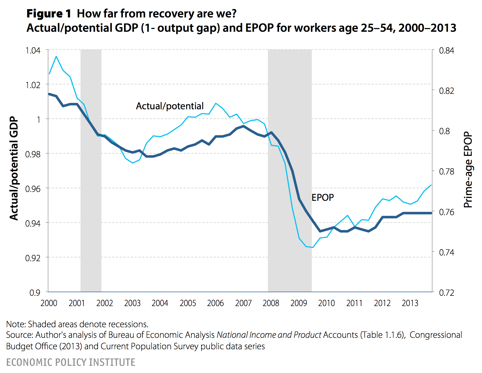
The first measure, the prime-age employment-to-population (EPOP) ratio, is probably easier to understand—it’s simply the ratio of adults between the ages of 25 and 54 who are employed. Recent years’ declines in the headline unemployment rate have been overwhelmingly driven not by increased employment, but instead by a sharp reduction in the labor-force participation rate. In order for jobless adults to be classified as unemployed, as opposed to not in the labor force, they must identify themselves as actively seeking work. As job opportunities became terribly scarce during and after the Great Recession, more and more potential workers began abandoning active search, simply because they could not find work. We have termed this group “missing workers” and assume that most would return to active search should job opportunities ever become plentiful again. Some have claimed that the decision to abandon searching for work was voluntary and unlikely to reverse even in a strengthening economy—and changing demographics of the labor force is frequently invoked as a reason why. The advantage of focusing on the EPOP is that such issues should matter much less. It is hard indeed to think why a much larger number of workers between 25 and 54 voluntarily decided right at the end of 2007 to stop working, and why it has bounced back so little since. In 2013 this prime-age EPOP was still 4 full percentage points below its 2007 value (and 5.6 percentage points below the 2000 value, which arguably is a better approximation of genuinely full employment); a little less than a third of the falloff in this measure since the Great Recession’s EPOP trough has been recouped.
The second measure shows the ratio of actual gross domestic product (or GDP, the broadest measure of economic activity) to potential gross domestic product as measured by the Congressional Budget Office (CBO). This measure of potential GDP is an estimate of how much output (and income) could be produced if all idle resources in the economy were employed. Essentially, the gap between actual and potential GDP (or, the “output gap”) is simply the most direct measure of the demand shortfall faced by the economy. According to this measure, only about half of the falloff in this since the beginning of the Great Recession has been recouped.
Worse, a good portion of the improvement in this measure is not due to economic growth that would have been deemed acceptable before the Great Recession, rather it is due to the CBO continually ratcheting down its estimate of potential GDP. Figure 2 shows growth in actual GDP and growth in potential output in succeeding CBO estimates. According to CBO’s 2008 estimates of potential GDP over the following 10 years, the economic growth we actually experienced by the end of 2013 should have left more than 90 percent of the maximum output gap experienced during the Great Recession remaining with us today. However, because CBO has marked down estimates of potential growth in succeeding years’ economic outlooks, the actual growth we’ve experienced has led to smaller and smaller estimated CBO output gaps.
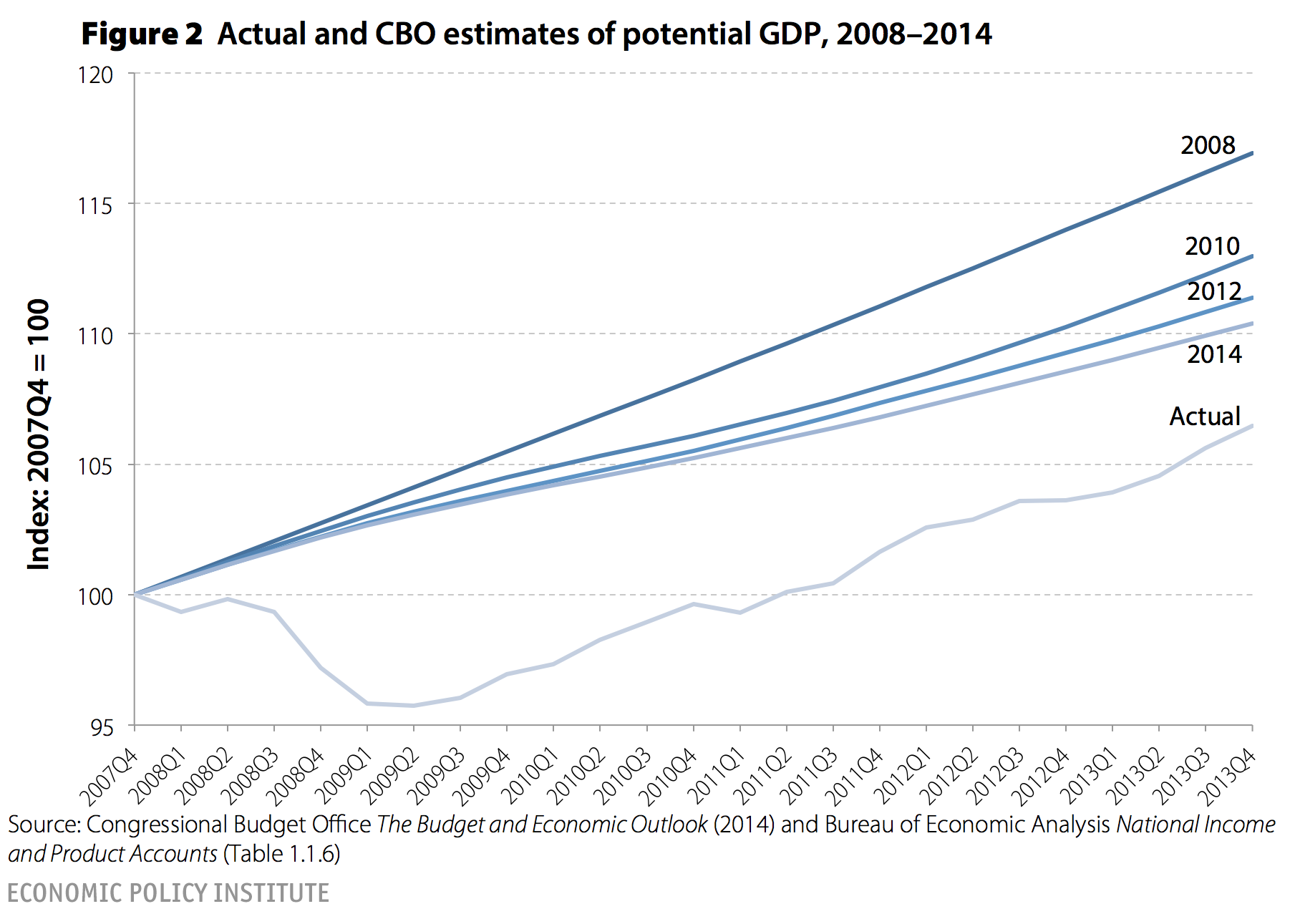
Allowing for more progress each year with no change in actual growth is essentially an exercise in defining “recovery” down. So, CBO’s 2010 estimates of potential GDP over the following 10 years now implies that the actual growth we’ve experienced would have left only three-quarters of the maximum output gap intact today. And their 2012 estimates imply that the same actual growth we’ve achieved would have left only 60 percent of the maximum output gap intact. And by their 2014 estimates, potential output has shrunk enough that the same growth that was estimated to erode only 10 percent of the output gap in earlier projections of potential output now has led to the erasure of more than half of the output gap. Given that much of this shrinking of potential GDP is in itself a casualty of the Great Recession, this implies that the ratio of actual/potential GDP from Figure 1 greatly understates how far we are from fully recouping the recession’s losses.
One thing that is crucial to understand about this, however, is that if slack demand can lead to shrinking potential output (which is what the CBO is estimating here, and is consistent with theories of “hysteresis” that have been used to justify reducing estimates of potential output), then periods of above-potential demand growth should similarly lead to increasing potential output. Policymakers going forward should be very aggressive in getting the long-run growth trajectory of the U.S. economy back on its pre-2007 track, and should not simply take new estimates of potential output—which are themselves deeply depressed by the Great Recession and subsequent slow recovery—as a hard and fast constraint.
Our biggest challenge remains a lack of demand
Figures 3–5 simply provide supporting evidence that this falloff in prime-age EPOPs and rising output gap are the result of a demand shortfall.
The first piece of evidence simply that we know precisely the source of the demand shortfall: the bursting of the early and mid-2000s bubble in home prices. The result, as shown in Figure 3, was a $7 trillion decline in nominal wealth compressed in a couple of years. Take a standard estimate of the effect of housing wealth on household consumption and the prediction is roughly a 3–4 percent of GDP decline in annual demand. Besides affecting consumption, the decline in home prices led to another 2 percent of GDP decline in residential investment (why build new homes when the price of existing ones are plummeting?). Take standard estimates of the accelerator effect of overall economic activity on business investment and one can easily get another decline of 1–2 percent of GDP. Finally, as economic activity fell, tax collections fell. For state and local governments constrained (mostly) to balance budgets each year, this led to significant spending cutbacks at the subfederal level. In short, the fall in housing wealth in Figure 3 can fully explain the size of the resulting demand shortfall.
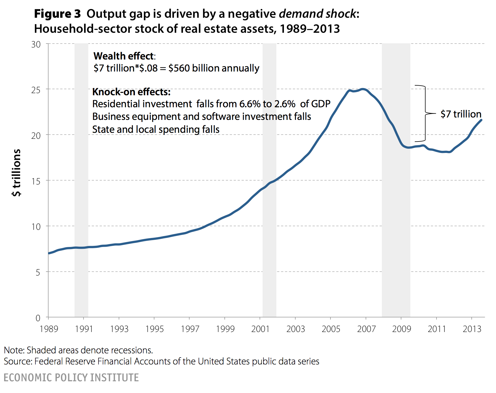
Figure 3 showed the source of the demand shock that resulted in the Great Recession; Figures 4 and 5 show evidence that the demand shortfall persists through the end of 2013 and that this shortfall is consistent only with an economy that is severely demand-constrained.
Figure 4 shows the enormous increase in monetary base (i.e., reserves held at the Federal Reserve) since the beginning of the Great Recession—a historically unprecedented increase. It is widely agreed that increasing the monetary base this much in an economy with no demand shortfall would lead to rapid increases in inflation. Yet inflation has declined substantially over this period, indicating an extraordinarily large shortfall in demand.
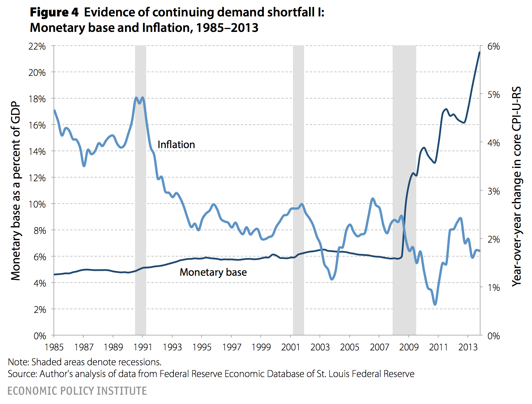
Figure 5 shows the large increase in federal budget deficits (or, the decline in net lending, to be precise) that coincided with the Great Recession. This rise in federal budget deficits was driven mostly by the mechanical collapse of tax collections and increase in safety-net spending (i.e., “automatic stabilizers”) accompanying the economic slowdown, as well as discretionary policies—like the stimulus packages of 2008 and 2009—passed to fight the Great Recession. It is widely agreed that increasing federal borrowing by this amount in an economy with no demand shortfall would lead to upward pressure on interest rates. Yet interest rates drifted steadily down even as federal borrowing increased significantly. Again, this indicates an enormous shortfall in aggregate demand putting intense downward pressure on interest rates, as private-sector households’ and businesses’ desires to save exceeded demand for lending.

So, we know the source of the demand shortfall (the burst housing bubble) and we know the demand shortfall was never fully filled in, as evident in the failure of inflation and interest rates to rise, even in the face of very large (in historic terms, not relative to the underlying demand shortfall) increases in the monetary base and federal budget deficits, respectively.
But what’s the consequence of the demand shortfall?
Slow GDP growth, unlikely to hit escape velocity any time soon
Figure 6 provides the answer: the slowest GDP growth at this point in any recovery in the post-World War II era. The chart shows a clear dichotomy between recoveries from recessions pre- and post-1990—in the earlier business cycles the economy grew much faster following recessions. But even in the late, slow-recovery set, the recovery from the Great Recession has been the worst. Further, a casual theory developed that slow recoveries starting in 1991 and 2001 may have been a function of the relative shallowness of the preceding recession. This obviously cannot explain the slow recovery following the Great Recession, as this recession was plenty deep.

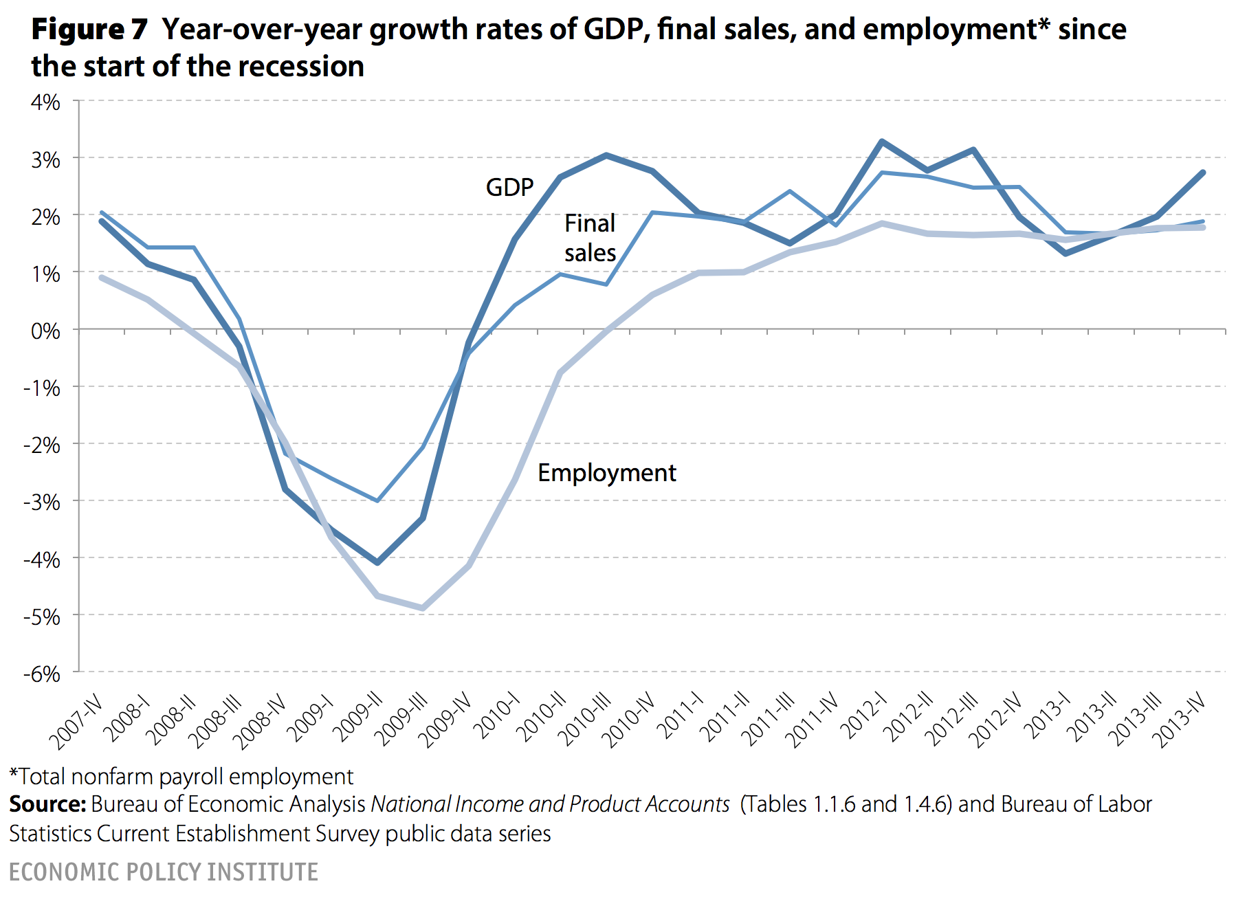
Figure 7 proves that the recovery has not improved with time, showing year-over-year growth rates of GDP, final demand (a less volatile measure that strips out the contribution of inventory investments), and employment. If one reads economics reporting in major media outlets, one often gets the impression that economic activity and employment is always beginning to accelerate relative to earlier stages of the recovery, and yet this durable acceleration just has not yet shown up in the data.
Figures 8–10 show why various components of GDP are quite unlikely to accelerate in coming years and drive a substantially improved recovery. Figure 8 shows the contribution of building (both residential and commercial investment in structures) to GDP growth. The resuscitation of the building sector is often, rightly, pointed to as a key source of potential strength in coming years. But, as the figure shows, the building recovery has already happened, contributing roughly as much to GDP growth in 2013 as it did during the peaks of the mid-2000s housing bubble. It could well be true that building will continue to make solid contributions to growth in coming years, but prospects for an acceleration of this growth sufficient to change the trajectory of the current recovery on its own seems unlikely.

Another common hope for accelerating economic activity is that U.S. consumers will spend more “confidently” in coming years as recovery takes hold. Figure 9 shows how little hope there is for consumers’ decisions to spend more (driven by confidence or anything else) to spur an acceleration of growth in coming years. The figure tracks the personal savings rate. The rate spikes sharply in 2008–09—a spike reflecting consumers’ decisions to sharply cut back purchases and save more due to the wealth loss spurred by the bursting housing bubble. This upward spike in savings is the mirror-image of the downward movement of consumer spending (a category which accounts for roughly 70 percent of total GDP) that was the single largest contributor to the Great Recession. But, as of the end of 2013, the personal savings rate had returned again to mid-2000s housing-bubble-depressed levels. It seems very hard to ask U.S. consumers to start saving less in order to drive a faster recovery.

Figure 10 looks at another component of GDP that economic commenters often claim is being held back by lack of confidence: business investment in equipment and intellectual property products. However, this component is actually performing quite well in historical perspective, rising more in line with pre-1990s recessions than with the slower 2001 recession performance. Again, for this component (which accounts for roughly 10 percent of overall GDP) to drive an accelerating recovery in coming years would require it to rise significantly faster than it has in any previous recovery. Given that a prime driver of this sort of business investment is simply the overall pace of economic growth (often labeled an “accelerator effect” on investment) and given that overall economic growth is historically slow, it seems that business investment in equipment and software is substantially overperforming in this recovery already, making a significant acceleration very unlikely.

Two ways to boost demand
Figures 11 and 12 show two components of GDP that could lead to an acceleration of demand growth if policymakers act decisively: public spending and net exports.
Figure 11 shows public spending growth at all levels of government since the recovery began compared with previous postwar recessions. The results are stunning: The current recovery has seen an unprecedented degree of austerity on the spending side since the recovery began. It is true that public spending during the Great Recession rose significantly—driven largely by the American Recovery and Reinvestment Act and automatic stabilizers. Yet this initial rise (which can be seen in the figure on the lefthand side of the vertical line marking the beginning of the recovery phase) quickly stabilized and then, starting with the 2011 Budget Control Act (which was forced into existence by Republicans in Congress threatening to force a default on U.S. debt by refusing to raise the statutory debt ceiling) federal spending’s growth collapsed.
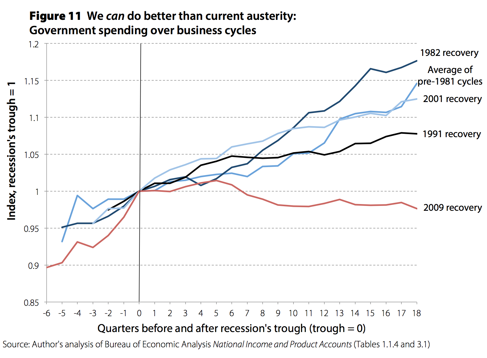
At this point, the current recovery’s weakness can essentially be entirely explained by the resulting spending austerity. Take the gap between public spending in the current recovery compared with the recovery following the early 1980s recession. This comparison is instructive in a couple of ways. First, both were extraordinarily sharp recessions and the output gaps at the troughs of these two recessions were very similar. Second, monetary policy had much more scope to boost economic activity during the 1980s recovery, as the preceding recession had largely been caused by historically large increases in short-term policy rates controlled by the Federal Reserve. In this sense, the need for higher growth of public spending for macroeconomic stabilization was much less in the 1980s recovery. Yet if public spending in the current recovery simply matched its growth over the 1980s recession and recovery, it would be more than roughly $800 billion higher today. Given multiplier effects on direct spending, this means that if we simply spent the way we did following the last very sharp recession, we would have achieved a full recovery by now.
Boosting public spending is therefore the clearest path to spurring an acceleration of growth in coming years. There is some mild good news on this front: The fiscal drag in 2014 is set to be far less extreme than in previous years. Yet it still will not actively boost overall growth, it will simply weigh less heavily on it. The last thing to note about this figure is that calls for enacting a public spending boost sufficient to spur full recovery are not radical, historically unprecedented policy proposals. What is radical and historically unprecedented is the status quo degree of austerity.
Figure 12 shows another potential source of demand growth in coming years—net exports. The U.S. economy entered the Great Recession with a very large trade deficit. The drag on demand stemming from net exports in the mid-2000s was largely offset by the boost to demand induced by rising home prices. Once home prices began falling and a large output gap appeared, however, the potential drag from trade deficits no longer had any offset. During the Great Recession, net exports actually rose, as imports fell faster than exports. This actually had a stabilizing effect on the economy and blunted the fall in GDP. However, once recovery began, net exports fell once again. Over the past year they have remained stable at roughly 3 percent of U.S. GDP. But, moving closer to balance on trade accounts could provide a much-needed boost to demand. In order for this to happen, the value of the U.S. dollar must be allowed to adjust (fall) in order to boost cost-competitiveness of U.S. exports and import-competing producers. This adjustment is currently blocked by the policy of a range of U.S. trading partners that actively manage the value of their currency vis-à-vis the U.S. dollar and receive a mercantilist boost from this policy. That is, by buying U.S. assets, they keep the value of their own currency from rising, which keeps their own exports relatively cost-competitive and keeps U.S. exports expensive in world markets. Policymakers have so far shown about as much interest in engineering a decline in the value of the dollar to boost economic activity and employment as they have in boosting public spending (i.e., none), but it is clearly a powerful potential lever to aid recovery.

Full employment is too important for complacency
And this relative disinterest in using the two levers of macroeconomic policy (fiscal support and exchange rate policy) that could actually work to spur demand enough to restore the economy to full recovery explains Figure 13. This figure shows the size and persistence of the output gap as forecast by successive editions of the CBO’s Budget and Economic Outlook. Since January 2008, the CBO has consistently forecast a stronger and quicker recovery than what has come to pass. We should be clear that this is not a CBO-specific criticism—rather it’s a reflection of two important facts that have not been incorporated in most macroeconomic analyses that informed pre-Great Recession forecasting.
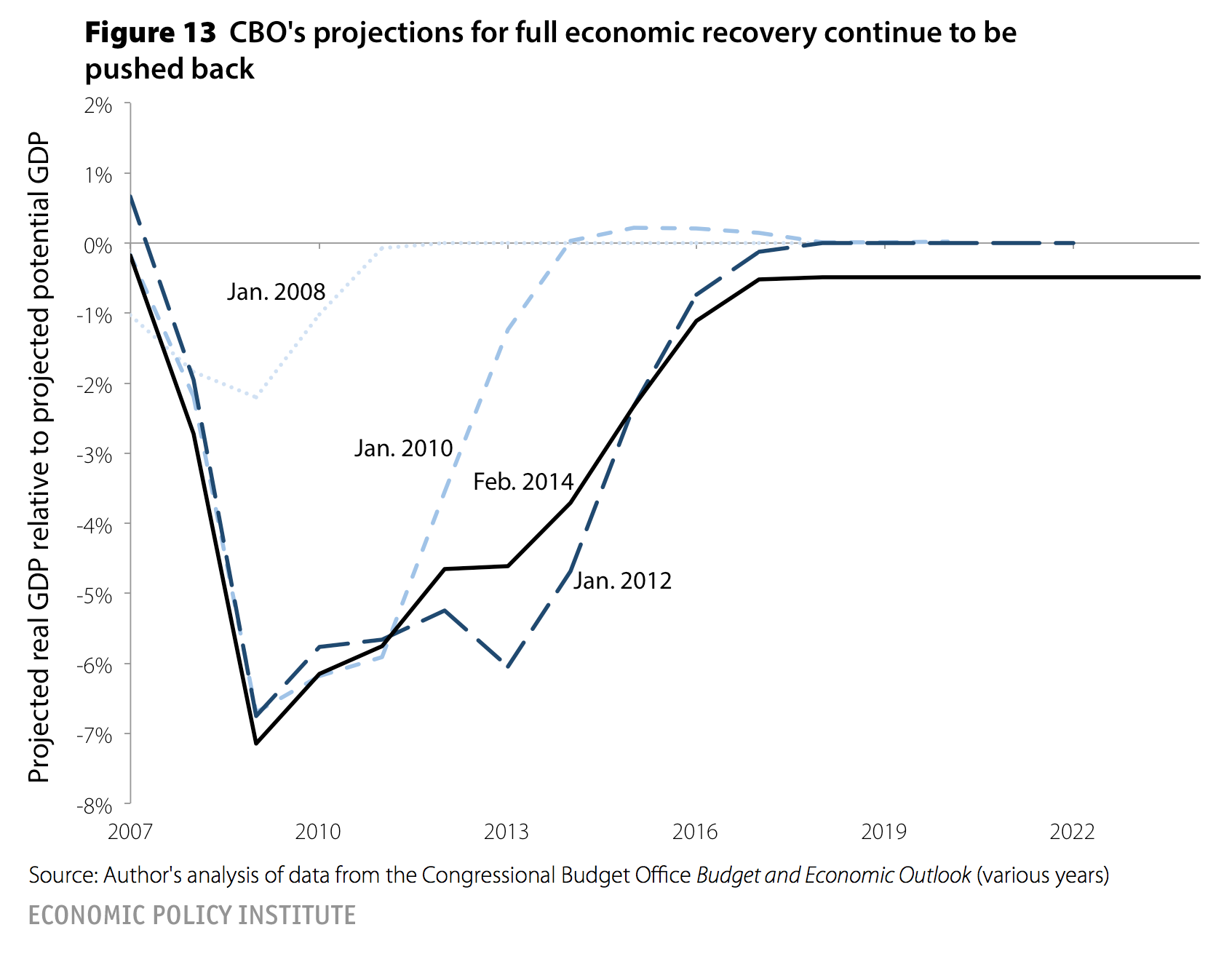
First, the size of the demand shock inflicted by the burst housing bubble simply broke many of the economy’s self-regulating mechanisms. The most obvious one is the Federal Reserve’s control over short-term policy interest rates. The Fed had moved these rates to zero by late 2008, yet the recession deepened and recovery has been slow in coming. And even as nominal short-term rates were buried at zero, real rates actually were often slightly rising over this period as inflation decelerated. What Figure 13 should remind us of is that full recovery should not be assumed to happen regardless of policy choices. Second, over the past generation advanced economies have indeed seen literally decades of potential income generation sacrificed due to large demand shortfalls that were never decisively remedied by macroeconomic policy. In the latest Budget and Economic Outlook (2014), the CBO finally has stopped pushing out the date of final recovery—but as shown before in Figure 3, this is not because of an acceleration of actual GDP growth, it’s simply because CBO has defined “recovery” down by reducing its estimates of potential GDP.
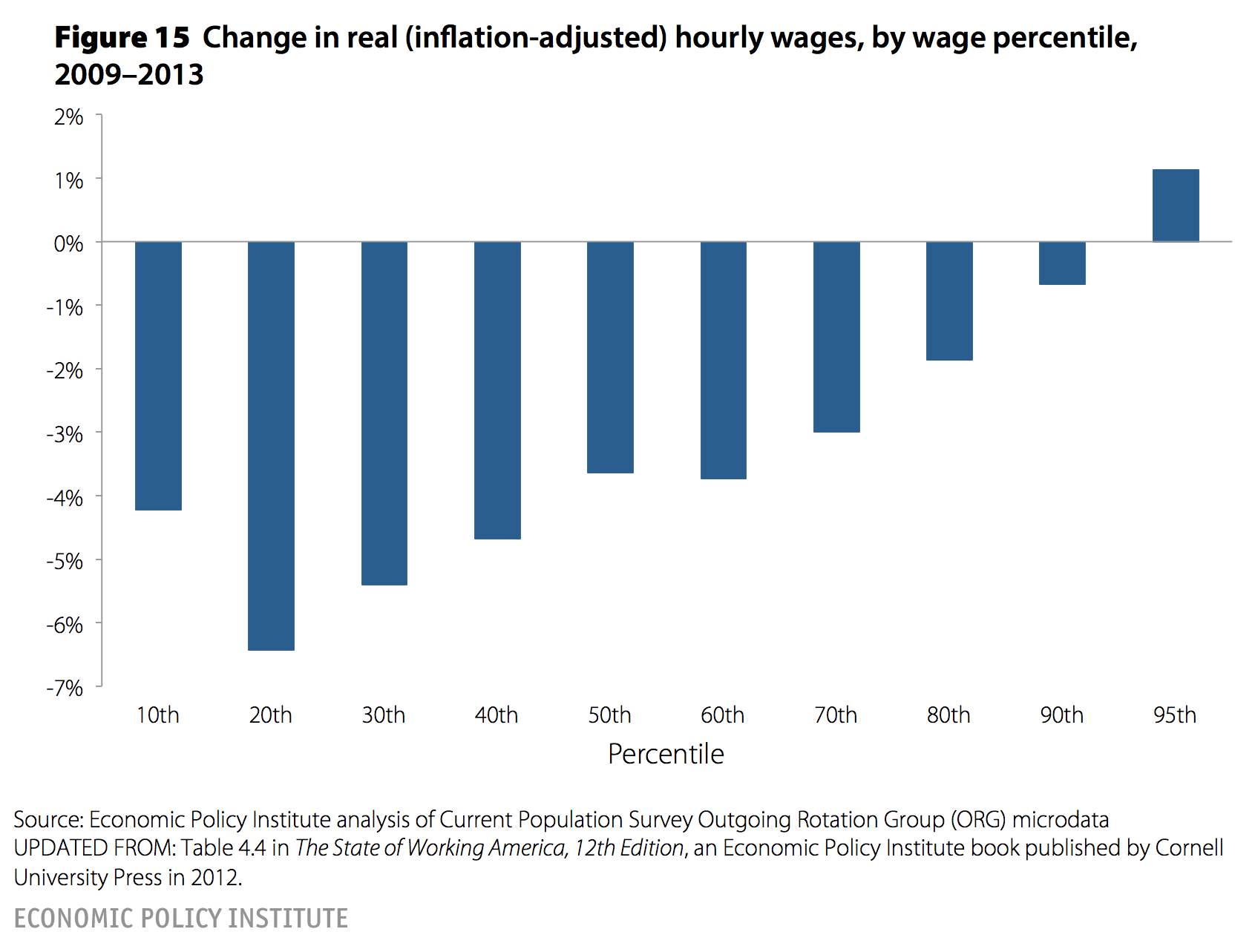
Figures 14 and 15 provide the last bit of evidence on why policymakers should be more aggressive in ensuring a full recovery yet probably have extremely blunted incentives to undertake this needed aggressive policy action. Figure 14 shows the growth of capital income (profits plus net interest) and labor compensation in the corporate sector since the recovery began. It shows exceptionally rapid growth in capital incomes with labor compensation (the combined wages and salaries and benefits of all workers in the corporate sector) essentially flat between 2006 and 2013—seven full years. Figure 15 shows the change in (inflation-adjusted) hourly wages between 2009 and 2013 for various points in the wage distribution, showing that the vast majority of workers have seen wage declines in each of these years.
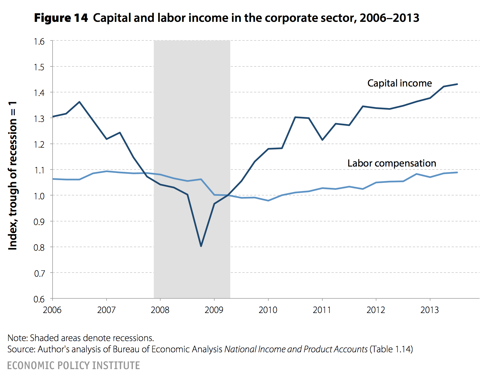
This raises two problems for the economy. First, the marginal propensity to consume out of wages (and particularly wages of lower-wage households) is much higher than out of corporate profits. This means that the profit-bias of the current recovery is exerting a substantial drag on recovery. Further, there is little boost to investment from higher profits simply because alternative forms of financing investment (debt) are so cheap right now that high profits are not loosening any serious constraint on this investment. Second, the urgency to enact further recovery measures is substantially blunted for those in the upper reaches of the wage distribution and those receiving significant amounts of capital income, because they have seen much more rapid recovery than the vast majority of American households. Yet these high-income households tend to be extraordinarily influential in policy debate, so if their incentive to demand aggressive policy action to restore full recovery is blunted, this makes it a much harder political demand to achieve.
Given the policy course we’ve taken—particularly the extreme austerity on the spending side of fiscal policy—it’s no real mystery why the U.S. economy remains so depressed even as it enters its seventh year since the Great Recession began. The immediate future does look brighter on this front: Austerity’s grip will be substantially loosened in 2014. But it seems like it would make more sense to use policy to affirmatively boost growth and spur rapid recovery than to just reduce policy’s drag and hope for the best. Full recovery, and full employment, are far too important for this kind of complacency.