In recent decades, the bulk of income growth in America has gone to the top 10% of families, but that was not always the case. Throughout most of the 20th Century, the bottom 90% claimed a much larger share of income growth than they have in recent years. The Chart, from EPI’s new interactive State of Working America Web site, compares the distribution of income growth over two periods. Between 1948 and 1979, a period of strong overall economic growth and productivity in the United States, the richest 10% of families accounted for 33% of average income growth, while the bottom 90% accounted for 67%. The overall distribution of income was stable for these three decades. In an extreme contrast, during the most recent economic expansion between 2000 and 2007, the period that led up to the Great Recession, the richest 10% accounted for a full 100% of average income growth.
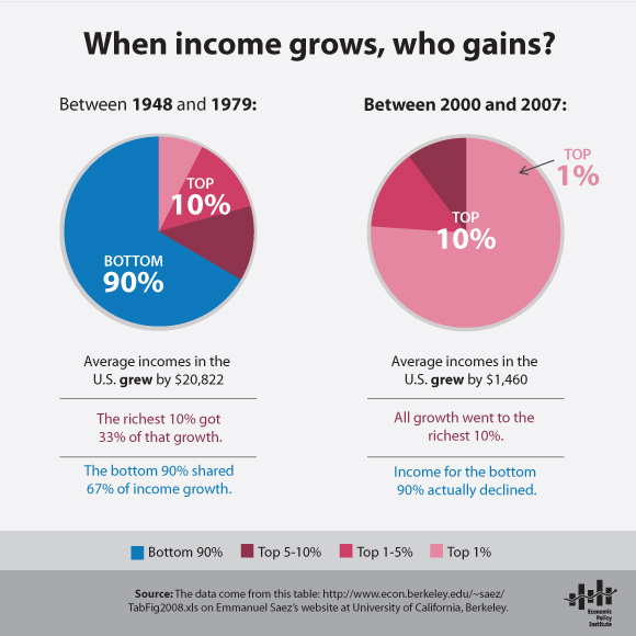
In other words, while average annual incomes over the seven-year period between 2000 and 2007 grew by $1,460, that growth was extremely lopsided. Average incomes for the bottom 90% of households actually declined. The interactive feature When income grows, who gains?, on the new State of Working America Web site, lets users look at income growth and distribution patterns for any time frame between 1917 and 2008.
This new feature lets users choose any two years between 1917 and 2008 to see how much the top 10%, versus the bottom 90%, contributed to growth in average incomes. Because income growth can change a lot during periods of recession, researchers tracking trends in inequality often chart movements between the peaks of different business cycles in order to avoid comparing a high point in one business cycle to a low point in another. The interactive feature on income distribution also shows how an increasing amount of income growth has been flowing not just to the top 10%, but to the richest 1% of families.
