Gross domestic product is up, but unemployment is still growing. U.S. auto manufacturers are operating at higher capacity, following a steep drop earlier this year, but Michigan — home of the major car makers — has the highest unemployment rate in the nation. The unemployment rate is lower than average for white women, but significantly higher for black men. It is comparatively low in North Dakota and Nebraska, but much higher in Florida, California, and other states.
That is what an economy as large and diverse as the United States’ looks like, and a full understanding of its complexities requires the ability to look deeper than last month’s national averages.
Introducing Economy Track: a new Web site created by EPI featuring a collection of charts containing our exclusive data. Economy Track offers a detailed picture of the recession and the current jobs crisis unavailable elsewhere.
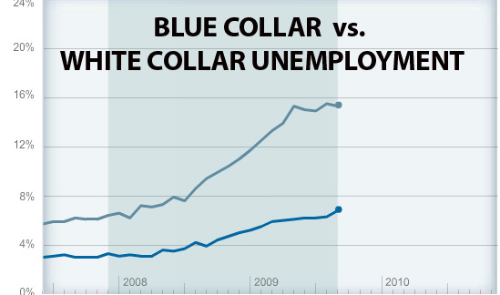
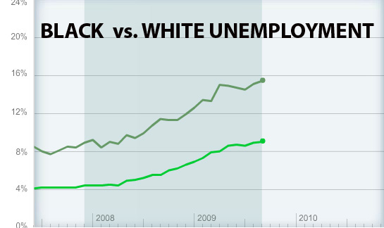
The site (www.economytrack.org) presents a collection of often complex economic data in an interactive, easy-to-use format that lets users see the context behind the numbers by comparing the latest employment data to that from past recessions. Users can also parse the numbers by race, gender, region, and level of education. Rather than just charting total unemployment, for example, Economy Track illustrates how unemployment is higher for blacks and Hispanics than for whites, higher for men than for women, and much higher for blue-collar workers than for those with white-collar jobs.

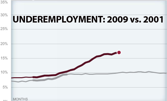
One image that best shows the severity of the current recession in comparison to past downturns is the underemployment rate, a figure that measures the number of people who have been unable to find full-time work and are working either part time or not at all. Underemployment now stands at 17% — meaning that more than one in six workers are now unemployed or underemployed — and Economy Track charts how that number steeply rose over the course of the latest recession. During the prior recession of 2001, underemployment showed a much more modest increase and never rose much above 10%.

Economy Track also features a state-by-state unemployment map of the United States that provides a quick, color-coded picture of the regions hardest hit by the recession. Other charts on the site allow users to flesh out some of the most dramatic stories of the downturn, with interactive charts on unemployment, underemployment, and many other measures of the labor market. One group of charts focuses on gross domestic product and capacity utilization, offering another way of measuring the economy’s performance.
Data on total underemployment, underemployment among black workers, and among those with less than a high school degree are the sort of indicators that EPI’s economists watch closely. Our attention to detail and to labor market trends that are not always reflected in the overall unemployment numbers signaled to us more than a year ago that the current recession was far more severe than past downturns and was likely to have more devastating consequences.

Economy Track tells the story of the current economy through a series of images that policy makers, advocates, students, and journalists will all find useful, such as the six-to-one ratio between job seekers and job openings. During this critical juncture in the economy, when some experts say the recession is over while others see more pain in the pipeline, EPI’s team of economists will regularly update these charts with all of the latest economic data, making it an invaluable source of information and insight.