Briefing Paper #286
With signs pointing to persistent high unemployment and a recovery even weaker than those of the early 1990s and 2000s, it is becoming common to hear in the media and among some policy makers the claim that lingering unemployment is not cyclical but “structural.” In this story, the jobs problem is not a lack of demand for workers but rather a mismatch between workers’ skills and employers’ needs. Another version of the skills mismatch is also being told about the future: we face an impending skills shortage, particularly a shortfall of college graduates, after the economy returns to full employment.
The common aspect of each of these claims about structural problems is that education is the solution, the only solution. In other words, delivering the appropriate education and training to workers becomes the primary if not sole policy challenge if we hope to restore full employment in the short and medium term and if we expect to prevent a (further) loss of competitiveness and a further rise in wage and income inequality in the longer term.
There are ample reasons to be skeptical of both claims:
- The number of job openings in the current recession has been far too few to accommodate those looking for work, and the shortfall in job openings is pervasive across sectors, not just the hard-hit construction industry, which tends to be the focus of skills-mismatch claims.
- There is no one education group—particularly not the least educated, as the structural argument would suggest—fueling the rise of long-term unemployment in this recession. If there has been some transformation of the workplace leaving millions of workers inadequate for the currently available jobs, then it was not based on a major educational upscaling of jobs.
- The challenge the nation faces as high unemployment persists is not better education and training for those currently unemployed. The problem is a lack of jobs.
- The huge increase in wage and income inequality experienced over the last 30 years is not a reflection of a shortfall in the skills and education of the workforce. Rather, workers face a wage deficit, not a skills deficit. It is hard to find some ever-increasing need for college graduates that is going unmet: college graduates have not seen their real wage rise in 10 years, and the pay gap with high school graduates has not increased in that time period. Moreover, even before the recession college students and graduates were working as free interns, a phenomenon we would not observe if college graduates were in such demand.
In the following I do not present definitive evidence, but I hope to be persuasive enough for readers to demand more evidence before accepting either of these claims of immediate structural employment problems or long-term skills deficits. The first section draws heavily on recent work on structural unemployment in the current recession (see Mishel et al. 2010), and the second draws heavily on the wages chapter of the most recent version of The State of Working America (Mishel et al. 2009).
I. Is current unemployment primarily structural in nature?
The context
Unemployment has remained at 9.5% or above since mid-2009 and may remain that high or inch even higher through 2011. The predominant narrative to describe this situation has been that the bursting of the housing and stock bubbles and the financial crisis led to a severe cutback in household consumption and business investment, causing severe job losses. The policy conclusion drawn from this narrative is that we need faster growth to increase the demand for workers and reduce unemployment.
A competing and, in my view, misguided narrative has also been put forth that a large share of current high unemployment is structural, meaning that those who are unemployed are not well suited to the jobs becoming available. This would be, for instance, because their skills are inadequate, have deteriorated, or are not applicable to the industries that are expanding, or because the unemployed simply do not live where the jobs are. Some make claims about structural unemployment because certain aggregate relationships, such as that between job openings and unemployment, do not appear to be following historical patterns, thereby suggesting a possible skills mismatch. Others have postulated that employers have substantially revamped their production processes in this downturn, thereby eliminating the need for many of the types of workers who are currently unemployed. Still others note that the housing bubble led to a bloated construction sector, and many of those jobs will never come back; displaced construction workers must switch to new jobs for which they may not be qualified. The policy implications of a finding that high unemployment is primarily structural are that: (1) it would be foolhardy to use further demand management (fiscal stimulus, either tax cuts or increased spending, or monetary policy) to lower unemployment, and (2) the appropriate policy is to offer education and training to the unemployed to help them make a transition to new occupations and sectors.
Yet there has been little evidence offered to support the claim of extensive structural unemployment, and we find that the pattern of employer behavior regarding job openings, layoffs, and hires does not lend it much credence. This matters quite a bit for guiding policy.
Lest I be accused of critiquing a straw man, note the recent statement of the Minneapolis Federal Reserve Bank president, Narayana Kocherlakota (2010):
What does this change in the relationship between job openings and unemployment connote? In a word, mismatch. Firms have jobs, but can’t find appropriate workers. The workers want to work, but can’t find appropriate jobs. There are many possible sources of mismatch—geography, skills, demography—and they are probably all at work. Whatever the source, though, it is hard to see how the Fed can do much to cure this problem. Monetary stimulus has provided conditions so that manufacturing plants want to hire new workers. But the Fed does not have a means to transform construction workers into manufacturing workers.
Of course, the key question is: How much of the current unemployment rate is really due to mismatch, as opposed to conditions that the Fed can readily ameliorate? The answer seems to be a lot. Most of the existing unemployment represents mismatch that is not readily amenable to monetary policy.
The competing explanation, as mentioned above, is the one I find most plausible: the economy is operating far below its potential output because of a shortfall in demand caused by an extreme loss of financial and housing wealth that caused consumption to fall; thus, there are simply not enough jobs to go around. Evidence for this explanation focuses on such indicators as low operating capacity in manufacturing, which was 71.6% in June 2010, down from 79.1% in December 2007. Vacancies in commercial offices (now at 17.4%) are further indication of excess capacity. The bottom line is that total demand in the second quarter of 2010 was still below its pre-recession level. In fact, total output, as measured by gross domestic product, was 1.3% below its pre-recession level. Of course, one would expect demand and output to have grown substantially over the two-and-a-half years since the official start of the recession and the ensuing recovery. The Congressional Budget Office conservatively puts the “output gap,” the difference between potential and actual output, at 6.4% in the second quarter.1 I think the output gap is larger, probably about 9.0% (derived by multiplying 4.5% excess unemployment by 2, from the usual Okun gap formula).
In my view, the pervasiveness of (1) lost employment and output across sectors and (2) high unemployment across types of workers by state, education, age, and occupation suggests an aggregate or macroeconomic explanation rather than one rooted in a few sectors or locations or because some workers lack skills.
Skepticism appropriate
The claim that current unemployment is primarily structural should require much more evidence than has been offered because common sense would deny such an explanation. The structural unemployment story presumes that millions of workers are now inadequately prepared for available jobs even though they were fruitfully employed just a few months or years ago. The argument raises a few key questions.
Has there been a major shift in productivity or technology investment?
What footprints would lead us to believe that the economy transformed itself from the end of 2007 to the beginning of 2010, leaving millions of workers inadequate? Productivity did grow a pretty spectacular 6.3% from early 2009 to early 2010, but that was the extent of productivity growth since the recession started in late 2007.2 Net investment in business equipment and software in 2009 (the latest data) was actually negative, the first time this occurred since World War II.3 Thus, the alleged structural transformation of production processes that left 4-5% of the labor force inadequate for the available jobs was clearly not associated with new equipment or new technological processes (requiring software), leaving us doubtful it happened at all.
Have the jobs moved around?
Is the problem just a need for greater mobility, for the unemployed to move to where jobs are more plentiful? Well, where would they go? There are 11 states with a total adult population of about 17 million where the unemployment rate in June was less than 7.0%.4 There are not enough jobs in those states to matter much, and if the unemployed moved to those states they would nearly double the labor force there.
Is unemployment unusually high compared to job openings?
The “Beveridge curve” describes the historical relationship between unemployment and job openings, and allows one to predict how high or low the unemployment rate should be given a certain number of job openings. There has been much attention to the mid-July blog post by David Altig (2010a), senior vice president and research director at the Atlanta Federal Reserve Bank, who used such an analysis to suggest that almost a third of the unemployed, 4.6 million workers, are structurally unemployed. His claim was based solely on a simple analysis of job openings and unemployment since 2000 that encompassed the experiences of just two recessions. Less noticed is that Altig (2010b) retreated from this claim just a month later, following an analysis by Cleveland Federal Reserve economists Murat Tasci and John Lindner (Tasci and Lindner 2010). Those authors, using data back to 1951, showed that unemployment higher than what the Beveridge curve would suggest is not “anomalous”: rather, it happened in the initial recoveries following the deep recessions in the 1970s and 1980s as well.
Looking for evidence on the employer side
One of the curious aspects of this developing structural unemployment storyline is how hard it is to find any research tying this hypothesis to actual detailed trends in employment, unemployment, or output data. This section explores patterns on the demand side, such as employer job openings, layoffs, and hiring, to see if they correspond to a structural unemployment story.
The number of job openings
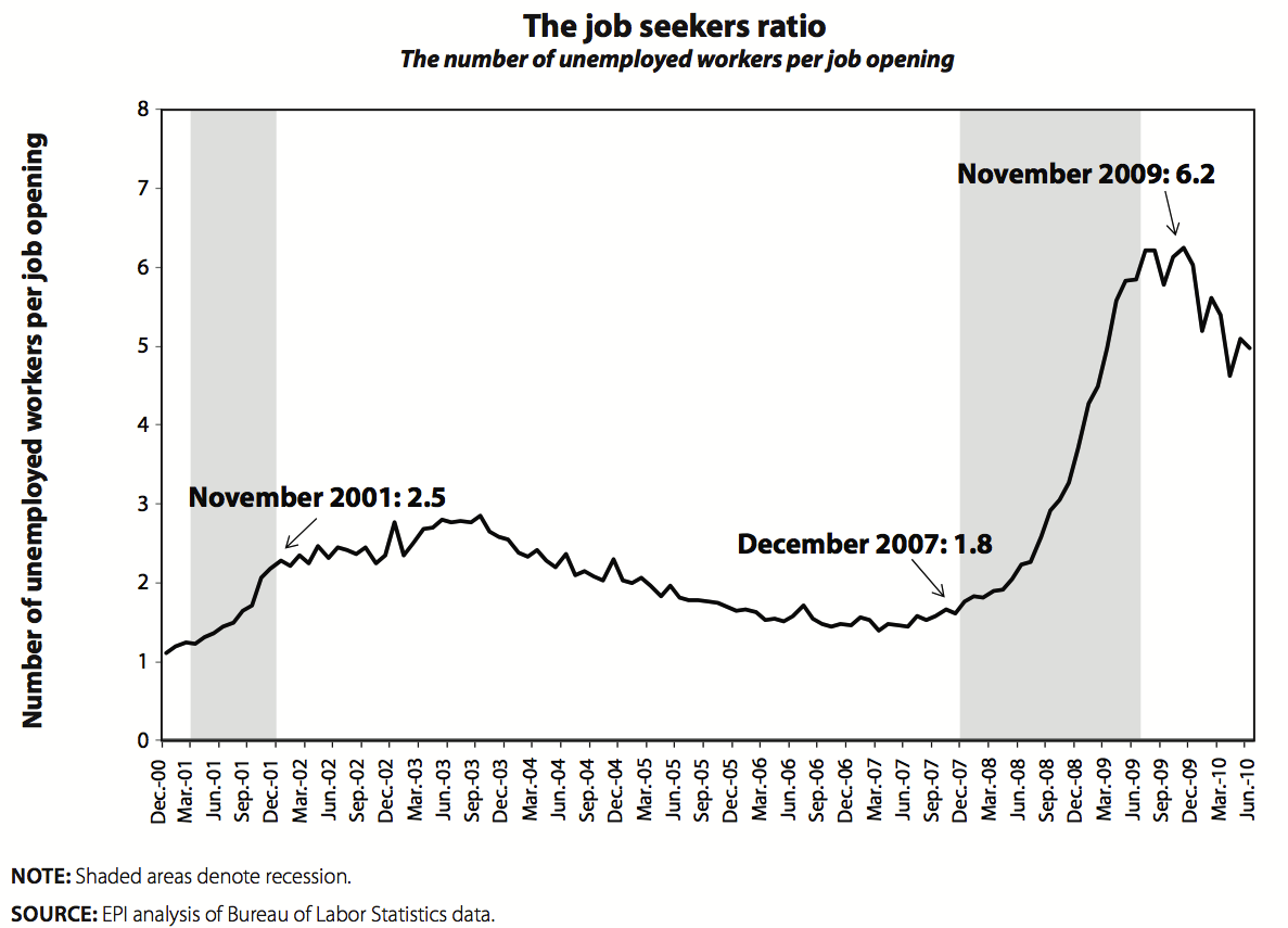
The job seekers ratio, which is the number of unemployed workers per job opening, provides ample evidence of a demand side problem. Simply put, the number of job openings has been far too few to accommodate those looking for work.
As Figure A shows, the ratio of unemployed to job openings surpassed six in the summer of 2009 but has dropped to the low five range more recently (once jobs to conduct the 2010 Census were filled). Even if the unemployed filled every job opening there would still remain many unemployed workers, an indication of too few job openings.5 The ratio of the unemployed to job openings in recent months has been nearly double that attained at the worst points of the early 2000s recession, a ratio of 2.8, which is not surprising since total job openings in the last half of 2009 were 25% below those in mid-2003.
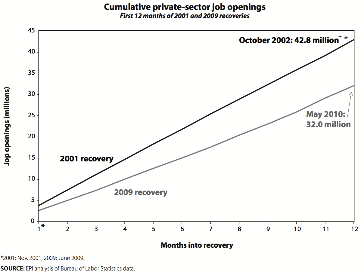
We can examine this phenomenon further by comparing the cumulative number of job openings in the first 12 months of the last recovery to the first 12 months of this one.
Figure B shows that the cumulative job openings in this recovery’s first year were about 32.0 million, roughly 10.0 million fewer than the cumulative openings in the early 2000s recovery. Recall that the recovery of the early 2000s is known as a “jobless recovery,” as the economy shed an additional 600,000 jobs after the recession had ended. Yet the current recovery has generated far fewer job openings than that pitifully weak recovery.
Job openings by industrial sector. A shortfall in job openings is clear, yet a concentration of this shortfall in a few specific industries such as construction would provide evidence of a structural shift.
Figure C shows the ratio in each sector of the cumulative job openings in the current recovery to those in the early 2000s recovery. This measure shows how far short this recovery’s job openings are relative to those of the earlier recovery for each sector. The shortfall in job openings is pervasive, occurring in every sector (except mining). Recent openings averaged 72% of those in the earlier recovery. Recent construction job openings were indeed just 58% of those in the earlier recovery, but the shortfall in job openings was also severe in labor-intensive service industries such as hospitality, entertainment, and accommodation. Since the trends are pervasive across all sectors, it is time to stop thinking about unemployment and the failure to generate job openings as a circumstance driven by developments in particular sectors.
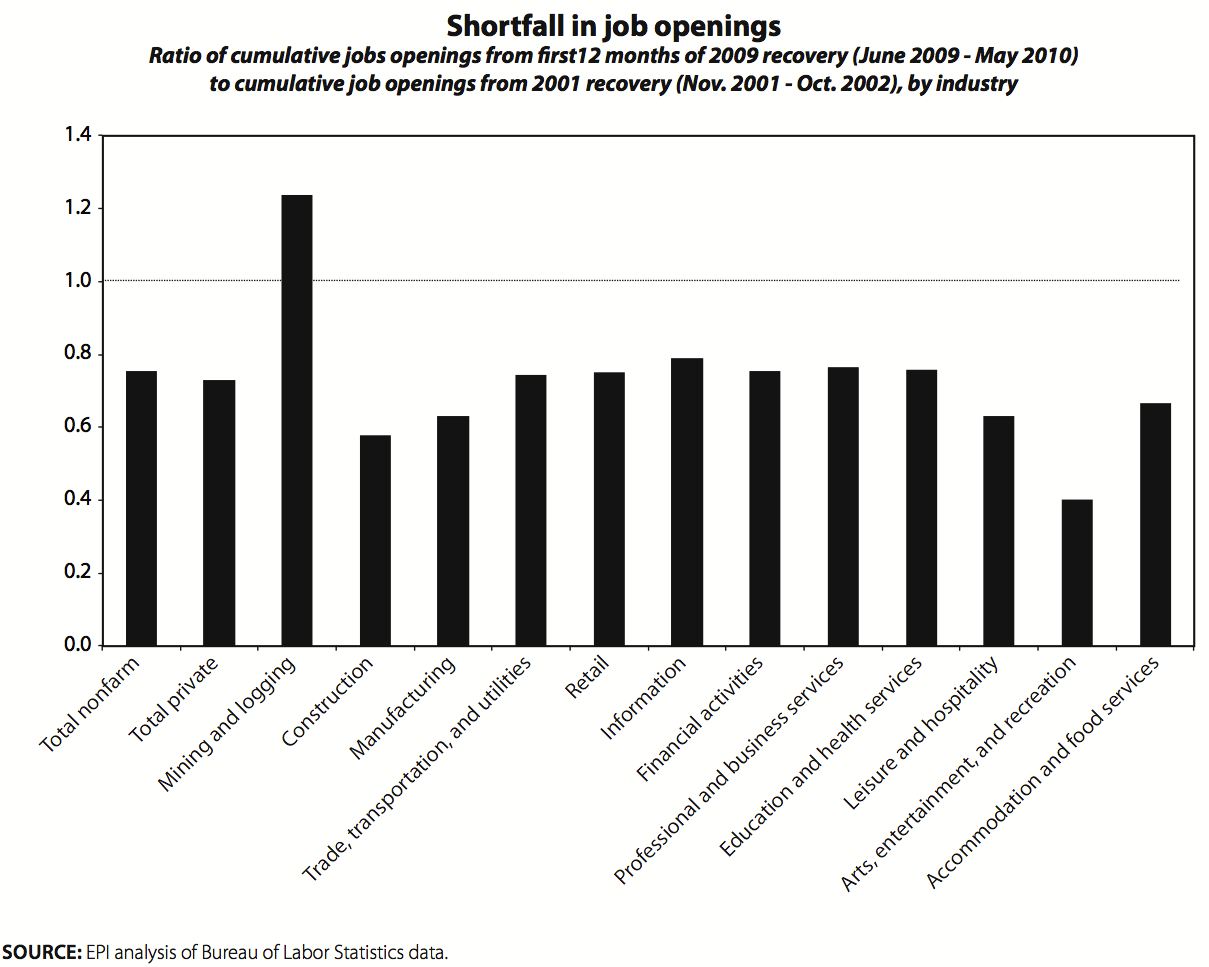
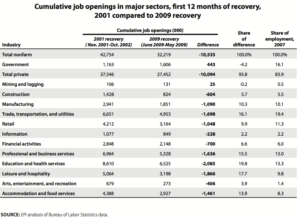
Table 1, which shows the job opening data for each sector in both the 2001 and 2007 recoveries, allows an assessment of the scale of the recent openings shortfall by sector. Construction is responsible for 5.7% of the recent shortfall, but that is comparable to that sector’s 5.5% share of employment; in other words, construction has not played any outsized role in the failure for openings to rise as fast now as in the earlier recovery. The shortfall has predominately been driven by private service-sector industries (professional and business services, health, education, entertainment, hospitality, and accommodations), which generated 71% of the openings shortfall despite having just 46% of total employment. In fact, the worst performing industry under this measure was leisure and hospitality, which accounts for 10% of employment but 18% of the job openings shortfall.
The number of job losses
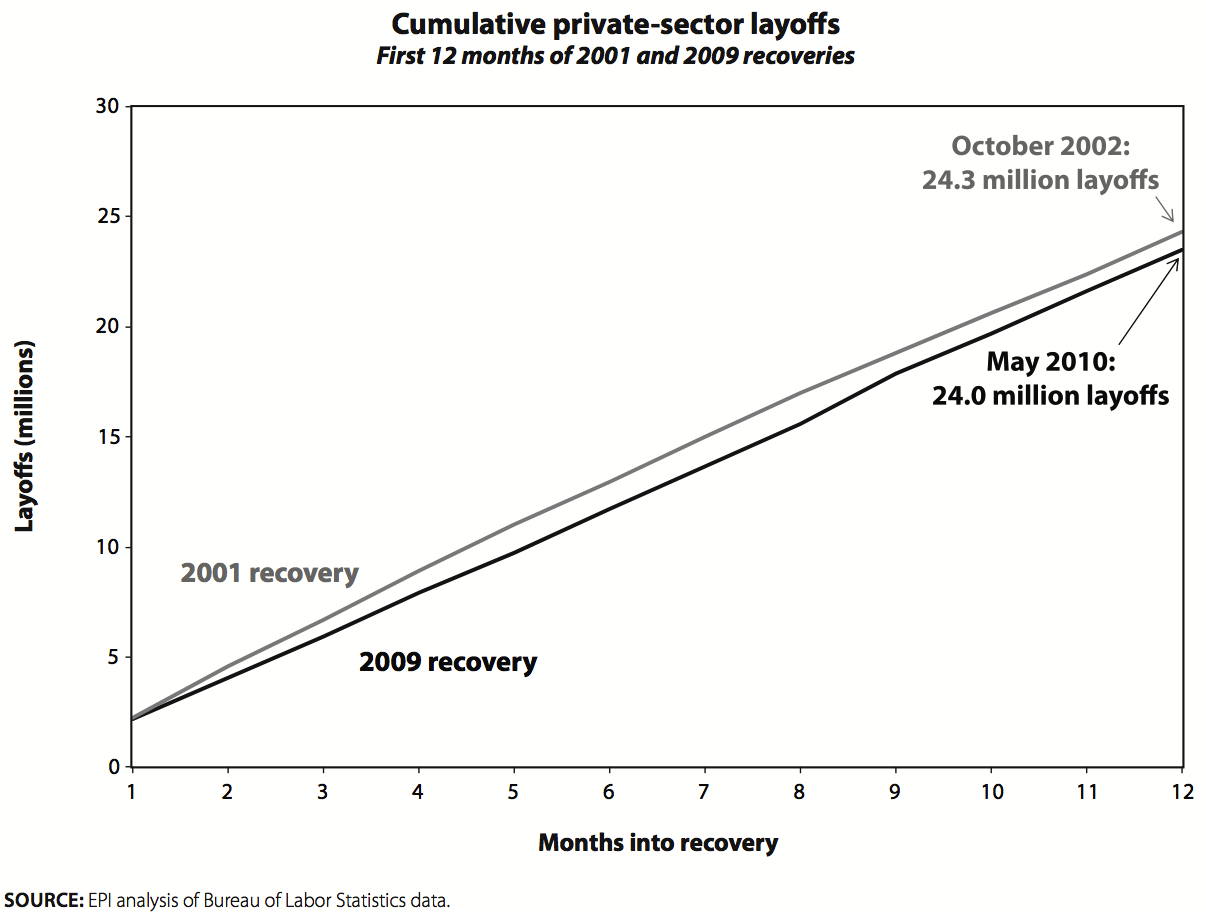
Maybe the issue is that we have been seeing more structural changes within industries or shifts across industries that are leading to more layoffs, thereby impeding growth in overall employment. A look at the cumulative layoffs in this recovery compared to the last recovery, as in Figure D, shows that layoffs are not a piece that fills in any puzzle: the cumulative layoffs in each recovery are totally comparable.
Filling job openings
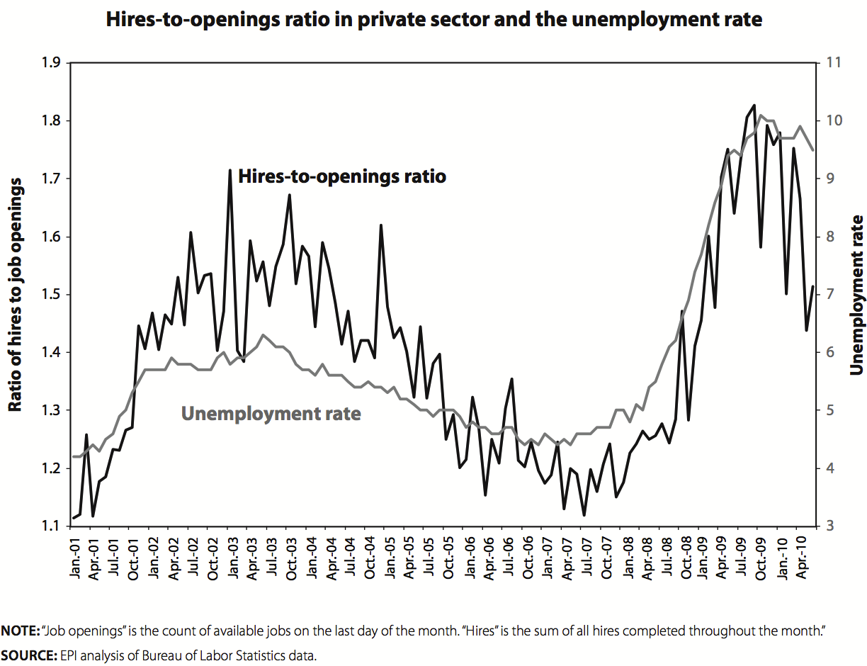
Last, we examine whether it is harder to fill job openings, an indication that structural challenges such as having workers with the right skills or in the right locations are evident. The data for the private sector, however, show it is easier to hire people now than in the last recovery or earlier in this recession, at least as reflected in the ratio of hires per job opening.
If it is difficult to hire adequately skilled workers it should take longer to fill vacancies, and the ratio of hires to openings should fall. In fact, as Figure E shows, the opposite has occurred: the ratio has been somewhat higher in this recovery (averaging 1.7 hires per job opening) relative to the earlier recovery (1.5 hires per job opening).6 Moreover, this ratio has increased since the recession started, which means there is no evidence of a growing structural problem. Remember, too, how these data are timed. “Job openings” is the count of available jobs on the last day of the month. “Hires,” on the other hand, is the sum of all hires completed throughout the month. As long as the number of hires is larger than the number of openings, it is taking less than a month to fill those jobs.
Looking for evidence on the employee side
The analysis now turns to an examination of the characteristics of the unemployed, especially the increase in unemployment, to see whether those who are unemployed are not well matched to the available jobs. Since those making the claim that there is severe structural unemployment have not presented any evidence about workers themselves—relying simply on the extent of overall unemployment—it is difficult to identify how to test their claim. However, it seems reasonable to assume that workers who are “inadequate” for current jobs would tend to have less education, be stuck in declining industries, and be older. To gauge whether this is the case the analysis that follows focuses on how the composition of unemployment and long-term unemployment has changed since 2007. That is, the analysis explores who (which type of worker) fueled the rise in unemployment and long-term unemployment.
The construction industry
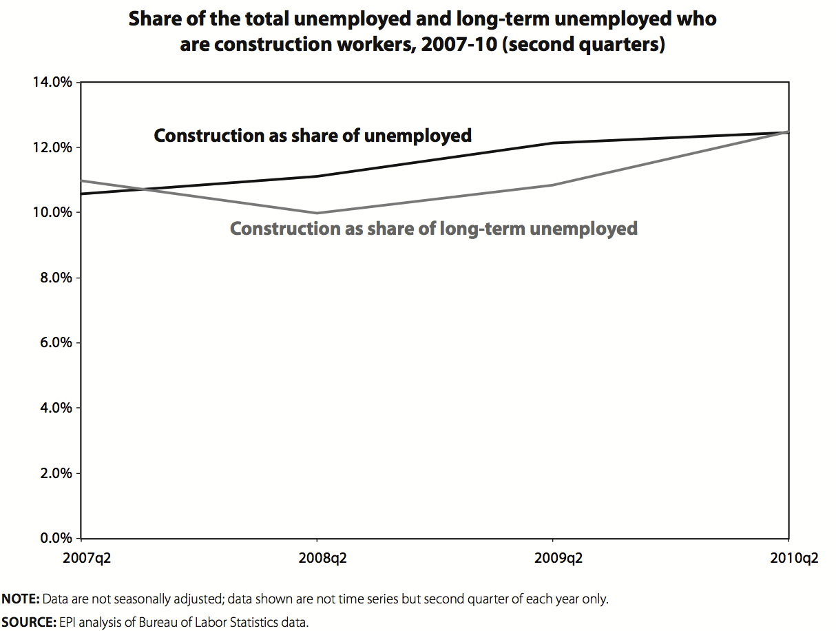
Much of the intuitive appeal of the structural unemployment claim is that the recession came because of the bursting of the housing bubble and the consequent shrinking of the construction sector. In this view, many unskilled workers who benefited from the expansion of the construction sector have been forced to find new types of work, presumably a difficult transition to make. I will not comment on the notion that construction workers are “unskilled,” which can easily be refuted by an examination of their wages and benefits and the training needed for jobs in this sector: this is plainly a judgment on “skill” set by the fact that workers in this sector do not necessarily need to have a college education or an advanced degree. Rather let us turn to what we know about unemployment in this sector. A minor foray into labor market data suggests that construction does not play the outsized role imagined by the president of the Minnesota Federal Reserve Bank and many other commentators. It is true that construction has lost nearly two million jobs in this downturn, 25% of all private sector jobs lost. But is this what has fueled growing unemployment? The answer is no. In the second quarter of 2010 (Figure F) unemployed construction workers made up 12.4 % of the unemployed and 12.5% of the long-term unemployed: this means that unemployed construction workers are not more likely to be long-term unemployed than those displaced from other sectors. Even before the recession, in 2007, unemployed construction workers were 10.6% of all unemployed and 11.0% of the long-term unemployed. This means that the composition of unemployment and long-term unemployment has barely shifted toward construction workers. Just because there was an extreme loss of jobs in construction does not imply that those workers are driving up unemployment. More research is needed to determine what happened to those workers displaced from construction, but it is apparent that many have found jobs in other sectors, and perhaps some of the immigrant workers in this sector have left the country.
The composition of unemployment
Table 2 provides a breakdown of unemployment by education level, based on published BLS data for those ages 25 and over (this group has presumably completed its education). The data are presented for the last quarter of the previous recovery to give an indication of the composition of unemployment before the recession. Data are also presented for the most recent quarter (the second quarter of 2010) and for that same quarter in 2009. This allows us to examine the changes over the entire recession and over the last year, a period where the Beveridge curve analyses are said to suggest a growing mismatch between the skills of the unemployed and those needed for job openings. What is most apparent from Table 2, however, is that the composition of unemployment has remained remarkably stable throughout this period. Workers with less education have higher unemployment rates at every point in the business cycle, but the unemployment rate has more than doubled for every education group over the downturn. Unemployment rose for each education group in the last year except the least-educated—those lacking a high school degree—a finding not very supportive of a recent twist against the least-educated workers.
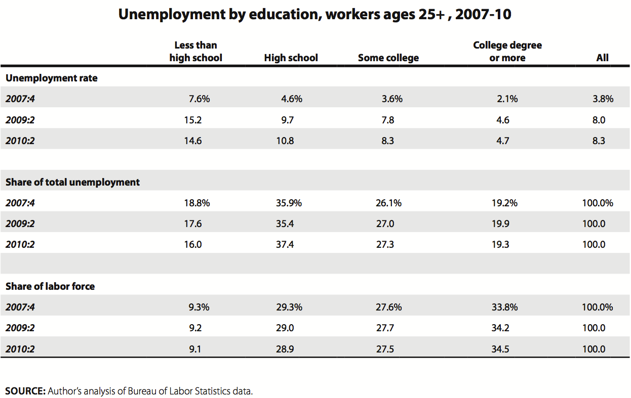
The second panel presents the composition of unemployment by education level, and the trends do not support any notion of this recession’s higher unemployment being fueled by those with the least education. The share of the unemployed with bachelor’s degrees or more is the same in the most recent quarter as before the recession. Those with some college have seen their share of unemployment bumped up slightly. These two groups make up the upper 61% of the labor force by education, and their share of unemployment has not fallen. One might even imagine that our expectation is that those with more education saw their share decline in a recession. Further analysis along these lines, looking at earlier recessions, would be useful.
Table 3 provides data on the rise in the unemployment rates by demographic group, including by education, for those ages 16 and over. The table also provides information on the long-term unemployment of each group: the share of the labor force that is long-term unemployed (27 weeks or more) and the share of the unemployed of each group that is unemployed long term. Data are presented for two time periods, the last half of both 2007 and 2009. These data are computed from the microdata and therefore are not seasonally adjusted, and so we make comparisons to similar time periods of the year.
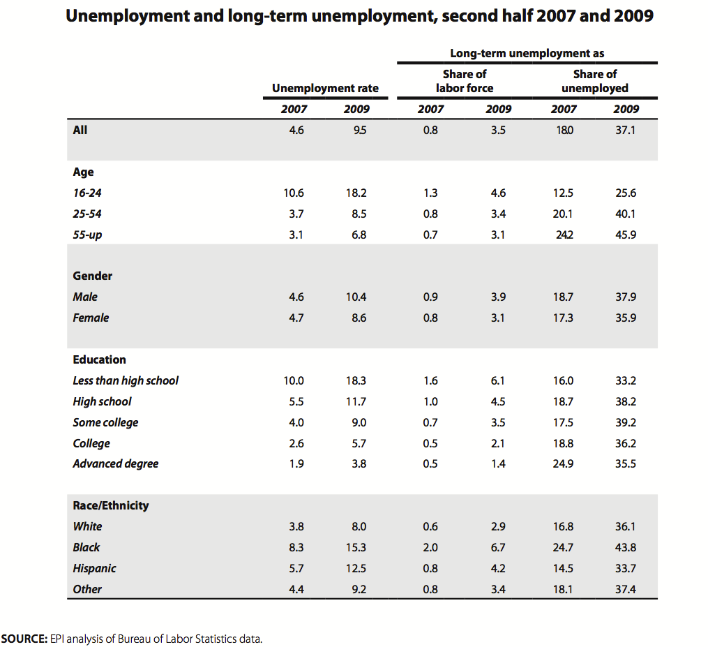
Between these two periods the unemployment rate more than doubled, up 4.9 percentage points to 9.5%. As we saw in the previous table, unemployment rose sharply for every education group. With these data we can separately examine those with a bachelor’s degree and those with advanced degrees and see that those with at most a college degrees saw their unemployment rate rise (up 119%) as fast as or faster than those with a high school degree or less. It does appear that older workers saw their unemployment rate rise disproportionately relative to younger workers (those ages 16 to 24), consistent with possible structural unemployment. Along these same lines it is true that the oldest workers had the highest share of long-term unemployed among the unemployed of their group (45.9%).
The biggest strike against the structural unemployment claim is that every education group has a similar share of its unemployment as long-term unemployed. Therefore, it seems that all workers once they are unemployed have a similar probability of being unemployed for at least 27 weeks regardless of their education level. That means that there is no particular education skew fueling the rise of long-term unemployment, just as we saw with overall unemployment in the previous table. If there has been some transformation of the workplace leaving millions of workers inadequate for the currently available jobs, as the structural unemployment claim would venture, then this transformation was definitely not based on a major educational upscaling of jobs, or at least that is what the unemployment data are telling us.
It is also clear that black workers suffer by far the most from long-term unemployment, with 6.7% of the black labor force affected. Blacks have an even larger share of the long-term unemployed than the whole group of those lacking a high school degree, even though the vast majority of the black labor force has a high school degree or further education. This finding, however, sheds no particular insight into the structural unemployment claim.
Conclusion on current structural unemployment
We increasingly hear or read claims that we have a serious structural unemployment problem, even to the extent of claiming that most of the unemployed beyond a normal (full-employment) rate face structural problems in finding work. This argument implies that unemployment difficulties reside in the workers who are unemployed: they either are located in the wrong place or do not have the required skills for the currently available jobs. If this is so, then macroeconomic tools such as fiscal policy (spending or tax cuts) or monetary policy cannot address our unemployment or long-term unemployment situation. But surprisingly, perhaps amazingly, there is no systematic empirical evidence for such assertions. Before policy makers adopt this framework—that much of our unemployment is “structural”—they should require much more evidence than is currently available. This is especially the case because common sense would suggest that the problem faced by the unemployed is a scarcity of job openings, a feature of the labor market facing every group of workers regardless of education, sector, occupation, and location.
II. Is there a looming shortage of college-educated workers?
The second structural issue to examine in the labor market is the claim that the economy faces a looming shortage of college graduates that, if not addressed, will cause flagging competitiveness and further growth in wage and income inequality. A related claim is that the rise in wage inequality over the last 30 years or so can be traced primarily to a technology-driven shift toward a greater need for “more educated” and skilled workers—i.e., college graduates—that was not met by a corresponding increase in the supply of college graduates. This is not necessarily a shortage we face in the next few years, according to some leading economists, but one we will face when the economy returns to full employment.
In response to a question posed by The Economist, “Is America facing an increase in structural unemployment?” MIT economist Daron Acemoglu wrote an article, “Yes, the labour force hasn’t responded to shifting demand for skills” (Acemoglu 2010). He wrote:
U.S. structural unemployment is up. But this is not a recent turn of events. It is the continuation of an ongoing process….U.S. employment and demand for labour have been undergoing profound changes over the last 30 years. While the demand for high skill workers, who can perform complex, often non-production tasks, has increased, manufacturing jobs and other “middling occupations” have been in decline. Also noteworthy is that over the last 10-15 years, many relatively low-skill, low-pay service occupations have been expanding rapidly.
David Autor (2010), another MIT economist and a co-author with Acemoglu of important papers on this topic, recently wrote a paper for the Hamilton Project and the Center for American Progress saying:
Although the U.S. labor market will almost surely rebound from the Great Recession, this paper presents a somewhat disheartening picture of its longer-term evolution. Rising demand for highly educated workers, combined with lagging supply, is contributing to higher levels of earnings inequality. Demand for middle-skill jobs is declining, and consequently, workers that do not obtain postsecondary education face a contracting set of job opportunities.
The policy implications of this impending skills shortage, according to Autor, are that “an increased supply of college graduates should eventually help to drive down the college wage premium and limit the rise in inequality,” and “the United States should foster improvements in K-12 education so that more people will be prepared to go on to higher education.” Moreover, we need “training programs to boost skill levels and earnings opportunities in historically low-skilled service jobs—and more broadly, to offer programs for supporting continual learning, retraining, and mobility for all workers.” In short, the U.S. needs to create many more college graduates and to provide various types of training for those who do not become college graduates.
But the need to vastly boost the total number of college graduates in the future may not be as great as Autor and Acemoglu believe. For instance, the trends in the 2000s indicate that the relative demand for college graduates is growing much more slowly than in prior decades. Plus, the wages for college graduates have been flat for about 10 years and running parallel to those with high school degrees, and they have been growing far more slowly than productivity. The implication of these trends is that a surge of college graduates, whatever the benefits (and there are many), can be expected to drive the college wage down. Wage inequality would diminish, but by pressing college graduate wages down (not just in relative terms), which is not the picture frequently painted of the future.
It is important to note that when we discuss the employment or wages of “college graduates” we refer to those with a four-year degree but no further degree; i.e., we exclude both those with advanced or “professional” degrees and those with associate college degrees or with “some college” but no degree past high school. This definition is important because the trends for the aggregate group of all those with a college degree, including those with advanced degrees, is always far more favorable than trends among those with at most a bachelor’s degree. For instance, in 2009 the unemployment rate among all college graduates was 4.6%, but those with at most a bachelor’s degree had a rate of 5.2% and those with advanced degrees had a rate of 3.4%. There are also very different wage trends among those with only bachelor’s degrees (not so good) and those with advanced degrees (much better). And so it is not surprising that analyses which look at the aggregate college group would recommend a vast increase in the supply of college graduates, but in reality what the trends mean is that we need more people with advanced degrees, not just college degrees. It is important to distinguish these groups so we are clear about the findings and implications.
Remarkably, few people seem to know how the workforce breaks down across these categories, and so we have illustrated them in Table 4. Note that about 21% of those employed have at most a bachelor’s degree, and another 10% have an advanced degree. Only 6.1% of non-immigrant employed workers lack a high school degree (or do not have a GED). A small group, roughly 10%, have an associate’s college degree, but an even larger group, about 20%, has attended college but has no degree past high school; this group is labeled “some college.”
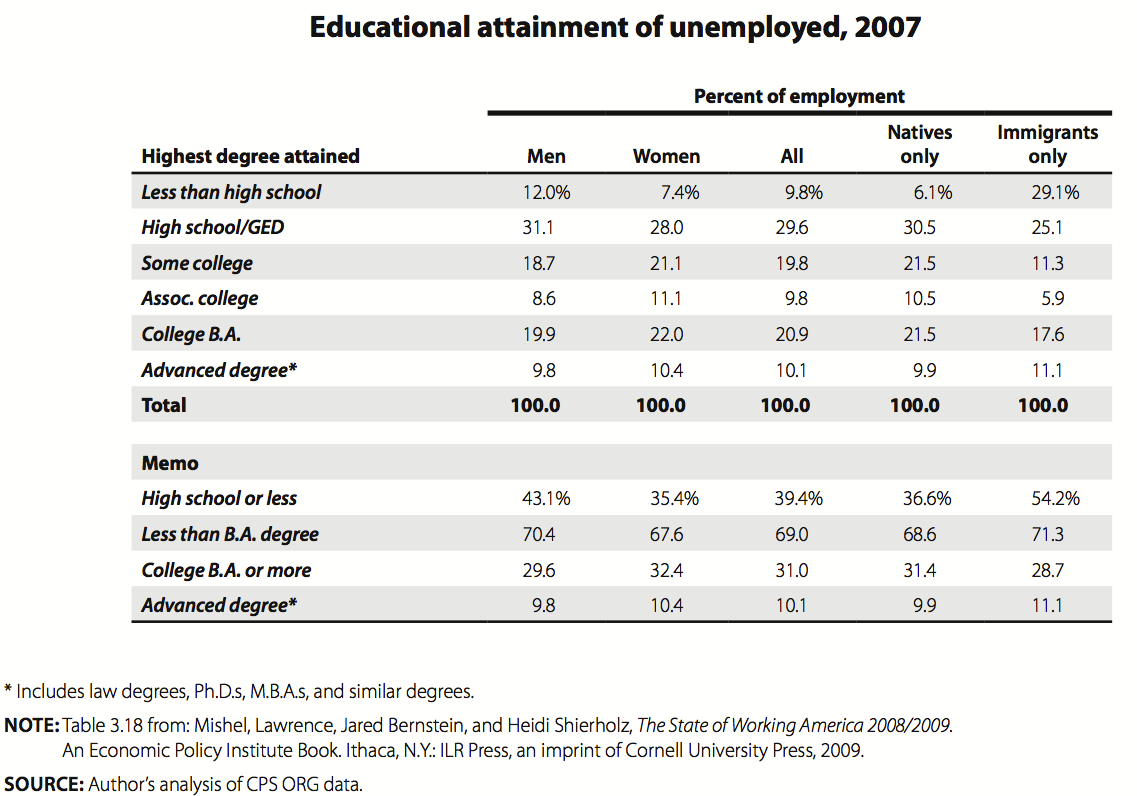
As we have argued in great detail in The State of Working America (Mishel et al. 2009) and in other studies dating back to 1994 (with my frequent co-author, Jared Bernstein) technological change and unmet needs for skill have had little to do with the growth of wage inequality over the last 30 years. This is not to say that there hasn’t been an increased employer demand for workers with more skills and more education: that has been happening for at least a century. What this means is that the growing need for “education” has been met with a growing supply. For instance, between 1973 and 2007 the share of the workforce with bachelor’s degrees and advanced degrees has doubled, from about 10% of the workforce with a bachelor’s degree and 4.5% with an advanced degree.
Regardless of the pressures or lack of them from the labor market, it would be a very positive thing to give every student who wants to obtain a college education a real chance—resources and the appropriate education in K-12—to attend and complete college, even if this drives down the college wage. One could argue that the issue facing the nation is not so much the need to vastly increase the number of college graduates but to give broader access to the asset of a completed college education. While employer demand is not booming so much that we need to vastly boost college graduation—it will continue to expand at a rate fast enough to satisfy employer needs—it may be the case that moving forward we will have a challenge to generate enough college graduates because we will be exhausting the traditional sources of their supply, the white middle and upper classes. (That is an avenue of research the author expects to pursue.)
Furthermore, it is still certainly the case that completing college will put a person in a better position in the workplace relative to someone who has less education, at least on average. And there are clear non-economic benefits as well, from enjoying better health to being a more informed citizen. Going to college will not be a guarantee of a certain type of income or even access to certain employer benefits—recent college graduates (not just during the recession) earn less in their mid-twenties than those who graduated in the late 1990s, and they are far less likely to have jobs with employer-provided health insurance (Mishel et al. 2009)—yet recent college graduates are clearly faring better than those who have attained only a high school degree.
Wage inequality: It is about much more than college
Though this paper does not attempt to break down the rise of wage inequality into its various components or to analyze the various causes of rising wage inequality, we would like to offer a few findings that suggest that the movement of the college wage premium—the gap between college and high school wages—is not central to the growth of wage inequality over time.
What is going on at the top
One of the remarkable aspects of the growth of wage and income inequality over the last three decades is the immense growth at the very top of these distributions relative to every other group. This trend has not been explored frequently with the wage distribution because the main sources of data do not allow one to separate out the top 1%. However, research using Social Security wage data that we have been able to update does permit an assessment of wage growth at the very top. Consider the two illustrations in Figure G. The first shows that annual wages for the top 0.1% grew 324% from 1979 to 2006, 20 times faster than the 16% wage growth of the bottom 90% of wage earners. The top 1%, which includes the top 0.1%, had 144% growth in annual wages. The next rung down, those in the 95-99th percentile of wages, saw wage growth of 52%, at least three times faster than wage growth of the bottom 90% but nowhere near the growth of the top 1%.
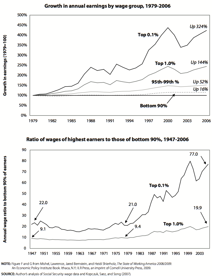
The second part of Figure G demonstrates the differences another way, detailing the ratio of the wages of the top 0.1% and the top 1% to the wages of the bottom 90%.
What happened at the top is not a trivial matter, as the top 1%’s share of all wages almost doubled from 7.3% to 13.6% over this period, nearly corresponding to the wage share loss of the bottom 90% (an 8.3 percentage-point decline in wage share). Thus, what the bottom 90% lost essentially accrued to the very top.
The stories usually told about changing production techniques and technological change and patterns of demand for skills have little to do with this critically important dimension of the growth of wage inequality.
The productivity–pay gap
During the postwar period into the 1970s productivity and pay (compensation or wages per hour) grew in tandem, but starting in the late 1970s productivity growth began to far outpace the growth of pay. Between 1979 and 2007 productivity in the nonfarm business sector grew by 73%, while the hourly compensation of production, nonsupervisory workers (over 80% of all employment) rose by about 4%, with all of that growth occurring in the boom period of the late 1990s. If anything, the divergence between pay and productivity has widened in recent years, with the divergence stronger in the last recovery than in any prior recovery back into the 1970s.
Figure H shows the gap between the growth of productivity and that of the hourly compensation of the median college- and high-school-educated worker since 1995. Each variable is indexed to 1995, so the lines show growth relative to their 1995 value. Hourly compensation grew in the late 1990s for each type of worker, though not at the rate at which productivity improved. After the momentum of the wage growth in the 1990s boom faded in the 2002-03 period, there was no growth in pay, though productivity continued to climb (it actually grew somewhat faster than in the late 1990s).
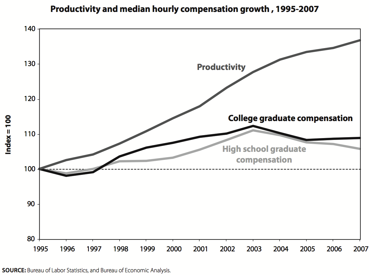
This gap between productivity and pay growth is a fundamental characteristic of the economy, and a key policy challenge is how to reconnect productivity and pay growth. It is hard to see how we can have rising consumption not based on asset bubbles or household debt unless we succeed in restoring wage growth as productivity rises.
That is not our focus here, however. The point for our current purposes is that the pay of college graduates is as disconnected from productivity growth as is the pay of high school graduates. Vastly expanding college enrollment and completion will do nothing to address this problem.
Education wage gaps are just a part of wage inequality
Many media and other discussions of the need for more people to complete college focus on the growth of the college wage premium, that is, the degree to which college graduates earn more than high school graduates. It is frequently assumed, as in the discussion by Autor and Acemoglu above, that the rising college premium accounts for the growth of overall wage inequality. In fact, that is not the case. Most of the growth of wage inequality—the wage gap between a high-wage and low-wage worker—can be explained by increased wage gaps among workers with the same education (e.g., the inequality of wages among college graduates) than by wage gaps between workers of different educations (e.g., the college wage premium). That being the case, then even if greater college enrollment and completion could eliminate the wage gap between college graduates and other workers, much of wage inequality (and the greater extent of wage inequality now versus the past) would still remain, and wage inequality would continue to grow.
In more technical language, there are two dimensions of wage inequality—”between-group” wage differentials, such as those relating to groups defined by their education and experience, and “within-group” wage inequality that occurs among workers of similar education and experience. The growth of within-group inequality can account for roughly 60% of the growth of overall wage inequality since 1973 (see Table 3.21 of The State of Working America; Mishel et al. 2009). The connection between growing wage gaps among workers with similar education and experience is not easily related to technological change unless interpreted as a reflection of growing economic returns to worker skills (motivation, aptitudes for math, etc.) that are not easily measured (that is, the regressions used to estimate education differentials cannot estimate these kinds of differentials). However, there are no signs that the growth of within-group wage inequality has been fastest in those industries where the use of technology grew the most. It is also unclear why the economic returns for measurable skills (e.g., education) and unmeasured skills (e.g., motivation) should not grow in tandem. In fact, between-group and within-group inequality have not moved together in the various sub-periods since 1973.
The timing of the growth of within-group wage inequality does not easily correspond to the technology story. For instance, consider what happened during the 1995-2000 period associated with a technology-led productivity boom: within-group wage inequality actually declined among women and was essentially flat among men. In the early 1990s, the so-called early stages of the “new economy,” within-group wage inequality grew moderately, whereas it grew rapidly in the low-productivity 1980s. Within-group wage inequality did, however, start growing again as productivity accelerated further after 2000 but still lags far behind the 1980s pace. All in all, changes in within-group wage inequality do not seem to mirror the periods of rapid productivity growth or technological change. Perhaps more important, the extent of within-group wage inequality is not affected at all by the supply-side education and training policies that are usually linked to a claim about a shortage of college graduates—so there is no reason to believe that vastly increasing college enrollment and completion will diminish within-group wage inequality.
The growth of inequalities among college graduates has an important practical interpretation as well. As Richard Freeman of Harvard University has pointed out, the wider variance of earnings among college graduates implies that obtaining a college degree is becoming a riskier investment.
Wage inequality in the 2000s
It is surprising that the story of the education premium driving wage inequality persists in the face of its complete failure to explain wage inequality in the 2000s. Most discussions, like those referred to above, make it seems as if the trends of the 1980s were a juggernaut that continued unabated throughout the 1990s and 2000s. In fact, the demand for college graduates relative to other workers has grown the least in this decade compared to other postwar decades, and the college premium, which has grown substantially since the late 1970s, has not grown much at all in recent years. Finally, the actual real wage of college graduates has not grown in about 10 years. Along these lines it is noteworthy that the jobs obtained by young college graduates in recent years pay less than the jobs obtained by those graduating five and 10 years earlier, both in terms of their wages and in the probability that employers provide health insurance or pension coverage.
Together, these trends suggest that the forthcoming supply of college graduates is meeting the growing demands of employers for such workers. Moreover, these trends suggest that a rapid expansion of the supply of college graduates will cause the wages of college graduates to decline, assuming that the productivity–pay gap continues unabated. We can expect the wages of young college graduates and male college graduates (whose wages are currently in decline) to experience the steepest declines. That may or may not be a desirable outcome, but it is definitely not the outcome that most people would expect given the claims that graduating many more people from college will prevent a rise of inequality or reduce inequality.
A relatively flat line cannot explain a rising line
Table 5 presents two wage ratios, one describing the difference between high-wage and middle-wage workers (the logged wage ratio of the 95th percentile to the median) and the other the difference between the wages earned by college graduates and high school graduates (called the college–high school wage premium). The data in Table 5 show the changes in the last three business cycles (1979-89, 1989-2000, and 2000-07) in terms of both the total change and the annual change (which allows for a better comparison of periods of different length).
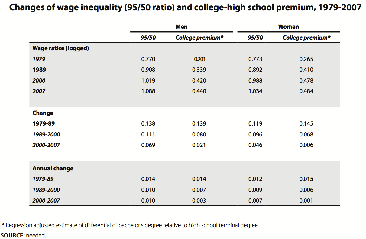
In the 1980s the trends in overall wage inequality at the top half of the wage distribution—illustrated by the 95/50 wage ratio—correspond closely to the growth of the college wage premium. In the 1990s business cycle both wages continued to rise, though at a somewhat slower pace. More significant for our discussion, though, is that the college premium in the 1990s no longer was rising as fast or faster than the 95/50 wage ratio: rather, the college premium rose about 70% as fast. This divergence became even stronger in the 2000s, when the college wage premium rose hardly at all (up 0.003 log points per year for men) and the 95/50 wage ratio continued to grow strongly among men (the same 0.01 log point pace as in the 1990s) and among women (though at a somewhat slower pace than in the 1990s). It is hard to explain how a trend that became relatively flat—the growth of the college wage premium—is said to be driving fast-growing wage inequality.
The relative demand for college graduates slows down
Table 6 presents estimates of changes in the relative wages, relative supply, and relative demand for college graduates (those with a four-year degree or more and some of those with an education beyond high school) for periods covering the last 90 years (from the work of Claudia Goldin and Lawrence Katz). These measures show whether college graduates are becoming better paid and more plentiful relative to those without a college degree. Using an assumed value for the elasticity of substitution (i.e., how easy it is to replace a college worker with one who does not have a college degree in the process of producing goods and services) one can calculate, as this table does, trends in relative demand for college graduates. In effect, the more the relative supply or the relative wage of college graduates increases, the more the relative demand for college graduates must have risen (or else the increased relative supply would have led to lower relative wages). Because these measures include those with an advanced degree beyond college along with those with at most a bachelor’s degree, they overstate, in my view, the growth of the relative demand and wages of those with a bachelor’s degree (although one cannot be sure, since some workers with less than a college degree are also included). For purposes of this discussion we will refer to this group as college graduates.
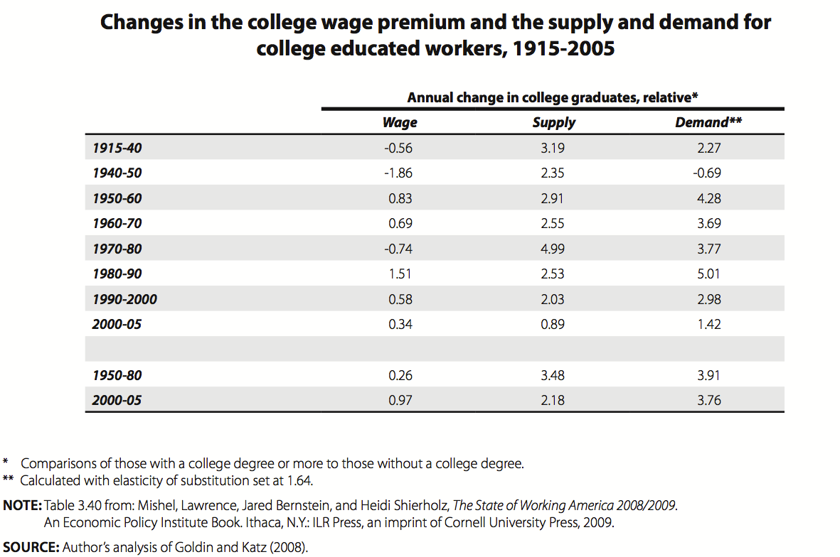
What does the pattern in Table 6 tell us? First, the relative demand for college graduates grew over the entire period (except during the special circumstances of World War II, when wages grew faster for non-college workers), and an expanding relative supply of college graduates occurred throughout this period. In this light we can safely say that employers have demonstrated an increasingly greater need for college graduates over this entire period.
The data in Table 6 are also informative about the last few decades. In the 1970s the wages of college graduates declined relative to other workers in response to a rapid growth in the supply of college graduates that overwhelmed the growing need for them. But their relative wages rapidly recovered and grew in the 1980s. It is this growth of the college wage at a time of rapid growth in overall wage inequality that has focused attention on education/wage gaps and led to technological change as an explanation.
It is critical to note, however, that the trends since 1990, especially in the 2000s, do not fit an explanation of a technologically driven demand for college-educated workers driving up their wages and therefore driving up wage inequality. Note that the relative demand for college graduates grew more slowly in the 1990s than in any previous period since World War II, and that relative demand grew even more slowly in the 2000-05 period than in the 1990s. That is, the rapid growth of the need for college graduates is not a juggernaut launched in the early 1980s that continues to this day: rather, the relative demand for college graduates has been slowing down in each decade since the 1980s and is now growing at a historically slow pace. It is this slow pace of the most recent period that might be the best clue to the future needs for college graduates.
This change in trend would suggest that the argument that we are in a time of historically rapid change in the need for education/skills in the workplace is not accurate, at least if one equates a college degree with skills. In fact, during the entire period since 1980 the relative demand for college graduates grew no faster than during the prior 30 years. So, given that wage inequality grew faster in recent decades than in earlier decades when technologically driven demands for college graduates were at least as rapid, it is difficult to say that a more rapid rise in technological change drove up wage inequality in recent years. That is, there was not an acceleration of a technologically driven demand for college graduates that can explain why wage inequality rose in the last three decades but did not in the prior three decades.
The fact that skill-biased technological change has not been more rapid in recent years, as evidenced by the measured growth in relative demand for college graduates, is even clearer when one digs a bit deeper into the measures used in Table 6. The measure of relative demand, as explained earlier, is deduced from changes in relative supply and the growth in relative wages. It is more accurate to say that this measure of relative demand captures all non-supply factors that influence relative wages, including all institutional changes (minimum wage, unionization, norms, etc.) and all changes in relative demand (arising from technological change but also globalization, shifts in consumer demand toward services, and so on). In this light, technical change is just one component driving the measured “relative demand” for college graduates presented in Table 6. Given that other factors have been more important in the last few decades, including institutional ones, such as the lowering of the minimum wage and deunionization (which raise the relative wage of college graduates by lowering the wages of those without a college degree), and globalization, it seems certain that technical change was playing a smaller role in the last few decades than in the pre-1980 period.
Last, note that the growth of the college wage premium in the 2000-05 period was the slowest of any period, other than when the premium actually declined in the 1970s (due to the rapid expansion of college graduates) and during World War II. This measure, however, includes those with advanced degrees beyond college (and some who have less than a four-year college degree), so it may actually be overstating the growth in the college premium in recent years.
The wage growth of college graduates in the 2000s
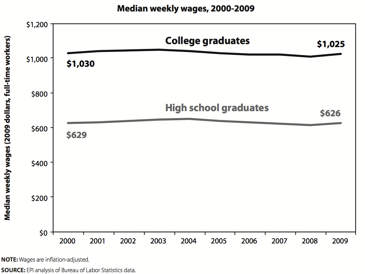
We have already seen in Figure H that the real hourly compensation (wages and benefits) of both college graduates and high school graduates failed to grow in the recovery of the prior business cycle. Figure I shows the trends of the median weekly earnings of college graduates (those with just a bachelor’s degree) and high school graduates since 2000. These data are drawn from the Bureau of Labor Statistics wage series for those ages 25 and over. As the data show, the median college graduate was earning the same weekly pay in 2009 as in 2000. This stagnation of wages for college graduates preceded the current Great Recession.
The wage trends are even more disappointing when one examines recent college graduates, a group one might imagine includes the best technologically prepared group of college graduates. In updating State of Working America analyses we have found that young college graduates (defined as those ages 23-29) were earning lower wages than those who graduated ahead of them. For instance, between 2000 and 2007 the wages of young college graduates fell 2.5% among men and 1.6% among women. The wages fell a bit more during the recession years from 2007 to 2009.
Health insurance coverage has fallen among young college graduates in recent years, from 70.6% covered in 2000 to 65.7% in 2007. Pension coverage among young college graduates fell from 54.6% in 2000 to 46.6% in 2007. This sharp reduction in both health and pension benefits for young college graduates over the last few years indicates a substantial job quality problem even for those with the highest educational attainment.
It is also noteworthy that weekly wages have fallen about $40 for the median male full-time college graduate between the first half of 2000 and the comparable period in 2010.
Will a large expansion of college graduates lead to reduced wages and benefits?
The most recent trends, those in the prior business cycle plus those in the current downturn, indicate that the demand for college graduates is growing at a historically slow rate and that the wages of college graduates have been stagnant. The earlier discussion of structural unemployment in the recession showed that unemployment has affected college graduates a great deal and that the college graduate share of unemployment and long-term unemployment has remained at pre-recession levels. These data provide some confirmation that the recession is not introducing a major shift favorable to college graduates. In this environment we have seen that the wages and benefits of young college graduates have deteriorated relative to those of their older siblings who graduated ahead of them. My conjecture would be that these demand conditions can be expected to prevail in the future and that any major expansion of the supply of college graduates (beyond the pace of expansion in recent years) would necessarily lead to steady decline in college wages and benefits, with the wages and benefits of recent college graduates and male college graduates suffering the most. This would definitely lead to less wage inequality, as the wage gap between college and high school graduates would shrink. This, however, is hardly anyone’s favored recipe for shared prosperity.
It would be useful to work through all the expected employment shifts to determine whether there are any trends that might lead to a surge in the need for college graduates, though none come to mind. Some trends suggest a potential slowing of the growing demand for college graduates, such as an expected shrinkage of the financial sector and pressure on the federal and state and local governments to curtail employment as spending grows more slowly. We know that there is a surge in college enrollment induced by the recession that may already be providing a major boost to their supply. If so we may have more supply and less demand for college graduates than recent modeling would show.
The future
Finally, let us look at the pay levels and education and skill requirements of the jobs that are projected by the Bureau of Labor Statistics to be created over the next 10 years. These projections do not take account of the trends noted just above. Some analysts examine which occupations are expected to grow at the fastest (and slowest) rates, while others examine which occupations will create the most (or least) absolute number of jobs. Our purpose here is to assess whether the types of jobs that are expected to be created will significantly change the wages that workers earn or significantly raise the quality of work or the skill/education requirements needed to fill tomorrow’s jobs. This exercise requires an analysis of how the composition of jobs will change, i.e., which occupations will expand or contract their share of overall employment.
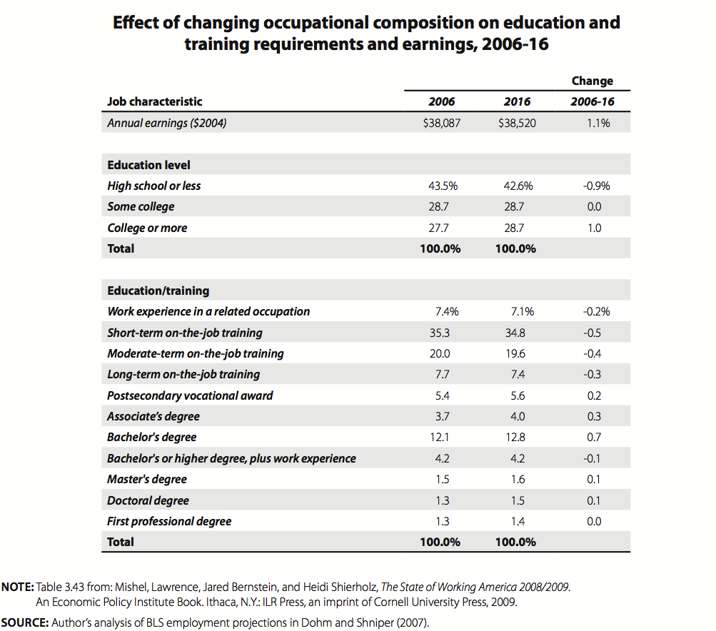
Table 7 presents such an analysis for the 754 occupations for which the Bureau of Labor Statistics provides projections from 2006 to 2016 (there is a later BLS projection than this one, though I doubt it will show different results). Through a shift-share analysis (weighting each occupation’s characteristic, such as wage level, by its share of total employment) we can see what the characteristics of jobs are in 2006 and what they will be in 2016 if the projections are realized.
There are a few drawbacks to this analysis. One is that it does not take into account how the jobs of a particular occupation (one of the 754 we analyze) will change over the next 10 years. (For example, will employers’ education requirements for a loan officer or a parking lot attendant grow?) In other words, the changing “content” of particular jobs is a dimension of future skill requirements not captured by our analysis. Second, we have no point of historical comparison (due to lack of data availability owing to changing occupational definitions) for judging whether growth expected in the future is fast or slow relative to the past.
There are some strengths of the analysis, too. We are able to look at the education and skill requirements of occupations in two ways. One is to look at the educational attainment in each occupation now and assume that such education levels will prevail in the future. The second is to use the education and skill requirements that the BLS assigns to each occupation. So, we have one measure that reflects the workers that employers currently hire into each occupation (the “revealed preference” of employers) and another measure that draws on BLS’ judgment. There is still much to learn from how occupational composition shifts will affect the job and wage structure, especially whether the claim that there will be a jump in the need for college graduates is consistent with these projections.
Table 7 shows that employment will shift to occupations with higher median annual wages, but the effect will be to raise annual wages by 1.1% over 10 years (or about 0.1% per year). This is not a large change compared to the real wage growth that normally occurs each year or to the composition effects evaluated in earlier years (using a different occupation coding system). The analysis also shows that the jobs of the future will require greater education credentials but not to any great extent. In 2006, according to these data, the occupational composition of jobs requires that 27.7% of the workforce have a college degree or more. This share will rise by one percentage point to 28.7% by 2016. The jobs will entail no need to expand the share of the workforce with only some college, a group roughly the same size as the required college-educated workforce. The demand for workers with a high school degree or less will fall slightly, from 43.6% to 42.6% over the 2006-16 period.
Table 7 also provides a detailed assessment of the education or training needed to be employed in an occupation. The results suggest a shift to the occupations that require the most education or training (those requiring a bachelor’s degree or more increase their employment share by less than a percentage point) and, correspondingly, a shift from those occupations that require the least education and training (the bottom three categories lose a 1.1 percentage-point share of employment). Nevertheless, this method of gauging occupational skill requirements yields a lower estimate of the share of jobs requiring a college degree or more, just 21.4% in 2016; the other method, based on actual education in those occupations today, suggests a higher 28.7% of college graduates needed. So, using assessments of skill requirements in each occupation suggests a somewhat smaller growth in skill requirements and growth to a lesser level in 2016.
These projections show that occupational upgrading will continue in the future, as the jobs created will be in occupations with somewhat higher wages and educational and training requirements. This trend has been evident over the last century, and the developments in the future do not appear to be extraordinary in any sense. The need to greatly expand the size of the college-educated workforce cannot be demonstrated by looking at occupational projections. If future workers will need much more education than those currently working, it will only occur if the education requirements in particular occupations rise substantially.
Conclusion on the looming shortage of the college educated
More education and training is necessary to obtain the long-term growth we desire and to provide equal access to job opportunities for the entire population and workforce. This was the case 30 years ago and remains the case today. Individuals deciding whether to pursue more education and training would be wise to enhance their human capital, as it will place them in a better position as wage earners and as citizens.
That being said, the challenge we face with high and persistent unemployment exceeding 9% is not better education and training for those currently unemployed. Rather, we need more jobs. Moreover, the reason we have seen a huge increase in wage and income inequality over the last 30 years is not a shortfall in the skills and education of the workforce. Workers face a “wage deficit” much more than a “skills deficit.”
Moving forward, our primary challenge is not generating a greatly expanded supply of college graduates because otherwise employers will not have a sufficient number available to them. Rather, we need to provide access to further education (i.e., college completion) for the many working class and minority children who are now excluded from it so they can have a full opportunity to compete for the jobs that require such an education. Greatly expanding the pool of college graduates may help to lessen wage and income inequalities, but it will do so by forcing young college graduates to take jobs with lower pay and benefits than earlier cohorts and by pushing downward the average college graduate’s earnings (especially those of men). Those with advanced degrees will continue to see their salaries rise, but that group is only about a tenth of the workforce and even with rapid expansion its share will only rise slowly.
The challenge, in my view, is to provide a much broader path to prosperity, one that encompasses those at every education level. The nation’s productivity has grown a great deal in the last 30 years, up 80% from 1979 to 2009, and such productivity growth or better can be expected in the future. Yet with all the income generated in the past and expected in the future it is difficult to explain why more people have not seen rapid income growth. It is not the economy that has limited or will limit strong income growth, but rather the economic policies pursued and the distribution of economic and political power that are the limiting factors.
Acknowledgements
The first part of the paper draws on joint work by the author and EPI economist Heidi Shierholz and research assistant Kathryn Edwards. The second part draws on many years of work conducted jointly with former EPI economist Jared Bernstein and with Richard Rothstein, an EPI research associate. The paper was originally presented at the Scholars Strategies Network conference, “The Next American Economy: Debating How to Spur Innovation, Growth, and Jobs,” Harvard University, September 30, 2010.
An earlier version of this paper was prepared for the Scholars Strategy Network Conference on “The Future of the American Economy” in September 2010 as “Worrying about the Wrong Things: A Skeptic’s Look at Structural Problems in the Labor Market.”
Endnotes
- Data sources are: Table 7. Capacity Utilization in Manufacturing. Series ; G.17 Industrial Production and
- Domestic Purchases; Real Final Sales to Domestic Purchasers, Chained Dollars. Bureau of Economic Analysis; Gross Domestic Product. National Income Product Accounts. Table 1.1.6;. Real Gross Domestic Product, Chained Dollars. Bureau of Economic Analysis; 6. Congressional Budget Office. Table 2.2 Key Assumptions in CBO’s Projections of Potential Output. “The Budget and Economic Outlook 2010-2020.” August 2010.
- Output per hour of nonfarm business sector from “Productivity and Costs”, Bureau of Labor Statistics. Number shown describes growth from first quarter 2009 to first quarter 2010, first quarter 2010 to second quarter 2010, and fourth quarter 2007 to second quarter 2010. See http://www.bls.gov/news.release/pdf/prod2.pdf .
- Net investment from NIPA, reflects investment less depreciation.
- “Seasonally Adjusted Statewide Unemployment Rates. Local Area Unemployment Statistics,” Bureau of Labor Statistics. The 11 states are Oklahoma, Iowa, Minnesota, Wyoming, Kansas, Hawaii, Vermont, New Hampshire, Nebraska, North Dakota, and South Dakota. Population includes the civilian noninstitutional population age 16 and older from the “Local Area Unemployment Statistics,” Bureau of Labor Statistics.
- All job opening, layoffs, and hiring data used throughout are seasonally adjusted, total U.S. from the “Job Openings and Labor Turnover Survey,” Bureau of Labor Statistics.
- The data are for private-sector openings and hires to avoid any impact of temporary Census hiring.
References
Acemoglu, Daron. 2010. “Is America Facing an Increase in Structural Unemployment? Yes, the Labour Force Hasn’t Responded to Shifting Demand for Skills.” The Economist, July 25. http://www.economist.com/economics/by-invitation/guest-contributions/yes_labour_force_hasnt_responded_shifting_demand_skills/print
Altig, David. 2010a. “A Curious Unemployment Picture Gets More Curious.” Macroblog. Federal Reserve Bank of Atlanta, July 16. http://macroblog.typepad.com/macroblog/2010/07/a-curious-unemployment-picture-gets-more-curious.html
Altig, David. 2010b. “Just How Curious Is That Beveridge Curve?” Macroblog Federal Reserve Bank of Atlanta, August 18. http://macroblog.typepad.com/macroblog/2010/08/just-how-curious-is-that-beveridge-curve.html
Autor, David. 2010. “The Polarization of Job Opportunities in the U.S. Labor Market: Implications for Employment and Earnings.” Center for American Progress and The Hamilton Project. http://econ-www.mit.edu/files/5554
Canalog, Victor. 2010. “Reis Quarterly Briefing.” Reis Reports. Speech given on August 11. http://www.reisreports.com/blog/category/reis-quarterly-briefing/
Kocherlakota, Narayana. 2010. “Inside the FOMC.” Speech given at Marquette, Michigan, August 17. http://www.minneapolisfed.org/news_events/pres/speech_display.cfm?id=4525
Mishel, Lawrence, Heidi Shierholz, and Kathryn Edwards., 2010. “Reasons for Skepticism About Structural Unemployment” Washington, D.C.: Economic Policy Institute
Mishel, Lawrence, Jared Bernstein, and Heidi Shierholz. 2009. The State of Working America 2008/2009. Ithaca, N.Y.: Cornell University Press.
Tasci, Murat, and John Linder. 2010. “Has the Beveridge Curve Shifted?” Economic Trends. Federal Reserve Bank of Cleveland, August 10. http://www.clevelandfed.org/research/trends/2010/0810/02labmar.cfm