Full Report
The US economy has performed better when the president of the United States is a Democrat rather than a Republican, almost regardless of how one measures performance…The superiority of economic performance under Democrats rather than Republicans is nearly ubiquitous: it holds almost regardless of how you define success. By many measures, the performance gap is startlingly large. (Blinder and Watson 2016)
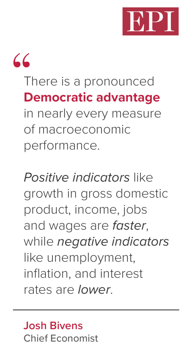
This quote is not from an op-ed written by a political pundit; it’s from a 2016 peer-reviewed article in the American Economic Review. Adding in data since this article was written does not change its conclusion. There is still a pronounced Democratic advantage in nearly every measure of macroeconomic performance. Positive indicators like growth in gross domestic product (GDP), income, and wages are faster, while negative indicators like unemployment, inflation, and interest rates are lower. For those who want to skip right to this bottom line, see Table 1.
Besides the pronounced superiority of macroeconomic performance under Democratic presidents, the fruits of economic growth are also distributed substantially more equally under Democratic presidents. This is true even for data that are dominated by market-based incomes and exclude most of the federal government’s safety net and income support payments. It is, in short, not just driven by Democrats being more supportive of using taxes and spending to reduce inequality.
Given how clear the data are, it is striking that public opinion polling has consistently shown that voters rate Republicans more highly as the party that is better at managing the economy.1
The data presented in Blinder and Watson (2016) and in this report obviously cannot claim to measure the causal effect of partisan White House control on economic performance. The president does not have total control over the economy, and there is a lot of luck and chance that determine economic outcomes. Those who prefer Republican stewardship may consider it just bad luck again and again that keeps their preferred policy ideas from translating into faster growth in real time. And bad luck is a real issue in these examinations. For example, both the Obama administration and the Biden administration inherited a depressed macroeconomy that had been buffeted by severe shocks whose aftereffects had to be managed.
But it is our sense that the simple facts on real-time economic performance during Democratic and Republican administrations—and how starkly better this performance is during Democratic administrations—aren’t particularly well known. And these facts constitute important information people should have during this time of rampant misinformation.
Aggregate results
It is difficult to tell what respondents to opinion polls have in mind when they are asked about “the economy.” For example, respondents often rate the Republican party higher as economic managers yet rate the Democratic party more highly on issues related to health care. But health care is, by far, the single largest sector of the U.S. economy, affecting economic outcomes of households, businesses, and governments in significant ways. It seems hard to imagine that one could manage health care poorly and yet be a decent economic manager overall since health care is nearly a fifth of the U.S. economy.
But it seems fair to guess that what constitutes good management of “the economy” in the minds of polling respondents is fast economic growth, fast income growth, low unemployment, and low inflation. In the jargon of economists, it means successful macroeconomic stabilization.2 Further, these variables can indeed respond relatively quickly (within a year) to decisions of policymakers. Besides these variables, we also include a few others (measures of business investment and market incomes) that more closely measure the performance of the private sector.
Table 1 shows the average performance of a range of key macroeconomic variables under Democratic and Republican administrations since 1949, the beginning of Harry Truman’s first elected term.3 There is a Democratic advantage in every measure.
Macroeconomic performance by partisan control of the presidency, 1949–present
| Democratic | Republican | Total | Democratic advantage? | ||
|---|---|---|---|---|---|
| Real Gross Domestic Product, % growth | (1) | 3.79 | 2.60 | 3.15 | Y |
| Real Net Domestic Product per capita, % growth | (1) | 2.60 | 1.28 | 1.89 | Y |
| Job growth, total, % | (1) | 2.47 | 1.07 | 1.72 | Y |
| Job growth, private, % | (1) | 2.55 | 0.97 | 1.71 | Y |
| Unemployment rate | (1) | 5.41 | 6.01 | 5.73 | Y |
| Real wages, % growth | (1) | 1.08 | 0.88 | 0.97 | Y |
| Real business investment, % growth | (1) | 6.58 | 2.98 | 4.65 | Y |
| Real personal income excluding government transfers, % growth | (1) | 2.66 | 1.41 | 1.99 | Y |
| Inflation, all items, % | (1) | 2.91 | 3.29 | 3.13 | Y |
| Inflation less food and energy, % | (2) | 2.87 | 3.59 | 3.24 | Y |
| Federal funds rate | (3) | 4.17 | 4.94 | 4.60 | Y |
1 = available all years since first Truman Administration (1949)
2 = available since 1959
3 = available since 1954
Below we provide a brief description of each variable and why it is included in our analysis.
Real (inflation-adjusted) gross domestic product (annual % growth) is by far the most cited variable for assessing overall macroeconomic health. Gross domestic product (GDP) is the value of all final goods and services produced and sold in the United States—a measure of total economic activity and incomes. The Democratic advantage in this measure (1.2 percentage points) is very large. Given the $27.4 trillion GDP in the United States in 2023, just a single year of growing 1.2% faster would translate into an additional $330 billion in income that could accrue to U.S. families.
Real net domestic product per capita (annual % growth) is a lesser-known measure of economic health, but it measures with even greater precision the potential that economic growth provides for living standards to rise. It provides this greater precision by accounting for population growth and depreciation of the nation’s capital stock. Both are important influences for potential growth in living standards.
For example, real GDP growth has decelerated significantly in recent decades. Some of this reflects genuinely worse economic performance, but part of it simply reflects slower population growth (and hence slower labor force growth) in more recent decades. To account for this, a measure of real domestic product per capita is valuable. Second, recent decades have also seen a large rise in the rate of depreciation in the economy, as more and more of the nation’s capital stock is composed of short-lived computers that need to be replaced regularly. Because depreciation is a drain on gross domestic product, a measure that accounts for this drain—net domestic product—more faithfully tracks the potential of the economy to deliver rising living standards (rather than to simply maintain the nation’s capital stock).
Making these adjustments for population growth and depreciation yields a measure of net domestic product per capita—and here the Democratic advantage is even larger than it is for real GDP growth. At the 2.6% annual growth rate that has characterized Democratic administrations, per capita living standards could double every 28 years—within a single worker’s career. At the 1.3% rate that has characterized Republican administrations, this doubling would take 56 years or twice as long.
Total job growth is the percentage increase in total employment (private-sector plus government employment) over the past year. During Democratic administrations, total job growth has averaged 2.5% annually, while it is barely over 1% annually during Republican administrations. Applied to today’s total workforce, this would imply nearly 2.4 million more jobs created every year under Democratic administrations.
Private job growth is the percentage increase in private-sector employment over the past year. The Democratic advantage is even larger in private job growth than it is for total job growth. During Democratic administrations, private job growth has averaged 2.6% annually, while it is less than 1% annually during Republican administrations. This also means that private-sector job growth is faster than overall job growth during Democratic administrations but that private-sector job-growth is slower than overall job growth during Republican administrations.
The unemployment rate is a straightforward measure of how easy it is for jobseekers to find work. Applied to today’s labor force, the Democratic advantage in this measure (0.6 percentage points) would translate into roughly 1 million more people being able to find jobs. Since 1972 the Bureau of Labor Statistics (BLS) has also gathered data on the unemployment rate of Black workers, and there is a consistent Democratic advantage in this measure as well. We show this comparison in Table 2 when we compare performance for the post-1980 periods.
Real (inflation-adjusted) wages for production and nonsupervisory workers measure hourly wages for the roughly 80% of U.S. workers who are not managers. Here again the Democratic advantage is substantial.
Real business investment (annual % growth) is a measure of investment in structures, equipment, and intellectual property made by private-sector businesses (excluding both residential investments and changes to inventories). Some have argued that Republican policy mainstays (lower taxes on corporations and rollbacks of federal regulations) boost economic growth through their alleged effect on business investment. Yet this category shows the largest Democratic advantage in performance by far, with investment growth running at more than double the pace during Democratic administrations than it does during Republican ones.
Real personal income excluding transfers per capita (annual % growth) is a measure of market incomes, excluding the effect on personal incomes of tax changes or public benefits (like Social Security). Again, to the degree that Republican rhetoric reflected actual results, there should be a Republican advantage in generating greater growth in market-driven incomes. Yet again the Democratic advantage is large in this category, with market-driven personal incomes rising at almost double the pace of growth compared with times when Republicans hold the presidency.
Inflation. Average rates of inflation—both overall and “core” measures that exclude volatile food and energy prices—are lower during Democratic administrations. The gap is very small, but it tilts toward Democratic administrations. It’s worth noting that because all of the income and activity measures above are adjusted for inflation already, it should be mostly irrelevant which party generally presides over lower inflation. But recent years have shown that even after accounting for the impact of inflation on wages and incomes, the public does seem to care about inflation in and of itself.
The federal funds rate is a measure of the interest rate set by the Federal Reserve. This rate roughly sets the level of most of the economy’s other interest rates (like mortgage rates, or rates on car loans or credit cards), so it serves as a good barometer for the pressure that interest rates generally might be putting on household budgets. The federal funds rate (only tracked since 1954) is also lower during Democratic administrations than Republican, which means that borrowing money is generally cheaper during Democratic administrations.
Table 2 shows an almost identical set of indicators as Table 1 but measured only since 1981, the first term of the Reagan administration. There are two reasons to look at this set of more recent administrations. First, if the Democratic advantage mostly stems from the performance of very long-past administrations (say that the Kennedy/Johnson administration had superior performance relative to the Eisenhower administration), perhaps many will simply find these comparisons irrelevant.
The second reason has a bit more of a quantitative basis: Some of the variables examined above have possible time trends (both real GDP and inflation, for example), with clear differences between the period before the Reagan administration and the period after the Reagan administration.4 Before 1980, Democratic and Republican control of the White House was split exactly equally, with both parties having 16 years in power between 1948 and 1980. But because Republicans held the White House in 60% of the years after this, perhaps Republican performance is penalized simply by having held power disproportionately in later decades when variables like GDP growth were trending downward, driven by structural forces that neither party had any control over. “Leveling the playing field” by focusing solely on the later period addresses this issue. If slow growth rates after 1980 were driven by structural forces that neither party could affect, then only focusing on this period would penalize both parties equally.
Macroeconomic performance by partisan control of the presidency, 1981–present
| Democratic | Republican | Total | Democratic advantage? | ||
|---|---|---|---|---|---|
| Real Gross Domestic Product, % growth | (1) | 2.90 | 2.51 | 2.68 | Y |
| Real Net Domestic Product per capita, % growth | (1) | 1.86 | 1.39 | 1.59 | Y |
| Job growth, total, % | (1) | 1.92 | 0.81 | 1.31 | Y |
| Job growth, private, % | (1) | 2.17 | 0.81 | 1.41 | Y |
| Unemployment rate | (1) | 5.80 | 6.27 | 6.07 | Y |
| Unemployment rate, Black jobseekers | (1) | 10.61 | 11.85 | 11.31 | Y |
| Real wages, % growth | (1) | 0.64 | 0.28 | 0.44 | Y |
| Real business investment, % growth | (1) | 6.52 | 2.64 | 4.33 | Y |
| Real personal income excluding government transfers, % growth | (1) | 2.05 | 1.42 | 1.69 | Y |
| Inflation, all items, % | (1) | 2.11 | 2.96 | 2.59 | Y |
| Inflation less food and energy, % | (1) | 2.08 | 3.06 | 2.63 | Y |
| Federal funds rate | (1) | 2.69 | 5.10 | 4.05 | Y |
1 = available all years
Even looking only at the post-1980 period, there is a pronounced (and mostly similar in size) Democratic advantage across all variables, including inflation. Focusing on this more recent period also lets us add a measure—the unemployment rate for Black jobseekers (which the Bureau of Labor Statistics only began collecting in 1972).
Distributional results
Tables 3 and 4 show economic performance by income class under Democratic and Republican administrations. In earlier work looking at trends through the early 2000s, Bartels (2016) documented that household income growth was faster on average and far more equal during Democratic administrations than during Republican ones. Tables 3 and 4, updated with data through 2022, show that this pattern continues.
These two tables show changes in pre-tax money income by income fifth (and the top 5%) using data from the Census Bureau, and the tables also show changes in post-tax, post-transfer income (including in-kind transfers like food stamps or Medicaid) for the bottom half of the income distribution, the 50th through the 90th percentile, the 90th–99th percentile, and the top 1%, using data from the World Inequality Database (WID), which is in turn based on estimations from Piketty, Saez, and Zucman (2018).
Income growth by percentiles, 1949–present
| Democratic | Republican | Overall | Democratic advantage? | |
|---|---|---|---|---|
| 20th percentile money income, % growth | 2.07 | 0.72 | 1.34 | Y |
| 40th percentile money income, % growth | 1.59 | 1.17 | 1.37 | Y |
| 60th percentile money income, % growth | 1.86 | 1.26 | 1.54 | Y |
| 80th percentile money income, % growth | 1.79 | 1.59 | 1.68 | Y |
| 95th percentile money income, % growth | 1.95 | 1.74 | 1.83 | Y |
| Bottom 50th post-tax and transfer income, % growth | 2.40 | 1.10 | 1.70 | Y |
| 50th to 90th percentile post-tax and transfer income, % growth | 2.53 | 0.96 | 1.68 | Y |
| 90th to 99th percentile post-tax and transfer income, % growth | 2.58 | 1.19 | 1.83 | Y |
| Top 1% post-tax and transfer income, % growth | 2.98 | 1.57 | 2.22 | Y |
In Table 3, showing income growth over the full post–1948 period, the Census Bureau data show a Democratic advantage in income growth for every percentile measured, and the advantage uniformly becomes larger the lower one goes down the income distribution.
For example, income growth for families at the 95th percentile of the income distribution (those making more income than 95% of other families) is about 10% faster during Democratic administrations (1.95% average annual growth compared with 1.74% growth in Republican administrations). But families in the middle fifth of the income distribution see growth that is 48% faster during Democratic administrations (1.9% average annual growth compared with 1.3% growth during Republican administrations). And for families in the bottom fifth of the income distribution, income growth is 188% faster during Democratic administrations (2.1% average annual growth compared with 0.7% growth during Republican administrations).
In data from the World Inequality Database, the Democratic advantage also holds for every income grouping, and it is largest for the 50th to 90th percentile and smallest for the top 1%.
Income growth by percentiles, 1981–present
| Democratic | Republican | Overall | Democratic advantage? | |
|---|---|---|---|---|
| 20th percentile money income, % growth | 1.27 | 0.11 | 0.61 | Y |
| 40th percentile money income, % growth | 0.85 | 0.47 | 0.63 | Y |
| 60th percentile money income, % growth | 1.03 | 0.63 | 0.80 | Y |
| 80th percentile money income, % growth | 1.15 | 0.97 | 1.05 | Y |
| 95th percentile money income, % growth | 1.65 | 1.17 | 1.38 | Y |
| Bottom 50th post-tax and transfer income, % growth | 1.44 | 0.72 | 1.03 | Y |
| 50th to 90th percentile post-tax and transfer income, % growth | 2.04 | 0.84 | 1.36 | Y |
| 90th to 99th percentile post-tax and transfer income, % growth | 2.50 | 1.05 | 1.67 | Y |
| Top 1% post-tax and transfer income, % growth | 3.44 | 2.88 | 3.12 | Y |
In Table 4, showing income growth only since 1980, there is again a Democratic“ advantage in pre-tax money income in every income group, and it is by far the largest for the lowest income fifth. In the WID data, there is a Democratic advantage in every income group, and it is by far the smallest for the top 1%.
In short, the clear sweep of income trends is that during Democratic control of the White House, overall income rises faster, income for every measured income class rises faster, and income growth is far more equalizing.
Conclusion
The matching of economic policy decisions and real-time economic performance is far from perfect. Some presidential administrations enact smart policies and run into bad luck, and others enact short-sighted policies and are blessed with good luck. Some might even get the results their policy decisions deserve. One would expect that the large role of chance would (almost by definition) cut uniformly across the partisan composition of presidential administrations. And yet the Democratic advantage in economic performance by partisan control of the presidency is striking.
As Blinder and Watson (2016) note in their abstract, the performance gap between Democratic and Republican administrations is “so large, in fact, that it strains credulity, given how little influence over the economy most economists (or the Constitution, for that matter) assign to the president of the United States.”
All of this seems worth knowing as people make their decisions about which candidates are likely to be better economic managers.
Appendix: Methods and sources
For the measures of aggregate economic performance in Appendix Tables 1 and 2, all data are collected at a quarterly frequency. We date the start of a presidential administration as the third quarter of the year following their election. So, for example, the Biden administration is dated as starting in June 2021. We think this very roughly allows some scope of administration decisions to affect variables, and it lines up relatively closely with the annual data series we use to undertake the analysis of distributional outcomes. Importantly, none of the results or partisan rankings is sensitive at all to reasonable changes in the “window” over which administrations are defined.
For growth measures (including inflation), we average the growth rates measured each quarter relative to the same quarter a year ago. For level variables (like the unemployment and federal funds rate), we use quarterly averages of the unemployment rate. For our comparisons by partisan control of the White House, we simply collapse the averages of all our variables by either Democratic or Republican control of the White House.
For the distributional variables, we measure the start of a presidential administration as the year that they are inaugurated—for example, the Biden administration starts in 2021. So, the first growth rate measured under the Biden administration is average income in 2021 relative to average income in 2020. For making partisan comparisons, we again simply collapse the average growth rate of all variables by either Democratic or Republican control of the White House.
Our variables have the following sources:
Real gross domestic product: The National Income and Products Account (NIPA) Table 1.1.6 compiled by the Bureau of Economic Analysis (BEA).
Net domestic product per capita: NIPA Tables 1.7.6 (net domestic product) and 2.1 (population) compiled by the BEA.
Total job growth: The Current Employment Statistics (CES) online database from the Bureau of Labor Statistics.
Private job growth: The Current Employment Statistics (CES) online database from the Bureau of Labor Statistics.
Unemployment rate (including for Black jobseekers): The Current Population Survey (CPS) online database from the Bureau of Labor Statistics (BLS).
Real wages of production and nonsupervisory workers: This is an EPI-derived series using data from the BLS Current Employment Statistics (CES) online database. For 1964 on, we use the overall series for wages for production and nonsupervisory workers for the entire private sector. This series was not available before 1964, so we use the broadest economic sector where wage data is available—goods-producing industries. We use the growth rate for the goods-producing sector and apply it to the overall private-sector levels from 1964 to backcast a consistent series.
Real business investment: NIPA Tables 1.1.6, (Nonresidential fixed investment) from the Bureau of Economic Analysis.
Inflation (including “core” inflation removing food and energy prices): The price deflator for personal consumption expenditures, from BEA NIPA Table 2.3.4. Importantly, the Democratic advantage in inflation performance holds for alternative inflation series as well, like the CPI-U (overall and core) or the CPI-U-RS (overall and core).
Federal funds rate: These data are obtained from the Federal Reserve Economic Database (FRED) of the Federal Reserve Bank of St. Louis.
Money income by income fifth and top 5%: These data are obtained from the Historical Income Statistics: Family Program of the Census Bureau. To measure incomes consistently over time, we have to account for two breaks in the series that represent methodological changes made by the Census Bureau in 2013 and 2017. In both cases, the Census Bureau has provided an income measure using both the old and the new method of calculating incomes. This lets us use the growth rate between the “break year” estimate using the new method and the subsequent year (which also is calculated with the new methodology). Because we are only interested in growth rates and not income levels, this lets us use a growth rate each year that is not infected by methodological changes.
Post-tax, post-transfer incomes of the bottom 50%, the 50th to 90th percentiles, the 90th to 99th percentiles, and the top 1%: These data are obtained from the World Inequality Database (WID) using methods first laid out by Piketty, Saez, and Zucman (2018). We use post-tax, post-transfer income of all adults, assuming an equal split of household income between married adults.
Appendix Table 1
| Real GDP, % growth | Real net domestic product per capita, % growth | Inflation, excluding food and energy prices, % | Job growth, total, % | Job growth, private, % | Unemployment rate | Unemployment rate, Black jobseekers | Real wages of production and nonsupervisory workers, % growth | Real business investment, % growth | Real personal income per capita excluding transfers, % growth | Inflation, % | Federal funds rate | |
|---|---|---|---|---|---|---|---|---|---|---|---|---|
| Truman | 5.90 | 4.44 | . | 2.83 | 2.72 | 4.06 | . | 3.44 | 2.93 | 4.12 | 2.41 | . |
| Eisenhower | 2.67 | 0.65 | 1.61 | 1.02 | 0.69 | 5.16 | . | 2.84 | 3.54 | 1.10 | 1.64 | 2.45 |
| Kennedy/Johnson | 5.16 | 3.84 | 2.25 | 3.20 | 2.94 | 4.63 | . | 1.84 | 7.89 | 3.80 | 2.10 | 4.15 |
| Nixon/Ford | 2.78 | 1.57 | 5.54 | 1.95 | 1.79 | 6.08 | 11.93 | 0.71 | 3.42 | 1.69 | 5.93 | 6.66 |
| Carter | 3.08 | 1.74 | 7.75 | 3.00 | 3.21 | 6.55 | 13.40 | -0.75 | 7.86 | 1.75 | 8.71 | 11.04 |
| Reagan | 3.59 | 2.52 | 4.65 | 2.08 | 2.30 | 7.40 | 15.44 | -0.35 | 3.88 | 2.67 | 4.09 | 9.16 |
| Bush I | 2.12 | 0.70 | 3.49 | 0.65 | 0.46 | 6.54 | 12.53 | -0.41 | 1.74 | 0.16 | 3.43 | 5.81 |
| Clinton | 3.79 | 2.40 | 1.85 | 2.39 | 2.62 | 5.03 | 9.81 | 1.03 | 8.95 | 3.06 | 1.91 | 5.17 |
| Bush II | 1.89 | 0.64 | 1.92 | 0.19 | 0.04 | 5.55 | 9.83 | 0.60 | 1.76 | 0.37 | 2.21 | 2.60 |
| Obama | 2.04 | 1.16 | 1.51 | 1.02 | 1.25 | 7.18 | 12.67 | 0.59 | 4.57 | 1.32 | 1.38 | 0.20 |
| Trump | 1.99 | 1.30 | 1.75 | -0.34 | -0.29 | 5.21 | 8.01 | 1.57 | 2.84 | 2.29 | 1.74 | 1.25 |
| Biden | 2.81 | 2.37 | 4.63 | 3.57 | 3.90 | 3.83 | 6.55 | -0.42 | 5.02 | 1.17 | 5.13 | 2.70 |
Appendix Table 2
| Income of 20th percentile, % growth | Income of 40th percentile, % growth | Income of 60th percentile, % growth | Income of 80th percentile, % growth | Income of 95th percentile, % growth | Average income of bottom 50%, % growth | Average income of 50th to 90th percentile, % growth | Average income of 90th to 99th percentile, % growth | Average income of top 1 percent, % growth | |
|---|---|---|---|---|---|---|---|---|---|
| Truman | 3.25 | 2.74 | 3.06 | 2.25 | 1.13 | 6.13 | 4.03 | 2.60 | 1.73 |
| Eisenhower | 2.60 | 3.36 | 3.08 | 3.35 | 3.20 | 1.32 | 2.29 | 2.42 | -0.13 |
| Kennedy/Johnson | 4.25 | 3.31 | 3.67 | 3.31 | 3.32 | 5.49 | 2.99 | 3.72 | 3.66 |
| Nixon/Ford | 0.67 | 1.11 | 1.35 | 1.69 | 1.97 | 0.53 | 1.01 | 0.93 | -1.79 |
| Carter | 0.10 | 0.35 | 0.80 | 1.19 | 1.35 | 0.37 | 1.21 | 0.81 | 1.17 |
| Reagan | 0.29 | 0.66 | 1.13 | 1.55 | 2.07 | -0.08 | 1.51 | 2.49 | 7.29 |
| Bush I | -1.21 | -0.63 | -0.43 | -0.37 | -0.20 | -0.77 | 0.99 | 1.31 | -0.09 |
| Clinton | 2.25 | 1.71 | 1.87 | 2.16 | 2.91 | 2.31 | 2.36 | 3.41 | 5.29 |
| Bush II | -0.63 | -0.10 | 0.05 | 0.22 | 0.31 | -0.02 | 0.63 | 0.78 | 1.19 |
| Obama | 0.82 | 0.50 | 0.78 | 0.93 | 1.23 | -0.32 | 0.76 | 1.44 | 1.65 |
| Trump | 2.54 | 2.31 | 1.85 | 2.64 | 2.45 | -5.05 | 0.78 | 0.92 | -0.18 |
| Biden | -0.82 | -1.24 | -1.31 | -1.99 | -1.64 | 4.74 | 1.40 | 2.87 | 10.01 |
Notes
1. See Newall and Feldman (2023) for one example of this polling advantage. Over the longer run (since the 1950s, when Gallup first began asking a regular question) neither party has held a public opinion monopoly on being more trusted to “keep the country prosperous,” but since 2000, Republicans have been slightly more likely to have an advantage. See Saad (2023) and the linked data in that report for an examination of longer-run trends on this issue.
2. Macroeconomic stabilization is, of course, only one target of policymakers (though a very important one). There are also policies potentially meant to influence the rate of long-run growth. By definition, the effect of such policies will be far less related to contemporaneous control of the White House, so we do not look at these in the present study. It is worth noting, however, that there are few instances where policies that spur successful macroeconomic stabilization would be somehow bad for long-run growth. Further, political realism argues that presidents would generally not choose to sacrifice successful near-term macroeconomic stabilization (tolerating high unemployment or high inflation) to bequeath higher long-run growth (even if that were a viable trade-off). Given all of this, it would be hard to credit arguments that Republicans care so much about long-run growth that they are willing to sacrifice near-term performance.
3. For details on each variable, including its construction, see the Appendix.
4. See McConnell and Quiros (1997) for some of this evidence.
References
Bartels, Lawrence M. 2016. Unequal Democracy: The Political Economy of the New Gilded Age. Princeton, N.J.: Princeton Univ. Press.
Blinder, Alan S., and Mark W. Watson. 2016. “Presidents and the US Economy: An Econometric Exploration.” American Economic Review 106, no. 4: 1015–1045.
McConnell, Margaret M., and Gabriel Perez Quiros. 1997. “Out Put Fluctuations in the United States : What Has Changed Since the Early 1980s?” Federal Reserve Bank of New York Research Paper No. 9735, November 1997.
Newall, Mallory, and Sarah Feldman. 2023. “One Year from Election Day, Republicans Perceived as Better at Handling the Economy.” Ipsos website, November 5, 2023.
Piketty, Thomas, Emmanuel Saez, and Gabriel Zucman. 2018. “Distributional National Accounts: Methods and Estimates for the United States.” Quarterly Journal of Economics 133, no. 2: 553–609.
Saad, Lydia. 2023. “Neither Party Well-Liked, but GOP Holds Advantage on Issues.” Gallup. October 3, 2023.