Predicting wage growth with measures of labor market slack: It’s complicated

Josh Bivens, Director of Research
Why have wages grown so slowly in recent years despite relatively low unemployment rates? This puzzle has dominated economic commentary.
Figure A below, for example, shows a scatterplot of quarterly nominal wage growth (measured against the same quarter in the previous year) and unemployment rates since 2008. The trendline showing the relationship between these variables demonstrates it’s very weak—both statistically and economically insignificant.
Unemployment does not predict wage growth after 2007 : Unemployment rate and annual change in nominal wage growth, 2008–2018
| UR | NWC | |
|---|---|---|
| 2008-Q1 | 5.00% | 3.81% |
| 2008-Q2 | 5.33% | 3.65% |
| 2008-Q3 | 6.00% | 3.73% |
| 2008-Q4 | 6.87% | 3.88% |
| 2009-Q1 | 8.27% | 3.61% |
| 2009-Q2 | 9.30% | 3.10% |
| 2009-Q3 | 9.63% | 2.72% |
| 2009-Q4 | 9.93% | 2.62% |
| 2010-Q1 | 9.83% | 2.49% |
| 2010-Q2 | 9.63% | 2.50% |
| 2010-Q3 | 9.47% | 2.32% |
| 2010-Q4 | 9.50% | 2.20% |
| 2011-Q1 | 9.03% | 2.15% |
| 2011-Q2 | 9.07% | 2.09% |
| 2011-Q3 | 9.00% | 2.08% |
| 2011-Q4 | 8.63% | 1.82% |
| 2012-Q1 | 8.27% | 1.52% |
| 2012-Q2 | 8.20% | 1.55% |
| 2012-Q3 | 8.03% | 1.42% |
| 2012-Q4 | 7.80% | 1.45% |
| 2013-Q1 | 7.73% | 1.92% |
| 2013-Q2 | 7.53% | 1.90% |
| 2013-Q3 | 7.23% | 2.13% |
| 2013-Q4 | 6.93% | 2.32% |
| 2014-Q1 | 6.67% | 2.35% |
| 2014-Q2 | 6.20% | 2.39% |
| 2014-Q3 | 6.07% | 2.36% |
| 2014-Q4 | 5.70% | 2.13% |
| 2015-Q1 | 5.53% | 1.89% |
| 2015-Q2 | 5.43% | 2.06% |
| 2015-Q3 | 5.10% | 2.03% |
| 2015-Q4 | 5.03% | 2.33% |
| 2016-Q1 | 4.93% | 2.45% |
| 2016-Q2 | 4.90% | 2.45% |
| 2016-Q3 | 4.90% | 2.53% |
| 2016-Q4 | 4.77% | 2.42% |
| 2017-Q1 | 4.60% | 2.33% |
| 2017-Q2 | 4.37% | 2.30% |
| 2017-Q3 | 4.30% | 2.38% |
| 2017-Q4 | 4.13% | 2.33% |
| 2018-Q1 | 4.07% | 2.50% |
| 2018-Q2 | 3.90% | 2.71% |
| 2018-Q3 | 3.80% | 2.83% |
| 2018-Q4 | 3.80% | 3.25% |

Note: Data are quarterly, with nominal wage changes measured from the same quarter in the previous year.
Source: Unemployment rates are from the Bureau of Labor Statistics (BLS) Current Population Survey and wages are the average hourly earnings of production and nonsupervisory workers from the BLS Current Employment Statistics.
In this newsletter, I address a number of questions raised by this weak relationship between unemployment rates and wage growth since 2008. My key conclusions are:
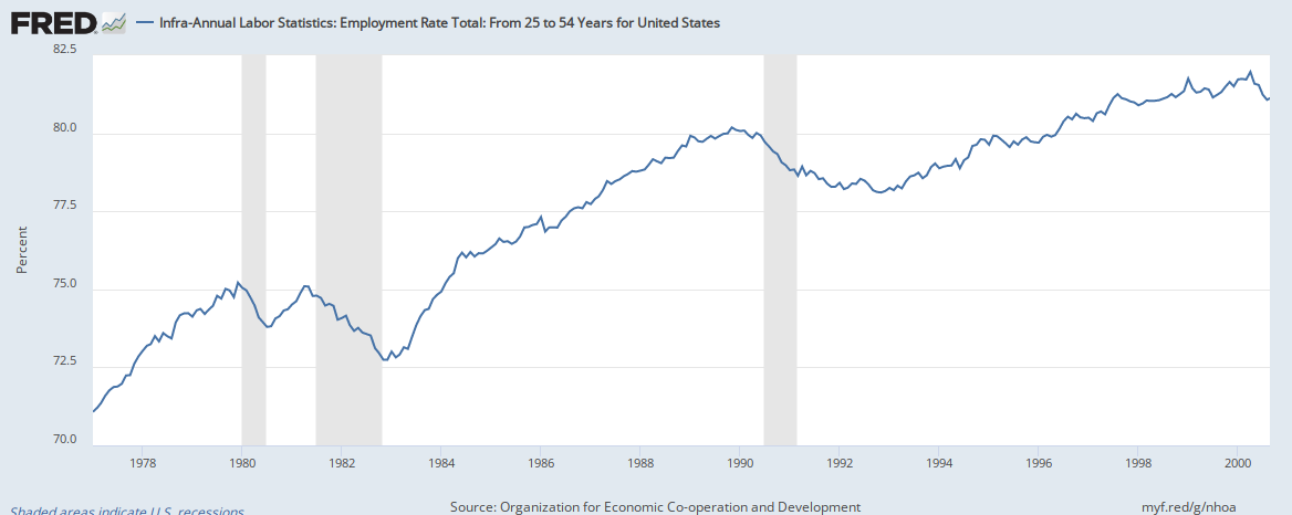
- Since 2008, the share of adults between the ages of 25 and 54 who are employed (or the “prime-age EPOP”) has predicted wage growth better than the unemployment rate.
- But even the prime-age EPOP has done a poor job at predicting wage growth since 2008 compared with both its own predictive power pre-2008 and the predictive power of the unemployment rate in earlier periods.
- The prime-age EPOP’s advantage in predicting wage growth seems to have started even a bit before the Great Recession, around 2001.
- Because both the unemployment rate and the prime-age EPOP have seen a large reduction in their predictive power regarding wage growth since 2008, efforts to explain this decline in predictive power should involve looking to the unique features of the Great Recession: very high rates of unemployment combined with very low rates of inflation.
- While both the unemployment rate and the prime-age EPOP are likely to be fine statistical predictors of wage growth moving forward, there has been a steady decline in how responsive wage growth is to a given change in either. In short, workers have seemingly needed ever-tighter labor markets (measured by quantity-side variables like the unemployment rate and the prime-age EPOP) to generate a given amount of wage growth.
If unemployment fails, does anything predict post-2008 wage growth?
The weak connection between unemployment rates and wage growth since 2008 has led to many analysts looking for signs of labor market slack in other measures. For example, to be classified as unemployed, someone must be first classified as in the labor force, which requires that person to be actively engaged in a job search. If an extended period of weak hiring leads significant numbers of potential workers to despair of finding a job, then they might cease to look for work and drop out of the labor force, which lowers the measured unemployment rate. In early parts of the recovery from the Great Recession (until roughly 2015), this reduction in labor force participation actually explained about a third of the overall decline in unemployment.
A measure of labor market health uninfected by sometimes-arbitrary labor force participation decisions is the employment-to-population ratio (EPOP). This simply measures what share of adults have jobs, regardless of whether the jobless are classified as “actively” searching for work or not. Because large waves of baby boomers are currently reaching retirement age, the overall EPOP has trended down in recent years for demographic reasons. A measure that circumvents these demographic effects is the “prime age” EPOP—the EPOP measuring only adults between the ages of 25 to 54. At EPI we have often highlighted the importance of using the prime-age EPOP to supplement other measures of labor market health. In The Upshot from The New York Times, Ernie Tedeschi showed that a related measure (an “adjusted” EPOP that accounted for the effect of demography) predicted nominal wage growth quite well between 1990 and 2017.
This backstory raises the question of whether the prime-age EPOP has done a significantly better job since 2008 of predicting wage growth. Figure B shows a scatterplot like Figure A but with the prime-age EPOP substituted for unemployment.
Prime-age employment-to-population ratio predicts wage growth after 2007 : Prime-age EPOP and annual change in nominal wage growth, 2008–2018
| PAEPOP | NWC | |
|---|---|---|
| 2008-Q1 | 79.7% | 3.8% |
| 2008-Q2 | 79.4% | 3.7% |
| 2008-Q3 | 79.0% | 3.7% |
| 2008-Q4 | 78.1% | 3.9% |
| 2009-Q1 | 76.7% | 3.6% |
| 2009-Q2 | 75.8% | 3.1% |
| 2009-Q3 | 75.4% | 2.7% |
| 2009-Q4 | 75.1% | 2.6% |
| 2010-Q1 | 75.2% | 2.5% |
| 2010-Q2 | 75.2% | 2.5% |
| 2010-Q3 | 75.1% | 2.3% |
| 2010-Q4 | 75.0% | 2.2% |
| 2011-Q1 | 75.2% | 2.2% |
| 2011-Q2 | 75.0% | 2.1% |
| 2011-Q3 | 75.0% | 2.1% |
| 2011-Q4 | 75.3% | 1.8% |
| 2012-Q1 | 75.6% | 1.5% |
| 2012-Q2 | 75.7% | 1.5% |
| 2012-Q3 | 75.7% | 1.4% |
| 2012-Q4 | 75.9% | 1.4% |
| 2013-Q1 | 75.8% | 1.9% |
| 2013-Q2 | 75.9% | 1.9% |
| 2013-Q3 | 76.0% | 2.1% |
| 2013-Q4 | 76.0% | 2.3% |
| 2014-Q1 | 76.4% | 2.4% |
| 2014-Q2 | 76.6% | 2.4% |
| 2014-Q3 | 76.8% | 2.4% |
| 2014-Q4 | 77.0% | 2.1% |
| 2015-Q1 | 77.2% | 1.9% |
| 2015-Q2 | 77.2% | 2.1% |
| 2015-Q3 | 77.3% | 2.0% |
| 2015-Q4 | 77.4% | 2.3% |
| 2016-Q1 | 77.8% | 2.4% |
| 2016-Q2 | 77.9% | 2.4% |
| 2016-Q3 | 77.9% | 2.5% |
| 2016-Q4 | 78.2% | 2.4% |
| 2017-Q1 | 78.3% | 2.3% |
| 2017-Q2 | 78.5% | 2.3% |
| 2017-Q3 | 78.6% | 2.4% |
| 2017-Q4 | 79.0% | 2.3% |
| 2018-Q1 | 79.2% | 2.5% |
| 2018-Q2 | 79.3% | 2.7% |
| 2018-Q3 | 79.4% | 2.8% |
| 2018-Q4 | 79.7% | 3.3% |
Note: Data are quarterly, with nominal wage changes measured from the same quarter in the previous year.
Source: Prime-age unemployment-to-population ratio is from the Bureau of Labor Statistics (BLS) Current Population Survey and wages are the average hourly earnings of production and nonsupervisory workers from the BLS Current Employment Statistics.
As the figure shows (and statistical tests confirm), the prime-age EPOP has done better at predicting wage growth than the unemployment rate has since 2008. The prime-age EPOP’s effect on wage growth is both economically and statistically significant, as it explains roughly 30 percent of the variation in wage growth over this period (this statistic is reported later, in Table 1).
But that’s actually a pretty poor performance! In earlier periods, the unemployment rate predicted a far higher share of variation in wage growth than this.
Figure C shows a scatterplot of the relationship between real wage growth and unemployment from 1979 to 2007. Over this longer period price inflation varied a lot, szo we can no longer use nominal wages but rather must account for price changes. The reasoning is simple: When inflation is hovering around 2 percent (like it has since the early 1990s), nominal wage growth of 4 percent would be pretty healthy—generating inflation-adjusted wage increases well in excess of productivity. But when inflation is hovering around 8 percent (like it did in the early 1980s), nominal wage growth of 4 percent is a disaster, leading to steep inflation-adjusted wage cuts for workers. In short, against the backdrop of unstable inflation that characterizes a long period like 1979 to 2007, a given nominal wage growth figure can mean very different things regarding the health of the labor market.
To calculate real wages, I generated my own measure of expected inflation. The idea is that workers bargain over nominal wages with their employers with some idea of future expected price inflation in the backs of their minds. If workers assume prices will rise 5 percent over the next year, they know that nominal wage growth of less than 5 percent constitutes a cut in real living standards. Workers’ expectations of price growth can be reasonably represented by a rolling average of the recent inflation experience, with more-recent inflation rates weighted more heavily. My expected inflation measure incorporates data from the previous 12 quarters. Year-over-year inflation rates lagged one to four quarters are each given a weight of 12.5 percent. Inflation rates lagged five to eight quarters are given a weight of 10 percent, and inflation rates lagged nine to 12 quarters are given a weight of 2.5 percent. None of the results that follow are sensitive to precise weighting decisions.
Unemployment accurately predicted wage growth before 2008: Unemployment rate and annual change in real wage growth, 1979–2007
| UR | RWC_2 | |
|---|---|---|
| 1979-Q1 | 5.9% | 2.0% |
| 1979-Q2 | 5.7% | 0.9% |
| 1979-Q3 | 5.9% | 0.7% |
| 1979-Q4 | 6.0% | -0.2% |
| 1980-Q1 | 6.3% | -1.0% |
| 1980-Q2 | 7.3% | -1.0% |
| 1980-Q3 | 7.7% | -1.5% |
| 1980-Q4 | 7.4% | -1.1% |
| 1981-Q1 | 7.4% | -1.0% |
| 1981-Q2 | 7.4% | -1.4% |
| 1981-Q3 | 7.4% | -1.5% |
| 1981-Q4 | 8.2% | -2.7% |
| 1982-Q1 | 8.8% | -3.3% |
| 1982-Q2 | 9.4% | -3.7% |
| 1982-Q3 | 9.9% | -3.8% |
| 1982-Q4 | 10.7% | -3.8% |
| 1983-Q1 | 10.4% | -3.4% |
| 1983-Q2 | 10.1% | -2.8% |
| 1983-Q3 | 9.4% | -2.8% |
| 1983-Q4 | 8.5% | -1.9% |
| 1984-Q1 | 7.9% | -1.8% |
| 1984-Q2 | 7.4% | -1.6% |
| 1984-Q3 | 7.4% | -1.2% |
| 1984-Q4 | 7.3% | -1.5% |
| 1985-Q1 | 7.2% | -1.4% |
| 1985-Q2 | 7.3% | -1.2% |
| 1985-Q3 | 7.2% | -1.2% |
| 1985-Q4 | 7.0% | -1.0% |
| 1986-Q1 | 7.0% | -1.1% |
| 1986-Q2 | 7.2% | -1.5% |
| 1986-Q3 | 7.0% | -1.4% |
| 1986-Q4 | 6.8% | -1.2% |
| 1987-Q1 | 6.6% | -0.7% |
| 1987-Q2 | 6.3% | -0.2% |
| 1987-Q3 | 6.0% | 0.1% |
| 1987-Q4 | 5.8% | 0.3% |
| 1988-Q1 | 5.7% | 0.0% |
| 1988-Q2 | 5.5% | 0.4% |
| 1988-Q3 | 5.5% | 0.4% |
| 1988-Q4 | 5.3% | 0.3% |
| 1989-Q1 | 5.2% | 0.7% |
| 1989-Q2 | 5.2% | 0.2% |
| 1989-Q3 | 5.2% | 0.1% |
| 1989-Q4 | 5.4% | -0.1% |
| 1990-Q1 | 5.3% | 0.1% |
| 1990-Q2 | 5.3% | 0.1% |
| 1990-Q3 | 5.7% | -0.1% |
| 1990-Q4 | 6.1% | -0.6% |
| 1991-Q1 | 6.6% | -1.3% |
| 1991-Q2 | 6.8% | -1.4% |
| 1991-Q3 | 6.9% | -1.6% |
| 1991-Q4 | 7.1% | -1.7% |
| 1992-Q1 | 7.4% | -1.6% |
| 1992-Q2 | 7.6% | -1.5% |
| 1992-Q3 | 7.6% | -1.4% |
| 1992-Q4 | 7.4% | -1.0% |
| 1993-Q1 | 7.1% | -0.5% |
| 1993-Q2 | 7.1% | -0.5% |
| 1993-Q3 | 6.8% | -0.4% |
| 1993-Q4 | 6.6% | -0.2% |
| 1994-Q1 | 6.6% | -0.1% |
| 1994-Q2 | 6.2% | 0.0% |
| 1994-Q3 | 6.0% | 0.2% |
| 1994-Q4 | 5.6% | 0.3% |
| 1995-Q1 | 5.5% | 0.2% |
| 1995-Q2 | 5.7% | 0.4% |
| 1995-Q3 | 5.7% | 0.6% |
| 1995-Q4 | 5.6% | 0.6% |
| 1996-Q1 | 5.5% | 0.8% |
| 1996-Q2 | 5.5% | 1.1% |
| 1996-Q3 | 5.3% | 1.0% |
| 1996-Q4 | 5.3% | 1.2% |
| 1997-Q1 | 5.2% | 1.2% |
| 1997-Q2 | 5.0% | 1.0% |
| 1997-Q3 | 4.9% | 1.3% |
| 1997-Q4 | 4.7% | 1.7% |
| 1998-Q1 | 4.6% | 1.8% |
| 1998-Q2 | 4.4% | 2.0% |
| 1998-Q3 | 4.5% | 1.9% |
| 1998-Q4 | 4.4% | 1.7% |
| 1999-Q1 | 4.3% | 1.8% |
| 1999-Q2 | 4.3% | 1.9% |
| 1999-Q3 | 4.2% | 2.1% |
| 1999-Q4 | 4.1% | 1.9% |
| 2000-Q1 | 4.0% | 1.9% |
| 2000-Q2 | 3.9% | 1.8% |
| 2000-Q3 | 4.0% | 1.6% |
| 2000-Q4 | 3.9% | 1.7% |
| 2001-Q1 | 4.2% | 1.4% |
| 2001-Q2 | 4.4% | 1.1% |
| 2001-Q3 | 4.8% | 0.6% |
| 2001-Q4 | 5.5% | 0.3% |
| 2002-Q1 | 5.7% | 0.0% |
| 2002-Q2 | 5.8% | -0.1% |
| 2002-Q3 | 5.7% | 0.4% |
| 2002-Q4 | 5.9% | 0.7% |
| 2003-Q1 | 5.9% | 0.9% |
| 2003-Q2 | 6.1% | 0.7% |
| 2003-Q3 | 6.1% | 0.5% |
| 2003-Q4 | 5.8% | -0.1% |
| 2004-Q1 | 5.7% | -0.3% |
| 2004-Q2 | 5.6% | 0.0% |
| 2004-Q3 | 5.4% | 0.0% |
| 2004-Q4 | 5.4% | 0.2% |
| 2005-Q1 | 5.3% | 0.1% |
| 2005-Q2 | 5.1% | 0.1% |
| 2005-Q3 | 5.0% | 0.1% |
| 2005-Q4 | 5.0% | 0.2% |
| 2006-Q1 | 4.7% | 0.4% |
| 2006-Q2 | 4.6% | 0.7% |
| 2006-Q3 | 4.6% | 0.7% |
| 2006-Q4 | 4.4% | 0.7% |
| 2007-Q1 | 4.5% | 0.8% |
| 2007-Q2 | 4.5% | 0.9% |
| 2007-Q3 | 4.7% | 0.9% |
| 2007-Q4 | 4.8% | 0.8% |
Note: Data are quarterly, with wage changes measured from the same quarter in the previous year. Nominal wages are deflated with a measure of expected inflation. This expected inflation uses the Consumer Price Index Research Series (CPI-U-RS). It uses 12 quarters of lagged inflation rates to obtain the expected inflation series. The most recent 4 quarters’ inflation rates are weighted at 12.5 percent each, inflation rates lagged five to eight quarters are weighted at 10 percent each, while inflation rates lagged nine through 12 quarters are weighted at 2.5 percent each. This expected inflation allows lagged inflation to be used to deflate nominal wages to represent “adaptive expectations” to inflation, but smooths out quarterly spikes.
Source: Unemployment rates are from the Bureau of Labor Statistics (BLS) Current Population Survey and wages are the average hourly earnings of production and nonsupervisory workers from the BLS Current Employment Statistics.
The relationship between unemployment and wage growth is striking in comparison with the similar scatterplot in Figure A. Before 2008, the unemployment rate predicted wage growth quite well; far more accurately, for example, than the prime-age EPOP has since 2008.
What was the better predictor of wage growth before the Great Recession?
The predictive power of unemployment before 2008 raises the question of whether the superior performance of the prime-age EPOP in predicting wage growth is only a recent phenomenon. The short answer is that the prime-age EPOP seems to be doing better than the unemployment rate as a wage growth predictor only since around 2001. Table 1 below simply reports the coefficient and r-squared values of regressions of nominal wage growth on the unemployment rate or the prime-age EPOP and our measure of expected inflation (where r-squared in this case is the share of total variation in wage growth that is explained by each regression model).
Coefficients and r-squareds from wage Phillips curves in different time periods
| Unemployment rate | Prime-age EPOP | ||||||
|---|---|---|---|---|---|---|---|
| Coefficient | r-squared | Coefficient | r-squared | ||||
| 1979–2000 | -0.904 | *** | 0.940 | 0.505 | *** | 0.759 | |
| 2001–2007 | -0.341 | * | 0.745 | 0.441 | *** | 0.802 | |
| 2008–2013 | -0.018 | 0.320 | 0.372 | *** | 0.523 | ||
| 2014–2018 | -0.211 | 0.383 | 0.196 | *** | 0.480 | ||
*** indicates significant at 1 percent
* indicates significant at 10 percent
Note: Regression coefficients are from a regression of nominal wage changes on the measure of labor market slack (either the unemployment rate or the prime-age employment-to-population ratio) and a measure of expected inflation. This inflation measure is a weighted average of the previous 12 quarters’ inflation rates, with a weight of 12.5 percent on the previous 4 quarters’ inflation rates, 10 percent on each the inflation rates between four and eight quarters ago, and a weight of 2.5 percent on inflation rates between nine and 12 quarters ago.
Source: Unemployment rates and prime-age employment-to-population ratios are from the Bureau of Labor Statistics (BLS) Current Population Survey and wages are the average hourly earnings of production and nonsupervisory workers from the BLS Current Employment Statistics.
Before 2000, the regression with the unemployment rate outperforms the prime-age EPOP, by a relatively clear margin, judged on the basis of the r-squared. Between 2001 and 2007, the performance is very similar, with the prime-age EPOP seemingly having a slight advantage. It is only in the post-2007 period that the prime-age EPOP is clearly superior. And its advantage is starting to erode post-2013.
The reason the prime-age EPOP seemed to be the inferior predictor of wage growth pre-2001 seems clear: it had a strong structural (upward) trend that was largely unrelated to the overall health of the labor market. This trend was driven by the rising share of women entering the workforce (even as there was a very mild downward trend in male labor force participation). But since 2001, there has been no upward trend in women’s prime-age EPOP.
Lessons going forward
Where does this leave us? First, while the unemployment rate failed to predict wage growth accurately after the Great Recession, this doesn’t necessarily mean that we should throw it out forever as a predictive tool. Table 1 shows that the really poor performance mostly occurred between 2008 and 2013. Figure D depicts this. It shows actual wage growth along with predicted wage growth based on the relationship between wage growth and unemployment that prevailed between 1979 and 2007. The unemployment rate (along with expected inflation) does a fine job predicting wages until 2007—meaning that the actual and predicted wage growth lines are very close together. After 2007, the lines diverge, and radically so between 2009 and 2013. Basically, in the first few years into the recovery, inflation plummeted and the unemployment rate rose to some of its highest levels in the postwar period. These two influences lead our model to predict steeply negative nominal wage growth for a spell. But, as much research has pointed out, nominal wage growth seems rigid at zero and rarely goes outright negative.
Immediate post–Great Recession period explains the declining predictive power of unemployment on wages : Predicted nominal wage changes and actual nominal wage changes, 1979–2018
| Predicted nominal wage change | Actual nominal wage change | |
|---|---|---|
| 1979-Q1 | 6.4568% | 8.5480% |
| 1979-Q2 | 6.9673% | 7.7275% |
| 1979-Q3 | 7.1740% | 7.9820% |
| 1979-Q4 | 7.5579% | 7.5949% |
| 1980-Q1 | 7.8323% | 7.3355% |
| 1980-Q2 | 7.5601% | 7.8640% |
| 1980-Q3 | 7.6828% | 7.8605% |
| 1980-Q4 | 8.2987% | 8.6445% |
| 1981-Q1 | 8.6399% | 9.0955% |
| 1981-Q2 | 8.8435% | 8.9655% |
| 1981-Q3 | 8.9093% | 8.8803% |
| 1981-Q4 | 8.1953% | 7.6742% |
| 1982-Q1 | 7.5155% | 6.9093% |
| 1982-Q2 | 6.5770% | 6.0127% |
| 1982-Q3 | 5.6151% | 5.3635% |
| 1982-Q4 | 4.3919% | 4.7661% |
| 1983-Q1 | 4.0328% | 4.5239% |
| 1983-Q2 | 3.6313% | 4.4350% |
| 1983-Q3 | 3.6747% | 3.8704% |
| 1983-Q4 | 3.8395% | 4.1736% |
| 1984-Q1 | 3.7962% | 3.7098% |
| 1984-Q2 | 3.8859% | 3.5933% |
| 1984-Q3 | 3.6103% | 3.6857% |
| 1984-Q4 | 3.4368% | 3.0849% |
| 1985-Q1 | 3.3082% | 3.0207% |
| 1985-Q2 | 3.0360% | 2.9957% |
| 1985-Q3 | 2.9615% | 2.7734% |
| 1985-Q4 | 3.0002% | 2.9149% |
| 1986-Q1 | 2.9136% | 2.7006% |
| 1986-Q2 | 2.5933% | 2.1814% |
| 1986-Q3 | 2.4426% | 1.8624% |
| 1986-Q4 | 2.3243% | 1.8505% |
| 1987-Q1 | 2.1802% | 1.9534% |
| 1987-Q2 | 2.2492% | 2.2472% |
| 1987-Q3 | 2.5366% | 2.5746% |
| 1987-Q4 | 2.8056% | 2.9663% |
| 1988-Q1 | 3.0181% | 2.7634% |
| 1988-Q2 | 3.2665% | 3.2601% |
| 1988-Q3 | 3.4062% | 3.3830% |
| 1988-Q4 | 3.7379% | 3.4930% |
| 1989-Q1 | 4.0190% | 4.0875% |
| 1989-Q2 | 4.2318% | 3.7602% |
| 1989-Q3 | 4.4209% | 3.8705% |
| 1989-Q4 | 4.3500% | 3.8274% |
| 1990-Q1 | 4.5140% | 4.0303% |
| 1990-Q2 | 4.6829% | 4.2051% |
| 1990-Q3 | 4.3946% | 4.1328% |
| 1990-Q4 | 4.2089% | 3.7869% |
| 1991-Q1 | 4.0041% | 3.2450% |
| 1991-Q2 | 3.8937% | 3.2152% |
| 1991-Q3 | 3.7944% | 3.0579% |
| 1991-Q4 | 3.4960% | 2.8092% |
| 1992-Q1 | 2.9904% | 2.6620% |
| 1992-Q2 | 2.5399% | 2.4476% |
| 1992-Q3 | 2.3386% | 2.3674% |
| 1992-Q4 | 2.2722% | 2.4812% |
| 1993-Q1 | 2.2684% | 2.6867% |
| 1993-Q2 | 2.0688% | 2.5132% |
| 1993-Q3 | 2.1733% | 2.4360% |
| 1993-Q4 | 2.2161% | 2.5437% |
| 1994-Q1 | 2.1219% | 2.5555% |
| 1994-Q2 | 2.3637% | 2.5121% |
| 1994-Q3 | 2.4079% | 2.6189% |
| 1994-Q4 | 2.6998% | 2.6300% |
| 1995-Q1 | 2.7405% | 2.5215% |
| 1995-Q2 | 2.5620% | 2.6867% |
| 1995-Q3 | 2.5743% | 2.9334% |
| 1995-Q4 | 2.6462% | 2.9121% |
| 1996-Q1 | 2.7328% | 3.0961% |
| 1996-Q2 | 2.7614% | 3.4503% |
| 1996-Q3 | 2.9853% | 3.4198% |
| 1996-Q4 | 3.0281% | 3.5937% |
| 1997-Q1 | 3.2039% | 3.7609% |
| 1997-Q2 | 3.4235% | 3.6131% |
| 1997-Q3 | 3.4660% | 3.8027% |
| 1997-Q4 | 3.5928% | 4.2065% |
| 1998-Q1 | 3.5966% | 4.1655% |
| 1998-Q2 | 3.6223% | 4.2918% |
| 1998-Q3 | 3.4048% | 4.0350% |
| 1998-Q4 | 3.3602% | 3.6697% |
| 1999-Q1 | 3.2924% | 3.6095% |
| 1999-Q2 | 3.1843% | 3.6008% |
| 1999-Q3 | 3.2572% | 3.7765% |
| 1999-Q4 | 3.3716% | 3.6662% |
| 2000-Q1 | 3.5472% | 3.7594% |
| 2000-Q2 | 3.8250% | 3.8481% |
| 2000-Q3 | 3.9408% | 3.8358% |
| 2000-Q4 | 4.2454% | 4.1463% |
| 2001-Q1 | 4.1994% | 4.0580% |
| 2001-Q2 | 4.2207% | 3.9684% |
| 2001-Q3 | 4.0310% | 3.6704% |
| 2001-Q4 | 3.4834% | 3.3489% |
| 2002-Q1 | 3.2336% | 2.9944% |
| 2002-Q2 | 2.9470% | 2.6903% |
| 2002-Q3 | 2.8163% | 2.9237% |
| 2002-Q4 | 2.4633% | 3.0591% |
| 2003-Q1 | 2.3758% | 3.2004% |
| 2003-Q2 | 2.1979% | 2.9333% |
| 2003-Q3 | 2.1004% | 2.6187% |
| 2003-Q4 | 2.3025% | 1.9569% |
| 2004-Q1 | 2.3464% | 1.7908% |
| 2004-Q2 | 2.4058% | 2.0231% |
| 2004-Q3 | 2.6931% | 2.1194% |
| 2004-Q4 | 2.7882% | 2.4585% |
| 2005-Q1 | 3.0226% | 2.5531% |
| 2005-Q2 | 3.2727% | 2.6226% |
| 2005-Q3 | 3.4576% | 2.7319% |
| 2005-Q4 | 3.6522% | 3.0309% |
| 2006-Q1 | 4.0823% | 3.4310% |
| 2006-Q2 | 4.3377% | 3.9061% |
| 2006-Q3 | 4.4906% | 4.0404% |
| 2006-Q4 | 4.7206% | 4.1267% |
| 2007-Q1 | 4.4964% | 4.0858% |
| 2007-Q2 | 4.4399% | 4.0592% |
| 2007-Q3 | 4.2121% | 4.0618% |
| 2007-Q4 | 3.9904% | 3.7865% |
| 2008-Q1 | 3.9029% | 3.8088% |
| 2008-Q2 | 3.7446% | 3.6510% |
| 2008-Q3 | 3.2556% | 3.7319% |
| 2008-Q4 | 2.7425% | 3.8752% |
| 2009-Q1 | 1.4262% | 3.6129% |
| 2009-Q2 | 0.2150% | 3.0960% |
| 2009-Q3 | -0.5686% | 2.7166% |
| 2009-Q4 | -1.3954% | 2.6206% |
| 2010-Q1 | -1.5087% | 2.4932% |
| 2010-Q2 | -1.4088% | 2.4996% |
| 2010-Q3 | -1.4654% | 2.3231% |
| 2010-Q4 | -1.7253% | 2.1990% |
| 2011-Q1 | -1.3960% | 2.1505% |
| 2011-Q2 | -1.3722% | 2.0877% |
| 2011-Q3 | -0.9381% | 2.0782% |
| 2011-Q4 | -0.1843% | 1.8220% |
| 2012-Q1 | 0.2929% | 1.5186% |
| 2012-Q2 | 0.4972% | 1.5467% |
| 2012-Q3 | 0.7122% | 1.4200% |
| 2012-Q4 | 0.9508% | 1.4485% |
| 2013-Q1 | 1.0609% | 1.9208% |
| 2013-Q2 | 1.1572% | 1.8954% |
| 2013-Q3 | 1.2468% | 2.1255% |
| 2013-Q4 | 1.3511% | 2.3182% |
| 2014-Q1 | 1.3599% | 2.3516% |
| 2014-Q2 | 1.6594% | 2.3916% |
| 2014-Q3 | 1.7429% | 2.3621% |
| 2014-Q4 | 2.0478% | 2.1343% |
| 2015-Q1 | 2.1240% | 1.8902% |
| 2015-Q2 | 1.9794% | 2.0600% |
| 2015-Q3 | 2.0349% | 2.0332% |
| 2015-Q4 | 1.9391% | 2.3308% |
| 2016-Q1 | 1.9165% | 2.4468% |
| 2016-Q2 | 1.9033% | 2.4476% |
| 2016-Q3 | 1.8453% | 2.5304% |
| 2016-Q4 | 1.8932% | 2.4191% |
| 2017-Q1 | 2.1424% | 2.3259% |
| 2017-Q2 | 2.5573% | 2.2960% |
| 2017-Q3 | 2.7936% | 2.3754% |
| 2017-Q4 | 3.1166% | 2.3313% |
| 2018-Q1 | 3.2593% | 2.5019% |
| 2018-Q2 | 3.5560% | 2.7146% |
| 2018-Q3 | 3.8445% | 2.8326% |
| 2018-Q4 | 4.0281% | 3.2524% |
Note: The predicted nominal wage change is obtained from a regression of nominal wage changes on expected inflation and the unemployment rate for the years 1979–2007. The predicted nominal wage changes from this regression fit very tightly with actual nominal changes until the immediate post–Great Recession period (shaded in the figure).
Source: Unemployment rates are from the Bureau of Labor Statistics (BLS) Current Population Survey and wages are the average hourly earnings of production and nonsupervisory workers from the BLS Current Employment Statistics.
This leads to one clear lesson from this examination. Because historical relationships can go haywire when the economy becomes deeply depressed for a spell, we must make sure that the portfolio of indicators used to measure labor market health and to predict future wage growth is large. Relying on any single measure can lead to bad policymaking choices.
Finally, just because a statistically detectable relationship between unemployment rates and wage growth seems to be reasserting itself post-2013, this doesn’t mean policymakers should be on a hair-trigger impulse to slow growth for fear of inflation. Modest wage growth will not necessarily feed directly into price inflation because much of the post-recession decline in labor share of income has yet to rebound, and because wage pressure might actually induce some faster productivity growth.
More importantly, the reemergence of any statistical relationship at all between lower unemployment and wage growth is interesting—but the magnitude of this relationship is important to note. This magnitude has been falling steadily over time, as shown in the regression coefficients on unemployment in Table 1. Essentially, a given rate of wage growth requires ever-lower unemployment, a finding we’ve highlighted before. This is what you’d expect if structural determinants of wage growth were pushing down on workers’ bargaining power and leverage in the labor market. But this downward structural pressure on wages is also something that macroeconomic policymakers, including Federal Reserve officials, should keep in mind as they decide whether inflationary pressure is building in the economy.
Enjoyed this post?
Sign up for EPI's newsletter so you never miss our research and insights on ways to make the economy work better for everyone.