The economic story of the year was the shock caused by the COVID-19 pandemic—both the damage it caused and the rot it revealed in the U.S. economy’s ability to deliver basic economic security for all.
This year’s top charts tell a devastating story—not only about a crisis that has challenged us all, but also about underlying inequalities that have made the crisis so much worse for so many.
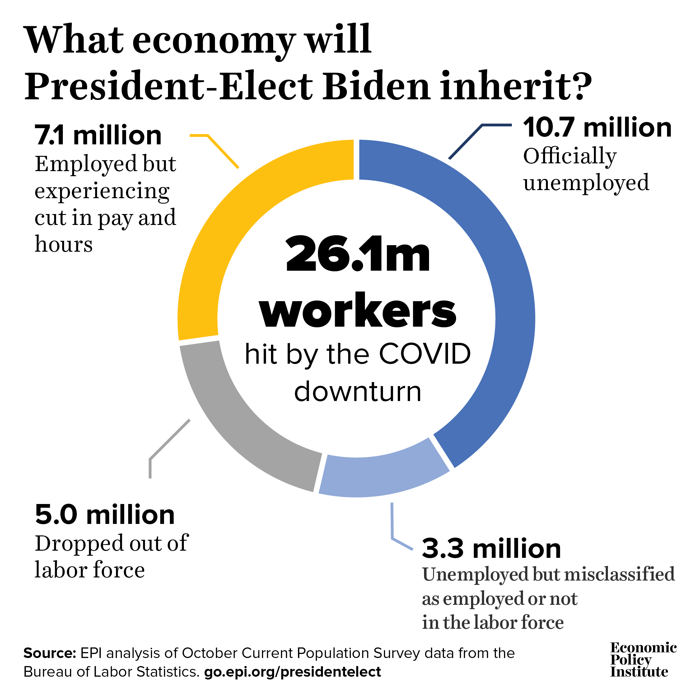
In November, 10.7 million workers were officially unemployed, yet this dramatically understates the true damage remaining in the U.S. labor market. Counting those driven out of the workforce entirely, seeing hours cuts, and misclassified as employed, the real number of casualties is closer to 26 million.
For every 10 people who successfully filed for unemployment insurance (UI) benefits, at least three more tried but couldn’t get through : Number of unsuccessful UI claimants for every 10 successful UI claimants, by reason for failure
| Survey question | UI claimants |
|---|---|
| I applied successfully | 10.0 |
| I tried but I could not get through | 3.7 |
| I tried but my application was rejected | 1.7 |
| I did not apply because it was too difficult | 2.0 |
Note: The survey targeted 25,000 people and as of this writing 98% of those targeted had completed it (24,607 respondents).
Source: Google Survey of 24,607 people conducted by EPI between April 14 and April 24, 2020. Survey responses were normalized to 10 respondents who reported that they successfully applied for unemployment insurance benefits.
In the first months of the COVID-19 shock, decades of underinvestment in our safety net came due, as millions of workers were unable to receive the unemployment insurance benefits they were entitled to in a timely manner. Correcting this needs to be an urgent priority.
Overall Latinx COVID-19 death rate masks disproportionate risk at every age group: COVID-19 death rates per 100,000, Latinx and white populations, by age group
| Latinx | White | |
|---|---|---|
| All ages | 39 | 35 |
| 0–14 years | 0 | 0 |
| 15–24 years | 1 | 0 |
| 25–34 years | 4 | 1 |
| 35–44 years | 13 | 2 |
| 45–54 years | 36 | 5 |
| 55–64 years | 88 | 17 |
| 65–74 years | 187 | 50 |
| 75 years and over | 536 | 296 |
Notes: White refers to non-Latinx whites; persons whose ethnicity is identified as Latinx may be of any race. Death rates calculated using COVID-19 provisional death counts as of July 22, 2020 (see Sources line).
Sources: Authors’ analysis of Economic Policy Institute Current Population Survey Extracts, Version 1.0.5 (2020a), https://microdata.epi.org; Centers for Disease Control and Prevention, COVID-19 Death Data and Resources Weekly Updates [Table 2], accessed July 22, 2020 (CDC 2020a).
The health shock of COVID-19 fell hard on Latinx families, a fact sometimes obscured by the overall numbers. While overall Latinx death rates from COVID-19 were comparable to white death rates, Latinx death rates were far higher if one adjusted for the age structure of the population (important because of how devastating COVID-19 was to older people).
Black workers are more likely than other workers to be in front-line jobs: Black workers as a share of all workers in a given industry
| Black workers’ share of workers in the industry | |
|---|---|
| Front-line workers | 17.0% |
| All workers | 11.9% |
| Grocery, convenience & drugstore workers | 14.2% |
| Public transit workers | 26.0% |
| Trucking, warehouse & postal service workers | 18.2% |
| Building cleaning services workers | 12.6% |
| Health care workers | 17.5% |
| Child care & social services workers | 19.3% |
Notes: The front-line industry categories used here are the categories used in the CEPR report (see Source below for more information). Sample is a 2014–2018 five-year estimate.
Source: EPI analysis of data from the Center for Economic Policy Research (CEPR) report A Basic Demographic Profile of Workers in Frontline Industries (April 2020).
Legacies of racism and discrimination have sorted Black workers into face-to-face service industries and occupations. One result of this is that Black workers faced far more risk from the COVID-19 shock because of their roles as “front-line workers.”
A staggeringly large across-the-board pay cut in August: Unemployment Insurance benefits as percentage of total wage and salary income
| Date | UI benefits as percentage of wage and salary income |
|---|---|
| Jan-2006 | 0.52% |
| Feb-2006 | 0.51% |
| Mar-2006 | 0.50% |
| Apr-2006 | 0.49% |
| May-2006 | 0.49% |
| Jun-2006 | 0.49% |
| Jul-2006 | 0.50% |
| Aug-2006 | 0.51% |
| Sep-2006 | 0.50% |
| Oct-2006 | 0.50% |
| Nov-2006 | 0.51% |
| Dec-2006 | 0.50% |
| Jan-2007 | 0.51% |
| Feb-2007 | 0.51% |
| Mar-2007 | 0.50% |
| Apr-2007 | 0.50% |
| May-2007 | 0.50% |
| Jun-2007 | 0.50% |
| Jul-2007 | 0.51% |
| Aug-2007 | 0.52% |
| Sep-2007 | 0.51% |
| Oct-2007 | 0.52% |
| Nov-2007 | 0.52% |
| Dec-2007 | 0.54% |
| Jan-2008 | 0.55% |
| Feb-2008 | 0.55% |
| Mar-2008 | 0.57% |
| Apr-2008 | 0.58% |
| May-2008 | 0.58% |
| Jun-2008 | 0.60% |
| Jul-2008 | 0.69% |
| Aug-2008 | 0.96% |
| Sep-2008 | 1.01% |
| Oct-2008 | 0.99% |
| Nov-2008 | 1.02% |
| Dec-2008 | 1.30% |
| Jan-2009 | 1.48% |
| Feb-2009 | 1.61% |
| Mar-2009 | 1.81% |
| Apr-2009 | 1.95% |
| May-2009 | 2.09% |
| Jun-2009 | 2.21% |
| Jul-2009 | 2.25% |
| Aug-2009 | 2.33% |
| Sep-2009 | 2.36% |
| Oct-2009 | 2.30% |
| Nov-2009 | 2.33% |
| Dec-2009 | 2.47% |
| Jan-2010 | 2.58% |
| Feb-2010 | 2.56% |
| Mar-2010 | 2.53% |
| Apr-2010 | 2.35% |
| May-2010 | 2.23% |
| Jun-2010 | 2.07% |
| Jul-2010 | 1.89% |
| Aug-2010 | 2.20% |
| Sep-2010 | 2.03% |
| Oct-2010 | 1.97% |
| Nov-2010 | 1.92% |
| Dec-2010 | 1.85% |
| Jan-2011 | 1.83% |
| Feb-2011 | 1.75% |
| Mar-2011 | 1.74% |
| Apr-2011 | 1.67% |
| May-2011 | 1.66% |
| Jun-2011 | 1.62% |
| Jul-2011 | 1.55% |
| Aug-2011 | 1.56% |
| Sep-2011 | 1.52% |
| Oct-2011 | 1.52% |
| Nov-2011 | 1.51% |
| Dec-2011 | 1.48% |
| Jan-2012 | 1.44% |
| Feb-2012 | 1.38% |
| Mar-2012 | 1.33% |
| Apr-2012 | 1.30% |
| May-2012 | 1.25% |
| Jun-2012 | 1.21% |
| Jul-2012 | 1.18% |
| Aug-2012 | 1.14% |
| Sep-2012 | 1.09% |
| Oct-2012 | 1.08% |
| Nov-2012 | 1.07% |
| Dec-2012 | 1.03% |
| Jan-2013 | 1.00% |
| Feb-2013 | 0.98% |
| Mar-2013 | 0.96% |
| Apr-2013 | 0.94% |
| May-2013 | 0.91% |
| Jun-2013 | 0.89% |
| Jul-2013 | 0.86% |
| Aug-2013 | 0.83% |
| Sep-2013 | 0.80% |
| Oct-2013 | 0.80% |
| Nov-2013 | 0.78% |
| Dec-2013 | 0.80% |
| Jan-2014 | 0.56% |
| Feb-2014 | 0.52% |
| Mar-2014 | 0.51% |
| Apr-2014 | 0.49% |
| May-2014 | 0.48% |
| Jun-2014 | 0.47% |
| Jul-2014 | 0.46% |
| Aug-2014 | 0.45% |
| Sep-2014 | 0.45% |
| Oct-2014 | 0.43% |
| Nov-2014 | 0.43% |
| Dec-2014 | 0.43% |
| Jan-2015 | 0.43% |
| Feb-2015 | 0.42% |
| Mar-2015 | 0.42% |
| Apr-2015 | 0.41% |
| May-2015 | 0.41% |
| Jun-2015 | 0.42% |
| Jul-2015 | 0.41% |
| Aug-2015 | 0.41% |
| Sep-2015 | 0.41% |
| Oct-2015 | 0.41% |
| Nov-2015 | 0.41% |
| Dec-2015 | 0.41% |
| Jan-2016 | 0.41% |
| Feb-2016 | 0.41% |
| Mar-2016 | 0.40% |
| Apr-2016 | 0.40% |
| May-2016 | 0.41% |
| Jun-2016 | 0.40% |
| Jul-2016 | 0.40% |
| Aug-2016 | 0.40% |
| Sep-2016 | 0.39% |
| Oct-2016 | 0.39% |
| Nov-2016 | 0.38% |
| Dec-2016 | 0.38% |
| Jan-2017 | 0.38% |
| Feb-2017 | 0.37% |
| Mar-2017 | 0.37% |
| Apr-2017 | 0.36% |
| May-2017 | 0.36% |
| Jun-2017 | 0.36% |
| Jul-2017 | 0.36% |
| Aug-2017 | 0.36% |
| Sep-2017 | 0.35% |
| Oct-2017 | 0.35% |
| Nov-2017 | 0.35% |
| Dec-2017 | 0.34% |
| Jan-2018 | 0.34% |
| Feb-2018 | 0.33% |
| Mar-2018 | 0.33% |
| Apr-2018 | 0.32% |
| May-2018 | 0.31% |
| Jun-2018 | 0.31% |
| Jul-2018 | 0.31% |
| Aug-2018 | 0.31% |
| Sep-2018 | 0.30% |
| Oct-2018 | 0.30% |
| Nov-2018 | 0.30% |
| Dec-2018 | 0.30% |
| Jan-2019 | 0.31% |
| Feb-2019 | 0.30% |
| Mar-2019 | 0.30% |
| Apr-2019 | 0.29% |
| May-2019 | 0.30% |
| Jun-2019 | 0.30% |
| Jul-2019 | 0.30% |
| Aug-2019 | 0.30% |
| Sep-2019 | 0.29% |
| Oct-2019 | 0.30% |
| Nov-2019 | 0.29% |
| Dec-2019 | 0.30% |
| Jan-2020 | 0.29% |
| Feb-2020 | 0.29% |
| Mar-2020 | 0.80% |
| Apr-2020 | 5.71% |
| May-2020 | 15.30% |
| Jun-2020 | 15.53% |
| Jul-2020 | 14.41% |
| Aug-2020 | 6.83% |
Source: National Income and Product Accounts (NIPA) data from the Bureau of Economic Analysis (BEA), Table 2.6.
For a few months during the worst of the economic shock from COVID-19, policymakers actually tried to construct a humane and generous safety net, with unemployment insurance substituting for a far larger share of wages than it ever had before. But starting in August, they allowed it to begin unraveling quickly.
