With the unemployment rate at 4 percent or below for eight consecutive months, 2018 appears to be the year when the economy finally became healthy again. But while low unemployment is good news, it doesn’t tell the whole story of how typical families are faring in the current economy.
As the economy normalizes following a long, slow recovery from the Great Recession, we are quickly resuming our prerecession course of rising inequality. The fruits of economic growth are bypassing typical families and going straight into the hands of the already-rich.
Our current policy trajectory is doing nothing to reverse the trend of inequality. But it’s doing plenty to widen it. This year’s edition of Top Charts highlights how policy choices continue to exacerbate inequality and how we can achieve more broadly shared prosperity through better policy choices.
The upward march of inequality is firmly reestablishing itself: Cumulative percent change in real annual earnings, by earnings group, 1979–2017
| Year | Bottom 90% | Top 1% | Top 0.1% |
|---|---|---|---|
| 1979 | 0.0% | 0.0% | 0.0% |
| 1980 | -2.2% | 3.4% | 5.8% |
| 1981 | -2.6% | 3.1% | 7.3% |
| 1982 | -3.9% | 9.5% | 17.4% |
| 1983 | -3.7% | 13.6% | 28.7% |
| 1984 | -1.8% | 20.7% | 44.0% |
| 1985 | -1.0% | 23.0% | 45.8% |
| 1986 | 1.1% | 32.6% | 60.9% |
| 1987 | 2.1% | 53.5% | 106.6% |
| 1988 | 2.2% | 68.7% | 140.2% |
| 1989 | 1.8% | 63.3% | 123.9% |
| 1990 | 1.1% | 64.8% | 129.8% |
| 1991 | 0.0% | 53.6% | 104.6% |
| 1992 | 1.5% | 74.3% | 156.0% |
| 1993 | 0.9% | 67.9% | 140.2% |
| 1994 | 2.0% | 63.4% | 126.9% |
| 1995 | 2.8% | 70.2% | 137.0% |
| 1996 | 4.1% | 79.0% | 157.3% |
| 1997 | 7.0% | 100.6% | 225.6% |
| 1998 | 11.0% | 113.1% | 254.9% |
| 1999 | 13.2% | 129.7% | 300.5% |
| 2000 | 15.3% | 144.8% | 337.6% |
| 2001 | 15.7% | 130.4% | 300.5% |
| 2002 | 15.6% | 109.3% | 239.5% |
| 2003 | 15.7% | 113.9% | 250.1% |
| 2004 | 15.6% | 127.2% | 287.6% |
| 2005 | 15.0% | 135.3% | 306.9% |
| 2006 | 15.7% | 143.4% | 324.9% |
| 2007 | 16.7% | 156.2% | 362.5% |
| 2008 | 16.0% | 137.5% | 309.0% |
| 2009 | 16.0% | 116.2% | 241.6% |
| 2010 | 15.2% | 130.8% | 278.0% |
| 2011 | 14.5% | 134.0% | 279.0% |
| 2012 | 14.6% | 148.3% | 327.9% |
| 2013 | 15.1% | 137.5% | 289.3% |
| 2014 | 16.6% | 149.0% | 323.7% |
| 2015 | 20.5% | 156.2% | 337.9% |
| 2016 | 21.0% | 148.1% | 310.3% |
| 2017 | 22.2% | 157.3% | 343.2% |
Source: Adapted from Figure A in Lawrence Mishel and Julia Wolfe, “Top 1 Percent Reaches Highest Wages Ever—Up 157 Percent Since 1979,” Working Economics (Economic Policy Institute blog), October 18, 2018. Shaded areas denote recessions.
While top 1 percent earnings took a dive following the Great Recession, by 2017 those earnings had risen to their highest level ever, and the annual earnings of the top 1 percent had risen 157 percent cumulatively since 1979. For the top 0.1 percent, earnings have grown a whopping 343.2 percent since 1979. In contrast, earnings of the bottom 90 percent of workers rose just 22.2 percent over the same period.
The dynamic of large but temporary earnings declines for the highest earners during the Great Recession reflects the composition of their pay packages. For CEOs and other executives in the top 1 and 0.1 percent, earnings include stock options and other compensation measures linked strongly to firms’ stock market performance. As the stock market fell rapidly during the recession, this led to a sharp decline in earnings. But as stock prices went back up, so did the earnings of the top 1 and 0.1 percent—and so did inequality.
Depending on the state, the average top 1-percenter makes between 12.7 and 44.4 times more each year than the average bottom 99-percenter
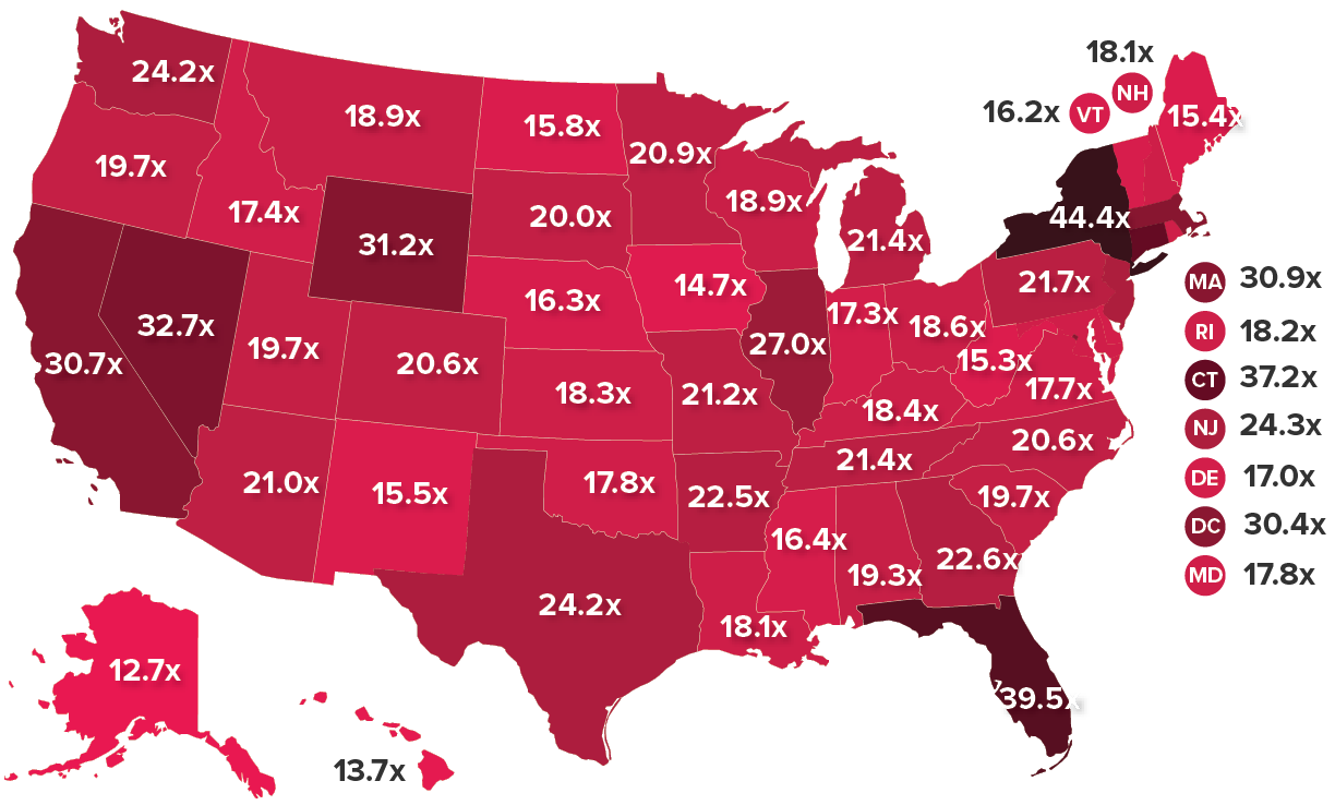
Source: Estelle Sommeiller and Mark Price, The New Gilded Age: Income Inequality in the U.S. by State, Metropolitan Area, and County, Economic Policy Institute, July 2018. Map is based on 2015 income data for tax units.
Rising inequality is not just a story of those on Wall Street, in Hollywood, or in the Silicon Valley reaping outsized rewards. Measured by the ratio of top 1 percent to bottom 99 percent income in 2015, every state has a sizable gap between the fortunate few at the top and everybody else. In eight states plus the District of Columbia, that ratio of top-to-bottom incomes is greater than the national ratio of 26.3-to-1.
The post–Great Recession recovery in top incomes—combined with unequal income growth since the 1970s—has America hurtling back toward levels of inequality that characterized the Gilded Age of the 1920s. In five states we’ve already surpassed Gilded Age levels of inequality. EPI research shows that in New York, Florida, Connecticut, Nevada, and Wyoming, the top 1 percent’s share of overall income tops the 1928 overall national record of 23.9 percent. Nationwide, the top 1 percent took home 22.0 percent of all income in 2015.
While the degree of income inequality differs across the country, the causes are mostly common and clear: intentional policy decisions to shift bargaining power away from working people and toward the top 1 percent.
The Fed can look to the late 1990s for guidance on how to raise wages: Average annual wage growth from 1996–2001 vs. all other years between 1979 and 2017
| Wage percentile | Avg. annual wage growth |
|---|---|
| 0% | |
| 20th percentile | 1.75% |
| Median | 1.66% |
| 95th percentile | 1.96% |
| 0% | |
| 20th percentile | -0.15% |
| Median | -0.02% |
| 95th percentile | 1.01% |
Source: Adapted from Figure C in Josh Bivens and Ben Zipperer, The Importance of Locking in Full Employment for the Long Haul, Economic Policy Institute, July 2018. Wage growth is inflation-adjusted.
Wages grew much more—and more equally—from 1996 to 2001 than in any of the other years between 1979 and 2017. Why? What was different about the late 1990s that policymakers should seek to emulate?
The most important difference was sustained low unemployment. The Fed kept interest rates low, allowing the unemployment rate to fall to levels far below what was considered sustainable for keeping inflation in check. And yet inflation did, in fact, remain in check. The late 1990s also saw an increase in the federal minimum wage, which helped boost wage growth at the bottom.
The Fed’s willingness to tolerate low unemployment, along with the boost to the minimum wage, paid enormous dividends in reducing inequality: annual wage growth for a 20th-percentile worker (1.8 percent) and for the median worker (1.7 percent) approximated that of a 95th-percentile worker (2.0 percent). In contrast, across all other years between 1979 and 2017, average annual wage growth for low- and middle-wage workers was essentially zero, while high-wage workers enjoyed consistently positive (if not hugely impressive) growth.
Attacks on unions have hurt their ability to hold inequality in check: Union membership and share of income going to the top 10 percent, 1917–2015
| Year | Union membership | Share of income going to the top 10 percent |
|---|---|---|
| 1917 | 11.0% | 40.3% |
| 1918 | 12.1% | 39.9% |
| 1919 | 14.3% | 39.5% |
| 1920 | 17.5% | 38.1% |
| 1921 | 17.6% | 42.9% |
| 1922 | 14.0% | 42.9% |
| 1923 | 11.7% | 40.6% |
| 1924 | 11.3% | 43.3% |
| 1925 | 11.0% | 44.2% |
| 1926 | 10.7% | 44.1% |
| 1927 | 10.6% | 44.7% |
| 1928 | 10.4% | 46.1% |
| 1929 | 10.1% | 43.8% |
| 1930 | 10.7% | 43.1% |
| 1931 | 11.2% | 44.4% |
| 1932 | 11.3% | 46.3% |
| 1933 | 9.5% | 45.0% |
| 1934 | 9.8% | 45.2% |
| 1935 | 10.8% | 43.4% |
| 1936 | 11.1% | 44.8% |
| 1937 | 18.6% | 43.3% |
| 1938 | 23.9% | 43.0% |
| 1939 | 24.8% | 44.6% |
| 1940 | 23.5% | 44.4% |
| 1941 | 25.4% | 41.0% |
| 1942 | 24.2% | 35.5% |
| 1943 | 30.1% | 32.7% |
| 1944 | 32.5% | 31.5% |
| 1945 | 33.4% | 32.6% |
| 1946 | 31.9% | 34.6% |
| 1947 | 31.1% | 33.0% |
| 1948 | 30.5% | 33.7% |
| 1949 | 29.6% | 33.8% |
| 1950 | 30.0% | 33.9% |
| 1951 | 32.4% | 32.8% |
| 1952 | 31.5% | 32.1% |
| 1953 | 33.2% | 31.4% |
| 1954 | 32.7% | 32.1% |
| 1955 | 32.9% | 31.8% |
| 1956 | 33.2% | 31.8% |
| 1957 | 32.0% | 31.7% |
| 1958 | 31.1% | 32.1% |
| 1959 | 31.6% | 32.0% |
| 1960 | 30.7% | 31.7% |
| 1961 | 28.7% | 31.9% |
| 1962 | 29.1% | 32.0% |
| 1963 | 28.5% | 32.0% |
| 1964 | 28.5% | 31.6% |
| 1965 | 28.6% | 31.5% |
| 1966 | 28.7% | 32.0% |
| 1967 | 28.6% | 32.0% |
| 1968 | 28.7% | 32.0% |
| 1969 | 28.3% | 31.8% |
| 1970 | 27.9% | 31.5% |
| 1971 | 27.4% | 31.8% |
| 1972 | 27.5% | 31.6% |
| 1973 | 27.1% | 31.9% |
| 1974 | 26.5% | 32.4% |
| 1975 | 25.7% | 32.6% |
| 1976 | 25.7% | 32.4% |
| 1977 | 25.2% | 32.4% |
| 1978 | 24.7% | 32.4% |
| 1979 | 25.4% | 32.3% |
| 1980 | 23.6% | 32.9% |
| 1981 | 22.3% | 32.7% |
| 1982 | 21.6% | 33.2% |
| 1983 | 21.4% | 33.7% |
| 1984 | 20.5% | 33.9% |
| 1985 | 19.0% | 34.3% |
| 1986 | 18.5% | 34.6% |
| 1987 | 17.9% | 36.5% |
| 1988 | 17.6% | 38.6% |
| 1989 | 17.2% | 38.5% |
| 1990 | 16.7% | 38.8% |
| 1991 | 16.2% | 38.4% |
| 1992 | 16.2% | 39.8% |
| 1993 | 16.2% | 39.5% |
| 1994 | 16.1% | 39.6% |
| 1995 | 15.3% | 40.5% |
| 1996 | 14.9% | 41.2% |
| 1997 | 14.7% | 41.7% |
| 1998 | 14.2% | 42.1% |
| 1999 | 13.9% | 42.7% |
| 2000 | 13.5% | 43.1% |
| 2001 | 13.5% | 42.2% |
| 2002 | 13.3% | 42.4% |
| 2003 | 12.9% | 42.8% |
| 2004 | 12.5% | 43.6% |
| 2005 | 12.5% | 44.9% |
| 2006 | 12.0% | 45.5% |
| 2007 | 12.1% | 45.7% |
| 2008 | 12.4% | 46.0% |
| 2009 | 12.3% | 45.5% |
| 2010 | 11.9% | 46.4% |
| 2011 | 11.8% | 46.6% |
| 2012 | 11.2% | 47.8% |
| 2013 | 11.2% | 46.7% |
| 2014 | 11.1% | 47.3% |
| 2015 | 11.1% | 47.8% |
Source: Figure A in Celine McNicholas, Samantha Sanders, and Heidi Shierholz, First Day Fairness: An Agenda to Build Worker Power and Ensure Job Quality, Economic Policy Institute, August 2018.
Source: Figure A in Celine McNicholas, Samantha Sanders, and Heidi Shierholz, First Day Fairness: An Agenda to Build Worker Power and Ensure Job Quality, Economic Policy Institute, August 2018. Data on union density follows the composite series found in Historical Statistics of the United States; updated to 2015 from unionstats.com. Income inequality (share of income to top 10 percent) data are from Thomas Piketty and Emmanuel Saez, “Income Inequality in the United States, 1913–1998,” Quarterly Journal of Economics 118, no. 1 (2003) and updated data from the Top Income Database, updated June 2016.
This chart is a dramatic representation of how essential unions are to keeping inequality in check. The growth in union membership in the late 1930s and early 1940s coincided with a falling share of income going to the top 10 percent. A strong labor movement means workers have more power to negotiate with their employers for a proportionate share of income growth. That power is precisely what corporations and policymakers doing their bidding have increasingly been eroding. Attacking unions makes sense from a bottom-line perspective: for corporations, the easiest path to profits is not in achieving greater efficiency and innovation but in suppressing wages.
As union membership has declined over the past 40-plus years, the top 10 percent have captured a greater and greater share of income. Breaking the momentum of rising inequality will require a much-strengthened labor movement. For lawmakers who will form a progressive majority in the U.S. House of Representatives in January 2019, the path is clear: enact ambitious reforms to the laws governing union organizing and collective bargaining to level the playing field and return bargaining power to workers.
An attack on public-sector unions is an attack on women, teachers, and African Americans: Distribution of unionized state and local government workers
| Workforce | Percent of workforce | Rest of workforce |
|---|---|---|
| Women | 58.3% | 41.7% |
| Education workers | 42.8% | 57.2% |
| African Americans | 12.1% | 87.9% |
Source: Julia Wolfe and John Schmitt, A Profile of Union Workers in State and Local Government, Economic Policy Institute, June 2018.
Source: Julia Wolfe and John Schmitt, A Profile of Union Workers in State and Local Government, Economic Policy Institute, June 2018. EPI analysis of Current Population Survey Outgoing Rotation Group microdata.
In recent years, anti-union interests have focused their attack on public-sector workers—the workforce with the highest rate of union representation. In 2018, a small group of foundations with ties to the largest and most powerful corporate lobbies celebrated their newest success: the Supreme Court decision in Janus v. AFSCME Council 31. The court ruling effectively stripped state and local government public-sector unions of their ability to collect fair share fees to cover the costs of representing workers who choose not to join their workplace’s union. By eliminating fair share fees, the ruling goes a long way toward stripping workers of their ability to organize and bargain collectively.
As this chart shows, this attack on state and local government unions constitutes an attack on women, teachers, and African Americans. Women and African Americans make up a disproportionate share of workers in the public sector who are represented by a union (relative to their shares of the private-sector workforce). And while teachers constitute the single largest subgroup of union workers in state and local government, union workers also include those serving the public as administrators, social workers, police officers, firefighters, and other professionals. The good news: actions policymakers take to bolster public-sector unions will disproportionately benefit women, African Americans, and teachers.
Raising the minimum wage would lift millions of African Americans and Hispanics out of poverty: Black and Hispanic nonelderly poverty rates in 2017, under actual, 1968-level, and a more ambitious minimum wage
| Black and Hispanic poverty | |
|---|---|
| Actual | 19.517836% |
| Under 1968-level minimum wage | 16.823694% |
| Under $12.67 minimum wage* | 11.325647% |
* $12.67 in 2017 is equivalent to $15 in 2024 after accounting for projected inflation
Source: Adapted and updated from Ben Zipperer, The Erosion of the Federal Minimum Wage Has Increased Poverty, Especially for Black and Hispanic Families, Economic Policy Institute, June 2018.
Source: Adapted and updated from Ben Zipperer, The Erosion of the Federal Minimum Wage Has Increased Poverty, Especially for Black and Hispanic Families, Economic Policy Institute, June 2018. Author’s calculations from the 2018 Current Population Survey Annual Social and Economic Supplement, historical federal minimum wage values, and the poverty rate elasticity reported for black and Latino individuals in Arindrajit Dube, “Minimum Wages and the Distribution of Family Incomes,” American Economic Journal: Applied Economics, forthcoming. A $12.67 minimum wage in 2017 is, after adjusted for projected inflation, equivalent to the value of a $15 minimum wage in 2024. Projected inflation from Congressional Budget Office, An Update to the Economic Outlook: 2018 to 2028, “10-Year Economic Projections” (Excel file supplement), August 2018.
Although the minimum wage is first and foremost a wage-boosting labor standard, it is also a critical anti-poverty tool. Applying new research on poverty’s response to income changes shows that we are consigning millions of people to poverty by not wielding the minimum wage effectively.
The inflation-adjusted value of the federal minimum wage is about 25 percent less today than it was at its peak in 1968. Had policymakers enacted adjustments to keep the 1968 minimum wage rising with inflation, the black and Hispanic poverty rate would be 14 percent lower today—meaning 2.5 million fewer blacks and Hispanics would be in poverty.
Policymakers have proposed going beyond simple inflationary adjustments to raise the federal minimum wage to $15 by 2024. If we had an equivalent policy in place today, we would lift 7.4 million blacks and Hispanics out of poverty.
The call to raise the minimum wage beyond its 1968 level is coming from more than just anti-poverty advocates. Supporters view it as a remedy for widening wage inequality. That’s because the minimum wage affects wages of low-wage workers and workers further up the wage scale by setting a wage floor. Adjusting this important labor standard upward would ensure that typical workers share more in our country’s economic growth.
Tipped workers fare better when they must be paid the regular minimum wage: How 'one-fair-wage' cities San Francisco and Seattle compare with the District of Columbia

Source: David Cooper, Why D.C. Should Implement Initiative 77, Economic Policy Institute, September 2018. EPI analysis of American Community Survey microdata, pooled years 2012–2016 (Ruggles et al. 2018). All values have been inflated to 2017 dollars.
As policymakers examine options for raising minimum wages, they should not forget about the tipped minimum wage. The federal tipped minimum wage has not been raised since 1991 and is currently just $2.13 per hour. Some cities and states are moving toward “one-fair-wage” policies—which would abolish the subminimum wage for tipped workers and require that all workers be paid the same minimum wage as a base wage, regardless of tips.
But recent proposals to move toward one fair wage in certain cities and states have been met with fearmongering. Critics claim that increasing the tipped minimum wage will destroy jobs or somehow even lower wages for workers in tipped industries. A ballot measure to bring one fair wage to Washington, D.C., was passed by voters but repealed by the city council—who used such claims to defend their decision to ignore the will of the voters.
The evidence behind these big claims is sorely lacking. But there is evidence refuting these claims. San Francisco and Seattle have both implemented one-fair-wage policies. Relative to D.C., there is less inequality between tipped workers and nontipped workers in Seattle and San Francisco, and tipped workers in these cities are much less likely than D.C. tipped workers to be in poverty.
Behind the teacher strikes is a big teacher pay gap: Teachers are paid less than other college graduates in every state
| State | Gap |
|---|---|
| AZ | -36.4% |
| NC | -35.5% |
| OK | -35.4% |
| CO | -35.1% |
| VA | -33.6% |
| MO | -33.2% |
| NM | -32.8% |
| UT | -32.1% |
| AL | -29.4% |
| GA | -29.0% |
| WA | -28.9% |
| TX | -28.9% |
| TN | -27.3% |
| NV | -26.5% |
| OR | -26.2% |
| FL | -25.7% |
| ID | -24.9% |
| KY | -24.6% |
| AR | -24.3% |
| NE | -24.3% |
| NH | -24.3% |
| US | -23.8% |
| LA | -23.5% |
| KS | -23.2% |
| IA | -23.0% |
| MI | -22.7% |
| DC | -22.3% |
| WI | -22.2% |
| SD | -22.1% |
| ME | -21.5% |
| MA | -21.3% |
| WV | -21.2% |
| IN | -21.0% |
| SC | -20.5% |
| IL | -19.8% |
| OH | -19.5% |
| HI | -19.1% |
| MS | -18.9% |
| MN | -18.1% |
| DE | -18.0% |
| CT | -16.7% |
| CA | -14.8% |
| MD | -14.4% |
| PA | -13.8% |
| MT | -13.1% |
| VT | -12.4% |
| NJ | -12.3% |
| ND | -11.0% |
| NY | -10.5% |
| AK | -5.4% |
| RI | -5.2% |
| WY | -3.1% |
Source: Adapted from Figure C in Sylvia Allegretto and Lawrence Mishel, The Teacher Pay Penalty Has Hit a New High, Economic Policy Institute, September 2018.
Source: Adapted from Figure C in Sylvia Allegretto and Lawrence Mishel, The Teacher Pay Penalty Has Hit a New High, Economic Policy Institute, September 2018. EPI analysis of pooled 2013–2017 Current Population Survey Outgoing Rotation Group data. Figure compares weekly wages of elementary, middle, and secondary public school teachers with weekly wages of all other workers with a college degree in a given state. Prekindergarten and kindergarten teachers, adult educators, and special education teachers are excluded.
A big story in 2018 was the wave of protests by teachers across the United States. These teachers were complaining that state and local governments had starved public education of the funding it needed to be effective. An obvious sign of severe education underfunding can found in the teacher wage penalty: the percent by which public school teachers are paid less than comparable workers. In every single state, the weekly wages of elementary, middle, and secondary public school teachers lags far behind wages of all other workers with a college degree. This teacher wage penalty has grown significantly over time, but is smaller in states with stronger collective bargaining rights for teachers.
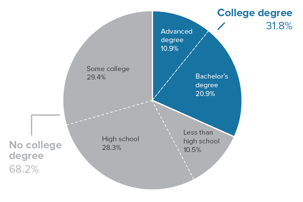
Most U.S. adults do not have a college degree: Shares of 18- to 64-year-olds with a given level of education, 2018
Source: Adapted from Figure A in Elise Gould, Zane Mokhiber, and Julia Wolfe, Class of 2018: High School Edition, Economic Policy Institute, June 2018.
Source: Adapted from Figure A in Elise Gould, Zane Mokhiber, and Julia Wolfe, Class of 2018: High School Edition, Economic Policy Institute, June 2018. EPI analysis of Current Population Survey basic monthly microdata from the U.S. Census Bureau. The 2018 analysis here uses the average of the most recent 36 months, March 2015–February 2018.
Every now and then policymakers in Washington will concede that a given economic trend warrants attention because it might harm workers without a four-year college degree. The effect that growing trade flows with less developed countries has on wages is one example. Often, however, this concession to the interests of “noncollege” workers is made with the implicit assumption that workers without a college degree represent a niche interest in the U.S. economy. This assumption is way off base. Two-thirds of working-age people in the United States have less than a four-year degree. Hence, anything that harms noncollege workers is harming the large majority of the American working-age population.
Our nation still has a long way to go in a quest for economic and racial justice: Social and economic circumstances of African American and white families, c. 1968 and c. 2018
| c. 1968 | c. 2018 (most recent available data) | Change | |
|---|---|---|---|
| High school graduate rate, adults ages 25–29 (%) | |||
| Black | 54.4% | 92.3% | 37.9 ppt. |
| White | 75.0% | 95.6% | 20.6 ppt. |
| Gap (black as % of white) | 72.6% | 96.5% | |
| College graduate rate, adults ages 25–29 (%) | |||
| Black | 9.1% | 22.8% | 13.7 ppt. |
| White | 16.2% | 42.1% | 25.9 ppt. |
| Gap (black as % of white) | 56.0% | 54.2% | |
| Unemployment rate (%) | |||
| Black | 6.7% | 7.5% | 0.8 ppt. |
| White | 3.2% | 3.8% | 0.6 ppt. |
| Gap (ratio black to white) | 2.1 | 2.0 | |
| Median hourly wage (2016$) | |||
| Black | $12.16 | $15.87 | 30.5% |
| White | $17.06 | $19.23 | 12.7% |
| Gap (black as % of white) | 71.3% | 82.5% | |
| Median household income (2016$) | |||
| Black | $28,066 | $40,065 | 42.8% |
| White | $47,596 | $65,041 | 36.7% |
| Gap (black as % of white) | 59.0% | 61.6% | |
| Poverty rate (%) | |||
| Black | 34.7% | 21.8% | -12.9 ppt. |
| White | 10.0% | 8.8% | -1.2 ppt. |
| Gap (ratio black to white) | 3.5 | 2.5 | |
| Median household wealth (2016$) | |||
| Black | $2,467 | $17,409 | 605.7% |
| White | $47,655 | $171,000 | 258.8% |
| Gap (black as % of white) | 5.2% | 10.2% | |
| Homeownership rate (%) | |||
| Black | 41.1% | 41.2% | 0.1 ppt. |
| White | 65.9% | 71.1% | 5.2 ppt. |
| Gap (black as % of white) | 62.4% | 57.9% | |
| Infant mortality (per 1,000 births) | |||
| Black | 34.9 | 11.4 | -67.4% |
| White | 18.8 | 4.9 | -74.0% |
| Gap (ratio black to white) | 1.9 | 2.3 | |
| Life expectancy at birth (years) | |||
| Black | 64.0 yrs. | 75.5 yrs. | 11.5 yrs. |
| White | 71.5 yrs. | 79.0 yrs. | 7.5 yrs. |
| Gap (black as % of white) | 89.5% | 95.6% | |
| Incarcerated population (per 100,000) | |||
| Black | 604 | 1,730 | 286.3% |
| White | 111 | 270 | 242.7% |
| Gap (ratio black to white) | 5.4 | 6.4 |

Source: Adapted from Table 1 in Janelle Jones, John Schmitt, and Valerie Wilson, 50 Years After the Kerner Commission: African Americans Are Better Off in Many Ways but Are Still Disadvantaged by Racial Inequality, Economic Policy Institute, February 2018. Values are for 1968 and 2018 or closest year for which data are available.
Source: Adapted from Table 1 in Janelle Jones, John Schmitt, and Valerie Wilson, 50 Years After the Kerner Commission: African Americans Are Better Off in Many Ways but Are Still Disadvantaged by Racial Inequality, Economic Policy Institute, February 2018. Values are for 1968 and 2018 or closest year for which data are available.
Detailed sources: High school and college graduate rates: National Center for Education Statistics, “Table 104.20. Percentage of Persons 25 to 29 Years Old with Selected Levels of Educational Attainment, by Race/Ethnicity and Sex: Selected Years, 1920 through 2017,” 2017 Tables and Figures, accessed February 4, 2018, at nces.ed.gov/programs/digest. Unemployment rates: 1968 data are from the Council of Economic Advisers, “Table B-43. Civilian Unemployment Rate by Demographic Characteristic, 1968–2009,” in Economic Report of the President 2010 (U.S. Government Printing Office), accessed February 4, 2018, at www.gpo.gov/fdsys. For 2018 (2017 data), we use Bureau of Labor Statistics data, data tools, www.bls.gov/data/#unemployment, series ID LNU04000003 and LNU04000006, accessed February 4, 2018. Median hourly wage: EPI analysis of March Current Population Survey data for calendar years 1968 and 2016. For median household income: U.S. Census Bureau, “Table H-5. Race and Hispanic Origin of Householder—Households by Median and Mean Income: 1967 to 2016,” Historical Income Tables, accessed February 4, 2018, at www.census.gov. Poverty rate: U.S. Census Bureau, “Table 2. Poverty Status of People by Family Relationship, Race, and Hispanic Origin: 1959 to 2016,” Historical Poverty Tables, accessed February 4, 2018, at www.census.gov. Median household wealth: Urban Institute analysis of Survey of Consumer Finances data, presented in “Chart 3: Average Family Wealth by Race/Ethnicity, 1963–2016,” in Nine Charts about Wealth Inequality in America, updated October 24, 2017. Homeownership rate: Laurie Goodman, Jun Zhu, and Rolf Pendall, “Are Gains in Black Homeownership History?” and accompanying downloadable spreadsheet, Urban Institute, February 15, 2017. Infant mortality: Centers for Disease Control and Prevention, “Table 11. Infant Mortality Rates, by Race: United States, Selected Years 1950–2015,” Health, United States, 2016—Individual Charts and Tables, accessed February 4, 2018, at www.cdc.gov/nchs/hus. Life expectancy at birth: Centers for Disease Control and Prevention, “Table 15. Life Expectancy at Birth, at Age 65, and at Age 75, by Sex, Race, and Hispanic Origin: United States, Selected Years 1900–2015,” Health, United States, 2016—Individual Charts and Tables, accessed February 4, 2018, at www.cdc.gov/nchs/hus. Incarcerated population: Authors’ calculations based on unpublished tabulations by Kris Warner of the Center for Economic and Policy Research, using Bureau of Justice Statistics and U.S. Census Bureau data. Values are for 1968 and 2018 or closest year for which data are available. For high school and college graduate rates, homeownership rate, infant mortality, and life expectancy at birth, the 1968 figure is estimated as 0.2 times the figure for 1960 and 0.8 times the figure for 1970. Recent data for high school and college graduate rates refer to 2016. Recent unemployment rate data refer to 2017. Median hourly wage and median household income data are converted to 2016 dollars using the CPI-U-RS chained to the CPI-U-X1. Data for median hourly wage and median household income refer to 1968 and 2016. Median household wealth data refer to 1963 and 2016. Median household wealth data are converted to 2016 dollars. For homeownership rate, infant mortality, and life expectancy at birth, most recent data refer to 2015. For infant mortality, 1968 data are based on the race of the child; 2015 data are based on the race of the mother.
This year marked the 50th anniversary of the landmark Kerner Commission report, which documented systemic racism in the United States and the economic and social inequities facing African Americans in 1968. The report warned that “our nation is moving toward two societies: one black, one white, separate and unequal,” and called for a commitment to “the realization of common opportunities for all within a single [racially undivided] society.” In a 2018 EPI report, we asked the question: Fifty years later, how far have we progressed toward that goal?
Not nearly far enough. The chart shows that, while African Americans are in many ways better off in absolute terms than they were in 1968, they are still disadvantaged in important ways relative to whites. African Americans today are much better educated than they were in 1968—but young African Americans are still half as likely as young whites to have a college degree. Black college graduation rates have doubled—but black workers still earn only 82.5 cents for every dollar earned by white workers. And—as consequences of decades of discrimination—African American families continue to lag far behind white families in homeownership rates and household wealth. The data reinforce that our nation still has a long way to go in a quest for economic and racial justice.
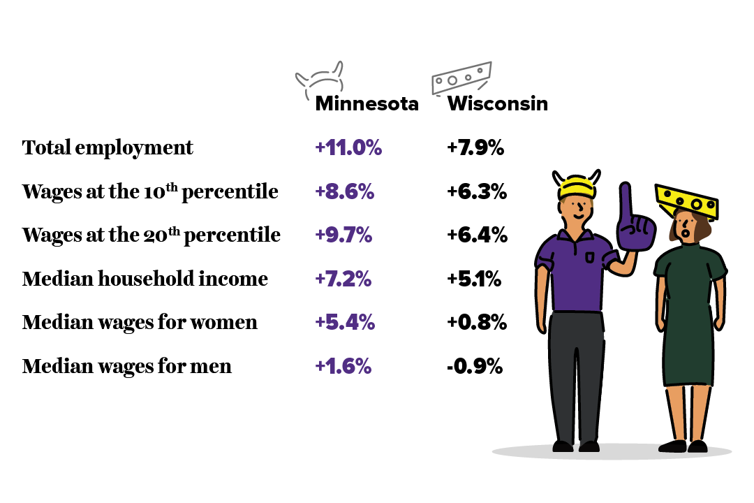
Progressive state policies create more broad prosperity than conservative state policies: Since 2010, Minnesota’s economy has outperformed Wisconsin’s
Source: David Cooper, As Wisconsin’s and Minnesota’s Lawmakers Took Divergent Paths, So Did Their Economies, Economic Policy Institute, May 2018.
Source: David Cooper, As Wisconsin’s and Minnesota’s Lawmakers Took Divergent Paths, So Did Their Economies, Economic Policy Institute, May 2018. Employment figures reflect changes from December 2010 to December 2017. Median household income numbers reflect changes from 2010 to 2016. All other numbers reflect changes from 2010 to 2017.
Policy matters, and this includes state policies. In 2010, the neighboring states of Wisconsin and Minnesota embarked on divergent political paths when voters elected a conservative, Scott Walker, as governor of Wisconsin and a progressive, Mark Dayton, as governor of Minnesota. Because these states were neighbors who had suffered similarly from the Great Recession that began in 2008, their post-recession economic performance provides useful evidence on the effect of divergent policy paths.
Governor Walker and the Wisconsin state legislature pursued a highly conservative agenda centered on cutting taxes, shrinking government, and weakening unions. In contrast, Minnesota lawmakers under Governor Dayton enacted a slate of progressive priorities: raising the minimum wage, strengthening safety net programs and labor standards, and boosting public investments in infrastructure and education, financed through higher taxes (largely on the wealthy). The evidence shows clearly superior performance—faster wage and employment growth—in Minnesota.
The Trump tax cuts didn't increase investment—but they did increase corporate profit hoarding
Undistributed domestic corporate profits as a percent of domestic corporate gross value added, 2002Q2–2018Q3
| Quarter | Undistributed profits as a percent of corporate gross value added |
|---|---|
| 2002Q2 | 3.2% |
| 2002Q3 | 3.7% |
| 2002Q4 | 4.0% |
| 2003Q1 | 4.4% |
| 2003Q2 | 3.5% |
| 2003Q3 | 4.2% |
| 2003Q4 | 3.8% |
| 2004Q1 | 4.4% |
| 2004Q2 | 4.8% |
| 2004Q3 | 5.0% |
| 2004Q4 | 2.9% |
| 2005Q1 | 5.1% |
| 2005Q2 | 6.0% |
| 2005Q3 | 8.0% |
| 2005Q4 | 9.7% |
| 2006Q1 | 4.7% |
| 2006Q2 | 4.4% |
| 2006Q3 | 3.9% |
| 2006Q4 | 2.0% |
| 2007Q1 | 1.7% |
| 2007Q2 | 2.1% |
| 2007Q3 | 0.7% |
| 2007Q4 | -0.1% |
| 2008Q1 | 0.2% |
| 2008Q2 | -0.1% |
| 2008Q3 | 0.4% |
| 2008Q4 | -1.5% |
| 2009Q1 | 1.9% |
| 2009Q2 | 3.1% |
| 2009Q3 | 5.7% |
| 2009Q4 | 6.1% |
| 2010Q1 | 6.3% |
| 2010Q2 | 6.3% |
| 2010Q3 | 7.2% |
| 2010Q4 | 6.8% |
| 2011Q1 | 4.5% |
| 2011Q2 | 5.7% |
| 2011Q3 | 5.9% |
| 2011Q4 | 6.6% |
| 2012Q1 | 6.3% |
| 2012Q2 | 6.2% |
| 2012Q3 | 5.8% |
| 2012Q4 | 3.1% |
| 2013Q1 | 5.5% |
| 2013Q2 | 3.2% |
| 2013Q3 | 3.8% |
| 2013Q4 | 3.6% |
| 2014Q1 | 2.7% |
| 2014Q2 | 3.8% |
| 2014Q3 | 4.3% |
| 2014Q4 | 4.0% |
| 2015Q1 | 3.0% |
| 2015Q2 | 3.1% |
| 2015Q3 | 2.6% |
| 2015Q4 | 1.1% |
| 2016Q1 | 1.8% |
| 2016Q2 | 2.1% |
| 2016Q3 | 2.1% |
| 2016Q4 | 2.2% |
| 2017Q1 | 2.3% |
| 2017Q2 | 2.2% |
| 2017Q3 | 3.1% |
| 2017Q4 | 2.6% |
| 2018Q1 | 13.7% |
| 2018Q2 | 9.3% |
| 2018Q3 | 7.2% |
Percent change in real nonresidential fixed investment, 2002Q2–2018Q3
| Quarter | Real nonresidential fixed investment |
|---|---|
| 2002Q2 | -1.1% |
| 2002Q3 | -0.3% |
| 2002Q4 | -1.3% |
| 2003Q1 | 0.5% |
| 2003Q2 | 2.8% |
| 2003Q3 | 2.1% |
| 2003Q4 | 1.3% |
| 2004Q1 | -1.0% |
| 2004Q2 | 2.5% |
| 2004Q3 | 2.9% |
| 2004Q4 | 2.1% |
| 2005Q1 | 1.5% |
| 2005Q2 | 1.6% |
| 2005Q3 | 2.1% |
| 2005Q4 | 0.8% |
| 2006Q1 | 3.4% |
| 2006Q2 | 1.7% |
| 2006Q3 | 1.7% |
| 2006Q4 | 1.1% |
| 2007Q1 | 1.8% |
| 2007Q2 | 2.2% |
| 2007Q3 | 1.6% |
| 2007Q4 | 1.5% |
| 2008Q1 | 0.4% |
| 2008Q2 | 0.2% |
| 2008Q3 | -1.9% |
| 2008Q4 | -5.8% |
| 2009Q1 | -7.5% |
| 2009Q2 | -3.0% |
| 2009Q3 | -0.6% |
| 2009Q4 | 0.7% |
| 2010Q1 | 0.7% |
| 2010Q2 | 3.3% |
| 2010Q3 | 2.7% |
| 2010Q4 | 1.9% |
| 2011Q1 | -0.1% |
| 2011Q2 | 2.6% |
| 2011Q3 | 4.7% |
| 2011Q4 | 2.6% |
| 2012Q1 | 2.6% |
| 2012Q2 | 2.2% |
| 2012Q3 | -0.3% |
| 2012Q4 | 1.1% |
| 2013Q1 | 1.3% |
| 2013Q2 | 0.3% |
| 2013Q3 | 1.7% |
| 2013Q4 | 2.0% |
| 2014Q1 | 1.3% |
| 2014Q2 | 2.3% |
| 2014Q3 | 2.1% |
| 2014Q4 | 0.5% |
| 2015Q1 | -0.4% |
| 2015Q2 | 0.5% |
| 2015Q3 | 0.3% |
| 2015Q4 | -1.0% |
| 2016Q1 | -0.3% |
| 2016Q2 | 0.9% |
| 2016Q3 | 1.1% |
| 2016Q4 | 0.0% |
| 2017Q1 | 2.3% |
| 2017Q2 | 1.8% |
| 2017Q3 | 0.8% |
| 2017Q4 | 1.2% |
| 2018Q1 | 2.8% |
| 2018Q2 | 2.1% |
| 2018Q3 | 0.6% |
Source: EPI analysis of data from Tables 1.1.6 and 1.14 from the National Income and Product Accounts (NIPA) from the Bureau of Economic Analysis (BEA). TCJA stands for the Tax Cuts and Jobs Act of 2017. Shaded areas denote recessions.
Policy can fight inequality, or it can generate more. And the policy priority of the Trump administration seems to be increasing inequality. Besides an ongoing assault on regulatory safeguards that provide workers needed leverage in labor market bargaining, the signature policy achievement that the administration and congressional Republicans delivered was a large, regressive tax cut for corporations. The Tax Cuts and Jobs Act (TCJA) of 2017 was championed with loud claims that it would boost investment in productivity-enhancing plants and equipment—eventually leading to higher wages for workers. Nearly a year after the act’s passage, the verdict so far is clear: the tax cuts have simply fattened already bloated corporate profits. Productive investment has not been spurred at all.
The top half of the figure shows undistributed corporate profits as a share of corporate-sector value-added (where value-added is a measure of all income—either wages or profits—generated by a corporation). Undistributed corporate profits are profits not immediately passed through to shareholders as dividends and thus available for investing in plants and equipment, or buying back shares of stock, or for other financial engineering. These undistributed profits soared in the wake of the TCJA, largely because it allowed a tax-free repatriation of profits that had been stored offshore. (A similar tax holiday in the mid-2000s led to a similar spike in undistributed profits.)
The bottom half of the figure shows where this profit bonanza did not end up—in investments in productive plants and equipment. The quarterly investment growth rate shows no indication that investment is shifting into a higher gear because of the tax cut.