We’re in the longest economic expansion in U.S. history, but the top line numbers don’t tell the whole truth. Low unemployment is finally starting to produce some wage gains, but it is going to take much more to raise living standards for wide swaths of the workforce.
Black unemployment and underemployment is still too high, black college graduates have seen their wages fall, inaction from federal policymakers on the minimum wage has dropped the wage floor from under workers at the low end of the wage ladder, and workers are still thwarted in their efforts to bargain collectively for better wages from their employers. Tax cuts for the rich have not trickled down, as history told us they would not. And claims that we can boost wages broadly by asking workers to get more education make little sense when almost two-thirds of the jobs now require—and 10 years from now will require—no education beyond high school.
On the bright side, we know from the evidence that certain policies like prioritizing full employment (by the Fed) and raising minimum wages (in the states) do make a meaningful difference in people’s lives. And teachers have shown that calling attention to disinvestment—in their case, the disinvestment in America’s schools—can bring about real change. Following are the charts that tell the story of the economic lessons of 2019.
The current ‘recovery’ hasn’t done much for wages of college grads and has done nothing for black college grads: Real average wage growth, workers with a bachelor's degree, 1996–2000 and 2015–2019
| Demographic | 1996–2000 | 2015–2019 |
|---|---|---|
| Men | 10.9% | 7.8% |
| Women | 9.8% | 3.0% |
| White | 10.6% | 6.6% |
| Black | 11.5% | -0.3% |
Note: In order to include data from the first half of 2019, all years refer to the 12-month period ending in June. Sample includes workers with a bachelor’s degree only.
Source: Reproduced from Figure A in Elise Gould and Valerie Wilson, Wage Growth Is Weak for a Tight Labor Market—and the Pace of Wage Growth Is Uneven Across Race and Gender, Economic Policy Institute, August 2019.
Source: Reproduced from Figure A in Elise Gould and Valerie Wilson, Wage Growth is Weak for a Tight Labor Market—and the Pace of Wage Growth is Uneven Across Race and Gender, Economic Policy Institute, August 2019. Data are from authors’ analysis of Current Population Survey basic monthly microdata from the U.S. Census Bureau.
Today’s low unemployment rate overstates the strength of the labor market. Other measures reveal weaknesses that highlight the danger of using only the unemployment rate as a measure of labor market slack. The figure shows one such weakness: weak wage growth among college-educated workers over the last four years, particularly when compared with wage growth for college graduates in the tight labor market of the late 1990s. Both periods had similar unemployment rates. For men and women and white and black college grads, median wages grew by more than 9% from 1996 to 2000. But from 2015 to 2019, among workers with a bachelor’s degree, only white workers and men experienced wage growth anywhere near that level: 6.6% and 7.8% respectively. Women with a bachelor’s degree saw just a 3% growth in wages, and black workers with a bachelor’s degree actually saw their wages fall 0.3%.
Inequality is rising as workers are increasingly cut out of the economic returns to productivity growth: Productivity growth and hourly compensation growth, 1948–2018
| Year | Hourly compensation | Net productivity |
|---|---|---|
| 1948 | 0.00% | 0.00% |
| 1949 | 6.24% | 1.55% |
| 1950 | 10.46% | 9.34% |
| 1951 | 11.74% | 12.24% |
| 1952 | 15.02% | 15.49% |
| 1953 | 20.82% | 19.41% |
| 1954 | 23.48% | 21.44% |
| 1955 | 28.70% | 26.38% |
| 1956 | 33.89% | 26.59% |
| 1957 | 37.08% | 30.04% |
| 1958 | 38.08% | 32.72% |
| 1959 | 42.46% | 37.63% |
| 1960 | 45.38% | 40.06% |
| 1961 | 47.84% | 44.37% |
| 1962 | 52.32% | 49.80% |
| 1963 | 54.86% | 55.03% |
| 1964 | 58.32% | 59.94% |
| 1965 | 62.27% | 64.92% |
| 1966 | 64.70% | 69.95% |
| 1967 | 66.68% | 71.98% |
| 1968 | 71.05% | 77.13% |
| 1969 | 74.39% | 77.85% |
| 1970 | 76.81% | 80.35% |
| 1971 | 81.66% | 87.10% |
| 1972 | 91.34% | 92.20% |
| 1973 | 90.96% | 96.96% |
| 1974 | 87.05% | 93.83% |
| 1975 | 86.86% | 98.11% |
| 1976 | 89.35% | 103.59% |
| 1977 | 92.82% | 106.05% |
| 1978 | 95.66% | 108.27% |
| 1979 | 93.25% | 108.11% |
| 1980 | 88.05% | 106.77% |
| 1981 | 87.36% | 110.50% |
| 1982 | 87.70% | 108.37% |
| 1983 | 88.49% | 114.51% |
| 1984 | 87.03% | 120.21% |
| 1985 | 86.18% | 123.65% |
| 1986 | 87.25% | 128.28% |
| 1987 | 84.67% | 128.80% |
| 1988 | 84.02% | 132.01% |
| 1989 | 83.93% | 134.12% |
| 1990 | 82.37% | 136.95% |
| 1991 | 82.02% | 138.50% |
| 1992 | 83.20% | 147.48% |
| 1993 | 83.46% | 148.51% |
| 1994 | 83.89% | 150.54% |
| 1995 | 82.76% | 151.59% |
| 1996 | 82.87% | 156.24% |
| 1997 | 84.87% | 160.72% |
| 1998 | 89.27% | 166.21% |
| 1999 | 91.98% | 173.46% |
| 2000 | 92.96% | 179.47% |
| 2001 | 95.60% | 183.71% |
| 2002 | 99.49% | 191.50% |
| 2003 | 101.58% | 201.22% |
| 2004 | 100.56% | 209.29% |
| 2005 | 99.73% | 215.29% |
| 2006 | 99.88% | 217.61% |
| 2007 | 101.45% | 219.78% |
| 2008 | 101.39% | 221.39% |
| 2009 | 109.30% | 228.75% |
| 2010 | 111.00% | 238.23% |
| 2011 | 108.47% | 238.21% |
| 2012 | 106.50% | 239.57% |
| 2013 | 108.40% | 240.96% |
| 2014 | 109.08% | 242.91% |
| 2015 | 112.41% | 245.75% |
| 2016 | 114.39% | 246.34% |
| 2017 | 114.67% | 249.78% |
| 2018 | 115.62% | 252.90% |
Notes: Data are for compensation (wages and benefits) of production/nonsupervisory workers in the private sector and net productivity of the total economy. “Net productivity” is the growth of output of goods and services less depreciation per hour worked.
Source: Adapted from The Productivity–Pay Gap, Economic Policy Institute, July 2019.
Source: Adapted from The Productivity-Pay Gap, Economic Policy Institute, July 2019. Data from from EPI analysis of unpublished Total Economy Productivity data from Bureau of Labor Statistics (BLS) Labor Productivity and Costs program, wage data from the BLS Current Employment Statistics, BLS Employment Cost Trends, BLS Consumer Price Index, and Bureau of Economic Analysis National Income and Product Accounts.
What is behind the extraordinary rise in inequality and the near-stagnant growth of wages for typical workers over most of the past generation? The root cause is that workers are being cut out of their share of economic growth—as shown in the pay–productivity gap. Before the late 1970s, wages and benefits of the vast majority of workers grew in line with productivity. In the late 1970s, typical worker pay growth split from economy-wide productivity growth. Productivity is a measure of how much income is generated in an average hour of work in the economy. While productivity after 1979 grew more slowly relative to previous decades, it did grow steadily, offering the potential for broad-based pay growth. But income gains were not broad-based. In fact, average pay of the 80 percent of the private-sector workers who are not supervisors barely budged in that time. The growing wedge between productivity and pay is the income generated by workers in the economy that has been claimed by corporate owners and managers and others at the very top of the pay scale.
We need low unemployment to help pay growth keep pace with productivity: How much productivity growth exceeded pay growth on an average annual basis in low-, medium-, and high-unemployment years, 1949–2017
| Category | Annual average of difference between productivity and pay growth |
|---|---|
| Lowest unemployment years | 0.09% |
| Medium unemployment years | 0.71% |
| Highest unemployment years | 1.26% |
Notes: Bars represent average annual difference between productivity growth and growth in hourly pay for typical workers for years with the highest, lowest, and medium unemployment rates from 1949 to 2017. Lowest unemployment group includes the 17 years with the lowest rates of unemployment in the 68-year sample, highest unemployment group includes the 17 years with the highest rates of unemployment in the sample, and medium unemployment group includes the 34 remaining years in the sample.
Notes: Bars represent average annual difference between productivity growth and growth in hourly pay for typical workers for years with the highest, lowest, and medium unemployment rates from 1949 to 2017. Lowest unemployment group includes the 17 years with the lowest rates of unemployment in the 68-year sample, highest unemployment group includes the 17 years with the highest rates of unemployment in the sample, and medium unemployment group includes the 34 remaining years in the sample. The growth of the productivity–pay gap is highlighted in EPI’s Productivity–Pay Tracker (epi.org/productivity-pay-gap).
Source: Adapted from Figure A in Josh Bivens, Wage Growth Is Being Held Back by Political Decisions and the Trump Administration Is on the Wrong Side of Key Debates, Economic Policy Institute, August 2019.
Source: Adapted from Figure A in Josh Bivens, Wage Growth Is Being Held Back by Political Decisions and the Trump Administration Is on the Wrong Side of Key Debates, Economic Policy Institute, August 2019. Data are from EPI analysis of unpublished Total Economy Productivity data from the Bureau of Labor Statistics (BLS) Labor Productivity and Costs program, wage data from BLS Current Employment Statistics, BLS Employment Cost Trends, BLS Consumer Price Index, Bureau of Economic Analysis National Income and Product Accounts, and BLS Current Population Survey public data.
A key reason why wage growth and productivity growth split in the late 1970s is that macroeconomic policymakers—particularly the Federal Reserve—stopped the aggressive pursuit of genuine full employment. Low unemployment helps give workers leverage when it comes to demanding wages that keep pace with the output they are helping to generate. As the figure shows, in the low unemployment years, productivity just slightly exceeded pay growth; in the medium unemployment years, the productivity–pay gap was significantly larger; and for the highest unemployment years, the gap was very large. (The lowest unemployment group includes the 17 years from 1949 to 2017 with the lowest unemployment rates, the highest unemployment group includes the years with the highest unemployment rates, and the medium unemployment group includes the remaining 34 years. For each group, we calculated the degree to which productivity exceeded pay growth, on average.)
For most of the post-1979 period, the Fed prioritized very low and falling rates of inflation over low rates of unemployment. This meant that they tolerated unemployment rates higher than were necessary to keep inflation stable, to the detriment of workers’ labor market leverage. Luckily, there are signs that the past decade has reminded the Fed of the benefits of pursuing maximum employment. Today’s low unemployment rate is essentially the continuation of a trend inherited by the Trump administration, with unemployment falling steadily in each year since 2010.
The remarkable thing about this trend is the Fed’s sharp break with past practice. Past recoveries have too often been cut short by the Fed’s excess fear of inflation: the Fed too often began raising interest rates before a sustained period of low unemployment began delivering healthy wage growth to low- and moderate-wage workers. In the current recovery, the Fed refrained from raising interest rates even when unemployment dipped far below what had been identified as the “natural rate” of unemployment that would keep inflation in check.
Black unemployment and skills-based underemployment are still too high: Black workers are twice as likely to be unemployed as white workers, and black college grads are 28% more likely to be in a job that doesn’t require a college degree
| Race/ethnicity | Rate |
|---|---|
| 0% | |
| Black | 6.4% |
| White | 3.1% |
| 0% | |
| Black | 3.5% |
| White | 2.2% |
| 0% | |
| Black | 39.4% |
| White | 30.9% |
Notes: Estimates are based on a 12-month average (July 2018–June 2019). “Black” includes blacks of Hispanic ethnicity. Whites are non-Hispanic. College graduates in the bottom panel include those with a bachelor’s degree or higher.
Notes: Estimates are based on a 12-month average (July 2018–June 2019). “Black” includes blacks of Hispanic ethnicity. Whites are non-Hispanic. College graduates in the bottom panel include those with a bachelor’s degree or higher. See the methodology in Williams and Wilson 2019 for how “college occupation” is defined.
Source: Reproduced from Figure C in Jhacova Williams and Valerie Wilson, Black Workers Endure Persistent Racial Disparities in Employment Outcomes, Economic Policy Institute, August 2019.
Source: Reproduced from Figure C in Jhacova Williams and Valerie Wilson, Black Workers Endure Persistent Racial Disparities in Employment Outcomes, Economic Policy Institute, August 2019. Data reflect the authors’ analysis of Current Population Survey basic monthly microdata from the U.S. Census Bureau.
While the current policy focus on sustaining low unemployment is welcome news, we need to keep unemployment low enough long enough to lift up all workers. As of mid-2019, black workers are twice as likely to be unemployed as white workers overall (6.4% vs. 3.1%). Even black workers with a college degree are more likely to be unemployed than similarly educated white workers (3.5% vs. 2.2%). When they are employed, black workers with a college or advanced degree are more likely than their white counterparts to be underemployed when it comes to their skill level—almost 40% are in a job that typically does not require a college degree, compared with 31% of white college grads. While tight labor markets provide disproportionate gains to black workers, there clearly remains more room to reduce race-based labor market disparities by both tightening up the aggregate labor market even further and honing in on race-specific policies to reduce gaps.
Failure to raise the federal minimum wage has taken thousands of dollars out of the pockets of minimum wage workers: The real value of the minimum wage (adjusted for inflation) is 17% less than 10 years ago and 31% less than in 1968
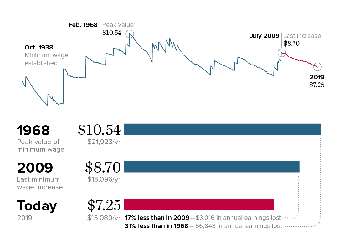
Note: All values are in June 2019 dollars, adjusted using the CPI-U-RS.
Source: Adapted from Figure C in David Cooper, Elise Gould, and Ben Zipperer, Low-Wage Workers Are Suffering from a Decline in the Real Value of the Federal Minimum Wage, Economic Policy Institute, August 2019).
Source: Adapted from Figure C in David Cooper, Elise Gould, and Ben Zipperer, Low-Wage Workers Are Suffering from a Decline in the Real Value of the Federal Minimum Wage, Economic Policy Institute, August 2019). The figure reflects EPI analysis of historical minimum wage data in the Fair Labor Standards Act and amendments.
By setting a wage floor, the federal minimum wage is supposed to help ensure that workers with the least bargaining power are cut in on an equitable share of economic growth. But federal policymakers have neglected to increase the federal minimum wage to keep up with inflation, and it is $7.25 per hour today. The figure shows that the real value of the federal minimum wage has dropped 17% since 2009 and 31% since 1968. A full-time worker earning the federal minimum wage today has about $6,800 less per year to spend on food, rent, and other essentials than did his or her counterpart 50 years ago. States can enact minimum wages that are higher than the federal minimum wage, and some states have done just that.
It’s not just minimum wage workers who benefit from minimum wage increases: Low-wage workers in general tend to get a wage bump when the wage floor rises. Wage growth for low-wage workers in states with minimum wage increases that have outpaced inflation is faster than in states without such increases. Federal policymakers should heed the lessons from state increases and raise the federal minimum wage. The Raise the Wage Act of 2019 would raise wages for 33.5 million workers nationwide by increasing the federal minimum wage to $15 by 2025 and would set it to update automatically each year based on median wage growth.
States enacting meaningful minimum wage increases have raised pay for their low-wage workers overall: Change in the 10th percentile real wage between 2010 and 2018 in states with and without real minimum wage changes, overall and by gender
| States without real increase | States with real increase | |
|---|---|---|
| Overall | 5.7% | 9.9% |
| Men | 6.0% | 8.6% |
| Women | 2.8% | 10.7% |
Note: The real minimum wage increased between 2010 and 2018 in Alaska, Arizona, Arkansas, California, Colorado, Connecticut, District of Columbia, Hawaii, Maine, Maryland, Massachusetts, Michigan, Minnesota, Nebraska, New Jersey, New York, Oregon, Rhode Island, South Dakota, Vermont, Washington, and West Virginia.
Source: Adapted from Figure C in David Cooper, Elise Gould, and Ben Zipperer, Low-Wage Workers Are Suffering from a Decline in the Real Value of the Federal Minimum Wage, Economic Policy Institute, August 2019.
Source: Adapted from Figure C in David Cooper, Elise Gould, and Ben Zipperer, Low-Wage Workers Are Suffering from a Decline in the Real Value of the Federal Minimum Wage, Economic Policy Institute, August 2019. Data are from the authors’ analysis of Current Population Survey basic monthly microdata from the U.S. Census Bureau.
While federal policymakers have neglected to increase the federal minimum wage above $7.25 per hour, many states and cities have raised their own minimum wages above the federal level. As of July 2019, 29 states and the District of Columbia have wage floors higher than the federal minimum. The lowest-paid workers in these states are clearly better off than their counterparts in the states with a minimum wage still stuck at $7.25 per hour.
But the most meaningful boost to living standards appears in the states whose minimum wage increases have outpaced inflation. If we subtract the eight states whose increases have been too infrequent and small to stay ahead of the rising cost of living, it leaves 21 states (and the District of Columbia) where the inflation-adjusted minimum wage actually rose in value between 2010 and 2018.
The wages of low-wage workers in those states rose much faster than in states without real minimum wage increases. The figure shows the gains in the 10th percentile hourly wage (i.e., the wage for the worker who earns more than only 10% of all workers) between 2010 and 2018 for each set of states, overall and by gender. Between 2010 and 2018, the 10th percentile hourly wage increased 9.9% in states with real minimum wage increases, compared with growth of only 5.7% in states without an inflation-adjusted increase in their minimum wage. The figure also shows that real minimum wage increases were particularly beneficial to women. And if we convert the overall growth rate in the two sets of states to an annual rate, we see that the 10th percentile wage grew 0.5 percentage points faster in states with real minimum wage increases than in states without real minimum wage increases. That’s a sizable benefit considering that labor markets were already tightening (i.e., employers were increasingly competing to fill jobs) in all states during this period).
A large share of workers do not have the union representation they want and need: Share of workers who are either covered by a union contract or would vote for a union in their workplace, and share of workers who are covered by a union contract, 1977 and 2017
| Year | Share of workers either covered by a union contract or who would vote for a union | Share of workers covered by a union contract |
|---|---|---|
| 1977 | 50.8% | 26.5% |
| 2017 | 54.2% | 11.9% |
Source: Reproduced from Figure A in Heidi Shierholz, Working People Have Been Thwarted in Their Efforts to Bargain for Better Wages by Attacks on Unions, Economic Policy Institute, August 2019.
Source: Reproduced from Figure A in Heidi Shierholz, Working People Have Been Thwarted in Their Efforts to Bargain for Better Wages, Economic Policy Institute, August 2019. Data are from the author’s analysis of Thomas A. Kochan et al., “Worker Voice in America: Is There a Gap Between What Workers Expect and What They Experience?” ILR Review 72, no. 1 (2019), and Bureau of Labor Statistics’ Current Population Survey public data series.
One institution of the U.S. economy that acts to raise workers’ wages (and improve benefits and working conditions) is labor unions. But as shown in the figure, a huge swath of U.S. workers do not have the union representation and voice at work that they want and that would enable them to bargain for better wages and working conditions. The share of workers covered by a collective bargaining agreement dropped from 27.0% in 1979 to 11.7% in 2018, meaning the union coverage rate is now less than half of what it was 40 years ago.
Are today’s workers just less interested in being in a union than workers of prior decades? Not in the least. As the figure shows, the share of workers who are either covered by a union contract or report they would vote for a union if a union election were held at their workplace has held steady for 40 years. It was 50.8% in 1977 and 54.2% in 2017 (we use these years here, instead of 1979 and 2018, due to limited data availability). Given the decline in union representation during those same years, the share of workers who would be represented by a union if those who didn’t get coverage could get it is now more than four times as high as the actual share of workers who are covered by a union contract.
Employers routinely fire workers and use other illegal tactics to thwart workers’ efforts to unionize
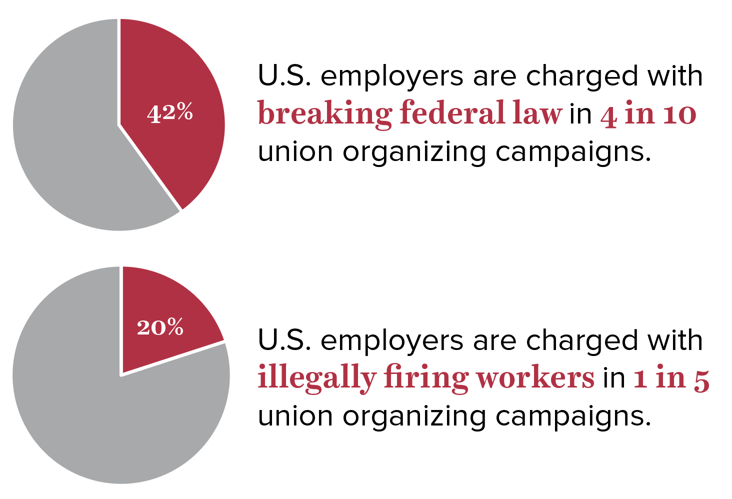
Source: Adapted from Figure C in Celine McNicholas, Margaret Poydock, Julia Wolfe, Ben Zipperer, Gordon Lafer, and Lola Loustaunau, Unlawful, Economic Policy Institute, December 2019. Data are from the authors’ analysis of National Labor Relations Board election data for calendar years 2016–2017 and ULP filings from fiscal years 2015–2018.
In the face of a worker campaign to form a union, employers routinely engage in a wide range of tactics to prevent workers from organizing. As the figure shows, more than two in five employers were charged with illegal tactics—from coercion to threats to firings—in more than two out of five (41.5%) of union elections in 2016 and 2017. And one of the most severe forms of employer aggression—firing or discharging workers for union activity—is widespread. Employers were charged with illegally firing workers in one out of five (19.9%) of union elections in 2016 and 2017. (The share of firings charges is a conservative estimate and could be as high as 30% if charges involving potential discharge as part of a “concerted activities” charge were included.) EPI’s analysis of the data also shows that when the potential bargaining unit size was larger (including 61 or more workers), employers were even more likely to be charged with engaging in illegal tactics or illegally firing workers around the time of the election.
As union membership declines, income inequality increases: Union membership and share of income going to the top 10%, 1917–2017
| Year | Union membership | Share of income going to the top 10% |
|---|---|---|
| 1917 | 11.0% | 40.3% |
| 1918 | 12.1% | 39.9% |
| 1919 | 14.3% | 39.5% |
| 1920 | 17.5% | 38.1% |
| 1921 | 17.6% | 42.9% |
| 1922 | 14.0% | 42.9% |
| 1923 | 11.7% | 40.6% |
| 1924 | 11.3% | 43.3% |
| 1925 | 11.0% | 44.2% |
| 1926 | 10.7% | 44.1% |
| 1927 | 10.6% | 44.7% |
| 1928 | 10.4% | 46.1% |
| 1929 | 10.1% | 43.8% |
| 1930 | 10.7% | 43.1% |
| 1931 | 11.2% | 44.4% |
| 1932 | 11.3% | 46.3% |
| 1933 | 9.5% | 45.0% |
| 1934 | 9.8% | 45.2% |
| 1935 | 10.8% | 43.4% |
| 1936 | 11.1% | 44.8% |
| 1937 | 18.6% | 43.3% |
| 1938 | 23.9% | 43.0% |
| 1939 | 24.8% | 44.6% |
| 1940 | 23.5% | 44.4% |
| 1941 | 25.4% | 41.0% |
| 1942 | 24.2% | 35.5% |
| 1943 | 30.1% | 32.7% |
| 1944 | 32.5% | 31.5% |
| 1945 | 33.4% | 32.6% |
| 1946 | 31.9% | 34.6% |
| 1947 | 31.1% | 33.0% |
| 1948 | 30.5% | 33.7% |
| 1949 | 29.6% | 33.8% |
| 1950 | 30.0% | 33.9% |
| 1951 | 32.4% | 32.8% |
| 1952 | 31.5% | 32.1% |
| 1953 | 33.2% | 31.4% |
| 1954 | 32.7% | 32.1% |
| 1955 | 32.9% | 31.8% |
| 1956 | 33.2% | 31.8% |
| 1957 | 32.0% | 31.7% |
| 1958 | 31.1% | 32.1% |
| 1959 | 31.6% | 32.0% |
| 1960 | 30.7% | 31.7% |
| 1961 | 28.7% | 31.9% |
| 1962 | 29.1% | 32.0% |
| 1963 | 28.5% | 32.0% |
| 1964 | 28.5% | 31.6% |
| 1965 | 28.6% | 31.5% |
| 1966 | 28.7% | 32.0% |
| 1967 | 28.6% | 32.0% |
| 1968 | 28.7% | 32.0% |
| 1969 | 28.3% | 31.8% |
| 1970 | 27.9% | 31.5% |
| 1971 | 27.4% | 31.8% |
| 1972 | 27.5% | 31.6% |
| 1973 | 27.1% | 31.9% |
| 1974 | 26.5% | 32.4% |
| 1975 | 25.7% | 32.6% |
| 1976 | 25.7% | 32.4% |
| 1977 | 25.2% | 32.4% |
| 1978 | 24.7% | 32.4% |
| 1979 | 25.4% | 32.3% |
| 1980 | 23.6% | 32.9% |
| 1981 | 22.3% | 32.7% |
| 1982 | 21.6% | 33.2% |
| 1983 | 21.4% | 33.7% |
| 1984 | 20.5% | 33.9% |
| 1985 | 19.0% | 34.3% |
| 1986 | 18.5% | 34.6% |
| 1987 | 17.9% | 36.5% |
| 1988 | 17.6% | 38.6% |
| 1989 | 17.2% | 38.5% |
| 1990 | 16.7% | 38.8% |
| 1991 | 16.2% | 38.4% |
| 1992 | 16.2% | 39.8% |
| 1993 | 16.2% | 39.5% |
| 1994 | 16.1% | 39.6% |
| 1995 | 15.3% | 40.5% |
| 1996 | 14.9% | 41.2% |
| 1997 | 14.7% | 41.7% |
| 1998 | 14.2% | 42.1% |
| 1999 | 13.9% | 42.7% |
| 2000 | 13.5% | 43.1% |
| 2001 | 13.5% | 42.2% |
| 2002 | 13.3% | 42.4% |
| 2003 | 12.9% | 42.8% |
| 2004 | 12.5% | 43.6% |
| 2005 | 12.5% | 44.9% |
| 2006 | 12.0% | 45.5% |
| 2007 | 12.1% | 45.7% |
| 2008 | 12.4% | 46.0% |
| 2009 | 12.3% | 45.5% |
| 2010 | 11.9% | 46.4% |
| 2011 | 11.8% | 46.6% |
| 2012 | 11.2% | 47.8% |
| 2013 | 11.2% | 46.7% |
| 2014 | 11.1% | 46.9% |
| 2015 | 11.1% | 47.2% |
| 2016 | 10.7% | 47.4% |
| 2017 | 10.7% | 47.9% |
Source: Reproduced from Figure A in Heidi Shierholz, Working People Have Been Thwarted in Their Efforts to Bargain for Better Wages by Attacks on Unions, Economic Policy Institute, August 2019.
Source: Reproduced from Figure A in Heidi Shierholz, Working People Have Been Thwarted in Their Efforts to Bargain for Better Wages by Attacks on Unions, Economic Policy Institute, August 2019. Data on union density follows the composite series found in Historical Statistics of the United States; updated to 2017 from unionstats.com. Income inequality (share of income to top 10%) data are from Thomas Piketty and Emmanuel Saez, “Income Inequality in the United States, 1913–1998,” Quarterly Journal of Economics 118, no. 1 (2003) and updated data from the Top Income Database, updated March 2019.
Many of the reasons workers want to be in unions—e.g., to improve their wages, benefits, and working conditions—are, of course, precisely the reasons unions are so fiercely opposed: strong unions mean that income growth is distributed broadly and not just to the richest households. The figure shows the relationship between union membership and the share of income going to the top 10 percent of households. As union membership rose in the 1930s and 1940s, the bottom 90 percent gained significantly. But as the decline in union membership began accelerating after 1979, the top 10 percent took ever-larger shares of income. The top 10% captured nearly half of income in 2017, and the union membership rate that year was 10.7%.
A separate EPI analysis shows that de-unionization accounts for a sizable share of the growth in inequality between typical workers and workers at the high end of the wage distribution in recent decades. Specifically, the decline in union coverage accounts for 13–20% of the rise in inequality between the lowest- and highest-wage women and 33–37% of the rise in inequality among the lowest- and highest-wage men. Efforts to erode worker power have paid off handsomely for the small sliver of people on the winning end of rising inequality.
(The inequality share estimates of 13% for women and 37% for men are from EPI analysis of data from a 2019 Vancouver School of Economics working paper and the estimates of one-fifth (i.e., 20% for women) and one-third (i.e., 33% for men) are from an August 2011 American Sociological Review article by Bruce Western and Jake Rosenfeld.)
More evidence the Trump tax cuts aren’t working as advertised: Change in real, nonresidential fixed investment shows no investment boom
| Years | Real, nonresidential fixed investment |
|---|---|
| 2003-Q1 | -2.3% |
| 2003-Q2 | 1.6% |
| 2003-Q3 | 4.0% |
| 2003-Q4 | 6.8% |
| 2004-Q1 | 5.2% |
| 2004-Q2 | 4.9% |
| 2004-Q3 | 5.7% |
| 2004-Q4 | 6.5% |
| 2005-Q1 | 9.2% |
| 2005-Q2 | 8.2% |
| 2005-Q3 | 7.4% |
| 2005-Q4 | 6.1% |
| 2006-Q1 | 8.0% |
| 2006-Q2 | 8.2% |
| 2006-Q3 | 7.8% |
| 2006-Q4 | 8.1% |
| 2007-Q1 | 6.5% |
| 2007-Q2 | 7.0% |
| 2007-Q3 | 6.8% |
| 2007-Q4 | 7.3% |
| 2008-Q1 | 5.8% |
| 2008-Q2 | 3.8% |
| 2008-Q3 | 0.2% |
| 2008-Q4 | -7.0% |
| 2009-Q1 | -14.4% |
| 2009-Q2 | -17.1% |
| 2009-Q3 | -16.1% |
| 2009-Q4 | -10.3% |
| 2010-Q1 | -2.3% |
| 2010-Q2 | 4.1% |
| 2010-Q3 | 7.5% |
| 2010-Q4 | 8.9% |
| 2011-Q1 | 8.0% |
| 2011-Q2 | 7.3% |
| 2011-Q3 | 9.3% |
| 2011-Q4 | 10.0% |
| 2012-Q1 | 12.9% |
| 2012-Q2 | 12.6% |
| 2012-Q3 | 7.2% |
| 2012-Q4 | 5.6% |
| 2013-Q1 | 4.3% |
| 2013-Q2 | 2.3% |
| 2013-Q3 | 4.4% |
| 2013-Q4 | 5.4% |
| 2014-Q1 | 5.5% |
| 2014-Q2 | 8.1% |
| 2014-Q3 | 8.4% |
| 2014-Q4 | 6.9% |
| 2015-Q1 | 5.0% |
| 2015-Q2 | 2.5% |
| 2015-Q3 | 0.8% |
| 2015-Q4 | -0.9% |
| 2016-Q1 | -0.7% |
| 2016-Q2 | 0.0% |
| 2016-Q3 | 1.1% |
| 2016-Q4 | 2.4% |
| 2017-Q1 | 4.2% |
| 2017-Q2 | 4.3% |
| 2017-Q3 | 3.5% |
| 2017-Q4 | 5.4% |
| 2018-Q1 | 6.0% |
| 2018-Q2 | 6.9% |
| 2018-Q3 | 6.8% |
| 2018-Q4 | 5.9% |
| 2019-Q1 | 4.8% |
| 2019-Q2 | 2.6% |
| 2019-Q3 | 1.3% |
Note: Chart shows year-over-year change in real, nonresidential fixed investment from 2003Q1 to 2019Q3.
Source: Adapted from Figure A in Hunter Blair, "The Tax Cuts and Jobs Act Isn’t Working and There’s No Reason to Think That Will Change," Working Economics (Economic Policy Institute blog), October 31, 2019.
Source: Adapted from Figure A in Hunter Blair, The Tax Cuts and Jobs Act Isn’t Working and There’s No Reason to Think That Will Change, Economic Policy Institute, October 2019. Data are from EPI analysis of data in Table 1.1.6 from the National Income and Product Accounts (NIPA) from the Bureau of Economic Analysis (BEA).
Working people’s wages rise when we cut corporate taxes, according to proponents of the Tax Cuts and Jobs Act (TCJA). This bold and disproven claim about the effects of the TCJA on the paychecks of U.S. households rested on an economic theory that corporate rate cuts would bring forth enough additional savings to finance an increase in investment spending . A durable and sharp increase in investment spending is hence necessary to sustain claims that the TCJA will boost growth in the long run. As the figure shows, investment has not boomed since the TCJA’s passage. Instead of an investment boom indicating the TCJA is working, we see investment growth continuing along its pre-TCJA trend for a couple of quarters before falling all the way to 1.3% in the third quarter of 2019. To be clear, if the TCJA’s corporate rate cuts were working, we would be seeing a permanent rise in investment. Instead, investment growth is cratering.
Teachers earn 21.4% less than comparable college graduates: Teacher weekly wage penalty for all teachers and by gender, 1979–2018
| All | Women | Men | All | Women | Men | All | Women | Men | |
|---|---|---|---|---|---|---|---|---|---|
| 1979 | -7.31% | 6.87% | -17.82% | ||||||
| 1980 | -9.56% | 4.82% | -20.34% | ||||||
| 1981 | -10.31% | 3.46% | -20.14% | ||||||
| 1982 | -10.45% | 3.17% | -20.54% | ||||||
| 1983 | -12.07% | 1.37% | -21.89% | ||||||
| 1984 | -10.28% | 2.82% | -20.86% | ||||||
| 1985 | -10.47% | 2.21% | -20.71% | ||||||
| 1986 | -9.04% | 3.52% | -19.53% | ||||||
| 1987 | -8.14% | 4.19% | -19.25% | ||||||
| 1988 | -8.26% | 5.45% | -19.35% | ||||||
| 1989 | -8.46% | 3.37% | -18.18% | ||||||
| 1990 | -7.98% | 4.37% | -19.05% | ||||||
| 1991 | -9.32% | 0.97% | -17.51% | ||||||
| 1992 | -7.25% | 3.42% | -16.75% | ||||||
| 1993 | -5.30% | 4.45% | -14.23% | -5.3% | 4.45% | -14.2% | |||
| 1994 | – | ||||||||
| 1995 | – | ||||||||
| 1996 | -6.30% | 0.25% | -16.23% | -6.30% | 0.25% | -16.23% | |||
| 1997 | -7.07% | 0.52% | -19.80% | ||||||
| 1998 | -9.80% | -1.97% | -21.73% | ||||||
| 1999 | -11.64% | -3.69% | -22.96% | ||||||
| 2000 | -11.56% | -4.71% | -23.05% | ||||||
| 2001 | -12.98% | -5.36% | -25.48% | ||||||
| 2002 | -12.96% | -6.28% | -24.72% | ||||||
| 2003 | -12.43% | -5.99% | -22.24% | ||||||
| 2004 | -11.96% | -5.16% | -22.88% | ||||||
| 2005 | -13.68% | -6.30% | -25.75% | ||||||
| 2006 | -15.11% | -8.27% | -26.60% | ||||||
| 2007 | -13.01% | -6.00% | -24.53% | ||||||
| 2008 | -14.55% | -7.95% | -25.40% | ||||||
| 2009 | -13.71% | -6.29% | -25.43% | ||||||
| 2010 | -13.54% | -5.91% | -25.47% | ||||||
| 2011 | -14.28% | -7.57% | -26.39% | ||||||
| 2012 | -15.51% | -9.14% | -26.41% | ||||||
| 2013 | -16.71% | -10.06% | -28.11% | ||||||
| 2014 | -17.10% | -11.14% | -26.75% | ||||||
| 2015 | -18.99% | -13.71% | -27.78% | ||||||
| 2016 | -20.23% | -12.98% | -32.46% | ||||||
| 2017 | -20.74% | -15.59% | -30.08% | ||||||
| 2018 | -21.44% | -15.12% | -31.55% |
Notes: Figure shows regression-adjusted weekly wage penalties (or premiums) for public school teachers (elementary, middle, and secondary) relative to other college graduates.
Notes: Figure shows regression-adjusted weekly wage penalties (or premiums) for public school teachers (elementary, middle, and secondary) relative to other college graduates. (The figure shows a wage premium for women teachers from 1979–1997.) Dependent variable is (log) weekly wages with indicator controls on public school teacher, private school teacher, gender, and married, along with indicator sets on education (M.A., professional degree, Ph.D.) and race/ethnicity (black, Hispanic, other); also included are age (as a quartic) and state fixed effects. Estimates are omitted for 1994 and 1995, as imputation flags are incomplete or not available; data points for these years are represented by dotted lines (see Appendix A in Allegretto and Mishel 2019 for more detail).
Source: Reproduced from Figure B in Sylvia Allegretto and Lawrence Mishel, The Teacher Weekly Wage Penalty Hit 21.4% in 2018, a Record High, Economic Policy Institute, April 2019.
Source: Reproduced from Figure B in Sylvia Allegretto and Lawrence Mishel, The Teacher Weekly Wage Penalty Hit 21.4% in 2018, a Record High, Economic Policy Institute, April 2019. Data are from authors’ analysis of Current Population Survey Outgoing Rotation Group data.
School teacher strikes made the news over and over again in 2019, highlighting the profound disinvestment in the nation’s public schools that has been taking place over recent decades. A growing teacher pay penalty is a critical component of that, as seen in this chart.
The teacher pay penalty has not been a fact of U.S. life forever—as recently as the mid-1990s, teacher pay was reasonably competitive. But in the past two decades or more, the relative pay of teachers has collapsed. By 2018, the teacher pay penalty had grown to more than 20%. While teachers do, on average, receive more valuable benefits than their professional peers, these better benefits do not make up for the huge gap in cash compensation. Given the vast reams of research showing the importance of teacher quality to student outcomes, this disinvestment in the pay of teachers is extraordinarily destructive to the quality of the nation’s public education system.
How much do teachers pay for school supplies?: U.S. teachers spend on average $459 of their own money on classroom supplies
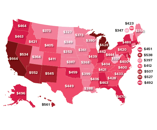
Note: The dollar values represent average unreimbursed spending across all K–12 public noncharter school teachers and include teachers who reported zero unreimbursed spending for school supplies. Data are 2011–2012 Schools and Staffing Survey microdata from the U.S. Department of Education's National Center for Education Statistics (NCES). Spending data are inflation-adjusted from 2011 dollars to 2018 dollars using the CPI-U-RS.
Source: Adapted from Figure A in Emma García, "It’s the Beginning of the School Year and Teachers Are Once Again Opening Up Their Wallets to Buy School Supplies," Working Economics (Economic Policy Institute blog), August 22, 2019.
The public investment shortfall that keeps teachers from being paid competitively with their professional peers also keeps the nation’s schools from being adequately stocked with the supplies needed for instruction. This supplies gap is often closed by the very same teachers who suffer from too low pay but who nevertheless pull out their own wallets to make sure their students have what they need. An overwhelming majority of teachers—more than nine out of 10—will not be reimbursed for these expenses, according to survey data from the National Center for Education Statistics (NCES).
The nation’s K–12 public school teachers shell out, on average, $459 annually on school supplies for which they are not reimbursed. The map shows that there are wide variations from state to state, with teachers on average spending $327 in North Dakota (on the low end of the spectrum) and $664 in California (on the high end).
In an economy dominated by noncollege jobs, we can’t pin hopes for broad wage growth on getting more education: Education requirements for the jobs of 2018 and for the projected jobs of 2028
| Education | 2018 | 2028 |
|---|---|---|
| High school diploma/GED, or no formal education required | 63% | 62% |
| Postsecondary nondegree award or certificate, or associate degree | 11% | 11% |
| Bachelor’s degree | 22% | 23% |
| Advanced degree | 4% | 5% |
Note: Percentages may not add up to 100 due to rounding.
Source: Economic Policy Institute analysis of Bureau of Labor Statistics Employment Projections data.
Ten years from now, no education beyond high school will be required for almost two-thirds (62%) of jobs in the United States. Only 38 percent of jobs will require education (whether a non-degree award, certificate, bachelor’s degree, or advanced degree) beyond high school. The share of jobs requiring more than a high school diploma is up slightly from 37% in 2018, so the share is growing, but slowly. If all workers were to get a certificate or degree of some kind, it would not meaningfully increase the share of jobs that require those credentials. It would just mean there would be a lot of workers with those credentials working in jobs that don’t require them.
What do we know about these jobs of the future? Five of the seven occupations projected to have the most growth in the next 10 years are low-wage jobs in the care sector (personal care aides and home health aides) and low-wage jobs in the restaurant industry (waiters and waitresses, restaurant cooks, and combined food preparation and serving workers, including fast food workers). None of these positions require any education beyond high school, and all of them currently pay less than $27,000 per year.
One key priority for a fair economy is therefore to support policies that will help ensure that 10 years from now, the 62% of jobs in our economy that don’t require any postsecondary education are good jobs.
