What this report finds: Rapid growth in the cost of U.S. health care has put sustained downward pressure on wages and incomes. This rapid growth of spending has not purchased notably high-quality care, however. U.S. spending on health care is higher than in peer countries, while quality is lower. These high costs cannot be attributed to overuse of health care in America; instead, it is clear that the high price of health care is the culprit. Prices for pharmaceuticals, physician salaries, and medical procedures are almost uniformly higher in the U.S. than in peer countries—sometimes staggeringly so.
Why it matters: Rising premiums, out-of-pocket costs, and public health spending are crowding out income gains and spending on other goods and services. Meanwhile, our health care system ranks low on measures of equity and quality relative to peer countries. Recognizing the role of health care prices in driving health spending is crucial: Efforts to contain costs by controlling use are not only economically inefficient but also dangerous—leading to decreases in medically indicated and preventive care that would improve health outcomes for Americans and that is more cost efficient in the long run.
What can be done about it: Policymakers need to focus on controlling health care prices, not restricting use. While much attention has understandably focused on the ambitious vision of adopting a “single-payer” or “Medicare-for-all” plan, there are steps policymakers could adopt in the nearer term that would allow many of the virtues of single-payer to be realized more quickly and that could serve as useful stepping stones to even more ambitious reform:
- Extend already existing public plans and incorporate a “public option” into ACA exchanges.
- Adopt “all-payer rates”—mandating that the same prices apply regardless of who is paying—to allow private insurers to benefit from the bargaining power of Medicare.
- Pursue policies that would diminish the intellectual property rights monopolies of key health care sectors, like pharmaceutical companies.
- Increase antitrust scrutiny of consolidation of hospitals and physician networks.
Introduction and key findings
Health care remains one of the most salient policy issues on the minds of American households. Polling indicates that people who currently have coverage are generally “satisfied with how the healthcare system is working for [them]” (Auter 2016). This holds true for both public coverage (Medicare and Medicaid) and employer-sponsored insurance (ESI), with unionized workers particularly likely to be satisfied with their ESI plans. On the one hand, this broad-based satisfaction with ESI is good news, as this type of coverage is by far the largest single source of health insurance for American families, with roughly 181 million enrollees. However, another survey stresses that even currently covered Americans realize that there is great pressure on the future sustainability of all forms of health coverage. When asked if they are satisfied about the “total cost of health care in this country,” only 14 percent respond “yes,” with 84 percent saying that they are dissatisfied (CNN/ORC 2017).
This widespread dissatisfaction with health care costs is completely rational; the cost of American health care is exceptionally expensive while its quality is subpar when compared with health care in similarly rich nations.1 Further, the high (and rising) costs of health care have drawn too little attention from policymakers. The Affordable Care Act (ACA) was a major step forward in addressing some key problems with the American health care system. The ACA expanded coverage to millions and established clear and popular rules to eliminate bias against preexisting conditions. Its provisions provided much better protection against personal bankruptcy due to medical costs. These advances notwithstanding, the provisions of the ACA were insufficient for achieving the aim of reining in the fast-rising costs of American health care without sacrificing households’ access to needed medical care.
Worse, since the ACA was passed, the Republican-controlled Congress has done nothing to usefully reform or strengthen the ACA but has instead sought to subvert its gains. A full repeal of even the most popular ACA provisions (like the ban against discrimination on the basis of preexisting conditions) just barely failed in Congress, and the Trump administration has engaged in numerous efforts to thwart the ACA’s effectiveness.2
On the cusp of the 2018 election, this has left the American health care system in limbo. The GOP has undermined the already insufficient reforms of the ACA without offering any alternative plan to provide health security. At the same time, many Democrats have expressed considerable desire to have the United States adopt a “single-payer” health system.3
Doing nothing but undermining an already-troubled American health system should not be a serious policy option. While a single-payer system has large potential benefits, moving toward such a system will almost certainly be a long process that promises little short-run relief for families. Luckily, however, many of the key policy virtues that allow more robust public systems (like Medicare or the health systems of peer countries) to achieve greater cost containment without sacrificing quality can be realized much more quickly and with potentially less political opposition.
These cost-containment strategies would not only make a large public role for health care more plausible, they would also supply needed short-run relief to the private American health care system, particularly the system of employer-provided health care. This ESI system, which provides coverage for American families through the workplace and is paid for with contributions from both employers and employees, is by far the single largest source of health insurance coverage in the United States today.4 This means that the ESI system is where key problems troubling the American health insurance system are most visible to working American families. In the decade before the Affordable Care Act was passed, the ESI system was clearly burdened with the most pressing problem facing the overall American health insurance system: rapidly rising costs. These rising costs in turn led to the rapid erosion of ESI coverage, even during the economic expansion of the early and mid-2000s.5 As costs have slowed a bit in the past decade, ESI coverage rates have largely stabilized. The lesson here is clear: controlling health care costs is vital to the economic well-being of the majority of Americans.
This report highlights trends in health care costs in both ESI and the overall American health system. It demonstrates the various channels through which rising health care costs put downward pressure on the growth of living standards of American families, and it identifies the key sources of rising health costs. Finally, it provides a series of recommendations for policymakers looking to pass reforms to slow the rate of health care cost growth, identifying, in particular, broad approaches that do and do not have merit.
Key findings
- Premium prices in the employer-sponsored insurance system have risen rapidly over the past two decades. The total cost of a family ESI plan rose from $5,791 to $18,142 between 1999 and 2016.6 As a share of average annual earnings for the bottom 90 percent of the workforce, these premium costs rose from 25.6 to 51.7 percent over that same period.
- Fast premium growth did not purchase better protection from health care cost growth for workers. Out-of-pocket costs rose faster between 2006 and 2016 than total costs or costs paid by insurers did. Out-of-pocket costs rose 53.5 percent cumulatively over that time, while total costs rose 49.2 percent and costs paid by insurers rose 48.5 percent.
- The rapid growth in health care costs has led to a rapid increase in total health spending as a share of GDP. This measure has risen from 5.2 percent of U.S. GDP in 1963 to 8.4 percent in 1979 to 17.4 percent in 2016.
- Among industrialized nations, the U.S. has the highest health care costs and below average quality and utilization. When comparing the American health system with the health systems of advanced economy peer countries, American health care spending and prices are by far the highest, while utilization—the volume of health goods and services being consumed—and measures of quality are decidedly below average.
- Policymakers need to focus on controlling prices, not utilization. The weight of the empirical evidence in this report indicates clearly that policies to “bend the health care cost curve” should focus on efforts to control prices, not use. The common root in strategies to contain prices in the health care sector is the need to bring countervailing market power to bear against monopoly-like pricing power currently wielded by health care providers.
- Policy focusing on utilization leads to inefficiency. To date, most efforts to control use of health care services have been poorly tailored because they focus simply on “cost sharing”—or raising the cost of receiving health care across the board. Raising the marginal cost of health in this way does reduce utilization, but patients do not cut back only on low-value care. They also cut back on medically indicated care that could actually be cost-saving in the long run.
- Meaningful policy to address pricing includes public negotiation of “all-payer rates.” The most straightforward way to provide countervailing force against the pricing power of health care providers, as well as to make health care prices informative to consumers, is more robust public negotiation of prices and the extension of this public-sector pricing power to all payers. For example, policymakers should strongly consider setting caps on rates as a tool to slow growth and provide greater transparency and accountability to consumers.
These findings underscore the depth of the challenges that remain to making our health care system more equitable and efficient. They also provide a clear series of steps that policymakers can take to improve this situation. These steps can be part of the groundwork for a more fundamental transformation of the American health system but would also ensure that the current pillar of this system—ESI—will remain strong as new reforms are made.
The canary in America’s health care coal mine: Rising costs for ESI
Table 1 shows one of the most salient trends in American economic life over recent decades—the rising cost of premiums for ESI. It shows employee contributions for these premiums, as well as their total cost, for both family and individual plans. The top panel of Figure A visually depicts the dramatic rise in health care costs as a share of income.
Bottom 90% earnings, and insurance premiums and premium contributions for employer-sponsored health insurance, 1999 and 2016 and 1999–2016 change
| 1999 | 2016 | Change 1999–2016 | ||||
|---|---|---|---|---|---|---|
| Dollars | As share of annual earnings | Dollars | As share of annual earnings | Dollars | Share of annual earnings | |
| Bottom 90% earnings | $22,651 | $35,083 | $12,432 | |||
| Total single premium | $2,196 | 9.7% | $6,435 | 18.3% | $4,239 | 8.6 ppt |
| Worker portion of single premium | $318 | 1.4% | $1,129 | 3.2% | $811 | 1.8 ppt |
| Total family premium | $5,791 | 25.6% | $18,142 | 51.7% | $12,351 | 26.1 ppt |
| Worker portion of family premium | $1,543 | 6.8% | $5,277 | 15.0% | $3,734 | 8.2 ppt |
Sources: Data on ESI premiums comes from the Kaiser Family Foundation (2017) Employer Benefits Survey. Data on average annual earnings for the bottom 90 percent are author’s analysis of data from the Social Security Administration 2017, updated using the methods of Mishel and Kroeger 2016.
The average annual employee contribution to single ESI premiums rose from $318 to $1,129 between 1999 and 2016. This 7.7 percent average annual increase far outpaced the 2.6 percent average annual increase in (nominal) average earnings for the bottom 90 percent of wage earners. This relatively rapid growth of ESI single premium costs led to employee payments for ESI single premiums rising from 1.4 percent to 3.2 percent of average annual earnings for the bottom 90 percent, while employee payments for family plans rose from 6.8 to 15.0 percent of earnings over the same time.
While increased costs of employee contributions to ESI premiums are one of the most salient ways that rising health costs can put pressure on living standards, most economists would agree that in the long run even rising employer contributions to ESI premiums harm potential wage growth.7 The intuition is simple: employers care about the level of employee compensation, not its composition. If workers would rather have more compensation in the form of health insurance contributions and less in cash, employers should in theory be happy to oblige this. This reasoning is why we also show the share of total ESI premiums (both employee and employer contributions) in Table 1 as well. These total premiums have grown slightly slower than just the employee contributions, but still rapidly enough to increase their share of average earnings of the bottom 90 percent in every year. Total ESI premiums for singles rose from $2,196 in 1999 to $6,435 in 2017, and as a share of average annual earnings for the bottom 90 percent, they rose from 9.7 percent to 18.3 percent. For family coverage, total ESI premiums rose from $5,791 in 1999 to $18,142 in 2016, and as a share of average annual earnings for the bottom 90 percent, they rose from 25.6 percent to 51.7 percent.
A straightforward way to interpret the findings shown in Table 1 (looking just at the dollar amounts) is that average annual earnings that could be spent on non-health-care-related goods and services could have been $4,239 higher for those with individual ESI coverage in 2016 but for the rise in ESI premiums. Looking at the change in ESI premiums as a share of annual earnings gives a potentially more realistic description of what the boost in earnings could be had premium price inflation not run ahead of wage growth. Had single ESI premiums simply stayed constant as a share of average earnings, the table shows that this would imply a boost to annual pay of 8.6 percent (or $3,032).8 For those with family ESI coverage, this boost to pay that could be spent on non-health-related consumption could have been $12,350 (as a simple dollar amount), or a 26.1 percent raise ($9,161)9 even if ESI premiums had simply stayed constant as a share of average earnings. Given that nominal annual earnings rose by 54.8 percent cumulatively between 1999 and 2016, this implies that earnings growth for those with single ESI coverage could have been 15.7 percent as rapid, and earnings growth for those with family coverage could have been 47.6 percent as rapid, but for the rising cost of ESI premiums.10
If these rising ESI premiums were purchasing more insulation against health care costs for workers, then perhaps their rapid rise in recent years would have stung less. In other words, if workers were paying less out of pocket when they go to the doctor, then the higher premiums might seem like a good deal. But out-of-pocket costs for health care (that is, costs not paid for by insurance companies even after they have received employees’ premiums) rose rapidly from 1999 to 2016 as well. The bottom panel of Figure A shows the rise of total health costs for those covered by ESI, the rise in costs covered by ESI, and the rise in costs covered by insured households’ out-of-pocket payments (deductibles, copayments, and coinsurance). Between 2006 and 2016, total health costs cumulatively rose by 49.2 percent. Out-of-pocket costs actually rose slightly faster in this period, at 53.5 percent.11 Costs covered by insurance rose by 48.5 percent. This indicates clearly that the rapid growth in ESI premiums paid in this time did not translate into enhanced coverage of total health costs (i.e., reduced out-of-pocket costs for insured households).
Workers' health insurance premiums are rising much faster than wages but not lowering out-of-pocket costs
Average annual earnings of the bottom 90 percent and premiums for employer-sponsored health insurance, 1999–2016
| Year | Average bottom 90% earnings | Family premiums | Single premiums |
|---|---|---|---|
| 1999 | $22,651 | $5,791 | $2,196 |
| 2000 | 23,854 | 6,438 | 2,471 |
| 2001 | 24,636 | 7,061 | 2,689 |
| 2002 | 24,989 | 8,003 | 3,083 |
| 2003 | 25,572 | 9,068 | 3,383 |
| 2004 | 26,255 | 9,950 | 3,695 |
| 2005 | 26,994 | 10,880 | 4,024 |
| 2006 | 28,055 | 11,480 | 4,242 |
| 2007 | 29,079 | 12,106 | 4,479 |
| 2008 | 30,042 | 12,680 | 4,704 |
| 2009 | 29,909 | 13,375 | 4,824 |
| 2010 | 30,205 | 13,770 | 5,049 |
| 2011 | 30,984 | 15,073 | 5,429 |
| 2012 | 31,682 | 15,745 | 5,615 |
| 2013 | 32,283 | 16,351 | 5,884 |
| 2014 | 33,269 | 16,834 | 6,025 |
| 2015 | 34,471 | 17,545 | 6,251 |
| 2016 | 35,083 | 18,142 | 6,435 |
Cumulative growth in total health care costs for workers covered by employer-sponsored insurance, costs paid by insurers, and costs paid out of pocket by covered households, 2006–2016
| Year | Total costs | Paid by insurer | Paid by insured household |
|---|---|---|---|
| 2006 | 0.0% | 0.0 | 0.0 |
| 2007 | 3.7 | 3.5 | 5.3 |
| 2008 | 9.7 | 10.2 | 6.9 |
| 2009 | 17.8 | 18.6 | 13.5 |
| 2010 | 20.5 | 20.4 | 20.8 |
| 2011 | 24.7 | 24.6 | 25.5 |
| 2012 | 27.9 | 26.8 | 34.1 |
| 2013 | 32.6 | 31.1 | 41.5 |
| 2014 | 39.8 | 39.2 | 43.4 |
| 2015 | 46.1 | 45.5 | 49.5 |
| 2016 | 49.2 | 48.5 | 53.5 |
Notes: In the bottom panel, costs paid out of pocket by employees include deductibles, copayments, and coinsurance but do not include employee contributions toward premiums. If insurers were compensating for rising premiums by providing more comprehensive coverage, their costs paid would be rising at a faster rate, but the closeness of the lines in the graph shows that the share of medical bills paid for by insurers has not increased.
Sources: Data on ESI premiums (top panel) and cumulative growth in total health care costs (bottom panel) come from the Kaiser Family Foundation (2017) Employer Benefits Survey. Data on average annual earnings for the bottom 90 percent are author’s analysis of data from the Social Security Administration 2017, updated using the methods of Mishel and Kroeger 2016.
In short, rising ESI premiums seem to be paying for essentially the same level of protection against health cost shocks as they ever did, with the overall cost of health shocks increasing over time. This implies that the real driver behind ESI premium growth is underlying health costs—an implication that is confirmed in the next section of this report.
Finally, besides their potential role in stifling wage growth, the rapidly rising costs of ESI premiums surely played a role in the rapid erosion of ESI coverage over much of this period. Gould (2013a) documents the erosion in the share of Americans covered by ESI in most of the period between 2000 and 2012. Before 2008, much of this fall was surely driven by historically fast “excess cost growth” (ECG) of health care. (As described in the next section, we define ECG as the difference between the per capita growth rate of potential GDP and the per capita growth rate of health costs.) After 2008, the pace of this excess cost growth relented (at least temporarily), and coverage declines were driven largely by the labor market crisis of the Great Recession. In recent years, ESI coverage has largely stabilized in a post-recession environment, with relatively moderate excess health care cost growth.
The rising cost of health care is a systemwide problem
Given that rising ESI premiums seem to not be paying for more comprehensive coverage, and seem instead to simply be paying for constant protection against steadily rising health costs, it seems likely that trends in premium growth are being driven by overall health costs. The simplest test of the hypothesis that rising health costs are not unique to ESI coverage can be found in Figure B. This figure shows annual growth rates of per capita potential gross domestic product (GDP) and per capita growth rates of health costs, and it also charts the growth in national health spending as a share of potential GDP over time.
GDP is essentially a measure of total domestic income, and potential GDP is a measure of what GDP could be in a given year assuming the economy did not suffer from excess unemployment during that year.12 For health costs, we show average annual growth in national health costs divided by the total population of the United States. The difference between the per capita growth rate of potential GDP and the per capita growth rate of health costs is one version of what is often labeled “excess costs” in health care. Because we are interested in growth rates of health care costs, and because these growth rates are influenced by price changes, neither of these series are adjusted for inflation; instead, we simply track nominal growth in both measures.
National health spending grows faster than the economy, leading to rising health costs as a share of GDP: Annual growth in potential gross domestic product (GDP) and national health spending per capita, and national health spending as a share of GDP, 1963–2016
| Health spending per capita, annual growth rate | Potential GDP per capita, annual growth rate | Health spending as a share of potential GDP | |
|---|---|---|---|
| 1963 | 6.6630% | 3.6753% | 5.2100% |
| 1964 | 8.1860% | 4.1030% | 5.4148% |
| 1965 | 8.1550% | 4.4119% | 5.6083% |
| 1966 | 8.7561% | 5.3061% | 5.7904% |
| 1967 | 9.0819% | 5.9913% | 5.9596% |
| 1968 | 10.6157% | 7.1631% | 6.1522% |
| 1969 | 11.5567% | 7.8402% | 6.3638% |
| 1970 | 11.9869% | 8.2077% | 6.5862% |
| 1971 | 11.0592% | 7.6787% | 6.7924% |
| 1972 | 10.8231% | 6.9372% | 7.0395% |
| 1973 | 10.0730% | 6.8901% | 7.2487% |
| 1974 | 11.2432% | 8.8411% | 7.4081% |
| 1975 | 12.0202% | 10.8218% | 7.4887% |
| 1976 | 13.2363% | 10.8772% | 7.6519% |
| 1977 | 13.2562% | 9.6124% | 7.9098% |
| 1978 | 12.5668% | 8.7754% | 8.1821% |
| 1979 | 12.1997% | 9.7512% | 8.3633% |
| 1980 | 12.6633% | 10.4858% | 8.5286% |
| 1981 | 13.7348% | 10.7466% | 8.7601% |
| 1982 | 13.5286% | 9.9516% | 9.0449% |
| 1983 | 11.8397% | 8.5082% | 9.3209% |
| 1984 | 10.0617% | 7.0991% | 9.5783% |
| 1985 | 8.7952% | 6.1881% | 9.8131% |
| 1986 | 7.8322% | 5.6611% | 10.0133% |
| 1987 | 7.4082% | 5.2874% | 10.2151% |
| 1988 | 8.4922% | 5.3897% | 10.5176% |
| 1989 | 9.7172% | 5.7079% | 10.9173% |
| 1990 | 10.5963% | 5.8368% | 11.4079% |
| 1991 | 9.5018% | 5.4317% | 11.8465% |
| 1992 | 8.5510% | 4.6792% | 12.2820% |
| 1993 | 7.0628% | 4.0980% | 12.6307% |
| 1994 | 5.8493% | 3.7034% | 12.8890% |
| 1995 | 5.0867% | 3.8628% | 13.0398% |
| 1996 | 4.3902% | 3.8349% | 13.1094% |
| 1997 | 4.4475% | 4.0035% | 13.1652% |
| 1998 | 4.4001% | 3.9734% | 13.2193% |
| 1999 | 4.9253% | 4.3937% | 13.2867% |
| 2000 | 5.4291% | 4.8084% | 13.3654% |
| 2001 | 6.3346% | 5.0957% | 13.5235% |
| 2002 | 7.4139% | 4.6979% | 13.8788% |
| 2003 | 7.8801% | 4.0745% | 14.3885% |
| 2004 | 7.4597% | 3.8726% | 14.8797% |
| 2005 | 6.5299% | 4.2965% | 15.1954% |
| 2006 | 5.8841% | 4.5144% | 15.3942% |
| 2007 | 5.6311% | 4.2787% | 15.5946% |
| 2008 | 4.7853% | 3.5169% | 15.7850% |
| 2009 | 4.0717% | 2.6437% | 16.0044% |
| 2010 | 3.3192% | 1.8707% | 16.2332% |
| 2011 | 3.0945% | 1.7810% | 16.4419% |
| 2012 | 3.1002% | 2.0850% | 16.6051% |
| 2013 | 2.7039% | 2.3707% | 16.6588% |
| 2014 | 3.2489% | 2.4439% | 16.7893% |
| 2015 | 3.8346% | 2.3154% | 17.0397% |
| 2016 | 4.3914% | 2.3941% | 17.3713% |
Notes: Potential GDP is a measure of what GDP could be as long as the economy did not suffer from excess unemployment. The difference between the growth rate of potential GDP per capita and health spending per capita is often described as “excess cost growth” in health care. Potential GDP is used to measure excess health care cost growth so that it is not infected by economic recessions and booms.
Sources: Data on potential GDP are from the Congressional Budget Office 2018a. Data on national health spending are from the National Health Expenditure (NHE) Accounts from the Centers for Medicare and Medicaid Studies (CMS) 2018.
As the chart shows, the per person annual rate of health care cost growth is substantially faster than annual growth in potential GDP per person over the entire period, by an average of 2.4 percentage points between 1963 and 2016 and an average of 2.1 percentage points between 1979 and 2016. This more rapid growth of health care costs implies that these costs have been rising over time as a share of total U.S. GDP. The figure also charts this evolution, indicating that health care spending has risen from 5.2 percent of U.S. GDP in 1963 to 8.4 percent in 1979 to 17.4 percent in 2016.
Figure C also shows the average annual excess cost growth of health care for the period from 1979 to 2007, just before the Great Recession, and for the period since 2007 (the period during and after the Great Recession). In addition to per capita rates for the entire U.S. population, Figure C also shows ECG rates per insurance enrollee (that is, for just the population that is covered by insurance). Figure C highlights that excess cost growth was quite steady for both of these populations until roughly a decade ago, when it fell substantially.
Excess health care cost growth was quite steady until roughly a decade ago, when it fell substantially: Average annual rates of excess cost growth per capita and per insurance enrollee, 1979–2007 compared with 2007–2016
| Per capita | Per insurance enrollee | |
|---|---|---|
| 1979–2007 | 2.3648% | 2.5510 |
| 2007–2016 | 1.3149 | .5848 |
Notes: Excess growth in health care costs is the difference between the growth rate of potential GDP per capita and the growth rate of health spending per capita (health costs divided by the entire population) and health spending per insurance enrollee (health care costs divided by the number of persons with health insurance). Potential GDP is a measure of what GDP could be as long as the economy did not suffer from excess unemployment.
Sources: Data on potential GDP come from the Congressional Budget Office 2018a. Data on national health expenditures come from the National Health Expenditure Accounts from the Centers for Medicare and Medicaid Studies (CMS 2018). Data on the share of the population with access to health coverage before 1987 come from Cohen et al. 2009; data for this share for the years 1987–2016 are from CMS 2018.
Figure C also shows that between 1979 and 2007, excess costs were slightly higher when calculated with health care costs divided by the share of the insured population rather than the entire population. Unlike nearly every other advanced economy, the United States has allowed a large share of its population to go without access to health insurance each year for decades. Because lack of insurance can make seeking medical care prohibitive on the grounds of cost, this failure to provide universal access to insurance may well have slightly held costs down at the national level. Figure C also highlights that the relative success in containing costs post-2007 is even more dramatic once one accounts for the large increase in the share of population covered in that time; excess cost growth calculated using a measure of cost per insured is far slower post-2007.13 While the recent slowdown in excess health care costs is welcome, policymakers should not be complacent about its durability, for reasons that are discussed in depth in Appendix A.14
Finally, it is worth emphasizing that—as has been documented extensively—the fast pace of health spending growth has not bought high health care quality for the United States relative to other advanced economies. In international comparisons, American health outcomes are decidedly below average when compared with these rich country peers. Figure D shows a comparison of 11 countries’ health systems across a range of measures, based on the findings of Schneider et al. (2017).15 In Schneider et al.’s study, the U.S. is ranked fifth out of 11 in “care process,” 10th out of 11 in “administrative efficiency,” and dead last in “equity,” “affordability,” and “health care outcomes.” The combination of “affordability” and “timeliness” represents a country’s score on “access,” and Schneider has the U.S. ranked last on this measure as well. Finally, the U.S. is also ranked last overall.
The scores in Figure D are normalized so that the weakest performance measured for each criterion is equal to 1. The figure shows the United States’s normalized performance measure alongside the average, minimum, and maximum of the remaining 10 non-U.S. countries. Not shown in Figure D, but worth noting, is the fact that within the “heath care outcomes” ranking, in Schneider et al.’s underlying data, the United States ranks last in the following specific outcomes: infant mortality, the share of nonelderly adults with at least two chronic health conditions, life expectancy at the age of 60, mortality amenable to health care, and the 10-year decline in mortality amenable to health care.16 In short, international comparisons provide no evidence that high U.S. spending buys it a particularly good national health system.
High U.S. health care spending buys poor health system outcomes: U.S. score on health system attributes relative to scores of 10 other advanced country peers
| 10-peer-country score (non-U.S. average) | Highest-scoring non-U.S. country | Lowest-scoring non-U.S. country | U.S. score | |
|---|---|---|---|---|
| 1 | ||||
| Care process* | 0.88 | 1.16 | 0.49 | |
| Affordability | 3.06 | 3.84 | 2.28 | |
| Timeliness | 1.15 | 1.71 | 0.51 | |
| Administrative efficiency | 2.11 | 2.63 | 0.83 | |
| Equity | 2.04 | 2.87 | 1.41 | |
| Health care outcomes | 1.85 | 2.38 | 1.13 | |
| 1 |
* “Care process” covers prevention, safe care, coordination, and patient engagement.
Notes: Because the different performance evaluations drew on different data sources and thus were not based on a common indexing scale, each measure was first transformed to make the worst-performing measure equal to 1. Then this normalized index was re-sorted to make the U.S. score equal to 1 on each measure. This process allows us to show how far the U.S. system falls from the average performance of all 10 peer countries and the performance of the highest- and lowest-scoring peer countries. The 10 comparison countries are Australia, Canada, France, Germany, the Netherlands, New Zealand, Norway, Sweden, Switzerland, and the United Kingdom.
Source: Author’s analysis of data from Schneider et al. 2017
How rising health spending puts pressure on growth of living standards
Rising health care costs crowd out household resources that could be spent on other things. In the first section of this report, we highlight one potential channel through which rising health costs could pressure living standards: crowding out potential growth in cash wages as employers put more money into compensation in the form of health insurance premiums for ESI coverage.17 Besides this crowd-out of cash wages, rising health care costs can also pressure living standards by forcing families to spend more of their own money on insurance premiums or on out-of-pocket health care costs like copays or insurance deductibles increase.
Finally, even though the U.S. federal government has a smaller role in providing health care financing relative to most international peers, this does not mean that this role is small relative to other important economic benchmarks. In 2017, for example, the federal government spent more than $1.2 trillion, or about 6.7 percent of total GDP, on Medicare, Medicaid, and the Children’s Health Insurance Program (CHIP) (CBO 2018c). Figure E tracks the role of various financers of health care spending in the United States over time. The most striking finding is that public sources of payment have grown the fastest by far; by 2016, public sources accounted for more than half of all spending.
Public sources are financing a growing share of all health care spending: Health care spending as a share of GDP, by source of payments, 1960–2016
| Year | Other | Out-of-pocket | Private insurance | Public |
|---|---|---|---|---|
| 1960 | 0.7% | 2.4% | 1.1% | 0.3% |
| 1961 | 0.8% | 2.4% | 1.1% | 0.3% |
| 1962 | 0.8% | 2.4% | 1.2% | 0.3% |
| 1963 | 0.8% | 2.4% | 1.2% | 0.3% |
| 1964 | 0.8% | 2.5% | 1.3% | 0.3% |
| 1965 | 0.9% | 2.4% | 1.4% | 0.3% |
| 1966 | 0.8% | 2.3% | 1.3% | 0.8% |
| 1967 | 0.7% | 2.2% | 1.2% | 1.6% |
| 1968 | 0.7% | 2.2% | 1.3% | 1.7% |
| 1969 | 0.8% | 2.2% | 1.3% | 1.8% |
| 1970 | 0.8% | 2.3% | 1.4% | 2.0% |
| 1971 | 0.8% | 2.3% | 1.5% | 2.2% |
| 1972 | 0.8% | 2.2% | 1.6% | 2.4% |
| 1973 | 0.8% | 2.2% | 1.6% | 2.4% |
| 1974 | 0.8% | 2.2% | 1.7% | 2.6% |
| 1975 | 0.9% | 2.2% | 1.8% | 2.9% |
| 1976 | 0.9% | 2.2% | 2.0% | 3.0% |
| 1977 | 0.9% | 2.2% | 2.2% | 3.1% |
| 1978 | 0.9% | 2.0% | 2.2% | 3.1% |
| 1979 | 0.9% | 2.0% | 2.3% | 3.2% |
| 1980 | 1.0% | 2.0% | 2.4% | 3.5% |
| 1981 | 1.0% | 2.0% | 2.5% | 3.6% |
| 1982 | 1.1% | 2.2% | 2.8% | 3.8% |
| 1983 | 1.1% | 2.2% | 2.9% | 3.9% |
| 1984 | 1.0% | 2.1% | 2.9% | 3.9% |
| 1985 | 1.1% | 2.2% | 3.0% | 3.9% |
| 1986 | 1.2% | 2.3% | 3.0% | 4.0% |
| 1987 | 1.2% | 2.3% | 3.1% | 4.1% |
| 1988 | 1.3% | 2.3% | 3.3% | 4.1% |
| 1989 | 1.2% | 2.2% | 3.6% | 4.3% |
| 1990 | 1.3% | 2.3% | 3.9% | 4.7% |
| 1991 | 1.3% | 2.3% | 4.1% | 5.4% |
| 1992 | 1.3% | 2.2% | 4.2% | 5.8% |
| 1993 | 1.4% | 2.1% | 4.3% | 6.1% |
| 1994 | 1.3% | 1.9% | 4.2% | 6.3% |
| 1995 | 1.3% | 1.9% | 4.2% | 6.5% |
| 1996 | 1.3% | 1.9% | 4.2% | 6.6% |
| 1997 | 1.3% | 1.9% | 4.2% | 6.5% |
| 1998 | 1.3% | 1.9% | 4.2% | 6.3% |
| 1999 | 1.3% | 1.9% | 4.3% | 6.4% |
| 2000 | 1.2% | 1.9% | 4.5% | 6.5% |
| 2001 | 1.2% | 1.9% | 4.7% | 7.0% |
| 2002 | 1.3% | 2.0% | 5.1% | 7.4% |
| 2003 | 1.3% | 2.0% | 5.3% | 7.7% |
| 2004 | 1.3% | 2.0% | 5.4% | 7.8% |
| 2005 | 1.3% | 2.0% | 5.4% | 7.9% |
| 2006 | 1.3% | 2.0% | 5.3% | 7.9% |
| 2007 | 1.3% | 2.0% | 5.4% | 8.1% |
| 2008 | 1.3% | 2.0% | 5.5% | 8.5% |
| 2009 | 1.3% | 2.0% | 5.8% | 9.4% |
| 2010 | 1.4% | 2.0% | 5.8% | 9.5% |
| 2011 | 1.3% | 2.0% | 5.8% | 9.5% |
| 2012 | 1.4% | 2.0% | 5.7% | 9.5% |
| 2013 | 1.4% | 1.9% | 5.7% | 9.6% |
| 2014 | 1.4% | 1.9% | 5.7% | 10.0% |
| 2015 | 1.3% | 1.9% | 5.9% | 10.3% |
| 2016 | 1.4% | 1.9% | 6.0% | 10.4% |
Notes: Public spending includes what the federal and state governments spend in Medicare, Medicaid, CHIP, and Departments of Defense and Veterans’ Affairs payments; private insurance spending is what insurers of both employer-sponsored and individually purchased plans spend; and out-of-pocket spending is what households spend on health care and includes households with and without insurance. Total spending minus these sources produces the “Other” spending category.
Source: Data from CMS 2018
Publicly provided health insurance is funded through a mix of taxes (both general revenue and dedicated revenue sources), user premiums, and increased debt. Dedicated funding sources for these programs include the Medicare portion of the Federal Insurance Contributions Act (FICA) taxes (2.9 percent of wage incomes); a surcharge on high incomes included as part of the ACA (0.9 percent on cash incomes over $200,000); the application of the Medicare portion of the FICA tax to investment incomes over $200,000 per year; and premiums that finance Medicare Parts B and D. In 2015, these dedicated revenue sources raised just under 2 percent of GDP (TPC 2018), leaving almost 5 percent of GDP spent on public insurance programs to be financed by a contribution of general federal government revenue, state revenues (for their contributions to Medicaid), and debt.
In the remainder of this section, we document how each of these direct channels that finance health care spending can lead to pressure on growth in non-health-related spending, and we provide an empirical assessment of how large this pressure might be.
Income pressure stemming from out-of-pocket costs
Figure F shows a sharp long-run decline in the share of total health costs paid out of pocket by households since 1961. However, this decline has done essentially nothing to relieve the pressure that out-of-pocket (OOP) costs puts on household incomes: Figure F also shows the share of household income for the bottom 90 percent of households that went to paying medical OOP costs for each year from 1961 to 2014. Since 1961, OOP costs have fallen from nearly 46 percent to roughly 11 percent of total health spending, yet the share of household income for the bottom 90 percent that must go to OOP costs has not really budged since 1979—averaging roughly 4 percent of income in the years since then.
Out-of-pocket (OOP) costs have declined as a share of overall health spending but their burden on households has remained steady: Out-of-pocket spending as a share of total health spending and as a share of bottom 90 percent household income, 1960–2014
| OOP costs as share of bottom 90% household incomes | OOP costs as share of total health costs | |
|---|---|---|
| 1961 | 5.247% | 45.840% |
| 1962 | 5.338% | 44.768% |
| 1963 | 5.446% | 44.258% |
| 1964 | 5.725% | 44.090% |
| 1965 | 5.726% | 43.508% |
| 1966 | 5.364% | 40.351% |
| 1967 | 4.936% | 35.949% |
| 1968 | 4.965% | 35.102% |
| 1969 | 4.922% | 34.284% |
| 1970 | 4.934% | 33.466% |
| 1971 | 4.799% | 31.805% |
| 1972 | 4.821% | 30.916% |
| 1973 | 4.723% | 30.761% |
| 1974 | 4.365% | 29.493% |
| 1975 | 4.345% | 27.957% |
| 1976 | 4.386% | 26.612% |
| 1977 | 4.353% | 25.800% |
| 1978 | 4.154% | 24.582% |
| 1979 | 3.953% | 23.614% |
| 1980 | 3.895% | 22.773% |
| 1981 | 3.948% | 22.068% |
| 1982 | 4.034% | 21.689% |
| 1983 | 4.190% | 21.375% |
| 1984 | 4.211% | 21.358% |
| 1985 | 4.391% | 21.594% |
| 1986 | 4.439% | 21.827% |
| 1987 | 4.543% | 21.229% |
| 1988 | 4.651% | 20.753% |
| 1989 | 4.514% | 19.643% |
| 1990 | 4.641% | 19.113% |
| 1991 | 4.562% | 17.869% |
| 1992 | 4.376% | 16.764% |
| 1993 | 4.212% | 15.721% |
| 1994 | 4.026% | 14.685% |
| 1995 | 3.821% | 14.175% |
| 1996 | 3.778% | 13.994% |
| 1997 | 3.861% | 14.215% |
| 1998 | 3.963% | 14.717% |
| 1999 | 3.948% | 14.681% |
| 2000 | 4.007% | 14.527% |
| 2001 | 3.937% | 13.875% |
| 2002 | 4.139% | 13.464% |
| 2003 | 4.221% | 13.331% |
| 2004 | 4.195% | 13.108% |
| 2005 | 4.236% | 13.036% |
| 2006 | 4.131% | 12.673% |
| 2007 | 4.102% | 12.634% |
| 2008 | 4.061% | 12.304% |
| 2009 | 4.050% | 11.771% |
| 2010 | 4.074% | 11.534% |
| 2011 | 4.079% | 11.526% |
| 2012 | 4.070% | 11.380% |
| 2013 | 4.038% | 11.295% |
| 2014 | 3.923% | 10.907% |
Notes: Exact data are unavailable for years prior to 1979, so we assumed that household incomes rose at the same rate as per capita personal income from BEA 2018, NIPA Table 2.1. For OOP costs as a share of income for the bottom 90 percent of households, we allocate 90 percent of total out-of-pocket costs to the bottom 90 percent of households in each year.
Sources: Data on out-of-pocket costs and overall costs come from CMS 2018. Data on total income for the bottom 90 percent of households come from CBO 2018a.
Income pressure stemming from increases in costs for employer-provided health insurance
As discussed above, Table 1 shows the rise in average ESI premiums as a share of the bottom 90 percent’s annual earnings. Figure A provides an illustrative estimate that ESI premium growth since 1999 could have crowded out $4,239 in spending on non-health-care-related goods and services for an employee with single coverage: $811 through higher employee contributions to premiums, and the rest through potentially lower cash wages due to employers’ need to contribute more to premiums instead of cash wages.
Figure G shows employer contributions to ESI premiums as a share of total labor compensation and as a share of compensation for the bottom 90 percent since 1979, using data from the National Income and Product Accounts (NIPA) of the Bureau of Economic Analysis as well as data on comprehensive household incomes from the Congressional Budget Office.18 Between 1960 and 2016, employer contributions to ESI premiums rose from 1.1 to 8.2 percent of total employee compensation. Data for examining the bottom 90 percent are only readily available since 1979. Between 1979 and 2016, employer contributions as a share of compensation rose by 3.9 percentage points overall, but rose by 4.4 percentage points for the bottom 90 percent of earners.
Employer contributions to health insurance premiums are consuming a rising share of employee compensation, especially for the bottom 90 percent: Employer contributions to employer-sponsored insurance premiums as a share of total employee compensation, all employees and bottom 90 percent, 1960–2016
| All employees | Bottom 90% | |
|---|---|---|
| 1960 | 1.1258% | |
| 1961 | 1.2211% | |
| 1962 | 1.2613% | |
| 1963 | 1.3098% | |
| 1964 | 1.3797% | |
| 1965 | 1.4521% | |
| 1966 | 1.6656% | |
| 1967 | 1.7809% | |
| 1968 | 1.9921% | |
| 1969 | 2.1160% | |
| 1970 | 2.3516% | |
| 1971 | 2.4438% | |
| 1972 | 2.6172% | |
| 1973 | 2.9322% | |
| 1974 | 3.0102% | |
| 1975 | 3.3046% | |
| 1976 | 3.6716% | |
| 1977 | 3.9350% | |
| 1978 | 4.1657% | |
| 1979 | 4.2874% | 4.4956% |
| 1980 | 4.4949% | 4.7128% |
| 1981 | 4.9070% | 5.1757% |
| 1982 | 5.2837% | 5.6367% |
| 1983 | 5.5062% | 5.8389% |
| 1984 | 5.4879% | 5.8704% |
| 1985 | 5.5918% | 5.9723% |
| 1986 | 5.6765% | 6.0767% |
| 1987 | 5.6829% | 6.0115% |
| 1988 | 5.8558% | 6.1358% |
| 1989 | 6.0912% | 6.4337% |
| 1990 | 6.3348% | 6.6571% |
| 1991 | 6.6952% | 7.0387% |
| 1992 | 6.9704% | 7.2655% |
| 1993 | 7.2228% | 7.5817% |
| 1994 | 7.2768% | 7.6092% |
| 1995 | 6.9270% | 7.3356% |
| 1996 | 6.7033% | 7.1421% |
| 1997 | 6.4355% | 6.8426% |
| 1998 | 6.4595% | 6.8850% |
| 1999 | 6.6156% | 7.0158% |
| 2000 | 6.7865% | 7.2485% |
| 2001 | 7.0931% | 7.5718% |
| 2002 | 7.4426% | 7.9656% |
| 2003 | 7.8821% | 8.4330% |
| 2004 | 7.9970% | 8.5740% |
| 2005 | 8.1813% | 8.7971% |
| 2006 | 7.9388% | 8.5540% |
| 2007 | 7.8621% | 8.4417% |
| 2008 | 7.9802% | 8.5957% |
| 2009 | 8.3982% | 9.0379% |
| 2010 | 8.3506% | 8.9437% |
| 2011 | 8.3677% | 9.0088% |
| 2012 | 8.2276% | 8.9760% |
| 2013 | 8.3044% | 9.0010% |
| 2014 | 8.1925% | 8.9205% |
| 2015 | 8.1646% | 8.8901% |
| 2016 | 8.1654% | 8.8909% |
Sources: Data on total compensation and total employer contributions to employer-sponsored insurance (ESI) premiums come from BEA 2018, NIPA Table 7.8. Data for bottom 90 percent are constructed using shares of total compensation and employer ESI contributions from Congressional Budget Office 2018b.
If employer contributions to ESI premiums had remained constant as a share of cash wages since 1979, cash compensation could have been $387 billion higher by 2016 for the total labor force, or $327 billion higher for the bottom 90 percent.19 For the bottom 90 percent of full-time-equivalent employees, this would imply cash wages that were higher by roughly $2,740 on average. Appendix B gives some texture to this aggregate analysis by examining the potential crowd-out of cash wages by rising ESI premiums across wage fifths.
Income pressure stemming from rising public costs of health coverage
The rise in spending on public health coverage stems from rising per-enrollee costs of this coverage combined with an increase in the population covered by public insurance. A simple way to hold the latter influence constant is to look at what public spending on health coverage would have been in recent decades had the “excess cost” of these insurance programs been zero. We provide a broad measure of this “excess cost” in Figure B—the growth rate of health costs per capita minus the growth rate of potential GDP per capita. For Figure H, we use the excess growth rates calculated by the Congressional Budget Office (CBO) specifically for the public programs. CBO measures take into account demographic changes within the public programs that may have influenced costs. Figure H charts actual federal spending on health costs versus what federal spending would have been in 2016 had there been no excess costs in health programs since 1987. The figure shows that public spending as a share of GDP in 2016 would have been 1.3 percentage points—or more than $250 billion—lower had there been no excess cost growth in public insurance programs over that time period.
Excess cost growth pushes up spending on public health insurance programs: Public spending on Medicare, Medicaid, and Children’s Health Insurance Program as a share of GDP, actual and if there had been no excess cost growth, 1987–2016
| Year | Actual | No excess cost growth |
|---|---|---|
| 1987 | 2.7% | 2.7% |
| 1988 | 2.7% | 2.7% |
| 1989 | 2.9% | 2.8% |
| 1990 | 3.1% | 2.9% |
| 1991 | 3.5% | 3.1% |
| 1992 | 3.7% | 3.2% |
| 1993 | 4.0% | 3.3% |
| 1994 | 4.1% | 3.3% |
| 1995 | 4.3% | 3.4% |
| 1996 | 4.3% | 3.3% |
| 1997 | 4.3% | 3.2% |
| 1998 | 4.2% | 3.2% |
| 1999 | 4.1% | 3.3% |
| 2000 | 4.2% | 3.4% |
| 2001 | 4.5% | 3.6% |
| 2002 | 4.7% | 3.9% |
| 2003 | 4.8% | 4.0% |
| 2004 | 5.0% | 4.0% |
| 2005 | 5.0% | 4.0% |
| 2006 | 5.2% | 4.0% |
| 2007 | 5.3% | 4.0% |
| 2008 | 5.6% | 4.2% |
| 2009 | 6.1% | 4.5% |
| 2010 | 6.2% | 4.6% |
| 2011 | 6.2% | 4.7% |
| 2012 | 6.2% | 4.8% |
| 2013 | 6.3% | 4.9% |
| 2014 | 6.5% | 5.1% |
| 2015 | 6.7% | 5.2% |
| 2016 | 6.7% | 5.4% |
Notes: We use potential GDP in our calculations. Potential GDP is a measure of what GDP could be as long as the economy did not suffer from excess unemployment. The difference between the growth rate of potential GDP per capita and health spending per capita is often described as “excess cost growth” in health care. Potential GDP is used to measure excess health care cost growth so that it is not infected by economic recessions and booms.
Source: Author’s analysis of data from CMS 2018
Pressure on incomes stemming from rising health costs is projected to rise significantly
As discussed above, by 2016, excess health care cost growth had already caused the employer-provided premium share of total compensation to rise by 3.9 percentage points overall (and by 4.4 percentage points for the bottom 90 percent) since 1979; it had also caused public health spending as a share of GDP to rise by 1.3 percentage points since 1987. But this past performance may understate potential future pressures from health care cost growth. The 30 to 40 years ending in 2016 that saw pervasive excess health care growth saw these costs start from a much more modest base.
Going forward from today, rates of excess health care cost growth in line with the historical averages over the past 40 years would put rapid and large pressure on Americans’ incomes available for nonhealth consumption. Figure I highlights the outcome of such a forecast, showing employer contributions to ESI premiums and spending on public insurance programs as a share of total GDP in two scenarios. In the first scenario, excess cost growth follows the path forecast by the CBO long-term budget outlook for public programs. For employer-paid ESI premiums, we use the forecast of the Social Security Administration (SSA) about the pace of decline in the ratio of earnings to total compensation, a decline that SSA attributes entirely to the rising cost of health care (SSA 2018). In the second scenario, there is no excess cost growth in either public or private health costs.
Under the current projections path, spending on public programs and by employers on ESI premiums reaches 18.1 percent of GDP by 2048, but without excess cost growth, it reaches only 15.6 percent of GDP. The 2.5 percentage-point difference implied by these divergent paths would imply almost $500 billion in additional resources in today’s dollars. Crucially, between 2017 and 2035, a significant portion of the projected rise in public spending is attributable to the baby boom generation aging fully into Medicare eligibility.20 After the baby boomers are absorbed into Medicare, the upward pressure on health spending stemming from pure demographics is expected to slow dramatically, and excess cost growth becomes almost the sole explainer of trends thereafter.
At projected rates, excess health care cost growth will crowd out income gains in coming decades: Spending on public health insurance programs and employer contributions to employer-sponsored insurance (ESI) premiums as a share of GDP, current projections and with no excess cost growth, 2018–2048
| Projected | No excess cost growth | |
|---|---|---|
| 2018 | 13.3654% | 13.3654% |
| 2019 | 13.3653% | 13.3654% |
| 2020 | 13.4911% | 13.4654% |
| 2021 | 13.7170% | 13.6654% |
| 2022 | 14.0429% | 13.9654% |
| 2023 | 14.1687% | 14.0654% |
| 2024 | 14.0945% | 13.9654% |
| 2025 | 14.4203% | 14.2654% |
| 2026 | 14.6461% | 14.4654% |
| 2027 | 14.7719% | 14.5654% |
| 2028 | 15.0977% | 14.8654% |
| 2029 | 15.1234% | 14.7654% |
| 2030 | 15.2492% | 14.7654% |
| 2031 | 15.5749% | 14.9654% |
| 2032 | 15.7006% | 15.0654% |
| 2033 | 15.8263% | 15.0654% |
| 2034 | 16.0519% | 15.1654% |
| 2035 | 16.1776% | 15.1654% |
| 2036 | 16.4032% | 15.2654% |
| 2037 | 16.5288% | 15.2654% |
| 2038 | 16.6545% | 15.3654% |
| 2039 | 16.8801% | 15.3654% |
| 2040 | 17.0056% | 15.3654% |
| 2041 | 17.2312% | 15.3654% |
| 2042 | 17.2567% | 15.3654% |
| 2043 | 17.4823% | 15.3654% |
| 2044 | 17.6078% | 15.4654% |
| 2045 | 17.7333% | 15.5654% |
| 2046 | 17.8588% | 15.5654% |
| 2047 | 17.9842% | 15.5654% |
| 2048 | 18.1097% | 15.5654% |
Notes: We use potential GDP in our calculations. Potential GDP is a measure of what GDP could be as long as the economy did not suffer from excess unemployment. The difference between the growth rate of potential GDP per capita and health spending per capita is often described as “excess cost growth” in health care. Potential GDP is used to measure excess health care cost growth so that it is not infected by economic recessions and booms.
Sources: Data on projected public spending on public health insurance programs include Medicare, Medicaid, Children’s Health Insurance Program and subsidies for Affordable Care Act marketplace exchanges from Congressional Budget Office 2018c. For projections of employer contributions to ESI premiums, we use the data from Figure G and then project that the ratio of earnings to total compensation will be reduced by rising health care costs at the rate forecast by the Social Security Administration (SSA 2018).
Does America overutilize health care? Or is it just too expensive?
The rise in health spending as a share of GDP (shown in Figure B) could in theory stem from either of two influences: a rising volume of health goods and services being consumed (increased utilization) or an increase in the relative price of health care goods and services. Figure J provides evidence suggesting which of these is the prime driver. The figure shows price-adjusted health care spending as a share of price-adjusted GDP (“health spending, real”) and also shows the relative evolution of overall economywide prices and the prices of medical goods and services (“GDP price index” vs. “health care price index”). It shows clearly that health care has risen much more slowly as a share of GDP when adjusted for prices, rising 2.1 percentage points between 1979 and 2016, as opposed to the 9.2 percentage points when measured without price adjustments (“health spending, nominal”). The figure also shows that since 1979, prices for health-care-related goods and services rose more than twice as much as economywide prices.
Rise in health spending as a share of GDP is largely driven by prices, not use of health care: Inflation-adjusted health spending as a share of inflation-adjusted GDP, nominal health spending as a share of nominal GDP, and price indexes for GDP and health care, 1960–2016
| Year | Health spending, real | Health spending, nominal | Health care price index | GDP price index |
|---|---|---|---|---|
| 1960 | 9.39% | 4.94% | 1.000 | 1.000 |
| 1961 | 9.63% | 5.03% | 1.019 | 1.011 |
| 1962 | 9.91% | 5.22% | 1.036 | 1.023 |
| 1963 | 10.14% | 5.38% | 1.062 | 1.035 |
| 1964 | 10.60% | 5.64% | 1.086 | 1.051 |
| 1965 | 10.41% | 5.80% | 1.111 | 1.070 |
| 1966 | 10.28% | 5.93% | 1.155 | 1.100 |
| 1967 | 10.50% | 6.15% | 1.215 | 1.132 |
| 1968 | 10.81% | 6.37% | 1.283 | 1.180 |
| 1969 | 11.27% | 6.56% | 1.365 | 1.238 |
| 1970 | 11.93% | 6.82% | 1.462 | 1.304 |
| 1971 | 12.35% | 6.99% | 1.526 | 1.370 |
| 1972 | 12.56% | 7.31% | 1.584 | 1.429 |
| 1973 | 12.75% | 7.45% | 1.652 | 1.507 |
| 1974 | 13.28% | 7.47% | 1.797 | 1.642 |
| 1975 | 13.93% | 7.55% | 1.990 | 1.794 |
| 1976 | 13.78% | 7.94% | 2.173 | 1.893 |
| 1977 | 13.75% | 8.24% | 2.350 | 2.010 |
| 1978 | 13.66% | 8.36% | 2.545 | 2.152 |
| 1979 | 13.75% | 8.48% | 2.785 | 2.329 |
| 1980 | 14.20% | 8.74% | 3.114 | 2.539 |
| 1981 | 14.47% | 9.06% | 3.491 | 2.776 |
| 1982 | 14.78% | 9.34% | 3.882 | 2.949 |
| 1983 | 14.58% | 9.57% | 4.235 | 3.065 |
| 1984 | 13.86% | 9.83% | 4.552 | 3.174 |
| 1985 | 13.70% | 10.04% | 4.832 | 3.275 |
| 1986 | 13.67% | 10.17% | 5.122 | 3.341 |
| 1987 | 13.77% | 10.44% | 5.448 | 3.427 |
| 1988 | 13.75% | 10.95% | 5.862 | 3.546 |
| 1989 | 13.48% | 11.37% | 6.363 | 3.684 |
| 1990 | 13.70% | 11.91% | 6.899 | 3.821 |
| 1991 | 13.98% | 12.26% | 7.433 | 3.948 |
| 1992 | 13.88% | 12.67% | 7.946 | 4.038 |
| 1993 | 13.62% | 12.96% | 8.349 | 4.134 |
| 1994 | 13.25% | 13.04% | 8.671 | 4.222 |
| 1995 | 13.23% | 13.13% | 8.955 | 4.310 |
| 1996 | 13.09% | 13.16% | 9.159 | 4.389 |
| 1997 | 13.01% | 13.20% | 9.330 | 4.464 |
| 1998 | 13.02% | 13.29% | 9.500 | 4.512 |
| 1999 | 12.82% | 13.37% | 9.720 | 4.581 |
| 2000 | 12.85% | 13.44% | 9.999 | 4.685 |
| 2001 | 13.44% | 13.76% | 10.351 | 4.792 |
| 2002 | 13.98% | 14.43% | 10.646 | 4.866 |
| 2003 | 14.07% | 14.97% | 11.029 | 4.963 |
| 2004 | 14.06% | 15.24% | 11.420 | 5.099 |
| 2005 | 14.03% | 15.38% | 11.781 | 5.263 |
| 2006 | 14.09% | 15.57% | 12.149 | 5.425 |
| 2007 | 14.24% | 15.84% | 12.549 | 5.570 |
| 2008 | 14.60% | 15.95% | 12.881 | 5.679 |
| 2009 | 15.28% | 16.22% | 13.242 | 5.722 |
| 2010 | 15.08% | 16.52% | 13.600 | 5.792 |
| 2011 | 15.21% | 16.58% | 13.889 | 5.911 |
| 2012 | 15.18% | 16.71% | 14.175 | 6.020 |
| 2013 | 15.11% | 16.69% | 14.350 | 6.117 |
| 2014 | 15.28% | 16.97% | 14.554 | 6.227 |
| 2015 | 15.61% | 17.47% | 14.726 | 6.295 |
| 2016 | 15.88% | 17.68% | 14.977 | 6.375 |
Sources: Data on health spending from CMS 2018. Data on GDP and price indices for overall GDP and health spending from the Bureau of Economic Analysis 2018 National Income and Product Accounts.
The evidence in this figure argues strongly that prices are a prime driver of health care’s rising share of overall GDP. This finding is important for policymakers to absorb as they attempt to find ways to rein in the rise of health costs in coming years. International comparisons (highlighted in the next section) provide even more reason to think that the primary problem with American health care costs is prices instead of utilization.
International evidence confirms that it is prices, not utilization, that make American health care so expensive
Some researchers have made the claim that quality improvements in American health care in recent decades have led to an overstatement of the pure price increase of this health care in official statistics like those in Figure J.21 On its face, this is a reasonable enough sounding objection—most of us would rather have the portfolio of health care goods and services available today in 2018 than what was available to Americans in 1979, even if official price indexes tell us that the main difference between the two is the price.
But even if official price indexes understate the increase in health care quality made available to U.S. households in recent decades, this should not cause policymakers to be complacent about the pace of health care price growth. A look at the U.S. health system from an international perspective reinforces this view. The first finding that leaps out from this international comparison is that the United States spends more on health care than other countries—a lot more. Table 2 shows the share of health care spending in 2017 normalized by overall GDP for a group of 21 advanced country peers. The 17.2 percent figure for the United States is almost 30 percent higher than the next-highest figure (12.3 percent, for Switzerland). It is almost 80 percent higher than the group average of 9.7 percent. Table 2 also shows the average annual percentage-point change in the health care share of GDP, as well as the average annual percent change in this ratio over time.22
A particularly striking finding from this table is that not only did the United States spend more on health care as a share of the overall economy than any of its peers in the first year for which data is available, it has also generally pulled away from these peers in subsequent years. When growth in health spending is measured as the average annual percentage-point change in health spending as a share of GDP (using earliest data through 2017), the United States has seen unambiguously faster growth than any other country in recent decades. When growth in health spending is measured as the average annual percent change in this ratio, the United States has seen faster growth than all other countries except Spain and Korea (two countries that are starting from a base period ratio of half or less of the United States).
U.S. health spending is an outlier among advanced countries—and is rising faster than spending in those countries: Health spending as a share of GDP, by country, 2017, and annual growth in health spending, by country, earliest data year through 2007 and 2017
| Annual percentage-point change | Annual percent change | ||||
|---|---|---|---|---|---|
| Health spending as % of GDP, 2017 | Earliest year–2007 | Earliest year–2017 | Earliest year–2007 | Earliest year–2017 | |
| United States | 17.2% | 0.23 | 0.23 | 2.4% | 2.2% |
| Switzerland | 12.3% | 0.14 | 0.16 | 2.0% | 2.0% |
| Japan | 10.7% | 0.10 | 0.14 | 1.6% | 1.9% |
| Norway | 10.4% | 0.11 | 0.14 | 1.9% | 2.1% |
| France | 11.5% | 0.14 | 0.13 | 1.9% | 1.7% |
| Belgium | 10.0% | 0.14 | 0.13 | 2.3% | 2.1% |
| United Kingdom | 9.7% | 0.09 | 0.12 | 1.7% | 1.9% |
| Spain | 8.8% | 0.13 | 0.12 | 2.5% | 2.2% |
| Germany | 11.3% | 0.12 | 0.12 | 1.5% | 1.5% |
| Austria | 10.3% | 0.13 | 0.12 | 1.8% | 1.6% |
| Sweden | 10.9% | 0.07 | 0.12 | 1.0% | 1.5% |
| Korea | 7.6% | 0.08 | 0.11 | 2.0% | 2.3% |
| Netherlands | 10.1% | 0.10 | 0.10 | 1.4% | 1.3% |
| Australia | 9.1% | 0.10 | 0.10 | 1.6% | 1.5% |
| Finland | 9.2% | 0.08 | 0.09 | 1.2% | 1.3% |
| Canada | 10.4% | 0.08 | 0.09 | 1.0% | 1.1% |
| New Zealand | 9.0% | 0.09 | 0.08 | 1.3% | 1.2% |
| Iceland | 8.5% | 0.11 | 0.08 | 1.7% | 1.3% |
| Italy | 8.9% | 0.08 | 0.08 | 1.1% | 1.0% |
| Israel | 7.3% | 0.08 | 0.07 | 1.4% | 1.2% |
| Denmark | 10.2% | 0.05 | 0.06 | 0.5% | 0.6% |
| Ireland | 7.1% | 0.08 | 0.05 | 1.3% | 0.8% |
| Non-U.S. average | 9.7% | 0.10 | 0.10 | 1.6% | 1.5% |
| Non-U.S. maximum | 7.1% | 0.05 | 0.05 | 0.5% | 0.6% |
| Non-U.S. minimum | 12.3% | 0.14 | 0.16 | 2.5% | 2.3% |
Notes: Data are available beginning in different years for different countries. First year of data availability ranges from 1970 (for Austria, Belgium, Canada, Finland, France, Germany, Iceland, Ireland, Japan, Korea, New Zealand, Norway, Spain, Sweden, Switzerland, the United Kingdom, and the United States) to 1971 (Australia, Denmark), 1972 (Netherlands), 1975 (Israel), and 1988 (Italy).
Source: Author’s analysis of data from OECD 2018a
Examining data on utilization and prices separately shows clearly that it is high prices that drive the U.S. position as an outlier in health care spending. Figure K shows the utilization of physicians and hospitals in the United States compared with the median, maximum, and minimum utilization of physicians and hospitals among its OECD (Organisation for Economic Co-operation and Development) peers. The United States is well below typical utilization of physicians and hospitals among OECD countries.
Broad measures show Americans use less health care than residents of typical peer countries: Utilization of physicians and hospitals in the U.S. compared with utilization levels across 13 OECD (Organisation for Economic Co-operation and Development) countries
| U.S. | OECD minimum | OECD maximum | 13-OECD-country median | |
|---|---|---|---|---|
| 1 | ||||
| Physicians | 0.73 | 3.23 | 1.63 | |
| Hospitals | 0.66 | 2 | 1.3 | |
| 1 |
Notes: For physician services, the utilization measure is physician visits normalized by population. For hospital services, the utilization measure is hospital stays (determined by discharges) normalized by population. U.S. levels are set at 1, and measures of utilization for other countries are indexed relative to the U.S. As described in Squires 2015, the data represent either 2013 or the nearest year available in the data. For the U.S., the data are from 2010. The 13 OECD countries included in Squires’s analysis are Australia, Canada, Denmark, France, Germany, Japan, Netherlands, New Zealand, Norway, Sweden, Switzerland, the United Kingdom, and the United States. The U.S. is included in the median calculation.
Source: Data from Squires 2015
While utilization in the United States is typically lower than utilization levels for its industrial peers, prices in the United States are far above average. Figure L shows the findings of the latest International Federation of Health Plans Comparative Price Report (CPR). The CPR shows the prices of various medical goods and services in the United States compared with prices for the same goods and services in a number of other advanced countries.
Health care prices are almost uniformly higher in the U.S.—sometimes staggeringly so: Prices of various health care goods and services in the United States compared with prices among advanced peer countries, 2015
| Six-peer-country average | Lowest non-U.S. price | Highest non-U.S. price | U.S. average | U.S. 95th percentile | |
|---|---|---|---|---|---|
| Xarelto | 32 | 16 | 43 | 100 | 110 |
| Humira | 37 | 21 | 51 | 100 | 112 |
| Harvoni | 60 | 53 | 70 | 100 | 103 |
| Truvada | 55 | 43 | 70 | 100 | 104 |
| Tecfidera | 26 | 13 | 36 | 100 | 105 |
| Avastin | 38 | 24 | 45 | 100 | 225 |
| OxyContin | 27 | 14 | 36 | 100 | 104 |
| Angiogram | 68 | 16 | 185 | 100 | 267 |
| CT scan abdomen | 48 | 10 | 102 | 100 | 280 |
| MRI | 43 | 12 | 72 | 100 | 271 |
| Colonoscopy | 86 | 29 | 235 | 100 | 261 |
| Cardiac catheterization | 44 | 4 | 80 | 100 | 266 |
| Hospital cost per day | 33 | 8 | 92 | 100 | 333 |
| Appendectomy: Total | 29 | 11 | 50 | 100 | 209 |
| Normal delivery: Total | 38 | 12 | 72 | 100 | 170 |
| C-section: Total | 35 | 14 | 62 | 100 | 177 |
| Cataract surgery: Total | 66 | 34 | 89 | 100 | 237 |
| Knee replacement: Total | 51 | 24 | 71 | 100 | 198 |
| Hip replacement: Total | 47 | 23 | 67 | 100 | 197 |
| Bypass surgery: Total | 33 | 19 | 44 | 100 | 206 |
| Angioplasty: Total | 30 | 21 | 43 | 100 | 233 |
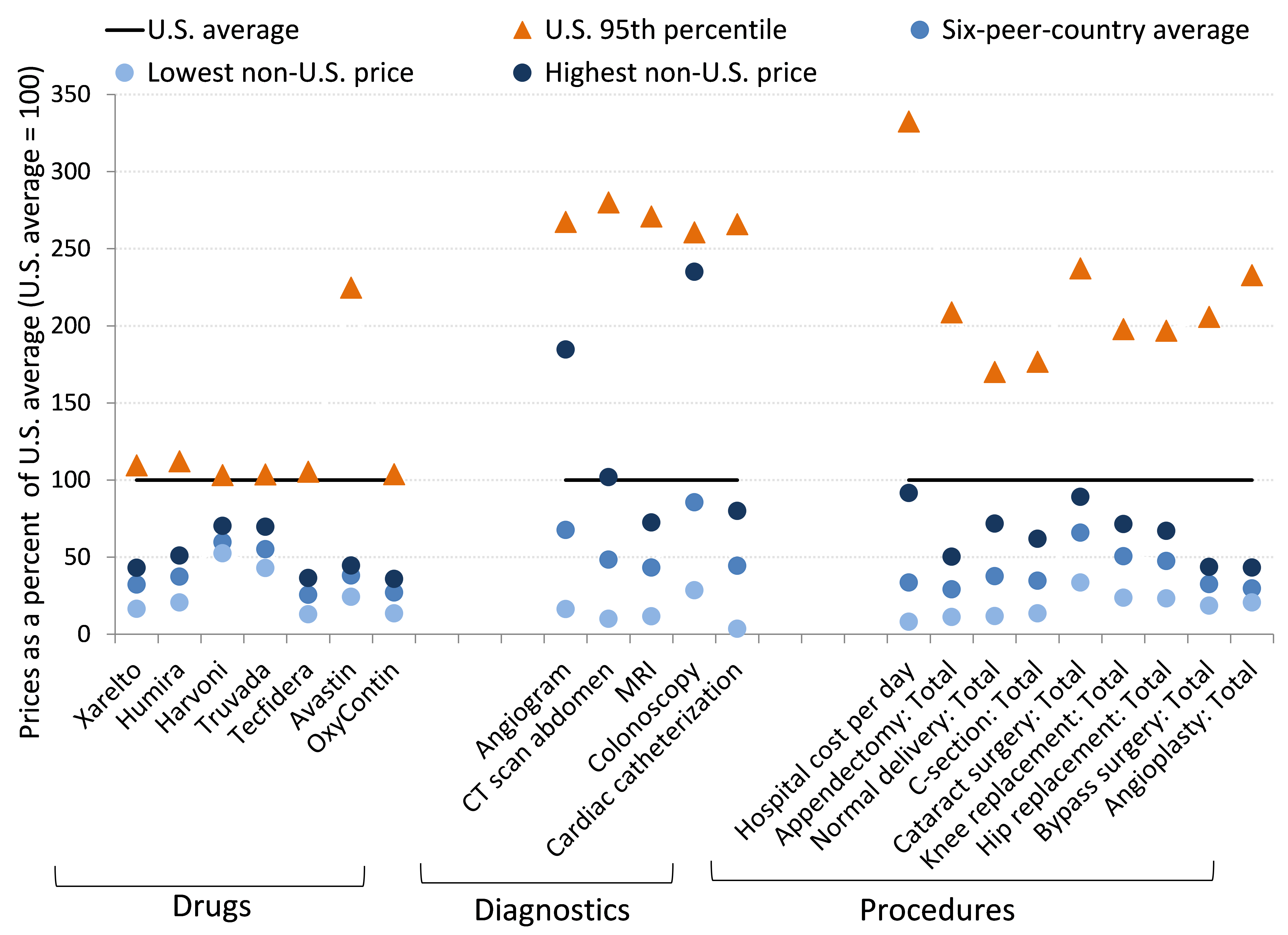
Notes: For listed procedures, “Total” refers to the total cost of hospital and physician services. Comparison countries are Australia, New Zealand, Spain, South Africa, Switzerland, and the United Kingdom. Price data are not available for all goods and services in all countries (e.g., prices for Xarelto are available only for South Africa, Spain, Switzerland, the United Kingdom, and the United States, not for Australia or New Zealand).
Source: Author’s analysis of International Federation of Health Plans (2016) Comparative Price Report
For the 21 goods and services surveyed in the CPR, average prices in the United States are higher than the non-U.S. average for all 21 and are the highest among all the countries (that is, the U.S. average exceeds the non-U.S. maximum) for 18. Averaged across the non-U.S. mean prices, prices in the United States are more than twice as high as prices in peer countries. And even when averaged across the non-U.S. maximums, average U.S. prices are more than 40 percent higher. Notably, a number of these goods and services are highly tradeable—particularly pharmaceuticals. The fact that international tradeability has not eroded enormous price differentials between the United States and other countries should be a red flag that something strikingly inefficient is happening in the U.S. health care market.
Figure M shows some specific measures of utilization that correspond to the price data highlighted in Figure L: the incidence of angioplasties, appendectomies, cesarean sections, hip replacements, and knee replacements, normalized by the size of the country’s population. On two of the five measures, the United States has either a typical (angioplasties) or relatively low (appendectomies) utilization rate relative to other countries’ averages. On two more measures (C-sections and hip replacements), the average of other countries’ utilization levels is roughly three-quarters of the United States’s utilization level. For all four of these measures, the United States is well below the highest utilization rate. The United States is only the highest-utilization country—by a small margin—when it comes to knee replacements. In short, if one were looking only at the data charting health care utilization, one would have little reason to guess that the United States spends far more than its advanced country peers on health care.
U.S. residents aren’t undergoing more health procedures than residents of typical peer countries: Utilization level for various medical interventions, U.S. compared with 30 advanced peer countries, 2015
| U.S. | OECD minimum | OECD maximum | 30-OECD-peer-country average | |
|---|---|---|---|---|
| 1 | ||||
| Angioplasty | 0.19 | 2.15 | 1.03 | |
| Appendectomy | 0.79 | 2.03 | 1.39 | |
| C-section | 0.41 | 1.92 | 0.76 | |
| Hip replacement | 0.12 | 1.49 | 0.76 | |
| Knee replacement | 0.03 | 0.93 | 0.47 | |
| 1 |
Notes: Utilization measures are normalized by population. U.S. levels are set at 1, and measures of utilization for other countries are indexed relative to the U.S. Comparisons are with 30 OECD (Organisation for Economic Co-operation and Development) countries.
Source: Author’s analysis of OECD 2018a
Figure N shows another set of international comparisons of health care inputs and prices, from Laugesen and Glied (2008). Laugesen and Glied compare physician services’ utilization and salaries in Australia, Canada, France, Germany, and the United Kingdom with those in the United States (in the figure, the U.S. level of each is set to 1). They find that utilization of primary care physicians by patients is higher in all of these countries, by an average of more than 50 percent. Yet salaries of primary care physicians are higher in the U.S., by roughly 50 percent. The utilization measure they use for orthopedists is hip replacements. Hip replacements (normalized by the population) are a bit rarer in Canada than the United States, with Canada undertaking 74 hip replacements for every 100 in the United States. They are roughly as common in Australia (94 to 100) and the United Kingdom (105 to 100), and they are more common in France and Germany. Orthopedist salaries are much higher in the United States than in any peer country—more than twice as high on average.
The salary comparisons in Figure N are net of doctor’s debt service payments for medical school loans, so this common explanation for high American physician salaries cannot explain these differences.
Physician salaries in the U.S. are dramatically higher than in other countries. Use of their services is not.: Comparisons of primary care and orthopedic utilization and salaries, U.S. compared with five other countries, 2008
Primary care physicians’ and orthopedists’ salaries
| U.S. = 1 | Primary care physicians’ salaries | Orthopedists’ salaries | |
|---|---|---|---|
| 1 | |||
| Australia | 0.50 | 0.42 | |
| Canada | 0.67 | 0.47 | |
| France | 0.51 | 0.35 | |
| Germany | 0.71 | 0.46 | |
| United Kingdom | 0.86 | 0.73 | |
| Non-U.S. average | 0.65 | 0.49 | |
| 1 |
Primary care and hip replacement utilization
| U.S. = 1 | Primary care utilization | Hip replacement utilization | |
|---|---|---|---|
| 1 | |||
| Australia | 1.61 | 0.94 | |
| Canada | 1.53 | 0.74 | |
| France | 1.84 | 1.33 | |
| Germany | 1.95 | 1.67 | |
| United Kingdom | 1.34 | 1.05 | |
| Non-U.S. average | 1.65 | 1.15 | |
| 1 |
Notes: Utilization measures are normalized by population. U.S. levels are set at 1, and measures of utilization for other countries are indexes relative to the U.S. The data source uses incidence of hip replacements as the comparative utilization measure for orthopedists.
Source: Data from Laugesen and Glied 2008
As we have noted, many rightfully argue that most Americans would not want to trade the health care available to them today for what was available in decades past, even as official price data indicate that all that has changed is the price. However, the international evidence indicates clearly that most Americans should be willing to trade the health care available to them today for what is available to the residents of most other advanced economies. This health care available abroad is far cheaper and yet of at least as high quality. The relatively low level of utilization and very high price levels in the U.S. provide suggestive evidence that the faster rate of health care spending growth in the United States in recent decades has been driven on the price side as well. This inference is supported with some more specific evidence in Appendix C, which provides indirect estimates of the rise in hospital prices across countries over time.
The appropriate policy focus going forward: Price, not utilization
It is clear that the United States is an outlier in international comparisons of health care costs. It is also clear that the United States is an outlier not because of overuse of health care but because of the high price of its health care.
As discussed above, the United States is decidedly unremarkable on health outcome measures (see Figure D) and is even toward the low end of many crucial health measures.23 On measurable utilization of health care, consistent with our findings, most studies similarly find the United States to be below average on broad measures of utilization when compared with its advanced country peers.24 Finally, the indirect evidence on hospital prices presented in Appendix C suggests that prices have likely been rising faster in the U.S. than in the vast majority (18 of 21) of peer countries. All of this evidence strongly indicates that getting U.S. health care prices more in line with international peers could have significant success in relieving the pressure that rising health care costs are putting on American incomes.
Attacking utilization is a dangerous strategy
Even though many health researchers have noted that price—not utilization—is the clear source of the dysfunction of the American health system, it is striking how much attention has been paid to reducing utilization, rather than reducing prices, when it comes to making health policy in the United States in recent decades.
In the years leading up to the passage of the ACA, many policymakers cited the Dartmouth Atlas of Health Care and its research spinoffs (e.g., Skinner et al. 2009) to claim that up to a third of American health spending was wasteful; hence, they concluded, great opportunities abounded to squeeze out this waste by targeting lower utilization. These findings were a great source of temptation for policymakers, and they were incredibly influential in the American policy debate in the run-up to the ACA. The problem is, even if the Dartmouth research was entirely correct, it was always going to be hard to figure out how to operationalize these findings for policy. The most obvious complication was how to construct policy levers to precisely target which third of health care spending was wasteful.
Further, subsequent research in recent years has highlighted additional reasons to think that the Dartmouth findings would be difficult to translate into policy recommendations. The earlier Dartmouth Atlas findings were largely gleaned from looking at regional variation in spending by Medicare. The Atlas found large regional variations in costs and found that high-cost regions did not seem to produce better health outcomes. The authors of the Atlas hypothesized that regional differences in physician practice drove price differentials that were not correlated with quality improvements. Policymakers and analysts have often made the argument that if the lower-priced, but equally effective, practices of more efficient regions could be adopted nationwide, then a large chunk of wasteful spending could be squeezed out of the system. However, research by Doyle (2011) and Sheiner (2014b) indicates that the noncorrelation between spending and outcomes found in the Dartmouth research may well be driven by a failure to fully control for the socieoeconomic and health characteristics of patients. Further, Cooper et al. (2018) study the regional variation in spending on privately insured patients and find that it does not correlate tightly at all with Medicare spending. This finding casts doubt on the hypothesis that regional variation in practice is driving trends in both spending and quality, as these type of region-specific practices should affect both Medicare and private insurance payments.
Policies to increase cost sharing are a cost blunderbuss—A scalpel is needed
The evidence reviewed above casts doubt on the potential to rein in health costs on the utilization side. And it’s certainly not possible to eliminate wasteful and unproductive care simply by raising the patient cost of care across the board, as we show below. Yet this blunderbuss approach of increasing “cost sharing” indiscriminately is by far the most common theme in policy proposals aimed at reducing the growth rate of health spending.
On the conservative side, the last couple of decades have seen much writing from policy analysts about “consumer-directed health care” and efforts to put health care consumers’ “skin in the game” as a strategy to constrain costs.25 The rhetoric from the center left rejects this view, but their actions tell a different story: Perhaps the single most-trumpeted cost-containment device included in the ACA was the so-called Cadillac Tax, which seeks to contain costs precisely by forcing health care consumers to face a higher share of marginal costs. This excise tax would be levied on employer-provided health benefits above set limits, thus incentivizing employers to offer less expensive health plans, which would in turn translate into higher out-of-pocket costs for workers.26
The logic of forcing health consumers to face higher marginal costs of buying health care is based in the economics of moral hazard: If people do not face the marginal cost of undertaking a behavior, they’ll do more of it. In the case of health care, insured consumers pay fixed premiums every month regardless of whether or not they visit a doctor. Then, when they do visit a doctor’s office or go to the hospital, insurance pays for some (often even most) of the marginal cost of this visit. Once the fixed cost of paying a premium is met, each subsequent visit to a health provider is then partially to fully subsidized by the insurance company, and this means that the patient does not face the full marginal cost of the decision to obtain health care.
Even the most dogmatic proponents of solving moral hazard would not, of course, endorse outlawing insurance as a means of containing costs. Instead, they would argue that most Americans are simply overinsured and that more health care spending should be financed out of pocket until those costs become prohibitive, at which point insurance would then properly kick in.27 Being overinsured and not facing the full marginal cost of each new visit to a health care provider is thought to make Americans overconsume health care, potentially using resources (i.e., money paid out by their insurance companies) to obtain treatments that they would not have sought had these treatments’ full marginal cost been faced (that is, had they been required to pay the costs themselves).
However, this focus on increasing patient cost-sharing is poorly designed for smart cost containment and could do significant harm, for a number of reasons. First, unless one is willing to increase cost sharing even for truly catastrophic medical costs, such measures will miss the primary cost drivers in the U.S. health care system. Eighty percent of health dollars are spent on just 19 percent of health consumers, and 50 percent of health dollars are spent on just 5 percent—presumably the sickest patients (Gould 2013b). In other words, encouraging relatively healthy people to cut back on health care simply misses the vast majority of health care costs, and no one would suggest that expensively sick patients should be required to pay more than they already do (which is likely already too high relative to their resources in many cases).
Second, the assumption that all moral hazard results in economically inefficient overconsumption of health care may well be wrong. Nyman (2007) directly questions this theory by arguing that a large portion of moral hazard represents health care that sick consumers would not otherwise have had access to without the income that is transferred to them through insurance. This portion of moral hazard—the transfer of income—is efficient and generates a welfare gain. Take the example of an adult who has lost front teeth in a bicycling accident. Having missing teeth is obviously not life-threatening, but it is quite likely that if insurance gave the cash-equivalent cost of replacing the teeth to this person, they would opt to do precisely this and not spend the cash on other goods and services. As long as the income transfer made possible by insurance was spent buying health care and not something else, then this portion of the moral hazard caused by insurance is efficient.
This recognition that not all moral hazard is economically inefficient is becoming well understood in other branches of economics. Chetty (2008) makes similar arguments in the context of unemployment insurance, focusing on the fact that unemployment insurance benefits solve a liquidity problem rather than creating a disincentive to look for work. His research differentiates the moral hazard effect from the relief of liquidity constraints by comparing households that can and cannot smooth consumption through a spell of unemployment with assets or income from other sources, such as a working spouse or accumulated wealth. He finds that higher-than-average unemployment insurance benefits increase unemployment duration only for workers with no liquid wealth. This suggests strongly that it is the relief of liquidity constraints and not the disincentive to work—stemming from reductions in the “cost” of leisure (i.e., the loss of income) spurred by the receipt of UI—that drives responses. Chetty explicitly notes that this analysis could apply even more strongly to the case of liquidity constraints in the purchase of health care. This would be particularly true in the case of individuals with serious illnesses who require expensive treatments, as the liquidity demands imposed by contracting such an expensive illness would dwarf those needed to finance a short spell of normal consumption while unemployed.
Third, short-run cutbacks in the consumption of health care can end up being “penny wise and pound foolish.” If increased cost-sharing leads some patients to cut back on medical spending, they may end up cutting back on medically indicated treatment that could save money in the long run, especially for vulnerable populations and those with chronic conditions. Goldman, Joyce, and Zheng (2007) find that cuts in plan generosity can lead to reduced compliance with drug therapies for chronic disease, and Buntin et al. (2011) find that enrollment in high-deductible health plans leads to reductions in the use of preventive care. Both Gruber (2006) and Hsu et al. (2006) demonstrate that higher cost sharing is detrimental to the health of the chronically ill.
McWilliams, Zaslavsky, and Huskamp (2011) find that cuts in plan generosity can lead to higher overall medical spending. Chandra, Gruber, and McKnight (2009) find that there are substantial “offset” effects to broad increases in cost-sharing rates for physician visits and prescription drugs; spending on these categories fell with higher cost sharing, but hospitalization costs rose substantially. In one related study, Goldman, Joyce, and Zheng (2007) find that higher cost sharing for pharmaceuticals is associated with an increased use of overall medical services, particularly for patients with greater needs (e.g., heart disease, diabetes, or schizophrenia).
Similarly, lower cost sharing is associated with a reduction in overall health spending, particularly for those with chronic diseases. For instance, Chernew et al. (2008) demonstrate that cost sharing with lower costs for those for whom the intervention would be most cost effective (generally the chronically ill) leads to higher compliance. Furthermore, Muszbek et al. (2008) find that increased compliance with drugs for hypertension, diabetes, and a series of other ailments will lead to higher drug costs but lower nondrug costs, leading to overall cost savings. Mahoney (2005) also finds that lowered cost sharing for diabetes patients reduces health costs per plan.
The most recent, and perhaps the most persuasive, study of the effect of increasing cost sharing comes from Brot-Goldberg et al. (2017). In this study, the authors examine the response of employees covered by ESI when the insurer imposes a number of changes to cost sharing. The entire firm being studied (the name of the firm is kept anonymous) switched from a plan that provided essentially free health care to one with a large deductible. The switch led to large reductions in medical spending, but the changes all came from reduced utilization, and the goods and services sacrificed to higher health costs were not low value; instead, they were essentially random. Perhaps most strikingly, Brot-Goldberg et al. “find no evidence of consumers learning to price shop after two years in high-deductible coverage. Consumers reduced quantities across the spectrum of health care services, including potentially valuable care (e.g., preventive services) and potentially wasteful care.” The findings on preventive care are particularly shocking. Facing a deductible, the firm’s employees cut back on preventive care at essentially a comparable rate with their cutbacks on other health care services. Yet even under the new health plan, preventive services were all free!
Finally, Swartz (2010) points out that it is often the health care providers and not the patients themselves who are the drivers of high health care spending. To the extent that moral-hazard-induced overconsumption of health care is a significant problem, patients already active in the health care system (e.g., under the care of a physician) may be less sensitive to cost sharing. Under a physician’s care, the amount of health services consumed is more likely to reflect the decisions made by providers. At that point, patients exercise little control over the medical care they receive. The corollary is that those less active in the health care system may be more sensitive to prices, meaning they are more likely to forgo expensive care if they believe there is less of an immediate medical need for it.
The sweep of this evidence is clear. To the extent that consumers do cut back on care in response to increased cost sharing, they cut back essentially randomly, even on medical spending that is cost effective in the long run. Proponents of increased cost sharing often implicitly suggest that consumers would only be forced to cut back on luxury items (e.g., designer eyeglasses) or medical care that has little or no long-term health effects (e.g., treating a minor skin condition). But a growing body of research indicates that this is not true; increased cost sharing does indeed often crowd out health-improving and cost-effective medical interventions.
In the end, markets for health care goods and services in the United States just do not provide consumers the ability to make efficient decisions. Health care prices are dominated by monopolization and consolidation, and price rarely, if ever, matches marginal cost (a key condition for prices to allow consumers to make efficient decisions). Efforts to cut utilization without harming patient care are going to have to be led by payers and by health care providers who are hemmed in by a system that incentivizes them to provide efficient information. This is a heavy policy lift. Experiments on how to do this can certainly be undertaken, but this is certainly not the low-hanging fruit in the health care cost policy world that too many in the past have claimed it to be.
It is almost certain that no country in the world has managed to make health care prices good enough conveyors of information to rely on market-based decisions to efficiently constrain costs. Instead, other countries have largely tried to use the monopsony power of large public insurance plans to provide countervailing force against health care providers’ monopoly position. In addition, public plans in both the U.S. and abroad try to provide information on what health care goods and services provide good value based on which health care interventions are covered by insurance and which are not. This is clearly an imperfect approach, as occasionally medical interventions that might improve health outcomes for a small number of people might not get covered on the basis that for most people in most circumstances, they are “low value,” or interventions that cutting-edge research shows are low value might be hard to take away from patients who are used to receiving them without cost. But the economics of health care are complicated enough that we will never be in an optimal world, and we should take as given that policy will need to proceed under the “theory of the second best.”28
How can we use policy to restrain provider pricing power in health markets?
The recent political momentum for ambitious further reform of American health care (calls for either single-payer- or Medicare-for-all-type plans) did not spring from nowhere. Despite the large strides made by the ACA toward securing a fairer and more efficient system, there remains much work to be done, and much of this work needs to focus on locking in and extending the cost slowdowns of recent years, but in ways that do not harm health care quality.29
While a single-payer system is a worthy goal to pursue for many reasons, not just cost control, such root-and-branch reform will likely require an extended political process. That is, it is unlikely to happen quickly. However, there are incremental, but still ambitious, reforms that could be undertaken that would allow many of the virtues of single-payer to be realized more quickly. In this section, we talk about some broad reforms that could help with cost containment. These include increasing the scope of strength of already existing public programs (Medicare, Medicaid, and the ACA exchanges); adopting measures to help private payers leverage the bargaining power of the large public programs; revising the law to allow Medicare to negotiate drug prices, and pursuing other policies to diminish the intellectual monopoly power of pharmaceutical companies; and using robust antitrust enforcement to keep consolidation of medical providers like hospitals and physician practices from pushing up prices. Below we provide a short discussion of each of these.
Extend already existing public plans and incorporate a “public option” into ACA exchanges
The most obvious reform to provide countervailing power against the ability of monopoly providers to mark up health care prices is to increase the role of public insurance. Medicare (the large sort-of-single-payer program that provides universal coverage to Americans 65 and older30) is often presented as being a problem because it is projected to see costs rise and increase federal spending in coming years. However, Medicare costs have actually risen more slowly than costs in the American private insurance market in recent decades. This largely reflects the fact that Medicare’s size gives it enormous power to set the reimbursement rates it will pay health care providers. Medicare’s enrollment is now well over 50 million, and its enrollees are the highest-spending part of the population (health care spending rises with age, and Medicare provides coverage largely for the over-65 population). This gives it enormous price-setting power that no private insurer—even those that are well-managed and efficient—can match. Figure O shows the growth in per-enrollee costs for Medicare and for private health insurance, for similar benefits.
Medicare’s monopsony power has led to slower growth in per-enrollee costs: Per-enrollee costs for like benefits, Medicare and private health insurance, 1968–2016 (indexed, 1968 = 100)
| Year | Private health insurance | Medicare |
|---|---|---|
| 1968 | 100.000 | 100.000 |
| 1969 | 116.228 | 111.632 |
| 1970 | 135.167 | 119.398 |
| 1971 | 151.997 | 129.186 |
| 1972 | 169.907 | 139.956 |
| 1973 | 184.962 | 145.846 |
| 1974 | 213.680 | 177.045 |
| 1975 | 250.366 | 208.569 |
| 1976 | 295.331 | 243.841 |
| 1977 | 342.870 | 275.297 |
| 1978 | 384.768 | 312.274 |
| 1979 | 449.608 | 352.871 |
| 1980 | 519.467 | 417.419 |
| 1981 | 598.365 | 490.759 |
| 1982 | 675.973 | 563.635 |
| 1983 | 742.038 | 630.148 |
| 1984 | 801.485 | 689.365 |
| 1985 | 877.310 | 733.634 |
| 1986 | 928.269 | 768.845 |
| 1987 | 1035.547 | 813.987 |
| 1988 | 1195.170 | 855.996 |
| 1989 | 1352.504 | 954.907 |
| 1990 | 1563.446 | 1021.202 |
| 1991 | 1714.009 | 1096.218 |
| 1992 | 1859.685 | 1211.705 |
| 1993 | 1957.572 | 1309.844 |
| 1994 | 2003.316 | 1439.611 |
| 1995 | 2015.043 | 1557.042 |
| 1996 | 2067.358 | 1655.073 |
| 1997 | 2144.238 | 1734.012 |
| 1998 | 2218.454 | 1709.487 |
| 1999 | 2300.558 | 1726.846 |
| 2000 | 2525.503 | 1798.322 |
| 2001 | 2742.434 | 1960.645 |
| 2002 | 3059.740 | 2079.713 |
| 2003 | 3285.581 | 2178.614 |
| 2004 | 3501.214 | 2357.059 |
| 2005 | 4602.486 | 2531.503 |
| 2006 | 4950.365 | 2950.344 |
| 2007 | 5143.444 | 3096.297 |
| 2008 | 5427.461 | 3258.014 |
| 2009 | 5888.045 | 3398.044 |
| 2010 | 6186.353 | 3457.796 |
| 2011 | 6473.815 | 3536.240 |
| 2012 | 6609.460 | 3554.467 |
| 2013 | 6754.163 | 3568.240 |
| 2014 | 6930.079 | 3630.526 |
| 2015 | 7352.095 | 3708.251 |
| 2016 | 7742.071 | 3756.258 |
Sources: Author’s analysis of data from CMS 2018a. The like benefits comparison follows the methods of Boccuti and Moon 2003.
The implications of this figure are staggering for the 181 million Americans with ESI coverage. If ESI per-enrollee costs had grown at the same rate as per-enrollee costs for Medicare since 1970, a family insurance plan that costs $18,000 today would cost roughly 48 percent less, giving workers the potential of $8,800 in additional income to spend on non-health-related goods and services.31 This is serious money.
More suggestive evidence that cost control is aided by a strong public role in providing health insurance is seen in Figure P. This figure displays data across a range of countries. For each country it shows the average annual growth in overall health spending as a share of GDP, as well as the share of GDP represented by public health spending in the first year in the data. The latter variable is meant as a stand-in for the country’s commitment to using the public sector’s monopsony power as a brake on cost growth. In theory, we could have used the growth in public spending instead, but this is obviously endogenous to growth in overall spending (i.e., fast cost growth could have spurred countries to adopt larger public systems as a cost-containment device). The scatter plot shows a clear negative relationship—large public sectors in the beginning of the data series are associated with significantly slower increases in health care costs thereafter.
Countries that invest more in health care experience slower growth in health care costs: Relationship between what each country spent annually on health care at the beginning of the study period (y-axis) and how much health care spending had grown annually as of 2017 (x-axis)
| Average annual growth, health expenditures as a share of GDP | Public health spending as share of GDP in year one |
|---|---|
| 9.967% | 2.790% |
| 11.666% | 2.944% |
| 9.688% | 5.635% |
| 8.634% | 4.469% |
| 5.524% | 6.422% |
| 9.023% | 3.553% |
| 13.349% | 3.881% |
| 11.828% | 4.080% |
| 9.938% | 2.967% |
| 7.991% | 3.132% |
| 4.655% | 3.735% |
| 2.068% | 4.715% |
| 7.693% | 5.407% |
| 13.581% | 3.045% |
| 9.969% | 3.879% |
| 8.357% | 4.075% |
| 13.566% | 3.625% |
| 14.306% | 1.276% |
| 12.119% | 2.012% |
| 8.921% | 4.612% |
| 13.355% | 4.979% |
| 12.162% | 3.429% |
| 23.735% | 2.318% |
Notes: We include only countries that had by 2010 achieved a level of productivity of at least 60 percent of that of the United States. “Year one” differs for each country because the earliest year of data availability differs, ranging from 1970 (for Austria, Canada, Finland, France, Germany, Iceland, Ireland) to 1971 (Australia, Denmark), 1972 (Netherlands), 1992 (Belgium), 1988 (Greece, Italy), 1979 (Sweden), and 1995 (Switzerland).
Source: Author’s analysis of OECD 2018a
The observation that more robust public roles in health care financing are associated with more success in restraining costs lies behind much of the recent political enthusiasm expressed for single-payer proposals. The impulse that a large public role can ameliorate many ills is clearly correct. One way to start a process leading to a much larger role is fairly straightforward: add a “public option” to the health care exchanges that were established under the ACA. This public option would allow households the choice to enroll in a public plan (comparable to Medicare) instead of a private plan. They would pay actuarially fair premiums (with the income-related ACA premium subsidies in force) and receive insurance coverage. The ACA architects largely thought that a public option was always meant to be included (a public option, for example, was part of the bill that passed out of the House of Representatives). The Congressional Budget Office has estimated that including a public option would save roughly $140 billion in federal spending over a decade, due to the downward pressure on premium prices it would exert (CBO 2016). Further, introducing a public option would increase competition in many counties around the United States where private insurers have largely abandoned the ACA exchanges. In 2017, 47 percent of counties had fewer than three insurers offering plans in the ACA exchanges (CMS 2018). This is a prime example of health insurance markets consolidating and robbing consumers of the potential benefits of competition. Adding a public option to the ACA exchanges would go a long way toward remedying the lack of competition, and if it attracted enough enrollees, it would be able to use its market power to bargain to keep payments to providers from growing excessively fast.
Besides providing a public option for the insurance exchanges set up by the ACA, another straightforward way to introduce a more robust public-sector involvement in health care would be to expand eligibility for the existing large public programs—Medicare and Medicaid. Allowing Americans 55 and over to “buy in” to Medicare at actuarially fair premium rates is an idea with a long pedigree. This would not only expand Medicare’s enrollee pool and boost its bargaining power with providers, but it would also provide a crucial window of health security at a time in Americans’ lives when they are often most vulnerable to an unexpected employment shock leading them to lose access to affordable health care. Similarly, one could expand eligibility for Medicaid. Currently, this eligibility requires household incomes of less than 138 percent of the federal poverty line (FPL), but there’s nothing particularly magical about this threshold—there’s no particular reason why this could not be raised to 200 percent of the FPL. Essentially, policymakers eager to claim the policy virtues of single-payer systems should seize on any chance they can get to expand existing public programs, even if this must be done incrementally.
Adopt “all-payer rates” to help private payers draft in the bargaining power of Medicare
It has often been observed that the large public programs, and Medicare in particular, can serve to set pricing benchmarks that private insurers can use in their own bargaining with providers. However, even if Medicare reimbursement rates provide useful information to private insurers, this latter group’s success in achieving the same bargain Medicare strikes with providers will depend on raw market power. As a recent landmark study of the private insurance market (Cooper et al. 2018) put it, “The results paint a consistent picture of bargaining power. At least descriptively, when hospital markets are concentrated (and/or insurer markets are fragmented), hospital prices are higher and hospitals are able to obtain contracts that shift more risk on to insurers.”
These findings suggest a clear policy recommendation: Besides having large public programs with pricing clout cover more Americans directly, we can use policy to allow private payers to draft in the price-setting power of public plans.
One obvious way to help the pricing benchmarks set by Medicare apply more tightly to all private payers (even those not large enough to wield considerable bargaining power on their own) is to establish all-payer rates. All-payer rates, much like they sound, simply require that health care providers charge the same price for a given procedure regardless of who is paying for it. Wide variance in rates charged for the same procedure—even for the same procedure undertaken in the same hospital in the same month and year—is a notable feature of the American health care market (Cooper et al. 2018). It is hard to see how this variance helps efficiency, and careful research has concluded that it is largely the outcome of differential bargaining power wielded by different health care payers.
Setting all-payer rates effectively lets the payer with the most bargaining power set rates for everybody. It therefore replicates much of the monopsony power of large public systems. Currently, Maryland is the only state with all-payer rates, and they apply only to the hospital sector. Murray (2009) has documented that hospital prices in Maryland have risen far more slowly than in other states in recent decades, indicating some beneficial effect of all-payer rates.32
Erode the intellectual monopoly of key health care sectors (e.g., pharmaceuticals)
A growing share of health costs in recent decades is accounted for by increased spending on pharmaceuticals. These drugs are generally developed and tested by private companies that are given intellectual property rights, which in turn give them substantial monopoly pricing power.33 As shown in Figure M, the price of drugs in the United States is often orders of magnitude higher than in other advanced countries. This suggests strongly that other countries—again, often with the help of more robust public roles in health financing—use their purchasing power to cut down the pharmaceutical company markups on drugs. Strikingly, Medicare was explicitly barred from effectively negotiating for lower drug prices when the 2003 law that expanded Medicare coverage to include pharmaceuticals was passed.34 Affirming Medicare’s responsibility to strike better bargains for taxpayers when purchasing from pharmaceutical companies should be seen as low-hanging fruit in the struggle to control costs. Baker (2013), for example, notes that having Medicare bargain for lower drug prices could save $40–60 billion annually.
Baker (2008) would go even further than simply having the government bargain for lower prices when serving as a direct purchaser. He suggests having clinical trials for new drugs be publicly financed. He notes the many economic conflicts of interest that arise when drug companies themselves undertake and report on the results of clinical drug trials. There are obvious incentives to overstate a drug’s effectiveness and understate any risks. Baker recommends that the cost of setting up publicly financed drug trials be recouped (and then some) by having the intellectual property resulting from new discoveries be placed in the public domain. This would result in far lower prices charged for pharmaceuticals.
Finally, the enormous price differences across countries (even those that share a border) for the exact same brand of drug suggests one obvious potential strategy for reducing drug costs in the United States: Allow these drugs to be bought in other countries and reimported into the United States. Economists for decades have evangelized about the benefits of free trade and have been nearly unanimous in advocating for trade treaties like the North American Free Trade Agreement (NAFTA) that cut tariffs for apparel and textiles and other goods. Yet these same trade treaties have almost always forbidden such drug reimportation and even demanded extension of U.S. levels of intellectual property protections to trading partners as a precondition for access to the U.S. market. This is a truly odd oversight on the part of the profession—free trade in pharmaceuticals would actually solve a pressing economic pressure on the budgets of millions of American families.
Increase antitrust scrutiny of consolidation in health care markets
We have noted many times in this report that providers of health care goods and services have substantial market power. The most intuitive way sellers in a market can wield power is when the market is relatively concentrated, with too few sellers to provide meaningful price competition. This lack of competition is an obvious feature of those corners of the health care market that are explicitly protected by patents (pharmaceuticals and medical instruments, mostly), as described above.
However, recent decades have seen another trend leading to degraded competition in a crucial sector of the American health system: consolidation of hospitals. This consolidation has been both horizontal and vertical. Horizontally, the number of hospitals (or hospital companies) in any given region is falling on average over time, and this fall has restricted price competition. Vertically, hospitals have affiliated with other providers (often networks of physicians) to extend pricing power.
The year 2017 saw a record number of hospital mergers and acquisitions (115), and 2018 saw 30 such mergers and acquisitions in the first quarter alone. This extends a pronounced trend in hospital consolidation over the past decade. In 2007, 53 percent of community hospitals belonged to a larger system. By 2017, the share was over two-thirds (66.8 percent). Similarly, between 2009 and 2015, the share of hospital-employed physicians grew from 40 to 48 percent.35
Research indicates that hospital mergers increase the price charged for services by 10–17 percent. In already consolidated markets, mergers between close competitors can raise prices by as much as 50 percent. Other research indicates that when hospitals acquire physician practices, prices for physican services increase by 14 percent.
A growing literature has documented potential increases in market concentration across a range of sectors and geographies. This wider literature makes a powerful case that enhanced antitrust protection should be a key priority of economic policymakers in coming years. It is hard to imagine a sector besides health care where this is a more pressing priority.
Conclusion
Nobody who was clear-eyed about the deep problems in the American health system in 2009 thought that the Affordable Care Act should be the last ambitious reform undertaken. While the ACA was a major step forward in addressing some key problems—like the lack of insurance coverage among a large share of the population—it was clearly insufficient to serve as a comprehensive cure for what ailed the American health system. The clearest goal for post-ACA policymakers is reining in the fast-rising costs of American health care without sacrificing households’ access to needed medical care.
American health care is singularly expensive among industrialized nations, and other nations with a stronger public role in health provision spend far less while achieving at least comparable (and often superior) health outcomes. This insight is what lies behind the considerable political desire to have the United States adopt a “single-payer” health care financing program. Single-payer is clearly a worthy policy goal, but moving toward it could be a long process, and it would take some time before full implementation of such a system could be achieved. Luckily, however, many of the key policy provisions that allow more robust public systems to achieve greater cost containment without sacrificing quality can be adopted quite early in any march toward single-payer. These cost-containment strategies would not only make a large public role for health care more plausible, they would also supply much-needed relief in the short run to the private American health care system, particularly the system of employer-provided health care.
Crucially, the class of reforms highlighted in this paper will enable many of the virtues inherent in a single-payer system to be realized without radically disrupting the ESI system that currently covers the majority of Americans. These households with ESI plans have shown themselves to be (understandably) quite leery about major reforms that threaten to disrupt this system before a proven alternative is demonstrated. As this report shows, however, there are significant reforms we can enact that would both pave the way for single-payer reform in the long run and, in the short run, provide enormous benefits for those families who currently have ESI coverage.
Acknowledgments
The author gratefully acknowledges the help of Elise Gould, Jessica Schieder, and Julia Wolfe in preparing the report, and Zane Mokhiber for help with figures and tables. I also thank Krista Faries and Lora Engdahl for editing assistance. Large portions of the section detailing the dangers of policy measures to attack utilization are lifted from Gould 2013, which in turn draws heavily on previous joint work.
About the author
Josh Bivens joined the Economic Policy Institute in 2002 and is currently EPI’s director of research. His primary areas of research include macroeconomics, social insurance, and globalization. He has authored or co-authored three books (including The State of Working America, 12th Edition) while working at EPI, edited another, and has written numerous research papers, including for academic journals. He appears often in media outlets to offer economic commentary and has testified several times before the U.S. Congress. He earned his Ph.D. from The New School for Social Research.
Appendix A
Recent cost slowdown is welcome but should not breed complacency
While the forecast of future income pressure stemming from rising health costs implied by Figure I is disquieting, it is perhaps more hopeful to note that the rate of excess cost growth has dropped significantly over the past decade (as can be seen in Figure C). The precise sources of this drop in excess cost growth remains not well understood.36 There is some evidence that the Great Recession had something to do with it. The recession saw enormous drops in spending on all goods and services economywide, so it is perhaps not shocking that this included the health care sector as well.
Some have conjectured that the ACA had something to do with it.37 The ACA created an Independent Payments Advisory Board (IPAB), a board that was empowered to change provider reimbursements from the public insurance programs if excess health care cost growth continued. The ACA also provided funding for experiments in payment reforms for the public insurance programs meant to better peg value and money spent on health care. A key thrust of those reforms was moving the public insurance systems away from payment models characterized by “fee for service” (FFS), where each medical intervention for a patient is billed and reimbursed by a provider. FFS carries an obvious incentive to provide more medical interventions for that patient. To break this incentive, some proposed payment reforms reimburse diagnoses and medical management rather than discrete procedures.
One key example of the policy thrust toward moving away from FFS reimbursement and toward “paying for quality” was an effort to reduce readmissions to hospitals following treatment. Hospital readmissions are too often a sign that care has been suboptimal in the first contact between patient and hospital. Readmissions are also quite costly in resource terms. But from the strict perspective of hospitals and doctors being paid on a fee-for-service model, they represent income gains. Efforts have been made to break this perverse incentive by penalizing readmissions or not reimbursing for multiple admissions related to a single diagnosis. The ACA specifically created a Hospital Readmission Reduction Program (HRRP) in 2012. The HRRP financially penalizes hospitals that have higher-than-expected readmission rates for a range of illnesses.38
It has been speculated that, in anticipation of IPAB decisions and widespread adoption of payment reforms, providers undertook cost-saving modifications of their own practices.
Whether these speculations are true or not, it seems clear that the recent slowdown in excess health care cost growth is not fully understood, and there is no guarantee that it rests on solid ground. Worse, some of the policy reforms that may have contributed to the recent slowdown have been significantly weakened. The IPAB was abolished as part of the Republican tax cut passed at the end of 2017, and the Trump administration Department of Health and Human Services seems far less interested in cost-saving reforms than its predecessor. If anticipation of the effect of IPAB and payment reform really was driving efficiency-seeking behavior of medical providers over the past decade, the removal of these cost-disciplining institutions could threaten to unleash faster excess cost growth in coming years.
In short, while we should not take the more dire forecasts embedded in Figure I as set in stone and immovable, nor should we take recent years’ slowdown in health costs as inevitable and obviously durable. Instead, policymakers should realize that health care costs are starting from a very high base, so any excess cost growth in coming decades will do substantial damage to possibilities for nonhealth consumption of goods and services. This argues strongly for noncomplacency and the need for aggressive measures to lock in the recent decade’s excess cost slowdown and to build on it.
Appendix B
How rising ESI costs pressure wages across the distribution
Figure G provides evidence on how wages overall (and wages for the bottom 90 percent) have been potentially crowded out by the rising cost of ESI premiums. Appendix Table B1 gives some more texture to this discussion by showing how much rising employer contributions to ESI premiums affected workers at different wage fifths.
The first set of rows (“Hourly wage, nominal”) shows the median hourly wage within each wage fifth for three separate years: 1979, 2007, and 2016. In 2016, this ranges from $9.54 for the lowest fifth to $44.79 for the highest fifth. The second set of rows (“ESI coverage rate”) shows the share of workers in each fifth who receive ESI coverage through their own job. These rows show that in 2016, 53.1 percent of workers overall received ESI coverage from their own job, down from 69.0 percent in 1979. The next set of rows (“Cost of employer contributions”) show an estimate of the average cost to an employer of providing ESI coverage, expressed as a share of the median wage in each fifth. These rows show that in 1979, employer contributions for the average ESI plan were equal to 16.8 percent of the median wage for the bottom fifth and 4.7 percent of the median wage of the top fifth. The next set of rows (“Hourly wages plus employer contribution”) show the sum of the hourly wage plus employer contributions to ESI premiums for an employee at the median of each fifth, accounting for the fact that not all workers receive this ESI coverage. The next set of rows (“Hourly wages plus employer contributions, counterfactual”) provides this same measure but holds the cost of providing the average ESI plan constant at its 1979 share of median hourly wages in each fifth. Finally, the last two sets of rows show the difference between the actual measure of hourly wages plus employer contributions to ESI per wage fifth and the counterfactual measure (by dollar amount in the first set and by percent of wages in the second set). This difference shows the potential crowd-out of hourly wages by the rising cost of ESI premiums. By 2016, this difference was $2.15 on average, with the crowd-out ranging from $0.99 per hour for the lowest wage fifth to $2.47 for the fourth fifth.39
Rising premium costs crowd out wage growth and ESI coverage across the wage distribution: Estimated wage crowd-out by rising health care costs by wage fifth, 1979–2016
| All | Bottom | Second | Middle | Fourth | Top | |
|---|---|---|---|---|---|---|
| Hourly wage, nominal | ||||||
| 1979 | $6.38 | $3.06 | $4.07 | $5.40 | $7.38 | $10.53 |
| 2007 | $19.80 | $8.02 | $11.24 | $15.34 | $21.68 | $35.69 |
| 2016 | $24.50 | $9.54 | $13.19 | $18.24 | $25.62 | $44.79 |
| ESI coverage rate | ||||||
| 1979 | 69.0% | 37.9% | 60.5% | 74.7% | 83.5% | 89.5% |
| 2007 | 55.4% | 24.3% | 45.9% | 60.3% | 69.8% | 76.9% |
| 2016 | 53.1% | 24.3% | 43.9% | 57.1% | 67.5% | 73.1% |
| Cost of employer contributions to ESI premiums as % of hourly wages, per covered employee | ||||||
| 1979 | 8.6% | 16.8% | 12.5% | 9.4% | 6.9% | 4.7% |
| 2007 | 23.7% | 53.2% | 38.5% | 28.0% | 19.4% | 11.5% |
| 2016 | 25.1% | 59.5% | 43.1% | 31.0% | 21.1% | 11.8% |
| Hourly wages plus employer contribution to ESI premiums | ||||||
| 1979 | $6.76 | $3.26 | $4.38 | $5.78 | $7.81 | $10.97 |
| 2007 | $22.40 | $9.06 | $13.22 | $17.93 | $24.62 | $38.84 |
| 2016 | $27.77 | $10.92 | $15.69 | $21.47 | $29.28 | $48.67 |
| Hourly wages plus employer contributions to ESI premiums, counterfactual if ESI share held constant at 1979 level | ||||||
| 1979 | $6.76 | $3.26 | $4.38 | $5.78 | $7.81 | $10.97 |
| 2007 | $20.74 | $8.35 | $11.88 | $16.21 | $22.71 | $36.98 |
| 2016 | $25.62 | $9.93 | $13.91 | $19.22 | $26.81 | $46.33 |
| Hourly wages potentially crowded out by rising ESI premium costs, $ | ||||||
| 1979 | $0.00 | $0.00 | $0.00 | $0.00 | $0.00 | $0.00 |
| 2007 | $1.66 | $0.71 | $1.34 | $1.72 | $1.90 | $1.86 |
| 2016 | $2.15 | $0.99 | $1.78 | $2.25 | $2.47 | $2.34 |
| Hourly wages potentially crowded out by rising ESI premium costs, % of wages | ||||||
| 1979 | 0.0% | 0.0% | 0.0% | 0.0% | 0.0% | 0.0% |
| 2007 | 8.4% | 8.9% | 11.9% | 11.2% | 8.8% | 5.2% |
| 2016 | 8.8% | 10.4% | 13.5% | 12.3% | 9.6% | 5.2% |
Notes: The per-hour cost of employer contributions to ESI (employer-sponsored insurance) was calculated by dividing total hours worked in the economy by total employer contributions. This per-hour cost was then adjusted by the share of all workers with ESI coverage to get a cost per covered worker. This cost per covered worker was then compared with average wages in the fifths of the wage distribution. The counterfactual of no excess health costs was simulated by holding employer contributions to ESI fixed as a share of overall compensation over the period.
Sources: Data from EPI State of Working America Data Library 2018 as well as BEA 2018, NIPA Tables 7.8 and 6.9
It should be noted that these calculations may understate the damage that rising health care costs have done to workers in the bottom two-fifths of the wage distribution. We should be clear that this damage has been substantial, for a number of reasons. First, the crowd-out of wages from rising ESI premiums has actually been larger than average for the bottom two-fifths, measured in percentage terms (as seen in the last row of the table). Second, while this chart shows the crowd-out of wages taking ESI coverage erosion into account, for those workers who continue to receive ESI, the wage crowd-out stemming from rising ESI premiums (not shown here) is much higher in percentage terms for workers in the bottom two-fifths than for other workers, for the simple reason that ESI premiums constitute a much higher share of these workers’ wages. For the same reason, conditional upon receipt of ESI, the benefits of the tax exclusion of ESI premiums are also greatest for lower-wage workers.40 Finally, the table shows clearly that ESI coverage has eroded most dramatically for workers in the bottom two-fifths of the wage distribution (as seen in the second set of rows, “ESI coverage rate”). This erosion is surely related to the fact that growth in ESI premiums relative to these workers’ wages has been extreme. In a real sense, the stakes for these workers in slowing health care costs are the greatest: To keep coverage in the face of rising costs, they must suffer the largest wage declines or else have coverage become so completely unaffordable that they must go without it.
Appendix C
American health care today is expensive relative to its international peers—but have prices in the U.S. actually grown faster than prices in peer countries?
Figure J provides a look at American health care prices over time, and Figure L provides comparisons of the U.S.’s and other countries’ health prices at a single point in time. Unfortunately, there is no reliable set of comparative price indices across countries that would allow one to make easy comparisons about the pace of health care price growth.41
We can, however, take a suggestive look at one particular slice of health care—hospitalization. The Organisation for Economic Co-operation and Development has a rich data set (OECD Health Statistics, or OHS henceforth) on health care financing and utilization across countries (but again, unfortunately, no cross-country set of health care deflators over a long period of time). For hospitalizations, the OHS provides national spending per capita as well as volume-based measures of utilization—the number of hospital discharges normalized by population size, as well as the average length of stay in hospitals. By looking at the trend in purely volume-based hospitalizations and comparing it with the rise in spending (which is the product of volume and prices), one can infer a rough trend for the price of hospitalizations. If, for example, a country has seen a 10 percent increase in hospital spending per capita but only a 5 percent increase in the volume of hospitalizations per capita, this implies that hospital prices have likely risen by 5 percent over that time as well.
Appendix Table C1 shows the trends in hospital spending and trends in hospital utilization for a range of OECD countries. Unfortunately, the United States does not show up in the OHS for a key measure of hospital utilization—hospital discharges. But independent sources do provide such a measure for the U.S. Potentially reassuringly, the trend from the independent U.S. sources displays the same nearly universal downward slope experienced by other OECD countries in recent decades.
American prices are not just high, they also rise faster than average: Hospital spending and utilization per capita, and inferred “excess” hospital price growth across OECD countries (various years)
| Hospital utilization | Hospital spending | Implied hospital prices | Overall price level | “Excess” hospital price growth | |
|---|---|---|---|---|---|
| Finland | -3.11% | 4.55% | 7.66% | 1.49% | 6.17% |
| Netherlands | -2.46% | 4.49% | 6.95% | 1.85% | 5.10% |
| Denmark | -3.39% | 6.06% | 9.44% | 4.41% | 5.04% |
| United States | -2.25% | 5.14% | 7.39% | 2.61% | 4.77% |
| Luxembourg | -2.02% | 4.72% | 6.74% | 2.05% | 4.70% |
| Norway | -0.54% | 6.09% | 6.62% | 2.08% | 4.54% |
| Sweden | -1.37% | 3.42% | 4.79% | 0.32% | 4.47% |
| Switzerland | -2.00% | 3.62% | 5.62% | 1.23% | 4.39% |
| Australia | -1.20% | 8.51% | 9.71% | 5.46% | 4.25% |
| New Zealand | 1.28% | 7.82% | 6.54% | 2.93% | 3.62% |
| Spain | -1.35% | 4.36% | 5.72% | 2.20% | 3.52% |
| France | -1.70% | 3.06% | 4.75% | 1.53% | 3.22% |
| Belgium | -1.05% | 3.82% | 4.87% | 1.95% | 2.92% |
| Japan | -1.20% | 1.61% | 2.81% | 0.12% | 2.69% |
| Germany | -1.18% | 3.06% | 4.24% | 1.58% | 2.66% |
| Austria | -1.15% | 3.36% | 4.51% | 1.88% | 2.63% |
| Ireland | -1.61% | 1.37% | 2.98% | 0.42% | 2.56% |
| Italy | -2.79% | 0.29% | 3.08% | 0.52% | 2.55% |
| United Kingdom | 0.46% | 3.58% | 3.12% | 0.94% | 2.17% |
| Canada | -0.47% | 5.71% | 6.18% | 4.03% | 2.15% |
| Iceland | -1.91% | 4.89% | 6.80% | 5.13% | 1.67% |
| United States | -2.25% | 5.14% | 7.39% | 2.61% | 4.77% |
| Non-U.S. median | -1.36% | 4.09% | 5.67% | 1.87% | 3.37% |
| Non-U.S. average | -1.44% | 4.22% | 5.66% | 2.11% | 3.55% |
| Non-U.S. minimum | -3.39% | 0.29% | 2.81% | 0.12% | 1.67% |
| Non-U.S. maximum | 1.28% | 8.51% | 9.71% | 5.46% | 6.17% |
Notes: Countries in our data set had different first and last years of data availability. For each country, the average annual change that characterized their entire spell of data was constructed. The annual change in the overall price was constructed to map onto the same period of data availability for hospital utilization and spending. “Excess” hospital price growth is price implied by the difference between the percent growth of hospital spending per capita and hospital utilization, minus the percent growth in overall prices. For this comparison we only included countries in the data who had achieved roughly comparable levels of productivity to the United States by 2010 (60 percent or more of the U.S. productivity level).
Sources: Data from the Organization of Economic Cooperation and Development Health Statistics and Main Economic Indicators (OECD 2018a, 2018b). Utilization measured as the product of total hospital discharges and average length of hospital stays. Data on hospital discharges in the United States are from Hall et al. 2010.
Taking the simple difference between the average annual growth rate of hospital spending (the second column of the table) and the average growth rate of hospital utilization (the first column) provides our inferred measured of hospital prices (the third column). Finally, to account for differences in overall price growth between countries, we subtract overall price inflation (the fourth column) from the constructed measure of hospital price to get a measure of “excess hospital price growth.” This last measure shows that this excess price growth in the United States for hospital services was indeed notably faster than the OECD average, with only three of 21 countries seeing faster excess price growth over this time. Most fundamentally, this table shows that hospital spending in the U.S. is quite high relative to OECD peers but hospital utilization does not appear to be, given that hospital utilization rates have been declining in the U.S. at a faster rate than in most other countries.
Endnotes
1. The degree to which the United States is an outlier in costs is well established, and later sections of this report provide the documentation. The middling-at-best performance of the United States health care system from an international perspective is almost as well established, with Sawyer and Gonzales (2018) providing a good recent rundown of the evidence.
2. See Center on Budget and Policy Priorities 2018 for an excellent overview of the administrative undermining of the ACA.
3. “Single-payer” is not a particularly specific term. It is often used interchangeably with “Medicare for All,” but the current American Medicare system allows private payers in and so is not, strictly speaking, a single-payer system. Further, some have interpreted “single-payer” to mean that no individual contributions to health care costs (e.g., deductibles or copays) are required. But no other country, including those often described as having a “single-payer” system, has a public insurance plan that pays for 100 percent of medical costs. In the end, “single-payer” should generally be taken to mean universal coverage that is achieved with a large public plan that covers a large portion of health care costs.
4. See Barnett and Berchick 2017 for information on sources of insurance coverage.
5. Gould 2013a documents this rapid erosion in ESI coverage following the 2001 recession.
6. Family plans include all plans that provide coverage for more than one person. KFF (2017) averages across family plans to yield an overall family plan cost.
7. For this argument, and some evidence validating the long-run trade-off between health insurance premiums and earnings, see Baicker and Chandra 2006.
8. The percentage-point difference between the 1999 share and the 2016 single premium share of earnings (8.6 ppt.), shown in the last column of Table 1, corresponds to the percent boost in annual pay (8.6 percent) that could have occurred had the premium stayed constant as a share of earnings. If this correspondence is not obvious, another way to calculate the percentage boost in annual pay is to assume that the single premium’s share of annual earnings in 2016 is still 9.7 percent, as it was in 1999—this makes the dollar amount of the 2016 premium $3,403 instead of $6,435, or $3,032 less, which represents an implied boost to pay of 8.6 percent ($3,032/$35,083) if that amount is redirected into cash wages.
9. This is indicated by the 26.1 percentage-point difference shown in the last column. If we assume the 2016 family premium remains at 25.6 percent of annual earnings, as in 1999, then the dollar amount of the 2016 premium becomes $8,981 instead of $18,142, for a potential boost in pay of $9,161, or 26.1 percent ($9,161/$35,083).
10. For single coverage, take the 8.6 percent increase in earnings that could have occurred had ESI premiums remained constant as a share of annual earnings, and divide by 54.8 percent to get the 15.7 percent figure. For family coverage, the relevant numbers are 26.1 percent and 54.8 percent.
11. The Kaiser Family Foundation Employer Health Benefits Survey (KFF 2017) finds that the composition of out-of-pocket costs changed dramatically over this period. Copayments (fixed costs associated with each visit to a provider), for example, fell 37.8 percent. Coinsurance (out-of-pocket costs that are charged as a share of the total provider cost) rose by 67.1 percent. Deductibles (out-of-pocket costs that fully cover provider costs up to a threshold above which insurance payments kick in) rose most rapidly of all, by over 176 percent.
12. Potential GDP is used instead of actual GDP in measures of excess health care cost growth because one doesn’t want the measure of excess health cost growth to be infected by economic recessions and booms. For example, measured relative to actual GDP growth, excess costs would have skyrocketed during the Great Recession, yet nobody would think this was a meaningful change.
13. Some of this rapid slowdown in excess cost growth per enrollee relative to growth per capita is likely compositional: Many of those who were newly insured following the implementation of the ACA were likely relatively healthy and cheap to cover, pulling down average costs.
14. Sheiner (2014a) provides a good overview of cost trends and a good discussion about how to think about the recent slowdown in health care cost growth, noting that “…it seems premature to either declare a turning point or to decide that nothing has changed. There remains much uncertainty about the likely trajectory of future health spending.”
15. The 11 countries are Australia, Canada, France, Germany, the Netherlands, New Zealand, Norway, Sweden, Switzerland, the United Kingdom, and the United States.
16. Mortality amenable to health care is a measure of population health that estimates deaths that are potentially preventable with timely and effective health care and hence attempts to separate mortality changes due to influences outside the control of health care changes.
17. Again, this presumes that even employer contributions to rising ESI costs are, in the long run, financed by slower potential growth of cash wages. Over the long run, this seems like a safe assumption.
18. The virtue of including this measure, as well as those from the previous section, is that the measures in Table 1 and Figure A essentially show the potential crowd-out of cash wages stemming from rising ESI premiums conditional on workers receiving ESI. It is possible that some employers respond to rising ESI premiums by no longer providing coverage, and this could reduce the crowd-out of cash wages systemwide. The NIPA data examined in this section essentially show the unconditional rise in total compensation accounted for by rising health costs—including the potential effect of employers reducing coverage.
19. The overall number is derived by multiplying the change in the share of total compensation accounted for by employer contributions to ESI premiums since 1979 by total compensation as measured by Bureau of Economic Analysis (BEA) NIPA Table 1.10. For the bottom 90 percent, we multiply the change in the share of total compensation accounted for by employer contribution to ESI premiums by the change in the bottom 90 percent’s total compensation, which is the product of total compensation from BEA NIPA Table 1.10 and the measure of the bottom 90 percent’s share of total compensation provided in CBO 2018c.
20. This fact is highlighted most usefully in some earlier versions of the Congressional Budget Office’s Long-Term Budget Outlook (CBO 2007).
21. See Aizcorbe et al. 2013 for a good overview of this argument.
22. One might argue that because the United States is starting these comparisons from a higher base ratio of health spending relative to GDP, a larger percentage-point change does not necessarily imply less success in constraining the growth of costs. Highlighting the average annual percent change in the ratio accounts for the higher base level of the United States.
23. See Sawyer and Gonzales 2018 for U.S. outcomes in comparative perspective.
24. See Papanicolas, Woskie, and Jha 2018 for more on cross-country comparisons of utilization measures.
25. See Davis 2004 for a good overview of the theory and evidence regarding consumer-directed health plans.
26. For a critical review of the effect of the excise tax on expensive health plans, see Bivens and Gould 2015 and Gould 2013b.
27. To be fair, many proponents of increased cost sharing for the first dollar of health spending would readily concede that tens of millions of Americans are underinsured as well.
28. The “theory of the second best” says that if markets are characterized by even one deviation from the perfectly competitive optimum, then it is possible that welfare improvements may happen only by moving further away from this competitive optimum, not closer.
29. Further cementing the need for future reforms, of course, is the intentional campaign to weaken the ACA undertaken by Republicans in Congress, the White House, and the courts since the day it was passed. The combined effect of these campaigns have succeeded in significantly reducing potential enrollment in both Medicaid and the ACA exchanges.
30. Medicare also provides coverage to some Americans under age 65 who qualify due to a disability.
31. This number is derived by taking the cost of a family ESI plan today, as estimated by KFF (2017), and backcasting its cost growth from the private health insurance costs in Figure P. Once its 1970 value is derived from this backcast, we then let it follow the cost path taken by Medicare costs and compare this counterfactual 2016 cost with its actual cost.
32. At the same time, overall hospital utilization in Maryland over the same period has risen significantly faster than in other states. This could be random luck, or it could be providers with market power using another margin of this power—increasing recommended medical utilization—to preserve revenue in the face of price controls. Finally, it could be simply that demand for hospital services is relatively price elastic, and the subdued price growth in Maryland has moved potential patients down the demand curve relative to other states, leading to higher rates of utilization.
33. It should be noted that much of this argument applies to medical devices as well as to pharmaceuticals. Payments for devices, however, are harder to separate in the data than payments for pharmaceuticals, so the data do not provide as clean a basis for how much we spend on devices.
34. Medicare Prescription Drug, Improvement, and Modernization Act of 2003, 117 Stat. 2066.
35. Statistics on consolidation taken from congressional testimony of Martin Gaynor (2018).
36. Again, Sheiner (2014a) remains a good documentation of competing explanations.
37. Cutler and Sahni (2013) provide the most forceful argument that the ACA should be expected to have had relatively immediate effects in restraining cost growth.
38. These hospital readmission rates were risk adjusted to account for different patient populations handled by different hospitals. McIlvennan, Eapen, and Allen (2015) provide an overview of the HRRP.
39. These estimates rely on the assumption that covered workers face the same premium prices regardless of which wage fifth they are in. This could certainly be incorrect, but it is not obvious which way the bias would run. On the one hand, low-wage workers might be given substandard plans that provide less protection and are hence cheaper. On the other hand, smaller employers tend to pay lower wages yet face significantly higher costs for health insurance.
40. See White 2017 for a detailed discussion of these points.
41. The OECD Main Economic Indicators does provide data on the consumer price index for medical care, but the data are too spotty for too many countries to provide a good comparison. For example, the data for the United States in these statistics only begin in 2004.
References
Aizcorbe, Ana, Ralph Bradley, Ryan Greenaway-McGrevy, Brad Herauf, Richard Kane, Eli Liebman, Sarah Pack, and Lyubov Rozental. 2013. “Alternative Price Indexes for Medical Care: Evidence from the MEPS Survey.” Bureau of Economic Analysis Working Paper.
Auter, Zac. 2016. “Americans’ Satisfaction with Healthcare System Edges Down.” Gallup poll.
Baicker, Katherine, and Amitabh Chandra. 2006. “The Labor Market Effects of Rising Health Insurance Premiums.” Journal of Labor Economics 24, no. 3: 609–634.
Baker, Dean. 2008. The Benefits and Savings of Publicly-Funded Clinical Trials of Prescription Drugs. Center for Economic Policy Research, March 2008.
Baker, Dean. 2013. Reducing Waste with an Efficient Medicare Prescription Drug Benefit. Center for Economic and Policy Research, January 2013.
Barnett, Jessica, and Edward Berchick. 2017. Health Insurance Coverage in the United States: 2016. U.S. Census Bureau Report no. 60-260.
Bivens, Josh, and Elise Gould. 2015. “Tax on Expensive Health Plans Could Cut Care as Well as Cost.” Wall Street Journal online, Washington Wire, October 2, 2015.
Boccuti, Cristina, and Marilyn Moon. 2003. “Comparing Medicare and Private Insurance: Growth Rates in Spending Over Three Decades.” Health Affairs 22, no. 2.
Brot-Goldberg, Zarek, Amitabh Chandra, Benjamin Handel, and Jonathan Kolstad. 2017. “What Does a Deductible Do? The Impact of Cost-Sharing on Health Care Prices, Quantities, and Spending Dynamics.” Quarterly Journal of Economics 132, no. 3: 1261–1318.
Buntin, Melinda Beeuwkes, Amelia M. Haviland, Roland McDevitt, and Neeraj Sood. 2011. “Healthcare Spending and Preventive Care in High-Deductible and Consumer-Directed Health Plans.” American Journal of Managed Care 17, no. 3: 222–230.
Bureau of Economic Analysis (BEA). 2018. Interactive Tables: National Income and Product Accounts. Accessed July 2018.
Center on Budget and Policy Priorities. 2018. Sabotage Watch: Tracking Efforts to Undermine the ACA.
Centers for Medicare and Medicaid Services (CMS). 2018. Historical Data from the National Health Expenditure Accounts [online database].
Chandra, Amitabh, Jonathan Gruber, and Robin McKnight. 2009. “Patient Cost-Sharing, Hospitalization Offsets, and the Design of Optimal Health Insurance for the Elderly.” National Bureau of Economic Research Working Paper no. 12972.
Chernew, Michael E., Mayur R. Shah, Arnold Wegh, Stephen N. Rosenberg, Iver A. Juster, Allison B. Rosen, Michael C. Sokol, Kristina Yu-Isenberg, and A. Mark Fendrick. 2008. “Impact of Decreasing Copayments on Medication Adherence within a Disease Management Environment.” Health Affairs 27, no. 1: 103–112.
Chetty, Raj. 2008. “Moral Hazard vs. Liquidity and Optimal Unemployment Insurance.” Journal of Political Economy 116, no. 2: 173–234.
CNN/Opinion Research Corporation (ORC). 2017. Poll results.
Cohen, Robin, Diane Makuc, Amy Bernstein, Linda Bilheimer, and Eve Powell-Griner. 2009. Health Insurance Coverage Trends, 1959–2007: Estimates from the National Health Interview Survey. National Health Statistics Reports, Centers for Disease Control.
Congressional Budget Office (CBO). 2007. The 2007 Long-Term Budget Outlook. December 2007.
Congressional Budget Office (CBO). 2016. Options for Reducing the Deficit: 2017 to 2026. December 2016.
Congressional Budget Office (CBO). 2018a. Potential GDP and Underlying Inputs [Excel file].
Congressional Budget Office (CBO). 2018b. Supplemental Data from “The Distribution of Household Income 2014” [set of CSV data files].
Congressional Budget Office (CBO). 2018c. The 2018 Long-Term Budget Outlook. June 2018.
Cooper, Zack, Stuart Craig, Martin Gaynor, and John Van Reenen. 2018. “The Price Ain’t Right? Hospital Prices and Health Spending on the Privately Insured.” National Bureau of Economic Research Working Paper no. 21815, issued December 2015, revised May 2018.
Cutler, David and Nikhil R. Sahni. 2013. “If Slow Rate of Health Care Spending Growth Persists, Projections May Be Off by $770 Billion.” Health Affairs 32, no. 5: 841–850.
Dartmouth Atlas of Health Care. 2018. Online database.
Davis, Karen. 2004. “Consumer-Directed Health Care: Will It Improve Health System Performance?” Health Services Research 39, no. 2: 1219–1234.
Doyle, Joseph. 2011. “Returns to Local-Area Healthcare Spending: Evidence from Health Shocks to Patients Far From Home.” American Economic Journal: Applied Economics 3, no. 3: 221–243.
Economic Policy Institute (EPI). 2018. State of Working America Data Library.
Gaynor, Martin. 2018. “Examining the Impact of Health Care Consolidation.” Statement before the Committee on Energy and Commerce Oversight and Investigations Subcommittee, H.S. House of Representatives, February 14, 2018.
Goldman, Dana, Geoffrey F. Joyce, and Yuhui Zheng. 2007. “Prescription Drug Cost Sharing: Association with Medication and Medical Utilization and Spending and Health.” Journal of the American Medical Association 29, no. 8: 61–69.
Gould, Elise. 2013a. Public Insurance Coverage Is Crucial to American Families Even as Employer-Sponsored Health Insurance Coverage Ends Its Steady Decline. Economic Policy Institute Briefing Paper no. 368.
Gould, Elise. 2013b. Increased Cost-Sharing Works As Intended: It Burdens the Patients Who Need Care the Most. Economic Policy Institute Briefing Paper no. 358.
Gruber, J. 2006. The Role of Consumer Copayments for Health Care: Lessons from the RAND Health Insurance Experiment and Beyond. The Kaiser Family Foundation.
Hall, Margaret, Carol DeFrances, Sonja Williams, Aleksandr Golosinskiy, and Alexander Schwartzman. 2010. National Hospital Discharge Survey: 2007 Summary. National Health Statistics Reports, U.S. Centers for Disease Control.
Hsu, John, Mary Price, Jie Huang, Richard Brand, Vicki Fung, Rita Hui, Bruce Fireman, Joseph Newhouse, and Joseph Selby. 2006. “Unintended Consequences of Caps on Medicare Drug Benefits.” New England Journal of Medicine 354: 2349–2359. https://doi.org/10.1056/NEJMsa054436.
International Federation of Health Plans. 2016. 2015 Comparative Price Report.
Kaiser Family Foundation (KFF). 2017. Employer Health Benefits Survey.
Laugesen, Miriam and Sherry Glied. 2008. “Higher Fees Paid to US Physicians Drive Higher Spending for Physician Services Compared to Other Countries.” Health Affairs 30, no. 9. https://doi.org/10.1377/hlthaff.2010.0204.
Mahoney, John J. 2005. “Reducing Patient Drug Acquisition Costs Can Lower Diabetes Health Claims.” American Journal of Managed Care 11, no. 5 (supplement): S170–S176.
McIlvennan, Colleen, Zubin Eapen, and Larry Allen. 2015. “Hospital Readmissions Reduction Program.” Circulation 131, no. 20: 1796–1803. https://doi.org/10.1161/CIRCULATIONAHA.114.010270.
McWilliams, Michael, Alan Zaslavsky, and Haiden Huskamp. 2011. “Implementation of Medicare Part D and Nondrug Medical Spending for Elderly Adults with Limited Prior Drug Coverage.” Journal of American Medical Association 306, no. 4: 402–409.
Mishel, Lawrence and Teresa Kroeger. 2016. “Strong Across-the-Board Wage Growth in 2015 for Both Bottom 90 Percent and Top 1.0 Percent.” Working Economics (Economic Policy Institute blog), October 27, 2016.
Murray, Robert. 2009. “Setting Hospital Rates to Control Costs and Boost Quality: The Maryland Experience.” Health Affairs 28, no. 5.
Muszbek, Noemi, Diana Brixner, Agnes Benedict, Abdulkadir Keskinaslan, and Zeba M. Kahn. 2008. “The Economic Consequences of Noncompliance in Cardiovascular Disease and Related Conditions: A Literature Review.” International Journal of Clinical Practice 62, no. 3: 338–351.
Nyman, John. 2007. “American Health Policy: Cracks in the Foundation.” Journal of Health Politics, Policy and Law 32, no. 5: 759–783. https://doi.org/10.1215/03616878-2007-029.
Organisation for Economic Co-operation and Development (OECD). 2018a. OECD Health Statistics 2018 [online database].
Organisation for Economic Co-operation and Development (OECD). 2018b. OECD Main Economic Indicators [online database].
Papanicolas, Irene, Liana Woskie, and Ashish Jha. 2018. “Health Care Spending in the United States and Other High-Income Countries.” Journal of the American Medical Association 319, no. 10: 1024–1039. https://doi.org/10.1001/jama.2018.1150.
Sawyer, Bradley, and Selena Gonzales. 2018. How Does the Quality of the U.S. Healthcare System Compare to Other Countries? Kaiser Family Foundation chart collection.
Schneider, Eric, Dana Sarnak, David Squires, Arnav Shah, and Michelle Doty. 2017. Mirror, Mirror 2017: International Comparisons Reflects Flaws and Opportunities for Better U.S. Health Care. The Commonwealth Fund.
Sheiner, Louise. 2014a. “Perspectives on Health Spending Growth.” Hutchins Center on Fiscal & Monetary Policy at Brookings Working Paper no. 4.
Sheiner, Louise. 2014b. “Why the Geographic Variation in Heath Care Spending Can’t Tell Us Much about the Efficiency or Quality of Our Health Care System.” Brookings Papers on Economic Activity.
Skinner, Jonathan, Amitabh Chandra, David Goodman, and Elliot Fisher. 2009. “The Elusive Connection Between Health Care Spending and Quality.” Health Affairs 28, no. 1. https://doi.org/10.1377/hlthaff.28.1.w119.
Social Security Administration (SSA). 2017. Wage Statistics for 2016 [online database].
Social Security Administration (SSA). 2018. The Long-Range Economic Assumptions for the 2018 OASDI Trustees Report.
Squires, David. 2015. U.S. Health from a Global Perspective: Spending, Use of Services, Prices and Health in 13 Countries. Commonwealth Fund Issue Brief.
Swartz, Katherine. 2010. Cost Sharing: Effects on Spending and Outcomes. The Robert Wood Johnson Foundation Synthesis Project, Research Synthesis Report no. 20.
Tax Policy Center (TPC). 2018. Key Elements of the U.S. Tax System: What Is the Medicare Trust Fund and How Is It Financed? Tax Policy Center Briefing Book. Accessed September 2018.
White, Joseph. 2017. “The Tax Exclusion for Employer-Provided Health Care Is Not Regressive: But What Is It?” Journal of Health Politics, Policy and Law 42, no. 4: 697–708. https://doi.org/10.1215/03616878-3856135.
