Briefing Paper #362
Executive summary
Policymakers considering changes to social insurance programs such as Social Security and Medicare must consider the economic realities confronting elderly Americans. Many of America’s 41 million seniors are just one bad economic shock away from significant material hardship. Most seniors live on modest retirement incomes, which often are barely adequate—and sometimes inadequate—to cover the costs of basic necessities and support a simple, yet dignified, quality of life. For these seniors, and even for those with greater means, Social Security and Medicare are the bedrock of their financial security. Any proposed changes to these programs must be evaluated not just for their impact on future budget deficits, but for their impact on living standards of the elderly.
In this study, we use the Supplemental Poverty Measure (SPM) from the U.S. Census Bureau to assess the economic health of the elderly population in the United States, overall and by age, gender, and race and ethnicity. Using evidence on elderly economic insecurity from Wider Opportunities for Women (WOW), we identify the share of the elderly population that is particularly vulnerable to changes in social programs. Our analysis enables us to estimate how proposed increased cost-sharing by Medicare beneficiaries or reduced Social Security benefits would impact the well-being of a significant portion of the elderly population.
Our main findings include the following:
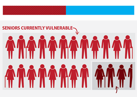
- Nearly half (48.0 percent) of the elderly population in the United States is “economically vulnerable,” defined as having an income that is less than two times the supplemental poverty threshold (a poverty line more comprehensive than the traditional federal poverty line).1 This equates to roughly 19.9 million economically vulnerable seniors.
- The older elderly—people age 80 and older—have a far higher rate of economic vulnerability (58.1 percent) than people age 65 to 79 (44.4 percent).
- Women are 10.7 percentage points more likely to fall below two times the supplemental poverty threshold than men (52.6 versus 41.9 percent)
- The majority of elderly blacks and Hispanics are economically vulnerable: 63.5 percent of blacks and 70.1 percent of Hispanics, age 65 and older, have incomes less than two times the supplemental poverty threshold. In comparison, 43.8 percent of whites are economically vulnerable.
- The share of economically vulnerable elderly varies across the United States, from a low of 35.4 percent in North Dakota to a high of 59 percent in the District of Columbia.
- Under House Budget Committee Chairman Paul Ryan’s proposed changes to Medicare, the predicted increase in seniors’ out-of-pocket health costs would raise the share of economically vulnerable elderly (those below two times the supplemental poverty threshold) by 8.4 percentage points, pushing the share up to 56.4 percent. That means almost 3.5 million more seniors would be economically insecure.
- Reductions in Social Security benefits arising from a proposed shift to indexing cost-of-living adjustments to the chained consumer price index (chained CPI) would also push more elderly into economic insecurity. For example, a switch to the chained CPI would boost the share of 70- to 75-year-olds below two times the supplemental poverty threshold by 1.2 percentage points, resulting in 132,000 more economically vulnerable seniors.
EDITOR’S NOTE: This report was updated December 20, 2013, with a minor data correction. The correction does not affect the report’s conclusion.
Measuring income security
Elderly individuals, on average, have much lower family incomes than non-elderly adults. Table 1 shows average and median annual family incomes of non-elderly adults and elderly adults in various age groups. As measured over 2009–2011, the average family income of working-age adults, ages 18 to 64 years old, is $67,659 compared with $52,355 for those 65 to 79 years old and $33,535 for those 80 years old and older. The average family income of those 80 and older is less than half the income of those between 18 and 64 years old. While averages can be skewed by a relatively small number of particularly-high-income families, the same pattern emerges within median family income. Individuals age 18 to 64 have a median family income of $48,430 compared with $35,690 for those age 65 to 79, and $23,370 for those age 80 and older. Once again, the median family income of non-elderly adults is more than twice that of the older elderly. Some of this difference is certainly caused by family size: Non-elderly families are more likely to have more people, particularly more income-earning adults. However, even when controlling for family size, elderly adults have family incomes that are, on average, $13,470 lower than non-elderly adults.2
Our analysis of income security merges data from three consecutive years of the Current Population Survey Annual Social and Economic Supplement, which ensures sample sizes large enough to conduct reliable analyses of income for various demographic subgroups of the elderly population and across the states. Our sample includes data years 2009, 2010, and 2011, all three years for which the Census has been collecting data on the Supplemental Poverty Measure (our preferred measure of poverty, as explained later). Our elderly sample includes 66,309 individuals, and our non-elderly adult sample includes 374,350 individuals.
Average and median annual family income, by age group, pooled years 2009–2011 (2011$)
| Age group | Average family income | Median family income | |
|---|---|---|---|
| Non-elderly | 18 to 64 | $67,659 | $ 48,430 |
| Elderly | All (65+) | $46,925 | $31,114 |
| 65 to 79 | $52,355 | $35,690 | |
| 80+ | $33,535 | $23,370 |
Source: Authors' analysis of pooled 2009–2011 Current Population Survey Annual Social and Economic Supplement microdata
When we compare elderly and non-elderly adults using the official definition of poverty, the picture of elderly economic security is somewhat misleading. Figure A shows for both groups the share of people at various income-to-poverty-threshold ratios, where poverty is measured by the official poverty line (roughly three times a basic food budget, adjusted by family size and composition), and the poverty rate is the share with incomes under that line. Over the three-year period described in this study, the poverty rate of non-elderly adults (ages 18–64) is 13.4 percent, considerably higher than the 8.9 percent poverty rate of elderly adults.3 This is primarily because non-elderly families are more likely to have larger families (typically with children), thus elevating their respective poverty thresholds.
Note: Income is measured using family income for persons in families and individual income otherwise. Source: Authors' analysis of pooled 2009–2011 Current Population Survey Annual Social and Economic Supplement microdata Share of elderly and non-elderly adults at various income-to-poverty-threshold ratios (using official poverty line), 2009–2011 average
However, while the elderly may be less likely than the non-elderly to fall below the official poverty line, the non-elderly are, on the whole, more likely to be well-off. About 70 percent of non-elderly adults have incomes at or greater than two times the official poverty line compared with 66 percent of the elderly. And 40.0 percent of non-elderly adults have incomes at least four times the poverty line, compared with only 31.6 percent of the elderly.
One important reason why elderly poverty rates are lower even though their average and median incomes are lower is that elderly families receive the income support of Social Security, which typically prevents them from falling below the poverty line. However, because this support is by no means lavish, households relying on it for a significant share of their income often live dangerously close to the poverty line.
Figure A also shows precisely that there is a disproportionately large group of elderly Americans with incomes between the federal poverty line and two times the poverty line. One fourth (25.1 percent) of elderly adults fall into this group, compared with only 16.6 percent of non-elderly adults. This is an economically precarious group of Americans: Modest income levels leave them dangerously vulnerable to changes in federal social programs, even though they are not officially classified as being in poverty.
SPM measures of poverty and economic vulnerability
A growing body of research has identified serious conceptual and empirical problems with the official definition of poverty (see, for example, Citro and Michael 1995). A potentially more useful tool to measure poverty and economic vulnerability in the United States is the U.S. Census Bureau’s Supplemental Poverty Measure (SPM).4 The SPM attempts a more comprehensive and realistic appraisal of both a family’s expenses and their available resources, including government assistance programs (Short 2012). It is calculated using the average spending on food, clothing, shelter, and utilities by a family between the 30th percentile and the 36th percentile of such spending. This amount is then adjusted to reflect other necessary expenses, such as child care, federal income taxes, Social Security and Medicare payroll taxes, out-of-pocket medical expenses, and work-related expenses such as costs for commuting, uniforms, and tools. At the same time, the SPM accounts for noncash resources available to low-income families through government programs, including the Earned Income Tax Credit (EITC), Supplemental Nutrition Assistance Program (SNAP, formerly known as food stamps), housing subsidies, school lunch programs, heating assistance, and food assistance for Women, Infants, and Children (WIC). Finally, unlike the official poverty measure, the SPM adjusts for regional differences in prices.
Figure B compares the share of elderly people at various income-to-poverty-threshold ratios using the official poverty line with the share at various income-to-poverty-threshold ratios under the SPM.5 In what follows we define elderly people with incomes below two times the SPM threshold as economically vulnerable. Under the SPM’s more sophisticated appraisal of income and expenses, enormous growth in the number of people with incomes 1.0 to 1.99 times the poverty threshold boosts the share of elderly Americans with incomes below two times the poverty threshold from 34.0 percent (under the official measure) to 48.0 percent. With more than 41 million seniors in the United States today, this 14 percentage-point difference equates to roughly 5.7 million more economically vulnerable elderly Americans when measured with the SPM rather than the official federal poverty line. This translates to a total of 19.9 million economically vulnerable seniors.
Share of the elderly at various income-to-poverty-threshold ratios, official vs. supplemental (SPM), 2009–2011 average
Note: Elderly are age 65 and older. Under the official poverty measure, income is measured by family income for person in families and individual incomes otherwise. Under the Supplemental Poverty Measure (SPM), income consists of total SPM resources by "SPM resource unit," a slightly broader category than the family unit. See endnotes for more information.
Source: Authors' analysis of pooled 2009–2011 Current Population Survey Annual Social and Economic Supplement microdata
As shown in a later analysis, the main cause of the difference between estimates of elderly economic vulnerability under the official and SPM measures is the inclusion of health expenditures in the SPM’s catalogue of expenses. Without any out-of-pocket medical expenditures, only 37.9 percent of the elderly would fall under two times the supplemental poverty threshold.
When we compare the income-to-supplemental-poverty threshold ratios of the elderly versus the non-elderly, a pattern similar to that under the official poverty rate emerges, although it is somewhat muted by the various factors included in the SPM. Figure C illustrates the differences in the shares of elderly and non-elderly adults at various ratios. Looking at the level we have defined as economically vulnerable, 48.0 percent of the elderly fall below two times the supplemental poverty threshold, compared with 44.1 percent of non-elderly adults. While the shares of each group falling below the SPM threshold are similar, once again a larger share of the elderly are clustered in the 1.0–1.99 times the SPM range.
Why is 200 percent of the SPM the vulnerability threshold?
When describing living standards, it is important to understand what thresholds such as the poverty line or the SPM poverty line actually describe. The poverty line was developed and is calculated as an income level adequate to provide the most basic supply of food and shelter. Even the SPM, with its more sophisticated assessment of living expenses and income sources, still only denotes sufficient income for the most basic level of subsistence. Official poverty or even poverty as measured by the SPM—measures of outright material deprivation—do not capture the broader share of people we seek to measure—those who are “economically vulnerable” (or, interchangeably, “economically insecure”).
Our focus on two times poverty is not idiosyncratic. Poverty researchers and many government “transfer” programs (those providing benefits to families meeting certain guidelines) often use two times the official poverty line as a useful benchmark for assessment or even as a criterion for eligibility because they recognize that many people between 100 and 200 percent of the poverty line still struggle to afford basic needs (Mishel et al. 2012). Yet again, because the official poverty line is crude in its evaluation of true living expenses, particularly for the elderly population, we have to look for a better metric.
Measuring Up, a 2013 report by the Insight Center for Community Economic Development (ICCED), reviews various measures constructed by researchers to assess adequacy of income, describing both the weaknesses of the official federal poverty line (FPL) and the SPM. The authors note that the FPL is an absolute measure set to a fixed historical amount—adjusted for inflation yet otherwise unchanged since the 1960s. As such, it does not reflect changes in overall living standards and thus does a poor job in capturing the relative differences in living conditions for families at different points across the income distribution. For instance, the FPL represented 50 percent of median income for a family of four in 1979, yet it was only 30 percent of median income for that same family configuration in 2007. According to the authors, the FPL methodology is outdated, and, because it captures only pretax cash income, it significantly misses how public policy affects poverty rates, particularly if a growing share of public transfers is noncash, as is now the case.
The SPM improves on the official federal poverty line by including tax credits and in-kind transfers, thereby showing how policies can reduce poverty. Still, the ICCED study points out that the SPM does not dramatically change overall poverty rates compared with the FPL. The study questions some of the results generated using the SPM, particularly the finding that child poverty goes down under the SPM framework. It notes that the SPM does not effectively account for the cost of adequate childcare; it merely subtracts respondents’ child care expenses from their available resources, without assessing the adequacy of those child care expenditures. The paper also points out that the SPM does not include other important expenses such as transportation costs beyond commuting (often a significant expense in rural areas) and savings (needed for economic security). Finally, ICCED argues that because the SPM is based upon a particular percentile of consumer spending as opposed to, say, median income levels, it is set at a somewhat arbitrary level, the selection of which may have been motivated by political concerns more than by scientific considerations.
To better measure the economic vulnerability of older adults, they suggest using the Elder Economic Security Standard Index (Elder Index) developed by Wider Opportunities for Women (WOW). The Elder Index estimates how much it costs seniors to live in different communities across the country, accounting for an elder household’s housing type, transportation type, health status, and geography-specific cost of living. The index is more comprehensive than the SPM in its appraisal of costs, including food, housing, healthcare, and transportation costs, as well as miscellaneous expenses such as telephone, clothing, and personal care costs and relevant sales taxes. At the time we began our analysis, the measure had only been produced for 17 states, and therefore could not be used to assess elderly vulnerability nationwide. However, when we compared the index’s state-level thresholds to SPM thresholds for those same areas, we found a measurable pattern: The Elder Economic Security Standard Index threshold (the line below which the elderly are considered economically insecure) is roughly 200 percent of, or twice, the SPM threshold, on average. (Note that WOW has since released Elder Index values for states, counties, and cities throughout the United States; the data are available at www.basiceconomicsecurity.org/EI)
Figure D illustrates the close alignment between the WOW Elder Index determination of economic security and twice the SPM threshold. The figure compares the WOW threshold to the SPM threshold, using data for the 17 then-available states.6 The dotted line denotes two times the SPM. Both the average and median for single- and two-adult elderly households fall near the 2.0 line on the graph. This is true for both households renting a home and owning a home (with or without a mortgage.) Given the Elder Index’s explicit focus on elderly economic security, twice the SPM threshold seems to be a very good proxy for identifying economic vulnerability.
Comparison of WOW Elder Index thresholds to Supplemental Poverty Measure thresholds, all and by housing type, pooled years 2009–2011
Note: The WOW Elder Index measures the threshold below which the elderly are considered economically insecure. The bars show the ratio of the Elder Index thresholds to the Supplemental Poverty Measure (SPM) thresholds across available regions and housing types.
Source: Authors' analysis of pooled 2009–2011 Current Population Survey Annual Social and Economic Supplement microdata and Wider Opportunities for Women (WOW) Elder Index
Who are the vulnerable elderly?
While two times the SPM is relevant for measuring the vulnerability of elderly Americans, other thresholds help us assess income variations across demographic subgroups of the elderly, to better identify those that are the most vulnerable. To that end, we specifically compare the elderly by age group, 65 to 79 years old versus 80 years old and older, and demonstrate how the older elderly are far more likely to be less economically secure. We examine men and women separately and find that women are more economically vulnerable than men. We assess differences in the economic status of the elderly by race and ethnicity and find that Hispanics and non-Hispanic blacks are more at risk of falling into poverty than non-Hispanic whites. Lastly, we compare the share of vulnerable elderly across all 50 states and Washington, D.C.
People age 80 and older
Younger elderly people (age 65 to 79) make up about 75 percent of the elderly population in the United States. While 48.0 percent of the elderly overall fall below twice the SPM threshold, the older elderly (age 80 and older) are far more likely to fall below that threshold. Only 44.4 percent of people age 65 to 79 fall below 200 percent of the supplemental poverty threshold compared with 58.1 percent of people age 80 and older. Figure E shows how the shares of elderly adults at various income-to-poverty ratios differ by age group.
The younger elderly are clearly better off. There are more younger elderly above four times the SPM threshold (21.5 percent) than there are older elderly living above 300 percent of the SPM (20.8 percent). The older elderly are also far poorer. Only 14.1 percent of 65- to 79-year-olds fall below the supplemental poverty threshold compared with nearly one in five (19.5 percent) of those 80 and older. At every level of the distribution, the younger group is more likely to be economically well-off.
Women
While the economic disparities are most striking by age, there are also large differences between the vulnerability of men and women (Figure F). Women are 10.7 percentage points more likely to fall below twice the SPM threshold than men (52.6 percent versus 41.9 percent). They are also far more likely to fall below the SPM (17.5 percent versus 12.8 percent). Men are more likely to be found in the top of the income-to-SPM distribution. Over a third (36.6 percent) of men have incomes at or above three times the supplemental poverty threshold, compared with about one quarter of women (27.1 percent). At the further extremes of the distribution, the gender inequality is particularly striking. Although not shown in Figure F, an analysis of Current Population Survey data show that women make up 55 percent of the elderly, but only 47 percent of the elderly above four times poverty, as measured by the SPM. Similarly, although men constitute about 45 percent of the elderly, they represent only 36 percent of the elderly in poverty (under the SPM threshold).
Blacks and Hispanics
White elderly people comprise nearly four-fifths (79.9 percent) of the elderly population, but less than three-fourths (72.4 percent) of the economically vulnerable elderly population (those with incomes below twice the SPM threshold), as shown in Figure G.7 Taken together, blacks and Hispanics constitute 15.4 percent of the elderly population but over one-fifth (21.9 percent) of the vulnerable elderly. Blacks are 8.3 percent of the elderly population and 11.2 percent of the vulnerable elderly while Hispanics are 7.1 percent of the elderly population and 10.7 percent of the vulnerable elderly. It is clear that non-whites make up a disproportionate share of the economically insecure.
Share of the elderly and vulnerable elderly populations in various racial/ethnic groups, 2009–2011 average
Note: The vulnerable elderly are people age 65 and older with incomes below 2.0 times the Supplemental Poverty Measure. Races and ethnicities are presented in mutually exclusive categories, i.e., white refers to non-Hispanic whites, black refers to non-Hispanic blacks, and Hispanic refers to Hispanics of any race.
Source: Authors' analysis of pooled 2009–2011 Current Population Survey Annual Social and Economic Supplement microdata
Figure H shows, for each race or ethnic subgroup, the share of the elderly population that falls within each SPM category, with particular attention to the bottom end of the income distribution. Among the subgroups, the share of the elderly with incomes under twice the supplemental poverty threshold ranges from 43.8 percent for whites to 63.5 percent for blacks to 70.1 percent for Hispanics. Hispanics are 26.3 percentage points, or 60 percent, more likely to be economically vulnerable than whites, while blacks are 19.7 percentage points, or 45 percent, more likely to be vulnerable than whites. Hispanic and black elderly adults are also much more likely than elderly whites to fall below the SPM, the threshold for the most basic level of subsistence. Only 13.0 percent of whites fall below this level compared with 24.9 percent of blacks and 27.2 percent of Hispanics. Hispanic seniors are more than twice as likely to live below the SPM threshold than white seniors. Further breakdowns by race and ethnicity are available in the Appendix tables.
Share of the elderly at various income-to-supplemental-poverty-threshold ratios, by race/ethnicity, 2009–2011 average
Note: The vulnerable elderly are people age 65 and older with incomes below 2.0 times the Supplemental Poverty Measure (SPM) threshold. Races and ethnicities are presented in mutually exclusive categories, i.e., white refers to non-Hispanic whites, black refers to non-Hispanic blacks, and Hispanic refers to Hispanics of any race.
Source: Authors' analysis of pooled 2009–2011 Current Population Survey Annual Social and Economic Supplement microdata
State-level analysis
The map (Figure I), which is interactive in the online version of this report, illustrates the level of elderly economic vulnerability by state. Rolling over any state displays the share of that state’s elderly population (age 65 and older) living below the economic vulnerability threshold of two times the Supplemental Poverty Measure. The shading differentials between states show which states have certain levels of vulnerability, i.e., where shares of the elderly population with incomes below twice the SPM threshold are between 35 and 40 percent, between 54 and 59 percent, or somewhere in between.
Share of elderly (age 65+) who are economically vulnerable, by state, 2009–2011 average
| State name | Less than 2.0 SPM |
|---|---|
| United States | 48.0% |
| Maine | 47.6% |
| New Hampshire | 49.3% |
| Vermont | 47.4% |
| Massacusetts | 48.4% |
| Rhode Island | 51.8% |
| Connecticut | 46.4% |
| New York | 52.0% |
| New Jersey | 49.4% |
| Pennsylvania | 46.4% |
| Ohio | 43.6% |
| Indiana | 48.3% |
| Illinois | 46.9% |
| Michigan | 44.5% |
| Wisconsin | 40.6% |
| Minnesota | 44.6% |
| Iowa | 41.6% |
| Missouri | 43.1% |
| North Dakota | 35.4% |
| South Dakota | 37.2% |
| Nebraska | 40.5% |
| Kansas | 41.4% |
| Delaware | 46.4% |
| Maryland | 48.0% |
| District of Columbia | 59.0% |
| Virginia | 41.6% |
| West Virginia | 43.5% |
| North Carolina | 47.3% |
| South Carolina | 47.1% |
| Georgia | 53.8% |
| Florida | 51.4% |
| Kentucky | 48.0% |
| Tennessee | 52.2% |
| Alabama | 45.4% |
| Mississippi | 51.5% |
| Arkansas | 50.2% |
| Louisiana | 51.9% |
| Oklahoma | 41.5% |
| Texas | 46.8% |
| Montana | 44.8% |
| Idaho | 43.1% |
| Wyoming | 45.8% |
| Colorado | 42.5% |
| New Mexico | 45.6% |
| Arizona | 42.7% |
| Utah | 43.6% |
| Nevada | 49.2% |
| Washington | 42.0% |
| Oregon | 43.2% |
| California | 55.8% |
| Alaska | 47.1% |
| Hawaii | 55.2% |
Note: The map shows for each state and the District of Columbia the share of the elderly population living below the "economic vulnerability" threshold, defined as 2.0 times the Supplemental Poverty Measure threshold. In the static map, the share is provided as a range; in the interactive map accessible at epi.org, users can obtain the specific share by hovering a cursor over a state. Specific shares are also provided in Appendix Table 2.
Source: Authors' analysis of pooled 2009–2011 Current Population Survey Annual Social and Economic Supplement microdata
The map shows that states with large minority populations tend to have the highest levels of elderly vulnerability. For example, in California, 55.8 percent of the elderly population is economically vulnerable, surpassed only by the District of Columbia, where the share with incomes below two times the supplemental poverty threshold is 59 percent. Hawaii, Georgia, Tennessee, and New York also have large vulnerable elderly populations, each with at least 52 percent of seniors living below two times the supplemental poverty threshold. The states with the lowest shares of vulnerable elderly are North Dakota (35.4 percent), South Dakota (37.2 percent), Nebraska (40.5 percent), and Wisconsin (40.6 percent).
Policy experiments
Changes to the social programs relied on by America’s seniors would particularly affect economically vulnerable seniors. These lower-income elderly households depend heavily on transfer programs such as Social Security and Medicare, and cannot easily adjust to increases in expenses or reductions in income because they cannot easily increase their income by seeking work or increasing their level of work. For them, changes to Medicare that increase their out-of-pocket costs or changes to Social Security that reduce their benefit levels could drive them into poverty.
Medicare cost-sharing
House Budget Committee Chairman Paul Ryan’s 2014 budget proposes several significant changes to the Medicare program (Ryan 2013). Specifically, Ryan proposes to increase competition and stem the growth of the Medicare program by converting it to a voucher system where the government provides a voucher at a set rate per beneficiary and seniors shop for their plans in a competitive Medicare Exchange. The government contribution is set at the lesser of the second-least-expensive private plan or traditional Medicare. So in the first year, people can choose to remain in traditional Medicare without paying additional costs.
However, in future years, the value of the voucher will be set according to a competitive bidding process. More importantly, the program’s growth rate cannot exceed the rate of overall GDP growth plus 0.5 percentage points, a rate likely to lag actual health cost growth. Given that the gap between increasing health care costs and government contributions to premiums will compound each year, over time, the voucher will lose value relative to the health plans available for purchase. Van de Water (2013) argues that the only way to keep Medicare cost growth within the target spending levels under the Ryan proposal is to limit the annual increase in the amount of the voucher. Over time, this pushes both the cost of health insurance and the cost of health care onto seniors.
While it is impossible to know exactly how this policy would be implemented, it is possible to simulate the effects of higher premium and medical care cost-sharing on the elderly population. Even though nearly all of the elderly have health insurance through Medicare, many still spend a large share of their income on health expenses, including premiums and out-of-pocket medical costs. The elderly have lower incomes than the non-elderly but greater medical needs.
From 2009 to 2011, elderly families paid an average of over $5,000 in medical out-of-pocket costs (in 2011 dollars), while non-elderly adult families paid only $3,300, despite having much higher incomes, as previously discussed. On average, medical out-of-pocket costs equaled 14.1 percent of elderly families total cash income, or about 13.7 percent of total family income after accounting for all government transfers. With out-of-pocket medical costs consuming such a large share of elderly incomes, every additional dollar in medical costs can cause significant financial strain. This is why the elderly poverty rate is so much higher when calculated using the SPM, which accounts for medical out-of-pocket costs, than when calculated using the official federal poverty line, which does not.
Figure J demonstrates how the share of the elderly population at various income-to-poverty ratios (under the SPM) changes under different scenarios of both cuts to and increases in out-of-pocket medical expenditures (shorthand for both enrollee premiums and enrollee costs for medical care). If the elderly today had zero out-of-pocket medical expenditures, only 37.9 percent would fall below two times the SPM (compared with the 48.0 percent that currently fall below that threshold) and thus be considered economically vulnerable. Using the more extreme hardship threshold—at the supplemental poverty threshold—only 8.4 percent would be poor without any medical expenditures compared with the 15.5 percent who are poor under the current framework.
Share of the elderly at various income-to-supplemental-poverty-threshold ratios, by health cost scenario, 2009–2011 average
Note: MOOP refers to medical out-of-pocket costs, including Medicare premiums and purchases of health care. SPM refers to the Supplemental Poverty Measure.
Source: Authors' analysis of pooled 2009–2011 Current Population Survey Annual Social and Economic Supplement microdata
Under the Ryan voucher system for Medicare, seniors must spend an ever-larger share of income to pay premiums and to purchase medical care. Given that the voucher will lose its value quickly in the face of rising health costs, it is not unreasonable to assume that the elderly may have to pay considerably more in medical care than they do under current law. Ryan’s plan is designed to force seniors to have more “skin in the game” when they purchase health insurance (Gould 2013). An analysis of the Ryan Medicare proposal by the Congressional Budget Office (CBO) in 2011 found that it would more than double out-of-pocket costs for the average 65-year-old Medicare enrollee by 2022 (Elmendorf 2011). Forcing seniors to pay more out of pocket may lead some to cut back on health care, but will force others to spend more and more of their incomes on health care costs. Because we do not know how seniors might reduce their health care consumption to minimize increases in their out-of-pocket costs, we consider two cases: a 50-percent increase in out-of-pocket health expenses, and a 100-percent increase in out-of-pocket health expenses.
Since we cannot know the distribution of elderly incomes in 2022 (or whenever the proposed changes would take effect), we use today’s elderly population as a proxy for the future elderly population. We predict that if today’s elderly had to pay 50 percent more on health care, it would increase the share who are economically insecure by 4.5 percentage points, to 52.5 percent. The share of the elderly falling below the supplemental poverty line would increase by five percentage points, an increase of nearly one-third. If the Ryan plan pushes costs further onto the backs of the elderly, to the point where seniors’ out-of-pocket costs increased by 100 percent, as predicted by the CBO, then 56.4 percent of the elderly would become economically vulnerable. Some of those pushed to the lowest levels of income by their new out-of-pocket medical expenditures would find refuge in Medicaid (health insurance for the poor and medically needy), though this is surely not the intended consequence of the policy.
Figure K illustrates the effects of a 100 percent increase in medical out-of-pocket expenditures on particular groups that would be hit the hardest. While an increasing share of the overall elderly would be economically vulnerable (56.4 percent, compared with 48.0 percent under the current scenario), several specific groups would have even larger shares of their populations falling below twice the SPM. For example, more than two-thirds of blacks and about three-quarters of Hispanics would fall below the threshold. Furthermore, 28.6 percent of women and 37.5 percent of Hispanics would have incomes below the supplemental poverty threshold. Shifting greater health costs onto seniors would have real, detrimental effects on the lives of elderly Americans.
Share of the elderly at various income-to-supplemental-poverty-threshold ratios under 200% MOOP cost scenario, by population subgroup, 2009–2011 average
Notes: Races and ethnicities are presented in mutually exclusive categories, i.e., white refers to non-Hispanic whites, black refers to non-Hispanic blacks, and Hispanic refers to Hispanics of any race. SPM refers to the Supplemental Poverty Measure. MOOP refers to medical out-of-pocket costs, including Medicare premiums and purchases of health care.
Source: Authors' analysis of pooled 2009–2011 Current Population Survey Annual Social and Economic Supplement microdata
Social Security
President Barack Obama and others have proposed cutting the cost-of-living adjustment (COLA) to Social Security benefits by tying it to a “chained” consumer price index (CPI) instead of the current cost-of-living adjustment, the consumer price index for wage earners (CPI-W) (Felsenthal and Youngman 2013). One feature of the chained CPI is that it rises more slowly than the current index, meaning that COLAs will be smaller in succeeding years if it is used. The economic arguments in favor of moving to this chained index for calculating Social Security benefits are deeply flawed (Bivens 2011). The unambiguous outcome of moving to the chained index for calculating the COLA is a reduction of government expenditures. However, for those concerned about the standard of living of the elderly, it poses a problem.
We use the current elderly population to examine how a theoretical Social Security benefit cut roughly equal to that which would occur under the proposed switch to the chained CPI would affect the incomes of the elderly. Because the effects of the cut are cumulative, the reduction in benefits to seniors just entering retirement would be relatively small. Over time, however, the reduction in income would be significant. At the same time, the proposed legislation includes provision of a so-called “birthday bump,” which would automatically increase social security benefits for recipients who turn age 76. The details of this increase have not been described in adequate detail to model with accuracy. Thus for this simulation, we examine only 70- to 75-year-olds. We model the effect of an annual 0.3-percentage-point decrease to these seniors’ Social Security income (the expected annual difference between the CPI-W and the chained CPI) for every year since they reached age 62. We assume a retirement age of 62 because most recipients elect to begin receiving benefits at 62, particularly low-income seniors (Li, Hurd, and Loughran 2008).
Figure L displays the estimated effects of changing the Social Security COLA index to the chained CPI. If benefits had grown at a rate 0.3 percentage points lower than the current COLA from the time each recipient was 62, 1.2 percent more of today’s 70- to 75-year-olds would fall under the economic vulnerability threshold of twice the SPM. Perhaps more importantly, the bulk of this change occurs at lower income levels, as the share of 70- to 75-year-olds falling below the SPM grows from 14.5 percent to 15.4 percent.
Share of the elderly age 70 to 75 at various income-to-supplemental-poverty-threshold ratios under the current Social Security COLA index and an estimated chained-CPI index, 2009–2011 average
Note: SPM refers to the Supplemental Poverty Measure. The current cost-of-living adjustment (COLA) to Social Security benefits uses the consumer price index (CPI) for wage earners. Tying the COLA to a "chained" CPI would lead to smaller COLAs.
Source: Authors' analysis of pooled 2009–2011 Current Population Survey Annual Social and Economic Supplement microdata
This may not seem like a large change, but there are roughly 11 million seniors age 70 to 75 today (authors’ calculations using American Community Survey data). Thus a 1.2 percentage-point shift would equal about 132,000 more seniors facing precariously low levels of income.
Conclusion
There is a large share of elderly Americans who are economically vulnerable; a single economic shock could push them precariously close to or into outright material deprivation. With nearly half of all seniors in the United States falling below the threshold of economic vulnerability, policymakers must be especially careful when considering changes to the social insurance programs—predominantly Social Security and Medicare—that protect this group. Proposals that would shift greater out-of-pocket medical costs onto the elderly, or reduce their annual Social Security cost-of-living adjustments, would represent a tangible financial hardship for many of these seniors. If anything, the findings in this paper suggest a need for strengthening social protections for the elderly, not cutting the vital yet bare-bones protections they currently have.
—Elise Gould joined the Economic Policy Institute in 2003. Her research areas include employer-sponsored health insurance, inequality and health, poverty, mobility, and the employer tax exclusion. She has published her research in a range of venues from academic journals to general audience periodicals, been quoted by various news sources, and testified before the U.S. Congress. Also, she teaches health economics and econometrics to graduate students at Johns Hopkins University and The George Washington University, respectively. She has a master’s degree in public affairs from the University of Texas-Austin and a Ph.D. in economics from the University of Wisconsin-Madison.
—David Cooper joined the Economic Policy Institute in July 2011. He conducts national and state-level research on a variety of issues, including labor markets, poverty, and economic development. He also provides support to the Economic Analysis and Research Network (EARN) on data-related inquiries and quantitative analyses. David previously worked as an economic policy analyst at the Bipartisan Policy Center, where he focused on federal budget policy. He has also worked in higher education development and in political consulting. His graduate research focused on international development policy and social mobility. He has a master’s degree in public policy from Georgetown University.
Share of the elderly who are economically vulnerable, by race, sex, and age group, 2009–2011 average
| Age 65 to 79 | Race / ethnicity | Share below 2.0 SPM | Share at or above 2.0 SPM |
|---|---|---|---|
| All | All | 44.3% | 55.7% |
| White | 39.4 | 60.6 | |
| Black | 60.8 | 39.2 | |
| Hispanic | 69.0 | 31.0 | |
| Other race | 53.5 | 46.5 | |
| Women | All | 48.3 | 51.7 |
| White | 43.5 | 56.5 | |
| Black | 64.7 | 35.3 | |
| Hispanic | 70.3 | 29.7 | |
| Other race | 55.9 | 44.1 | |
| Men | All | 39.5 | 60.5 |
| White | 34.7 | 65.3 | |
| Black | 55.3 | 44.7 | |
| Hispanic | 67.3 | 32.7 | |
| Other race | 50.5 | 49.5 | |
| Age 80 and older | |||
| All | All | 58.1% | 41.9% |
| White | 55.3 | 44.7 | |
| Black | 72.2 | 27.8 | |
| Hispanic | 74.1 | 25.9 | |
| Other race | 65.5 | 34.5 | |
| Women | All | 63.4 | 36.6 |
| White | 61.1 | 38.9 | |
| Black | 74.2 | 25.8 | |
| Hispanic | 76.6 | 23.4 | |
| Other race | 66.4 | 33.6 | |
| Men | All | 49.9 | 50.1 |
| White | 46.2 | 53.8 | |
| Black | 68.1 | 31.9 | |
| Hispanic | 70.5 | 29.5 | |
| Other race | 64.0 | 36.0 |
Notes: SPM refers to the Supplemental Poverty Measure. "Economically vulnerable" is defined as having an income less than 2.0 times the SPM threshold.
Source: Authors' analysis of pooled 2009–2011 Current Population Survey Annual Social and Economic Supplement microdata
Share of the elderly who are economically vulnerable, by state, 2009–2011 average
| State | Share below 2.0 SPM | Share at or above 2.0 SPM |
|---|---|---|
| District of Columbia | 59.0% | 41.0% |
| California | 55.8 | 44.2 |
| Hawaii | 55.2 | 44.8 |
| Georgia | 53.8 | 46.2 |
| Tennessee | 52.2 | 47.8 |
| New York | 52.0 | 48.0 |
| Louisiana | 51.9 | 48.1 |
| Rhode Island | 51.8 | 48.2 |
| Mississippi | 51.5 | 48.5 |
| Florida | 51.4 | 48.6 |
| Arkansas | 50.2 | 49.8 |
| New Jersey | 49.4 | 50.6 |
| New Hampshire | 49.3 | 50.7 |
| Nevada | 49.2 | 50.8 |
| Massacusetts | 48.4 | 51.6 |
| Indiana | 48.3 | 51.7 |
| Kentucky | 48.0 | 52.0 |
| Maryland | 48.0 | 52.0 |
| United States | 48.0 | 52.0 |
| Maine | 47.6 | 52.4 |
| Vermont | 47.4 | 52.6 |
| North Carolina | 47.3 | 52.7 |
| South Carolina | 47.1 | 52.9 |
| Alaska | 47.1 | 52.9 |
| Illinois | 46.9 | 53.1 |
| Texas | 46.8 | 53.2 |
| Delaware | 46.4 | 53.6 |
| Connecticut | 46.4 | 53.6 |
| Pennsylvania | 46.4 | 53.6 |
| Wyoming | 45.8 | 54.2 |
| New Mexico | 45.6 | 54.4 |
| Alabama | 45.4 | 54.6 |
| Montana | 44.8 | 55.2 |
| Minnesota | 44.6 | 55.4 |
| Michigan | 44.5 | 55.5 |
| Ohio | 43.6 | 56.4 |
| Utah | 43.6 | 56.4 |
| West Virginia | 43.5 | 56.5 |
| Oregon | 43.2 | 56.8 |
| Missouri | 43.1 | 56.9 |
| Idaho | 43.1 | 56.9 |
| Arizona | 42.7 | 57.3 |
| Colorado | 42.5 | 57.5 |
| Washington | 42.0 | 58.0 |
| Iowa | 41.6 | 58.4 |
| Virginia | 41.6 | 58.4 |
| Oklahoma | 41.5 | 58.5 |
| Kansas | 41.4 | 58.6 |
| Wisconsin | 40.6 | 59.4 |
| Nebraska | 40.5 | 59.5 |
| South Dakota | 37.2 | 62.8 |
| North Dakota | 35.4 | 64.6 |
Notes: SPM refers to the Supplemental Poverty Measure. "Economically vulnerable" is defined as having an income less than 2.0 times the SPM threshold.
Source: Authors' analysis of pooled 2009–2011 Current Population Survey Annual Social and Economic Supplement microdata
Endnotes
1. Throughout this paper, the terms “economically vulnerable” and “economically insecure” are used interchangeably. Both denote incomes less than 2.0 times the supplemental poverty threshold.
2. Authors’ calculation using ordinary least squares estimation with pooled 2009–2011 microdata from the Current Population Survey Annual Social and Economic Supplement.
3. In order to have sufficient sample sizes of elderly individuals, we pooled the three most recent years of data from the 2009–2011 Current Population Survey Annual Social and Economic Supplement. Because of this, all reported poverty rates and distributions reflect three-year averages from 2009 to 2011.
4. While the SPM is far more useful for assessing poverty levels than the official federal poverty line, it is still an imperfect measure. See the section, “Why is 200 percent of the SPM the vulnerability threshold?” for a discussion of the SPM’s shortcomings.
5. The unit of analysis for the SPM, the SPM resource unit, is broadly equivalent to the family unit used to calculate poverty rates under the official federal poverty line. However, the SPM resource unit is slightly different because in addition to the primary family living at a particular address, it includes cohabitating adults, unrelated individuals under 15 years old, foster children ages 15 to 21, and unmarried parents of a child in the primary family. An analysis of expanding the unit in this way found that it changed about 7 percent of the units (Short 2011) and tended to decrease overall poverty rates (Short 2009).
6. The WOW Elder Economic Security Index is available for California, Colorado, Connecticut, Illinois, Iowa, Massachusetts, Michigan, Minnesota, New Jersey, New Mexico, New York, North Carolina, Pennsylvania, South Dakota, Washington, West Virginia, and Wisconsin.
7. Note that races and ethnicities in this paper are presented in mutually exclusive categories, i.e., white refers to non-Hispanic whites, black refers to non-Hispanic blacks, and Hispanic refers to Hispanics of any race.
References
American Community Survey (U.S. Census Bureau). 2011. “ACS Demographic and Housing Estimates, 2011 American Community Survey 1-Year Estimates” [Table DP05 in American FactFinder]. http://factfinder2.census.gov/faces/tableservices/jsf/pages/productview.xhtml?pid=ACS_11_1YR_DP05&prodType=table
Bivens, Josh. 2011. A Protection, not a Windfall. Economic Policy Institute Briefing Paper No. 320. http://www.epi.org/publication/a_protection_not_a_windfall/
Citro, Constance F., and Robert T. Michael (eds.). 1995. Measuring Poverty: A New Approach. Washington, D.C.: National Academy Press.
Current Population Survey Annual Social and Economic Supplement microdata. Various years. Survey conducted by the Bureau of the Census for the Bureau of Labor Statistics [machine-readable microdata file]. Washington, D.C.: U.S. Census Bureau. http://www.bls.census.gov/ftp/cps_ftp.html#cpsmarch
Elmendorf, Douglas. 2011. Letter to the Honorable Paul Ryan. Congressional Budget Office. April 5. http://cbo.gov/sites/default/files/cbofiles/ftpdocs/121xx/doc12128/04-05-ryan_letter.pdf
Felsenthal, Mark, and Sam Youngman. 2013. “Both Parties Wary of Obama’s Proposal to Cut Social Security.” Reuters, April 11. http://www.reuters.com/article/2013/04/12/us-usa-fiscal-social-idUSBRE93A19320130412
Gould, Elise. 2013. Increased Health Care Cost Sharing Works As Intended. Economic Policy Institute Briefing Paper #358. http://www.epi.org/publication/bp358-increased-health-care-cost-sharing-works/
Insight Center for Community Economic Development. 2013. Measuring Up. http://www.insightcced.org/uploads/besa/Insight_MeasuringUp_FullReport_Web.pdf
Li, Xiaoyan, Michael Hurd, and David S. Loughran. 2008. The Characteristics of Social Security Beneficiaries Who Claim Benefits at the Early Entitlement Age. AARP Public Policy Institute Research Report. http://assets.aarp.org/rgcenter/econ/2008_19_beneficiaries.pdf
Mishel, Lawrence, Josh Bivens, Elise Gould, and Heidi Shierholz. 2012. The State of Working America, 12th Edition. An Economic Policy Institute book. Ithaca, N.Y.: Cornell University Press.
Ryan, Paul. 2013. The Path to Prosperity: A Responsible, Balanced Budget. House Budget Committee. http://budget.house.gov/uploadedfiles/fy14budget.pdf
Short, Kathleen. 2009. “Cohabitation and Child Care in a Poverty Measure.” U.S. Census Bureau Poverty Measurement Working Paper. In 2009 Proceedings of the American Statistical Association, Social Statistics Section [CD-ROM], presented at the American Statistical Association conference in Washington, D.C.
Short, Kathleen. 2011. “The Research Supplemental Poverty Measure: 2010.” Current Population Reports [U.S. Census Bureau] November. http://www.census.gov/prod/2011pubs/p60-241.pdf
Short, Kathleen. 2012. “The Research Supplemental Poverty Measure: 2011.” Current Population Reports [U.S. Census Bureau], November. http://www.census.gov/prod/2012pubs/p60-244.pdf
Van de Water, Paul N. 2013. Medicare in Ryan’s 2014 Budget. Center on Budget and Policy Priorities. http://www.cbpp.org/cms/index.cfm?fa=wiew&id=3922
Wider Opportunities for Women (WOW). 2013. “The Elder Economic Security Standard Index” [website] http://www.wowonline.org/ourprograms/eesi/eess.asp
