Evidence that tight labor markets really will increase labor’s share of income: Economic Policy Institute Macroeconomics Newsletter

Josh Bivens, Director of Research
In a previous edition of this newsletter, I highlighted the labor share of income as a target variable the Fed should be monitoring to assess whether or not the U.S. labor market has returned to full health. Specifically, I argued that a period of above-trend growth in wages should be allowed if it leads to steady clawbacks in the share of national income that labor lost during earlier phases of the economic recovery and expansion. Figure A shows the evolution of labor’s share of income in the corporate sector in recent decades; it clearly documents that the post–Great Recession collapse in labor’s share has still largely not been reversed.1
Workers' share of corporate income hasn't recovered: Share of corporate-sector income received by workers over recent business cycles, 1979–2018
| date | Labor share |
|---|---|
| Jan-1979 | 79.08% |
| Apr-1979 | 79.52% |
| Jul-1979 | 80.29% |
| Oct-1979 | 80.81% |
| Jan-1980 | 81.28% |
| Apr-1980 | 82.76% |
| Jul-1980 | 81.96% |
| Oct-1980 | 80.65% |
| Jan-1981 | 80.38% |
| Apr-1981 | 80.46% |
| Jul-1981 | 79.67% |
| Oct-1981 | 80.48% |
| Jan-1982 | 81.52% |
| Apr-1982 | 80.90% |
| Jul-1982 | 81.02% |
| Oct-1982 | 81.59% |
| Jan-1983 | 81.00% |
| Apr-1983 | 79.95% |
| Jul-1983 | 79.47% |
| Oct-1983 | 79.07% |
| Jan-1984 | 77.85% |
| Apr-1984 | 78.02% |
| Jul-1984 | 78.52% |
| Oct-1984 | 78.41% |
| Jan-1985 | 78.50% |
| Apr-1985 | 78.73% |
| Jul-1985 | 78.43% |
| Oct-1985 | 79.77% |
| Jan-1986 | 80.14% |
| Apr-1986 | 80.99% |
| Jul-1986 | 81.75% |
| Oct-1986 | 82.02% |
| Jan-1987 | 81.98% |
| Apr-1987 | 81.16% |
| Jul-1987 | 80.66% |
| Oct-1987 | 81.23% |
| Jan-1988 | 81.24% |
| Apr-1988 | 81.20% |
| Jul-1988 | 81.07% |
| Oct-1988 | 80.46% |
| Jan-1989 | 80.93% |
| Apr-1989 | 81.15% |
| Jul-1989 | 81.20% |
| Oct-1989 | 82.18% |
| Jan-1990 | 82.04% |
| Apr-1990 | 81.91% |
| Jul-1990 | 82.95% |
| Oct-1990 | 83.44% |
| Jan-1991 | 82.47% |
| Apr-1991 | 82.72% |
| Jul-1991 | 83.04% |
| Oct-1991 | 83.54% |
| Jan-1992 | 83.17% |
| Apr-1992 | 83.35% |
| Jul-1992 | 83.77% |
| Oct-1992 | 83.19% |
| Jan-1993 | 83.67% |
| Apr-1993 | 82.89% |
| Jul-1993 | 82.86% |
| Oct-1993 | 81.60% |
| Jan-1994 | 81.59% |
| Apr-1994 | 81.44% |
| Jul-1994 | 80.82% |
| Oct-1994 | 80.51% |
| Jan-1995 | 80.82% |
| Apr-1995 | 80.55% |
| Jul-1995 | 79.69% |
| Oct-1995 | 79.86% |
| Jan-1996 | 79.30% |
| Apr-1996 | 79.26% |
| Jul-1996 | 79.40% |
| Oct-1996 | 79.48% |
| Jan-1997 | 79.13% |
| Apr-1997 | 79.05% |
| Jul-1997 | 78.40% |
| Oct-1997 | 78.69% |
| Jan-1998 | 79.81% |
| Apr-1998 | 80.08% |
| Jul-1998 | 79.99% |
| Oct-1998 | 80.64% |
| Jan-1999 | 80.45% |
| Apr-1999 | 80.71% |
| Jul-1999 | 81.10% |
| Oct-1999 | 81.48% |
| Jan-2000 | 81.93% |
| Apr-2000 | 82.01% |
| Jul-2000 | 82.48% |
| Oct-2000 | 83.19% |
| Jan-2001 | 83.32% |
| Apr-2001 | 82.92% |
| Jul-2001 | 83.09% |
| Oct-2001 | 84.12% |
| Jan-2002 | 82.22% |
| Apr-2002 | 82.04% |
| Jul-2002 | 81.95% |
| Oct-2002 | 80.92% |
| Jan-2003 | 80.50% |
| Apr-2003 | 80.34% |
| Jul-2003 | 79.97% |
| Oct-2003 | 79.99% |
| Jan-2004 | 78.89% |
| Apr-2004 | 78.78% |
| Jul-2004 | 78.69% |
| Oct-2004 | 78.56% |
| Jan-2005 | 77.12% |
| Apr-2005 | 76.94% |
| Jul-2005 | 77.10% |
| Oct-2005 | 75.90% |
| Jan-2006 | 75.55% |
| Apr-2006 | 75.48% |
| Jul-2006 | 74.82% |
| Oct-2006 | 76.10% |
| Jan-2007 | 77.40% |
| Apr-2007 | 76.97% |
| Jul-2007 | 78.18% |
| Oct-2007 | 79.22% |
| Jan-2008 | 79.66% |
| Apr-2008 | 79.73% |
| Jul-2008 | 80.03% |
| Oct-2008 | 83.77% |
| Jan-2009 | 79.96% |
| Apr-2009 | 79.64% |
| Jul-2009 | 78.60% |
| Oct-2009 | 77.57% |
| Jan-2010 | 76.47% |
| Apr-2010 | 76.86% |
| Jul-2010 | 74.87% |
| Oct-2010 | 74.95% |
| Jan-2011 | 77.04% |
| Apr-2011 | 75.86% |
| Jul-2011 | 75.91% |
| Oct-2011 | 74.14% |
| Jan-2012 | 73.77% |
| Apr-2012 | 74.02% |
| Jul-2012 | 74.30% |
| Oct-2012 | 75.08% |
| Jan-2013 | 74.67% |
| Apr-2013 | 74.86% |
| Jul-2013 | 75.03% |
| Oct-2013 | 74.66% |
| Jan-2014 | 75.95% |
| Apr-2014 | 74.21% |
| Jul-2014 | 73.42% |
| Oct-2014 | 73.85% |
| Jan-2015 | 74.22% |
| Apr-2015 | 74.44% |
| Jul-2015 | 75.02% |
| Oct-2015 | 75.56% |
| Jan-2016 | 75.47% |
| Apr-2016 | 75.44% |
| Jul-2016 | 75.44% |
| Oct-2016 | 75.62% |
| Jan-2017 | 76.14% |
| Apr-2017 | 75.85% |
| Jul-2017 | 76.28% |
| Oct-2017 | 76.32% |
| Jan-2018 | 76.25% |
| Apr-2018 | 75.87% |
| Jul-2018 | 75.27% |
| Oct-2018 | 75.67% |
Notes: Shaded areas denote recessions. Federal Reserve banks’ corporate profits were netted out in the calculation of labor share.
Source: EPI analysis of Bureau of Economic Analysis National Income and Product Accounts (Tables 1.14 and 6.16D)
That newsletter wasn’t the first time I’ve stressed that the Fed should allow ever-tighter labor markets until the labor share of income normalizes or until there is an extended period of above-target price inflation. The argument, put simply, is this: If price inflation accelerates well before the clawback of labor’s share of income, this would be some evidence that structural changes (perhaps growing industrial concentration of product markets) have contributed to the fall in labor’s share, and that tighter labor markets by themselves will not be enough to return this measure to pre–Great Recession levels. However, if we don’t see this outbreak of extended above-trend price inflation well before any clawback, it means the Fed can and should strive to restore labor’s share by keeping labor markets tight.
In today’s newsletter, I follow up on those arguments, looking specifically at whether there really is a reliable positive effect of tight labor markets on labor income shares. If there is such a reliable effect, this provides a strong argument that the Fed should keep labor markets tight until labor’s share moves much closer to its pre-recession levels.
This analysis yields three key conclusions:
- Recent years have seen the relationship between low unemployment and faster price inflation greatly attenuated. Put simply, in the last decade tighter labor markets have seemed less and less likely to lead to rapid price acceleration. This means the risk to the Fed’s inflation mandate from allowing tight labor markets has substantially declined.
- There is indeed a reliable effect of sustained tight labor markets leading to increases in labor’s share of income. This finding convincingly shows that the conventional wisdom characterizing the labor share of income as simply “countercyclical” is far too simple and masks important dynamics of the labor share over business cycles.
- For each year that today’s state of labor market tightness persists, we should see a nearly 1.5 percentage-point increase in labor’s share of income. As of the fourth quarter of 2018, the U.S. labor share of income was roughly 4 percentage points below its pre–Great Recession peak. This means that we would need to maintain today’s state of labor market tightness for more than two years to see a return to pre-recession labor share.
Let’s go into a bit more detail on each of these points.
How do we know we’re at less risk of rapid price acceleration from sustained tight labor markets?
Traditionally, the primary argument against allowing “high-pressure” labor markets to persist for a sustained period was that this risked an outbreak of price inflation well above the Fed’s target. The fear was that even a brief spell of above-target inflation could set off a wage–price spiral that would require large interest rate hikes to quell, and that these rate hikes would substantially slow growth or even put us into a recession.
New analysis from Jared Bernstein of the Center on Budget and Policy Priorities demonstrates that the relationship between unemployment and price inflation has greatly attenuated in recent decades. Figure B adapts a figure from Bernstein’s forthcoming report showing a rolling regression of price inflation predicted by the “unemployment gap”—the difference between the actual unemployment rate and the Congressional Budget Office’s (CBO’s) 2010 estimate of the natural rate of unemployment.
A rolling regression is an analysis of the changes in the statistical relationship between variables over time. In this case, the regression’s dependent variable is price inflation, and it is being correlated with the unemployment gap. The entire data set includes quarterly data from 1959 to 2018. But for the rolling regression, instead of using the entire data set to estimate the relationship between the unemployment gap and inflation, the regression is instead first estimated over just the first 80 quarters of data. The regression coefficient representing the correlation between the unemployment gap and inflation is then plotted. Then the first observation is dropped and replaced with the 81st quarter of data, and then the first observation of this new data set is dropped and replaced with the 82nd quarter of data, and so on. Each subsequent regression provides a new measure of the correlation between the two variables, and each subsequent regression uses more recent data than the last.
The striking finding evident in Figure B is that correlation between the unemployment gap and price inflation (the middle line) steadily weakens over time, becoming economically and statistically insignificant in recent years. In the graph, this is seen as the middle (green) line plotting the regression coefficient in successive years rapidly approaching zero since the mid-1990s.
The price inflation coefficient (PC) has flattened: Coefficient on unemployment gap from rolling regression, 1960–2017
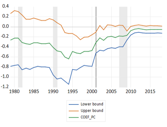
Notes: Shaded areas denote recessions. The unemployment gap is the difference between the actual unemployment rate and the Congressional Budget Office's 2010 estimate of the natural rate of unemployment.
Source: Adapted from a forthcoming report by Jared Bernstein of the Center on Budget and Policy Priorities
In short, this analysis confirms what many have been arguing in recent years: There is little danger that tight labor markets will quickly accelerate inflation to levels above the Fed’s target zone. Given this, targeting other variables with high-pressure labor markets seems like it can be done at quite low risk.
Yes, tight labor markets do lead to a rising labor share of income
It is often asserted that the labor share of income is a countercyclical variable—rising during recessions and falling during recoveries.2 This is an incomplete description, as its dynamics are quite a bit more complicated than that.
Figure C shows the labor share of income since 1949. In this figure, we highlight when it reaches local maximum levels during recessions—justifying an insight that this variable is countercyclical with regard to its increase during recessions. Moreover, in early parts of recoveries, it tends to fall rapidly, again potentially justifying the countercyclical description. But in later periods of recoveries it almost always rises sharply, well before (sometimes years before) the subsequent recession. (In the figure, these later-in-recovery upswings are marked with red arrows.)
Labor's share of income spikes in recessions, plummets in early recoveries, and ascends in late recoveries: Labor's share of income in the corporate sector, 1949–2018
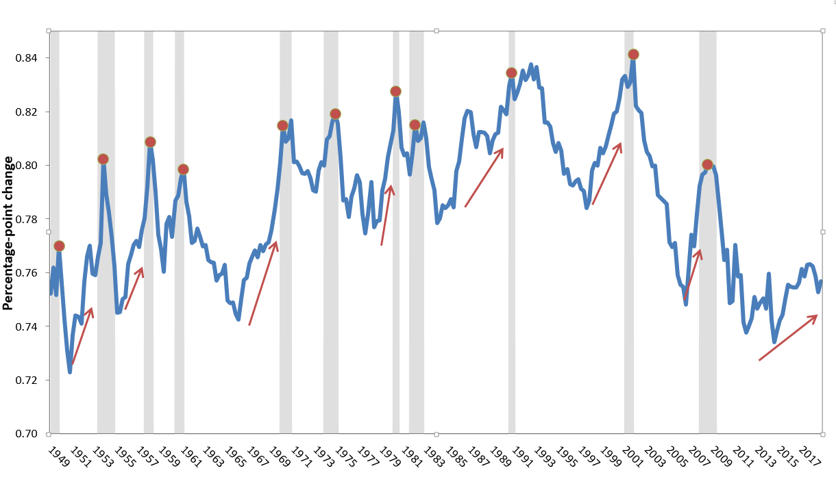
Note: Shaded areas denote recessions.
Source: Author’s analysis of Bureau of Economic Analysis National Income and Product Accounts (Table 1.14)
While this empirical regularity is much less well known than the incomplete description that labor’s share is “countercyclical,” it hasn’t completely escaped notice. Richard Clarida noted this pattern in a 2016 journal article, before he became Fed vice chair:
Note that this pattern of a mid-cycle rebound in labor’s share is typical of past U.S. recoveries. In the three expansions during the “Great Moderation”—the quarter-century after then-Fed Chair Paul Volcker broke the back of inflation—labor’s share of income initially fell during the early days of recovery and then began to rebound during the expansion phase of the business cycle. Importantly, this rise in labor’s share occurred before, and usually well before, the business cycle peak and continued as the economy fell into recession. The rise in labor’s share that occurs during recessions is well known and is usually attributed to the desire of firms to “hoard” labor initially in downturns as sales decline—holding off on firing workers until the decline in demand is clearly expected to persist. What is less appreciated is the phenomenon of labor’s rising share of income well in advance of the peak in economic activity and for reasons unrelated to labor hoarding.
Figure C also shows lots of variability and potential decade-specific trends in labor’s share. This explains why a simple scatterplot of the relationship between the change in labor’s share of income and the unemployment gap is very noisy, with only a mild (if statistically significant) downward correlation, indicating that low unemployment gaps (signifying tight labor markets) are weakly associated with an increased labor share. Once decade-specific dummy variables and decade-specific trends are controlled for, however, this relationship dramatically strengthens, as shown in Figure D. The figure shows the coefficient on the unemployment gap from a regression of the change in the labor share on the unemployment gap, plus decade-specific dummy variables, decade-specific trends, and productivity growth. It shows this regression for all periods in our data (quarterly data from 1949 to 2018), as well as periods when the unemployment gap is greater than 1, less than or equal to 1, greater than 0, and less than or equal to 0. An unemployment gap of 0 or below indicates a tight labor market with actual unemployment either matching or below estimates of the natural rate. An unemployment gap of 1 or below indicates an economy operating below full employment, but at least within shouting distance of it. An unemployment gap of above 1 indicates an unhealthy labor market. For reference, the CBO’s estimated natural rate of unemployment for this year is 4.6 percent, making today’s unemployment gap roughly -0.8 percent.
In tight labor markets, the labor share of income rises : Change in labor's share of income per a 1 percentage-point decline in the unemployment gap, overall and by periods when the unemployment gap falls within the specified range
| Samples | |
|---|---|
| Overall | 0.16% |
| >1 | 0.08% |
| ≤1 | 0.312% |
| >0 | 0.137% |
| ≤0 | 0.47% |
Notes: The unemployment gap is the actual unemployment rate minus the estimate of the natural rate of unemployment. Bars represent the regression coefficient on the unemployment gap from a regression, with the change in the labor share of income as the dependent variable. Controls include productivity growth and the four-quarter change in the unemployment rate; dummy variables for the business cycles of the 1950s, 1960s, 1970s, 1980s, and 1990s, and for the 2001–2007 business cycle; and business cycle–specific trends for each of those time periods. An asterisk indicates the coefficient is not statistically significant at conventional levels.
Source: Author’s analysis of data from the Bureau of Economic Analysis National Income and Product Accounts, unemployment rates from the Bureau of Labor Statistics, and estimates of the natural rate of unemployment from the Congressional Budget Office (2019)
Given today’s unemployment gap, the regression coefficients shown in Figure D would indicate that another year at this low rate of unemployment should see a rise in the labor share of income by just over 1.5 percentage points, all else equal.3 The decline from the nonrecessional peak of labor’s share of income in 2007 until today has been roughly 4 percentage points, meaning that more than two years of labor markets as tight as today’s would be needed for full recovery of labor’s share.
What will rise in an extended high-pressure labor market—price inflation or labor’s share?
So far, the tighter labor markets of recent years have not translated into a robust clawback of the labor share of income lost in the early part of this recovery. But the evidence from the past six decades-plus of data seems to clearly indicate that eventually a hot labor market will translate into such a clawback.
Data on more recent periods indicate that while the labor share of income should reliably rise in high-pressure labor markets, price inflation may not necessarily increase. Avoiding rapid price accelerations is the main justification for Fed rate increases to slow the pace of growth and avoid the risk of wage-driven price inflation. This risk seems to have abated substantially. Given this, the Fed should go full speed ahead in targeting a return to pre-crisis levels of labor’s share of income. The evidence seems clear that sustained tight labor markets will eventually deliver this.
1. In the January newsletter, we provided details on how our labor share measure is constructed. Briefly, this labor share is labor compensation as a share of the sum of labor compensation and net operating surplus in the corporate sector.
2. For example, the first sentence in the abstract of a 2018 paper by Vasco Botelho begins, “There is a consensus that the U.S. labor share is countercyclical….” The paper then goes on to argue that the cyclical dynamics of the labor share have changed substantially in recent years.
3. To see this, multiply the unemployment gap (-0.8 percent) by the regression coefficient (-0.47 percent) and then multiply this quarterly relationship by 4 to calculate the effect for a full year.
Enjoyed this post?
Sign up for EPI's newsletter so you never miss our research and insights on ways to make the economy work better for everyone.