EPI’s top charts of 2021
 The economic fallout from the COVID-19 pandemic exposed a range of stark inequalities in American society. Besides highlighting these inequalities, EPI’s research over the past year has identified the clear fingerprints of intentional policy decisions in driving the inequalities.
Building a better and fairer economy in the pandemic’s wake will require a fundamental reorientation of economic policy along many dimensions. While 2021 has seen a decent start in some of this reorientation, much more remains to be done. Here are the charts that we selected as our top ones of 2021.
After the longest period in history without an increase, the federal minimum wage today is worth 21% less than 12 years ago—and 34% less than in 1968. : Real value of the minimum wage (adjusted for inflation)
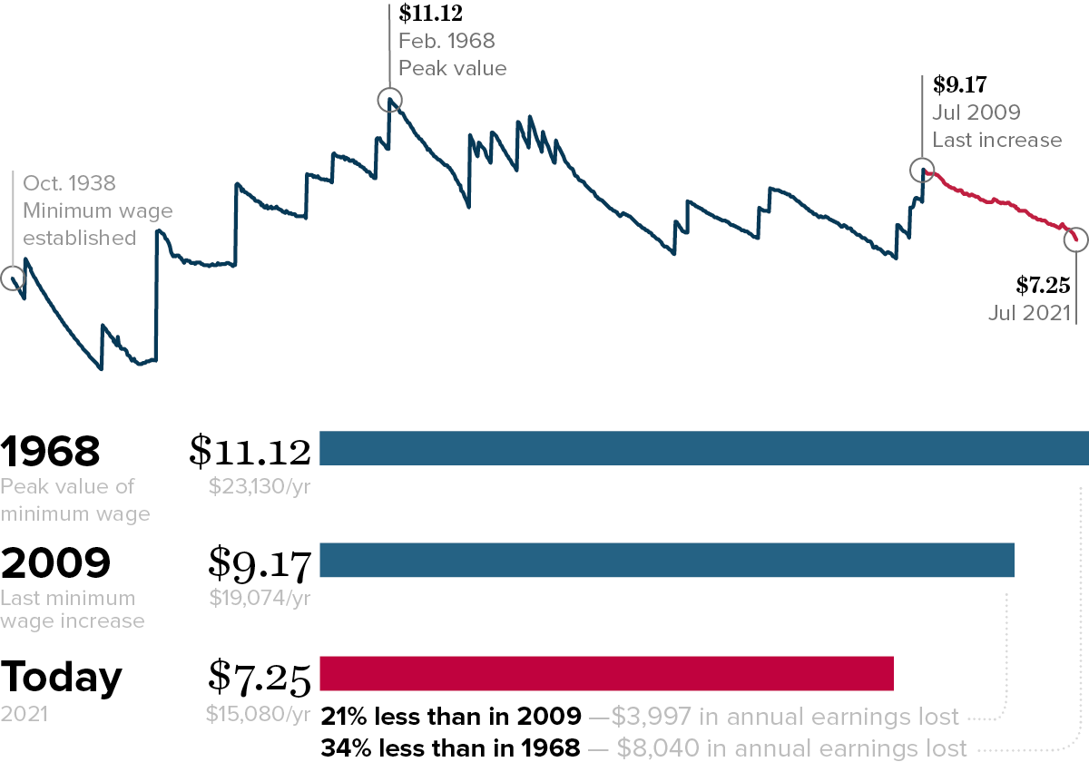
Notes: All values are in June 2021 dollars, adjusted using the CPI-U-RS
Source: Reproduced from Ben Zipperer, “The Minimum Wage Has Lost 21% Of Its Value Since Congress Last Raised the Wage,” Working Economics Blog, Economic Policy Institute, July 22, 2021. Data sources are Fair Labor Standards Act and amendments.
It’s been 12 years since the last federal minimum wage increase on July 24, 2009, the longest period in U.S. history without an increase. In the meantime, rising costs of living have diminished the purchasing power of a minimum wage paycheck. Workers paid the federal minimum of $7.25 today effectively earn 21% less than what their counterparts earned 12 years ago, after adjusting for inflation.
Some demographic groups are more likely to telework than others in the pandemic recession: Share of employed that teleworked by select demographic, average May 2020–April 2021
| group_value | share_tw_emp |
|---|---|
| Total, 16 years and older | 24.27% |
| 16 to 24 years | 11.07% |
| 25 to 54 years | 27.30% |
| 55 years and older | 22.90% |
| Men | 22.1% |
| Women | 27.9% |
| White | 25.89% |
| Black | 20.42% |
| Hispanic | 15.19% |
| AAPI | 39.20% |
| Not U.S. citizen | 18.81% |
| U.S. citizen | 24.76% |
| Less than high school | 3.06% |
| High school | 8.12% |
| Some college | 15.70% |
| College | 38.42% |
| Advanced | 51.58% |
Notes: Race/ethnicity categories are mutually exclusive (i.e., white non-Hispanic, Black non-Hispanic, and Hispanic any race). AAPI includes Asian American and Pacific Islander.
Source: Reproduced from Figure B in Elise Gould and Jori Kandra, “Only One in Five Workers Are Working from Home Due to COVID,” Working Economics Blog, Economic Policy Institute, June 2, 2021. Data are from authors' analysis of EPI Current Population Survey Extracts, Version 1.0.14 (2021), https://microdata.epi.org and the Current Population Survey COVID supplement.
The share of workers who teleworked as a result of COVID-19 exposes the disparities that exist not only across education levels, but also across age groups, gender, race/ethnicity, and citizenship. This figure shows that young workers are least able to work from home, which is not surprising given their tendency to work in face-to-face occupations, where job losses were also greater. In the pandemic, women were more likely to telework than men. And as with the pre-pandemic period, there remains a large disparity between the share of Black and Hispanic workers who are able to telework, compared with white and Asian American and Pacific Islander (AAPI) workers.
Sustained lower unemployment would help shrink Black–white wage gaps: Black–white median wage gap, actual and under three counterfactual scenarios, 1973–2019
| Actual | 1.0 ppt. lower average unemployment | 1.5 ppt. lower average unemployment | 2.0 ppt. lower average unemployment | |
|---|---|---|---|---|
| 1973 | 28.6% | 28.6% | 28.6% | 28.6% |
| 1974 | 24.8% | 24.5% | 24.3% | 24.2% |
| 1975 | 23.7% | 23.1% | 22.8% | 22.5% |
| 1976 | 23.4% | 22.5% | 22.0% | 21.6% |
| 1977 | 23.2% | 22.0% | 21.4% | 20.8% |
| 1978 | 25.1% | 23.6% | 22.9% | 22.1% |
| 1979 | 19.6% | 17.9% | 17.1% | 16.3% |
| 1980 | 20.9% | 18.9% | 17.9% | 16.9% |
| 1981 | 21.1% | 18.8% | 17.6% | 16.5% |
| 1982 | 24.0% | 21.3% | 19.9% | 18.6% |
| 1983 | 22.5% | 19.5% | 18.1% | 16.6% |
| 1984 | 24.2% | 20.9% | 19.3% | 17.7% |
| 1985 | 23.9% | 20.3% | 18.5% | 16.8% |
| 1986 | 24.9% | 21.0% | 19.1% | 17.2% |
| 1987 | 24.4% | 20.2% | 18.1% | 16.1% |
| 1988 | 22.5% | 18.1% | 16.0% | 13.9% |
| 1989 | 25.6% | 20.7% | 18.4% | 16.1% |
| 1990 | 25.2% | 20.0% | 17.6% | 15.2% |
| 1991 | 28.4% | 22.8% | 20.1% | 17.5% |
| 1992 | 25.8% | 20.0% | 17.2% | 14.5% |
| 1993 | 24.8% | 18.7% | 15.9% | 13.1% |
| 1994 | 25.1% | 18.8% | 15.8% | 12.8% |
| 1995 | 26.3% | 19.6% | 16.4% | 13.3% |
| 1996 | 27.8% | 20.7% | 17.3% | 14.1% |
| 1997 | 27.3% | 20.0% | 16.5% | 13.1% |
| 1998 | 25.6% | 18.0% | 14.5% | 11.1% |
| 1999 | 24.4% | 16.7% | 13.0% | 9.5% |
| 2000 | 26.2% | 18.0% | 14.2% | 10.5% |
| 2001 | 29.3% | 20.6% | 16.5% | 12.6% |
| 2002 | 27.1% | 18.3% | 14.1% | 10.2% |
| 2003 | 25.3% | 16.3% | 12.1% | 8.1% |
| 2004 | 24.8% | 15.6% | 11.3% | 7.2% |
| 2005 | 26.7% | 17.1% | 12.6% | 8.3% |
| 2006 | 25.9% | 16.1% | 11.5% | 7.1% |
| 2007 | 28.7% | 18.3% | 13.4% | 8.8% |
| 2008 | 30.0% | 19.2% | 14.2% | 9.4% |
| 2009 | 27.1% | 16.3% | 11.3% | 6.5% |
| 2010 | 26.9% | 15.8% | 10.7% | 5.8% |
| 2011 | 28.5% | 16.9% | 11.6% | 6.6% |
| 2012 | 32.7% | 20.4% | 14.8% | 9.4% |
| 2013 | 29.1% | 16.9% | 11.3% | 6.0% |
| 2014 | 31.8% | 19.0% | 13.2% | 7.6% |
| 2015 | 34.4% | 21.1% | 15.0% | 9.2% |
| 2016 | 29.8% | 16.6% | 10.6% | 5.0% |
| 2017 | 33.8% | 20.0% | 13.7% | 7.7% |
| 2018 | 36.4% | 22.0% | 15.4% | 9.2% |
| 2019 | 32.2% | 18.0% | 11.5% | 5.4% |
Notes: The wage gap is how much less in percent terms the median Black worker earns in hourly wages than the median white worker.
Source: Reproduced from Figure C in Josh Bivens, The Promise and Limits of High-Pressure Labor Markets for Narrowing Racial Gaps, August 2021. For original data sources and regression coefficients used to construct counterfactual wage growth see Figures B and C in the report.
Achieving and sustaining high-pressure labor markets since the early 1970s would have dramatically narrowed the median Black–white wage gap. Had unemployment averaged 2 percentage points less over the entire period, 80% of the median Black–white wage gap that appeared in 1973 could have been erased (as the gap shrank from 28.6% to 5.4%). Instead, the gap increased to 32.2%. With unemployment averaging just 1 percentage point less, the median wage gap could have fallen to 18.0%. In short, high-pressure labor markets—the very low unemployment and rapid job growth that occur when the Federal Reserve prioritizes low unemployment—hold great potential to reduce this particular measure of racial inequality in the labor market.
Pay growth has lagged productivity growth largely thanks to policy failures: Contribution (in 2017 dollars) of various factors to productivity–median compensation divergence, 1979–2017
| Year | Unexplained** | Noncompetes, misclassification, overtime, supply chain dominance* | Corporate globalization | Eroded collective bargaining | Excessive unemployment | Actual growth | Baseline |
|---|---|---|---|---|---|---|---|
| 1979 | $20.48 | $20.48 | $20.48 | $20.48 | $20.48 | $20.48 | $20.48 |
| 2017 | $33.10 | $30.72 | $28.59 | $27.30 | $25.46 | $23.15 | $20.48 |
Notes: Automation/skill deficits had no effect.
* Dominant buyer and fissuring
** Including but not limited to: wage theft, guestworker programs, racial discrimination, industry deregulation, forced arbitration, and anti-poaching agreements
Source: Adapted from Figure J in Lawrence Mishel and Josh Bivens, Identifying the Policy Levers Generating Wage Suppression and Wage Inequality, May 2021.
Had median hourly wages grown with productivity since 1979 they would be at least $10 higher than they are. This figure shows that excessive unemployment, eroded collective bargaining, and corporate-driven globalization are key factors that have suppressed wage growth over the last four decades. Together these factors lowered the growth of median hourly compensation relative to net productivity growth by $5.45—accounting for 54.7% of the divergence between productivity and pay from 1979 to 2017. Absent these factors, median hourly compensation would have risen to $28.59 rather than to $23.15.
Care workers are disproportionately women of color: Gender and race/ethnicity breakdown of all workers, home health care workers, and child care workers
| Men | White women | Black women | Hispanic women | AAPI women | Women of other race/ethnicity | |
|---|---|---|---|---|---|---|
| All workers | 53.1% | 29.1% | 6.4% | 7.5% | 3.3% | 0.5% |
| Home health care workers | 11.4% | 34.0% | 26.1% | 20.1% | 7.0% | 1.4% |
| Child care workers | 6.0% | 53.1% | 14.1% | 22.3% | 3.3% | 1.2% |
Notes: To ensure sufficient sample sizes, this figure draws from pooled 2018–2020 microdata. AAPI refers to Asian American/Pacific Islander. Race/ethnicity categories are mutually exclusive (i.e., white non-Hispanic, Black non-Hispanic, AAPI non-Hispanic, and Hispanic any race).
Source: Reproduced from Figure B in Asha Banerjee, Elise Gould, and Marokey Sawo, Setting Higher Wages for Child Care and Home Health Care Workers is Long Overdue, Economic Policy Institute, November 2021. Data are from authors' analysis of Current Population Survey basic monthly microdata, EPI Current Population Survey Extracts, Version 1.0.18 (2021), https://microdata.epi.org.
Care workers are deeply undervalued and underpaid. This figure shows that Black, Hispanic, and Asian American/Pacific Islander (AAPI) women are far more likely to be home health care workers compared with their shares in the workforce overall. In particular, Black women are more than four times as likely to be home health care workers relative to their shares in the workforce overall. And white, Black, and Hispanic women are overrepresented in the child care workforce.
Enjoyed this post?
Sign up for EPI's newsletter so you never miss our research and insights on ways to make the economy work better for everyone.