Issue Brief #374
The Great Recession officially began in December 2007 and ended in June 2009, making the upcoming release of December 2013 employment and unemployment data the six-year anniversary of the Great Recession’s beginning and the four-and-a-half-year anniversary of its end.
Time-wise, the current recovery can now be considered a mature economic recovery, and some indicators have made substantial progress toward full recovery. The stock market and corporate profits, for example, have both surpassed their pre-recession peak in real (i.e., inflation-adjusted) terms. Unfortunately, such gains do little to help the vast majority of households. For example, less than half of households own any stock at all—even including stock held indirectly in retirement accounts. Furthermore, many of those who do hold stock do not hold meaningful amounts; less than one-third of households have stock worth at least $10,000—again, even including stock held indirectly in retirement accounts (Mishel et al. 2012).
Worse, the indicators that really matter to the living standards of the vast majority of working-age households—jobs and wages—have seen agonizingly slow progress toward full recovery. This paper provides an overview of the state of the U.S. labor market six years after the onset of the Great Recession. Key findings include:
- The total “jobs gap”—the number of jobs needed to return the U.S. economy to pre-recession health—is 7.9 million jobs (3.6 million for women and 4.3 million for men).
- The pace of the jobs recovery has not accelerated significantly since 2011. On average in 2011, the labor market added 175,000 jobs per month. In 2012, it was 183,000 jobs per month. Over the last 12 months for which these data are available (December 2012–November 2013), the labor market added 191,000 jobs per month, and over the last three months with available data (September 2013–November 2013) the labor market added 193,000 jobs per month.
- At 200,000 jobs per month, pre-recession labor market conditions would not be regained for another five years. To regain pre-recession labor market conditions in two years, we would need to add 400,000 jobs per month.
- Most of the improvement in the unemployment rate since its peak of 10.0 percent in the fall of 2009 has not been driven by increased employment, but rather by potential workers dropping out of, or never entering, the labor force because job opportunities are so weak. In other words, these are people who would be either working or looking for work if job opportunities were significantly stronger. Because jobless workers are only counted as unemployed if they are actively seeking work, these “missing workers” are not reflected in the unemployment rate. If all of these missing workers were actively seeking work, the unemployment rate would be 10.3 percent instead of 7.0 percent.
- With job opportunities so weak for so long, unemployed workers have gotten stuck in unemployment for record lengths of time. Last month, the extensions of unemployment insurance benefits were allowed to expire—an unprecedented move given the weak state of the labor market. The share of the workforce that is long-term unemployed (i.e., jobless for more than six months) is twice as high today as it was in any other period when we allowed an extended benefits program to expire following earlier recessions.
- It is likely that 12.7 percent of all workers experienced unemployment at some point in 2013. The estimate is significantly higher for racial and ethnic minorities: It is likely 15.5 percent of Hispanic workers and 19.7 percent of black workers were unemployed at some point in 2013.
- Today’s labor market weakness is not due to skills mismatch (workers lacking skills for available jobs). The “signature” of an increase in skills mismatch would be shortages relative to 2007 (before the recession began) in some consequentially sized group or groups of workers, but this signature is not found in the data. Weak demand for workers is broad-based; job seekers dramatically outnumber job openings in every industry, and unemployment is significantly higher at every education level than in 2007.
- A key driver of this broad-based weakness is austerity in the public sector. Since the recovery began in June 2009, the public sector has lost 728,000 jobs. However, to keep up with population growth over this period, public-sector employment should have increased by around 750,000. That means the total gap in public-sector employment today is around 1.5 million jobs. Nearly 30 percent of that gap has occurred in local government education, which is mostly public K–12 employment.
- It is not just job seekers who are hurt by the weak recovery—workers with jobs are also doing much more poorly than they would be if job opportunities were plentiful. This is because when the labor market is weak, employers do not have to pay substantial wage increases to get and keep the workers they need. In today’s weak recovery, real wages have dropped for the entire bottom 90 percent of workers.
- Because today’s weak job growth is due to businesses not seeing demand for goods and services rise rapidly enough to necessitate increased hiring, the economy needs policies that will stimulate demand. In the current moment this can most reliably be accomplished through expansionary fiscal policy: large-scale ongoing public investments, the reestablishment of public services and public-sector employment cut in the Great Recession and its aftermath, and the reinstatement of extended unemployment insurance benefits.
- Another category of policies that could bring down the unemployment rate are those that would spread the total hours of work across more workers: work-sharing, allowing early entry into Social Security and Medicare for workers who wish to move up their retirement, and mandatory paid leave.
Job growth has not accelerated significantly since 2011
Between the start of the recession and the employment trough in February 2010, the labor market lost 8.7 million jobs. It has since gained back 7.4 million, so the labor market remains “just” 1.3 million jobs below its December 2007 level of employment. It is important to note, however, that because the working-age population (and with it, the potential labor force) is growing all the time, getting back to the December 2007 level of employment is not nearly enough. To keep up with growth in the potential labor force as measured by the Congressional Budget Office (CBO), we should have added over 90,000 jobs per month on average over the last six years. Altogether, we would have needed to add 6.6 million jobs over the last six years just to keep up with growth in the potential labor force. Given that we are instead down 1.3 million jobs, the total “jobs gap” is currently 7.9 million (see Figure A).
Payroll employment and the number of jobs needed to keep up with the growth in the potential labor force, January 2000–November 2013
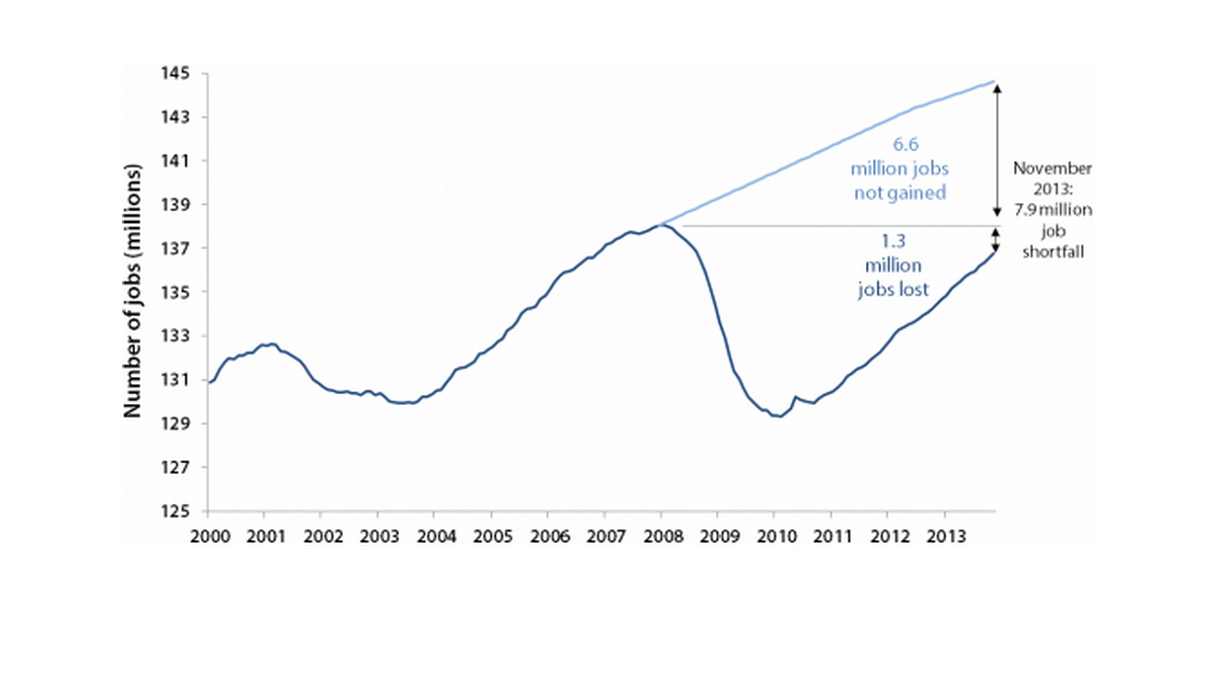
Source: Author's analysis of Bureau of Labor Statistics Current Employment Statistics and estimates of the potential labor force from the Congressional Budget Office (2012)
The overall jobs gap can be broken down by gender. Women have surpassed their pre-recession employment peak by nearly a quarter-million jobs. However, the number of jobs held by women should have increased by close to 3.8 million over the last six years to keep up with growth in the potential female labor force, so women are actually down 3.6 million jobs. Men are still 1.5 million below their pre-recession peak. Given that the number of jobs held by men should have increased by 2.8 million to keep up with growth in the potential male labor force, men are 4.3 million jobs in the hole.
Much has been made of the recent acceleration in employment growth, but in fact, the acceleration since 2011 has been quite modest. In 2011, the labor market added an average of 175,000 jobs per month. In 2012, the labor market added 183,000 jobs per month. Over the last 12 months for which these data are available (December 2012–November 2013), the labor market added 191,000 jobs per month, and over the last three months with available data (September 2013–November 2013) the labor market added 193,000 jobs per month. That is far from rapid acceleration. For context, it is worth noting that at 200,000 jobs per month, it would take roughly five years to get back to pre-recession labor market conditions (given CBO’s projections for potential labor force growth). To get back to pre-recession labor market conditions in two years—which would translate into a total of eight years of labor market weakness, given the six we have already experienced—we would need to add 400,000 jobs per month.
Little of the improvement in the unemployment rate has been because people got jobs
In 2006 and 2007, the unemployment rate averaged 4.6 percent. It rose to 10.0 percent in October 2009, and has since dropped to 7.0 percent. An unemployment rate of 7.0 percent is still extremely high—for example, the highest the unemployment rate ever got in the early 2000s downturn was 6.3 percent—but the drop from 10.0 percent to 7.0 percent could nevertheless represent substantial improvement. However, most of that decrease was not for “good” reasons. Somewhat counter-intuitively, the unemployment rate can decline for two opposing reasons—one representing a strengthening labor market and one representing a weak labor market. In the case of the former, the decline is caused by a higher share of the potential workforce finding work. In the case of the latter, the decline is caused by potential workers dropping out of, or never entering, the labor force because job opportunities are weak (jobless workers who are not actively seeking work are not counted as unemployed, so they are not counted as being in the labor force).
Most of the improvement in the unemployment rate over the last six years has been of the “bad” type. Since late 2008, when job loss in the Great Recession began to accelerate dramatically, the pool of “missing workers”—potential workers who, because of weak job opportunities, are neither employed nor actively seeking work—has grown steadily and is now 5.7 million strong. Because jobless workers are only counted as unemployed if they are actively seeking work, these “missing workers” are not reflected in the unemployment rate. Figure B shows the unemployment rate (7.0 percent), along with what the unemployment rate would be if the missing workers were actively seeking work (10.3 percent). The very modest improvement in the “alternative” unemployment rate since late 2009 demonstrates that the employment situation has actually improved little over the last four years. In fact, just slightly over one-quarter of the decline in the official unemployment rate since October 2009 has been due to potential workers getting work. Nearly three-quarters of the decrease has been due to the labor market being so weak that potential workers have been sidelined.
Unemployment rate, actual and if missing workers were looking for work, January 2006–November 2013
| Date | Actual | If missing workers were looking for work |
|---|---|---|
| 2006-01-01 | 4.7% | 5.1% |
| 2006-02-01 | 4.8% | 4.9% |
| 2006-03-01 | 4.7% | 4.8% |
| 2006-04-01 | 4.7% | 4.9% |
| 2006-05-01 | 4.6% | 4.8% |
| 2006-06-01 | 4.6% | 4.7% |
| 2006-07-01 | 4.7% | 4.8% |
| 2006-08-01 | 4.7% | 4.6% |
| 2006-09-01 | 4.5% | 4.5% |
| 2006-10-01 | 4.4% | 4.4% |
| 2006-11-01 | 4.5% | 4.4% |
| 2006-12-01 | 4.4% | 4.1% |
| 2007-01-01 | 4.6% | 4.3% |
| 2007-02-01 | 4.5% | 4.3% |
| 2007-03-01 | 4.4% | 4.2% |
| 2007-04-01 | 4.5% | 4.8% |
| 2007-05-01 | 4.4% | 4.7% |
| 2007-06-01 | 4.6% | 4.7% |
| 2007-07-01 | 4.7% | 4.8% |
| 2007-08-01 | 4.6% | 5.0% |
| 2007-09-01 | 4.7% | 4.8% |
| 2007-10-01 | 4.7% | 5.1% |
| 2007-11-01 | 4.7% | 4.7% |
| 2007-12-01 | 5.0% | 5.0% |
| 2008-01-01 | 5.0% | 4.7% |
| 2008-02-01 | 4.9% | 4.9% |
| 2008-03-01 | 5.1% | 5.0% |
| 2008-04-01 | 5.0% | 5.1% |
| 2008-05-01 | 5.4% | 5.3% |
| 2008-06-01 | 5.6% | 5.5% |
| 2008-07-01 | 5.8% | 5.6% |
| 2008-08-01 | 6.1% | 5.9% |
| 2008-09-01 | 6.1% | 6.1% |
| 2008-10-01 | 6.5% | 6.4% |
| 2008-11-01 | 6.8% | 6.9% |
| 2008-12-01 | 7.3% | 7.4% |
| 2009-01-01 | 7.8% | 8.1% |
| 2009-02-01 | 8.3% | 8.6% |
| 2009-03-01 | 8.7% | 9.2% |
| 2009-04-01 | 9.0% | 9.3% |
| 2009-05-01 | 9.4% | 9.6% |
| 2009-06-01 | 9.5% | 9.7% |
| 2009-07-01 | 9.5% | 9.9% |
| 2009-08-01 | 9.6% | 10.2% |
| 2009-09-01 | 9.8% | 10.8% |
| 2009-10-01 | 10.0% | 11.2% |
| 2009-11-01 | 9.9% | 11.0% |
| 2009-12-01 | 9.9% | 11.4% |
| 2010-01-01 | 9.8% | 11.2% |
| 2010-02-01 | 9.8% | 11.2% |
| 2010-03-01 | 9.9% | 11.1% |
| 2010-04-01 | 9.9% | 10.8% |
| 2010-05-01 | 9.6% | 10.8% |
| 2010-06-01 | 9.4% | 10.9% |
| 2010-07-01 | 9.5% | 11.1% |
| 2010-08-01 | 9.5% | 11.0% |
| 2010-09-01 | 9.5% | 11.1% |
| 2010-10-01 | 9.5% | 11.3% |
| 2010-11-01 | 9.8% | 11.5% |
| 2010-12-01 | 9.3% | 11.3% |
| 2011-01-01 | 9.1% | 11.2% |
| 2011-02-01 | 9.0% | 11.1% |
| 2011-03-01 | 8.9% | 11.0% |
| 2011-04-01 | 9.0% | 11.2% |
| 2011-05-01 | 9.0% | 11.1% |
| 2011-06-01 | 9.1% | 11.3% |
| 2011-07-11 | 9.0% | 11.4% |
| 2011-08-20 | 9.0% | 11.2% |
| 2011-09-01 | 9.0% | 11.0% |
| 2011-10-11 | 8.9% | 11.0% |
| 2011-11-20 | 8.6% | 10.8% |
| 2011-12-30 | 8.5% | 10.7% |
| 2012-01-12 | 8.3% | 10.6% |
| 2012-02-12 | 8.3% | 10.4% |
| 2012-03-12 | 8.2% | 10.4% |
| 2012-04-12 | 8.1% | 10.6% |
| 2012-05-12 | 8.2% | 10.3% |
| 2012-06-12 | 8.2% | 10.3% |
| 2012-07-12 | 8.2% | 10.6% |
| 2012-08-12 | 8.1% | 10.7% |
| 2012-09-12 | 7.8% | 10.2% |
| 2012-10-12 | 7.9% | 10.1% |
| 2012-11-12 | 7.8% | 10.2% |
| 2012-12-12 | 7.8% | 10.1% |
| 2013-01-12 | 7.9% | 10.3% |
| 2013-02-12 | 7.7% | 10.3% |
| 2013-03-12 | 7.6% | 10.4% |
| 2013-04-12 | 7.5% | 10.3% |
| 2013-05-12 | 7.6% | 10.2% |
| 2013-06-12 | 7.6% | 10.1% |
| 2013-07-12 | 7.4% | 10.2% |
| 2013-08-12 | 7.3% | 10.1% |
| 2013-09-12 | 7.2% | 10.2% |
| 2013-10-12 | 7.3% | 10.8% |
| 2013-11-12 | 7.0% | 10.3% |
Note: Missing workers are potential workers who, due to weak job opportunities, are neither employed nor actively seeking work. For more information on the missing workers data, see the methodology section of the Economic Policy Institute’s “Missing Workers” Economic Indicator (https://www.epi.org/publication/missing-workers/).
Source: Author's analysis of Toossi (2007) and Current Population Survey public data series
Given that changes in the official unemployment rate are currently providing a murky picture of trends in labor market health, it is useful to turn to other measures. Arguably the most helpful is the employment-to-population ratio of “prime-age” workers (workers age 25–54). (In fact, I refer to this as my “desert island” measure—meaning that if I were going to a desert island and could only take one measure with me to judge current trends in labor market conditions, this would be the one.) The employment-to-population ratio (or EPOP) is simply the share of the population with a job. In other words, this measure entirely sidesteps the issue of whether potential workers are in the labor force. Restricting our attention to prime-age workers serves the important purpose of avoiding confounding changes in employment that are not due to labor market conditions but are instead due to longer-run structural factors, such as baby boomers hitting retirement age and declining employment of young adults due to increased college enrollment.
Figure C shows the prime-age EPOP over the last several years. In spring 2007, the prime-age EPOP was 80.0 percent. It dropped more than 5 percentage points to 74.8 percent by December 2009, and has since increased only 1.1 percentage points to 75.9 percent. In other words, six years after the start of the Great Recession and four-and-a-half years after the official end of the Great Recession, the labor market has recovered just a little over one-fifth of what it lost, according to this key labor market indicator.
Employment-to-population ratio of workers age 25–54, January 2006–November 2013
| Month | Employment to population ratio |
|---|---|
| Jan-2006 | 79.6% |
| Feb-2006 | 79.7% |
| Mar-2006 | 79.8% |
| Apr-2006 | 79.6% |
| May-2006 | 79.7% |
| Jun-2006 | 79.8% |
| Jul-2006 | 79.8% |
| Aug-2006 | 79.8% |
| Sep-2006 | 79.9% |
| Oct-2006 | 80.1% |
| Nov-2006 | 80.0% |
| Dec-2006 | 80.1% |
| Jan-2007 | 80.3% |
| Feb-2007 | 80.1% |
| Mar-2007 | 80.2% |
| Apr-2007 | 80.0% |
| May-2007 | 80.0% |
| Jun-2007 | 79.9% |
| Jul-2007 | 79.8% |
| Aug-2007 | 79.8% |
| Sep-2007 | 79.7% |
| Oct-2007 | 79.6% |
| Nov-2007 | 79.7% |
| Dec-2007 | 79.7% |
| Jan-2008 | 80.0% |
| Feb-2008 | 79.9% |
| Mar-2008 | 79.8% |
| Apr-2008 | 79.6% |
| May-2008 | 79.5% |
| Jun-2008 | 79.4% |
| Jul-2008 | 79.2% |
| Aug-2008 | 78.8% |
| Sep-2008 | 78.8% |
| Oct-2008 | 78.4% |
| Nov-2008 | 78.1% |
| Dec-2008 | 77.6% |
| Jan-2009 | 77.0% |
| Feb-2009 | 76.7% |
| Mar-2009 | 76.2% |
| Apr-2009 | 76.2% |
| May-2009 | 75.9% |
| Jun-2009 | 75.9% |
| Jul-2009 | 75.8% |
| Aug-2009 | 75.6% |
| Sep-2009 | 75.1% |
| Oct-2009 | 75.0% |
| Nov-2009 | 75.2% |
| Dec-2009 | 74.8% |
| Jan-2010 | 75.2% |
| Feb-2010 | 75.1% |
| Mar-2010 | 75.1% |
| Apr-2010 | 75.4% |
| May-2010 | 75.2% |
| Jun-2010 | 75.2% |
| Jul-2010 | 75.0% |
| Aug-2010 | 75.0% |
| Sep-2010 | 75.1% |
| Oct-2010 | 75.0% |
| Nov-2010 | 74.8% |
| Dec-2010 | 75.0% |
| Jan-2011 | 75.2% |
| Feb-2011 | 75.2% |
| Mar-2011 | 75.3% |
| Apr-2011 | 75.1% |
| May-2011 | 75.2% |
| Jun-2011 | 75.0% |
| Jul-2011 | 75.0% |
| Aug-2011 | 75.0% |
| Sep-2011 | 74.9% |
| Oct-2011 | 74.8% |
| Nov-2011 | 75.2% |
| Dec-2011 | 75.4% |
| Jan-2012 | 75.6% |
| Feb-2012 | 75.6% |
| Mar-2012 | 75.8% |
| Apr-2012 | 75.7% |
| May-2012 | 75.8% |
| Jun-2012 | 75.7% |
| Jul-2012 | 75.6% |
| Aug-2012 | 75.7% |
| Sep-2012 | 75.9% |
| Oct-2012 | 75.9% |
| Nov-2012 | 75.7% |
| Dec-2012 | 75.9% |
| Jan-2013 | 75.7% |
| Feb-2013 | 75.9% |
| Mar-2013 | 75.9% |
| Apr-2013 | 75.9% |
| May-2013 | 76.0% |
| Jun-2013 | 75.9% |
| Jul-2013 | 75.9% |
| Aug-2013 | 75.9% |
| Sep-2013 | 75.9% |
| Oct-2013 | 75.4% |
| Nov-2013 | 75.9% |
Note: Shaded area denotes recession.
Source: Author's analysis of Bureau of Labor Statistics Current Population Survey public data series
This is no time to cut off unemployment insurance extensions
With job opportunities so weak for so long, jobless workers have gotten stuck in unemployment for unprecedented lengths of time. Currently, more than one-third of unemployed workers (37.3 percent) have been unemployed for more than six months. Figure D shows the share of the labor force that has been unemployed for more than six months. In the most recent recession, that share rose to more than two-thirds higher than the previous record set during the downturn of the early 1980s. It has since come down significantly, but it is still above the previous record. It is important to note that the cause of today’s long-term unemployment situation is no mystery: It is entirely explained by the length and severity of the current period of labor market weakness, along with longer-term trends in long-term unemployment (Rothstein 2012). In other words, the long-term unemployment crisis we continue to experience is exactly what we would expect given how long our labor market has been as weak as it has. It is not the fault of individual unemployed workers failing to exert enough effort or flexibility in their job search.
Long-term unemployment rate and months when extended unemployment insurance benefits were allowed to expire following recessions, January 1957–November 2013
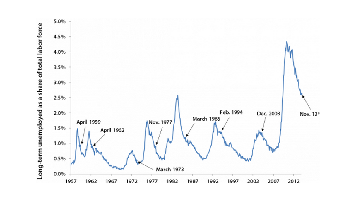
* Extensions expired in December 2013, but the latest labor force data available are for November 2013.
Note: Months in which a special extended benefits program expired are labeled.
Source: Author's analysis of Current Population Survey public data series and the Council of Economic Advisers/U.S. Department of Labor (2013)
In late December, the extensions of unemployment insurance benefits passed by Congress during and in the aftermath of the Great Recession were allowed to expire. Allowing extensions to expire when the labor market is still so weak is unprecedented. Figure D marks the date unemployment insurance extensions were allowed to expire following prior recessions. The share of the workforce that is long-term unemployed is twice as high today as it was in any other post-recession period when Congress allowed an extended benefits program to expire.
Racial and ethnic minorities hit with significantly more joblessness
Each month, the official unemployment rate provides the share of the labor force unemployed in that month. But this understates the number of people who are unemployed at some point over a longer period, since someone who is employed in one month may become unemployed the next, and vice versa. Therefore, the official annual unemployment rate—which is actually the average monthly unemployment rate for the year—is much lower than the share of the workforce that experienced unemployment at some point during the year. Figure E shows both the official unemployment rate and the “over-the-year” unemployment rate—the share of workers who experienced unemployment at some point during the year. We estimate that 12.7 percent of the workforce, or more than one out of every eight workers, was unemployed at some point in 2013.
Official unemployment rate and over-the-year unemployment rate, 2000–2013
| Year | Official unemployment rate | Over-the-year unemployment rate | Over-the-year unemployment rate |
|---|---|---|---|
| 2000 | 4.0% | 8.6% | |
| 2001 | 4.7% | 10.4% | |
| 2002 | 5.8% | 11.0% | |
| 2003 | 6.0% | 10.7% | |
| 2004 | 5.5% | 9.7% | |
| 2005 | 5.1% | 9.3% | |
| 2006 | 4.6% | 9.1% | |
| 2007 | 4.6% | 9.5% | |
| 2008 | 5.8% | 13.2% | |
| 2009 | 9.3% | 16.4% | |
| 2010 | 9.6% | 15.9% | |
| 2011 | 8.9% | 14.9% | |
| 2012 | 8.1% | 13.9% | 13.9% |
| 2013 | 7.4% | 12.7% |
Note: Shaded areas denote recessions. The 2013 unemployment rate is based on the Jan. 2013–Nov. 2013 monthly unemployment rates. The over-the-year unemployment rate is the share of workers who experienced unemployment at some point during the year. The over-the-year unemployment rate in 2013 is the 2013 unemployment rate times the ratio of the 2012 over-the-year unemployment rate to the 2012 unemployment rate.
Source: Author's analysis of Current Population Survey public data series and Bureau of Labor Statistics Work Experience of the Population (various years)
It is important to keep in mind that aggregate labor market measures mask enormous variation by race and ethnicity. For racial and ethnic minorities, the employment situation is significantly worse than it is for white non-Hispanic workers. Figure F shows both the official annual unemployment rate and the “over-the-year” unemployment rate for blacks and Hispanics. The 2013 unemployment rate for Hispanics was 9.2 percent, significantly higher than the overall 2013 unemployment rate of 7.4 percent (the latter is shown in Figure E). An estimated 15.5 percent of Hispanics were unemployed at some point in 2013. The 2013 unemployment rate for blacks was 13.2 percent, far higher than the highest overall annual unemployment rate over the last 70 years. An estimated 19.7 percent of black workers—nearly one in five—were unemployed at some point in 2013. The labor market is improving extremely slowly for all major groups, but the employment situation of African Americans remains at something more akin to depression-level conditions.
Official unemployment rate and over-the-year unemployment rate of blacks and Hispanics, 2000–2013
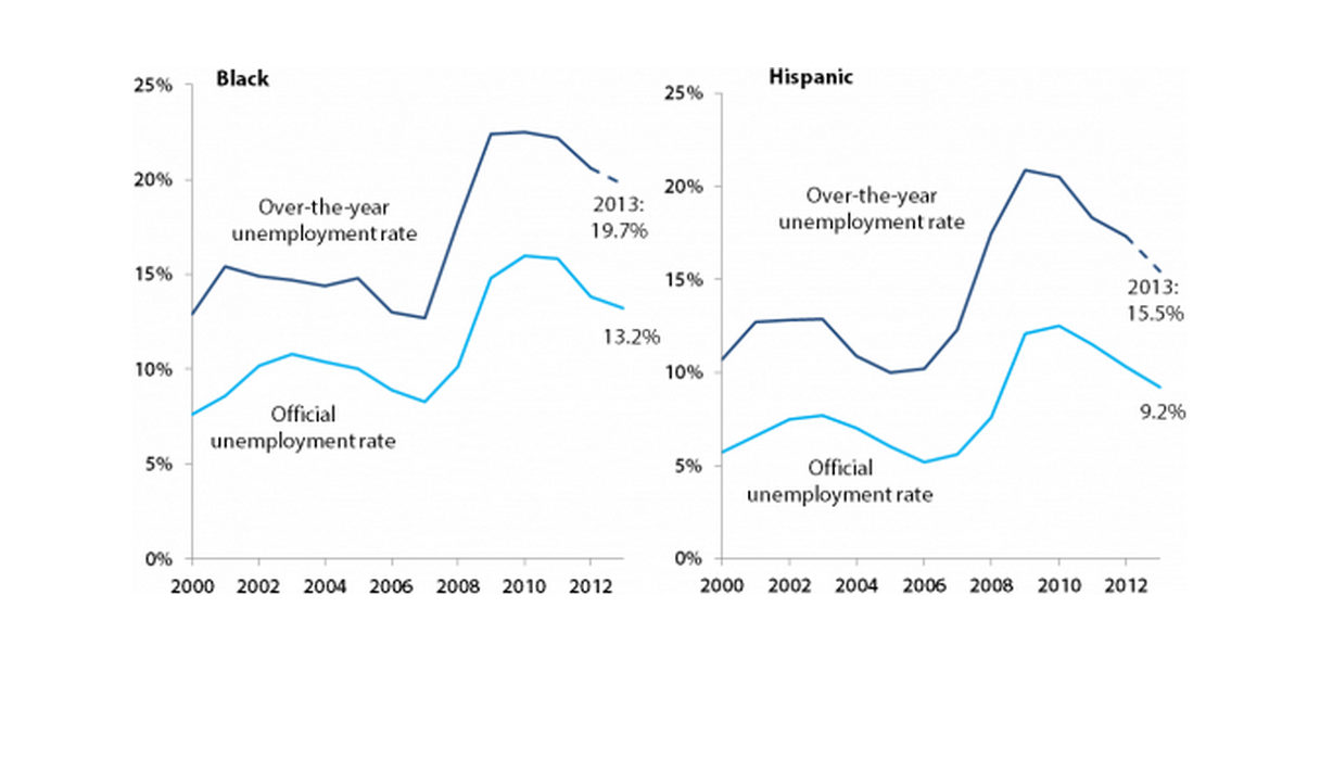
Note: The 2013 unemployment rates are based on the Jan. 2013–Nov. 2013 monthly unemployment rates. The over-the-year unemployment rate is the share of workers who experienced unemployment at some point during the year. The over-the-year unemployment rates in 2013 are the 2013 unemployment rates times the ratio of the 2012 over-the-year unemployment rate to the 2012 unemployment rate.
Source: Author's analysis of Current Population Survey public data series and Bureau of Labor Statistics Work Experience of the Population (various years)
Austerity has been a huge drag on the labor market
One thing that sets this recovery apart from other recoveries is the unprecedented loss of public-sector jobs. Since the recovery began in June 2009, the public sector has lost 728,000 jobs. However, public-sector employment should naturally grow as the population grows. To keep up with population growth over this period, public-sector employment should have increased by around 750,000. That means the total gap in public-sector employment today is around 1.5 million jobs.1 Nearly 30 percent of that gap has occurred in local government education, which is mostly public K–12 employment.
Figure G shows public-sector job growth in the current recovery compared with the prior three recoveries. Since the recovery began four-and-a-half years ago, the public sector has experienced an employment drop of 3.2 percent. By comparison, at this point in the recovery following the early 1980s recession, the public sector had experienced a 7.1 percent gain in employment. At this point in the recovery following the early 1990s recession, the public sector had seen 5.1 percent employment growth, and at this point in the recovery following the early 2000s recession, the public sector had seen 2.8 percent employment growth. Public-sector job loss in the current recovery represents a large drag that did not weigh on earlier recoveries.
Change in public-sector employment since the start of each of the last four recoveries
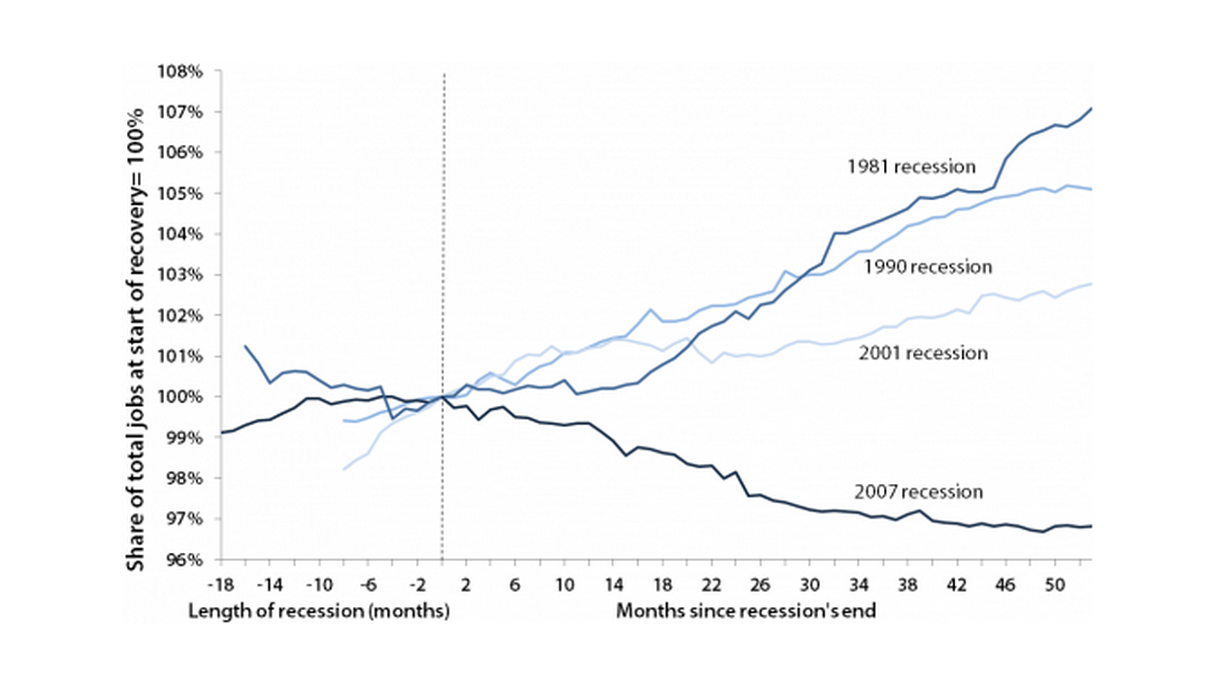
Note: Public data exclude temporary U.S. Census Bureau workers. The line for each recession begins at the official start of the recession, so the length of the line to the left of zero indicates the length of each recession.
Source: Author's analysis of Bureau of Labor Statistics Current Employment Statistics
The weak labor market is not due to workers lacking skills
One often-hypothesized explanation for the weak U.S. jobs recovery is “skills mismatch,” meaning workers do not have the skills for the jobs that are available. There has been a great deal of careful research on whether skills mismatch is a driver of today’s weak jobs recovery, and the strong consensus is that the weak labor market recovery is not due to skills mismatch, but instead to the fact that businesses have not seen demand for their goods and services pick up in a way that would require significantly more hiring. For example, a 2012 paper by Edward Lazear (economics professor at Stanford University and former chair of the Council of Economic Advisors under George W. Bush) and James Spletzer (of the U.S. Census Bureau) states, “Neither industrial nor demographic shifts nor a mismatch of skills with job vacancies is behind the increased rates of unemployment.”
It is useful to note that if today’s high unemployment were a problem of skills mismatch, we would expect to find some sizable group or groups of workers now facing tight labor markets relative to 2007, before the recession started. The “signature” of skills mismatch would be shortages relative to 2007 in some consequentially sized group or groups of workers. Figure H shows the unemployment rate by education level, both in 2007 and over the last 12 months for which these data are available (December 2012–November 2013). It shows that workers with higher levels of education currently face—as they always do—substantially lower unemployment rates than other workers. However, they too have seen large percentage increases in unemployment. Workers with a college degree or more still have unemployment rates 1.8 times as high as they were before the recession began. In other words, demand for workers at all levels of education is significantly weaker now than it was before the recession started.
Unemployment rates, by educational attainment, 2007 and the last 12 months
| Education | 2007 | Last 12 months |
|---|---|---|
| Less than high school | 10.3% | 15.4% |
| High school | 5.4% | 9.3% |
| Some college | 4.0% | 7.2% |
| College degree | 2.4% | 4.4% |
| Advanced degree | 1.7% | 3.2% |
Note: Because the data are not seasonally adjusted, 12-month averages are used. The last 12 months consist of data from December 2012 to November 2013.
Source: Author's analysis of Current Population Survey Outgoing Rotation Group microdata
Figure I shows the number of unemployed workers and the number of job openings by industry for the most recent 12 months for which these data are available (November 2012–October 2013). If today’s elevated unemployment were due to skills mismatch, we would expect to find some sectors where there are more unemployed workers than job openings, and some sectors where there are more job openings than unemployed workers. However, unemployed workers dramatically outnumber job openings in all sectors. There are between 1.3 and 9.0 times as many unemployed workers as job openings in every industry. Even in the industry (finance and insurance) with the most favorable ratio of unemployed workers to job openings, there are still nearly 30 percent more unemployed workers than job openings. In no industry does the number of job openings even come close to the number of people looking for work. In other words, the problem in today’s labor market is not that workers lack the right skills for the sectors where jobs are available; rather, the problem is a broad-based lack of demand for work to be done.
Number of unemployed and job openings, by industry (in thousands)
| Industry | Job openings | Unemployed |
|---|---|---|
| Professional and business services | 671.1 | 1301.3 |
| Health care and social assistance | 604.8 | 856.6 |
| Retail trade | 438.8 | 1276.4 |
| Accommodation and food services | 438.4 | 1163.8 |
| Government | 396.6 | 884.8 |
| Finance and insurance | 215.1 | 276.2 |
| Durable goods manufacturing | 164.8 | 624.7 |
| Other services | 148.4 | 443.4 |
| Wholesale trade | 122.3 | 204.3 |
| Transportation, warehousing, and utilities | 134.8 | 403.8 |
| Information | 93.0 | 184.4 |
| Construction | 107.8 | 970.8 |
| Nondurable goods manufacturing | 87.6 | 418.3 |
| Educational services | 62.7 | 288.8 |
| Real estate and rental and leasing | 59.8 | 149.5 |
| Arts, entertainment, and recreation | 59.0 | 246.2 |
| Mining and logging | 20.3 | 64.8 |
Note: Because the data are not seasonally adjusted, these are 12-month averages using data from November 2012 to October 2013.
Source: Author's analysis of data from the Bureau of Labor Statistics Job Openings and Labor Turnover Survey and Current Population Survey labor force statistics
Today’s labor market is not just hard for job seekers
When job opportunities are as weak as they are today, it is not just job seekers who suffer—workers with jobs also do much more poorly than they would if job opportunities were plentiful. The lack of available jobs shifts bargaining power away from workers; employers simply do not have to pay substantial wage increases to get and keep the workers they need when workers lack other options. Figure J shows real (i.e., inflation-adjusted) wage growth between 2009 and 2013 for various percentiles of the wage distribution. Since the recovery began in 2009, wages have dropped for the bottom 90 percent of workers, despite productivity growth of 4.8 percent over that period.2 One thing Figure J highlights is that though workers at all wage levels see slower wage growth when job opportunities are weak than they would if job opportunities were strong, the effect is more dramatic further down the wage distribution. In other words, even high-wage workers are worse off during periods of labor market weakness than they would be if the labor market were strong, but the impact of a weak labor market on low- and moderate-wage workers is much more severe. For example, since 2009, wages have dropped 6.3 percent for the 20th percentile worker, 3.7 percent for the median worker, “just” 1.9 percent for the 80th percentile worker, and have risen 0.9 percent for the 95th percentile worker.
Change in real hourly wages between 2009 and 2013 at various parts of the wage distribution
| Percentile | Change in wages |
|---|---|
| 10th | -4.0% |
| 20th | -6.3% |
| 30th | -5.3% |
| 40th | -4.6% |
| 50th | -3.7% |
| 60th | -3.9% |
| 70th | -3.0% |
| 80th | -1.9% |
| 90th | -1.0% |
| 95th | 0.9% |
Note: Data are by wage percentile. Due to data availability, 2013 is actually the 12-month average of data from December 2012 to November 2013.
Source: Author's analysis of Current Population Survey Outgoing Rotation Group microdata
It is useful to note that weak wage growth for most workers is not a new phenomenon emerging during the aftermath of the Great Recession. Wages for most workers have been stagnant or falling for the last decade. For more on this, see A Decade of Flat Wages, by Lawrence Mishel and Heidi Shierholz (2013).
A key way workers with jobs advance is by leaving one job and taking another that either pays more or offers better potential for advancement. A larger number of people voluntarily quitting their job indicates a labor market in which job opportunities are plentiful and employed workers have the chance to find a job that pays better and more closely matches their skills and interests. During downturns, the rate of voluntary quits falls significantly as outside job opportunities become scarce.
Figure K presents the quits rate. Between late 2006 and mid-2009, the share of employed people quitting their jobs each month dropped dramatically, from 2.3 percent to 1.2 percent. The quits rate has picked up since that time, but at 1.7 percent, it is far below its pre-recession level. This represents millions of lost opportunities; if the quits rate had not fallen, more than three-quarters of a million workers per month would have quit their job for something preferable during the last five years. A low quits rate is one of the factors underlying the wage declines previously discussed. Think, for example, of a young person who graduated and found a job in spring 2007, right before the Great Recession began. She is lucky to have found a job before the start of the recession, but under normal circumstances she may have greatly benefited at some point in the last six years from leaving her job for one that was a better match or offered better pay. Instead, she may have been locked in her job—whatever its pay level or opportunity for advancement—due to the weak labor market in the Great Recession and its aftermath.
Quits rate, December 2000–October 2013
| Month | Quits |
|---|---|
| 2000-12-01 | 2.30% |
| 2001-01-01 | 2.50% |
| 2001-02-01 | 2.50% |
| 2001-03-01 | 2.40% |
| 2001-04-01 | 2.40% |
| 2001-05-01 | 2.30% |
| 2001-06-01 | 2.20% |
| 2001-07-01 | 2.20% |
| 2001-08-01 | 2.20% |
| 2001-09-01 | 2.10% |
| 2001-10-01 | 2.20% |
| 2001-11-01 | 2.00% |
| 2001-12-01 | 2.00% |
| 2002-01-01 | 2.20% |
| 2002-02-01 | 2.10% |
| 2002-03-01 | 2.00% |
| 2002-04-01 | 2.10% |
| 2002-05-01 | 2.00% |
| 2002-06-01 | 2.00% |
| 2002-07-01 | 2.00% |
| 2002-08-01 | 2.00% |
| 2002-09-01 | 2.00% |
| 2002-10-01 | 2.00% |
| 2002-11-01 | 1.90% |
| 2002-12-01 | 2.00% |
| 2003-01-01 | 1.90% |
| 2003-02-01 | 1.90% |
| 2003-03-01 | 1.90% |
| 2003-04-01 | 1.80% |
| 2003-05-01 | 1.80% |
| 2003-06-01 | 1.80% |
| 2003-07-01 | 1.80% |
| 2003-08-01 | 1.80% |
| 2003-09-01 | 1.90% |
| 2003-10-01 | 1.90% |
| 2003-11-01 | 1.90% |
| 2003-12-01 | 1.90% |
| 2004-01-01 | 1.80% |
| 2004-02-01 | 1.90% |
| 2004-03-01 | 2.00% |
| 2004-04-01 | 2.00% |
| 2004-05-01 | 1.90% |
| 2004-06-01 | 2.00% |
| 2004-07-01 | 2.00% |
| 2004-08-01 | 2.00% |
| 2004-09-01 | 2.00% |
| 2004-10-01 | 2.00% |
| 2004-11-01 | 2.20% |
| 2004-12-01 | 2.10% |
| 2005-01-01 | 2.10% |
| 2005-02-01 | 2.00% |
| 2005-03-01 | 2.10% |
| 2005-04-01 | 2.10% |
| 2005-05-01 | 2.10% |
| 2005-06-01 | 2.10% |
| 2005-07-01 | 2.10% |
| 2005-08-01 | 2.20% |
| 2005-09-01 | 2.30% |
| 2005-10-01 | 2.20% |
| 2005-11-01 | 2.20% |
| 2005-12-01 | 2.10% |
| 2006-01-01 | 2.10% |
| 2006-02-01 | 2.20% |
| 2006-03-01 | 2.20% |
| 2006-04-01 | 2.00% |
| 2006-05-01 | 2.20% |
| 2006-06-01 | 2.20% |
| 2006-07-01 | 2.20% |
| 2006-08-01 | 2.20% |
| 2006-09-01 | 2.10% |
| 2006-10-01 | 2.20% |
| 2006-11-01 | 2.30% |
| 2006-12-01 | 2.30% |
| 2007-01-01 | 2.20% |
| 2007-02-01 | 2.20% |
| 2007-03-01 | 2.20% |
| 2007-04-01 | 2.10% |
| 2007-05-01 | 2.20% |
| 2007-06-01 | 2.10% |
| 2007-07-01 | 2.10% |
| 2007-08-01 | 2.10% |
| 2007-09-01 | 1.90% |
| 2007-10-01 | 2.10% |
| 2007-11-01 | 2.00% |
| 2007-12-01 | 2.10% |
| 2008-01-01 | 2.10% |
| 2008-02-01 | 2.10% |
| 2008-03-01 | 1.90% |
| 2008-04-01 | 2.10% |
| 2008-05-01 | 1.90% |
| 2008-06-01 | 1.90% |
| 2008-07-01 | 1.80% |
| 2008-08-01 | 1.80% |
| 2008-09-01 | 1.80% |
| 2008-10-01 | 1.80% |
| 2008-11-01 | 1.60% |
| 2008-12-01 | 1.60% |
| 2009-01-01 | 1.50% |
| 2009-02-01 | 1.40% |
| 2009-03-01 | 1.40% |
| 2009-04-01 | 1.30% |
| 2009-05-01 | 1.30% |
| 2009-06-01 | 1.30% |
| 2009-07-01 | 1.30% |
| 2009-08-01 | 1.30% |
| 2009-09-01 | 1.20% |
| 2009-10-01 | 1.30% |
| 2009-11-01 | 1.40% |
| 2009-12-01 | 1.30% |
| 2010-01-01 | 1.30% |
| 2010-02-01 | 1.40% |
| 2010-03-01 | 1.40% |
| 2010-04-01 | 1.50% |
| 2010-05-01 | 1.40% |
| 2010-06-01 | 1.50% |
| 2010-07-01 | 1.40% |
| 2010-08-01 | 1.40% |
| 2010-09-01 | 1.50% |
| 2010-10-01 | 1.40% |
| 2010-11-01 | 1.40% |
| 2010-12-01 | 1.50% |
| 2011-01-01 | 1.40% |
| 2011-02-01 | 1.50% |
| 2011-03-01 | 1.50% |
| 2011-04-01 | 1.40% |
| 2011-05-01 | 1.50% |
| 2011-06-01 | 1.40% |
| 2011-07-01 | 1.50% |
| 2011-08-01 | 1.50% |
| 2011-09-01 | 1.50% |
| 2011-10-01 | 1.50% |
| 2011-11-01 | 1.50% |
| 2011-12-01 | 1.50% |
| 2012-01-01 | 1.50% |
| 2012-02-01 | 1.60% |
| 2012-03-01 | 1.60% |
| 2012-04-01 | 1.60% |
| 2012-05-01 | 1.60% |
| 2012-06-01 | 1.60% |
| 2012-07-01 | 1.60% |
| 2012-08-01 | 1.60% |
| 2012-09-01 | 1.50% |
| 2012-10-01 | 1.50% |
| 2012-11-01 | 1.60% |
| 2012-12-01 | 1.60% |
| 2013-01-01 | 1.70% |
| 2013-02-01 | 1.70% |
| 2013-03-01 | 1.60% |
| 2013-04-01 | 1.60% |
| 2013-05-01 | 1.60% |
| 2013-06-01 | 1.60% |
| 2013-07-01 | 1.70% |
| 2013-08-01 | 1.70% |
| 2013-09-01 | 1.70% |
| 2013-10-01 | 1.70% |
Note: The Bureau of Labor Statistics defines the quits rate as “the number of quits during the entire month as a percent of total employment.” According to BLS, “Quits are generally voluntary separations initiated by the employee. Therefore, the quits rate can serve as a measure of workers’ willingness or ability to leave jobs.”
Source: Author's analysis of Bureau of Labor Statistics Job Openings and Labor Turnover Survey
Conclusion: What can be done?
Six years since the start of the Great Recession and four-and-a-half years since its official end, the U.S. labor market remains extraordinarily weak, with nearly eight million jobs needed just to restore the labor market to pre-recession health. The root of this labor market weakness is simply weak aggregate demand—businesses have not seen demand for their goods and services pick up in a way that would require them to significantly increase hiring.
This means that the most direct way to quickly improve labor market health is to institute measures that boost aggregate demand. In the current moment this can only reliably be accomplished through expansionary fiscal policy: large-scale ongoing public investments, the reestablishment of public services and public-sector employment cut in the Great Recession and its aftermath, and strengthening safety net programs. One of the most effective policies available to help the economy would be to simply reinstate the emergency unemployment insurance benefits program that was allowed to expire last month. Long-term unemployed workers, who are almost by definition cash-strapped, are likely to immediately spend their unemployment benefits. Unemployment benefits spent on rent, groceries, and other necessities increase economic activity, and that increased economic activity saves and creates jobs throughout the economy. For this reason, economists widely recognize government spending on unemployment insurance benefits as one of the most effective tools for increasing economic activity in a period of persistent labor market weakness. We estimate that reinstating the unemployment insurance benefit extensions through 2014 would save around 300,000 jobs (Mishel and Shierholz 2013). Combined with the fact that these expenditures would also assist millions of the long-term unemployed who lost their job through no fault of their own during the worst downturn in seven decades, the case for reinstating the extensions is unambiguous.
Policies that would spread the total hours of work across more workers could also bring down unemployment from the supply side. Work sharing would encourage employers who experience a drop in demand to cut back average hours per employee instead of cutting back the number of workers on staff. While layoffs are no more prevalent now than before the recession began, there are currently around 1.5 million layoffs every month, meaning a work-sharing program could avoid many layoffs and significantly reduce unemployment. Another possibility is to allow earlier entry into Social Security and Medicare for those workers wishing to move up their retirement. Early, voluntary retirements would decrease the labor supply while holding labor demand fixed, thereby allowing the unemployment rate to fall. Finally, mandatory paid leave policies could reduce the average annual hours worked. An obvious place to start would be providing paid sick days to the almost 40 percent of private-sector workers who lack the right to even a single day of paid sick leave so that they can stay home when they or their children are sick (Lafer 2013).
— Research assistance provided by Hilary Wething.
About the author
Heidi Shierholz joined the Economic Policy Institute as an economist in 2007. She has researched and spoken widely on the economy and economic policy as it affects middle- and low-income families, especially in regards to employment, unemployment, labor force participation, compensation, income and wealth inequality, young workers, unemployment insurance, and the minimum wage. Shierholz is a coauthor of The State of Working America, 12th Edition; is a frequent contributor to broadcast and radio news outlets, including ABC, CBS, NBC, CNN, and NPR; and is regularly quoted in print and online media outlets, including the New York Times, Washington Post, and the Huffington Post. She has repeatedly been called to testify in Congress on labor market issues. She is a member of the board of directors of the DC Employment Justice Center. Prior to joining EPI, Shierholz worked as an assistant professor of economics at the University of Toronto. She earned her Ph.D. in economics at the University of Michigan-Ann Arbor.
Endnotes
1. Notably, these additional public-sector jobs would result in a ratio of public employment to the overall population of 7.35 percent, which is slightly less than the average ratio of public employment to the overall population over the 2000–2007 business cycle (7.39 percent).
2. It is worth noting that this rate of productivity growth is in fact relatively weak; productivity growth has slowed substantially since the start of the Great Recession. Over the full business cycle from 2000 to 2007, productivity grew at an average annual rate of 1.9 percent, but since 2007 it has grown at an average annual rate of 1.2 percent.
References
Bureau of Labor Statistics (U.S. Department of Labor). Various years. Work Experience of the Population [annual report]. http://www.bls.gov/news.release/work.toc.htm
Bureau of Labor Statistics (U.S. Department of Labor). Current Employment Statistics program. Various years. Employment, Hours and Earnings—National [database]. http://www.bls.gov/ces/
Bureau of Labor Statistics (U.S. Department of Labor) Job Openings and Labor Turnover Program. Various years. Job Openings and Labor Turnover Survey [database]. http://www.bls.gov/jlt/
Congressional Budget Office. 2012. “Key Assumptions in Projecting Potential GDP—January 2012 Baseline” [Excel spreadsheet]. http://www.cbo.gov/publication/42912
Council of Economic Advisers and the U.S. Department of Labor. 2013. The Economic Benefits of Extending Unemployment Insurance.http://www.whitehouse.gov/sites/default/files/docs/uireport-2013-12-4.pdf
Current Population Survey labor force statistics. Various years. Labor Force Statistics Including and National Unemployment Rate [database]. http://www.bls.gov/cps/
Current Population Survey Outgoing Rotation Group microdata. Various years. Survey conducted by the Bureau of the Census for the Bureau of Labor Statistics [machine-readable microdata file]. Washington D.C.: U.S. Census Bureau.
Current Population Survey public data series. Various years. Aggregate data from basic monthly CPS microdata are available from the Bureau of Labor Statistics through three primary channels: as Historical “A” Tables released with the BLS Employment Situation Summary (http://www.bls.gov/data/#historical-tables), through the Labor Force Statistics Including the National Unemployment Rate database (http://www.bls.gov/cps/#data), and through series reports (http://data.bls.gov/cgi-bin/srgate).
Lafer, Gordon. 2013. “One by One, States Are Pushing Bans on Sick Leave Legislation.” Economic Policy Institute Economic Snapshot, November 6, 2013. http://www.epi.org/publication/states-pushing-bans-sick-leave-legislation/
Lazear, Edward P., and James R. Spletzer. 2012. The United States Labor Market: Status Quo or a New Normal? National Bureau of Economic Research Working Paper No. 18386.
Mishel, Lawrence, and Heidi Shierholz. 2013. A Decade of Flat Wages: The Key Barrier to Shared Prosperity and a Rising Middle Class. Economic Policy Institute Briefing Paper #365. http://www.epi.org/publication/a-decade-of-flat-wages-the-key-barrier-to-shared-prosperity-and-a-rising-middle-class/
Mishel, Lawrence, and Heidi Shierholz. 2013. Labor Market Will Lose 310,000 Jobs in 2014 if Unemployment Insurance Extensions Expire. Economic Policy Institute Issue Brief #371. http://www.epi.org/publication/labor-market-lose-310000-jobs-2014-unemployment/
Mishel, Lawrence, Josh Bivens, Elise Gould, and Heidi Shierholz. 2012. The State of Working America, 12th Edition. An Economic Policy Institute Book. Ithaca, N.Y.: Cornell University Press.
Rothstein, Jesse. 2012. The Labor Market Four Years into the Crisis: Assessing Structural Explanations. National Bureau of Economic Research Working Paper No. 17966.
Toossi, Mitra. 2007. “Labor Force Projections to 2016: More Workers in Their Golden Years.” Bureau of Labor Statistics, Monthly Labor Review. http://www.bls.gov/opub/mlr/2007/11/art3full.pdf
