Retirement Inequality Chartbook: How the 401(k) revolution created a few big winners and many losers
Overview
Today, many Americans rely on savings in 401(k)-type accounts to supplement Social Security in retirement. This is a pronounced shift from a few decades ago, when many retirees could count on predictable, constant streams of income from traditional pensions.
Types of retirement plans
401(k) and similar plans are referred to as “defined-contribution” plans because employer contributions, rather than retirement benefits, are determined in advance and employers incur no long-term liabilities. Participants in these plans are generally responsible for making investment decisions and shoulder investment and other risks. In contrast, in traditional “defined-benefit” pensions, employers are responsible for funding promised benefits, making up the difference if the contributions are insufficient due to lower-than-expected investment returns, for example.
The term “defined-contribution” is somewhat misleading because employers may not contribute anything to these plans and employer contributions most often take the form of matching contributions contingent on employee contributions. In contrast, private-sector employers that offer traditional defined-benefit pensions are generally responsible for the entire cost, though public-sector workers often share in pension costs.
The term “defined-contribution” usually refers to employer-sponsored plans, as opposed to individual plans (traditional and Roth IRAs). However, the line between employer-sponsored and individual plans is blurry because employers are not required to contribute anything to employee 401(k) accounts, and because most funds in IRAs are rolled over from 401(k)s. Also, employers contribute to some types of IRAs (SEP and SIMPLE IRAs).
Throughout the chartbook, we use “retirement account savings” to refer to savings in 401(k)s and other plans in which participants accrue account balances, reserving the word “pension” for benefits that take the form of income streams starting at retirement and ending when beneficiaries die. While some 401(k) participants may opt to convert account balances to life annuities, and some pension beneficiaries opt to withdraw lump sums at retirement, this is not the norm for these plans, and the two broad categories enable a good general comparison of workers’ retirement readiness under a traditional pension-based system and a savings-based approach (see the Data and Methodology appendix for more information).
This chartbook assesses the impact of this shift from pensions to individual savings by examining disparities in retirement preparedness and outcomes by income, race and ethnicity, education, gender, and marital status. Though assets in individual and pooled retirement funds have grown faster than income in recent decades (Figure 1), aggregates and averages can be misleading. Retirement insecurity has worsened for most Americans as retirement wealth has become more unequal.1 For many groups, the typical (50th-percentile, or median) household has no savings in retirement accounts and balances are low even when focusing only on households with savings. Retirement savings are characterized by large differences between mean and median values because mean savings are skewed by large balances at the top.
401(k)s are an accident of history. In 1980, a benefit consultant working on revamping a bank’s cash bonus plan had the idea of adding an employer matching contribution and taking advantage of an obscure provision in the tax code passed two years earlier clarifying the tax treatment of deferred compensation. Though 401(k)s took off in the early 1980s, Congress did not intend for them to replace traditional pensions as a primary retirement vehicle, and 401(k)s are poorly designed for this role (Sahadi 2001; Tong 2013).
In theory, the shift from traditional defined-benefit (DB) pensions to 401(k)-style defined-contribution (DC) plans could have broadened access to retirement benefits by making it easier and cheaper for employers to offer benefits. However, participation in any employer-based retirement plan declined over the past decade (Figures 2 and 3) even as defined- contribution plans became prevalent in the private sector (Figures 4 and 5).2 And as pension coverage declined, older households delayed retirement and increased their earned income (Figures 6 and 7) (Morrissey 2011).
Retirement-income inequality has grown in part because most 401(k) participants are required to contribute to these plans in order to participate, whereas workers are automatically enrolled in defined-benefit pensions and, in the private sector, are not required to contribute to these plans. Thus, higher-income workers are much more likely to participate in defined-contribution plans. In addition, higher-income workers have more disposable income and a higher investment-risk tolerance, receive larger tax breaks, and are more likely to work for employers that provide generous matches (CBO 2013; Morrissey 2009). Thus, even if participation had not grown more unequal, disparities in retirement preparedness would have grown with the shift from defined-benefit to defined-contribution retirement plans.
The shift to a retirement system based on individual savings also means that workers’ retirement prospects are increasingly affected by shocks to stock and housing markets and broader economic trends. Much of the 401(k) era coincided with a long bull market propping up household wealth measures even as traditional pensions became scarcer and the savings rate declined. This house of cards collapsed in 2001, and then again at the end of 2008. Though the share of households with any savings in retirement accounts has trended upward with the shift to defined-contribution plans and an aging population, it declined in the wake of the Great Recession (Figure 8). Nevertheless, aggregate savings in retirement accounts continued to grow faster than income even after the Great Recession (Figure 9), though median account balances declined (Figure 10) and retirement savings grew more unequal (Figure 11).
Generational differences. Where sample size permits, we focus on narrower age ranges to help control for the effects of an aging population and in order to compare the retirement prospects of successive generations. Focusing on older workers, for example, helps lay bare the ravages of the Great Recession, which reduced both mean and median account balances for households headed by individuals approaching retirement age (Figure 12); in broader measures, this effect is muted because the large baby boomer cohort is entering its peak saving years. A focus on older workers also confirms the much more unequal distribution of defined-contribution account savings relative to defined-benefit pension benefits (Figures 13 and 14), demonstrating that wide disparities cannot be explained by age differences.
Successive generations should be saving more in retirement accounts due to their higher average incomes, the shift from pensions to individual savings, and Social Security benefit cuts. But while the retirement savings of middle-aged and older households have generally grown, those of younger households have stayed flat or declined in recent years (Figure 15). GenX’ers have saved roughly the same as baby boomers did at the same ages, and savings of the youngest boomers are also languishing (Figure 16).
Other forms of saving, including home equity, may be tapped to pay for retirement. But household net worth took an even bigger hit than retirement savings following the collapse of the housing bubble and ensuing recession. Like retirement savings, overall financial wealth has grown more unequal in recent decades (Figure 17).
Differences by income fifth. Retirement savings are unequally distributed across and within income fifths (Figures 18, 19, and 20). Among middle-income households, for example, only half (52 percent) had savings in these accounts in 2010 (Figure 18). The average among all households was $34,981 (Figure 19), which means those with positive savings averaged around $67,000 ($34,981/52 percent). The median (50th percentile) balance in these accounts was much lower ($23,000) than the mean, reflecting an unequal distribution of retirement savings even for middle-income households with positive balances (Figure 20). In 2010, households in the top income-fifth accounted for 72 percent of total savings in retirement accounts (Figure 19). Disparities in retirement savings, part of a larger problem of rising wealth inequality, are only partly explained by income inequality (Figures 21 and 22).
Differences by race and ethnicity. Black workers’ participation in employer-based retirement plans, including defined-benefit pensions, used to be similar to that of white workers, but has lagged in recent years (Figures 23 and 24). Hispanic workers, who have always had low participation rates, have fallen even further behind (Figure 23). Racial and ethnic differences in retirement saving and wealth are even larger than differences in participation, and cannot be explained by income differences (Figures 25–29). White households have more than six times as much saved in retirement accounts as Hispanic and black households (Figure 26).
Differences by education. Gaps in retirement preparedness and outcomes between college-educated workers and those without a college degree have widened over the last two decades (Figures 30–34). Whereas 7 in 10 households headed by someone with a college degree or more education have savings in retirement accounts, only 4 in 10 households headed by someone with a high-school diploma or GED have savings in these accounts (Figure 32). College-educated households have nearly six times as much saved high school-educated households, a growing gap only partly explained by income inequality (Figures 33 and 35). While savings as in retirement accounts increased at least modestly across education groups, the collapse of the housing bubble left most households, with the exception of those headed by someone with a college degree, with less wealth in 2010 than their counterparts had two decades earlier (Figures 34 and 36).
Differences by sex and marital status. Unmarried people, especially women, tend to be less prepared for retirement than their married counterparts. In the past, married women were less likely to be covered through their own employers than unmarried women. However, married/coupled women’s participation increased as their earnings grew and as marriage became increasingly associated with higher socioeconomic status (Figures 37 and 38). Though the defined-benefit pension gap between men and women has all but disappeared, this has as much to do with declines for men as gains in expected benefits for women (Figures 39 and 40). Meanwhile, the retirement savings gap between men and women, though it has narrowed, remains large (Figure 41). The savings gap between couples and single households is large and growing—and only partly explained by income differences between the two groups (Figures 42–45). The wealth gap between couples and single households is even larger than the retirement savings gap (Figures 44 and 46).
Conclusion. The trends exhibited in these figures paint a picture of increasingly inadequate savings and retirement income for successive cohorts and growing disparities by income, race, ethnicity, education, and marital status. Even women, who by some measures appear to be narrowing gaps with men (in large part because men are faring worse than they did before) are ill-served by an inefficient retirement system that shifts risk onto workers, including the risk of outliving one’s retirement savings. The existence of retirement system that does not work for most workers underscores the importance of preserving and strengthening Social Security, defending defined-benefit pensions for workers who have them, and seeking solutions for those who do not.
Broad trends
Retirement assets are increasing faster than income—but this is not enough
Retirement assets and household net worth as a percent of personal disposable income, 1989–2010
Retirement assets and household net worth as a percent of personal disposable income, 1989–2010
| Year | Retirement assets* | Household net worth |
|---|---|---|
| 1989 | 80% | 507% |
| 1990 | 78% | 487% |
| 1991 | 89% | 501% |
| 1992 | 90% | 490% |
| 1993 | 97% | 502% |
| 1994 | 98% | 493% |
| 1995 | 111% | 517% |
| 1996 | 118% | 523% |
| 1997 | 130% | 559% |
| 1998 | 139% | 583% |
| 1999 | 152% | 632% |
| 2000 | 139% | 591% |
| 2001 | 127% | 564% |
| 2002 | 113% | 526% |
| 2003 | 129% | 573% |
| 2004 | 133% | 617% |
| 2005 | 136% | 660% |
| 2006 | 147% | 662% |
| 2007 | 150% | 634% |
| 2008 | 108% | 487% |
| 2009 | 129% | 520% |
| 2010 | 138% | 536% |
*Retirement assets include aggregate assets in private defined-benefit (DB) pension plans, private defined-contribution (DC) plans, state and local government employee retirement plans (includes DB and DC plans), federal government employee retirement plans (includes DB and DC plans), and IRAs.
Source: Authors' analysis of Federal Reserve Flow of Funds data
The total value of assets in retirement accounts and pension funds more than kept pace with disposable income over the past two decades, growing faster than income in the 1990s and rebounding after two stock market downturns in the 2000s. Household net worth, which includes home equity and other wealth that may be tapped for retirement, has also risen faster than income since 1989. However, retirement wealth should be increasing to offset cuts to Social Security and to hedge against increased risk brought on by the shift from secure pensions to individual savings. In addition, retirement disparities have grown, as will be shown in later charts.
Retirement plan participation is stagnant as baby boomers approach retirement
Share of workers age 26–61 participating in an employer-based retirement plan, 1989–2010
Share of workers age 26–61 participating in an employer-based retirement plan, 1989–2010
| Year | All (26–61) |
|---|---|
| 1989 | 46.3% |
| 1990 | 47.4% |
| 1991 | 47.2% |
| 1992 | 47.7% |
| 1993 | 47.6% |
| 1994 | 46.9% |
| 1995 | 49.1% |
| 1996 | 49.1% |
| 1997 | 49.9% |
| 1998 | 49.6% |
| 1999 | 51.7% |
| 2000 | 52.2% |
| 2001 | 52.0% |
| 2002 | 50.9% |
| 2003 | 49.0% |
| 2004 | 49.5% |
| 2005 | 48.9% |
| 2006 | 47.8% |
| 2007 | 45.9% |
| 2008 | 48.1% |
| 2009 | 46.6% |
| 2010 | 45.3% |
Source: Authors' analysis of Current Population Survey data from the Integrated Public Use Microdata Series (King et al. 2010)
Participation in any employer-based retirement plan (defined-contribution or defined-benefit) varies by class of worker and age: Full-time and prime-age workers have higher participation rates than part-time, younger, or older workers. However, by most measures, participation has been flat or declining in recent years. For prime-age workers (age 26–61)—both full- and part-time—participation declined from 52 percent in 2000 to 45 percent in 2010. We would normally expect participation to increase as the baby boomers enter their 50s and early 60s, when participation rates tend to be high.
Retirement plan participation is declining across age groups
Share of workers age 26–61 participating in an employer-based retirement plan, by age group, 1989–2010
Share of workers age 26–61 participating in an employer-based retirement plan, by age group, 1989–2010
| Year | 26–31 | 32–37 | 38–43 | 44–49 | 50–55 | 56–61 |
|---|---|---|---|---|---|---|
| 1989 | 38% | 45% | 50% | 52% | 51% | 51% |
| 1990 | 39% | 45% | 52% | 53% | 52% | 50% |
| 1991 | 39% | 46% | 51% | 53% | 52% | 49% |
| 1992 | 39% | 46% | 50% | 55% | 54% | 50% |
| 1993 | 38% | 45% | 51% | 54% | 52% | 50% |
| 1994 | 38% | 44% | 50% | 53% | 54% | 48% |
| 1995 | 40% | 46% | 52% | 55% | 56% | 49% |
| 1996 | 39% | 47% | 51% | 55% | 55% | 50% |
| 1997 | 42% | 47% | 52% | 54% | 56% | 51% |
| 1998 | 42% | 47% | 50% | 55% | 56% | 51% |
| 1999 | 42% | 49% | 54% | 58% | 58% | 52% |
| 2000 | 43% | 49% | 53% | 57% | 59% | 54% |
| 2001 | 43% | 49% | 54% | 57% | 58% | 55% |
| 2002 | 41% | 48% | 52% | 55% | 58% | 53% |
| 2003 | 39% | 46% | 50% | 54% | 56% | 52% |
| 2004 | 39% | 46% | 49% | 54% | 56% | 53% |
| 2005 | 39% | 45% | 49% | 52% | 56% | 53% |
| 2006 | 37% | 45% | 48% | 52% | 54% | 53% |
| 2007 | 37% | 42% | 46% | 49% | 51% | 50% |
| 2008 | 38% | 45% | 49% | 51% | 55% | 53% |
| 2009 | 38% | 43% | 46% | 50% | 51% | 52% |
| 2010 | 36% | 42% | 46% | 48% | 50% | 50% |
Source: Authors' analysis of Current Population Survey data from the Integrated Public Use Microdata Series (King et al. 2010)
The recent decline in worker participation in employer-based retirement plans is generally steeper when focusing on narrower age groups rather than all prime-age workers, because an aging workforce partly offsets declines within age groups as workers in their 50s and early 60s are more likely to participate.
Participation trends show a shift from defined-benefit pensions to defined-contribution plans
Share of full-time private-sector employees participating in various retirement plans, 1989–2010
Share of full-time private-sector employees participating in various retirement plans, 1989–2010
| Year | Any | Defined-contribution plan | Defined-benefit plan |
|---|---|---|---|
| 1989– 1990 | 62% | 40% | 42% |
| 1990– 1991 | 60% | 39% | 39% |
| 1991– 1992 | 61% | 40% | 39% |
| 1993– 1994 | 58% | 40% | 33% |
| 1994– 1995 | 60% | 44% | 33% |
| 1995– 1996 | 61% | 46% | 32% |
| 1996– 1997 | 62% | 47% | 32% |
| 1999 | 56% | 42% | 25% |
| 2000 | 55% | 42% | 22% |
| 2003 | 58% | 48% | 24% |
| 2005 | 60% | 50% | 25% |
| 2006 | 60% | 51% | 23% |
| 2007 | 60% | 50% | 23% |
| 2008 | 60% | 51% | 24% |
| 2009 | 61% | 51% | 24% |
| 2010 | 59% | 50% | 22% |
Note: The defined-contribution and defined-benefit lines also include employees who have both types of plans.
Source: Authors' estimates based on Wiatrowski (2011), Chart 1
While overall participation in employer-based plans has been flat or declining, there has been a shift from defined-benefit pensions to defined contribution plans in the private sector. In 1989, full-time private-sector workers with retirement benefits were divided roughly equally between those with defined benefit pensions and those with defined-contribution plans (including roughly 20 percent who had both—not shown). By 2010, 50 percent of these workers had a defined-contribution plan and 22 percent had a defined-benefit plan (including roughly 13 percent who had both).
Retirement assets show a shift from defined-benefit pensions to defined-contribution plans
Retirement assets by type of plan, 1989–2010 (trillions of 2010 dollars)
Retirement assets by type of plan, 1989–2010 (trillions of 2010 dollars)
| Year | Private-sector DB | Private-sector DC | IRA | Public-sector* defined-benefit (DB) and defined-contribution (DC) |
|---|---|---|---|---|
| 1989 | $1.564 | $1.206 | $0.92698 | $1.702 |
| 1990 | $1.455 | $1.179 | $1.03014 | $1.731 |
| 1991 | $1.642 | $1.373 | $1.21148 | $1.926 |
| 1992 | $1.644 | $1.459 | $1.32922 | $2.076 |
| 1993 | $1.776 | $1.620 | $1.47545 | $2.244 |
| 1994 | $1.856 | $1.688 | $1.53626 | $2.332 |
| 1995 | $2.083 | $2.035 | $1.82971 | $2.654 |
| 1996 | $2.200 | $2.261 | $2.02996 | $2.927 |
| 1997 | $2.389 | $2.640 | $2.34055 | $3.323 |
| 1998 | $2.548 | $2.987 | $2.87205 | $3.669 |
| 1999 | $2.715 | $3.296 | $3.46894 | $4.056 |
| 2000 | $2.506 | $3.151 | $3.32861 | $3.912 |
| 2001 | $2.229 | $2.758 | $3.22540 | $3.776 |
| 2002 | $1.987 | $2.468 | $3.06868 | $3.423 |
| 2003 | $2.364 | $2.994 | $3.54816 | $3.922 |
| 2004 | $2.461 | $3.221 | $3.80800 | $4.165 |
| 2005 | $2.548 | $3.470 | $3.82520 | $4.294 |
| 2006 | $2.735 | $3.843 | $4.54941 | $4.618 |
| 2007 | $2.730 | $4.011 | $4.99281 | $4.714 |
| 2008 | $1.877 | $2.733 | $3.72757 | $3.697 |
| 2009 | $2.139 | $3.424 | $4.43502 | $4.114 |
| 2010 | $2.264 | $3.839 | $4.83900 | $4.375 |
* Federal, state, and local government employee plans
Source: Authors' analysis of Federal Reserve Flow of Funds data
Savings in individual accounts—private-sector defined-contribution plans and IRAs—grew from 40 percent ($2.1 trillion) of retirement assets in 1989 to 57 percent ($8.7 trillion) in 2010. The shift in assets appears less pronounced than the shift in participation because older workers with accrued benefits are more likely to be in defined-benefit pensions and defined-contribution savings are low. In the public sector, the majority of workers remain in defined-benefit pensions, but Federal Reserve Flow of Funds data do not break down public-sector plan assets by type.
Seniors’ pension benefits have peaked while earnings have increased
Mean income of households age 62–79, by source, 1992–2010 (2010 dollars)
Mean income of households age 62–79, by source, 1992–2010 (2010 dollars)
| Year | Earnings | Social Security | Defined-benefit pension | Other |
|---|---|---|---|---|
| 1992 | $7,919 | $11,383 | $6,768 | $10,421 |
| 1998 | $9,263 | $13,172 | $7,432 | $11,098 |
| 2004 | $12,270 | $13,638 | $7,649 | $9,011 |
| 2010 | $16,931 | $14,186 | $7,545 | $9,203 |
Note: Regular payments from IRA, Keough, or 401(k) accounts and annuities are a small part of "other" income. Lump sum withdrawals from retirement savings plans are not included.
Source: Authors' analysis of Current Population Survey microdata
Older households received an average of $7,545 in defined-benefit pension benefits in 2010, slightly less than in 2004. Though older households’ incomes have grown over the past two decades, most of the growth has come from higher earnings. This reflects both a trend toward later retirement and the fact that since 2008 the large baby boomer generation has begun to age into the 62–79 age group, and many of these younger seniors are still working.
Seniors’ increasing reliance on earned income is not entirely explained by the influx of baby boomers
Mean income of households age 62–79, by age group and source, 1992–2010 (2010 dollars)
Mean income of households age 62–79, by age group and source, 1992–2010 (2010 dollars)
| Year | Age | Earnings | Social Security | Defined-benefit pension | Other |
|---|---|---|---|---|---|
| 1992 | 62-67 | $15,111 | $8,398 | $7,144 | $11,103 |
| 68-73 | $4,469 | $12,878 | $7,130 | $10,230 | |
| 74-79 | $2,029 | $13,742 | $5,699 | $9,672 | |
| 1998 | 62-67 | $17,745 | $10,068 | $7,586 | $12,383 |
| 68-73 | $5,918 | $15,085 | $7,872 | $11,461 | |
| 74-79 | $2,833 | $14,731 | $6,738 | $9,121 | |
| 2004 | 62-67 | $22,096 | $10,953 | $7,559 | $9,979 |
| 68-73 | $8,554 | $15,751 | $8,585 | $9,248 | |
| 74-79 | $3,588 | $14,864 | $6,787 | $7,528 | |
| 2010 | 62-67 | $27,031 | $10,470 | $7,166 | $10,432 |
| 68-73 | $11,747 | $17,463 | $8,128 | $8,549 | |
| 74-79 | $5,430 | $16,721 | $7,496 | $7,833 |
Note: Regular payments from IRA, Keough, or 401(k) accounts and annuities are a small part of "other" income. Lump sum withdrawals from retirement savings plans are not included.
Source: Authors' analysis of Current Population Survey microdata
A look at narrow age ranges within U.S. seniors suggests that the growth in earned income and leveling off of pension income among seniors cannot entirely be explained by the influx of not-yet-retired baby boomers. Defined-benefit pension income peaked at $8,585 with the Silent Generation cohort that was age 68–73 in 2004 and 74–79 in 2010. Earned income increased across age groups over the entire period.
Share of households with retirement savings grew in the 1990s, but declined after the Great Recession
Share of households age 26–61 with savings in retirement accounts, all and pre-retirement, 1989–2010
Share of households age 26–61 with savings in retirement accounts, all and pre-retirement, 1989–2010
| Year | All | Pre-retirement (56-61) |
|---|---|---|
| 1989 | 37% | 52% |
| 1992 | 40% | 52% |
| 1995 | 45% | 54% |
| 1998 | 49% | 62% |
| 2001 | 53% | 64% |
| 2004 | 50% | 63% |
| 2007 | 53% | 66% |
| 2010 | 50% | 57% |
Note: Retirement account savings include savings in 401(k) and other defined-contribution plans, IRAs (including employer-sponsored SEP IRAs and SIMPLE IRAs) and Keogh plans for small businesses.
Source: Authors' analysis of Survey of Consumer Finance microdata
As employers have replaced traditional pensions with 401(k)s, the share of prime-age households with retirement savings has trended upward. But because contributions are voluntary and funds may be tapped before retirement, retirement savings accounts are more affected by economic downturns than traditional pensions. The share of households with savings in retirement accounts expanded in the 1990s but contracted after the 2001 and 2007–2009 recessions. The dropoff was particularly sharp among pre-retirement-age households after 2007, a bad sign for baby boomers’ retirement prospects.
Retirement savings have grown faster than income as 401(k)s have replaced traditional pensions
Retirement account savings of households age 26–79 as a percent of income, 1989–2010
Retirement account savings of households age 26–79 as a percent of income, 1989–2010
| Year | All |
|---|---|
| 1989 | 34% |
| 1992 | 45% |
| 1995 | 58% |
| 1998 | 70% |
| 2001 | 80% |
| 2004 | 87% |
| 2007 | 93% |
| 2010 | 110% |
Note: Retirement account savings include savings in 401(k) and other defined-contribution plans, IRAs (including employer-sponsored SEP IRAs and SIMPLE IRAs) and Keogh plans for small businesses.
Source: Authors' analysis of Survey of Consumer Finance microdata
As 401(k)s replaced traditional pensions, average savings in retirement accounts grew in importance, surpassing the value of annual household income by 2010. Another contributing factor to the growth in savings was the aging of the population.
Retirement account savings are unequally distributed
Mean and median household savings in retirement accounts of households age 26–79, 1989–2010 (2010 dollars)
Mean and median household savings in retirement accounts of households age 26–79, 1989–2010 (2010 dollars)
| Year | Mean savings** | Median/positive savings*** | Mean/positive savings* |
|---|---|---|---|
| 1989 | $23,854 | $18,553 | $64,172 |
| 1992 | $27,033 | $21,225 | $67,434 |
| 1995 | $36,789 | $24,078 | $81,148 |
| 1998 | $49,775 | $32,013 | $101,748 |
| 2001 | $67,860 | $36,026 | $128,524 |
| 2004 | $70,636 | $40,503 | $141,635 |
| 2007 | $81,906 | $47,146 | $154,665 |
| 2010 | $86,071 | $44,000 | $170,859 |
* Mean savings for households in specified age range with positive retirement account balances
** Mean savings for all households in specified age range
*** Median savings for households in specified age range with positive retirement account balances
Note: Retirement account savings include savings in 401(k) and other defined-contribution plans, IRAs (including employer-sponsored SEP IRAs and SIMPLE IRAs) and Keogh plans for small businesses.
Source: Authors' analysis of Survey of Consumer Finance microdata
Average (mean) savings in retirement accounts increased over the past two decades to $86,071 in 2010 ($170,859 for households with savings in these accounts). However, the growth in average savings appears driven by a small number of households with large balances. Median savings—the savings of the typical household with a positive balance—are much lower ($44,000) and fell in the wake of the recent downturn. This is particularly disturbing given that the baby boomers were entering their peak saving years at the time.
A household at the 90th percentile has nearly 100 times more retirement savings than the median household
Savings in retirement accounts of households age 26–79, by percentile, 1989–2010 (2010 dollars)
Savings in retirement accounts of households age 26–79, by percentile, 1989–2010 (2010 dollars)
| Year | 90th | 80th | 70th | 60th | 50th |
|---|---|---|---|---|---|
| 1989 | $57,346 | $20,240 | $6,747 | $506 | $0 |
| 1992 | $68,223 | $26,986 | $9,096 | $1,516 | $0 |
| 1995 | $87,813 | $35,975 | $15,580 | $4,957 | $0 |
| 1998 | $133,389 | $56,023 | $26,011 | $10,004 | $1,334 |
| 2001 | $182,579 | $74,502 | $34,310 | $12,254 | $3,186 |
| 2004 | $201,363 | $80,545 | $34,519 | $12,657 | $2,301 |
| 2007 | $217,918 | $97,434 | $46,098 | $18,334 | $5,029 |
| 2010 | $239,000 | $85,000 | $35,000 | $14,000 | $2,500 |
Note: Retirement account savings include savings in 401(k) and other defined-contribution plans, IRAs (including employer-sponsored SEP IRAs and SIMPLE IRAs) and Keogh plans for small businesses.
Source: Authors' analysis of Survey of Consumer Finance microdata
Nearly half of households have no savings in retirement accounts, and for the other half, savings are very unevenly distributed. A household in the 90th percentile of the retirement savings distribution has nearly 100 times more retirement savings than the median (50th percentile) household, which has a negligible amount. The top 1 percent of households have over $1.3 million in retirement account savings (not shown).
Baby boomers’ retirement savings took a hit in the downturn
Mean and median savings in retirement accounts of households age 56–61, 1989–2010 (2010 dollars)
Mean and median savings in retirement accounts of households age 56–61, 1989–2010 (2010 dollars)
| Year | Mean savings** | Median/positive savings*** | Mean/positive savings* |
|---|---|---|---|
| 1989 | $54,666 | $40,480 | $105,463 |
| 1992 | $63,507 | $51,546 | $123,041 |
| 1995 | $74,886 | $38,241 | $139,593 |
| 1998 | $107,220 | $53,356 | $174,205 |
| 2001 | $144,976 | $61,268 | $224,958 |
| 2004 | $148,202 | $95,504 | $233,997 |
| 2007 | $197,710 | $111,054 | $298,897 |
| 2010 | $163,943 | $91,000 | $286,047 |
* Mean savings for households in specified age range with positive retirement account balances
** Mean savings for all households in specified age range
*** Median savings for households in specified age range with positive retirement account balances
Note: Retirement account savings include savings in 401(k) and other defined-contribution plans, IRAs (including employer-sponsored SEP IRAs and SIMPLE IRAs) and Keogh plans for small businesses.
Source: Authors' analysis of Survey of Consumer Finance microdata
Successive generations should be saving more in retirement accounts due to income growth, the shift from pensions to individual savings, and Social Security benefit cuts. However, as the median baby boomer born between 1949 and 1954 approached retirement in the aftermath of the Great Recession, he or she had less than the median member of the preceding cohort in 2004. The growing gap between mean and median savings suggests rising inequality over most of the 1990s and 2000s.
Retirement savings disparities are big even when the focus is on workers with savings and approaching retirement age
Mean and median retirement account savings of full-time participating workers age 51–56, 1992–2004 (2010 dollars)
Mean and median retirement account savings of full-time participating workers age 51–56, 1992–2004 (2010 dollars)
| Year | Median | Mean |
|---|---|---|
| 1992 | $22,839 | $66,841.56 |
| 1998 | $36,068 | $98,050.40 |
| 2004 | $41,554 | $103,308.94 |
Note: Data in this figure cover only workers who are participating in an employer-sponsored retirement savings plan and include total account balances for all plans in current job.
Source: Authors' analysis of Health and Retirement Study data in Gustman, Steinmeier, and Tabatabai (2010)
Disparities in retirement savings in part reflect differences between workers at different life stages and between those with and without accounts, some of whom may be covered by defined-benefit pensions. However, focusing only on workers in their early to mid-50s with retirement account savings, the mean ($103,309) is still 2.5 times larger than the median ($41,554).
Defined-benefit pension benefits are more equally distributed
Mean and median expected annual defined-benefit pension benefits of full-time participating workers age 51–56, 1992–2004 (2010 dollars)
Mean and median expected annual defined-benefit pension benefits of full-time participating workers age 51–56, 1992–2004 (2010 dollars)
| Year | Median | Mean |
|---|---|---|
| 1992 | $23,752 | $30,756.25 |
| 1998 | $27,251 | $32,327.24 |
| 2004 | $30,242 | $34,513.27 |
Note: Data in this figure cover only workers who are participating in a defined-benefit plan and include only expected benefits for the most important plan on current job.
Source: Authors' analysis of Health and Retirement Study data in Gustman, Steinmeier, and Tabatabai (2010)
In stark contrast to savings in retirement accounts (Figure 13), defined-benefit pension benefits appear fairly equally distributed among 51- to 56-year-old workers who are participating in an employer-sponsored retirement plan, with the mean benefit only slightly larger than the median benefit.
Retirement savings of younger households have been flat or declining
Mean household savings in retirement accounts, by age group, 1992–2010 (2010 dollars)
Mean household savings in retirement accounts, by age group, 1992–2010 (2010 dollars)
| Year | 26–31 | 32–37 | 38–43 | 44–49 | 50–55 | 56–61 | 62–67 |
|---|---|---|---|---|---|---|---|
| 1992 | $6,696 | $11,712 | $21,387 | $41,756 | $70,615 | $63,507 | $42,968 |
| 1998 | $10,319 | $27,487 | $44,867 | $59,873 | $85,260 | $107,220 | $106,267 |
| 2004 | $10,862 | $25,287 | $50,579 | $76,344 | $120,228 | $148,202 | $139,333 |
| 2010 | $11,551 | $24,134 | $45,230 | $79,737 | $129,433 | $163,943 | $195,314 |
Note: Retirement account savings include savings in 401(k) and other defined-contribution plans, IRAs (including employer-sponsored SEP IRAs and SIMPLE IRAs) and Keogh plans for small businesses.
Source: Authors' analysis of Survey of Consumer Finance microdata
While the average retirement account savings of middle-aged and older households have generally grown over time as incomes rose and 401(k)s replaced pensions, those of younger households have been flat or declining over the past decade. GenX’ers who were age 38–43 in 2010 had roughly $5,000 less in household savings than 38- to 43-year-olds in 2004.
Youngest cohorts lag behind on saving for retirement
Mean savings in retirement accounts of households age 26–67, by age group and birth cohort, 1989–2010 (2010 dollars)
| Year | b. 1931–1936 | b. 1937–1942 | b. 1943–1948 | b. 1949–1954 | b. 1955–1960 | b. 1961–1966 | b. 1967–1972 | b. 1973–1978 | b. 1979–1984 |
|---|---|---|---|---|---|---|---|---|---|
| 26–31 | $6,696.04 | $10,319.47 | $10,861.75 | $11,550.74 | |||||
| 32–37 | $11,712.34 | $27,487.32 | $25,286.75 | $24,133.66 | |||||
| 38–43 | $21,386.70 | $44,867.03 | $50,578.92 | $45,229.66 | |||||
| 44–49 | $41,755.72 | $59,873.07 | $76,344.15 | $79,737.20 | |||||
| 50–55 | $70,614.76 | $85,260.06 | $120,227.73 | $129,432.96 | |||||
| 56–61 | $63,507.09 | $107,220.25 | $148,201.62 | $163,942.51 | |||||
| 62–67 | $106,266.65 | $139,332.60 | $195,313.72 |
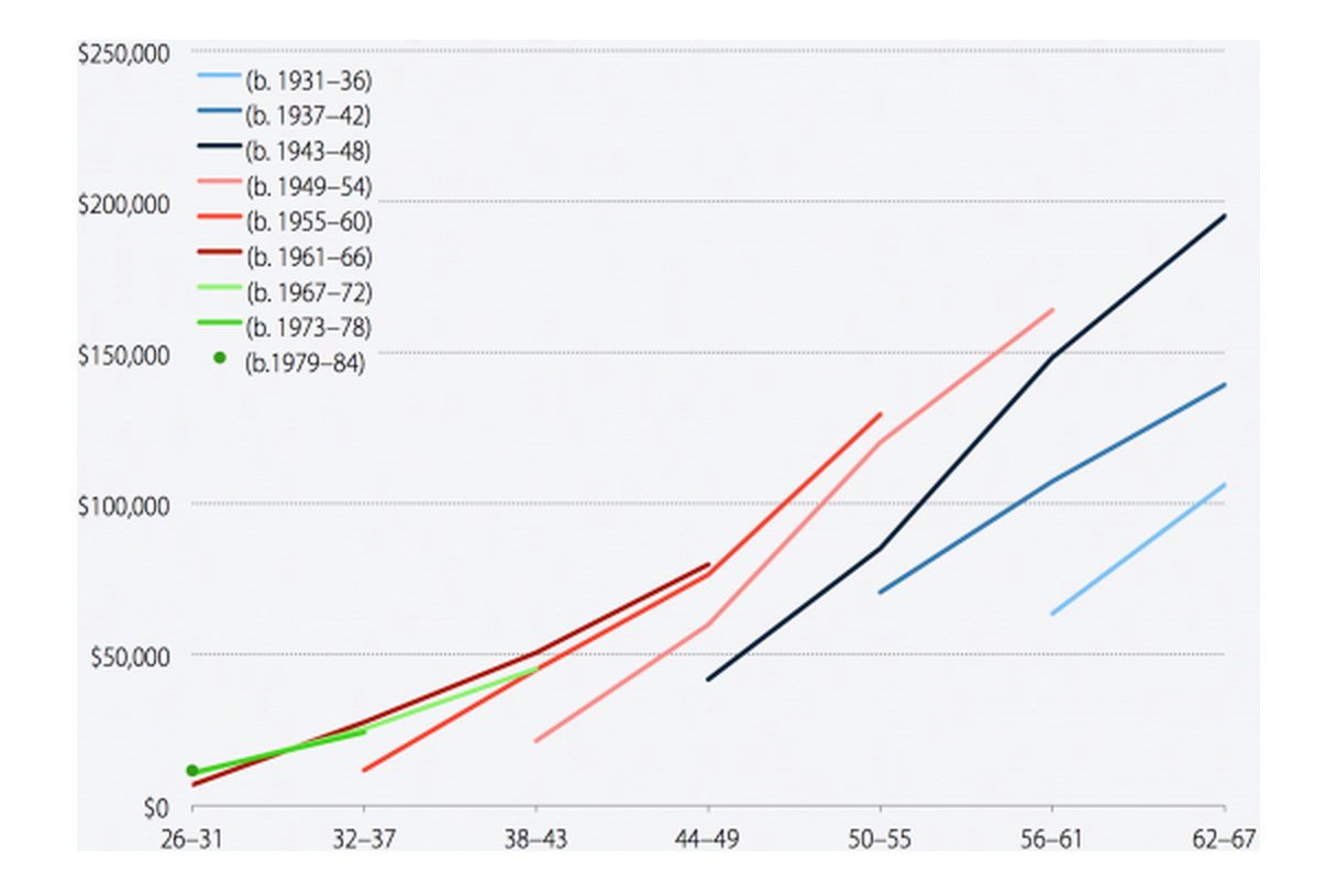
Note: Retirement account savings include savings in 401(k) and other defined-contribution plans, IRAs (including employer-sponsored SEP IRAs and SIMPLE IRAs) and Keogh plans for small businesses. Except for the two oldest cohorts, the upper tip of each line represents 2010.
Source: Authors' analysis of Survey of Consumer Finance microdata
Successive generations should be saving more in retirement accounts due to income growth, the shift from pensions to individual savings, and Social Security benefit cuts. But as shown in this chart, GenX’ers have saved roughly the same as baby boomers did at the same ages, and the savings of the youngest boomers are also languishing.
| Year born | Generation |
|---|---|
| 1931–1936 | Early silent generation |
| 1937–1942 | Middle silent generation |
| 1943–1948 | Late silent generation and earliest boomers |
| 1949–1954 | Early boomers |
| 1955–1960 | Middle boomers |
| 1961–1966 | Late boomers and earliest GenX |
| 1967–1972 | Early GenX |
| 1973–1978 | Middle GenX |
| 1979–1984 | Latest GenX and earliest GenY |
Retirement prospects have been hit hard by the collapse of the housing bubble
Mean and median net worth of households age 26–79, 1989–2010 (2010 dollars)
Mean and median net worth of households age 26–79, 1989–2010 (2010 dollars)
| Year | Median household net worth | Mean household net worth |
|---|---|---|
| 1989 | $79,374 | $319,397 |
| 1992 | $75,349 | $283,610 |
| 1995 | $81,864 | $301,853 |
| 1998 | $95,640 | $378,344 |
| 2001 | $106,288 | $487,155 |
| 2004 | $107,125 | $516,812 |
| 2007 | $126,769 | $583,525 |
| 2010 | $77,000 | $494,916 |
Source: Authors' analysis of Survey of Consumer Finance microdata
Other forms of saving, including home equity, may be tapped to pay for retirement. But household net worth, which includes home equity, took an even bigger hit than retirement savings with the collapse of the housing bubble in the late 2000s and ensuing recession. Like retirement savings, wealth appears to have grown more unequal: Median household net worth declined slightly between 1989 and 2010, while mean net worth grew by more than half.
Trends by Income Level
Retirement accounts are unequally distributed across and within income groups
Share of households age 26–79 with savings in retirement accounts, by income fifth, 1989–2010
Share of households age 26–79 with savings in retirement accounts, by income fifth, 1989–2010
| Year | Top | Fourth | Middle | Second | Bottom |
|---|---|---|---|---|---|
| 1989 | 75% | 52% | 38% | 16% | 4% |
| 1992 | 78% | 56% | 38% | 24% | 6% |
| 1995 | 78% | 64% | 48% | 28% | 9% |
| 1998 | 81% | 69% | 54% | 30% | 10% |
| 2001 | 87% | 75% | 54% | 34% | 14% |
| 2004 | 85% | 70% | 53% | 30% | 10% |
| 2007 | 88% | 74% | 55% | 36% | 11% |
| 2010 | 88% | 70% | 52% | 31% | 11% |
Note: Retirement account savings include savings in 401(k) and other defined-contribution plans, IRAs (including employer-sponsored SEP IRAs and SIMPLE IRAs) and Keogh plans for small businesses.
Source: Authors' analysis of Survey of Consumer Finance microdata
The share of households with savings in retirement accounts increased across income groups in the 1990s before stagnating in the 2000s. However, retirement accounts were never widely held by households in the bottom two-fifths of the income distribution. Even among households in the middle fifth, only half have savings in these accounts.
High-income households are the main beneficiaries of rising aggregate retirement savings
Mean retirement account savings of households age 26–79, by income fifth, 1989–2010 (2010 dollars)
Mean retirement account savings of households age 26–79, by income fifth, 1989–2010 (2010 dollars)
| Year | Top | Fourth | Middle | Second | Bottom |
|---|---|---|---|---|---|
| 1989 | $85,799 | $16,445 | $9,532 | $6,322 | $1,137 |
| 1992 | $96,508 | $23,582 | $9,408 | $4,280 | $1,349 |
| 1995 | $125,973 | $28,914 | $15,890 | $9,936 | $3,222 |
| 1998 | $170,667 | $43,999 | $21,153 | $10,642 | $2,381 |
| 2001 | $226,812 | $64,805 | $31,170 | $12,599 | $3,852 |
| 2004 | $253,737 | $59,821 | $27,215 | $9,103 | $3,274 |
| 2007 | $281,891 | $79,041 | $32,966 | $13,564 | $2,011 |
| 2010 | $308,674 | $66,964 | $34,981 | $12,182 | $7,543 |
Note: Retirement account savings include savings in 401(k) and other defined-contribution plans, IRAs (including employer-sponsored SEP IRAs and SIMPLE IRAs) and Keogh plans for small businesses.
Source: Authors' analysis of Survey of Consumer Finance microdata
In 2010, households in the top income fifth had an average of $308,674 in retirement account savings, which constituted 72 percent of total savings in these accounts. Assuming upper-income households receive tax subsidies at least proportional to their share of savings, this also suggests most tax subsidies for retirement savings go to high-income households.
Median retirement savings are also unequally distributed across income groups
Median retirement account savings of households age 26–79*, by income fifth, 1989–2010 (2010 dollars)
Median retirement account savings of households age 26–79*, by income fifth, 1989–2010 (2010 dollars)
| Year | Top | Fourth | Middle | Second | Bottom |
|---|---|---|---|---|---|
| 1989 | $45,539 | $15,180 | $12,144 | $5,060 | $8,433 |
| 1992 | $51,546 | $18,193 | $10,612 | $6,367 | $12,129 |
| 1995 | $56,653 | $20,679 | $11,331 | $14,163 | $14,163 |
| 1998 | $90,704 | $28,012 | $16,007 | $12,005 | $8,137 |
| 2001 | $104,156 | $37,986 | $17,155 | $9,803 | $6,127 |
| 2004 | $132,324 | $36,821 | $19,561 | $11,506 | $5,753 |
| 2007 | $145,104 | $50,289 | $25,144 | $12,572 | $6,810 |
| 2010 | $160,000 | $36,130 | $23,000 | $11,000 | $8,000 |
*Median balances are for households with positive savings in these accounts.
Note: Retirement account savings include savings in 401(k) and other defined-contribution plans, IRAs (including employer-sponsored SEP IRAs and SIMPLE IRAs) and Keogh plans for small businesses.
Source: Authors' analysis of Survey of Consumer Finance microdata
The median retirement savings for households in the top income fifth is $160,000, compared with $8,000–$36,000 for households in the bottom four-fifths. These amounts are for households with savings in retirement accounts. The median for all households (including those with no savings) is close to zero since nearly half of households have no savings in these accounts.
Retirement savings disparities are only partly explained by income inequality
Retirement account savings of households age 26–79 as a percent of income, by income fifth, 1989–2010
Retirement account savings of households age 26–79 as a percent of income, by income fifth, 1989–2010
| Year | Top | Fourth | Middle | Second | Bottom |
|---|---|---|---|---|---|
| 1989 | 43% | 24% | 22% | 25% | 11% |
| 1992 | 59% | 36% | 23% | 18% | 14% |
| 1995 | 73% | 44% | 37% | 40% | 34% |
| 1998 | 86% | 61% | 47% | 40% | 23% |
| 2001 | 90% | 81% | 63% | 43% | 31% |
| 2004 | 108% | 75% | 54% | 30% | 26% |
| 2007 | 105% | 99% | 67% | 46% | 16% |
| 2010 | 134% | 91% | 76% | 44% | 58% |
Note: Retirement account savings include savings in 401(k) and other defined-contribution plans, IRAs (including employer-sponsored SEP IRAs and SIMPLE IRAs) and Keogh plans for small businesses.
Source: Authors' analysis of Survey of Consumer Finance microdata
The retirement-savings-to-income ratio is higher for higher-income groups, suggesting that income inequality only partially explains retirement-savings disparities, including the large gap between the top income fifth and everyone else (shown in Figure 19). The story is murkier for the bottom two-fifths, whose share trend lines crossed after 2007. One possible explanation: Some relatively well-off boomers who could afford to retire despite the collapse of the housing bubble now appear in the lowest-income fifth, since lump-sum 401(k) withdrawals are not included in income measures.
Retirement disparities are part of a larger problem of rising wealth inequality
Median net worth of households age 26–79, by income fifth, 1989–2010 (2010 dollars)
Median net worth of households age 26–79, by income fifth, 1989–2010 (2010 dollars)
| Year | Top | Fourth | Middle | Second | Bottom |
|---|---|---|---|---|---|
| 1989 | $359,256 | $113,849 | $71,042 | $41,829 | $3,238 |
| 1992 | $293,132 | $114,327 | $59,960 | $42,071 | $5,973 |
| 1995 | $289,754 | $106,792 | $64,868 | $49,147 | $8,441 |
| 1998 | $405,862 | $148,995 | $71,163 | $46,153 | $7,697 |
| 2001 | $527,151 | $173,511 | $78,105 | $47,225 | $9,680 |
| 2004 | $590,051 | $184,103 | $83,365 | $39,548 | $8,538 |
| 2007 | $632,066 | $214,460 | $92,615 | $39,602 | $9,209 |
| 2010 | $541,800 | $127,100 | $64,930 | $27,700 | $6,060 |
Source: Authors' analysis of Survey of Consumer Finance microdata
While the wealth of households in the bottom two income-fifths declined and the wealth of the middle fifth stagnated between 1995 and 2010, the wealth of the fourth fifth rose modestly and that of the top fifth nearly doubled. Despite a noticeable drop after 2007, the top fifth saw the smallest decline in percentage terms after the collapse of the housing bubble and ensuing Great Recession.
Trends by Race and Ethnicity
Participation in employer retirement plans is dropping among minority workers
Share of workers age 26–61 participating in an employer-based retirement plan, by race/ethnicity, 1989–2010
Share of workers age 26–61 participating in an employer-based retirement plan, by race/ethnicity, 1989–2010
| Year | White, non-Hispanic | Black | Hispanic |
|---|---|---|---|
| 1989 | 48% | 47% | 32% |
| 1990 | 49% | 49% | 33% |
| 1991 | 49% | 48% | 33% |
| 1992 | 50% | 48% | 33% |
| 1993 | 50% | 46% | 32% |
| 1994 | 50% | 43% | 32% |
| 1995 | 51% | 49% | 32% |
| 1996 | 52% | 49% | 31% |
| 1997 | 52% | 48% | 35% |
| 1998 | 53% | 48% | 32% |
| 1999 | 55% | 49% | 36% |
| 2000 | 56% | 50% | 36% |
| 2001 | 56% | 48% | 35% |
| 2002 | 55% | 48% | 33% |
| 2003 | 53% | 46% | 30% |
| 2004 | 53% | 48% | 31% |
| 2005 | 53% | 47% | 30% |
| 2006 | 52% | 45% | 29% |
| 2007 | 50% | 43% | 28% |
| 2008 | 53% | 45% | 29% |
| 2009 | 51% | 43% | 29% |
| 2010 | 50% | 43% | 27% |
Note: In this figure, “black” and “Hispanic” are not mutually exclusive categories, so a black person of Hispanic origin will be included in both categories.
Source: Authors' analysis of Current Population Survey data from the Integrated Public Use Microdata Series (King et al. 2010)
As Figure 2 showed, participation in employer-based retirement plans rose in the 1990s and declined in the 2000s. As this figure shows, by this measure, white workers were slightly better off and black and Hispanic workers worse off in 2010 than they were two decades earlier. Whereas the participation rate of black workers had been close to that of white workers in the early 1990s, black workers had fallen behind by 2010. Hispanics, whose participation rate always significantly lagged that of non-Hispanic whites and blacks, fell further behind.
Black workers’ pension advantage has eroded
Share of participating workers age 51–56 in various retirement plans, by race/ethnicity, 1992–2004
Share of participating workers age 51–56 in various retirement plans, by race/ethnicity, 1992–2004
| Year | Gender | Defined-benefit (DB) only | Both DB and DC | Defined-contribution (DC) only | Didn’t know/wouldn’t answer |
|---|---|---|---|---|---|
| 1992 | White | 40% | 28% | 31% | 1% |
| 1992 | Black | 48% | 22% | 28% | 2% |
| 1992 | Hispanic | 39% | 16% | 39% | 6% |
| 1998 | White | 28% | 31% | 40% | 1% |
| 1998 | Black | 49% | 22% | 27% | 2% |
| 1998 | Hispanic | 28% | 26% | 37% | 9% |
| 2004 | White | 23% | 27% | 47% | 3% |
| 2004 | Black | 35% | 18% | 44% | 2% |
| 2004 | Hispanic | 28% | 16% | 49% | 7% |
Note: Data in this figure cover only workers who are participating in an employer-based retirement plan. This figure uses mutually exclusive racial and ethnic categories, with “white” and “black” referring to white and black non-Hispanics and “Hispanic” including persons of any race.
Source: Authors' analysis of Health and Retirement Study data in Gustman, Steinmeier, and Tabatabai (2010)
Among workers approaching retirement and participating in plans, black workers were more likely than white workers to participate in defined-benefit pensions in 1992. Black workers’ defined-benefit advantage was even more pronounced in 1998, after more white workers made the transition to defined-contribution plans. (Black workers are more likely than white workers to be employed in the public sector and may seek out jobs with secure pensions due to less inherited wealth.) By 2004, however, much of the difference had disappeared, as defined-benefit participation declined across the board, but especially among black workers. (This analysis includes those with defined-benefit plans alone and with both types of plans.)
White households are much more likely to have retirement savings
Share of households age 26–79 with savings in retirement accounts, by race/ethnicity, 1989–2010
Share of households age 26–79 with savings in retirement accounts, by race/ethnicity, 1989–2010
| Year | White, non-Hispanic | Black | Hispanic |
|---|---|---|---|
| 1989 | 44% | 17% | 15% |
| 1992 | 46% | 24% | 20% |
| 1995 | 49% | 28% | 33% |
| 1998 | 54% | 35% | 22% |
| 2001 | 58% | 39% | 31% |
| 2004 | 56% | 32% | 25% |
| 2007 | 58% | 37% | 32% |
| 2010 | 57% | 32% | 28% |
Note: Retirement account savings include savings in 401(k) and other defined-contribution plans, IRAs (including employer-sponsored SEP IRAs and SIMPLE IRAs) and Keogh plans for small businesses. In this figure, “black” and “Hispanic” are not mutually exclusive categories, so a black person of Hispanic origin will be included in both categories.
Source: Authors' analysis of Survey of Consumer Finance microdata
Roughly twice as many white households as black and Hispanic households have savings in retirement accounts. (Due to relatively small sample sizes for black and Hispanic households, year-to-year fluctuations and differences between black and Hispanic households may not be statistically meaningful.)
Retirement accounts are not a significant resource for minority households
Mean savings in retirement accounts of households age 26–79, by race/ethnicity, 1989–2010 (2010 dollars)
Mean savings in retirement accounts of households age 26–79, by race/ethnicity, 1989–2010 (2010 dollars)
| Year | White, non-Hispanic | Black | Hispanic |
|---|---|---|---|
| 1989 | $29,447 | $5,363 | $6,438 |
| 1992 | $32,992 | $7,050 | $4,745 |
| 1995 | $43,120 | $8,981 | $17,920 |
| 1998 | $57,573 | $14,931 | $13,184 |
| 2001 | $82,406 | $15,835 | $15,440 |
| 2004 | $87,590 | $21,912 | $11,491 |
| 2007 | $100,300 | $26,026 | $21,089 |
| 2010 | $109,122 | $17,081 | $17,239 |
Note: Retirement account savings include savings in 401(k) and other defined-contribution plans, IRAs (including employer-sponsored SEP IRAs and SIMPLE IRAs) and Keogh plans for small businesses. In this figure, “black” and “Hispanic” are not mutually exclusive categories, so a black person of Hispanic origin will be included in both categories.
Source: Authors' analysis of Survey of Consumer Finance microdata
White households have over six times as much saved in retirement accounts as Hispanic and black households, on average. The disparities in this measure (which includes households without any retirement savings) have gotten much bigger over the last two decades.
Racial and ethnic disparities are great even among households with savings
Median savings in retirement accounts of households age 26–79*, by race/ethnicity, 1989–2010 (2010 dollars)
Median savings in retirement accounts of households age 26–79*, by race/ethnicity, 1989–2010 (2010 dollars)
| Year | White, non-Hispanic | Black | Hispanic |
|---|---|---|---|
| 1989 | $20,240 | $10,120 | $7,253 |
| 1992 | $22,741 | $8,338 | $9,854 |
| 1995 | $25,636 | $11,331 | $16,996 |
| 1998 | $34,681 | $14,673 | $14,673 |
| 2001 | $42,888 | $11,028 | $10,710 |
| 2004 | $47,176 | $17,260 | $16,109 |
| 2007 | $53,432 | $26,192 | $17,811 |
| 2010 | $53,000 | $19,000 | $19,000 |
*Median balances are for households with positive savings in these accounts.
Note: Retirement account savings include savings in 401(k) and other defined-contribution plans, IRAs (including employer-sponsored SEP IRAs and SIMPLE IRAs) and Keogh plans for small businesses. In this figure, “black” and “Hispanic” are not mutually exclusive categories, so a black person of Hispanic origin will be included in both categories.
Source: Authors' analysis of Survey of Consumer Finance microdata
Racial and ethnic disparities are evident in retirement account balances of households with positive savings. In 2010, the median white non-Hispanic household had nearly three times as much saved in a retirement account as the median black or Hispanic household. It is important to keep in mind that most black and Hispanic households have no savings in these accounts.
Racial and ethnic disparities are not just a function of income
Retirement account savings of households age 26–79 as a percent of income, by race/ethnicity, 1989–2010
Retirement account savings of households age 26–79 as a percent of income, by race/ethnicity, 1989–2010
| Year | White, non-Hispanic | Black | Hispanic |
|---|---|---|---|
| 1989 | 37% | 16% | 17% |
| 1992 | 49% | 19% | 14% |
| 1995 | 62% | 28% | 40% |
| 1998 | 74% | 39% | 31% |
| 2001 | 86% | 34% | 33% |
| 2004 | 95% | 49% | 25% |
| 2007 | 101% | 54% | 42% |
| 2010 | 123% | 41% | 35% |
Note: Retirement account savings include savings in 401(k) and other defined-contribution plans, IRAs (including employer-sponsored SEP IRAs and SIMPLE IRAs) and Keogh plans for small businesses. In this figure, “black” and “Hispanic” are not mutually exclusive categories, so a black person of Hispanic origin will be included in both categories.
Source: Authors' analysis of Survey of Consumer Finance microdata
Despite the shift from defined-benefit pensions to defined-contribution plans, black and Hispanic households have seen fairly modest growth in retirement savings relative to income. In contrast, white households have seen strong growth in aggregate savings as a percent of income. This suggests that the growing disparity in retirement savings is not simply a function of income inequality, but that our retirement system exacerbates inequality between racial and ethnic groups.
Minority households have little wealth to tap for retirement
Median net worth of households age 26–79, by race/ethnicity, 1989–2010 (2010 dollars)
Median net worth of households age 26–79, by race/ethnicity, 1989–2010 (2010 dollars)
| Year | White, non-Hispanic | Black | Hispanic |
|---|---|---|---|
| 1989 | $121,742 | $7,253 | $8,433 |
| 1992 | $105,670 | $15,009 | $10,294 |
| 1995 | $108,775 | $15,466 | $17,704 |
| 1998 | $126,826 | $20,675 | $13,112 |
| 2001 | $148,882 | $23,429 | $14,214 |
| 2004 | $157,351 | $23,588 | $17,870 |
| 2007 | $171,003 | $17,915 | $22,012 |
| 2010 | $123,380 | $15,570> | $15,000> |
Note: In this figure, “black” and “Hispanic” are not mutually exclusive categories, so a black person of Hispanic origin will be included in both categories.
Source: Authors' analysis of Survey of Consumer Finance microdata
The collapse of the housing bubble and Great Recession that followed wiped out much of the wealth the median white household had accumulated since 1989. Nevertheless, the median white household is much better off than its black and Hispanic counterparts, which have virtually no wealth to tap in retirement. In addition to confronting a retirement system that poorly serves lower-income workers of all races, minority households are less likely to have inherited money, and many have faced barriers to building savings through homeownership.
Trends by Education
Less-educated workers have seen steeper declines in retirement plan participation
Share of workers age 26–61 participating in an employer-based retirement plan, by education, 1992–2010
Share of workers age 26–61 participating in an employer-based retirement plan, by education, 1992–2010
| Year | College graduate | Some college | High school graduate | Less than high school |
|---|---|---|---|---|
| 1992 | 60% | 49% | 43% | 27% |
| 1993 | 61% | 49% | 43% | 25% |
| 1994 | 60% | 48% | 42% | 24% |
| 1995 | 62% | 50% | 45% | 26% |
| 1996 | 61% | 50% | 45% | 25% |
| 1997 | 63% | 51% | 45% | 25% |
| 1998 | 62% | 50% | 44% | 24% |
| 1999 | 65% | 52% | 47% | 25% |
| 2000 | 65% | 53% | 45% | 25% |
| 2001 | 66% | 53% | 46% | 25% |
| 2002 | 65% | 52% | 46% | 24% |
| 2003 | 63% | 50% | 43% | 23% |
| 2004 | 63% | 51% | 43% | 22% |
| 2005 | 63% | 51% | 43% | 22% |
| 2006 | 62% | 50% | 42% | 20% |
| 2007 | 60% | 48% | 40% | 19% |
| 2008 | 62% | 50% | 42% | 20% |
| 2009 | 61% | 48% | 40% | 18% |
| 2010 | 60% | 47% | 39% | 18% |
Source: Authors' analysis of Current Population Survey data from the Integrated Public Use Microdata Series (King et al. 2010)
Participation of college graduates in employer-based retirement plans increased in the 1990s before declining in the 2000s. A similar pattern occurred with high school graduates and those with some college education, but the declines were steeper, leaving these workers further behind. For workers without a high school diploma, participation declined steadily over the entire period.
Defined-benefit pension participation fell more among less-educated workers
Share of participating workers age 51–56 in various retirement plans, by education, 1992–2004
Share of participating workers age 51–56 in various retirement plans, by education, 1992–2004
| Year | DB only | Both DB and DC | DC only | Didn’t know/wouldn’t answer | |
|---|---|---|---|---|---|
| 1992 | <High school | 49% | 11% | 36% | 4% |
| High school | 44% | 25% | 30% | 2% | |
| Some college | 33% | 30% | 37% | 1% | |
| College | 33% | 36% | 29% | 2% | |
| >16 years | 41% | 35% | 24% | 1% | |
| 1998 | <High school | 29% | 18% | 51% | 2% |
| High school | 29% | 32% | 38% | 1% | |
| Some college | 28% | 29% | 40% | 2% | |
| College | 27% | 34% | 38% | 0% | |
| >16 years | 32% | 33% | 33% | 2% | |
| 2004 | <High school | 20% | 11% | 60% | 9% |
| High school | 25% | 23% | 48% | 5% | |
| Some college | 21% | 25% | 51% | 2% | |
| College | 26% | 25% | 48% | 1% | |
| >16 years | 27% | 31% | 39% | 3% |
Note: Data in this figure cover only workers who are participating in an employer-based retirement plan.
Source: Authors' analysis of Health and Retirement Study data in Gustman, Steinmeier, and Tabatabai (2010)
Among workers age 51–56 participating in a workplace retirement plan, defined-benefit participation declined most steeply for the least and most educated workers between 1992 and 1998 (including those with both defined-benefit and defined-contribution plans). Likely explanations include deunionization, which had a bigger impact on less-educated workers, and the fact that workers with graduate and professional degrees were more likely to be covered to begin with. After 1998, the most educated group saw the smallest decline, so by 2004 were almost twice as likely to be covered by a defined-benefit pension as the least educated group.
Only those with college degrees are more likely than not to have retirement savings
Share of households age 26–79 with savings in retirement accounts, by education, 1989–2010
Share of households age 26–79 with savings in retirement accounts, by education, 1989–2010
| Year | College degree or more education | High school diploma or GED | Some college | No high school diploma/GED |
|---|---|---|---|---|
| 1989 | 58% | 33% | 41% | 15% |
| 1992 | 61% | 35% | 42% | 14% |
| 1995 | 64% | 41% | 47% | 19% |
| 1998 | 67% | 42% | 52% | 21% |
| 2001 | 75% | 46% | 54% | 18% |
| 2004 | 69% | 44% | 48% | 16% |
| 2007 | 74% | 43% | 53% | 22% |
| 2010 | 70% | 41% | 49% | 17% |
Note: Retirement account savings include savings in 401(k) and other defined-contribution plans, IRAs (including employer-sponsored SEP IRAs and SIMPLE IRAs) and Keogh plans for small businesses.
Source: Authors' analysis of Survey of Consumer Finance microdata
The share of households with retirement savings generally increased across educational groups in the 1990s and declined across educational groups in the 2000s, though the net effect was positive. Seventy percent of households headed by someone with a college degree or more education have savings in a retirement account. Only 41 percent of households headed by someone with a high school diploma or GED have savings in these accounts.
Only those with college degrees have significant retirement savings
Mean savings in retirement accounts of households age 26–79, by education, 1989–2010 (2010 dollars)
Mean savings in retirement accounts of households age 26–79, by education, 1989–2010 (2010 dollars)
| Year | No high school diploma/GED | High school diploma or GED | Some college | College degree or more education |
|---|---|---|---|---|
| 1989 | $7,093 | $12,350 | $20,645 | $53,408 |
| 1992 | $3,227 | $14,848 | $17,396 | $59,064 |
| 1995 | $5,698 | $21,529 | $31,924 | $74,332 |
| 1998 | $6,326 | $23,006 | $37,340 | $103,945 |
| 2001 | $7,976 | $28,033 | $44,749 | $145,733 |
| 2004 | $5,816 | $30,079 | $41,096 | $144,913 |
| 2007 | $11,920 | $30,388 | $49,327 | $173,724 |
| 2010 | $6,024 | $30,691 | $41,482 | $181,793 |
Note: Retirement account savings include savings in 401(k) and other defined-contribution plans, IRAs (including employer-sponsored SEP IRAs and SIMPLE IRAs) and Keogh plans for small businesses.
Source: Authors' analysis of Survey of Consumer Finance microdata
Households headed by someone with a college degree or more education have nearly six times as much saved in retirement accounts, on average, as households headed by someone with a high school diploma or GED. The disparities in savings between households with the most education and other households have increased significantly over the last two decades.
Retirement savings disparities based on education level are evident even among households with retirement accounts
Median savings in retirement accounts of households age 26–79, by education, 1989–2010 (2010 dollars)
Median savings in retirement accounts of households age 26–79, by education, 1989–2010 (2010 dollars)
| Year | College degree or more education | High school diploma or GED | Some college | No high school diploma/GED |
|---|---|---|---|---|
| 1989 | $26,312 | $13,493 | $15,180 | $16,866 |
| 1992 | $32,595 | $15,161 | $18,193 | $10,612 |
| 1995 | $32,576 | $21,245 | $22,661 | $13,455 |
| 1998 | $46,686 | $22,409 | $26,678 | $16,007 |
| 2001 | $61,268 | $22,057 | $24,507 | $12,254 |
| 2004 | $74,792 | $23,013 | $24,164 | $14,268 |
| 2007 | $78,576 | $30,383 | $33,526 | $15,715 |
| 2010 | $76,000 | $25,000 | $27,000 | $16,300 |
Note: Retirement account savings include savings in 401(k) and other defined-contribution plans, IRAs (including employer-sponsored SEP IRAs and SIMPLE IRAs) and keogh plans for small businesses. Median balances are for households with positive savings in these accounts.
Source: Authors' analysis of Survey of Consumer Finance microdata
Median savings are generally much lower than mean savings across education groups (Figure 33), even if the median savings include only households with savings in retirement accounts (households headed by an individual without a high school education are the exception). Nevertheless, there are large differences in median savings between households with different education levels. The typical household headed by someone with a college degree or more education has more than three times as much saved in retirement accounts as the typical household headed by someone with a high school diploma or GED.
Growing disparities in retirement savings by educational attainment are not just a function of economic inequality
Retirement account savings of households age 26–79 as a percent of income, by education, 1989–2010
Retirement account savings of households age 26–79 as a percent of income, by education, 1989–2010
| Year | College degree or more education | High school diploma or GED | Some college | No high school diploma/GED |
|---|---|---|---|---|
| 1989 | 44% | 24% | 30% | 22% |
| 1992 | 59% | 33% | 31% | 12% |
| 1995 | 73% | 43% | 56% | 19% |
| 1998 | 91% | 47% | 55% | 22% |
| 2001 | 99% | 51% | 65% | 26% |
| 2004 | 107% | 58% | 64% | 20% |
| 2007 | 115% | 57% | 69% | 36% |
| 2010 | 141% | 64% | 71% | 18% |
Note: Retirement account savings include savings in 401(k) and other defined-contribution plans, IRAs (including employer-sponsored SEP IRAs and SIMPLE IRAs) and Keogh plans for small businesses.
Source: Authors' analysis of Survey of Consumer Finance microdata
Households headed by someone with a college degree or more education have seen much faster growth in retirement savings relative to income than have other households. This suggests that disparities in retirement savings are not simply a reflection, but also a cause, of economic inequality.
Wealth has grown for college-educated households, stagnated for the rest
Median net worth of households age 26–79, by education, 1989–2010 (2010 dollars)
Median net worth of households age 26–79, by education, 1989–2010 (2010 dollars)
| Year | College degree or more education | High school diploma or GED | Some college | No high school diploma/GED |
|---|---|---|---|---|
| 1989 | $190,591 | $61,900 | $78,699 | $40,783 |
| 1992 | $150,576 | $58,217 | $87,705 | $28,350 |
| 1995 | $148,007 | $73,267 | $67,021 | $32,576 |
| 1998 | $195,148 | $72,230 | $99,455 | $28,012 |
| 2001 | $262,657 | $71,072 | $89,451 | $31,136 |
| 2004 | $260,759 | $78,704 | $79,538 | $23,703 |
| 2007 | $298,170 | $84,338 | $88,634 | $34,678 |
| 2010 | $193,500 | $56,700 | $50,900 | $16,300 |
Source: Authors' analysis of Survey of Consumer Finance microdata
Between 1995 and 2007, wealth doubled for the median household headed by someone with a college degree or more education; for other households, it grew much less. Despite a noticeable drop in the net worth of college-educated households after 2007, the collapse of the housing bubble and Great Recession did not reduce wealth inequality, since wealth declined roughly the same or more in percentage terms for other households.
Trends by Gender and Marital Status
The retirement-plan participation rate of married women is approaching that of married men
Share of workers age 26–61 participating in an employer-based retirement plan, by gender/marital status, 1989–2010
Share of workers age 26–61 participating in an employer-based retirement plan, by gender/marital status, 1989–2010
| Year | Married men | Married women | Unmarried men | Unmarried women |
|---|---|---|---|---|
| 1989 | 54% | 40% | 41% | 45% |
| 1990 | 55% | 42% | 40% | 46% |
| 1991 | 54% | 43% | 41% | 44% |
| 1992 | 55% | 43% | 40% | 47% |
| 1993 | 53% | 44% | 39% | 49% |
| 1994 | 53% | 44% | 39% | 46% |
| 1995 | 56% | 46% | 41% | 46% |
| 1996 | 55% | 47% | 42% | 47% |
| 1997 | 56% | 48% | 42% | 47% |
| 1998 | 56% | 47% | 42% | 47% |
| 1999 | 58% | 50% | 45% | 48% |
| 2000 | 58% | 50% | 45% | 49% |
| 2001 | 58% | 50% | 45% | 50% |
| 2002 | 57% | 50% | 43% | 48% |
| 2003 | 54% | 48% | 40% | 47% |
| 2004 | 54% | 49% | 41% | 48% |
| 2005 | 54% | 49% | 40% | 46% |
| 2006 | 53% | 48% | 39% | 46% |
| 2007 | 50% | 46% | 37% | 45% |
| 2008 | 53% | 49% | 38% | 45% |
| 2009 | 51% | 48% | 37% | 44% |
| 2010 | 50% | 47% | 36% | 43% |
Source: Authors' analysis of Current Population Survey data from the Integrated Public Use Microdata Series (King et al. 2010)
Participation in employer-based plans increased in the 1990s and decreased in the 2000s for both male and female workers. Participation is much higher for married men than unmarried men. Historically, participation was higher for single women than married women, but, since the end of the century, the reverse has been true. This likely reflects the growing importance of married women’s work to household finances as well as the changing composition of the two groups as marriage rates have fallen more among less-educated Americans.
Retirement-plan participation increased among married women approaching retirement
Share of individuals and couples age 51–56 with any retirement plan from current or previous jobs, by gender, 1992–2004
Share of individuals and couples age 51–56 with any retirement plan from current or previous jobs, by gender, 1992–2004
| Year | Couples (own or spouse/partner coverage) | Men in couple households | Women in couple households | Men in single households | Women in single households |
|---|---|---|---|---|---|
| 1992 | 84% | 75% | 49% | 65% | 55% |
| 1998 | 87% | 77% | 58% | 63% | 62% |
| 2004 | 88% | 75% | 62% | 61% | 58% |
Source: Authors' analysis of Health and Retirement Study data in Gustman, Steinmeier, and Tabatabai (2010)
Between 1992 and 2004, the share of women living with a spouse or partner and nearing retirement (age 51–56) who had retirement plans rose from 49 percent to 62 percent. Since their coupled male peers’ participation held steady at 75 percent (single men saw declines), the share of couples who participated in a plan increased slightly over this period. The share of single women who participated in a plan also had a modest increase. But these gains are likely to be short-lived, due to declines in participation among younger cohorts (not included in this figure).
Defined-benefit pension participation declined for men and women approaching retirement
Retirement plan type of participating workers, age 51–56, by gender, 1992–2004
Retirement plan type of participating workers, age 51–56, by gender, 1992–2004
| Year | Gender | Defined-benefit (DB) | Both DB and DC | Defined-contribution (DC) | Didn’t know/wouldn’t answer |
|---|---|---|---|---|---|
| 1992 | Men | 39% | 31% | 29% | 1% |
| 1992 | Women | 43% | 21% | 33% | 3% |
| 1998 | Men | 28% | 35% | 36% | 2% |
| 1998 | Women | 31% | 26% | 42% | 2% |
| 2004 | Men | 22% | 29% | 46% | 2% |
| 2004 | Women | 27% | 21% | 48% | 4% |
Note: Data in this figure cover only workers participating in an employer-sponsored retirement plan and include only savings and benefits tied to current jobs.
Source: Authors' analysis of Health and Retirement Study data in Gustman, Steinmeier, and Tabatabai (2010)
Among workers age 51–56 with a retirement plan, defined-benefit participation declined slightly more for men than for women between 1992 and 2004, leaving just over half of men and just under half of women in defined-benefit plans in 2004 (this includes those with defined-benefit plans alone and with both types of plans).
Defined-benefit pension benefits increased for women and shrank for men
Mean and median expected annual defined-benefit pension benefits of participating workers, age 51–56, by gender, 1992–2004 (2010 dollars)
Mean and median expected annual defined-benefit pension benefits of participating workers, age 51–56, by gender, 1992–2004 (2010 dollars)
| Year | Gender | Median | Mean |
|---|---|---|---|
| 1992 | Men | $29,234 | $36,237.57 |
| 1992 | Women | $14,008 | $19,641.37 |
| 1998 | Men | $30,909 | $35,476.27 |
| 1998 | Women | $15,530 | $23,447.84 |
| 2004 | Men | $32,736 | $33,801.43 |
| 2004 | Women | $26,188 | $30,908.51 |
Note: Data in this figure cover only workers participating in a defined-benefit pension and include only expected benefits for the most important plan tied to the current job.
Source: Authors' analysis of Health and Retirement Study data in Gustman, Steinmeier, and Tabatabai (2010)
While men approaching retirement had a significant drop in average expected defined-benefit pension benefits from their current job between 1992 and 2004, their female peers experienced a significant, albeit smaller, increase, eliminating most of the gender gap among participating workers. The small differences between mean and median benefits for both men and women suggest a fairly egalitarian distribution of defined-benefit pension benefits for this age group in general.
Men and women saw gains in retirement savings, but savings are highly unequally distributed
Mean and median retirement-account savings of full-time participating workers, age 51–56, by gender, 1992–2004 (2010 dollars)
Mean and median retirement-account savings of full-time participating workers, age 51–56, by gender, 1992–2004 (2010 dollars)
| Year | Gender | Median | Mean |
|---|---|---|---|
| 1992 | Men | $35,019 | $89,375.84 |
| 1992 | Women | $15,226 | $33,192.39 |
| 1998 | Men | $45,221 | $117,848.22 |
| 1998 | Women | $25,732 | $64,253.16 |
| 2004 | Men | $54,813 | $114,498.53 |
| 2004 | Women | $24,057 | $73,236.42 |
Note: Data in this figure cover only workers who are participating in an employer-sponsored retirement savings plan and include total account balances for all plans in current job.
Source: Authors' analysis of Health and Retirement Study data in Gustman, Steinmeier, and Tabatabai (2010)
Between 1992 and 2004, retirement savings of participating workers nearing retirement increased for both men and women, with women more than doubling their mean savings and narrowing the gap with men. However, large differences between mean and median account balances reflect a very unequal distribution of savings among workers of both genders.
Single people are less likely to have retirement savings
Share of households age 26–79 with savings in retirement accounts, by household type, 1989–2010
Share of households age 26–79 with savings in retirement accounts, by household type, 1989–2010
| Year | Married or living with partner | Neither married nor living with partner |
|---|---|---|
| 1989 | 48% | 22% |
| 1992 | 51% | 25% |
| 1995 | 56% | 30% |
| 1998 | 58% | 36% |
| 2001 | 62% | 38% |
| 2004 | 60% | 35% |
| 2007 | 62% | 39% |
| 2010 | 61% | 36% |
Note: Retirement account savings include savings in 401(k) and other defined-contribution plans, IRAs (including employer-sponsored SEP IRAs and SIMPLE IRAs) and Keogh plans for small businesses.
Source: Authors' analysis of Survey of Consumer Finance microdata
Couples are more likely to have savings in retirement accounts, both because these households have two potential workers and because married workers, who tend to have higher incomes, are more likely to be covered by a plan. The share with savings declined for both couples and singles after 2007 and is now lower than at the beginning of the last decade.
Single people lag behind in retirement savings
Mean retirement account savings of households age 26–79, by household type, 1989–2010 (2010 dollars)
Mean retirement account savings of households age 26–79, by household type, 1989–2010 (2010 dollars)
| Year | Married or living with partner | Neither married nor living with partner |
|---|---|---|
| 1989 | $34,418 | $9,150 |
| 1992 | $39,970 | $9,475 |
| 1995 | $53,538 | $13,201 |
| 1998 | $69,463 | $21,996 |
| 2001 | $95,835 | $25,349 |
| 2004 | $103,785 | $24,924 |
| 2007 | $112,750 | $37,826 |
| 2010 | $123,968 | $33,585 |
Note: Retirement account savings include savings in 401(k) and other defined-contribution plans, IRAs (including employer-sponsored SEP IRAs and SIMPLE IRAs) and Keogh plans for small businesses.
Source: Authors' analysis of Survey of Consumer Finance microdata
As of 2010, couples have nearly four times as much saved in retirement accounts as single people, a ratio that has remained roughly constant over the last two decades. This reflects differences in plan participation (Figure 42) and in the average savings of those who save.
Among savers, differences between couples and singles appear less pronounced
Median retirement account savings of households age 26–79*, by household type, 1989–2010 (2010 dollars)
Median retirement account savings of households age 26–79*, by household type, 1989–2010 (2010 dollars)
| Year | Married or living with partner | Neither married nor living with partner |
|---|---|---|
| 1989 | $23,613 | $11,807 |
| 1992 | $25,773 | $11,522 |
| 1995 | $28,327 | $16,713 |
| 1998 | $38,683 | $20,008 |
| 2001 | $46,564 | $18,380 |
| 2004 | $56,382 | $21,862 |
| 2007 | $56,575 | $31,430 |
| 2010 | $59,000 | $25,000 |
*Median balances are for households with positive savings in these accounts.
Note: Retirement account savings include savings in 401(k) and other defined-contribution plans, IRAs (including employer-sponsored SEP IRAs and SIMPLE IRAs) and Keogh plans for small businesses.
Source: Authors' analysis of Survey of Consumer Finance microdata
Among households with positive savings, the typical (median) couple has only slightly more than twice as much saved in retirement accounts as the typical single individual, roughly what you would expect based on differences in household size and income. This suggests that differences in plan participation and inequality at the top explain much of the gap in mean retirement savings between couples and single households shown in Figure 43.
Income explains only part of the gap in retirement savings between couples and single people
Retirement account savings of households age 26–79 as a percent of income, by household type, 1989–2010
Retirement account savings of households age 26–79 as a percent of income, by household type, 1989–2010
| Year | Married or living with partner | Neither married nor living with partner |
|---|---|---|
| 1989 | 38% | 23% |
| 1992 | 50% | 28% |
| 1995 | 63% | 40% |
| 1998 | 73% | 59% |
| 2001 | 86% | 57% |
| 2004 | 94% | 61% |
| 2007 | 95% | 86% |
| 2010 | 117% | 83% |
Note: Retirement account savings include savings in 401(k) and other defined-contribution plans, IRAs (including employer-sponsored SEP IRAs and SIMPLE IRAs) and Keogh plans for small businesses.
Source: Authors' analysis of Survey of Consumer Finance microdata
The wide gap between the average retirement savings of couples and of single households (Figure 43) is only partly explained by differences in household incomes, as the ratio of retirement savings to income has consistently been higher for couples. This gap widened with the Great Recession, perhaps because two-earner couples were less likely to reduce contributions to, or dip into, retirement savings in response to earnings losses or unemployment.
The wealth gap between couples and single people is even larger than the retirement-savings gap
Median net worth of households age 26–79, by household type, 1989–2010 (2010 dollars)
Median net worth of households age 26–79, by household type, 1989–2010 (2010 dollars)
| Year | Married or living with partner | Neither married nor living with partner |
|---|---|---|
| 1989 | $137,462 | $25,435 |
| 1992 | $115,919 | $34,233 |
| 1995 | $113,590 | $36,655 |
| 1998 | $145,420 | $38,990 |
| 2001 | $172,262 | $41,662 |
| 2004 | $179,006 | $46,026 |
| 2007 | $188,268 | $54,815 |
| 2010 | $129,100 | $34,300 |
Source: Authors' analysis of Survey of Consumer Finance microdata
The wealth gap between couples and single households is even larger than the retirement savings gap (Figure 44), in part because couples are more likely to be homeowners. Although the typical couple’s net worth declined nearly $60,000 between 2007 and 2010, in percentage terms the decline was smaller than that experienced by the typical single person, so the downturn exacerbated wealth inequality between the two groups.
Data and methodology
The focus of this chartbook is on employer-based plans, though we also consider broader trends in retirement income and wealth. We are most interested in the effects of the shift from defined-benefit pensions to defined-contribution plans. Savings in individual retirement accounts (IRAs) are sometimes included with defined-contribution account balances because most IRA savings are rollovers from 401(k)s.
Household survey data on retirement savings and benefits tend to be somewhat unreliable, as many respondents do not even know what type of plan they have (Gustman, Steinmeier, and Tabatabai 2010).1 Values are often reported in rounded numbers, indicating that the response was based on memory. In addition, because of small sample sizes, small differences from year to year or between groups may not be statistically significant. Caution should also be used when comparing charts that use different data sources. However, taken together, the evidence is persuasive that retirement preparedness and outcomes are growing more unequal and these disparities are exacerbating retirement insecurity.
The chartbook uses three primary data sources:
Federal Reserve Survey of Consumer Finances (SCF). SCF microdata are the source for most charts on net worth and retirement savings, including charts on the share of households with savings in retirement accounts and on savings-to-income ratios. Retirement savings measures are based on the “RETQLIQ” variable, which is the sum of quasi-liquid retirement assets in account-based retirement plans. This includes savings in defined-contribution plans, IRAs, and Keogh plans (for self-employed people and small-business owners). It may also include some savings in cash balance plans, which are legally considered defined-benefit pensions but have characteristics of both defined-benefit and defined-contribution plans.
Because of SCF’s small sample size, it is conventional to use broad demographic categories, such as “nonwhite or Hispanic” (Bricker et al. 2012). However, we separate black and Hispanic households because the retirement experiences of these two groups differ significantly from each other and from other minority groups. Though these particular charts can show broad trends, because of the small sample size, they should be approached with caution.
University of Michigan Health and Retirement Survey (HRS). Information on defined-contribution balances and defined-benefit pension benefits for older workers comes from Pensions in the Health and Retirement Study by Alan L. Gustman, Thomas L. Steinmeier, and Nahid Tabatabai (2010). Among other things, the authors impute missing data for some individuals. HRS data on retirement benefits are limited to older workers and in most cases include only savings and benefits tied to current jobs. HRS data allow gender breakdowns, which is not possible using SCF household data.
U.S. Census Bureau Current Population Survey (CPS). CPS microdata are the source for charts on retirement income and retirement-plan participation. A limitation of retirement-income measures is that they include regular distributions from retirement savings accounts but not lump sum withdrawals, giving an incomplete picture of available resources. Some retirees may have low reported incomes but large defined-contribution account balances, for example.
We use two additional sources besides SCF, HRS, and CPS data. Defined-benefit and defined-contribution participation trends are from the Bureau of Labor Statistics’ National Compensation Survey as published in Wiatrowski (2011). Charts on aggregate assets in retirement plans, net worth, and savings use data from the Federal Reserve’s Flow of Funds accounts.
Because the focus is on inequality, and because many people have no retirement savings or benefits, conventional summary statistics may be inadequate. For example, though the median (50th percentile) is usually used to provide a picture of the “typical” household or individual (since the mean may be skewed by outliers), the median retirement savings for many groups is zero. Therefore, some charts include measures limited to households or individuals with retirement savings, though it is important to keep in mind that they may represent a minority of households or individuals overall.
We interpret a divergence between mean and median retirement savings or pension benefits as an indicator of growing inequality. It is theoretically possible for mean and median measures to diverge as inequality shrinks if savings for households in the bottom half of the distribution increase with little or no change in household savings at and above the median. But there is little evidence of this in the retirement arena: Disparities in plan participation and in the share of households with retirement savings by income fifth, by educational achievement, and by percentile confirm the increasing maldistribution of retirement wealth.
Where possible, the charts span roughly two decades (1989–2010), covering much of the defined-benefit to defined-contribution shift and the effects of the Great Recession. The available years depend on the survey, with four years (1992, 1998, 2004, and 2010) coinciding with both the triennial SCF and the biennial HRS surveys, though Gustman, Steinmeier, and Tabatabai (2010) do not include 2010 HRS data.
Most of the charts cover a 26–79 age range or appropriate subsets for “working-age”/“prime-age” (26–61) or “retirement” (62–79) years (working-age years are used to focus on retirement preparedness and retirement-age years are used to focus on retirement outcomes). The overall age range was chosen to be as broad as possible while excluding younger ages when people are more likely to be in school and older ages when there is likely to be attrition due to institutionalization or death, to minimize effects related to the composition of the sample. The HRS charts use a different age range (51–56) because HRS is a survey focusing on older Americans; Gustman, Steinmeier, and Tabatabai (2010) used the youngest available age group within the HRS data that allowed a comparison of cohorts at six-year intervals.
Some charts allow for comparisons of non-overlapping six-year birth cohorts. The 26–79 age range allows for six pre-retirement cohorts and three post-retirement cohorts, with the Social Security early eligibility age (62) serving as the dividing line. In actuality, there is no clean line between workers and retirees, especially in the years between Social Security’s early eligibility age and the normal retirement age (66), when many people transition into retirement.
The fact that workers are retiring later and earned income is rising for older households complicates the picture, as does the increase in women’s participation in the labor force. Though both trends helped shore up retirement preparedness, they reflect both increased opportunity and need. It is difficult to say whether an older worker who remains in the workforce is better or worse off than a retiree with a somewhat lower income, especially since the decision to retire reflects in part the retirement resources available. Gustman, Steinmeier, and Tabatabai (2010), for example, note that the value of defined-benefit pension benefits appears to decline within a given cohort at older ages since those with generous pensions are more likely to retire early.
Retirement security is also affected by changes in Social Security, notably the gradual increase in the normal retirement age and other benefit cuts implemented in 1983; by broader income and wealth trends, such as growing earnings inequality and the collapse of the stock and housing bubbles; and by other factors, such as increasing out-of-pocket medical costs. A description of these broader trends is outside the scope of this chartbook. However, if the value of employer-based plans is declining or growing more unequal, we can assume that retirement security is declining or growing more unequal, since there is little evidence of countervailing trends.
About the Authors
Monique Morrissey joined the Economic Policy Institute in 2006. Her areas of expertise include labor markets, retirement security, executive compensation, unions and collective bargaining, and financial markets. She previously worked at the AFL-CIO Office of Investment and the Financial Markets Center. She has a Ph.D. in economics from American University and a B.A. in political science and history from Swarthmore College.
Natalie Sabadish is a research assistant at the Economic Policy Institute, providing support to EPI’s economists in a variety of policy areas. She also works with the Economic Analysis and Research Network (EARN), answering data-related inquiries and coordinating a nationwide internship program. She has previously interned at the Delaware Department of Labor and the Keystone Research Center. She has a B.S. in economics from the University of Delaware.
—The authors would like to thank Jin Dai and Nicholas Buffie for research assistance, on this project and the Rockefeller Foundation for support.
Endnotes & references
Endnotes
1. Though employer surveys may be somewhat more accurate than household surveys, they generally do not provide the necessary demographic information about retirement plan participants.
2. We use the word “participation” rather than “coverage” because the latter term sometimes includes workers who have access to an employer plan but opt out. However, for the majority of workers who do not participate in a plan, the choice is not theirs, but their employer’s.
References
Board of Governors of the Federal Reserve System. Flow of Funds Levels Tables. Various years. http://www.federalreserve.gov/apps/fof/FOFTables.aspx
Congressional Budget Office. 2013. The Distribution of Major Tax Expenditures in the Individual Income Tax System. CBO Publication No. 4308. http://www.cbo.gov/publication/43768
Current Population Survey basic monthly microdata. Various years. Survey conducted by the Bureau of the Census for the Bureau of Labor Statistics [machine-readable microdata file]. Washington, D.C.: U.S. Census Bureau. http://www.bls.census.gov/cps_ftp.html#cpsbasic
Gustman, Alan L., Thomas L. Steinmeier, and Nahid Tabatabai. 2010. Pensions in the Health and Retirement Study. Boston: Harvard University Press.
King Miriam, Steven Ruggles, J. Trent Alexander, Sarah Flood, Katie Genadek, Matthew B. Schroeder, Brandon Trampe, and Rebecca Vick. 2010. Integrated Public Use Microdata Series, Current Population Survey: Version 3.0. [Machine-readable database]. Minneapolis: University of Minnesota. https://cps.ipums.org/cps/index.shtml
Morrissey, Monique. 2009. Toward a Universal, Secure, and Adequate Retirement System. Retirement USA Conference Report. http://www.epi.org/page/-/pdf/20091021_retirement_usa.pdf
Morrissey, Monique. 2011. The Myth of Early Retirement. Economic Policy Institute Issue Brief #319. http://www.epi.org/publication/myth-early-retirement/
Sahadi, Jeanne. 2001. “The 401(k) Turns 20.” CNN Money. January 4. http://money.cnn.com/2001/01/04/strategies/q_retire_401k/
Survey of Consumer Finances full public microdata. 2010. Board of Governors of the Federal Reserve System. http://www.federalreserve.gov/econresdata/scf/scf_2010survey.htm
Tong, Scott. 2013. “Father of Modern 401(k) Says it Fails Many Americans.” Marketplace, American Public Media. June 13. http://www.marketplace.org/topics/sustainability/consumed/father-modern-401k-says-it-fails-many-americans
Wiatrowski, William J. 2011. Changing Landscape of Employment-based Retirement Benefits. Bureau of Labor Statistics. http://www.bls.gov/opub/cwc/cm20110927ar01p1.htm