Are the job polarization data robust?
This post is the fourth in a short series that assesses the role of technological change and job polarization in wage inequality trends.
In an earlier post, John Schmitt showed that “job polarization”—the expansion of low- and high-wage occupations at the expense of occupations in the middle—did not occur in the 2000s, (and therefore could not be responsible for rising wage inequality in the 2000s). In this post, I examine how well the key figures at the heart of the “job polarization” analysis really fit the underlying data. I begin with a closer look at the data for the 1990s, the decade that appears to conform most closely to the patterns implied by the job polarization explanation for wage inequality.
In a recent piece critical of research myself, John, and Larry Mishel are doing on technology and wages, Dylan Matthews makes a lot of our interpretation of the following chart for the 1990s. The chart, which we prepared for a paper presented at a conference earlier this month, shows the change between 1989 and 2000 in the share of total employment in 100 different occupation groups arrayed by their average wage level (labeled “skill percentile”):
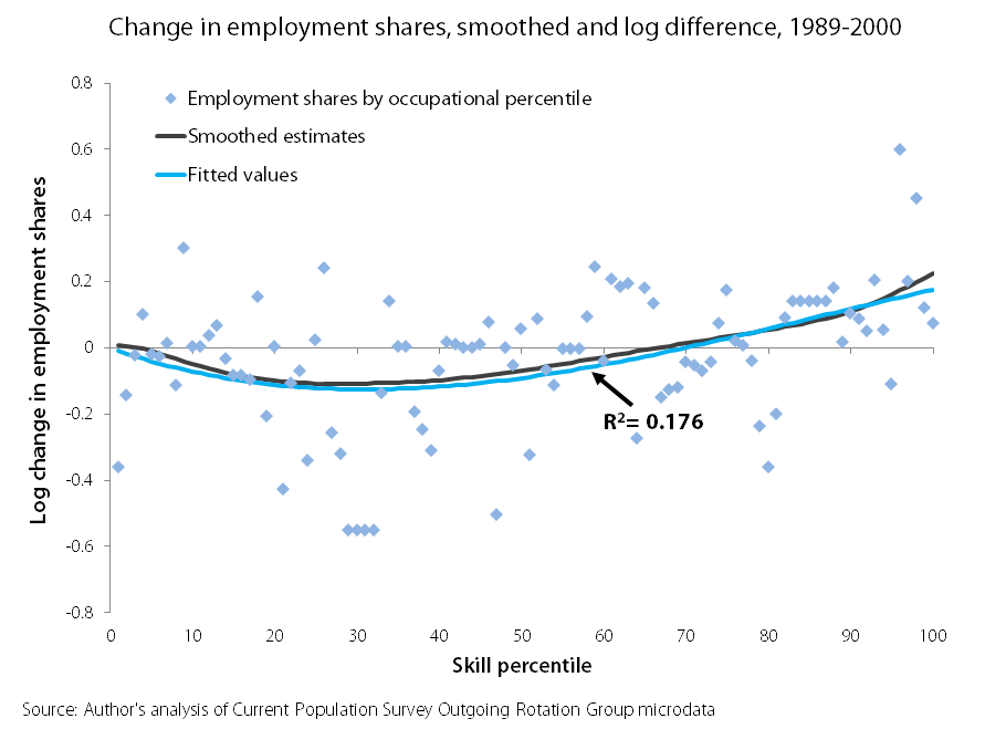
The two lines are statistically smoothed versions of the individual data points, which appear as blue diamonds. Both lines show a rough U-shape that is consistent with the standard story of job polarization: employment increases were largest at the top and bottom of the skill distribution and smallest in the broad middle.
MORE FROM THE SERIES
JOHN SCHMITT: Job polarization in the 2000s?
LARRY MISHEL: Can job polarization explain wage trends?
LARRY MISHEL: Occupation employment trends and wage inequality
We’ve since updated the chart in response to a suggestion by MIT economist David Autor (the most prominent researcher in this line of research and the discussant of our paper at the conference). The new version of the graph weights each occupation by the total number of hours worked by workers in each occupation, rather than by the total number of workers in each occupation, as we had done in the original version. As you can see, the switch from worker-weighted to hours-weighted occupations doesn’t have much visible impact on the chart:

In our paper, we express our concern that the smoothed lines, which have become the standard method for demonstrating job polarization, give an overly-optimistic view of just how well the occupational employment data fit the underlying data. (This is a point that was, as far as we are aware, first raised by economists Alexandru Lefter and Benjamin Sand.) We focused on the 1990s because that is the decade for which the data on job polarization are strongest, but we presented data for the 1980s and the 2000s, too.
As you can see by looking at the individual data points, even for the 1990s, the data are noisy; there are low-skill occupations that grew and low-skill occupations that shrank, middle-skill occupations that grew and middle-skill occupations that shrank, and high-skill occupations that grew and high-skill occupations that shrank. In the bottom 33 occupational skill percentiles, where the job polarization framework suggests that employment should be expanding, 12 actually saw declines. In the middle 34 skill percentiles, where we might expect to see declining employment, 8 groups show increases. Among the top 33 occupational skill groups, where we’d expect to see increases, 8 experienced employment declines.
The human eye would be hard-pressed to draw a U-shaped curve through the lines above. But, of course, we have statistical techniques to help us cope with exactly these kinds of circumstances. What concerned us is that in the work we’ve seen in this area, we have yet to see any researchers report how well the smoothed lines actually fit the data, that is, provide some metric for “goodness of fit.” So, we estimated a standard regression (a cubic in the percentile of the occupational wage distribution) and reported that the resulting line had an R-squared of 0.176 (roughly, the model explains 17.6 percent of the variation in the data). Using the new hours-based weighting scheme, the R-squared is a bit higher at 0.184.
In his post, Matthews is pretty impressed by the fit and writes: “Even a simple regression shows that 17.6 percent of the change in the groups’ shares is due to technological change…” At this point, we are arguing about what is large and what is small and reasonable minds can disagree. But, in such circumstances, proponents of job polarization should, in our view, present the actual employment changes (the diamonds in our version of the chart) alongside the smoothed lines and report some measure of the goodness of fit of the corresponding smoothed lines. As we see it, the smoothed lines in the chart are a fairly weak reed on which to hang a comprehensive theory of wage inequality, but readers of this work need to be provided the scatter plot and the goodness-of-fit measures to be in a position to evaluate for themselves.
As I said, the 1990s is the decade for which the data best fit the “job polarization” story, and as John emphasized in his post, the story fares poorly in the 2000s. Here, for example, is the corresponding chart for the data for the 2000s:

For the 2000s, the goodness-of-fit falls by more than half to just 0.072. For the 2000s, then, the model explains very little of the observed variation in the data and, as emphasized in the earlier post, does not show the U-shaped pattern that the theory predicts. In other words, the data for the 2000s—the decade that ought to matter most to current policy debates—provide essentially no hint of support for “job polarization.” It is unfortunate that Matthews chose not to report the much worse fit for the 2000s, which ought to be the one most relevant to his policy-oriented readership.
Enjoyed this post?
Sign up for EPI's newsletter so you never miss our research and insights on ways to make the economy work better for everyone.